

Muted blue paint colors have become the cornerstone of sophisticated interior design, offering the perfect balance between color and neutrality.
Unlike their bolder, more saturated cousins, muted blues bring a sense of calm and refinement to spaces without overwhelming the senses or limiting your decorating options.

What makes muted blues so appealing is their versatility. These colors incorporate varying amounts of gray, green, or even subtle purple undertones that soften the blue and create depth.
This complexity allows them to adapt beautifully to different lighting conditions throughout the day, revealing new dimensions of color as natural light shifts from morning to evening.
Both Sherwin Williams and Benjamin Moore have developed exceptional collections of muted blue paint colors that cater to every design style and preference.

From the lightest whispers of blue-gray that can brighten a dark hallway to deeper, more dramatic shades that create cozy, enveloping spaces, these 17 colors represent the best options for bringing tranquil sophistication into your home.
These colors all feature the muted quality you’re looking for, with various undertones of gray, green, or subtle purple that keep them from being too bold while still providing beautiful color.

Top Sherwin Williams Muted Blue Paint Colors
Niebla Azul (SW 9137)
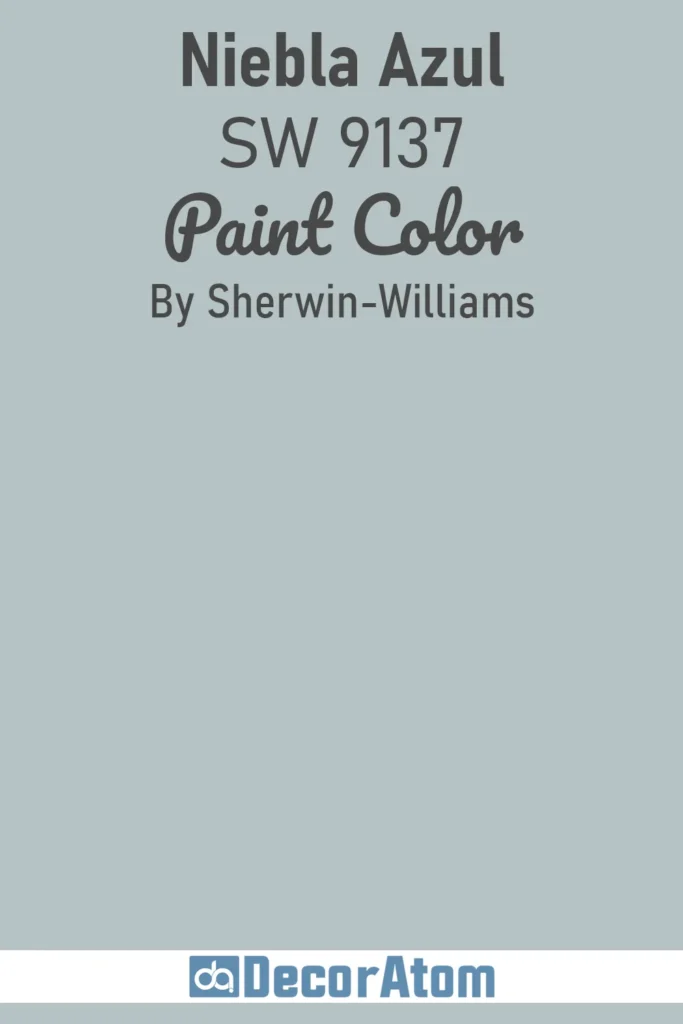
This serene dusty blue brings tranquility and sophistication to any space. The color is part of the Sherwin-Williams Neutral Nuance collection, making it ideal for creating calm environments.
Niebla Azul has an LRV of 52.91%, placing it in the medium range that reflects about half the light. This balanced quality prevents rooms from feeling too dark while maintaining enough depth to add character. The color works beautifully in spaces where you want to feel relaxed without sacrificing visual interest.
The touch of gray in Niebla Azul mutes the blue and makes it a dusty blue. This prevents it from looking like a typical nursery blue and gives it a more mature, sophisticated appearance. The gray undertones help the color adapt beautifully to different lighting conditions throughout the day.
Upward (SW 6239)
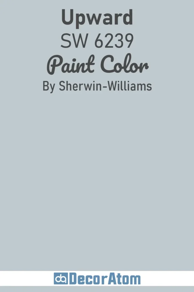
Sherwin Williams’ 2024 Color of the Year represents a breakthrough in soft blue paint. Upward is a beautiful shade of light blue that’s calming without looking as icy cold as cleaner, fresher blues can.
Upward has an LRV of 57, sitting right in the medium range where it brightens spaces without feeling washed out. This makes it versatile for rooms with varying amounts of natural light. The color maintains its character whether in bright or dimmer conditions.
Upward has subtle gray undertones along with a drop of violet. The gray prevents it from feeling too sweet or childish, while the hint of violet adds unexpected sophistication. This combination creates a color that feels both peaceful and refined.
Lullaby (SW 6236)
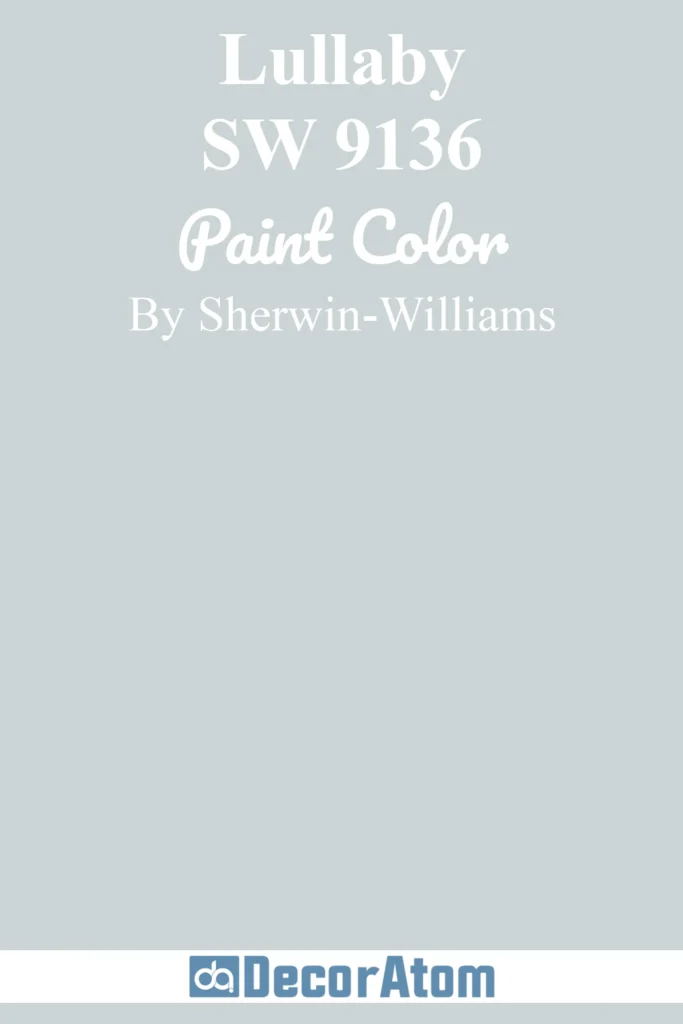
Lullaby lives up to its soothing name with substantial gray content that creates an almost-neutral backdrop. This muted blue works as a sophisticated wall color that won’t overwhelm your space while still providing gentle color interest.
The heavy gray influence makes Lullaby incredibly versatile for pairing with both warm and cool tones. It creates a restful environment perfect for bedrooms and spaces where relaxation is the priority. The color reads as a soft, whispered blue rather than making a bold statement.
Lullaby’s near-neutral quality means it functions beautifully as a whole-house color. It provides continuity between rooms while maintaining enough character to feel intentional and designed.
Tradewind (SW 6218)
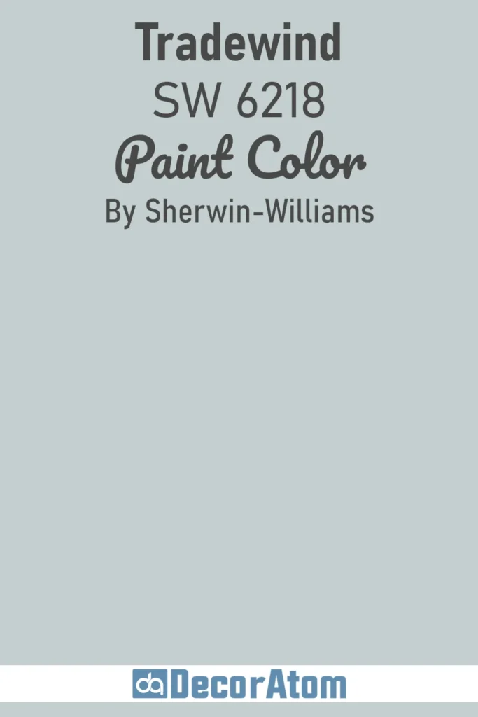
Tradewind offers a soft blue-green blend with aqua tones that brings a coastal sensibility to interiors. This versatile color bridges the gap between blue and green, making it adaptable to various design styles.
The aqua undertones give Tradewind a refreshing quality without feeling too beachy or themed. It works equally well in modern, traditional, or transitional spaces. The color has enough personality to stand on its own while remaining subtle enough to serve as a backdrop.
Tradewind’s balanced nature makes it suitable for most rooms in the home. It pairs beautifully with natural materials like wood and stone, creating an organic, calming environment.
Aleutian (SW 6241)
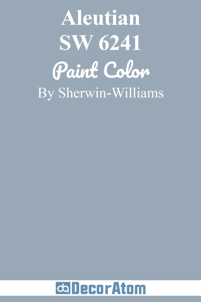
Aleutian is a darker muted blue that maintains true blue qualities while incorporating sophisticated gray undertones. This color offers more depth than lighter muted blues while still avoiding boldness or intensity.
The gray undertones in Aleutian prevent it from feeling too saturated or overwhelming. It creates a cocooning effect in spaces, making rooms feel intimate and refined. This makes it perfect for creating dramatic yet calming accent walls.
Aleutian works particularly well in spaces with good natural light where its depth can be appreciated. It pairs beautifully with crisp white trim and warm wood tones for a classic, timeless look.
Silver Strand (SW 7057)
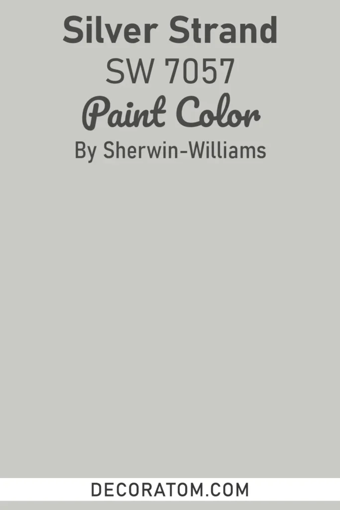
Silver Strand is a smoky blue-green that perfectly embodies the muted blue category. The slight green influence gives it a spa-like quality that feels immediately calming and serene.
This color has a misty, ethereal quality that changes subtly throughout the day. In bright light, the blue-green tones become more apparent, while in dimmer conditions, it leans more toward a soft gray. This chameleon-like quality makes it endlessly interesting.
Silver Strand works beautifully in bathrooms and bedrooms where you want to create a tranquil retreat. It pairs well with white, cream, and natural materials for a fresh, organic feel.
Krypton (SW 6247)

Krypton is a blue-gray with perfectly balanced undertones that doesn’t lean too heavily toward either color. This equilibrium makes it an excellent choice for those who want color without commitment to a bold hue.
The balanced nature of Krypton means it works in virtually any room and with most design styles. It provides a sophisticated backdrop that allows furnishings and artwork to take center stage. The color feels modern and current without being trendy.
Krypton’s versatility extends to its compatibility with both warm and cool accent colors. This makes it an excellent choice for open-concept spaces where color continuity is important.
Misty (SW 6232)
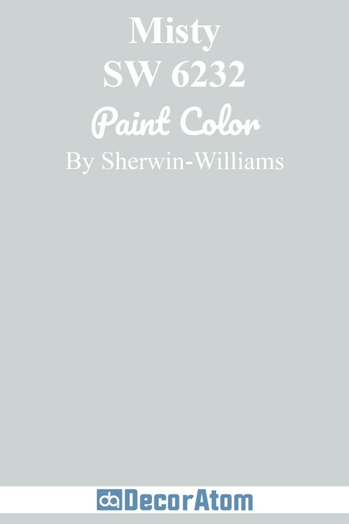
Misty is a light blue with gray undertones that creates an airy, peaceful atmosphere. The name perfectly describes the soft, hazy quality of this muted blue.
The gray influence keeps Misty from feeling too juvenile or sweet. It maintains a sophisticated edge while still being light and uplifting. This makes it suitable for spaces where you want brightness without starkness.
Misty works beautifully in rooms with limited natural light, as its high LRV helps reflect available light. It pairs wonderfully with white trim and soft neutral furnishings for a clean, fresh look.
Rainwashed (SW 6211)
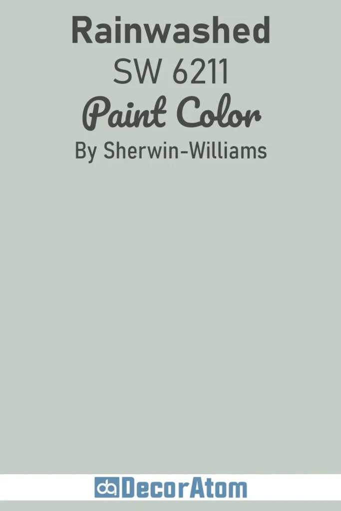
Rainwashed is a soft blue-green blend that brings a coastal vibe to interiors without feeling overly themed. The color has a gentle, washed-out quality that feels relaxed and casual.
The blue-green balance in Rainwashed makes it incredibly versatile and easy to live with. It creates a serene backdrop that works in virtually any room. The color has enough green to feel fresh without looking minty or bright.
Rainwashed pairs beautifully with natural materials and works especially well in coastal or farmhouse-style homes. It creates a sense of calm and connection to nature.
Best Benjamin Moore Muted Blue Paint Colors
Beacon Gray (2128-60)
Clean and luminous, this light blue-gray can instantly brighten and refresh a space. Beacon Gray represents the perfect intersection of soft gray and gentle blue.
Beacon Gray has an LRV of 65.92%, making it one of the lighter muted blues that effectively brightens spaces. This high reflectance value means it works well even in rooms with limited natural light, bouncing available light around the space.
Beacon Gray has cool blue tones that give it a fresh, airy quality. The color maintains its soft, crisp character throughout different lighting conditions, though the blue undertones become more noticeable in bright natural light.
Beach Glass (1564)
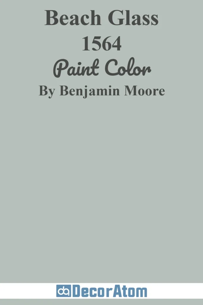
Beach Glass is a muted blue-green with spa-like qualities and subtle gray tones. The name evokes the smooth, frosted appearance of sea-worn glass, which perfectly describes this serene color.
The gray tones in Beach Glass give it a sophisticated, grounded quality that prevents it from feeling too beachy or casual. It creates a tranquil environment that feels both polished and relaxed. This makes it perfect for bathrooms where you want to create a spa-like retreat.
Beach Glass works beautifully with white, cream, and natural wood tones. It brings a sense of calm and connection to water without being overtly coastal in style.
Smoke (2122-40)
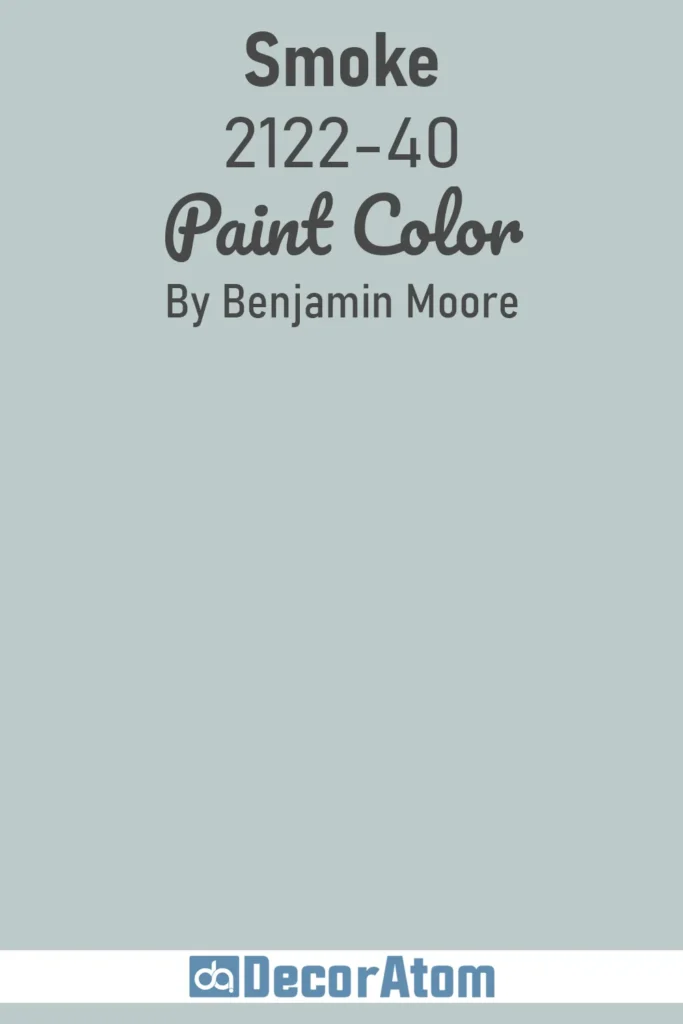
Smoke is a soft, easy-to-use light blue with hints of gray and green. This versatile color offers the perfect balance of color and neutrality, making it incredibly livable.
The combination of gray and green undertones gives Smoke a complex, nuanced quality. It shifts subtly in different lighting conditions, revealing different aspects of its character throughout the day. This complexity keeps it interesting without being overwhelming.
Smoke works well in any room of the house and pairs beautifully with both warm and cool accent colors. It’s an excellent choice for those who want a muted blue that feels current and sophisticated.
Palladian Blue (HC-144)
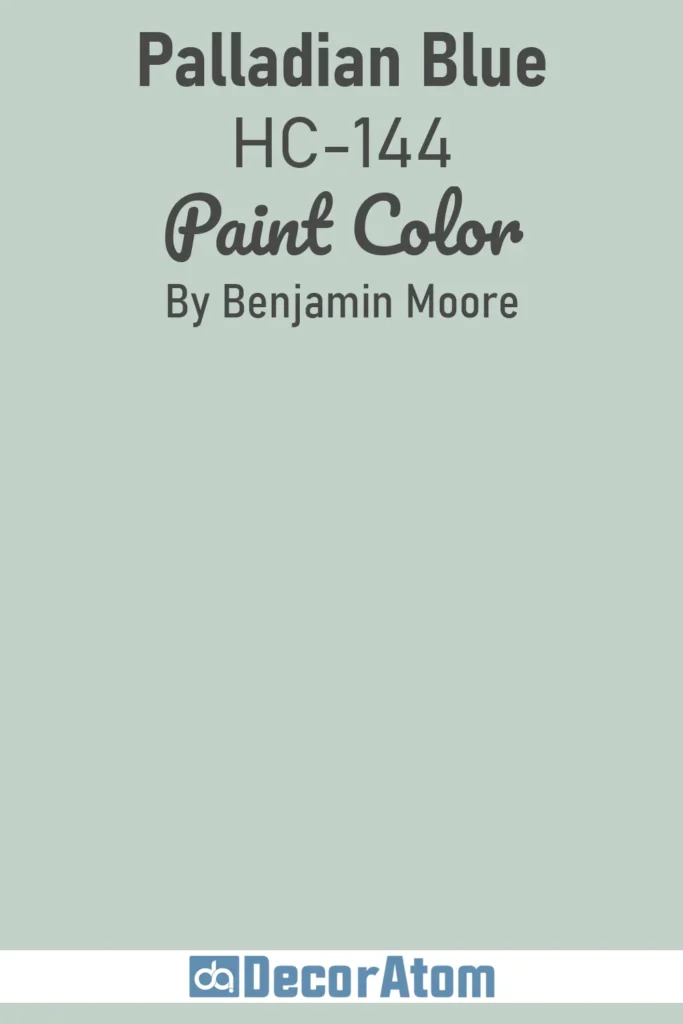
Palladian Blue is one of Benjamin Moore’s most popular colors for good reason. This blue-green with warm undertones creates an inviting, approachable atmosphere while maintaining sophistication.
The warm undertones in Palladian Blue prevent it from feeling cold or sterile. It has a friendly, welcoming quality that makes spaces feel lived-in and comfortable. This warmth makes it more versatile than cooler muted blues.
Palladian Blue works beautifully in traditional and transitional spaces. It pairs well with warm woods, cream, and other soft neutrals for a timeless, elegant look.
Woodlawn Blue (HC-147)

Woodlawn Blue is a trendy blue with a gray foundation and hints of green. This color has gained popularity for its ability to feel both current and timeless simultaneously.
The gray foundation gives Woodlawn Blue a sophisticated, grounded quality. The hints of green add freshness and prevent the color from feeling too serious or formal. This combination creates a color that feels balanced and livable.
Woodlawn Blue works particularly well in modern farmhouse and transitional interiors. It pairs beautifully with black accents, warm wood tones, and crisp white trim.
Wedgewood Gray (HC-146)
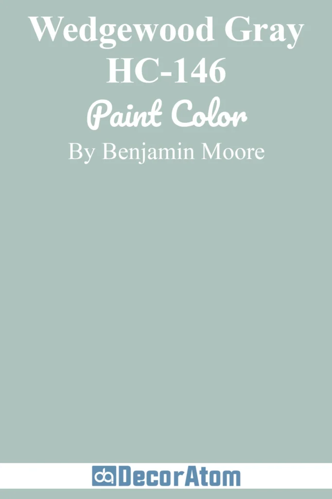
Wedgewood Gray is a slightly darker option with similar qualities to Woodlawn Blue. This classic color has been a favorite for decades thanks to its timeless appeal and versatility.
The color offers more depth than lighter muted blues while maintaining a soft, approachable quality. It creates a sense of intimacy and coziness in spaces without feeling heavy or dark. This makes it perfect for creating sophisticated, enveloping environments.
Wedgewood Gray works beautifully in dining rooms, libraries, and bedrooms where you want to create a more dramatic yet still calming atmosphere. It pairs well with warm metallics and rich wood tones.
Gray Cashmere (2138-60)
Gray Cashmere is a subtle blue-gray that can read as either color depending on lighting and surrounding elements. This chameleon-like quality makes it incredibly versatile and adaptable.
The soft, cashmere-like quality (as the name suggests) gives this color a luxurious, comforting feel. It creates a sophisticated backdrop that feels both polished and relaxed. The color works beautifully in spaces where you want subtle color without strong commitment.
Gray Cashmere pairs well with a wide range of colors and styles. It’s particularly effective in creating cohesive flow in open-concept spaces where color continuity is important.
Silver Gray (2131-60)
Silver Gray is a stormy blue-gray that’s light yet committed to its blue character. This color offers more personality than typical grays while maintaining a soft, muted quality.
The stormy quality gives Silver Gray a sense of depth and drama without being dark or heavy. It creates interesting, moody environments that still feel light and airy thanks to its relatively high LRV. This balance makes it unique among muted blues.
Silver Gray works beautifully in modern and contemporary spaces where you want color with edge. It pairs well with crisp whites, black accents, and metallic finishes for a sophisticated, current look.
Frequently Asked Questions About Muted Blue Paint Colors
What makes a blue paint color “muted”?
A muted blue paint color contains additional undertones—typically gray, green, or sometimes purple—that soften and desaturate the pure blue. This creates a more complex, sophisticated color that feels calming rather than bold or bright. The gray content in particular helps muted blues function almost like neutrals while still providing gentle color interest.
Muted blues have lower color saturation compared to pure or vivid blues. This makes them easier to live with long-term and more versatile for pairing with various furnishings and decor styles.
What is LRV and why does it matter for muted blue paint?
LRV stands for Light Reflectance Value, which measures how much light a paint color reflects on a scale from 0 (absolute black) to 100 (pure white). For muted blues, LRV typically ranges from the mid-40s to the mid-60s, though some lighter options can go higher.
Colors with higher LRVs (above 50) will brighten spaces and work well in rooms with limited natural light. Lower LRVs create more intimate, cozy environments but require adequate lighting to avoid feeling too dark. Understanding a color’s LRV helps you predict how it will perform in your specific space.
What’s the difference between Sherwin Williams and Benjamin Moore muted blues?
Both brands offer exceptional muted blue options, but they have slightly different characteristics. Sherwin Williams tends to offer colors with more contemporary, complex undertones and their formulations often shift beautifully in different lighting. Benjamin Moore’s Historic Color collection includes timeless muted blues that have proven their staying power over decades.
The main difference often comes down to personal preference and availability. Both brands use high-quality pigments and offer excellent coverage. It’s worth getting samples from both brands to see which formulation and undertones work best in your specific space.
Can I use muted blue throughout my entire house?
Absolutely! Muted blues are versatile enough to work as whole-house colors. Their near-neutral quality with just enough color interest creates beautiful flow between rooms. Colors like Lullaby, Beacon Gray, or Smoke work particularly well for this purpose.
When using a muted blue throughout your home, consider varying the trim color or using different sheens in different rooms to add subtle variation. You can also use slightly different muted blues in different zones to create distinction while maintaining cohesion.
What undertones should I look for in a muted blue?
The best undertone depends on your existing decor and desired atmosphere. Gray undertones create sophisticated, modern spaces and pair well with both warm and cool elements. Green undertones bring a fresh, coastal feel and work beautifully with natural materials. Purple or violet undertones add unexpected elegance and warmth.
Consider your lighting as well—rooms with warm artificial lighting can handle cooler gray-blue tones, while rooms with cool northern light might benefit from muted blues with warmer green or purple undertones.
How do I choose between a blue-gray and a gray-blue?
A blue-gray reads primarily as blue with gray undertones, while a gray-blue reads primarily as gray with blue undertones. If you want color to be the dominant feature, choose a blue-gray like Niebla Azul or Upward. If you prefer something more neutral that just hints at blue, opt for a gray-blue like Gray Cashmere or Krypton.
The decision often comes down to how much color commitment you’re comfortable with. Gray-blues offer an easier transition if you’re moving from neutral walls, while blue-grays make more of a statement.
What colors pair well with muted blue walls?
Muted blues are incredibly versatile and pair beautifully with crisp white trim, warm wood tones, cream and beige neutrals, soft grays, and even black accents for contrast. For furnishings, consider warm terracotta, soft blush pink, sage green, or golden yellows to create inviting, layered spaces.
Metallics also work wonderfully—brass and gold add warmth, while chrome and nickel enhance the cool sophistication of muted blues. Natural materials like rattan, jute, and linen complement the calming quality of these colors.
How can I test muted blue paint before committing?
Always purchase sample pots and paint large swatches directly on your walls. Paint samples on multiple walls to see how the color behaves in different lighting throughout the day. Observe the color in morning light, afternoon sun, and evening artificial light.
Live with your samples for at least 48-72 hours before deciding. Notice how the color looks next to your existing furnishings, flooring, and trim. Many muted blues can shift significantly in different conditions, so thorough testing is essential.
Will muted blue make my room feel cold?
Not necessarily. While blue is technically a cool color, muted blues with green or purple undertones can actually feel quite warm and inviting. The gray content in muted blues also helps neutralize the temperature, making them feel more balanced than pure blues.
If you’re concerned about coldness, choose muted blues with warm undertones like Palladian Blue or Rainwashed, and pair them with warm wood tones, layered textiles, and warm lighting. The right styling can make any muted blue feel cozy and welcoming.
Are muted blues still on-trend or are they dated?
Muted blues are considered timeless rather than trendy. While certain specific shades may rise and fall in popularity (like Sherwin Williams naming Upward their 2024 Color of the Year), the overall category of muted blues has remained consistently popular for decades. Colors like Benjamin Moore’s Palladian Blue and Wedgewood Gray have been favorites for generations.
The key to keeping muted blues feeling current is in how you style them. Pair them with contemporary furnishings and current design trends, and they’ll always feel fresh and relevant.