
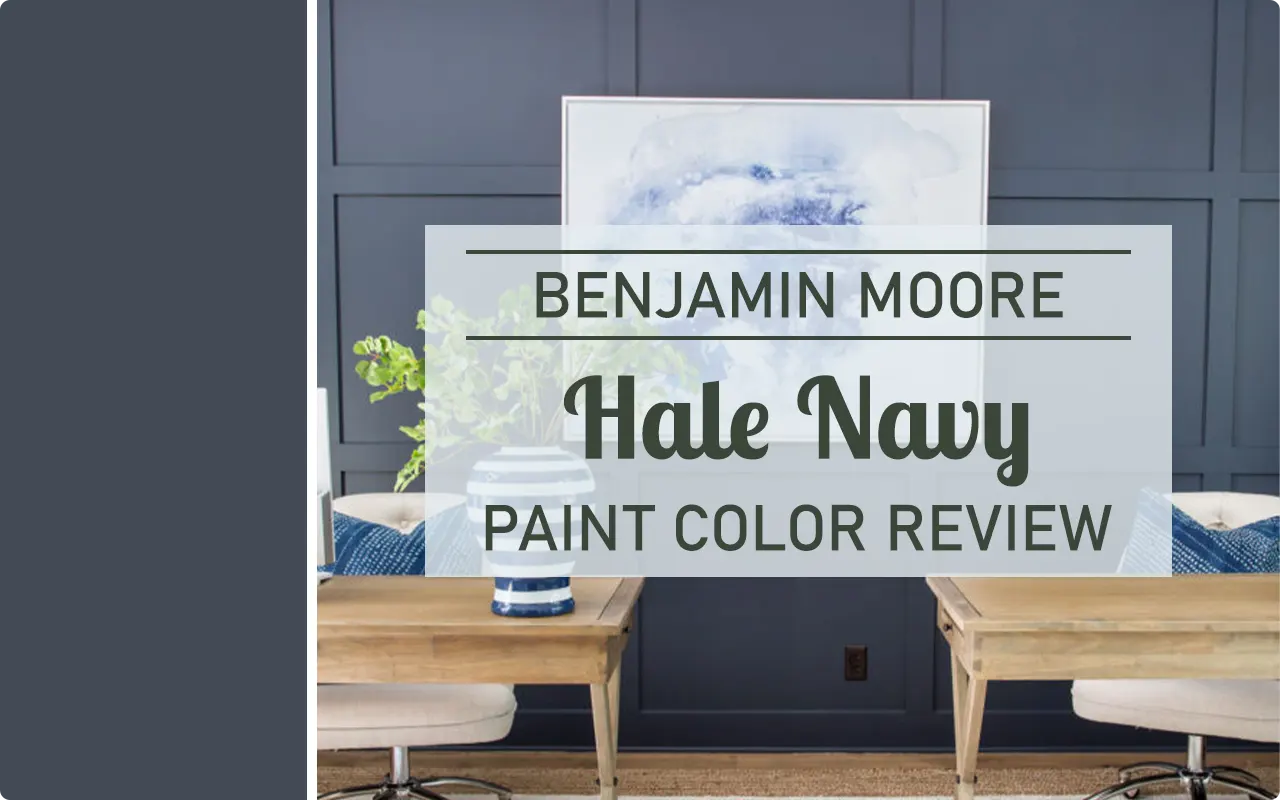
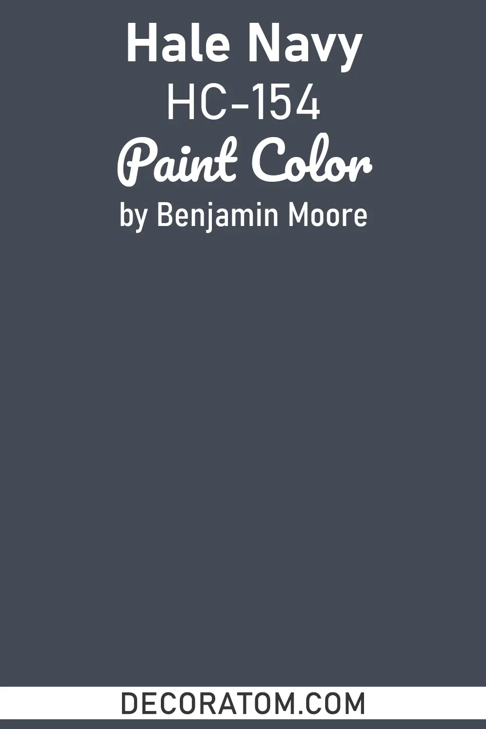
I’ll be honest — I didn’t fall in love with Hale Navy at first sight. I walked past it on the paint chip display more times than I can count, always gravitating toward the louder, more dramatic navy blues. But then I painted a single wall in my home office with it, and something just clicked. There was a depth to it, a kind of quiet confidence that I hadn’t expected. That’s when I knew I needed to write about this color.
Benjamin Moore Hale Navy HC-154 is part of the Historic Colors collection, which already tells you something about its character. It’s not trying to be trendy. It’s not chasing a moment.
It’s a color that has been working beautifully in homes for decades, and it continues to show up in some of the most thoughtfully designed spaces I’ve come across. Whether you’re thinking about using it on an exterior, an accent wall, kitchen cabinets, or a full room, this color has a way of making spaces feel grounded and intentional.
In this review, I’m going to walk you through everything you’d actually want to know before committing to this paint — from its LRV and lighting behavior to the best trim pairings and coordinating colors. Let’s get into it.
What Color is Benjamin Moore Hale Navy?
Hale Navy is a deep, rich navy blue with subtle green undertones that become more visible depending on the light in your space. It reads as a classic, sophisticated dark blue in most settings, but it’s not a flat or one-dimensional color. There’s a complexity to it that keeps it interesting.
As for whether it’s warm or cool — Hale Navy leans cool. That slight blue-green quality gives it a cool, collected feel rather than anything warm or inviting in a traditional sense. It’s the kind of cool that feels sharp and refined, not cold or uninviting.
LRV of Benjamin Moore Hale Navy
LRV stands for Light Reflectance Value, and it simply tells you how much light a color reflects back into a room. The scale runs from 0 (pure black, reflects no light) to 100 (pure white, reflects all light).
Hale Navy has an LRV of 8.36, which puts it firmly in the dark end of the spectrum. This means it absorbs a lot of light rather than bouncing it back, which is exactly why it creates such a dramatic, moody atmosphere. In a well-lit room, this works beautifully. In a small, windowless space, it can feel heavy — so keep that in mind before you commit to it in every corner.
How Different Types of Lighting Affect Benjamin Moore Hale Navy?
Lighting can completely transform how Hale Navy looks on your walls, and this is one of those colors where I’d strongly recommend getting a sample and watching it through different times of day before making a final decision.
In natural daylight, Hale Navy looks its most true — a clean, balanced navy with that subtle green-blue character coming through nicely. It feels fresh and sharp during the day.
Under warm incandescent or warm LED lighting, those green undertones soften and the color pulls a bit more toward a classic navy, sometimes even hinting at a warm slate. It feels richer and more enveloping in the evenings.
In cool or fluorescent lighting, the blue deepens and the green undertones become a little more pronounced, which can make the color feel slightly colder than expected.
North-facing rooms with limited natural light will push Hale Navy toward its darker, moodier side — which is stunning in the right context, like a cozy reading room or a moody dining space.
Trim Colors to Pair With Benjamin Moore Hale Navy
Trim can make or break a dark color like Hale Navy, and choosing the right one is genuinely important. You want something that creates a clean contrast without competing with the depth of the wall color. Here are three trim colors I think work really well with it:
1. Benjamin Moore Chantilly Lace OC-65
This is a crisp, bright white with no real undertones getting in the way — it’s clean and pure. Against the depth of Hale Navy, Chantilly Lace creates a high-contrast, polished look that feels classic and intentional.
2. Benjamin Moore White Dove OC-17
If you want something a touch softer than a stark white, White Dove is a beautiful option. It has a very subtle warmth to it, which takes the edge off the coolness of Hale Navy and creates a pairing that feels more relaxed and livable.
3. Benjamin Moore Simply White OC-17
Simply White sits between the two — it has a gentle warmth but still reads as a true white. It works especially well on trim and ceilings when you want everything to feel pulled together without any harshness.
Colors Similar to Benjamin Moore Hale Navy
Finding a similar color to Hale Navy is something a lot of people look into, either because they want to compare before committing, or because they’re trying to match it across different paint brands for things like cabinets, exterior elements, or furniture. And I get it — when you’re investing time and money into a paint project, you want to make sure you’re picking the right shade, not just settling for whatever is in stock.
What makes this a little tricky with Hale Navy is that subtle green undertone. A lot of navy blues that look similar on a chip can read quite differently on the wall once they’re up. Some pull more blue-purple, some go almost black in low light, and some stay more blue-green like Hale Navy does. So when I say “similar,” I mean colors that share that same dark, refined navy character and have a comparable depth and undertone family.
The six colors listed below are the closest matches I’ve found — some from Benjamin Moore’s own lineup, and a couple from Sherwin-Williams for those of you who prefer to shop there or need to cross-reference across brands.
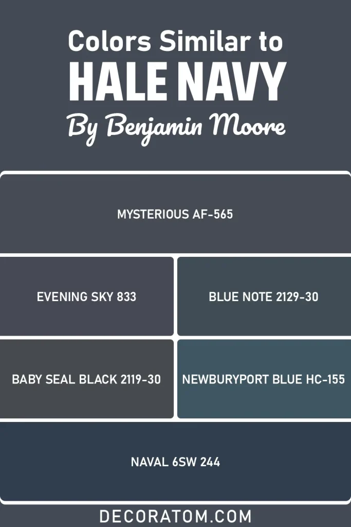
- Mysterious AF-565
- Evening Sky 833
- Blue Note 2129-30
- Baby Seal Black 2119-30
- Newburyport Blue HC-155
- Sherwin-Williams Naval SW 6244
Colors That Go With Benjamin Moore Hale Navy
One of the things I appreciate most about Hale Navy is how well it plays with other colors. It’s not a diva — it doesn’t demand all the attention. Instead, it acts as a strong, grounded base that makes the colors around it look better. That’s a quality you don’t always find in deep, dramatic paint colors.
When building a palette around Hale Navy, the goal is balance. Because the color itself is so saturated and dark, the other colors in the room need to either complement its coolness or provide enough contrast to keep the space from feeling too heavy. Soft whites and off-whites work brilliantly here because they create breathing room. Warm neutrals bring in a layer of coziness that prevents the space from feeling too serious or cold. And lighter grays or greige tones can bridge the gap between the navy and any wood tones or natural materials you might have in the room.
The four colors below are coordinating picks from Benjamin Moore that I think work particularly well with Hale Navy, whether you’re using them on ceilings, adjacent walls, cabinetry, or furniture.
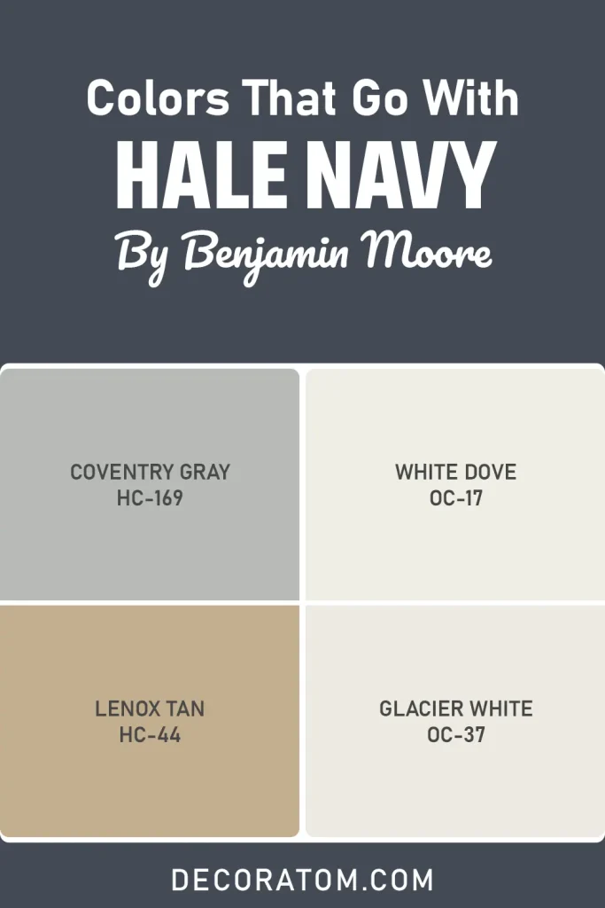
- Coventry Gray HC-169
- White Dove OC-17
- Lenox Tan HC-44
- Glacier White OC-37
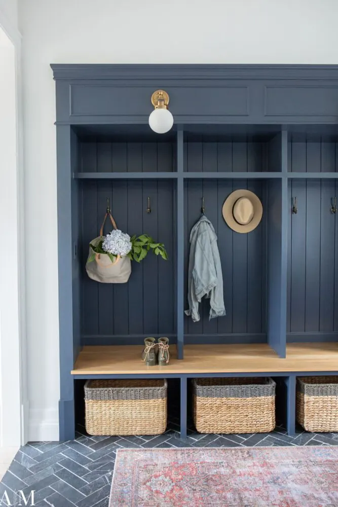
Where to Use Benjamin Moore Hale Navy?
Hale Navy is one of those rare paint colors that genuinely works almost everywhere — but how you use it matters. Here’s where I think it really earns its place:
- Exterior of the home: This is honestly where Hale Navy is at its absolute best. Against white trim and natural wood accents, it gives a home serious curb appeal. It photographs beautifully, holds up well in sunlight, and looks as good on a modern farmhouse as it does on a traditional colonial.
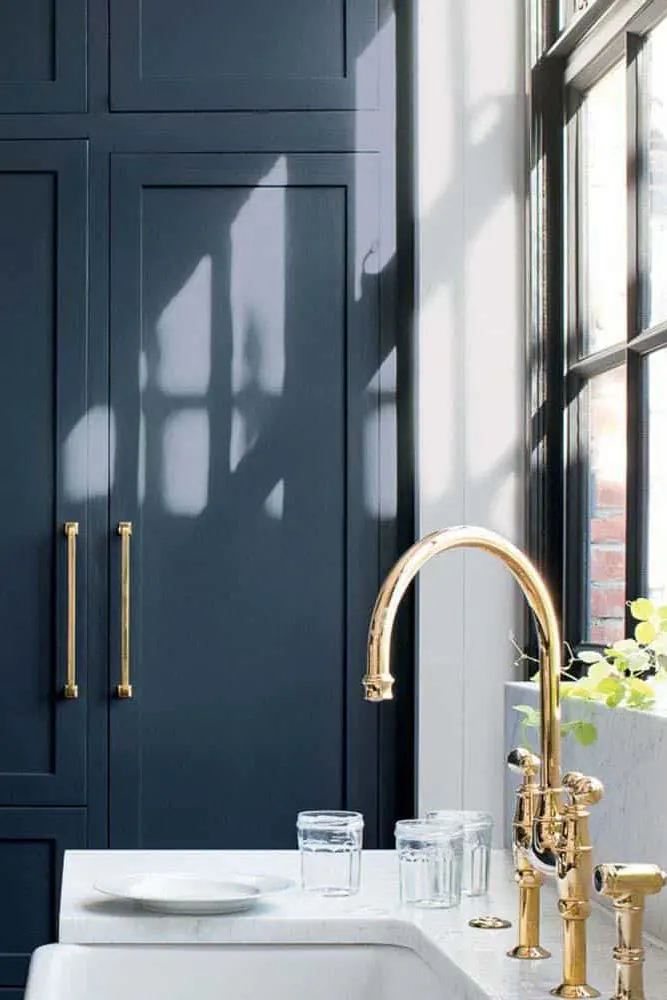
- Kitchen cabinets: If you want to add personality to a kitchen without going overboard, painting the lower cabinets (or all of them) in Hale Navy is a smart move. Pair with brass hardware and a light countertop and it looks genuinely expensive.
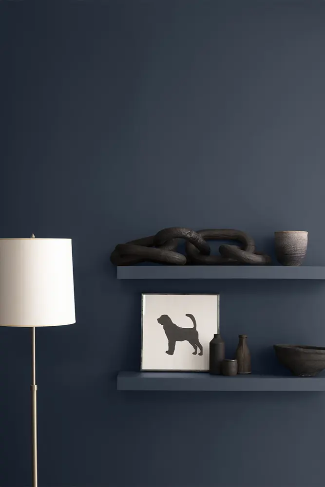
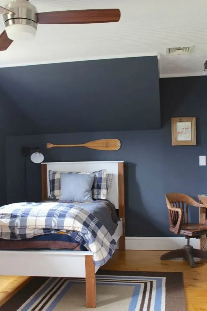
- Accent wall in a living room or bedroom: One wall in Hale Navy can completely anchor a space and give it focus. You don’t need to paint the whole room — just the right wall does the work.
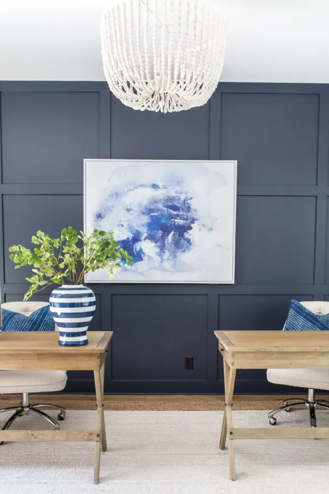
- Home office: There’s something about deep, cool colors that makes a workspace feel more focused. I painted my home office in it and found that it actually helped me concentrate. It’s not a proven science, but the color just feels serious in the best way.
- Front door: A Hale Navy front door is a classic move for a reason. It’s bold, welcoming, and pulls the whole exterior together.
- Dining room: Dark colors in dining rooms create intimacy, and Hale Navy does that without being aggressive. Paired with warm lighting and natural wood, it’s genuinely stunning.
Why I Love Benjamin Moore Hale Navy
I love Hale Navy because it never feels like a trend. I’ve seen paint colors come and go — colors that felt exciting for a season and then looked exhausted two years later. Hale Navy doesn’t do that. It has this timeless quality that keeps it relevant no matter what else is happening in the design world.
I also love that it’s not trying to be something it isn’t. It’s a dark, cool, complex navy — and it owns that completely. It doesn’t swing too purple, too black, or too teal. It just does its thing with a kind of quiet authority that I find genuinely refreshing.
And then there’s the way it transforms a space. I’ve seen it on a small powder room and on the entire exterior of a two-story home, and in both cases, it looked like the right choice. That kind of versatility is rare. Most colors have a sweet spot — one application where they really shine. Hale Navy seems to find its sweet spot everywhere it lands.
Final Thoughts
If you’ve been sitting on the fence about Hale Navy, I hope this post has given you enough to make a confident decision. It’s a color that rewards commitment. It’s not for people who want something safe and easy — it asks you to lean in, trust it, and let it do what it does best. And what it does best is make spaces feel considered, layered, and lasting.
My honest advice: grab a sample pot, paint a large swatch on the wall you’re considering, and live with it for a few days. Watch it in the morning light, the afternoon, and in the evening with your lamps on. You’ll see exactly what I mean when I say this color has a life of its own.
It’s become one of my favorite Benjamin Moore colors to recommend, and for good reason. Hale Navy HC-154 is simply a great paint color — and I don’t say that about many.