
I’ll be honest — the first time I saw October Mist on a paint chip, I almost passed it over. It looked a little too quiet, maybe even a little too safe. But then I put a sample on my wall, and I genuinely could not stop staring at it.
There’s something happening in that color that a tiny paint chip just cannot communicate. It shifts, it breathes, and depending on the time of day, it tells a completely different story.
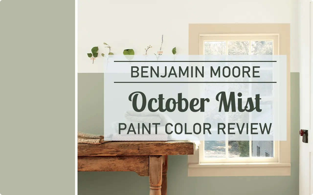
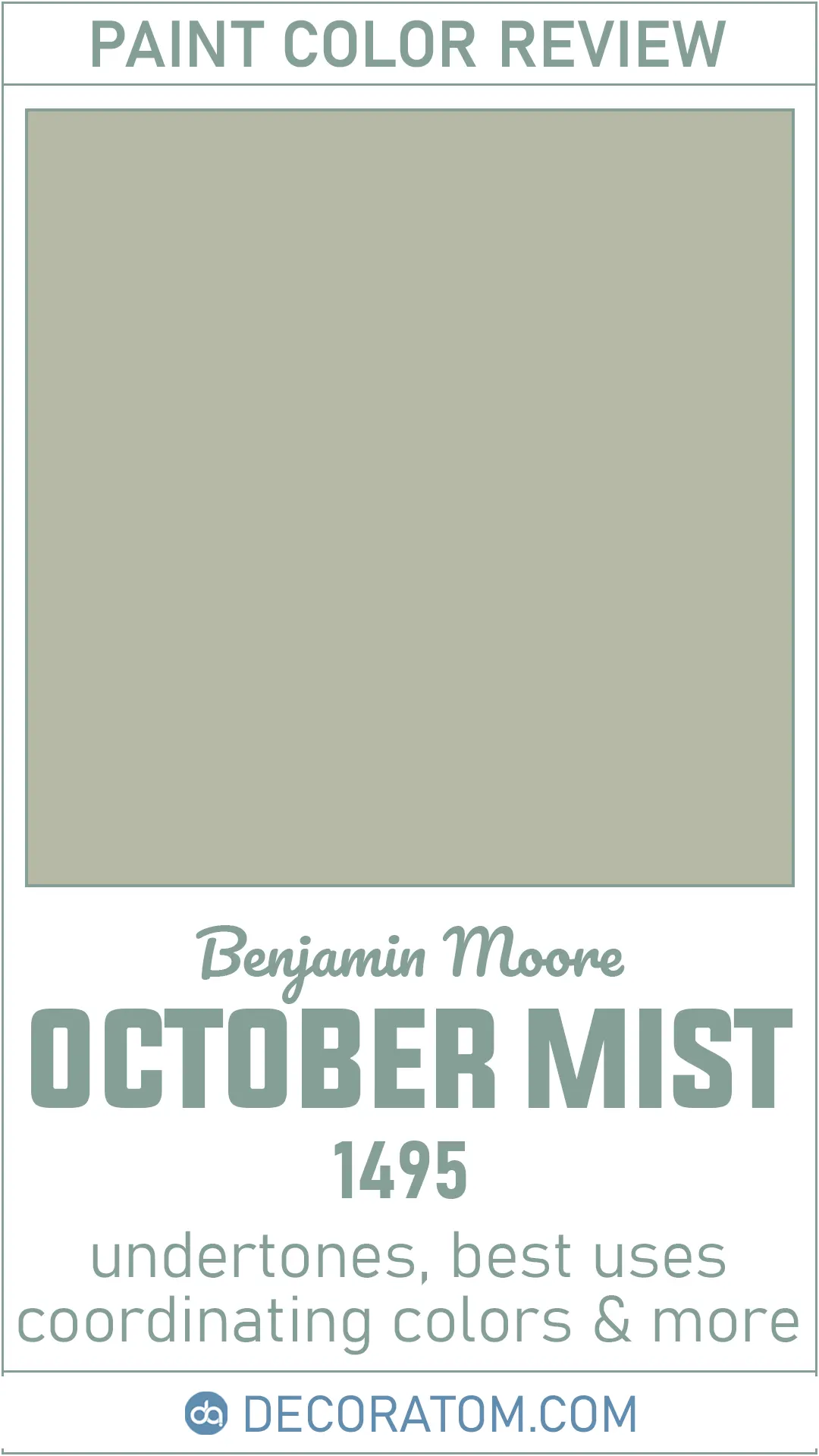
Benjamin Moore October Mist (color code 1495, also listed as CC-550) was the brand’s Color of the Year for 2022, and honestly, that recognition was well deserved.
It came at a time when people were gravitating toward nature-inspired interiors, and this color fit that mood perfectly. It’s the kind of color that feels both intentional and effortless — like you made a sophisticated design decision without trying too hard.
If you’ve been searching for a green that doesn’t scream green, a neutral that isn’t boring, and a color that works in practically any room of your house, you’ve landed in the right place. Let me walk you through everything you need to know about Benjamin Moore October Mist.
What Color is Benjamin Moore October Mist?
Benjamin Moore October Mist is a soft, muted sage green with a noticeable dose of gray running through it. It’s not the kind of green you’d find on a garden hose or a forest canopy. Think more along the lines of a dried herb, or the color of morning light on a dewy lawn in early fall. It has an earthy, organic quality that makes it feel grounded rather than bold.
Is It a Warm or Cool Color?
October Mist leans warm. Its hue angle sits closer to green-yellow than green-blue, which technically places it in the warm green family. That said, the gray in it tempers any obvious warmth, so it never feels golden or yellow-ish on the wall. The warmth is subtle — it’s just enough to keep the color from feeling cold or clinical in most lighting situations.
LRV of Benjamin Moore October Mist
LRV stands for Light Reflectance Value, and it’s essentially a number that tells you how much light a paint color bounces back into a room. The scale runs from 0 (pure black, absorbs all light) to 100 (pure white, reflects all light). The higher the number, the lighter and brighter the color will feel on your walls.
The LRV of Benjamin Moore October Mist is 46.54, which puts it right in the mid-tone range. In practical terms, this means it’s not going to flood a room with brightness, but it also won’t turn your space into a cave.
It holds its color confidently in well-lit rooms, and in lower-light spaces, it reads a touch deeper and moodier. It’s the sweet spot for anyone who wants a color with real presence but isn’t ready to commit to something dramatically dark.
How Different Types of Lighting Affect Benjamin Moore October Mist
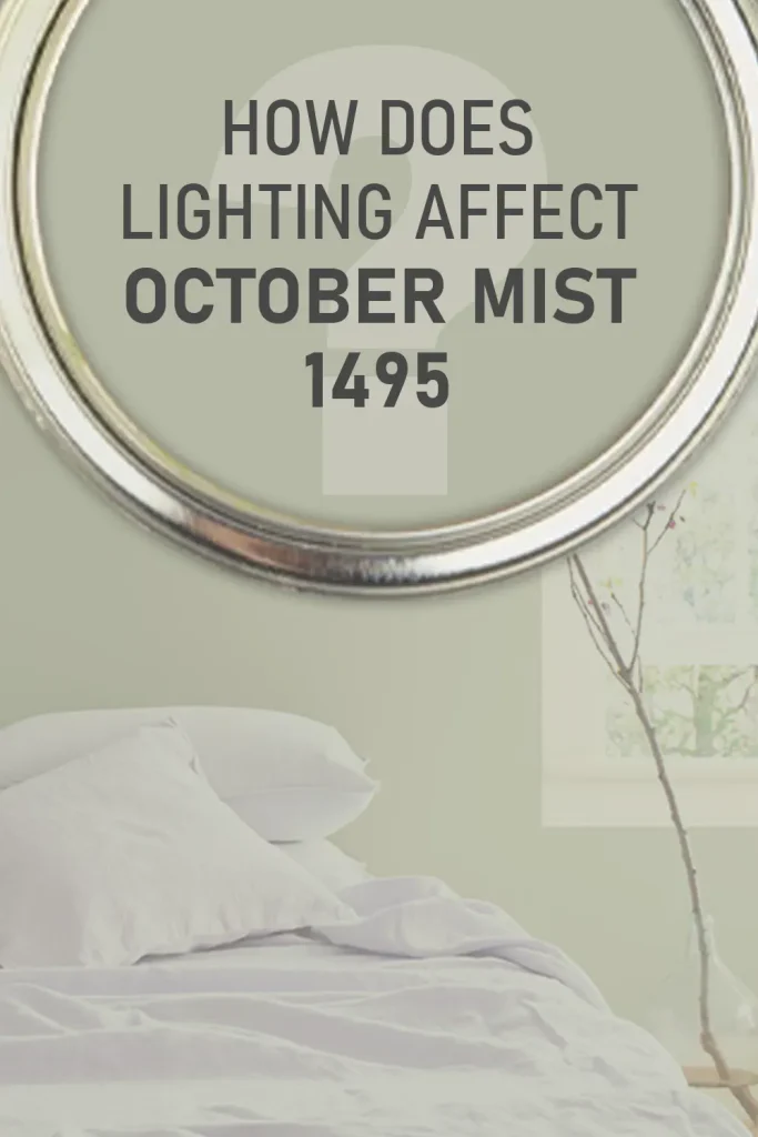
This is the section I always wish more paint reviews would slow down on, because lighting genuinely transforms October Mist in ways that can surprise you.
In natural daylight, particularly in south or east-facing rooms, the green in October Mist really comes alive. It looks fresh, herbal, and clearly green — this is probably the version of it that most people fall in love with in inspiration photos.
In north-facing rooms, the light is cooler and more diffused, and October Mist responds by pulling slightly more gray. The green stays visible, but the overall effect feels a bit more subdued and smoky. Interestingly, this pairing actually works really well — the warmth in October Mist balances the cool northern light nicely.
In west-facing rooms, especially during late afternoon, warm golden light hits the walls and brings out a slight brown undertone that feels cozy and very autumnal. It’s beautiful in a lived-in, farmhouse kind of way.
Under artificial lighting in the evening, October Mist tends to shift cooler. The gray undertones become more prominent under warm incandescent or LED bulbs, and the green quiets down considerably. If you’re painting a room that’s primarily used at night, keep this in mind — it will look noticeably different from what you see during the day.
The bottom line: always, always sample this color on your actual walls and observe it at different times of day before committing. What you see on a chip in a paint store will not match what you see on a full wall under your home’s specific lighting.
Trim Colors to Pair With Benjamin Moore October Mist
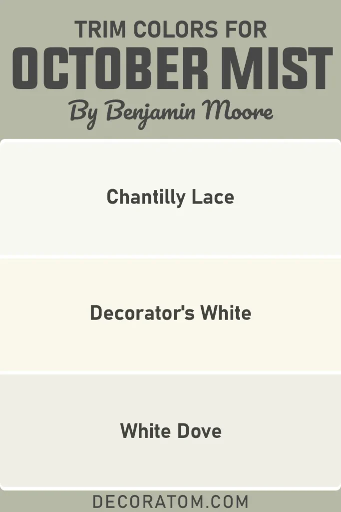
Trim color might seem like an afterthought, but getting it wrong can throw off the entire look of a room. With October Mist, you want to stay in the warm white family. Cool, stark whites tend to create a visual clash — they can make the walls look murky rather than sophisticated.
Here are the three trim colors I’d go to first:
1. Benjamin Moore White Dove (OC-17)
White Dove is probably the most recommended trim partner for October Mist, and for good reason. It’s a warm, creamy white that sits quietly alongside the sage green without competing with it. The contrast is gentle and layered, and it gives the room a collected, put-together feel rather than a high-contrast graphic one.
2. Benjamin Moore Chantilly Lace (OC-65)
If you want something crisper and cleaner, Chantilly Lace delivers. It’s a brighter, more pure white compared to White Dove, so it sharpens the contrast with October Mist’s depth. This pairing works beautifully in modern or transitional spaces where you want clean lines and a slightly more polished finish.
3. Benjamin Moore Decorator’s White (CC-20)
This is a softer, slightly cooler white that still plays nicely with October Mist. It’s a great middle-ground option if White Dove feels too creamy for your space but Chantilly Lace feels too stark. It lets the walls do the talking without the trim pulling too much attention.
Colors Similar to Benjamin Moore October Mist
Finding a color that closely resembles October Mist is trickier than it sounds. The combination of warm gray, muted green, and that particular mid-tone depth is a specific formula, and not every sage green in the paint aisle hits the same notes.
Some similar colors skew cooler and bluer, others are more saturated and vivid, and a few land noticeably lighter or darker on the wall. This matters a lot if you’re trying to match across rooms, or if you’re considering a different brand for budget or availability reasons.
It also matters if you’ve sampled October Mist and found it almost right but not quite — knowing what’s nearby on the spectrum helps you pivot with confidence rather than starting the search over from scratch.
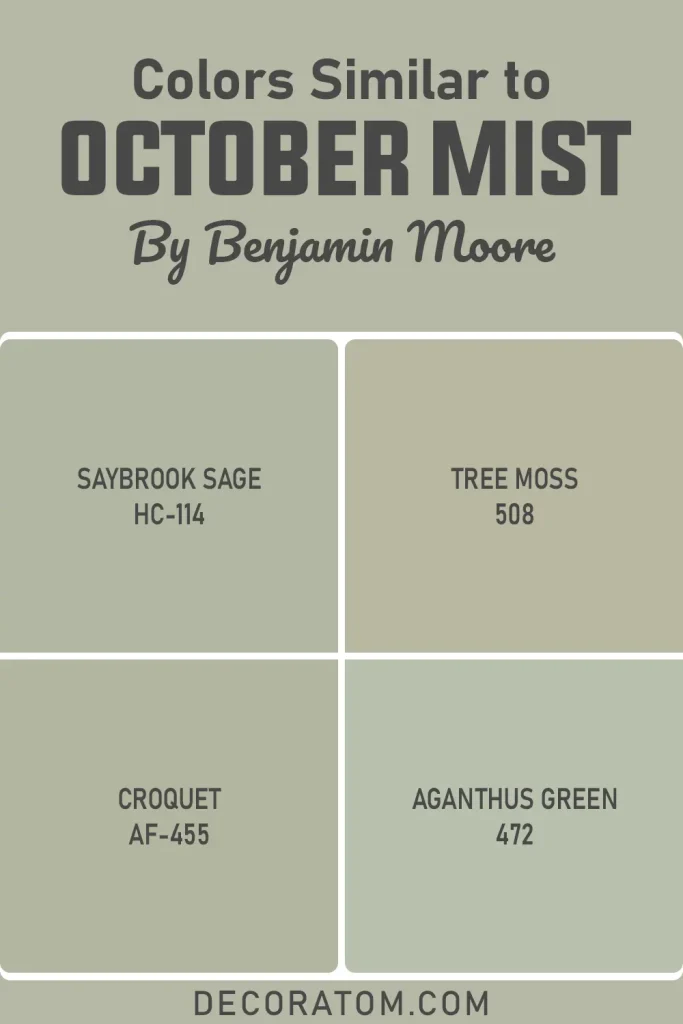
The colors listed below are the closest matches I’ve found, and while none of them are exact duplicates, each one shares enough of October Mist’s DNA that they’re worth sampling alongside the original.
- Benjamin Moore Saybrook Sage HC-114
- Benjamin Moore Tree Moss 508
- Benjamin Moore Croquet AF-455
- Benjamin Moore Aganthus Green 472
Colors That Go With Benjamin Moore October Mist
One of the things that makes October Mist so likable as a wall color is how easy it is to build a palette around it. Because it functions more like a neutral than a traditional color, it doesn’t demand attention or fight with other hues in the room.
It simply settles in and lets everything around it coexist peacefully. That said, pairing it intentionally still makes a real difference. Warm earth tones — think terracotta, warm beige, soft linen — feel completely natural next to it.
Deep, moody accents like navy or charcoal create a grounding contrast that keeps the room from feeling too soft. Creamy whites on trim and ceilings lift it without washing it out. You can go rustic and cozy, or clean and modern — October Mist adapts to both directions without complaint.
The coordinating colors below come directly from Benjamin Moore’s own palette recommendations and have been tested as proven companions for this specific shade.
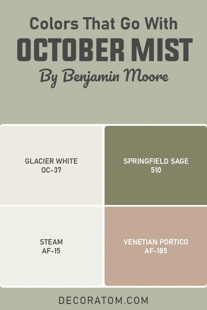
- Benjamin Moore Glacier White OC-37
- Benjamin Moore Springfield Sage 510
- Benjamin Moore Steam AF-15
- Benjamin Moore Venetian Portico AF-185
Where to Use Benjamin Moore October Mist?
October Mist is one of those rare colors that genuinely earns the label “versatile.” It’s not a one-room wonder — it moves through the home with ease. Here’s how it performs in different spaces:
Benjamin Moore October Mist in the Bedroom
The bedroom is probably where October Mist shines most naturally. The gray-green combo has a genuinely calming effect — it’s not an accident that this color keeps showing up in sleep-focused spaces. Pair it with white bedding, natural linen, and warm wood furniture and you’ve got a room that feels like a boutique hotel without trying. It’s deep enough to feel cozy at night but never heavy or oppressive during the day.
Benjamin Moore October Mist in the Living Room
In a living room, October Mist creates a backdrop that feels both relaxed and sophisticated. It works particularly well with leather sofas, woven textures, and wood furniture, giving the space an organic, collected quality. It’s the kind of color that makes a room feel like someone actually lives and thinks in it, rather than a staged showroom.
Benjamin Moore October Mist in the Kitchen
October Mist on kitchen cabinets is genuinely a standout move. It’s just colorful enough to make the kitchen feel intentional, while the gray keeps it from going too bold or trendy. Pair it with brass hardware and open wood shelving for a warm, current look, or go with matte black hardware and crisp white uppers for something more modern. Either way, it works.
Benjamin Moore October Mist in the Bathroom
In a bathroom, October Mist brings a spa-like, organic calm that’s hard to achieve with more conventional colors. It pairs especially well with white tile, natural stone, and brass or brushed gold fixtures. Keep the overall palette simple so the color has room to breathe, and the result is a bathroom that feels like a quiet retreat rather than a utility room.
Benjamin Moore October Mist for the Exterior
For exterior use, October Mist is a solid option, particularly for homes in sunny climates or with warm-toned brick, stone, or wood accents. It reads as a sophisticated, nature-inspired alternative to gray without looking trendy or too colorful. Pair it with white trim and a deep charcoal or black door for a look that’s both fresh and timeless.

Why I Love Benjamin Moore October Mist
I’ve looked at a lot of paint colors over the years, and most of them make you choose between personality and practicality. Either a color is interesting but hard to work with, or it’s easy to live with but a little forgettable. October Mist manages to sidestep that trade-off entirely.
What gets me about this color is the gray in it. Without that gray, October Mist would just be a sage green, and there are plenty of those. But that gray creates a kind of tension — a quiet complexity — that makes the color feel alive on the wall. It’s the reason it looks different at noon than it does at 8pm. It’s the reason it works in a modern apartment and a farmhouse bedroom. That built-in adaptability is genuinely rare.
I also appreciate how it responds to the things already in a room. Warm wood tones pull out a bit of its earthiness. White trim and clean lines sharpen it up. It doesn’t fight your existing furniture or make you feel like you have to redecorate around it. It just settles in and makes everything feel a little more cohesive.
And honestly, it feels good to be in a room painted with it. That’s not something I say about every color. But there’s a reason people keep describing spaces painted with October Mist as “peaceful” or “grounding.” It actually delivers on the mood it promises, which isn’t always the case with colors that look beautiful on a chip but fall flat at full scale.
Final Thoughts
If you’ve made it this far, you probably already have a good gut feeling about October Mist. And I think you should trust that instinct. This is a color that earns its place on the wall — not because it’s flashy or because it was once a Color of the Year, but because it’s genuinely useful and genuinely beautiful in a low-key, lasting way.
That said, don’t skip the sampling step. I know it’s tempting to just order the gallons and go for it, but October Mist’s behavior under your specific lighting, with your specific floors and furniture, is something you need to see for yourself. Get a large sample, put it on the wall, and watch it for a few days. Morning, afternoon, evening — observe the whole range.
If it keeps looking good to you across all those conditions, that’s your answer. And in my experience with this particular color, it usually does.