
Picking a white or near-white paint color is honestly harder than it sounds. You think you’ll just grab something light and call it a day, but then you’re standing in your living room holding two swatches wondering why they look completely different depending on the time of day.
That’s exactly where Drift of Mist and Alabaster come in.
These two Sherwin Williams colors are both on the lighter end of the spectrum, but they are not the same. Not even close, once you really look at them side by side.
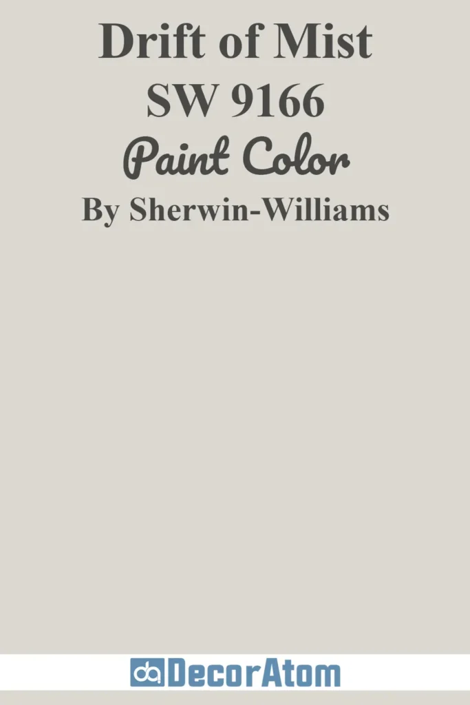
Drift of Mist SW 9166 is a soft, greige-leaning light color. It sits somewhere between warm gray and a barely-there beige. It’s subtle, grounding, and has this quiet, cozy quality to it.
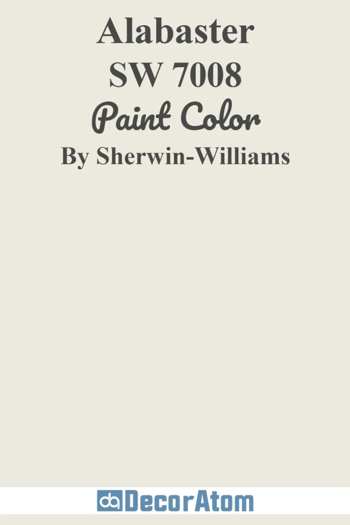
Alabaster SW 7008 is one of Sherwin Williams’ most popular whites. It leans warm, creamy, and feels like a fresh but not stark white. It’s been a go-to for so many people doing whole-home refreshes.
So which one do you actually need? Let’s dig in and figure that out together.
Key Differences Between Drift of Mist And Alabaster
The biggest difference is the LRV, which just means how light or dark a color appears. Drift of Mist has an LRV of 69, while Alabaster sits at 82. That’s a pretty noticeable jump in brightness.
Drift of Mist reads more like a light greige. Alabaster reads like a warm white.
Their hex values tell the story too. Drift of Mist is #DCD8D0, and Alabaster is #EDEAE0. Alabaster is clearly lighter and creamier looking.
If you want something that feels like a soft neutral with a little more color to it, Drift of Mist is your pick. If you want something that basically reads as white but still feels warm and livable, Alabaster is the one.
When to Use Drift of Mist And Alabaster
Both colors work in a lot of spaces, but they shine in different situations. Here’s a quick way to think about it before we break it down.
Use Drift of Mist if:
You want a cozy, layered neutral that’s not quite white and not quite gray. It works great in living rooms, bedrooms, and hallways where you want warmth without going full-on beige. It also pairs really well with darker trim or cabinetry because it has enough depth to stand alongside bolder colors. Good for people who feel plain white is too flat but don’t want to go full color.
Use Alabaster if:
You want a whole-home color that works almost everywhere. Alabaster is incredibly versatile. It’s great for walls, ceilings, and trim alike. If you’re flipping a house, refreshing a rental, or just want a clean but warm look throughout, Alabaster does the job without looking cold or clinical. It’s also the go-to if you’re pairing with white cabinetry and want everything to feel cohesive and airy.
Emotional Effects: Drift of Mist vs Alabaster
Colors affect how a room feels, even when you’re not thinking about it. That’s just the truth.
Drift of Mist has a calm, settled energy. Because it’s a little deeper and has that greige quality, it creates a sense of groundedness. Rooms painted in Drift of Mist tend to feel cozy and peaceful, like somewhere you actually want to sit and relax. It doesn’t feel stark or cold.
It can also make a room feel a little more intimate. Not dark, but not wide open either. That makes it nice for bedrooms, reading nooks, or any space where you want to slow down.
Alabaster feels more open and airy. Because of its higher LRV, it reflects more light and gives rooms a lifted, fresh feeling. It doesn’t feel sterile like a bright white might. It’s warm enough that it still feels like a home, not a hospital.
Alabaster is the kind of color that makes people say “wow, this feels so bright and clean” when they walk in. It creates a welcoming, optimistic mood. It’s hard to go wrong with it emotionally.
If you need a room to feel bigger or brighter, Alabaster helps with that. If you want a room to feel cozier and more personal, Drift of Mist does that better.
Detailed Comparing Drift of Mist And Alabaster
Drift of Mist is a light greige with warm and slightly cool undertones mixed together. It picks up gray in cooler lighting and beige in warmer lighting. That’s part of what makes it such a nuanced color. It works in different lighting without going off the rails.
Its LRV of 69 puts it in the medium-light range. It’s not a white, it’s not a mid-tone. It’s just a soft, quiet neutral that lives somewhere comfortable in between.
Alabaster has warm, creamy undertones. Some people see a faint yellow or wheat tone in it, especially in rooms with lots of natural light. It almost never reads as gray or cool. It’s consistently warm, which is why it layers so well with wood tones, soft furnishings, and natural textures.
With an LRV of 82, it’s much closer to white. In north-facing rooms it might feel a touch more muted, but it will still look beautiful.
| Features | Drift of Mist SW 9166 | Alabaster SW 7008 |
|---|---|---|
| Hex Value | #DCD8D0 | #EDEAE0 |
| LRV | 69 | 82 |
| Undertones | Warm gray, greige, soft beige | Warm, creamy, faint yellow-wheat |
| Best Use | Bedrooms, living rooms, hallways | Whole-home, walls, ceilings, trim |
| Finishes | Eggshell, satin, flat | Eggshell, satin, flat, semi-gloss |
| Style Fit | Modern farmhouse, transitional, cozy organic | Classic, farmhouse, Scandinavian, versatile |
| Feel | Cozy, grounded, intimate | Airy, warm, open |
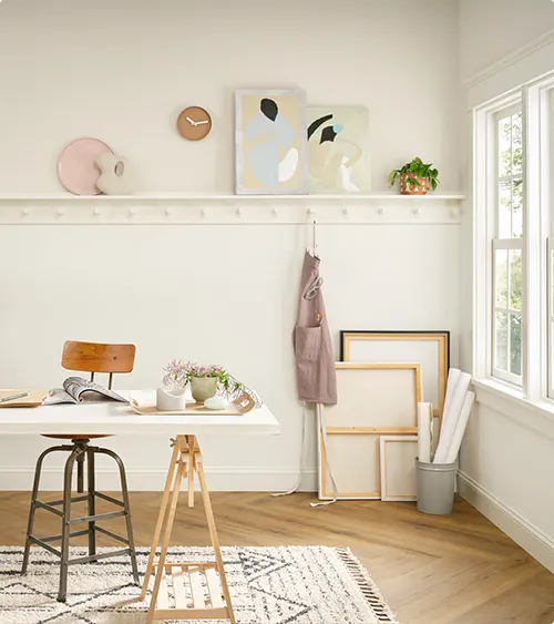
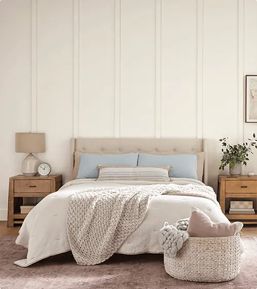
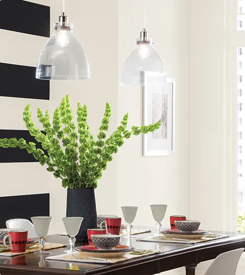
Real-Life Photos: Drift of Mist vs Alabaster
Seeing a color in real spaces makes such a difference. Swatches are helpful but rooms tell the whole story.
Below you’ll find real photos of both Drift of Mist and Alabaster used in actual homes. Pay attention to how the lighting in each photo changes the way the color looks. That’s the most useful thing you can study before making your decision.
Drift of Mist


Alabaster
Drift of Mist vs Alabaster: Are They Warm or Cool Paints?
Both of these colors lean warm, but in different ways.
Drift of Mist is warm with a hint of gray woven in. So depending on your lighting and your other finishes, it can look slightly cooler at times. But overall it reads warm.
Alabaster is consistently warm. It almost never tips cool. That creamy base keeps it in warm territory across most lighting conditions.
So if warm is what you’re going for, both work. Alabaster is just more reliably warm all the time. Drift of Mist has a little more flexibility in how it reads, which can be either great or tricky depending on your space.
Coordinating Colors
Getting coordinating colors right is what pulls a whole room together. Both of these neutrals are pretty easy to work with, but they each have their sweet spots.
Drift of Mist
Sherwin Williams Requisite Gray SW 7023 works beautifully with Drift of Mist. It deepens the palette without going too dark.
Sherwin Williams Accessible Beige SW 7036 brings in a warmer companion that feels cohesive and grounded alongside Drift of Mist.
Sherwin Williams Software SW 7074 is a soft, moody blue-gray that adds contrast without clashing. It pairs in a really elegant way.
Alabaster
Sherwin Williams Agreeable Gray SW 7029 is a classic pairing with Alabaster. Together they cover the most popular neutral palette in American homes right now.
Sherwin Williams Urbane Bronze SW 7048 gives Alabaster a rich, earthy contrast that feels current and sophisticated.
Sherwin Williams Tricorn Black SW 6258 is a bold pairing, but it works great if you’re doing black accents or cabinetry with Alabaster walls.
Trim Color with Drift of Mist And Alabaster
Trim color matters more than people realize. The wrong trim can make even a great wall color look off.
Here are solid trim options for each color, pulled from Sherwin Williams and Benjamin Moore.
For Drift of Mist:
Sherwin Williams Pure White SW 7005 is a clean, slightly warm white that frames Drift of Mist without competing with it.
Benjamin Moore White Dove OC-17 is another warm, soft white that sits alongside Drift of Mist in a really natural way.
Sherwin Williams Alabaster SW 7008 also works well as trim for Drift of Mist, which is interesting considering they’re the two colors we’re comparing here.
For Alabaster:
Sherwin Williams Extra White SW 7006 adds a crisper, brighter contrast to Alabaster walls without going stark.
Benjamin Moore Chantilly Lace OC-65 is a bright, clean white that gives Alabaster walls a sharp, defined edge that looks very polished.
Sherwin Williams High Reflective White SW 7757 is about as white as white gets. It makes Alabaster look slightly more toned in comparison, which can be a really nice effect.
What’s the Verdict? Should I Choose Drift of Mist or Alabaster
Here’s the honest answer. These are two great colors but for two different types of people.
If you want warmth with a little depth and character, go with Drift of Mist. It’s the kind of color that feels intentional. It’s not trying to be white, and that’s what makes it interesting.
If you want a light, airy, warm white that works in almost any room and pairs with nearly everything, Alabaster is your safer and honestly excellent choice. There’s a reason it’s been a bestseller for years.
Not sure which one is actually right for your walls and lighting? Order a peel-and-stick sample before you commit. It’s the smartest thing you can do.
FAQs
Is Drift of Mist lighter than Alabaster?
No. Alabaster is noticeably lighter with an LRV of 82. Drift of Mist sits at 69, making it a medium-light neutral rather than a near-white.
Can I use Drift of Mist and Alabaster together?
Yes, actually. Alabaster works well as a trim color alongside Drift of Mist walls. The contrast is subtle but clean.
Is Alabaster a true white?
Not exactly. It’s a warm white with creamy undertones. It reads as white in most spaces but has enough warmth that it never looks stark or cold.
Does Drift of Mist look gray or beige?
It depends on your lighting and surrounding colors. In cooler light it can pull grayer. In warmer light it leans more beige. That’s what makes it a greige.
Which one works better in small rooms?
Alabaster, because of its higher LRV. More light reflection makes small spaces feel bigger. That said, Drift of Mist can still work beautifully in small rooms if you want something cozier.
Is Alabaster good for ceilings?
Yes, it’s one of the most popular ceiling whites out there. It adds warmth without making the ceiling feel heavy or yellowed.