
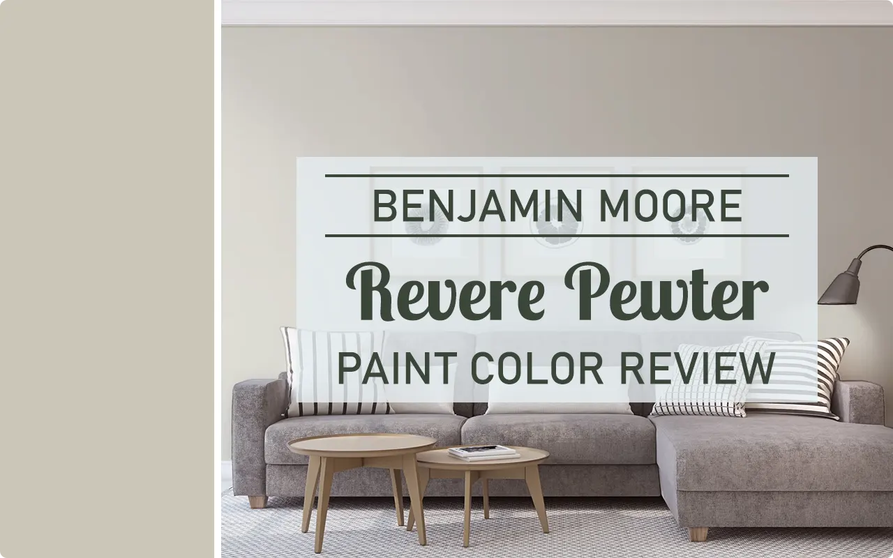
Some paint colors come and go with trends, but a few quietly stay popular year after year. For me, Revere Pewter by Benjamin Moore is one of those colors that never seems to lose its charm. The first time I saw it used in a home, I immediately understood why so many designers and homeowners talk about it. It felt calm, balanced, and incredibly livable.
When people ask me for a safe neutral that still has personality, Revere Pewter is one of the first colors that comes to mind. It sits right in that comfortable space between gray and beige, which makes it extremely flexible. I have seen it work beautifully in modern homes, traditional spaces, cozy cottages, and even contemporary apartments.
Another thing I appreciate about this color is how easy it is to live with. Some neutrals feel flat or cold after a while, but Revere Pewter tends to stay warm and welcoming throughout the day. It adapts to its surroundings in a very natural way.
In this review, I want to walk you through everything I know about this color. I will talk about its undertones, lighting behavior, coordinating colors, and where it works best inside and outside the home. If you are considering this shade for your walls, this guide should give you a very clear idea of what to expect.
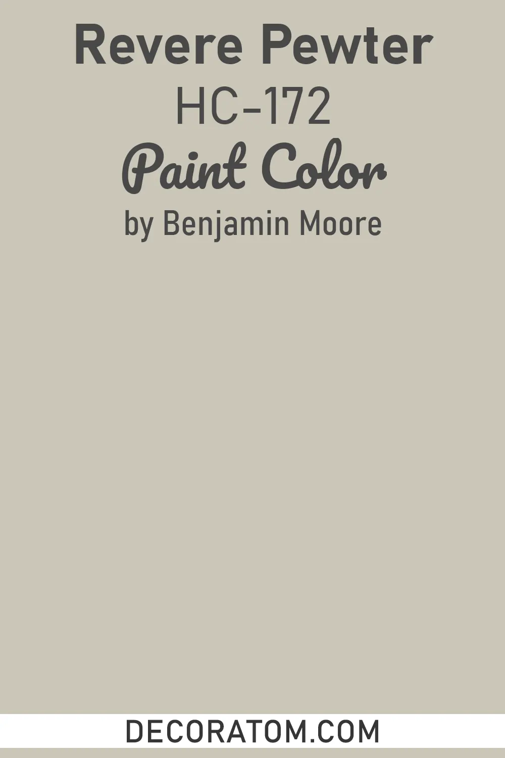
What Color is Benjamin Moore Revere Pewter?
When someone asks me what color Revere Pewter actually is, the simplest answer is this: it is a warm gray with soft beige influence.
Many people call colors like this greige, which simply means a mix of gray and beige. But when I look at Revere Pewter, I feel that it leans a little more toward the warm side than a typical gray.
If you place it next to a true gray paint color, you will immediately notice that Revere Pewter feels softer and warmer. At the same time, if you compare it to a beige wall, it looks more modern and slightly cooler.
That balance is exactly why the color is so popular. It avoids the cold feeling that some grays have, while also avoiding the heavy yellow tone that older beige paints sometimes show.
To my eye, Revere Pewter feels calm and grounded. It creates a neutral backdrop that does not compete with furniture, décor, or artwork. Instead, it allows everything else in the room to shine.
Is It a Warm Or Cool Color?
Revere Pewter is generally considered a warm neutral color.
Even though it contains gray, it has enough warmth in the formula to keep it from feeling cold. When I walk into a room painted in Revere Pewter, the first impression is comfort. It feels welcoming rather than crisp or stark.
That said, lighting and surrounding colors can shift how it appears. In some rooms, especially ones with cooler lighting or north-facing windows, the gray side may become a little more noticeable.
In brighter rooms with warm sunlight, the beige undertone tends to come forward more. This can make the color feel even softer and more inviting.
So while the base personality of Revere Pewter is warm, it still has the flexibility to lean slightly cooler depending on the environment.
How to Know if a Paint Color Is Right for You?
Would you like to sample Revere Pewter paint color? I recommend using Samplize. They offer 9”x15”” peel-and-stick paint swatches that make testing colors super simple. Just stick it on your wall, move it around if needed, and when you’re done, peel it off and toss it. No mess, no cleanup. It’s quick, easy, and way more convenient!

Advantages of using peel and stick paint samples:
- EASY TO USE: Simply move your SAMPLIZE paint sample around the room to test under a variety of lighting conditions.
- AFFORDABLE: Budget-friendly solution and no more buying inaccurate swatches, rollers, wasted paint.
- SUPER FAST DELIVERY: Depending on your location, 1 day delivery is possible.
- ORDER FROM HOME: Save a trip to the store looking for samples.
- NO MESS: SAMPLIZE uses real paint samples with zero-mess
- NO WASTE: No leftover cans or wasted paint.
LRV of Benjamin Moore Revere Pewter
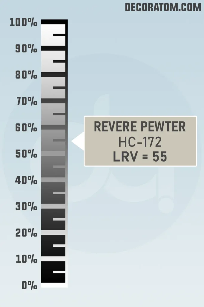
Before choosing any paint color, I always like to look at its LRV, which stands for Light Reflectance Value.
LRV measures how much light a color reflects. The scale runs from 0 to 100.
0 means the color absorbs almost all light and appears very dark.
100 means the color reflects nearly all light and appears very bright.
The LRV of Revere Pewter is 55.05.
This puts it right in the middle of the scale. It is not too dark and not too light. Because of this balanced LRV, Revere Pewter works well in many different rooms. It reflects enough light to keep spaces feeling open, but it still has enough depth to give the walls some character.
RGB Colors
The RGB values of Revere Pewter are:
RGB: 204, 198, 184
RGB values describe how much red, green, and blue are mixed together to create a digital version of the color.
In this case, the numbers are very close to each other, which is typical for neutral shades. The slightly higher red and green values help give Revere Pewter its warm and earthy feel.
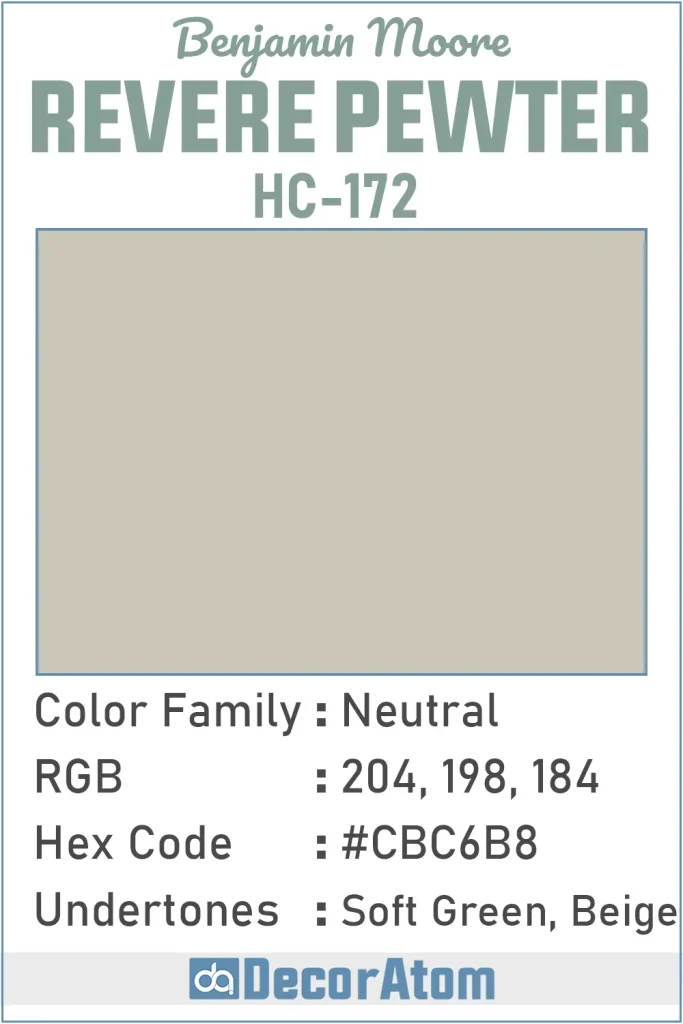
Hex Value
The Hex value of Revere Pewter is #CBC6B8.
Hex codes are another way of representing colors digitally. Designers often use them in web design or digital graphics to match colors accurately.
Undertones of Benjamin Moore Revere Pewter
Every paint color has undertones, and understanding them can make a big difference when choosing a color for your home.
Revere Pewter has soft green and beige undertones.
At first glance, most people simply see a warm gray. But once you start observing the color in different lighting, you may notice a gentle green influence hiding beneath the surface.
This green undertone is actually one of the reasons the color feels so natural. It prevents the gray from turning purple or blue, which can sometimes happen with cooler grays.
The beige undertone adds warmth and keeps the color grounded. Together, these undertones create a balanced neutral that feels calm and easy to live with.
How Different Types of Lighting Affect Benjamin Moore Revere Pewter?
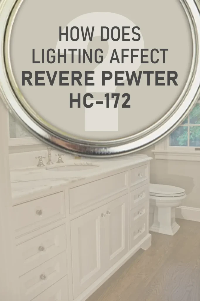
Lighting plays a huge role in how Revere Pewter appears throughout the day.
In north-facing rooms, the light tends to be cooler and softer. In these spaces, the gray side of Revere Pewter may become a little more noticeable. The color can appear slightly deeper and more muted.
In south-facing rooms, sunlight is warmer and stronger. Here, the beige undertones often come forward, making the color feel warmer and lighter.
East-facing rooms receive bright morning light. During the morning hours, Revere Pewter may look lighter and warmer. As the day moves toward afternoon, the color can shift slightly cooler.
West-facing rooms are the opposite. They tend to feel more neutral during the morning and warmer in the evening when sunlight becomes stronger.
Artificial lighting also affects the color. Warm bulbs bring out the beige warmth, while cooler LED lighting can highlight the gray side.
Trim Colors to Pair With Benjamin Moore Revere Pewter
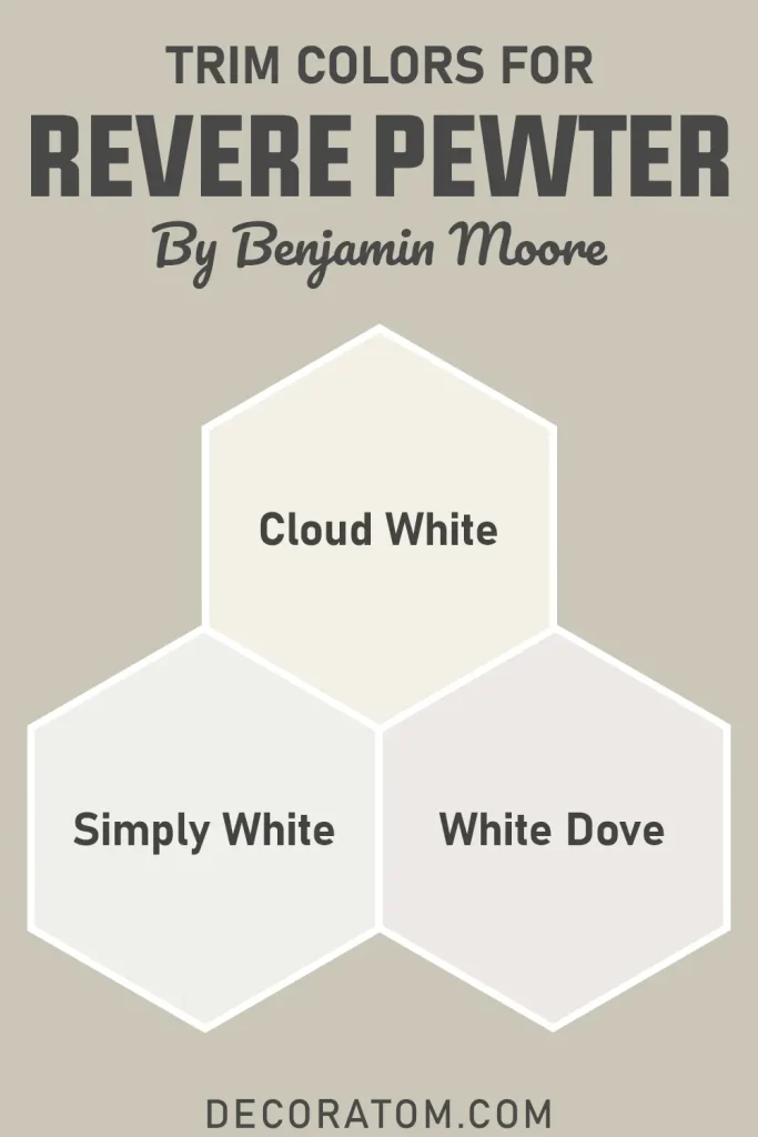
Choosing the right trim color can really enhance the look of Revere Pewter walls.
For a crisp and classic contrast, many people choose Benjamin Moore White Dove. It creates a soft white frame around the walls without looking harsh.
Another option I often recommend is Simply White. It feels slightly brighter and adds a fresh look to the room.
If you prefer a softer transition between wall and trim, Cloud White can work beautifully. It blends naturally with the warmth of Revere Pewter.
These whites help highlight the neutral depth of the walls while keeping the overall space balanced.
Colors Similar to Benjamin Moore Revere Pewter
When a color becomes as popular as Revere Pewter, it is natural for people to search for shades that feel similar. Sometimes the goal is to find a close alternative from another paint brand. Other times people simply want a color that gives the same general mood but with a slightly lighter or darker appearance.
I often think of similar colors as being in the same neighborhood rather than being exact copies. Many greige paints share a similar balance between gray and beige, but small differences in undertones or depth can make them feel quite different once they are on the wall.
For example, some similar colors may lean a little warmer, which makes them feel closer to beige. Others may shift slightly cooler, which makes the gray more noticeable. Lighting, surrounding finishes, and furniture will also affect how similar they appear in real life.
When comparing colors like these, I always suggest looking at samples side by side. The differences might seem small on a paint chip, but they become easier to notice when the colors are painted on larger surfaces.
Here are some paint colors that people often compare to Revere Pewter.
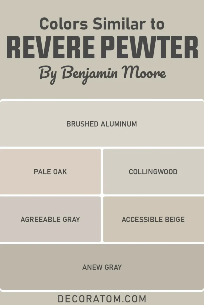
Benjamin Moore Brushed Aluminum
Benjamin Moore Pale Oak
Benjamin Moore Collingwood
Sherwin Williams Agreeable Gray
Sherwin Williams Accessible Beige
Sherwin Williams Anew Gray
Colors that Go With Benjamin Moore Revere Pewter
One of the reasons I enjoy working with Revere Pewter is how easy it is to coordinate with other colors. Because it sits comfortably between gray and beige, it pairs well with a wide range of shades. You can build a calm neutral palette around it, or you can introduce stronger accent colors without the room feeling chaotic.
When I decorate around this color, I usually start by thinking about balance. Revere Pewter has a grounded and steady presence on the wall, so it works nicely with both light and dark accents. Crisp whites help keep the space fresh, while deeper colors can add contrast and visual interest.
Another thing I notice is how well this color works with natural materials. Wood tones, stone surfaces, woven textures, and soft fabrics all seem to complement it beautifully. The subtle green undertone in the paint often helps connect the interior with outdoor elements like plants or garden views.
If you enjoy decorating with blues, soft greens, or even charcoal tones, Revere Pewter can easily support those colors without clashing. It acts like a calm background that allows other shades to stand out while still keeping the overall room cohesive.
Here are some Benjamin Moore colors that coordinate nicely with Revere Pewter.
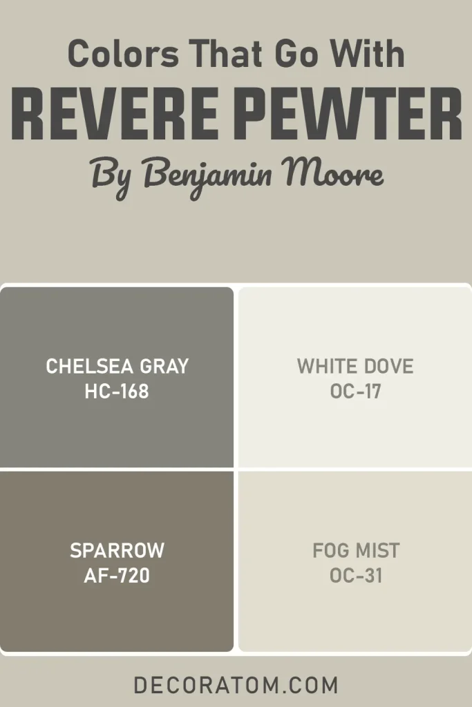
Benjamin Moore Chelsea Gray
Benjamin Moore White Dove
Benjamin Moore Sparrow
Benjamin Moore Fog Mist
Where to Use Benjamin Moore Revere Pewter?
One of the things I truly appreciate about Revere Pewter is its flexibility. It is not a color that only works in one type of room. I have seen it used successfully in almost every part of the home.
Because it sits in the middle of the neutral spectrum, it adapts easily to different furniture styles, lighting conditions, and decorative accents.
Benjamin Moore Revere Pewter In the Bedroom
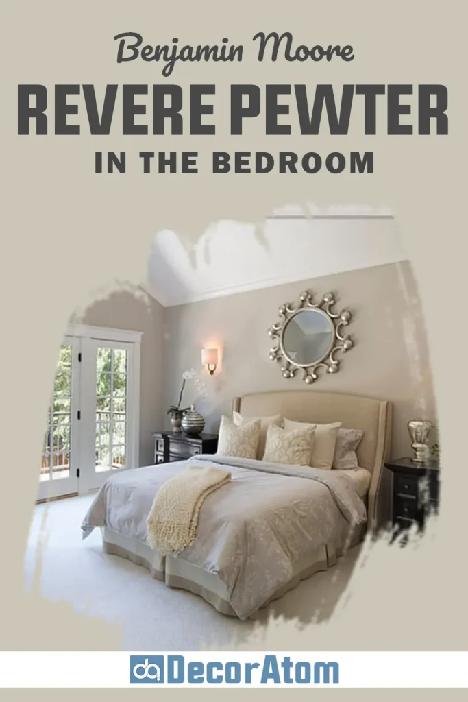
In a bedroom, Revere Pewter creates a calm and restful environment. The color feels soft enough to relax the mind without feeling dull or flat.
I like pairing it with warm white bedding, wooden furniture, and soft textiles. These elements bring out the warmth in the paint and make the room feel cozy.
It also works beautifully with layered lighting. Bedside lamps and warm light bulbs help enhance the inviting feel of the color.
Benjamin Moore Revere Pewter In the Living Room
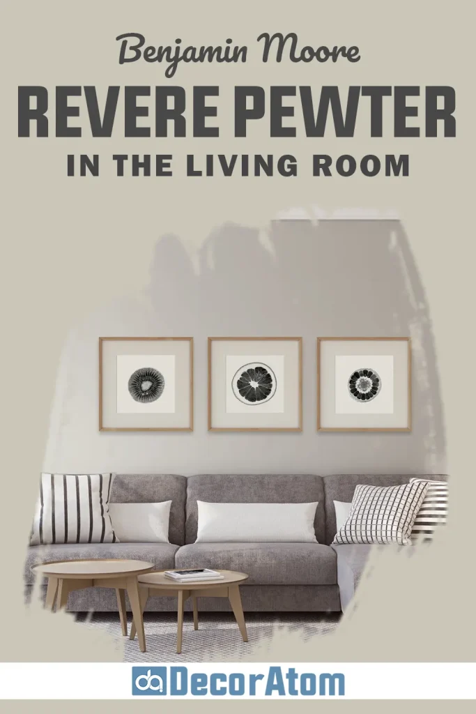
Living rooms often need a color that works with many different pieces of furniture and décor. Revere Pewter does that very well.
It provides a neutral background that allows sofas, rugs, and artwork to stand out. At the same time, it adds enough depth that the walls never feel plain.
I especially like it with natural wood tones and textured fabrics. The combination makes the space feel relaxed and welcoming.
Benjamin Moore Revere Pewter in Kitchen
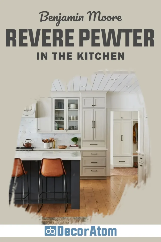
In kitchens, Revere Pewter can look very elegant when paired with white cabinets.
The contrast between the warm gray walls and bright cabinetry creates a balanced and timeless look. It also works well with stone countertops and stainless steel appliances.
Another approach is using Revere Pewter on cabinets themselves. When paired with light countertops and backsplash tiles, the result can feel very sophisticated.
Benjamin Moore Revere Pewter In the Bathroom
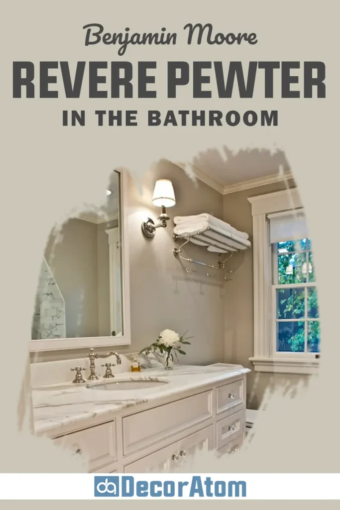
Bathrooms benefit from colors that feel calm and clean. Revere Pewter does both.
It pairs nicely with white tiles, marble surfaces, and chrome fixtures. The color adds warmth without making the space feel heavy.
In smaller bathrooms, it can also create a cozy atmosphere while still reflecting enough light to keep the room comfortable.
Benjamin Moore Revere Pewter For the Exterior
Revere Pewter is not just for interiors. It can also work beautifully on the exterior of a home.
On siding, the color creates a soft and welcoming appearance. It pairs nicely with white trim, dark shutters, and natural stone accents.
Because the color is neutral and balanced, it blends well with outdoor surroundings like landscaping and trees.
Why I Love Benjamin Moore Revere Pewter
What I love most about Revere Pewter is its reliability. It is one of those colors that rarely surprises you in a bad way.
It feels calm, comfortable, and easy to live with. It also adapts to different design styles without feeling outdated.
Whenever someone tells me they want a neutral that will still look good years from now, this is one of the first shades I suggest.
Final Thoughts
Revere Pewter has earned its reputation as a classic neutral for a good reason. It strikes a careful balance between gray and beige, which allows it to fit into many different spaces and styles.
The color feels warm, welcoming, and flexible enough to work in bedrooms, living rooms, kitchens, bathrooms, and even exterior spaces.
If you are looking for a paint color that feels safe but still interesting, Revere Pewter is definitely worth considering. Testing it in your own lighting is always a good idea, but in many homes it turns out to be a color that people end up loving for years.