

I have been obsessing over white paint colors for what feels like forever. And if you have ever tried to pick a white paint, you already know the struggle — it is never just “white.” There are hundreds of whites out there, each with its own personality, its own mood, and its own way of playing with light.
Some feel cold and clinical, some feel too yellow, and some just feel off in a way you cannot quite explain. But every once in a while, you come across one that just feels right the moment you see it on the wall.
That is exactly what happened to me with Benjamin Moore Alabaster OC-129.
I first considered this color when I was repainting my living room and felt completely overwhelmed by samples. I had tried crisp whites, warm creams, and everything in between. Then I put up a swatch of Alabaster OC-129 and something about it made me stop. It was not too stark, not too creamy, not trying too hard to be anything. It just looked like a clean, soft, livable white.
So I went deep on this color — researched it, tested it, and eventually used it. And now I want to share everything I found out about it, because if you are here, you are probably in the same rabbit hole I was in. Let me walk you through it all, from the technical specs to how it actually looks in real rooms.
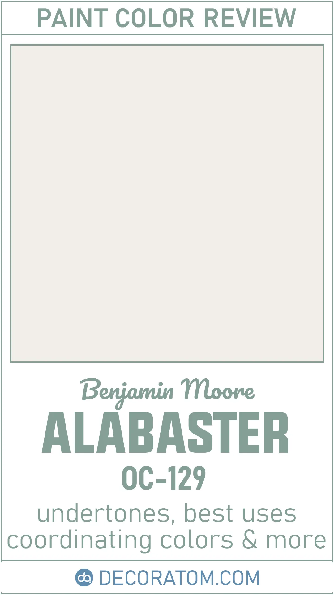
What Color is Benjamin Moore Alabaster OC-129?
Okay, so here is the thing about Alabaster OC-129 — it is white, but it is not the kind of white that makes you squint or feel like you are standing inside a hospital room. It is a soft, gentle white that has just enough warmth in it to feel cozy and inviting without tipping over into cream or beige territory.
Think of it this way: if you have ever seen a freshly laundered linen shirt drying in natural sunlight, that kind of soft, clean, slightly warm white is basically what Alabaster OC-129 looks like on a wall. It is light, it is airy, but it has a little something underneath that keeps it from feeling flat or cold.
It sits in that sweet spot between a pure white and a warm off-white. It does not scream white at you, but anyone who walks into a room painted in this color will immediately think of it as a white room. It just has more character than your standard builder-grade white.
What I love about it is that it does not look dirty or yellowed. Some warm whites have this problem where they start to look almost beige or aged in a way that is not flattering. Alabaster OC-129 avoids that. It feels fresh and clean while still being approachable and warm. That balance is honestly hard to find, and this color nails it.
Is It a Warm Or Cool Color?
Alabaster OC-129 is a warm color. Straight up — no debate about it.
Now, it is not aggressively warm. It is not going to make your room feel like a candlelit dining room or give everything an orange glow. But it does lean warm, and that warmth is actually what makes this color so pleasant to live with.
The way I like to explain warmth in paint colors is this: cool whites make a room feel crisp and modern, almost like the space is wide awake. Warm whites, on the other hand, make a room feel settled and comfortable, like it has been lived in and loved. Alabaster OC-129 falls firmly in that second camp.
Because of its warm undertones, this color pairs beautifully with natural wood tones, warm metals like brass and gold, and earthy textures like linen and jute. It feels right at home in a cozy bedroom or a warm, relaxed living room. It also tends to look really beautiful in spaces that get a lot of natural light, because the sunlight brings out that gentle warmth in a really flattering way.
If you are going for a cool, contemporary look with lots of grey, chrome, and clean lines, this might not be your first choice. But if you want a white that feels human and warm and welcoming, Alabaster OC-129 is a really strong pick.
LRV of Benjamin Moore Alabaster OC-129
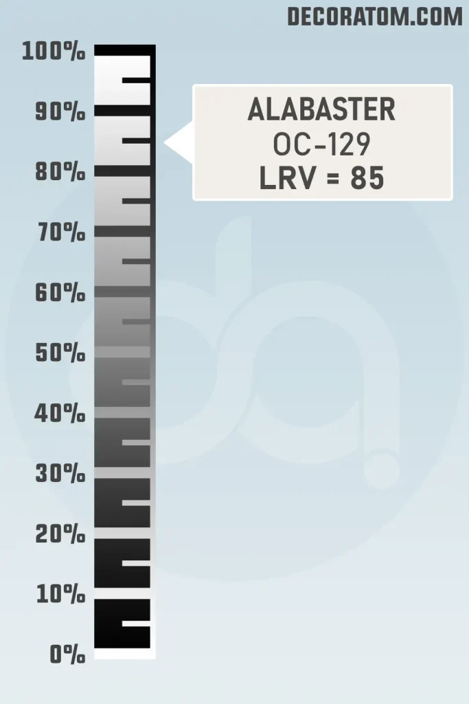
Benjamin Moore Alabaster OC-129 has an LRV of 85.08.
That is a high number, which tells you this is a genuinely light color. It is going to reflect a lot of light back into your room, which means it will make spaces feel open, airy, and larger than they actually are. This is great news if you are working with a smaller room or a space that does not get a ton of natural light.
The LRV of 85.08 also tells you that while this is a warm white, it is not muted or dull. It has real brightness to it. It is the kind of color that can make a dark hallway feel significantly less cave-like, or turn a small bathroom into something that feels fresh and open. That high reflectance, combined with its warmth, is honestly a big part of why this color works so well in so many different spaces.
Color Family
Alabaster OC-129 belongs to the White color family.
This might seem obvious given how we have been describing it, but it is worth talking about because “white” in the paint world covers an enormous range. The white color family in Benjamin Moore’s collection includes everything from the starkest, coldest whites all the way to the creamiest, almost-ivory tones that blur the line between white and beige.
Alabaster OC-129 sits in the warmer end of the white family. It is not an off-white in the traditional sense — it is still clearly a white when you look at it — but it has enough warmth in it to feel soft and lived-in rather than clinical or stark.
RGB Colors
The RGB value of Alabaster OC-129 is 243 / 239 / 232.
Let me break that down in plain English because those three numbers actually tell you a lot about this color.
RGB stands for Red, Green, Blue — the three primary colors of light that screens and digital tools use to create every color you see on a monitor. Each number goes from 0 (none of that color) to 255 (the full amount of that color).
Hex Value
The hex value of Benjamin Moore Alabaster OC-129 is #F2EFE8.
If you are not familiar with hex values, here is a quick explanation. Hex codes are a way of representing colors in digital design, web design, and basically any software that deals with color. Every hex code starts with a # symbol followed by six characters, which are made up of numbers (0–9) and letters (A–F).
These six characters are actually three pairs — the first pair represents red, the second represents green, and the third represents blue. So it is the same information as the RGB value, just written in a different format.
Undertones of Benjamin Moore Alabaster OC-129
The undertone of Alabaster OC-129 is pink.
Now, before you panic — I did too when I first read that. Pink undertones in a wall color sounds like a recipe for disaster, right? But here is the thing: the pink undertone in Alabaster OC-129 is incredibly subtle. We are not talking about a blush wall or anything that will make your room look like the inside of a birthday cake. The pink is so soft and quiet that in most lighting conditions, you will not consciously notice it at all.
What the pink undertone actually does is add a gentle warmth and a slight luminosity to the color. It gives Alabaster OC-129 that soft, almost glowing quality that makes it look so beautiful in rooms with natural light. Rather than reading as cold or flat, the color has this delicate warmth that makes walls look almost like they have a light source behind them.
Where the pink undertone can become more visible is in certain lighting situations. If your room has a lot of warm incandescent bulbs or gets a lot of warm afternoon sunlight, you might notice a slightly rosier quality to the color. This is not necessarily a bad thing — many people find it quite lovely — but it is worth knowing going in so you are not surprised.
To test for the pink undertone yourself before committing, hold a swatch of pure white next to Alabaster OC-129. In that comparison, the warmth and slight pinkish quality will become much more visible. That contrast test is always the most honest way to see what undertones a color is carrying.
How Different Types of Lighting Affect Benjamin Moore Alabaster OC-129?
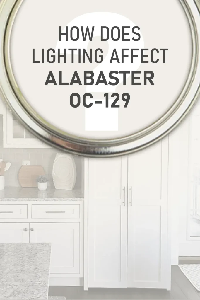
Lighting is honestly one of the most underestimated factors when choosing a paint color, and Alabaster OC-129 is a really interesting case study in how much lighting can change a color’s personality.
In natural north-facing light, which is the cool, indirect light that many rooms get, Alabaster OC-129 can look slightly cooler and more restrained than you might expect. The pink undertone tends to quiet down in this kind of light, and the color can appear a bit more like a clean, neutral white. It still looks beautiful — just less overtly warm. If your room faces north, do not worry, it will not look cold or grey. It will just be a cleaner, quieter version of itself.
In south-facing rooms, where you get that bright, warm sunlight for most of the day, Alabaster OC-129 really comes alive. The warm undertones get activated by all that natural light, and the color develops this gorgeous, almost luminous quality. The pink undertone becomes a little more present here, giving the walls a soft, healthy glow. South-facing rooms are honestly ideal for this color.
East-facing rooms get bright cool morning light and warmer afternoon light. In the morning, the color will look bright and clean and crisp. By afternoon, as the light warms up, the color shifts and gets cozier. It is actually a really dynamic experience throughout the day.
West-facing rooms are the opposite — cooler and shadier in the morning, then bathed in that gorgeous warm golden light in the late afternoon and evening. In the evening hours especially, Alabaster OC-129 in a west-facing room can look absolutely stunning. The warm light bouncing off those already-warm walls creates a really inviting atmosphere.
Under artificial lighting, the story changes based on the type of bulb. Warm incandescent or warm LED bulbs (around 2700K color temperature) will bring out the pink and warm undertones more, making the color feel very cozy and intimate. Cool LED or daylight bulbs (5000K and above) will push the color toward a cleaner, crisper white and tone down the warmth. For most living spaces, I would recommend staying with warm bulbs when using this color — it really is the most flattering combination.
Fluorescent lighting — common in older kitchens and offices — can sometimes make warm whites look a little flat or slightly greenish, so if you are painting a space with fluorescent overhead lighting, consider swapping those bulbs first before judging how the color looks.
Trim Colors to Pair With Benjamin Moore Alabaster OC-129
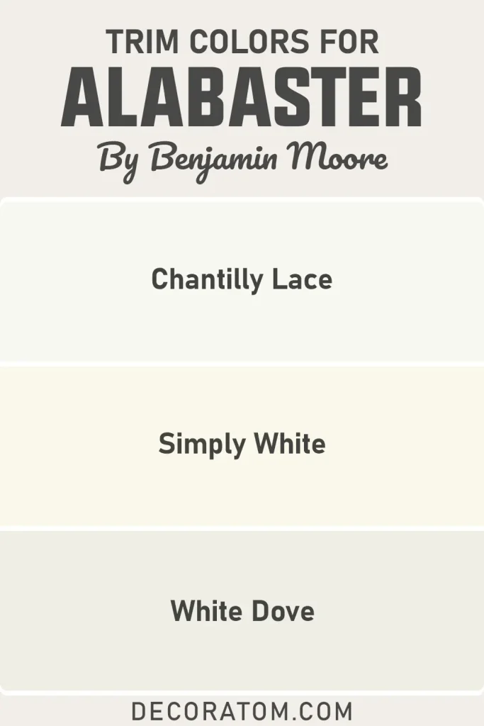
Trim color choices can completely change the way a wall color reads, and with a warm white like Alabaster OC-129, the trim is especially important because it defines the edges of the room and creates the contrast that makes everything feel finished and polished.
Benjamin Moore Chantilly Lace OC-65 is the classic pairing that interior designers reach for constantly, and for good reason. Chantilly Lace is a crisp, clean, almost-pure white that has virtually no warm undertones. When you pair it with Alabaster OC-129, the contrast is subtle but effective — it makes the walls look intentionally warm and the trim look sharp and defined. The result is a layered white look that feels sophisticated without being stark.
Benjamin Moore White Dove OC-17 is another excellent trim option that takes a slightly different approach. White Dove is itself a warm white, just a touch warmer and a bit brighter than Alabaster OC-129. Using it on trim creates a softer, more harmonious look where the wall and trim are clearly different but feel like they belong to the same family. This pairing works beautifully in bedrooms and living rooms where you want everything to feel cohesive and calm.
Benjamin Moore Simply White OC-117 also works very well as a trim color here. It has a slight warmth to it but reads as brighter and cleaner than Alabaster OC-129, so it gives the trim that clean pop without going full cold-white. It is a middle-ground option that is hard to get wrong.
My personal recommendation? If you want a polished, designer-approved look, go with Chantilly Lace on the trim. If you want the room to feel softer and more relaxed, White Dove is your friend.
Colors Similar to Benjamin Moore Alabaster OC-129
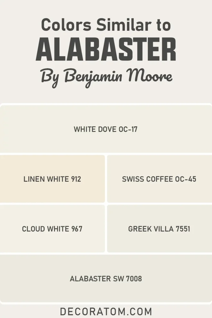
Finding a color that is similar to Alabaster OC-129 is not just a backup option exercise — it is actually a really useful thing to do before you commit to any paint color. Here is why: paint colors look different depending on where you buy them, what store you sample them at, what the lighting in your home is like, and even what other colors are already in the room.
Knowing which colors are in the same neighborhood as Alabaster OC-129 means that if for some reason you can not find this exact color at your local store, or if you want to compare options before making a final decision, you have real alternatives to consider.
Also, if you are working with a designer or contractor who uses a different brand than Benjamin Moore, being able to say “I want something similar to Alabaster OC-129 from Sherwin Williams” is incredibly helpful. Not every paint brand carries the same colors, and brand loyalty can sometimes limit your options unnecessarily.
Beyond the practical reasons, looking at similar colors also helps you understand what you actually love about Alabaster OC-129 in the first place. When you line up several near-matches and notice that you keep coming back to OC-129, it confirms your choice with confidence. And if one of the similar colors actually looks even better in your specific space, you have just made a better decision by doing your homework.
The colors listed below are warm, light whites with comparable LRV values and similar undertone personalities. They are not identical to Alabaster OC-129, but they occupy the same general territory.
Benjamin Moore:
- White Dove OC-17
- Linen White 912
- Swiss Coffee OC-45
- Cloud White 967
Sherwin Williams:
- Alabaster SW 7008
- Greek Villa 7551
Colors that Go With Benjamin Moore Alabaster OC-129
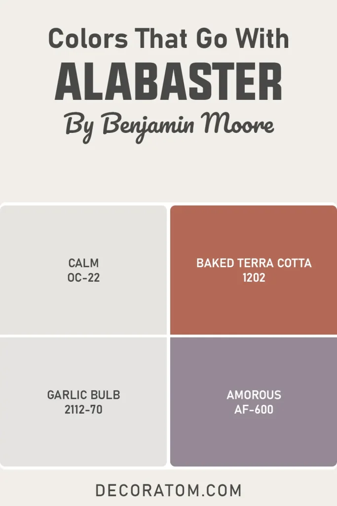
Pairing coordinating colors with Alabaster OC-129 is one of the most enjoyable parts of working with this color, mostly because it is such a generous backdrop. Warm whites like this one have an almost chameleon-like quality when it comes to coordinating colors — they can go soft and serene with muted, dusty palettes, or they can stand back and let a bold accent color take all the attention without competing.
The key to choosing colors that go well with Alabaster OC-129 is to think about how you want the room to feel overall, not just how the colors look next to each other in a swatch. Because this color has warm pink undertones, it naturally harmonizes with other warm, organic colors — things like terracotta, muted pinks, earthy neutrals, soft sages, and warm taupes all feel genuinely at home alongside it.
On the other end of the spectrum, rich, saturated colors like deep greens, navy blues, and warm charcoals work beautifully as accent colors because Alabaster OC-129 provides enough brightness to balance the depth of those darker hues without washing them out.
What does not tend to work as well are cool, grey-based colors with strong blue or green undertones, simply because they fight against the warmth that makes Alabaster OC-129 so appealing in the first place. That contrast can make the room feel a little uncertain in its mood, like it can not decide if it wants to be warm or cool.
The four colors below are coordinating options that I genuinely love with Alabaster OC-129, and they each create a different feel.
- Calm OC-22
- Baked Terra Cotta 1202
- Garlic Bulb 2112-70
- Amorous AF-600
Where to Use Benjamin Moore Alabaster OC-129?
One of the things I find most impressive about Alabaster OC-129 is that it does not feel like a color you have to use carefully or sparingly. It is not a tricky color that only works in very specific conditions. It is genuinely flexible and adapts well to all kinds of spaces and architectural styles. That said, there are certain rooms and applications where it really shines, and I want to walk you through each of them in detail so you can picture exactly what it would look like in your own home.
Benjamin Moore Alabaster OC-129 In the Bedroom
This is honestly where Alabaster OC-129 feels most at home. The warmth of the color mixed with that high LRV creates a space that feels restful and bright at the same time — not always easy to pull off with a single paint choice. The subtle pink undertone adds a quiet softness that makes the room feel nurturing rather than cold or sterile.
Pair it with warm wood furniture and linen bedding and you have a bedroom that practically decorates itself. It also grows with the space — works just as well in a kids room as it does in a primary suite without ever feeling out of place.
Benjamin Moore Alabaster OC-129 In the Living Room
What I appreciate most about this color in a living room is that it does not try to compete with your furniture or decor. It steps back and lets the room tell its own story. Bold art, natural textures, a statement sofa — none of it gets swallowed up or clashed with.
In rooms with good natural light, it looks clean and airy during the day. Come evening with warm lamps on, it shifts into something noticeably cozier. That transition from day to night is genuinely one of this color’s best qualities in a living space.
Benjamin Moore Alabaster OC-129 In the Kitchen
Alabaster OC-129 keeps a kitchen feeling clean without making it feel cold. That is a harder balance to strike than it sounds — a lot of whites go too stark in a kitchen and suddenly the whole space feels like a showroom rather than somewhere you actually cook.
On walls or cabinets, this color works especially well with natural wood accents and brass hardware. Just one heads-up: if your kitchen runs on cool overhead lighting, swap those bulbs to a warmer temperature. Cool light flattens this color out and you will not get the full effect.
Benjamin Moore Alabaster OC-129 In the Bathroom
Alabaster OC-129 turns a bathroom into something that actually feels relaxing rather than just functional. The warmth in the color does a lot of heavy lifting here, especially when paired with brushed gold fixtures and natural textures.
For smaller bathrooms, the LRV of 85.08 means the walls are bouncing light around and making the room feel considerably more spacious. And if you have white tile, the slight difference between tile white and this painted white creates a layered, intentional look rather than a flat, everything-the-same finish.
Benjamin Moore Alabaster OC-129 For the Exterior
On the outside of a home, this color reads as classic and warm rather than flashy. It suits traditional styles really well — Craftsman bungalows, farmhouses, Cape Cods — and it photographs beautifully in natural daylight.
Bright white trim like Chantilly Lace gives the exterior that crisp, defined finish. For a front door or shutters, go with something with depth: navy, forest green, or a warm charcoal all look great against it. One practical reminder — always test a large sample directly on your exterior wall, because outdoor light reads paint very differently than interior swatches do.
Why I Love Benjamin Moore Alabaster OC-129
I want to be honest here: I have tested a lot of white paint colors. My kitchen alone went through four rounds of samples before I finally landed on something I was happy with. And in all that testing, I developed a pretty strong sense of what separates a truly great white from one that just looks fine in the store.
Alabaster OC-129 is a truly great white.
What gets me about it is that it never feels like a compromise. So many whites are a compromise — you go warm and lose the brightness, or you go bright and lose the warmth, or you try to split the difference and end up with something that feels indecisive. Alabaster OC-129 somehow manages to be genuinely warm and genuinely bright at the same time. That is rare.
I also love how it handles different light throughout the day without becoming unrecognizable. Some colors are completely transformed by changing light and feel almost unstable to live with — like the color is making different promises depending on the hour. This one just shifts slightly, always flatteringly, and always still feels like itself.
And honestly? The pink undertone won me over. I was skeptical, but once I saw it in my space, I understood why it works. It gives the color life. It is not sitting there looking flat and trying to be inoffensive — it has a personality, just a gentle one. And that makes all the difference in a room you actually live in.
Final Thoughts
If you have been going back and forth on whether Alabaster OC-129 is the right white for your space, I hope this breakdown gave you a clearer picture of exactly what you would be working with. It is a warm, soft, high-LRV white with a subtle pink undertone, an LRV of 85.08, and a really impressive ability to look beautiful in all kinds of spaces and lighting conditions.
It is not a flashy color. It is not going to make someone walk into your room and immediately say “wow, look at that paint color.” And I think that is actually the point. The best paint colors are the ones that make the whole room feel right without drawing attention to themselves. They are the backdrop that makes everything else look better.
That is exactly what Alabaster OC-129 does — and it does it very, very well.
If you are on the fence, my advice is to grab a sample, paint a large swatch (bigger than you think you need), and live with it for a few days in different lighting conditions before you decide. I think you will find the same thing I did: it just feels right.