
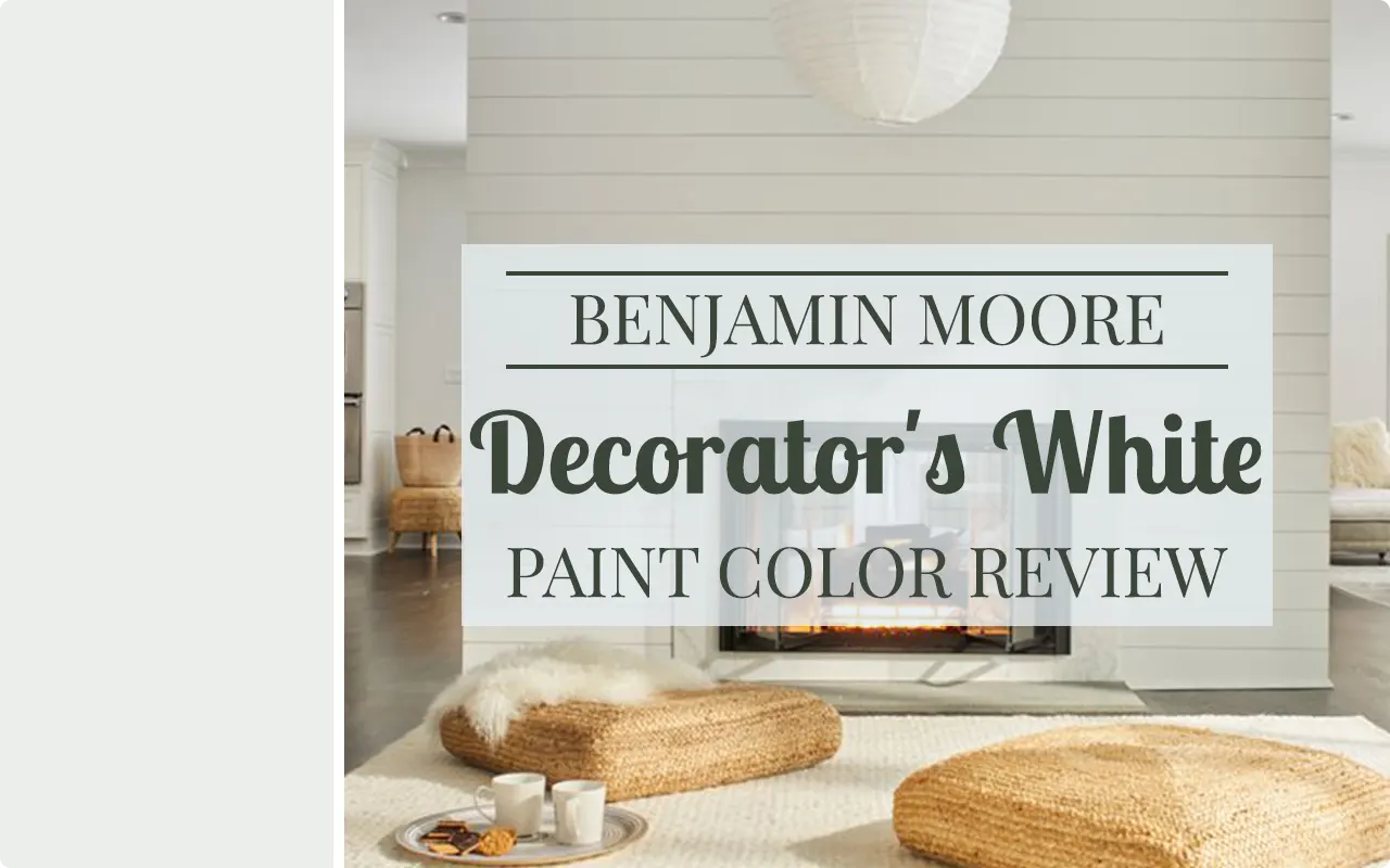
I’ll be honest — when I first heard the name Decorator’s White, I assumed it was just another basic white paint that designers throw on walls when they can’t make up their minds. I was wrong. After living with this color in my own space and watching it transform a room in ways I didn’t expect, I felt like I had to write about it.
Decorator’s White OC-149 is one of those colors that quietly does its job without demanding attention. It doesn’t shout “look at me,” but once it’s on your walls, you start to notice how everything else in the room looks a little more put-together. Your furniture looks intentional. Your trim looks crisp. Even the light coming through the windows feels a little warmer.
What makes this color interesting to me is that it sits in a very specific sweet spot — it’s white enough to feel clean and fresh, but it carries just enough warmth that it doesn’t feel cold or clinical. If you’ve ever painted a room with a stark white and felt like you were living inside a hospital waiting room, you’ll understand exactly why that distinction matters.
In this review, I’m going to walk you through everything I’ve learned about Decorator’s White OC-149 — its undertones, how lighting changes it, what colors to pair it with, and where it works best. Let’s get into it.
What Color is Benjamin Moore Decorator’s White?
Decorator’s White OC-149 is a soft, warm white. It’s not a pure, blinding white, and it’s not a cream either — it lives somewhere in between. Think of it as a white that has been slightly softened with a hint of warmth, making it feel livable and approachable rather than stark. It’s the kind of white that reads as clean on the walls but doesn’t make a room feel cold or overly sanitized.
Is It a Warm or Cool Color?
Decorator’s White is a warm white. It leans warm rather than cool, which means it doesn’t have those icy blue or grey undertones that can make a space feel a little uninviting. That warmth is subtle, but it’s there, and it’s actually what gives this color its charm.
LRV of Benjamin Moore Decorator’s White
LRV stands for Light Reflectance Value — it’s simply a number that tells you how much light a paint color bounces back into a room. The scale runs from 0 (pure black, absorbs all light) to 100 (pure white, reflects everything). The higher the number, the brighter and lighter the color will feel on your walls.
Decorator’s White has an LRV of 82.68, which is quite high. That tells you this color reflects a lot of light, so it will naturally make a room feel open and airy. It’s not the very brightest white out there, but that slight step down from pure white is actually what keeps it from feeling harsh.
Undertones of Benjamin Moore Decorator’s White
Decorator’s White carries subtle green and gray undertones. They’re not obvious at first glance — this still reads as a white — but depending on your lighting and what’s around it, those undertones can become more visible. The green undertone is very soft and earthy, which is part of why this color feels warm and grounded rather than cold.
How Different Types of Lighting Affect Benjamin Moore Decorator’s White?
Lighting changes this color more than you might expect. In natural daylight, it looks clean and bright — a balanced, true soft white. In north-facing rooms with cooler light, the grey undertone can come forward a bit, making it feel slightly cooler than it actually is.
In south or west-facing rooms with warm afternoon light, it glows beautifully and the warmth becomes more prominent. Under artificial warm lighting (like incandescent or warm LED bulbs), it leans creamier and cozier.
Under cool fluorescent lighting, it can look a touch flat or slightly grey. Always sample it in your specific room before committing — I can’t stress that enough.
Trim Colors to Pair With Benjamin Moore Decorator’s White
Picking trim for a white wall color can feel oddly tricky, but Decorator’s White actually pairs really well with a few specific options.
1. Chantilly Lace OC-65 (Benjamin Moore)
This is one of the crispest, brightest whites Benjamin Moore makes, and it works beautifully as trim against Decorator’s White on the walls. The contrast is subtle but just enough to define the edges of a room cleanly.
2. Super White OC-152 (Benjamin Moore)
Super White is another high-contrast option that gives you a clean, fresh trim line. It’s a bit warmer than Chantilly Lace, and I personally love this pairing in rooms with lots of natural light.
3. White Dove OC-17 (Benjamin Moore)
If you want a more tonal, soft look where the trim doesn’t dramatically stand out, White Dove is the move. It’s a warm off-white that complements the warmth in Decorator’s White without the two colors fighting each other.
Colors Similar to Benjamin Moore Decorator’s White
Finding a similar color to Decorator’s White is something a lot of people need to do — maybe you’re trying to match an existing wall, or you’re looking at options across brands before making a final decision. I get it. The good news is that because Decorator’s White sits in that very popular “soft warm white” category, there are several colors across Benjamin Moore and Sherwin-Williams that come close to it.
Now, “close” doesn’t mean identical. These colors share similar LRV ranges and warm, soft white character, but each one has its own personality. Some will lean slightly greener, some a touch grayer, and some a little creamier.
The differences are often subtle enough that in most rooms you wouldn’t notice them side by side — but in the right lighting, with the right surroundings, they can feel distinct. If you’re trying to match Decorator’s White exactly, the best thing you can do is pull samples and test them in your specific space before making a call.
But if you’re just looking for something in the same family, any of the colors below would be a reasonable starting point.
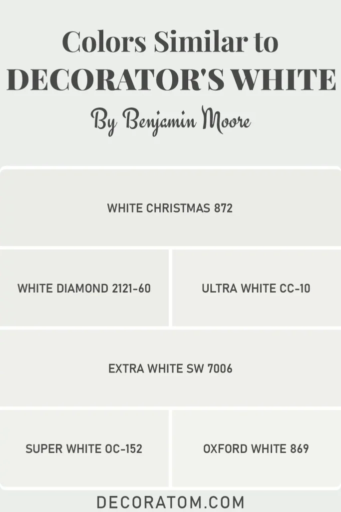
- BM White Christmas 872
- BM White Diamond 2121-60
- BM Ultra White CC-10
- Extra White SW 7006
- BM Super White OC-152
- BM Oxford White 869
Colors that Go With Benjamin Moore Decorator’s White
One of the best things about Decorator’s White is how well it plays with other colors. Because it’s a warm, soft white with that subtle green-grey undertone, it has a natural ability to sit peacefully alongside both cool and warm tones without clashing. It’s not a demanding color — it doesn’t need to be the star of the show, and that’s exactly what makes it such a good backdrop for bolder, more saturated hues.
When I think about coordinating colors for Decorator’s White, I tend to reach for colors that either complement its warmth or offer enough contrast to let the white breathe. Deep, moody greens and greys work especially well because they echo those undertones already present in the color, which creates a room that feels cohesive rather than random.
On the other end, soft mid-tones like dusty blues or muted greens also pair beautifully, keeping things calm and collected without being boring. The key is to avoid anything too cool or too blue-heavy, as those shades can make the warm undertones in Decorator’s White look muddy by comparison. Stick with colors that have some warmth or earthiness to them, and you’ll be in good shape.
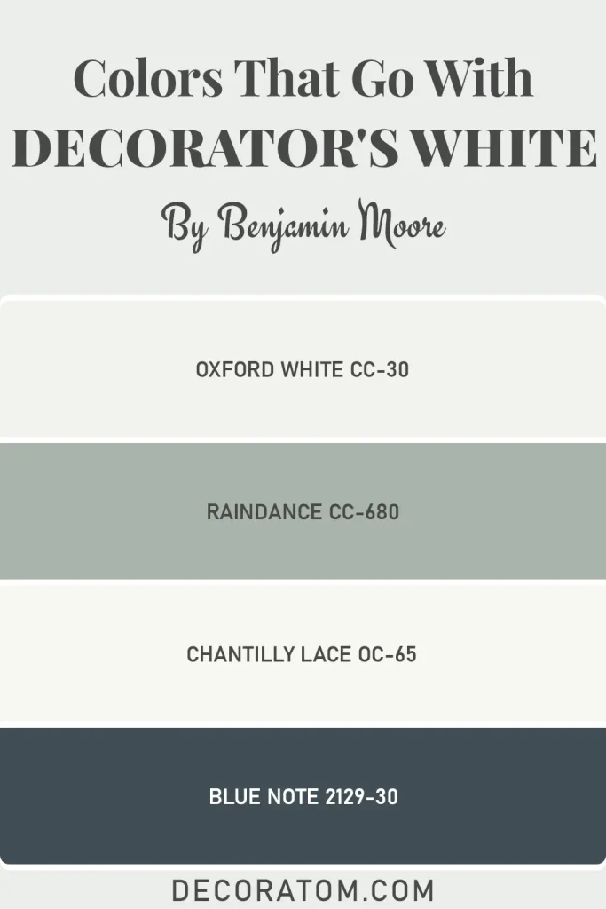
- Oxford White CC-30
- Raindance CC-680
- Chantilly Lace OC-65
- Blue Note 2129-30
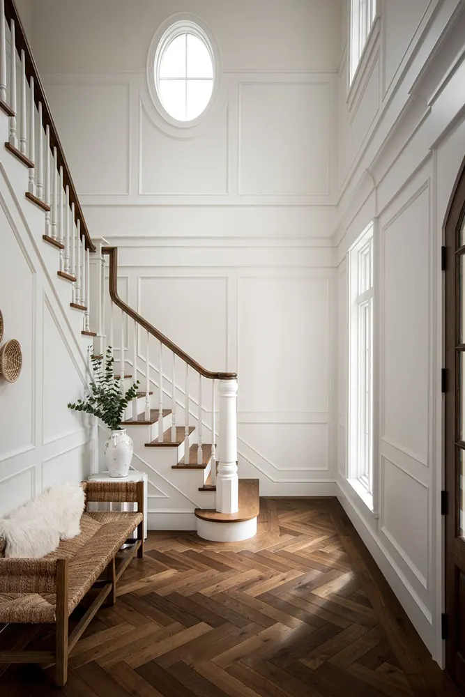
Where to Use Benjamin Moore Decorator’s White?
Decorator’s White is a surprisingly versatile color. I say “surprisingly” because you might assume an almost-white paint is only safe in certain rooms, but this one genuinely works across a wide range of spaces. Here’s where I think it really shines:
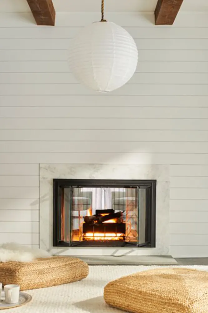
- Living Rooms: The warmth in this color makes living rooms feel welcoming without being heavy. It gives you a clean backdrop that lets furniture and artwork do the talking.
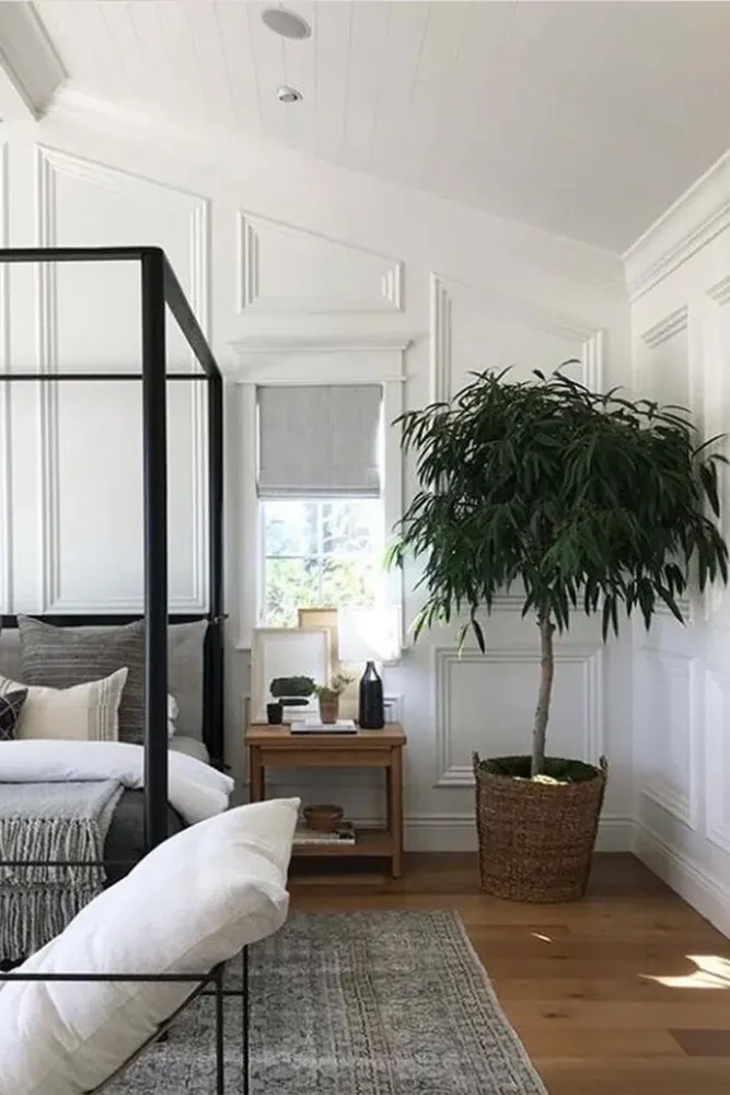
- Bedrooms: It’s calm and soft enough to be restful, which is exactly what you want in a space where you sleep. It doesn’t feel stark or clinical, which some whites can in a bedroom setting.
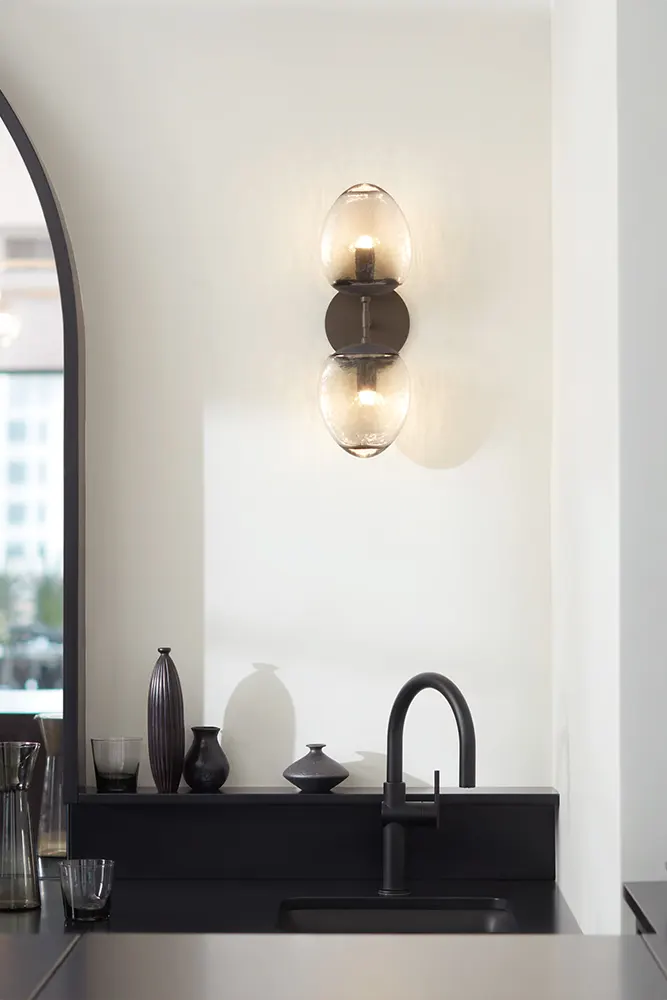
- Kitchens: Decorator’s White holds up really well in kitchens, especially when paired with warm wood tones or natural stone countertops. It keeps things feeling bright without going too cool.
- Home Offices: A soft white like this keeps a workspace feeling fresh and focused without the visual noise of a colored wall pulling your attention.
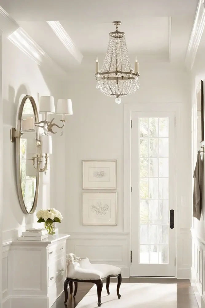
- Hallways and Entryways: These transitional spaces often don’t get a lot of natural light. The high LRV of Decorator’s White (82.68) helps bounce whatever light is available and keeps these areas from feeling dark or cramped.
- Ceilings: It works beautifully as a ceiling color paired with warmer wall colors, keeping things airy without the ceiling reading as stark white.
- Trim and Cabinetry: Some people use Decorator’s White on their trim and cabinetry, and it gives a softer, less-harsh finish compared to a bright white — great if you want a more relaxed, organic look.
Why I Love Benjamin Moore Decorator’s White
I’ll tell you exactly why this color stuck with me: it solved a problem I didn’t know how to solve.
I had a room that I kept repainting because nothing felt right. Bright whites felt too cold. Creams felt too yellow. Off-whites felt dated. I was going in circles. Then I tried Decorator’s White, and the room just… settled. It looked like it had always been that color. That feeling — when a paint color stops being something you notice and just becomes the room — that’s rare, and that’s what this color gave me.
I also love how low-maintenance it is in terms of pairing. I didn’t have to agonize over what furniture or textiles to bring in. Warm wood tones looked great. Cool grey accents worked. Even that green throw pillow I bought on a whim didn’t clash. It’s the kind of white that gets out of its own way and lets you build a room around it without constant second-guessing.
And practically speaking — it photographs beautifully. If you share your home on social media or just want your space to look good in photos, this color holds up well in different kinds of light without shifting into something unexpected on camera.
Final Thoughts
If you’re looking for a white that’s easy to live with, easy to pair, and genuinely flattering in a wide range of rooms and lighting situations, Decorator’s White deserves a serious look.
It’s not a dramatic color. It won’t transform your room in an obvious, head-turning way. But it will make your space feel considered and calm, and sometimes that’s exactly what a room needs. I’ve recommended this color to friends who were overwhelmed by white paint choices, and without exception, they’ve been happy with it.
My one piece of advice: grab a sample pot and put it on the wall before you commit. Look at it in the morning light, the afternoon light, and at night with your lamps on. Decorator’s White behaves differently across those conditions, and you want to know exactly what you’re getting before you roll it on every wall. But if it looks good in your space under all those conditions? Go for it. You won’t regret it.