

Not everyone wants a warm white. Some people walk into a paint store knowing exactly what they’re after — a clean, crisp, honest white that doesn’t play games with undertones. If that sounds like you, let me introduce you to Benjamin Moore Super White OC-152.
I’ve recommended this color countless times to people who come to me frustrated with whites that turned yellow on their walls or went unexpectedly pink under certain lighting. Super White is the antidote to all of that. It’s straightforward, it’s bright, and it delivers exactly what it promises — a clean, pure white that makes spaces feel fresh and open.
It belongs to Benjamin Moore’s Off-White collection, which might surprise you given how bright it is. But that placement reflects the fact that even Super White has a tiny amount of depth compared to a laboratory-pure white. It’s still approachable and livable — just at the brighter end of the spectrum.
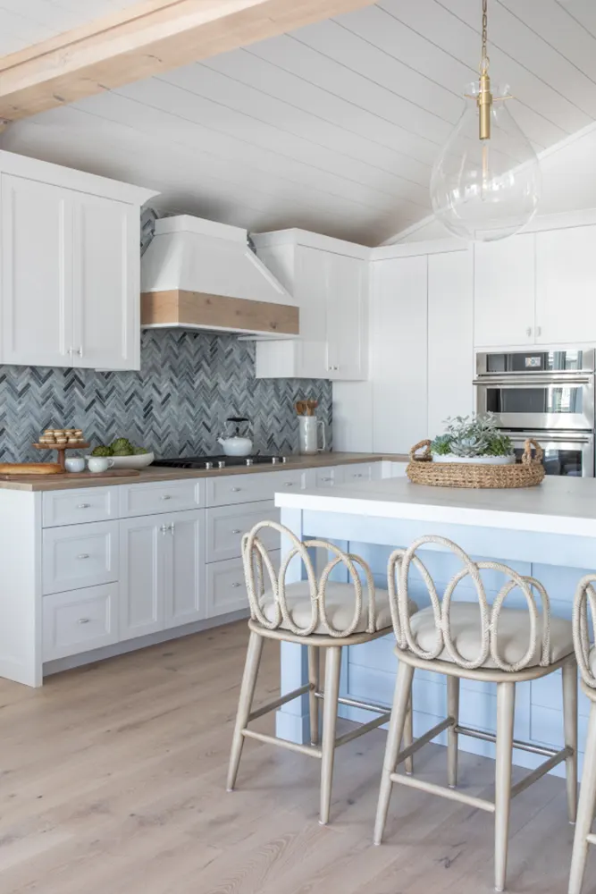
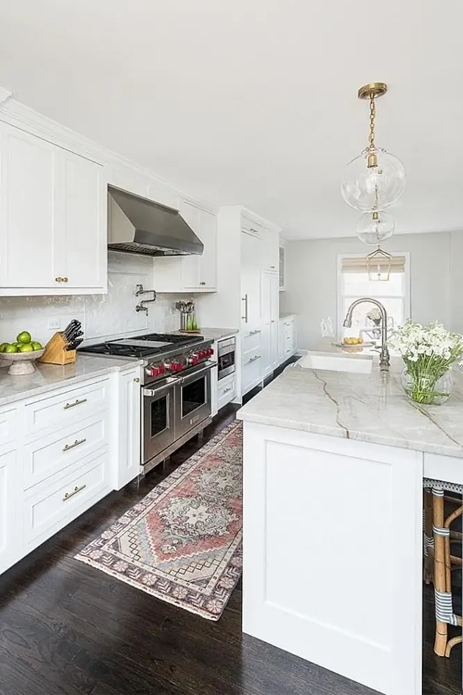
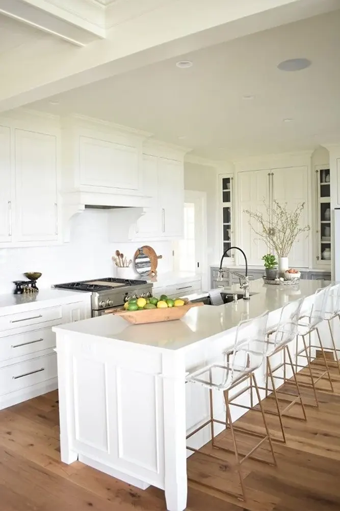
I’ve seen Super White work in modern minimalist spaces, coastal homes, contemporary kitchens, and bright airy studios. If you want maximum light and maximum freshness, this is the color to know.
What Color is Benjamin Moore Super White OC-152?
Super White OC-152 is a clean, bright, near-pure white. It has very little in the way of undertones, which makes it one of the most straightforward whites Benjamin Moore offers.
It reads as a true white in most lighting conditions — not creamy, not gray, not warm. Just clean and bright. It’s the kind of white that makes a room feel like it’s been filled with fresh air.

Is It a Warm or Cool Color?
Super White OC-152 leans slightly cool. It doesn’t have the creamy warmth of something like Cloud White or White Dove.
It sits closer to a neutral-to-cool white, which is exactly what makes it feel so clean and modern. In warm lighting, it can pick up the faintest hint of warmth, but it always stays on the fresher, brighter side of the spectrum.
LRV of Benjamin Moore Super White OC-152
The LRV of Super White OC-152 is 87.36. This is one of the highest LRV values Benjamin Moore offers, which tells you that this color reflects an enormous amount of light back into a room.
If you have a smaller space or a room that doesn’t get much natural light, Super White can genuinely help it feel larger and brighter. Its high reflectivity is one of its most practical strengths.
Undertones of Benjamin Moore Super White OC-152
Super White OC-152 has minimal undertones, which is a big part of its appeal. There’s the faintest hint of cool gray in certain lighting conditions, but it’s so subtle that most people won’t even notice it.
What you mostly get with Super White is exactly what the name says — white. No surprising shifts to pink, no unexpected yellowing. It stays true to itself across different light conditions, and that reliability is something I genuinely appreciate.
How Different Types of Lighting Affect Benjamin Moore Super White OC-152?
Super White is one of the most stable whites I’ve encountered when it comes to lighting changes, but there are still some nuances worth knowing.
In bright natural daylight, Super White is at its very best. It looks clean, crisp, and genuinely bright without being blinding. The light bounces off it beautifully.
In north-facing rooms with cooler light, the faint gray undertone can come forward slightly, making it feel a touch cooler. This can actually work well in modern spaces where you want a cooler, crisper aesthetic.
In south or west-facing rooms with warm afternoon light, Super White stays remarkably consistent. It might pick up the tiniest whisper of warmth from the light itself, but it doesn’t shift dramatically.
Under warm artificial lighting, it reads as a clean white with just a touch of creaminess. Under cool or daylight bulbs, it looks almost exactly as it does in natural light — crisp and fresh.

Trim Colors to Pair With Benjamin Moore Super White OC-152
1. Benjamin Moore Chantilly Lace OC-65 — This is a natural pairing. Both colors are clean and bright, and using Chantilly Lace on trim creates a polished, seamless look that feels very modern and put-together.
2. Benjamin Moore Super White OC-152 itself — Yes, using the same color on walls and trim is a legitimate design choice. It creates a clean, cocoon-like effect that works especially well in minimalist and contemporary spaces.
3. Benjamin Moore White OC-151 — For a slightly softer trim option that still stays clean and bright, White OC-151 offers a barely-there warmth that pairs beautifully with Super White walls without creating any visual tension.
Colors Similar to Benjamin Moore Super White OC-152
When you’re looking for a color as clean and bright as Super White, the alternatives are fewer than you might expect. Most whites in this territory tend to be very similar to each other because there’s simply less room for variation at the brighter end of the spectrum.
But that doesn’t mean the differences don’t exist — they do, and they matter when you’re comparing samples on an actual wall in your actual home.
The key things to look for in a similar color are LRV, undertone direction, and how stable the color is across different lighting conditions. Super White scores well on all three of these metrics, and any alternative worth considering should come close.
I’ve found a handful of colors from both Benjamin Moore and Sherwin Williams that sit in the same territory — clean, bright, minimal undertones. They’re worth sampling alongside Super White if you want to make sure you’re getting the exact version of “bright white” that works best in your space.
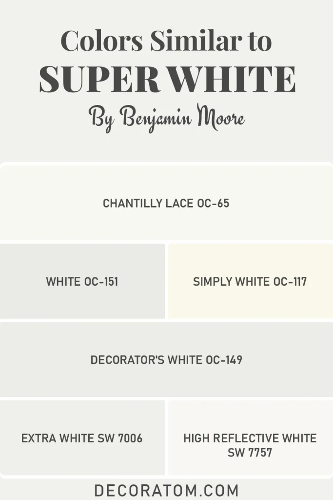
Similar Colors:
- Benjamin Moore Chantilly Lace OC-65
- Benjamin Moore White OC-151
- Benjamin Moore Simply White OC-117
- Benjamin Moore Decorator’s White OC-149
- Sherwin Williams Extra White SW 7006
- Sherwin Williams High Reflective White SW 7757
Colors That Go With Benjamin Moore Super White OC-152
Super White OC-152 is essentially a blank canvas, and that’s one of its most powerful qualities. Because it has so little going on in terms of undertones, it doesn’t compete with or clash against the colors you pair it with. Whatever you put next to it gets to shine fully.
That said, knowing which colors to pair with it intentionally will take your space from “nice” to genuinely stunning. Super White works beautifully with bold, saturated colors because it provides a clean, neutral backdrop that lets those colors breathe.
Think deep navy, rich emerald green, warm terracotta, or even a moody charcoal. On the softer side, it pairs naturally with light grays, dusty blues, and pale sage greens for a calm, airy aesthetic.
And if you’re going for a tonal, all-white look, layering Super White with slightly warmer or cooler whites in soft furnishings creates a sophisticated, textured result. The more I work with Super White, the more I appreciate how generously it gives space to everything around it.
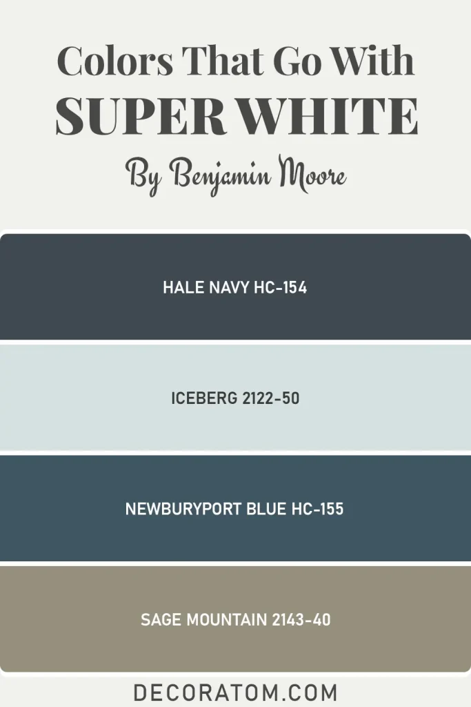
Coordinating Colors from Benjamin Moore:
- Benjamin Moore Hale Navy HC-154
- Benjamin Moore Iceberg 2122-50
- Benjamin Moore Newburyport Blue HC-155
- Benjamin Moore Sage Mountain 2143-40
Where to Use Benjamin Moore Super White OC-152?
Super White is versatile but particularly powerful in certain situations. Here’s where it excels:
- Modern and Minimalist Spaces: It’s practically the signature color of the contemporary minimalist aesthetic.
- Small Rooms: The high LRV makes small rooms feel significantly larger and more open.
- Kitchens: On walls, cabinets, or both, Super White gives kitchens a clean, fresh, professional feel.
- Bathrooms: It makes bathrooms feel spa-like and pristine, especially in spaces with white tile and chrome or brushed nickel fixtures.
- Trim, Doors, and Millwork: For a crisp, sharp trim finish, Super White is hard to beat.
- Studios and Home Offices: The brightness keeps these spaces feeling energetic and focused.
- Coastal or Scandinavian-Inspired Interiors: Its clean brightness aligns perfectly with these light-forward design styles.
Why I Love Benjamin Moore Super White OC-152
I love Super White for its honesty. It doesn’t hide anything or surprise you. You put it on the wall, and it does exactly what you expected — it’s white, it’s clean, and it makes the room feel bright. In a world where so many “whites” turn out to be sneaky beiges or unexpected pinks, Super White’s straightforwardness is genuinely refreshing.
I also love it for its range. It works as a wall color, a trim color, a ceiling color, and a cabinet color. That multi-purpose nature means you can build an entire room around it without ever feeling like you’re repeating yourself. It’s a workhorse color, and I mean that as a compliment.
Final Thoughts
If you want a white that simply works — no overthinking, no undertone drama, no surprises — Super White OC-152 is your color. It delivers brightness, cleanliness, and versatility in one dependable package.
Sample it on your wall, watch it through a full day of light, and I think you’ll find it does exactly what you need it to do. Sometimes the simplest answer really is the right one.