
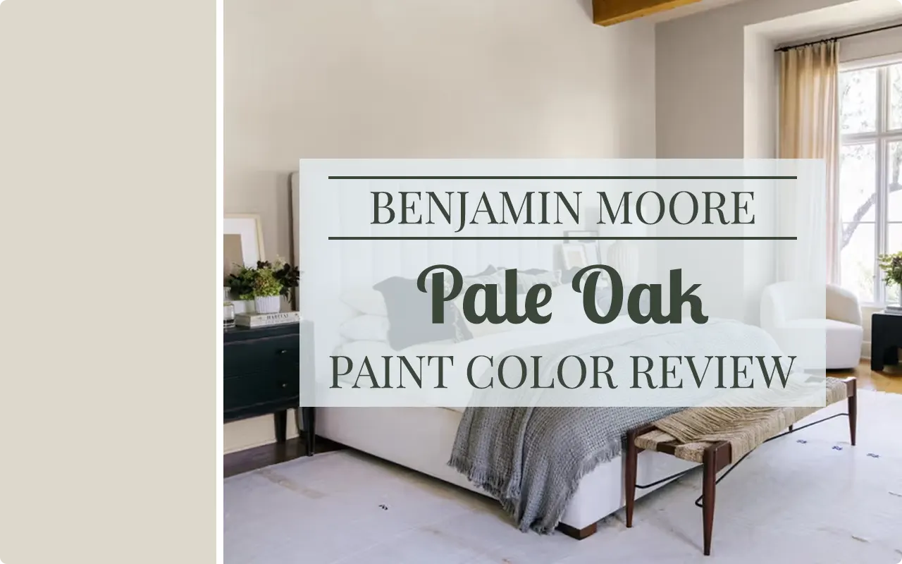
I still remember the first time I came across Pale Oak OC-20. I was helping a friend redesign her living room, and we must have gone through at least a dozen paint swatches before this one caught our eye. Something about it just felt right — not too bold, not too plain. It had that quiet confidence that made us both stop and say, “That’s the one.”
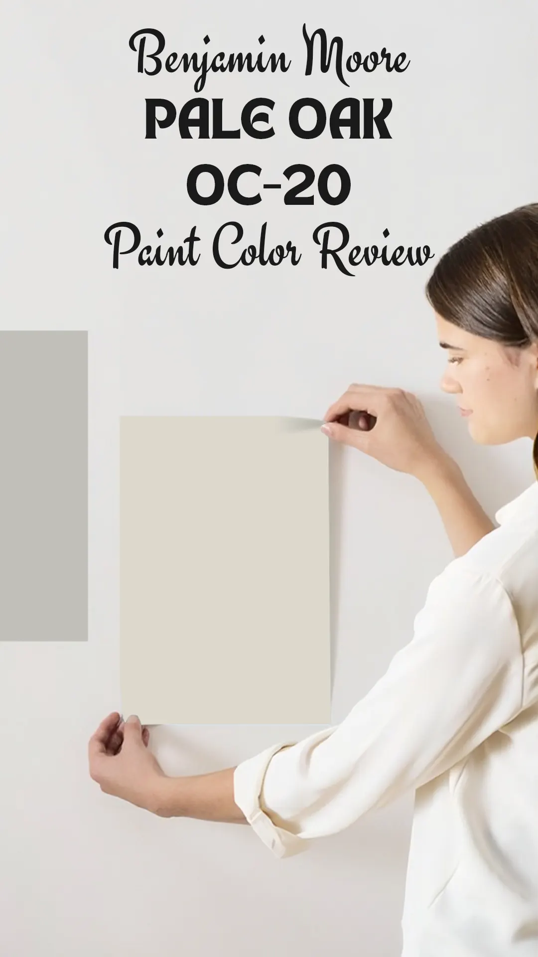
Pale Oak OC-20 is one of those paint colors that has earned its reputation over years of showing up in beautifully styled homes, interior design magazines, and renovation projects. It sits in Benjamin Moore’s Off-White collection, and honestly, it deserves every bit of the attention it gets. If you’re someone who wants a neutral that actually has a little personality, Pale Oak might just be your answer.
What makes this color so special is that it doesn’t try too hard. It’s not screaming for attention the way a bold color would, but it’s also not disappearing into the background like a flat white. It fills a room with a sense of warmth and softness that feels natural, lived-in, and genuinely comfortable.
Over the years, I’ve seen it work in farmhouse-style homes, modern spaces, traditional interiors, and everything in between. That kind of versatility is rare, and it’s a big part of why I keep coming back to it.
In this post, I’m going to walk you through everything you need to know about Pale Oak OC-20 — from its undertones and LRV to how it behaves in different lighting situations and where it works best. Let’s get into it.
What Color is Benjamin Moore Pale Oak OC-20?
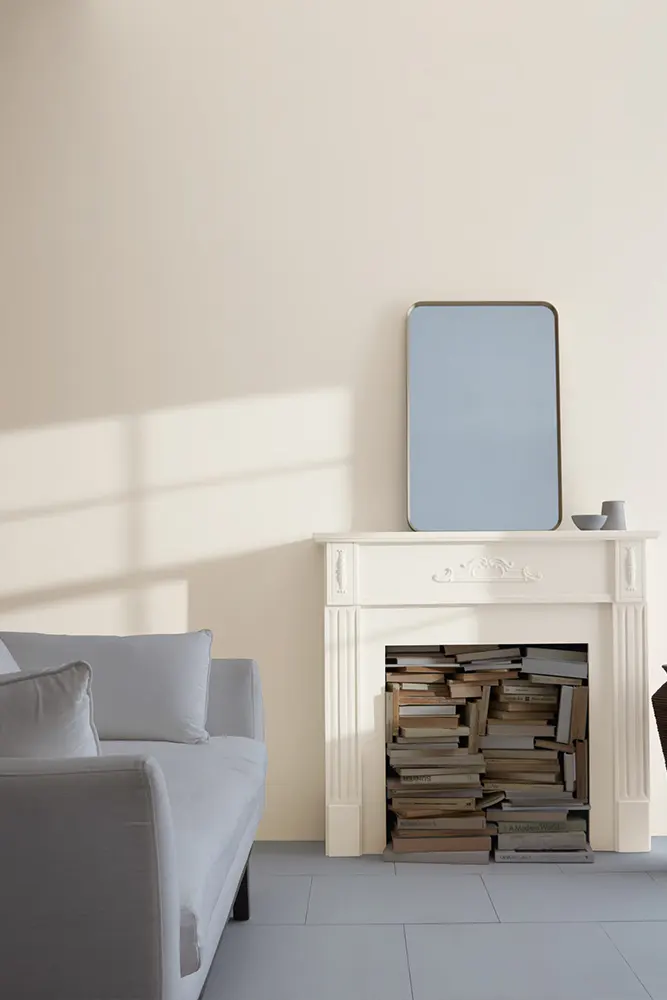
Pale Oak OC-20 is a soft, warm greige — a blend of beige and gray that leans more toward the beige side. It’s light without being stark, and it carries just enough color to feel intentional rather than default. Think of it as the kind of neutral that makes a room feel pulled together without stealing the spotlight from your furniture or decor.
It sits in that sweet spot between a warm white and a true beige, which is exactly why so many people reach for it when they want something approachable and livable.
Is It a Warm or Cool Color?
Pale Oak OC-20 is a warm color. It leans into beige and earthy tones rather than gray or blue, which gives it that cozy, inviting quality. Even in rooms with a lot of natural light, it holds onto its warmth rather than shifting into cooler territory.
LRV of Benjamin Moore Pale Oak OC-20
LRV stands for Light Reflectance Value, and it tells you how much light a color reflects back into a room. The scale goes from 0 (pure black) to 100 (pure white). The higher the number, the lighter and more reflective the color.
The LRV of Pale Oak OC-20 is 68.64. That puts it on the lighter side of the scale, meaning it will brighten up a room without making it feel stark or cold. It’s a great choice if you want a space to feel open and airy while still having some warmth to it.
Undertones of Benjamin Moore Pale Oak OC-20
Pale Oak OC-20 has pink and beige undertones with a subtle hint of gray. The pink undertone is what gives it that warmth and softness — it’s not a loud pink, more like a gentle blush sitting underneath the surface.
In certain lighting, the gray undertone can come forward a little, which keeps it from feeling too sweet or too traditional. These undertones together are what make Pale Oak such a balanced and livable neutral.
How Different Types of Lighting Affect Benjamin Moore Pale Oak OC-20?
Lighting changes everything with this color, and it’s something I’d really encourage you to pay attention to before committing.
In natural daylight, Pale Oak looks its most balanced — you’ll see that soft greige quality come through clearly, and the warmth feels natural and easy.
In north-facing rooms with cooler, indirect light, the gray undertone can come forward more, making it feel a bit cooler and muted. It can still work beautifully, but it won’t have that same warmth as it would in a sunnier room.
In south-facing rooms with bright, warm light, the beige and pink undertones really show up. The color feels lighter and warmer, almost glowing in the afternoon sun.
Under artificial lighting, particularly warm-toned bulbs like soft white LEDs, Pale Oak gets cozier and the beige deepens slightly. Under cooler fluorescent lighting, it can read a touch more gray. I always recommend testing a large sample on your wall and watching it through the day before deciding.
Trim Colors to Pair With Benjamin Moore Pale Oak OC-20
Choosing the right trim color for Pale Oak is key to making the whole room feel intentional. Here are my three top picks:
1. Benjamin Moore Chantilly Lace OC-65 — This is a clean, crisp white that creates a beautiful contrast with Pale Oak’s warmth. It’s sharp without being harsh, and it gives the room a polished, finished look.
2. Benjamin Moore White Dove OC-17 — If you want something a little softer for your trim, White Dove is a fantastic option. It has a slight warmth to it that complements Pale Oak’s beige tones without blending in too much.
3. Benjamin Moore Simply White OC-117 — This one strikes a nice balance between warm and bright. It’s clean enough to define your trim clearly but warm enough not to clash with Pale Oak’s undertones.
Colors Similar to Benjamin Moore Pale Oak OC-20
Finding a similar color to Pale Oak OC-20 matters more than you might think. Sometimes a specific paint brand isn’t available in your area, or you’ve already primed your walls with a different brand and don’t want to switch. Other times, you might love Pale Oak but want to explore something slightly lighter, slightly darker, or just a touch warmer or cooler before making a final call.
The good news is that Pale Oak sits in a category of warm greiges that several paint companies have explored, so there are genuine alternatives worth considering. These similar colors share that same soft, balanced quality — neither too yellow, too pink, nor too gray.
They work in the same types of spaces and respond to lighting in a comparable way. That said, no two colors are ever exactly the same once you put them on a wall, so I’d always recommend sampling before committing. Light, room size, and surrounding decor all play a role in how these colors ultimately look in your specific space.
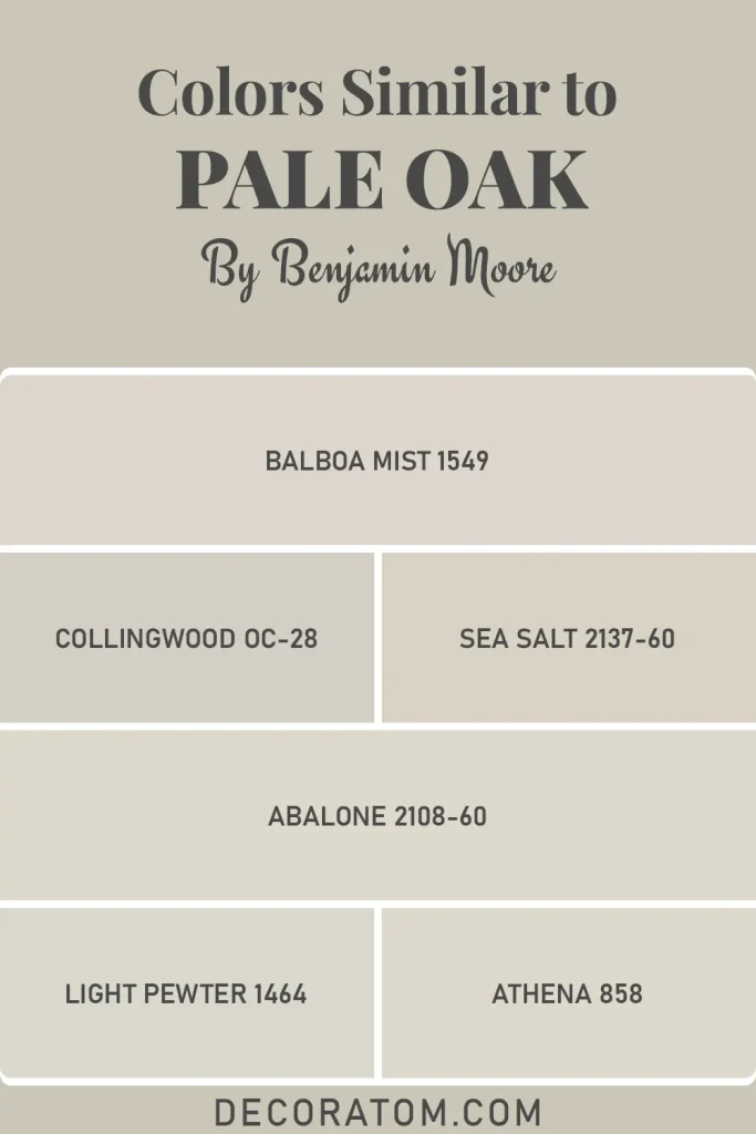
Similar Colors:
- Benjamin Moore Balboa Mist 1549
- Benjamin Moore Collingwood OC-28
- Benjamin Moore Sea Salt 2137-60
- Benjamin Moore Abalone 2108-60
- Benjamin Moore Light Pewter 1464
- Benjamin Moore Athena 858
Colors That Go With Benjamin Moore Pale Oak OC-20
Pale Oak OC-20 is one of those colors that plays well with others, and that’s honestly one of the biggest reasons I keep recommending it. Its warm greige base means it can sit comfortably next to both warm and slightly cooler tones without creating tension. But knowing which specific colors to pair it with makes a real difference in how cohesive your space feels.
When I think about coordinating colors for Pale Oak, I look for tones that either pick up on its warmth and deepen it, or provide a gentle contrast that keeps the room from feeling flat. Earthy tones like terracotta and warm camel work beautifully as accent colors.
Soft blues and sage greens offer a lovely contrast without fighting against Pale Oak’s warmth. On the deeper end, rich navy or charcoal can add drama and grounding to a Pale Oak room. And if you want to keep things soft and layered, creamy whites and warm off-whites alongside Pale Oak create a serene, spa-like quality that I personally love.
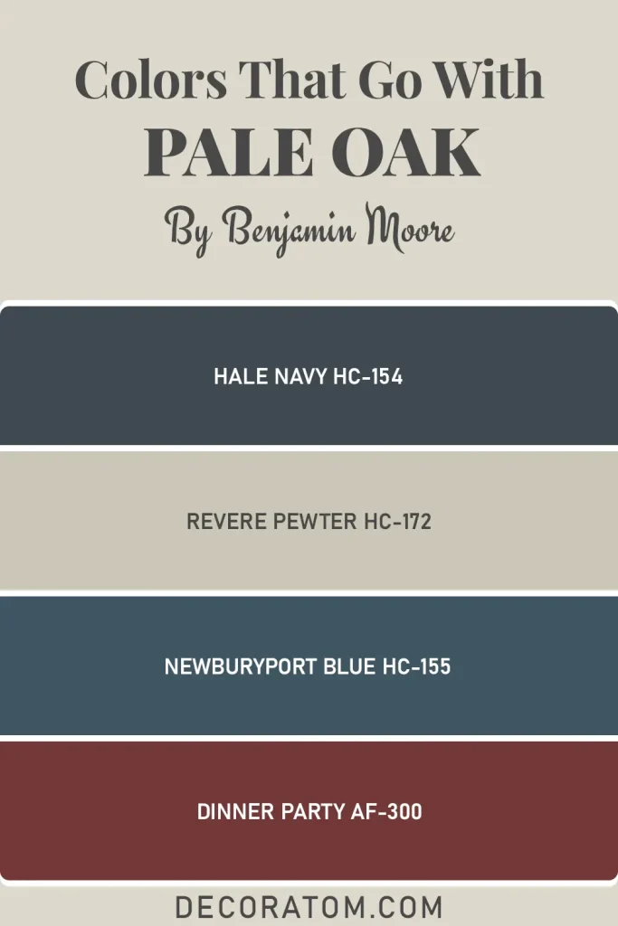
Coordinating Colors from Benjamin Moore:
- Benjamin Moore Hale Navy HC-154
- Benjamin Moore Revere Pewter HC-172
- Benjamin Moore Newburyport Blue HC-155
- Benjamin Moore Dinner Party AF-300
Where to Use Benjamin Moore Pale Oak OC-20?
Pale Oak is one of the most flexible neutrals I’ve ever worked with. Here’s where I think it really shines:
- Living Rooms: It creates a warm, welcoming atmosphere that works with almost any furniture style or color.
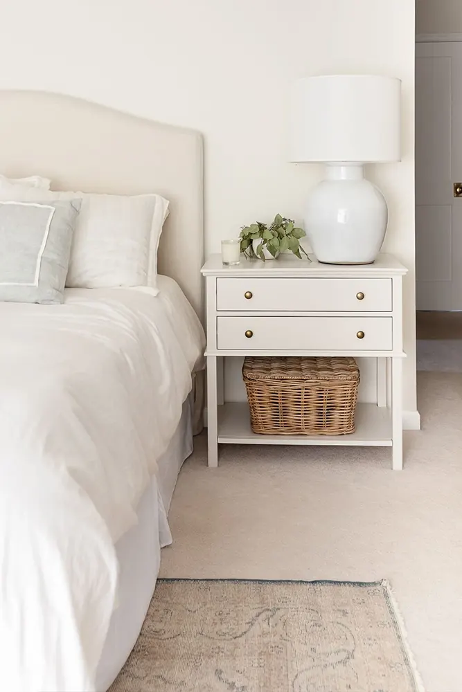
- Bedrooms: The softness of Pale Oak makes bedrooms feel calm and restful — exactly what you want in a sleeping space.
- Open-Plan Spaces: Because it reads consistently in different light conditions, it’s a reliable choice for large, connected spaces where you need continuity.
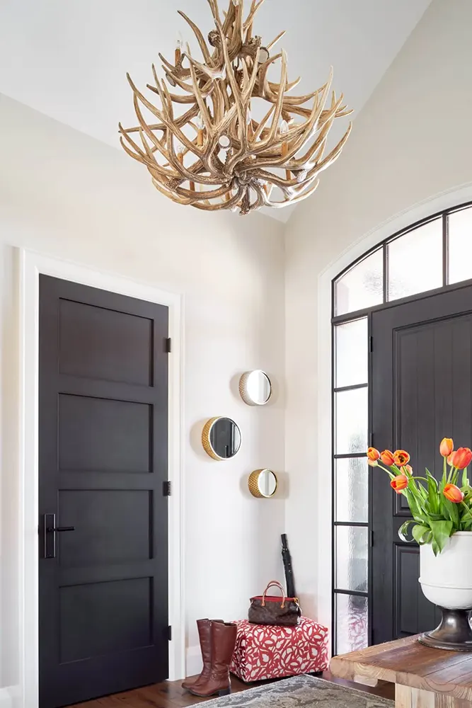
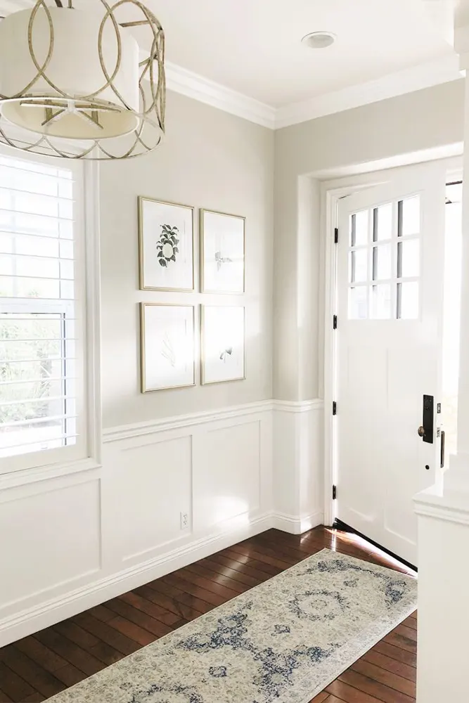
- Hallways and Entryways: It adds warmth to transitional spaces that often get overlooked.
- Home Offices: It’s neutral enough to keep focus but warm enough to avoid feeling clinical.
- Kitchens: On cabinets or walls, it gives kitchens a soft, timeless character.
- Dining Rooms: Paired with warm wood tones and candlelight, it creates a beautifully cozy atmosphere for dinner gatherings.
Why I Love Benjamin Moore Pale Oak OC-20
Honestly? It never lets me down. I’ve recommended Pale Oak to people with completely different homes — different sizes, different architectural styles, different furniture — and it consistently works. That’s not something I can say about many colors.
What I love most is that it makes a room feel considered without any fuss. You don’t have to overthink your decor around it because Pale Oak does the heavy lifting. It brings warmth, it’s light-reflective enough to keep spaces feeling open, and those subtle pink and gray undertones mean it has depth without being complicated.
There’s also something very emotionally comfortable about this color. When I walk into a room painted in Pale Oak, I feel relaxed almost immediately. It doesn’t demand anything from you. It just feels like home.
Final Thoughts
If you’ve been going back and forth on a neutral paint color and can’t seem to land on the right one, I genuinely think Pale Oak OC-20 deserves a spot on your shortlist. It’s earned its popularity for good reasons — it’s warm, it’s livable, it’s versatile, and it works across so many different spaces and styles.
My advice? Get a sample pot, paint a large swatch on your wall (at least 12×12 inches), and watch it over a few days in different lighting. I think you’ll find it’s one of those colors that just quietly grows on you until you can’t imagine your room any other way.