
I have painted a lot of walls over the years. And if there is one question I keep getting from friends, family, and even random people in the paint aisle, it is this: “What white should I use?” That question sounds simple, but anyone who has stood in front of a wall of white paint chips knows how quickly it becomes overwhelming.
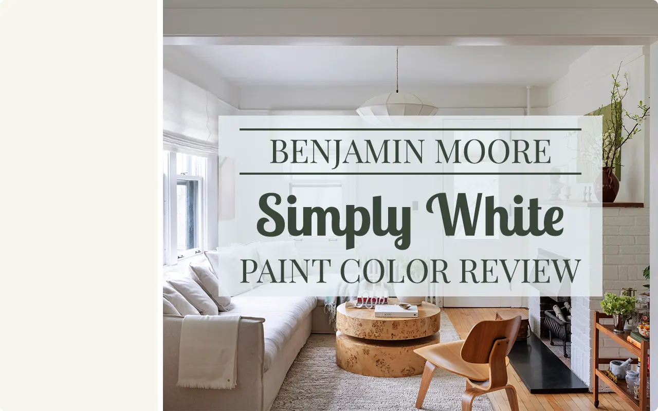
That is exactly why I want to talk about Benjamin Moore Simply White OC-117 today, because this one has genuinely earned its reputation. It is not just a trendy name or a marketing favorite.
I have seen this color in real homes, real lighting conditions, and real life, and each time it has delivered something that a lot of whites just cannot seem to pull off: it looks like white without looking cold, clinical, or stark.
I first started paying close attention to Simply White when I noticed it kept showing up on lists of best-selling whites year after year. Benjamin Moore has a massive lineup of whites, and yet this one keeps rising to the top.
So I dug into it, tested it, and spent a good deal of time studying how it behaves in different settings. What I found made me a genuine fan, and in this review, I want to walk you through everything you need to know before you pick up that brush.
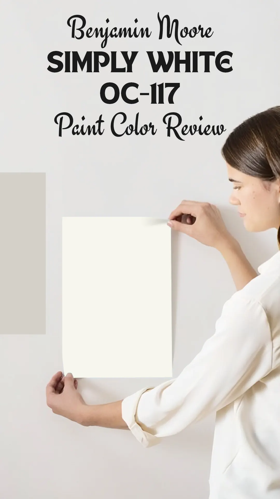
What Color is Benjamin Moore Simply White OC-117?
Simply White OC-117 is a soft, warm white. It is not a stark, bright white that makes you squint, and it is not a cream that leans too yellow. It lives right in that sweet spot where it reads as a clean white to the eye but carries just enough warmth to feel comfortable and inviting rather than cold and hospital-like. Think of it as white that has been given just a tiny bit of personality, enough to keep it from feeling flat or sterile.

Is It a Warm or Cool Color?
Simply White is definitively a warm color. It carries warm undertones that keep it from ever drifting into icy or blue territory. If you are someone who finds bright whites too harsh or too stark, this warmth is exactly what makes Simply White feel livable and cozy without tipping into a heavy cream or an obvious off-white.
LRV of Benjamin Moore Simply White OC-117
LRV stands for Light Reflectance Value, and it tells you how much light a paint color bounces back into a room on a scale of 0 (pure black, absorbs everything) to 100 (pure white, reflects everything).
Simply White OC-117 has an LRV of 89.52, which is quite high. In practical terms, this means the color is genuinely bright and will make spaces feel open and airy. It reflects a lot of natural and artificial light, which is a big part of why it works so beautifully in both small rooms and large ones.
That high LRV also helps preserve its warm quality even in lower-light spaces, where many whites start looking dull or dirty.
Undertones of Benjamin Moore Simply White OC-117
Simply White carries a mix of soft yellow and very faint orange undertones, which together create that signature warmth the color is known for. These undertones are subtle enough that the color still reads as white to most eyes, but they are present enough to prevent any blue or gray cast.
In certain lighting, especially natural light from a warm-directional source, you might notice the faintest hint of creaminess, but it never becomes heavy or muddy. It stays clean, just not cold.

How Different Types of Lighting Affect Benjamin Moore Simply White OC-117?
Lighting is everything with white paint, and Simply White handles it better than most.
In natural daylight, it looks like the most beautiful version of itself: bright, clean, and warmly white without any harshness. Morning light tends to bring out a soft golden quality, while midday light keeps it looking crisp.
In north-facing rooms that get indirect, cooler light, Simply White holds its own remarkably well. Its warm undertones prevent it from looking grayish or cold the way some whites do in those conditions.
Under warm artificial lighting (like incandescent or soft LED bulbs), it gets a touch cozier and slightly more creamy, which works well in living rooms and bedrooms where you want that relaxed, warm feel in the evenings.
Under cool LED or fluorescent lighting, the warmth dials back a little and the color looks more crisp and neutral, which makes it great for kitchens and bathrooms where you want clarity without starkness.
Trim Colors to Pair With Benjamin Moore Simply White OC-117
Trim can make or break a room, and with a warm white like Simply White on your walls, you want your trim to either match perfectly, provide a clean contrast, or stay in harmony with the overall warmth. Here are three trim colors that work especially well:
1. Benjamin Moore Chantilly Lace OC-65 — This is a true, bright white with no noticeable undertones. It creates a clean, crisp contrast against Simply White walls, making the trim pop in a very polished way. It is one of the most popular choices for this exact pairing.
2. Benjamin Moore White Dove OC-17 — If you want your trim to feel softer and more seamless rather than contrasting, White Dove is a near-perfect companion. It is also a warm white with similar undertones, so the two work together without any clash. The result is layered and sophisticated.
3. Benjamin Moore Super White PM-1 — For those who want a sharper, more modern contrast, Super White provides just enough brightness difference to define the trim clearly against the walls without looking stark. It works especially well in contemporary or transitional interiors.
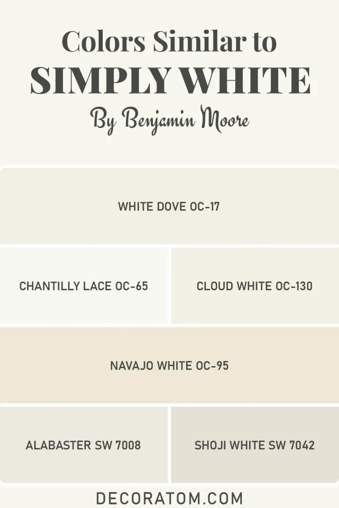
Colors Similar to Benjamin Moore Simply White OC-117
Finding a similar color to Benjamin Moore Simply White OC-117 is something a lot of people ask about, and I totally get why. Maybe you are renovating a home with existing Simply White walls and need to touch up with a different brand.
Maybe you are comparing options before committing to a purchase. Or maybe you just want to understand where this color sits in the broader landscape of warm whites so you can make a truly informed decision. Whatever your reason, knowing the neighbors in Simply White’s color family helps.
What makes this search interesting is that warm whites are everywhere, but truly good warm whites that balance brightness and coziness without tipping into cream territory are rarer than you might think. Simply White sits in a specific zone: high LRV, warm undertones, clean but not cold.
The colors I have listed below all share those general qualities, though each has its own personality and slight variation that sets it apart. Some lean just a touch more yellow, some a bit crisper, and some nearly indistinguishable in certain lighting. I have tried to be honest about where each one lands so you can compare before you commit to any of them.
Similar Colors:
- Benjamin Moore White Dove OC-17 — A warm white with soft yellow undertones and an LRV of around 83. Slightly warmer and less bright than Simply White, making it a popular alternative for those wanting something a touch cozier.
- Benjamin Moore Chantilly Lace OC-65 — Brighter and crisper than Simply White with a higher LRV and fewer warm undertones. It reads as a truer white and is best for those wanting slightly less warmth.
- Benjamin Moore Cloud White OC-130 — A classic warm white with a soft, creamy quality. It has a slightly lower LRV than Simply White and leans a bit more into the cream direction, especially in warm light.
- Benjamin Moore Navajo White OC-95 — Warmer and richer than Simply White. This one actually shows its warm undertones more openly and works better in spaces where you want a clear off-white rather than a near-white.
- Sherwin-Williams Alabaster SW 7008 — A beloved warm white from Sherwin-Williams that is frequently compared to Simply White. It has a similar LRV around 82 and warm, creamy undertones. It leans very slightly more yellow in warm lighting.
- Sherwin-Williams Shoji White SW 7042 — A soft, greige-adjacent white with warm beige undertones. It is warmer and more complex than Simply White but sits in the same family of whites that feel lived-in and inviting rather than sharp and modern.
Colors that Go With Benjamin Moore Simply White OC-117
One of the reasons Simply White OC-117 has become such a staple in so many homes is that it genuinely plays well with others. Because of its warm, neutral base, it acts almost like a foundational canvas that allows bolder or deeper colors to shine without competition.
Whether you are going for a moody, layered look with dark dramatic tones, a soft and airy palette with muted naturals, or something clean and classic with navy and cream, Simply White accommodates all of it without flinching.
The key to coordinating colors with Simply White is respecting its warmth. You want to avoid colors that pull too cool or too gray, because those can create an awkward visual tension. Instead, colors with warm, earthy, or rich tones tend to pair with Simply White in a way that feels intentional and pulled-together. The four colors below are ones I genuinely love alongside it, each creating a completely different mood while keeping the overall harmony intact.
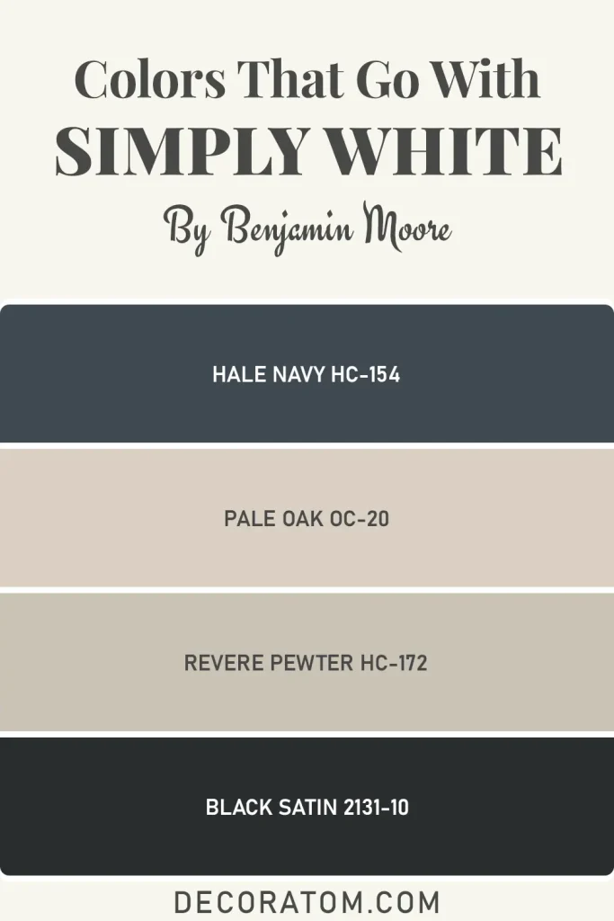
Coordinating Colors:
- Benjamin Moore Hale Navy HC-154 — A classic, deep navy with slightly warm undertones. Against Simply White walls or trim, it creates a crisp, timeless contrast that feels both classic and contemporary. Perfect for an accent wall, cabinetry, or a front door.
- Benjamin Moore Pale Oak OC-20 — A warm, soft greige that pairs beautifully with Simply White in open-concept spaces where adjacent rooms need to flow into each other without hard visual stops. The two colors share a warmth that makes transitions feel natural.
- Benjamin Moore Revere Pewter HC-172 — A medium warm gray with green and beige undertones. This one adds depth and grounding to a room where Simply White is on the ceiling or trim, keeping everything from looking too light or undefined.
- Benjamin Moore Black Satin 2131-10 — For those who love high contrast, this deep, rich dark adds drama and weight. It works on an accent wall or kitchen island against Simply White cabinetry or walls, and the pairing feels intentional and bold without being jarring.
Where to Use Benjamin Moore Simply White OC-117?
The honest answer is that Simply White is one of those rare colors that works almost everywhere. But rather than just leaving it at that, let me break down where it really shines and why:
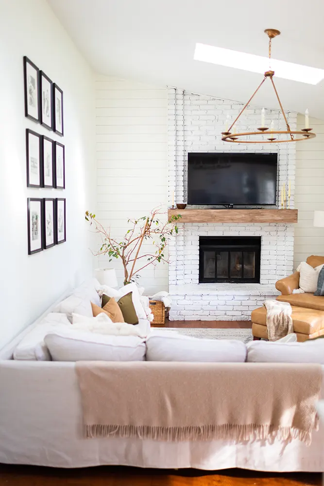
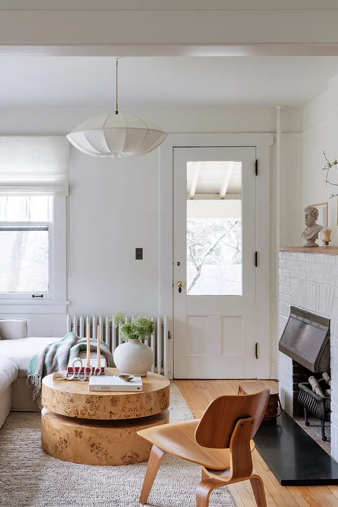
- Living Rooms: Simply White on walls creates a warm, welcoming backdrop that makes furniture and textiles look their best. It does not compete with your sofa color or your artwork; it just supports everything around it.
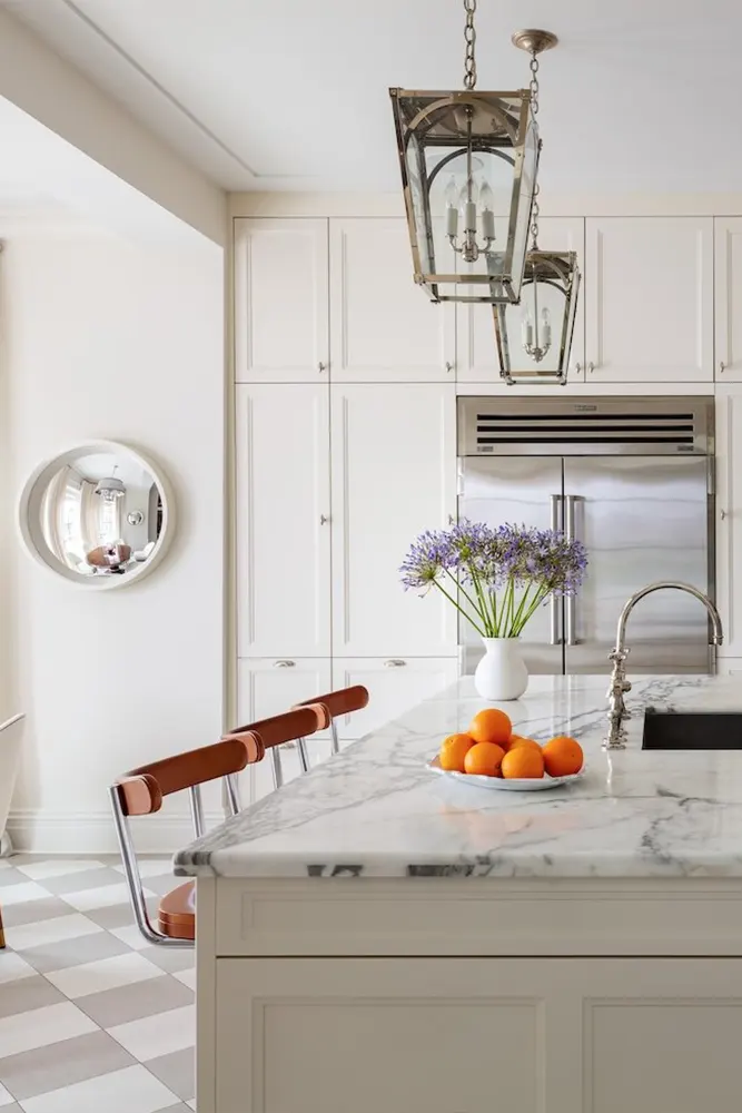
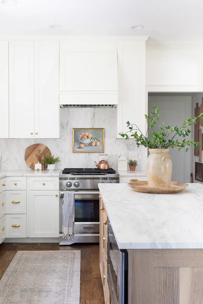
- Kitchens: On cabinets or walls, Simply White is a top performer. Its warmth keeps the kitchen from feeling sterile, while its brightness makes the space feel clean and fresh. It works with both white and wood countertops.
- Bedrooms: If you want your bedroom to feel calm and restful rather than cold and clinical, this is the white to use. The warmth in the undertones creates a cocooning quality that pure bright whites simply do not offer.
- Ceilings: With that high LRV of 89.52, Simply White on a ceiling reflects light beautifully and reads as crisp white from below. It avoids the yellowish look some warm whites can develop on ceilings under artificial lighting.
- Trim and Millwork: When used on trim alongside a deeper wall color, Simply White adds warmth and richness rather than the sharp, cold edge you sometimes get from a pure white trim. It softens without losing definition.
- Home Offices: A warm white helps reduce eye fatigue and makes long hours at the desk more comfortable compared to harsh, high-glare whites.
- Bathrooms: It works especially well in bathrooms with warm natural wood tones, brass fixtures, or warm stone. It keeps the space bright and clean without that cold, clinical vibe.
- Open Floor Plans: Because Simply White is so universally agreeable, it is ideal for flowing through an open floor plan where multiple spaces need to feel cohesive without looking monotonous.
Why I Love Benjamin Moore Simply White OC-117
I will be completely honest with you: I did not fall for Simply White immediately. When I first looked at the chip, I thought it looked like every other warm white on the strip. Nothing about it jumped out at me. But then I saw it on an actual wall in real light, and something clicked. It just looked right.
What I love most about it is how confident it is without being loud about it. It does not try to be the most dramatic color in the room, and it does not need to be. It is the kind of color that makes everything else in the space look better. Your furniture looks more intentional, your artwork stands out the way it should, and the room as a whole feels like it was designed rather than just painted.
I also love that it forgives mistakes. Not every home is flooded with perfect natural light. Some rooms have awkward exposures, cheap light fixtures, or north-facing windows. In my experience, Simply White handles those challenges better than most whites I have tested. It does not turn gray in shadow or green under fluorescent lights. It stays warm, stays bright, and stays true to itself.
And perhaps the most underrated thing about it? It photographs beautifully. Every real estate photographer I know loves a room with Simply White because it looks clean and bright on camera without blowing out the highlights. That might seem like a small thing, but if you are ever selling your home, that matters more than you would expect.
Final Thoughts
If you have been going back and forth on whites for your home and feel like you are drowning in chips and samples, let me make this easier for you. Simply White OC-117 by Benjamin Moore is genuinely one of the best warm whites available right now, and I say that with complete confidence having seen it in enough spaces to know it is not just hype.
It is not perfect for every single situation. If you specifically want a true, bright, cool white with no warmth at all, look elsewhere. But for the vast majority of homes and homeowners who want white walls that feel livable, warm, and consistently beautiful across different lighting conditions, Simply White delivers every single time.
My recommendation: order a sample pot, paint a large swatch directly on the wall (not a little paper chip), and live with it for a couple of days. Watch how it looks in the morning light, in the afternoon, and at night with your lamps on. I am betting you will stop looking at other whites once you do.