
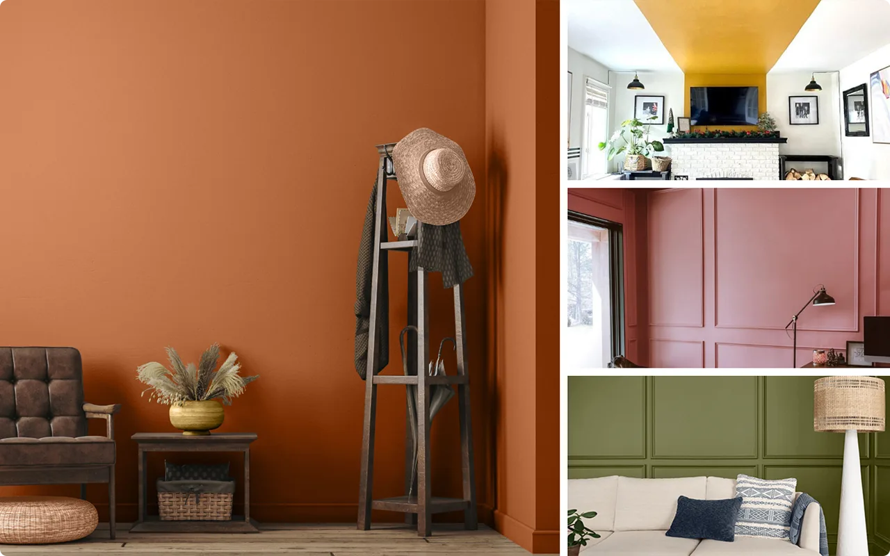
There’s something about a rustic living room that just feels right—cozy, grounded, and welcoming. It’s that mix of natural textures, timeworn charm, and warm tones that makes the space feel instantly lived-in.
But if there’s one element that really pulls it all together, it’s the paint color. The right shade can make your home feel like a modern farmhouse, a cozy cabin, or a vintage retreat without trying too hard.
Over the years, I’ve come across dozens of colors that claim to be “rustic,” but not all of them hit the mark.
So I’ve narrowed it down to 19 tried-and-true favorites that bring out the best in rustic-style living rooms.
If you’re looking for warm neutrals, deep earth tones, or bold heritage-inspired hues, there’s something in this list that’ll speak to your style.

Also Read: 31 Best Living Room Paint Colors for Every Style & Mood
What are Modern Rustic Paint Colors?
Modern rustic paint colors blend the natural charm of traditional rustic design with a cleaner, more updated palette. Think of them as rustic with a fresh twist.
These colors often pull from nature—rich browns, soft greens, warm grays, and muted earth tones—but they’re balanced with modern sensibilities.
That might mean a bit less saturation, more subtle undertones, or pairing rustic shades with contemporary neutrals like greige or soft white.
You’ll see less of the heavy, dark wood-on-wood look and more contrast—like a warm taupe wall with sleek black accents, or a soft sage green against creamy white shiplap.
Modern rustic colors still feel cozy, but they also bring in an air of simplicity and refinement. They let natural materials shine without overpowering the room.

Where to Use Rustic Paint Colors
Rustic paint colors aren’t just for cabins in the woods—they work beautifully in all kinds of homes.
In the living room, they create a warm, grounded feel that encourages you to slow down and settle in. You can use these colors on your main walls, of course, but don’t overlook other opportunities.
Accent walls, fireplace surrounds, exposed beams, built-ins, and even ceilings can all benefit from a rustic tone.
Colors like deep greens, warm reds, or creamy taupes look amazing when paired with stone fireplaces, reclaimed wood shelving, or vintage-style light fixtures. Even trim work or wainscoting painted in a complementary rustic hue can subtly elevate the room.
If you’re working with an open-concept space, these shades can also help define the living area and create a visual “zone” without needing walls.

How to Pick The Best Rustic Paint Color?
Choosing the right rustic paint color comes down to understanding the vibe you want to create. Start by looking at your room’s natural elements—things like flooring, furniture, light sources, and architectural features.
If your space already has warm wood or brick, you might want a paint color that complements rather than competes, like a soft greige or muted olive.
Think about lighting too. South-facing rooms can handle richer, darker shades like terracotta or deep green. North-facing spaces might need something a little warmer or lighter, like golden buff or creamy off-white, to avoid feeling cold.
Also, ask yourself whether you’re leaning more farmhouse or more cabin chic. For farmhouse, look to warm neutrals, soft greens, and cozy whites. If your taste runs a little more rugged or lodge-inspired, bolder colors like rust, coffee brown, and pine green will probably suit you better.
And don’t forget to sample first. Paint looks different in every room depending on the light, so it’s always smart to test a few favorites before committing.

Top 19 Paint Colors That Are Perfect for Rustic-Style Decorating
Here are my favorite Rustic paint colors to decorate with.
1. Sherwin-Williams Rookwood Red SW 2802

This deep, warm red is one of those colors that brings instant character to a room. Sherwin-Williams Rookwood Red has a strong, grounded feel that’s perfect for rustic living rooms with stone fireplaces or dark wood accents.
It’s not just bold—it’s refined. The richness of the red pairs beautifully with natural textures like brick, reclaimed wood, or leather furniture.
If you’re after a color that commands attention without feeling flashy, this is a fantastic starting point.
2. Benjamin Moore Shelburne Buff HC-28

Shelburne Buff is a soft golden neutral that adds a gentle glow to rustic spaces. It leans warm but doesn’t overpower, which makes it ideal for walls that need a cozy backdrop without feeling heavy.
This one’s incredibly versatile—it plays well with exposed beams, antique pieces, and even painted furniture.
I love how it warms up rooms with lots of natural light, but it also adds a touch of sophistication to darker, north-facing spaces.
3. Sherwin-Williams Warm Stone SW 7032
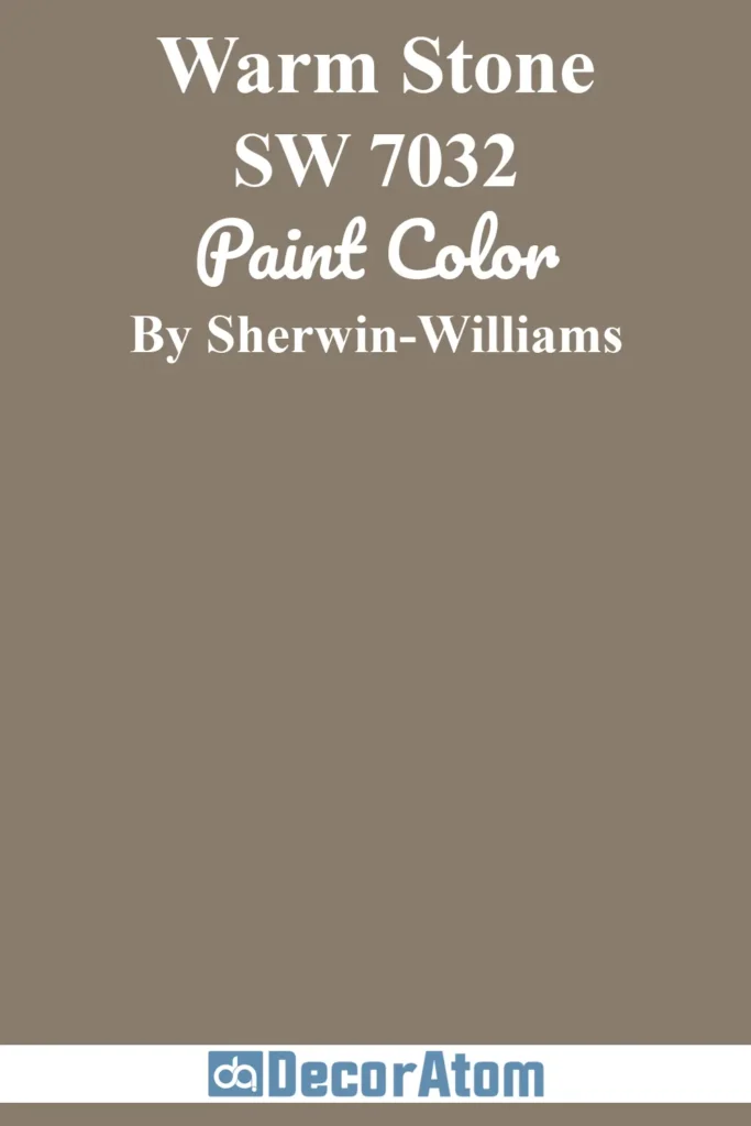
If you’re looking for something earthy and grounded, Warm Stone hits the mark. It’s a greige that leans into brown just enough to feel like a warm hug for your living room walls.
This color mimics the tones you see in natural stone, making it perfect for homes that feature slate flooring or rustic tile.
Paired with off-white trim and natural fibers—like jute or linen—Warm Stone can completely transform a space into a peaceful retreat.
4. Behr Hazelnut Cream 750C-2

Hazelnut Cream is one of those soft, creamy colors that feels instantly calming. It’s light enough to brighten a room but warm enough to keep things from feeling sterile.
If your rustic style leans more toward farmhouse or cottage, this color is a perfect match.
I like using it on the walls when there’s a lot of visual texture in the room—think shiplap, natural wood, or patterned upholstery—because it lets those elements shine without competing for attention.
5. Benjamin Moore Rainy Afternoon 1575

Rainy Afternoon is a moody mix of green and gray that captures the feeling of a storm rolling in over the mountains.
There’s something incredibly calming about it. It’s rich without being dark, which makes it a great option for accent walls or even an entire room if you’re feeling bold.
This one looks especially good with rustic wood tones—walnut, mahogany, or reclaimed barnwood—and it holds its own beautifully next to matte black fixtures or iron hardware.
6. Sherwin-Williams Antiquity SW 6402

Antiquity is where rustic charm meets a slightly unexpected twist. It’s a warm, muted green that feels historic yet fresh—like something you’d find in a weathered countryside inn.
It has just enough yellow in it to keep it from feeling cold, which makes it ideal for cozying up a living space. If you want to bring in a touch of color without committing to anything too bold, Antiquity is a solid middle ground.
7. Behr Peruvian Violet 660F-6

This color might surprise you—it’s a deep, smokey violet that adds a romantic, brooding edge to rustic interiors.
When paired with warm wood and aged brass or copper accents, Behr’s Peruvian Violet brings a layer of richness that’s totally unexpected. It’s not your typical rustic color, but that’s what makes it exciting.
Try it on an accent wall, around a fireplace, or even as a backdrop for a gallery wall filled with vintage art.
8. Behr Sequoia Dusk 700B-6

There’s something incredibly cozy about Sequoia Dusk. It’s a warm taupe with hints of maroon and brown, and it creates the kind of depth that makes a room feel grounded and inviting.
I picture this in a den or reading nook with soft throws, a crackling fire, and built-in bookshelves. It pairs well with creamy whites and deep purples, but it also looks stunning with aged leather and rustic wood.
9. Benjamin Moore Rusty Nail CC-390

Rusty Nail is a bold, burnt orange with a rich rust undertone that makes it feel like it’s been plucked straight from a sun-drenched canyon.
This is a go-to if you’re looking to inject a sense of Southwestern warmth into your living space.
It’s earthy but not dull, and it looks especially stunning with creamy neutrals and cool grays. This shade does well as a statement color on walls or even cabinetry if you want to experiment.
10. Sherwin-Williams Brandywine SW 7710

Brandywine is a warm, reddish-brown that feels timeless and earthy. It leans more toward the traditional side of rustic but still feels fresh when paired with contemporary furniture or layered textures.
It’s one of those colors that works well in both light-filled and dim spaces because of its rich undertones. I love using Brandywine when a room needs depth without going full-on dark.
11. Sherwin-Williams Latte SW 6108
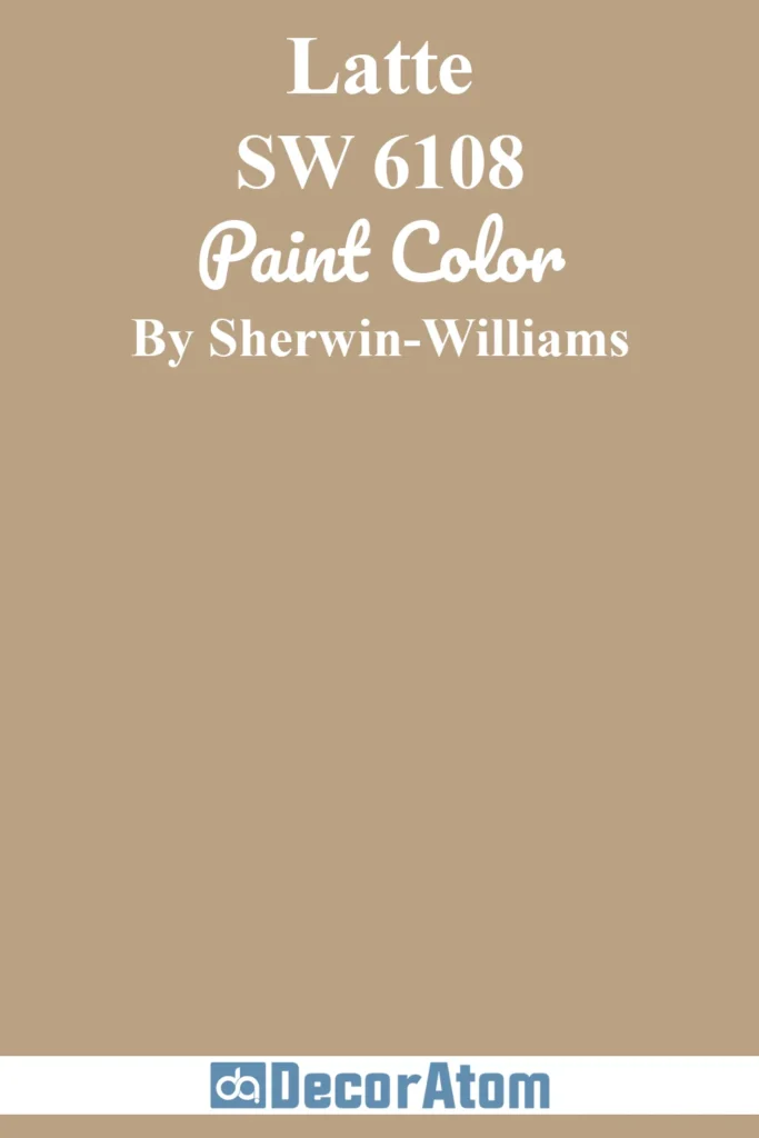
Latte is exactly what it sounds like: smooth, creamy, and warm with a comforting richness. This beige-brown tone feels like your favorite cup of coffee—inviting and dependable.
What makes Latte stand out is its subtle complexity; it’s not just beige, it has a golden warmth underneath that plays beautifully with sunlight.
In a rustic setting, this color thrives alongside linen curtains, warm wood floors, and chunky knit throws. It’s especially effective in spaces where you want a soft, neutral backdrop that still feels grounded and lived-in.
12. Sherwin-Williams Persimmon SW 6339

If you want a rustic color that adds personality without overwhelming the room, Persimmon might be the sweet spot.
It’s a creamy orange with a clay-like quality—imagine weathered adobe walls or a terracotta pot warmed by the sun.
Persimmon works great with whites, rich browns, and deep greens, making it a solid choice for someone wanting that warm desert-inspired aesthetic.
I like using this in rooms that need a little energy but still want to stay within the earthy, grounded palette of rustic design.
13. Behr Cracked Pepper PPU18-1

Cracked Pepper is the kind of dark, dramatic tone that anchors a rustic space. It’s not a pure black—it’s a deep charcoal with a soft, almost smoky edge.
This is the color that gives you moody cabin vibes without feeling cold or industrial.
Use it on an accent wall, built-ins, or even trim if you’re brave—it contrasts beautifully with lighter rustic tones like hazelnut, buff, or warm whites. And if your living room features brass, copper, or black iron accents, Cracked Pepper ties it all together effortlessly.
14. Sherwin-Williams Majolica Green SW 0013

Majolica Green brings a timeless, vintage feel to rustic interiors. It’s a medium green with a soft, heritage-like quality that feels both calm and rooted in nature.
This color reminds me of hand-thrown pottery or antique glass—there’s something artisan about it. It pairs wonderfully with exposed brick, creamy neutrals, and warm metallics like bronze or aged brass.
If you’re going for a collected, cozy look with an old-world charm, this shade is a hidden gem.
15. Behr Civara T18-02

Civara is an unapologetically bold pumpkin orange that radiates warmth and comfort. It’s the kind of color that immediately makes a space feel inviting—especially when layered with rustic woods and natural textures.
What I love about Civara is its ability to stand out without being loud. It works particularly well in rooms that don’t get a lot of natural light, adding that sun-kissed glow to otherwise dark corners.
Pair it with navy, charcoal, or even forest green for a rustic palette that feels elevated and fresh.
16. Sherwin-Williams Auric SW 6692

Auric is a deep golden yellow with real presence. It’s bright but not flashy, bold but not brash. It reminds me of golden wheat fields in late summer—warm, earthy, and radiant.
In a rustic living room, Auric can really shine when used as an accent wall or paired with dark neutrals like slate, espresso, or even muted teal.
It’s also stunning next to warm wood tones, especially walnut or cherry. If you want to bring a little sunshine indoors while keeping things grounded, this is a fantastic pick.
17. Sherwin-Williams Spicy Hue SW 6342

Spicy Hue is like a fiery sunset over the desert—it’s a deep red-orange with a punchy, earthy character.
It adds instant drama and vibrance to a space, yet somehow still feels cozy and approachable.
This color shines in rustic living rooms that embrace eclectic details—think patterned rugs, textured throws, and a mix of vintage and modern pieces.
It’s particularly striking when balanced with neutrals like greige, ivory, or even olive green.
18. Sherwin-Williams Basque Green SW 6426

Basque Green is a lush, nature-inspired green with a touch of softness. It’s not overly bright or minty—there’s a muted undertone that keeps it firmly in rustic territory.
I picture this on shiplap walls or even built-in bookshelves in a living room with worn leather seating and wrought iron lighting. It feels grounded and calming, like a quiet walk through the woods.
Pair it with warm whites, soft tans, or deeper shades like navy for a nature-forward palette that still feels refined.
19. Benjamin Moore Everard Coffee CW-150

Everard Coffee is a deep, soulful brown that feels like it belongs in a vintage lodge or an old-world library.
It has a slight red undertone that gives it warmth and depth, which makes it incredibly cozy in a living room setting.
This shade looks amazing with natural stone, antique brass, and traditional wooden elements.
Use it on the walls for a dramatic, cocooning effect, or bring it in through trim and cabinetry for something a little more subtle but equally rich.
Final Thoughts
Rustic style is more than just a trend—it’s a way of creating a home that feels rooted, welcoming, and effortlessly lived-in. The paint colors you choose are a big part of that.
Whether you lean toward creamy neutrals, earthy greens, or rich terracotta tones, the right shade can transform your space into a warm and inviting retreat.
I hope this list of 19 rustic living room paint colors gave you some fresh inspiration and a few new ideas to explore.
If you’re planning a living room refresh, start with one of these shades and build around it with texture, light, and meaningful pieces that make your space feel like home.