
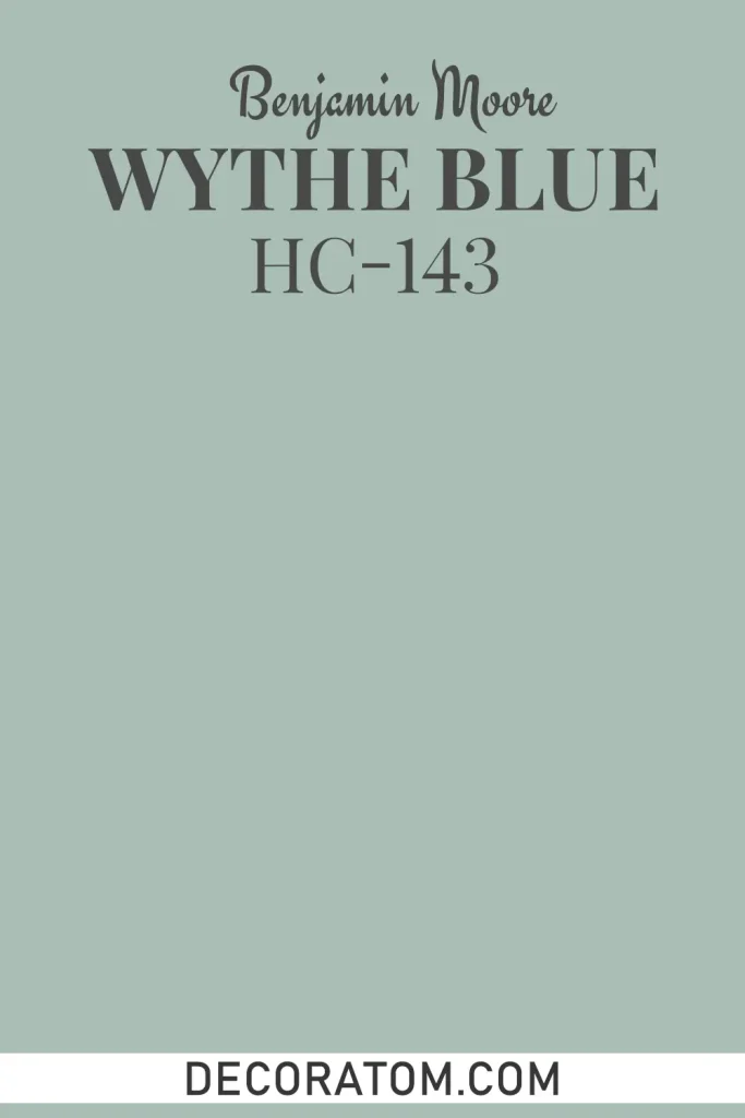
I’ll be honest — I didn’t expect to fall this hard for a blue-green paint color. But here I am, writing a whole review about Benjamin Moore Wythe Blue HC-143, because it genuinely surprised me in the best way possible.
I first came across this color when I was looking for something that felt calm without being cold, and historical without feeling stuffy. Wythe Blue kept popping up in my research, and once I saw it on an actual wall, I got it immediately.
There’s something about this color that just works — in old homes, in modern spaces, in coastal rooms, in farmhouse kitchens. It has this rare quality of fitting in almost anywhere without losing its character.
Named after the Wythe House in Colonial Williamsburg, Virginia, this color carries a little bit of history with it. Benjamin Moore actually developed it as part of their Historic Colors collection, which is a curated line of shades inspired by real architectural history.
That context matters, because it explains why Wythe Blue feels so grounded and intentional. It’s not a trendy color thrown together to sell cans — it has roots.
In this review, I’m going to walk you through everything you need to know before committing to this color: its undertones, how it behaves under different lighting, what to pair it with, and where it works best. By the end, you’ll know whether Wythe Blue is the right fit for your space — or not.
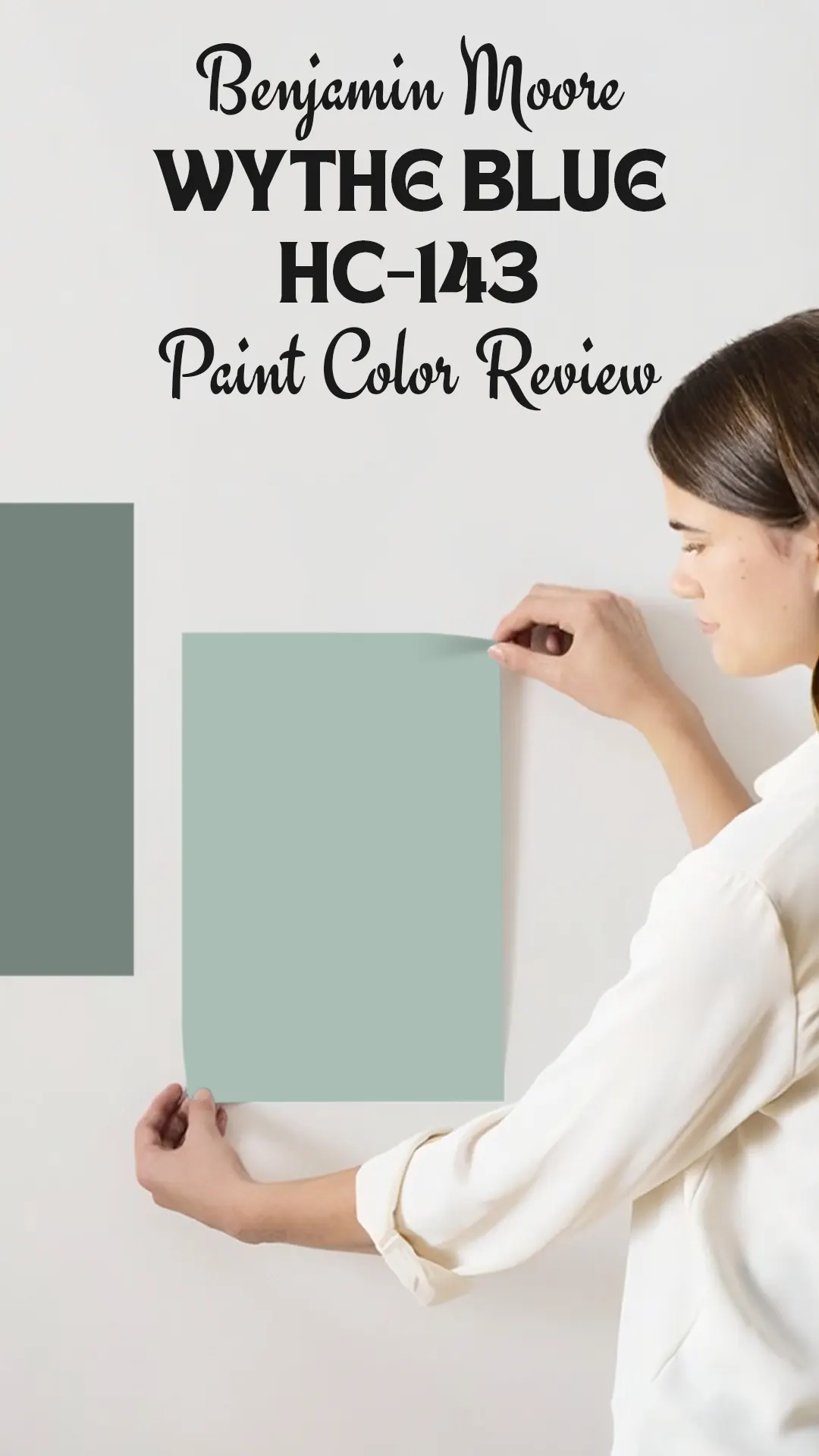
What Color is Benjamin Moore Wythe Blue HC-143?
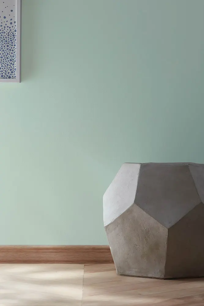
Wythe Blue is a soft, muted blue-green. Think of it as the middle ground between a classic sky blue and a gentle seafoam green — it’s neither too blue nor too green, which is a big part of its charm.
It has a distinctly historical, almost vintage quality to it, the kind of color you’d find on old colonial shutters or in a well-preserved Victorian parlor. It’s not a bold or saturated color by any means — it leans more toward the soft, understated side of the spectrum.
Is It a Warm or Cool Color?
Wythe Blue is a cool color. Its blue-green base keeps it firmly on the cooler side of the color wheel. That said, it’s not the kind of cool that makes a room feel stark or uninviting. The slight green in it softens the coolness just enough to keep things comfortable and livable.
LRV of Benjamin Moore Wythe Blue HC-143
LRV stands for Light Reflectance Value — basically, it tells you how much light a color reflects back into a room. It runs on a scale from 0 (pure black, reflects nothing) to 100 (pure white, reflects everything).
Wythe Blue has an LRV of 48.11, which puts it right in the middle of the scale. That means it’s not a light, airy color, but it’s not a dark, heavy one either. It will absorb a moderate amount of light, so in smaller or dimmer rooms, it can feel a bit deeper than you might expect. In rooms with good natural light, it’ll show up beautifully — neither washed out nor overwhelming.
Undertones of Benjamin Moore Wythe Blue HC-143
Wythe Blue has green undertones, which is the key thing to understand about this color. Those green undertones are what give it that soft, slightly aqua or teal-adjacent quality.
Depending on the light in your room and the colors surrounding it, the green can become more noticeable or pull back into the background.
In some lighting, you might even catch a very faint gray in there, which helps it read as a sophisticated, complex color rather than a flat, one-dimensional blue.
How Different Types of Lighting Affect Benjamin Moore Wythe Blue HC-143?
Lighting changes this color more than you might expect, so it’s worth thinking through before you commit.
In natural daylight, Wythe Blue looks its most balanced — the blue and green sit comfortably together, and the color feels fresh and soft.
In north-facing rooms that get indirect, cooler light, the green undertones tend to pull back, and the color reads more blue and slightly moodier. It can feel a little deeper and more serious in these spaces.
In south-facing rooms with warm, bright sunlight, the green comes forward more noticeably, giving the color an almost aqua or seafoam quality. It looks lighter and more energetic here.
Under artificial warm lighting (think incandescent or warm LED bulbs), Wythe Blue can take on a softer, slightly more muted tone — the warmth of the light tones down the coolness of the color, which can actually make it feel cozier.
Under cool or bright white artificial lighting, it stays truer to its base tone and can look a bit crisper and more blue-green.
Trim Colors to Pair With Benjamin Moore Wythe Blue HC-143
Trim can make or break how a wall color lands, so getting this right matters. Here are three that work really well with Wythe Blue:
1. Benjamin Moore White Dove OC-17 — This is a soft, warm white with just a hint of warmth to it. It doesn’t fight with Wythe Blue’s cool tones; instead, it balances them out and makes the whole combination feel inviting rather than cold. It’s my top pick for trim with this color.
2. Benjamin Moore Chantilly Lace OC-65 — If you want something crisper and brighter, Chantilly Lace is a clean, true white that creates a sharp, fresh contrast with Wythe Blue. It gives the room a more polished, almost coastal look.
3. Benjamin Moore Simply White OC-17 — A step warmer than Chantilly Lace, Simply White brings a little softness to the pairing without being as creamy as White Dove. It’s a great middle-ground option if you want clean but not stark.
Colors Similar to Benjamin Moore Wythe Blue HC-143
Finding the right paint color is rarely a straight line. You fall for one shade, swatch it on your wall, and suddenly it looks completely different than you imagined — either too green, too bright, or just slightly off from what you pictured in your head. That’s the whole reason it makes sense to look at similar colors before making a final decision.
When it comes to Wythe Blue, there are several alternatives worth exploring, both from Benjamin Moore and Sherwin-Williams. Some lean a bit bluer, some pull greener, and some feel a shade lighter or darker — but they all share that same calm, muted, blue-green family DNA.
Comparing them side by side on your actual walls (in actual sample form, please — never judge paint from a tiny chip card) can help you figure out if Wythe Blue is truly the one, or if one of its neighbors is a better fit for your specific room and lighting conditions. This step saves a lot of regret later.
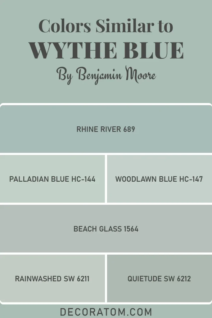
Here are six colors worth comparing:
- Benjamin Moore Rhine River 689
- Benjamin Moore Palladian Blue HC-144
- Benjamin Moore Woodlawn Blue HC-147
- Benjamin Moore Beach Glass 1564
- Sherwin-Williams Rainwashed SW 6211
- Sherwin-Williams Quietude SW 6212
Colors That Go With Benjamin Moore Wythe Blue HC-143
One of the things I appreciate most about Wythe Blue is that it’s genuinely easy to build a color palette around. It doesn’t demand attention the way a saturated or bold color does — it settles into a space and plays nicely with a wide range of other shades. That makes it a practical choice if you’re trying to coordinate across multiple rooms or pull together a cohesive look throughout a home.
The colors that work best with Wythe Blue tend to fall into two camps: warm neutrals that balance out its cool undertones, and deeper or earthier shades that give the palette some grounding and contrast.
You don’t want to pair it with colors that are also cool and muted, or the whole scheme starts to feel flat and toneless. Instead, bringing in something with a little warmth — a creamy white, a soft brown, a terracotta — is what gives the pairing life and keeps the room from feeling one-note. When you get the balance right, Wythe Blue can anchor a really beautiful, layered color story.
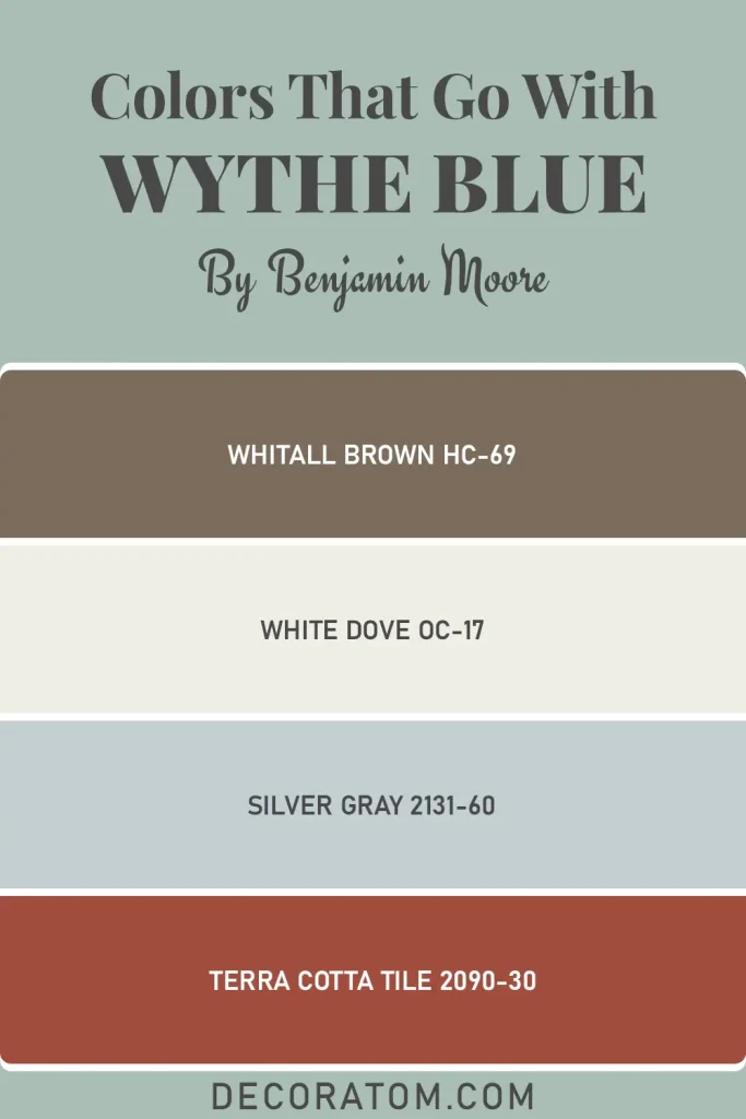
Here are four coordinating colors that pair well with Wythe Blue:
- Whitall Brown HC-69
- White Dove OC-17
- Silver Gray 2131-60
- Terra Cotta Tile 2090-30
Where to Use Benjamin Moore Wythe Blue HC-143?
Wythe Blue is one of those rare colors that travels well — it doesn’t get stuck in just one room type or one design style. Here’s where I think it really earns its place:
- Living rooms — It creates a calm, welcoming atmosphere without making the space feel sleepy. It works especially well in living rooms with natural wood furniture or warm-toned textiles.
- Bedrooms — The soft, cool quality of this color is genuinely restful. It’s the kind of shade that helps a bedroom feel like an actual retreat.
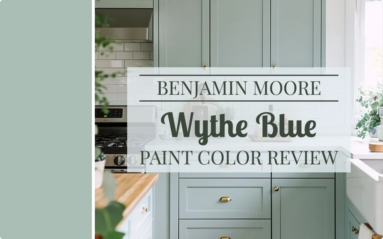
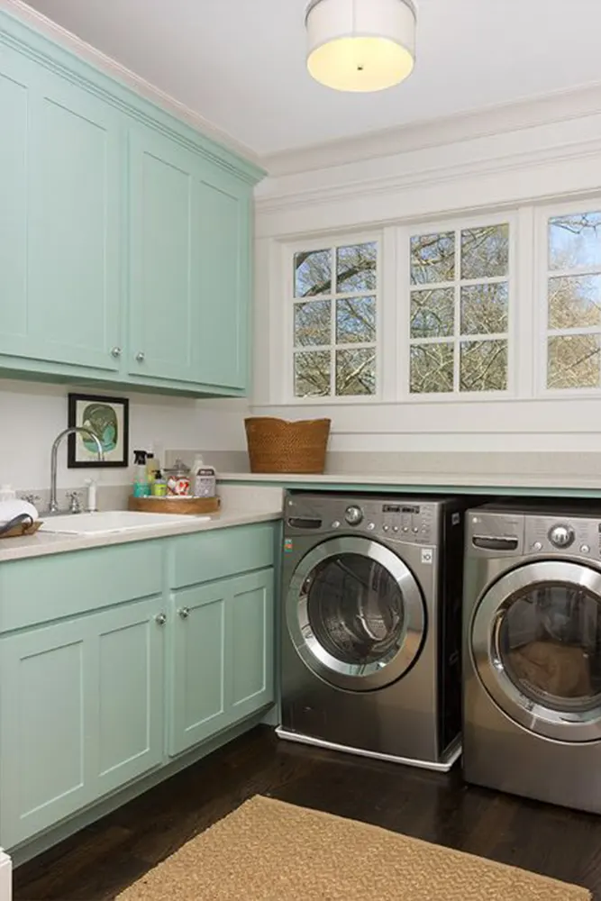
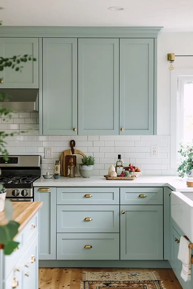
- Kitchens — Wythe Blue on kitchen cabinets is a look that has circulated for good reason. It reads as fresh and a little unexpected without being loud.
- Home offices — Cool, focused, not distracting. It’s a great background color for a space where you need to actually concentrate.
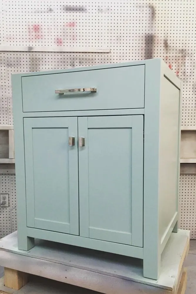
- Bathrooms — The blue-green undertones play up a spa-like quality in bathrooms, especially when paired with white fixtures and natural materials.
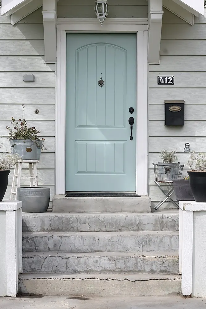
- Exteriors — Wythe Blue has the kind of historical credibility that looks stunning on a home’s exterior, particularly on older or traditional-style architecture. Paired with crisp white trim, it’s a classic.
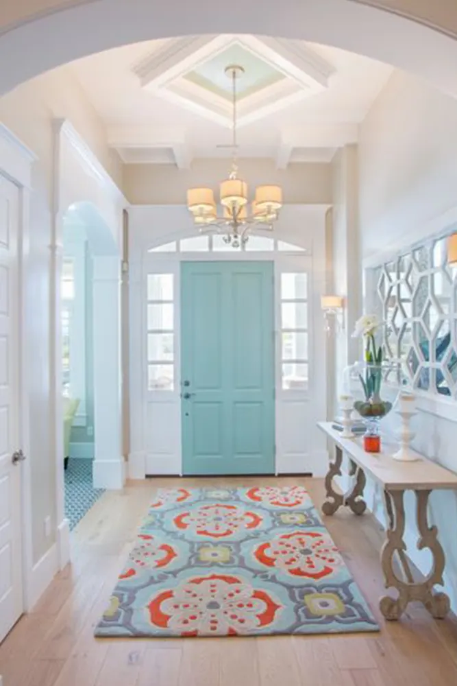
- Entryways and hallways — These transitional spaces benefit from a color with character, and Wythe Blue delivers that without being overwhelming in a narrow space.
Why I Love Benjamin Moore Wythe Blue HC-143
I’ll tell you exactly what got me: it’s the fact that this color does not try too hard.
So many blue-greens either lean aggressively teal or sit so close to gray that they lose all personality. Wythe Blue sits in this comfortable middle space where it’s clearly a color — you absolutely notice it — but it never feels like it’s shouting at you. There’s a quietness to it that I find genuinely appealing.
I also love that it photographs beautifully. That might sound like a superficial thing to say, but for anyone designing a space they actually want to live in and share, it matters. Wythe Blue has a quality in photos that feels natural and not oversaturated — it looks in pictures the way it looks in real life, which is rarer than you’d think with paint colors.
And honestly? The history behind it adds something. Knowing this color is connected to Colonial Williamsburg, that it’s based on real pigments from a real historical period, makes it feel less arbitrary. It’s not a color someone invented to chase a trend — it’s a color that has been working on walls for centuries, and that kind of track record is hard to argue with.
Final Thoughts
If you’ve been going back and forth on Wythe Blue, let me just say this: it tends to deliver on its promise. It’s the kind of color that looks good in the swatch, but more importantly, it holds up when you actually live with it.
It shifts beautifully through different times of day and different lighting conditions, it pairs with a wide range of furniture and finishes, and it has a timeless quality that keeps it from feeling dated.
My honest advice — sample it. Get the peel-and-stick samples or paint a large swatch directly on your wall and watch it for a few days. See it in the morning light, the afternoon light, and under your lamps at night. That’s the only way to really know if it’s the right fit for your specific room.
But if it works in your space the way it’s worked in so many others? You’re going to love it.