
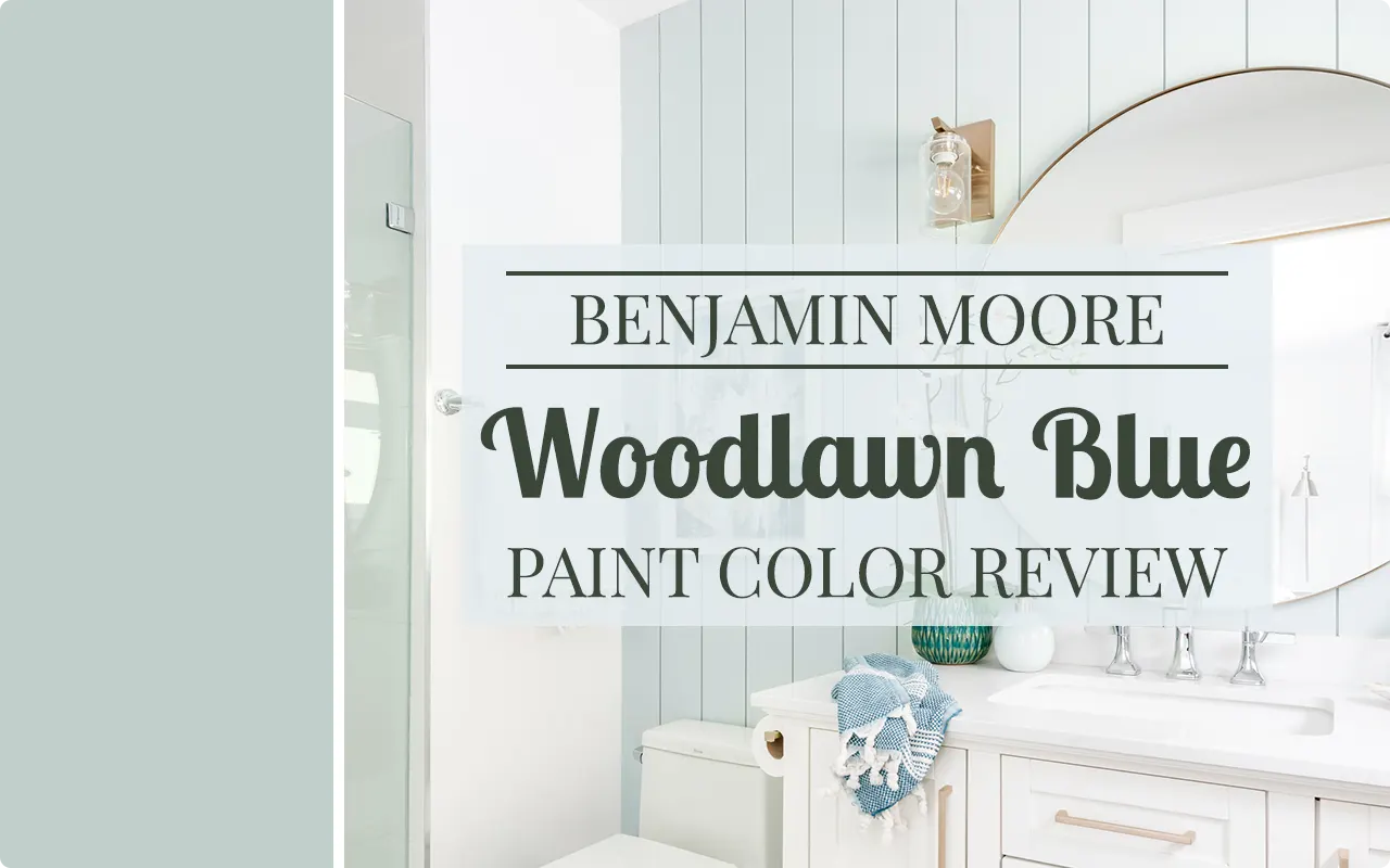
I still remember the first time I came across Woodlawn Blue HC-147. I was scrolling through paint swatches online. Then I spotted this color, and something about it just made me stop. It had this quiet, collected vibe that I couldn’t shake.
Woodlawn Blue is part of Benjamin Moore’s Historic Colors collection, which already tells you something about it. These are colors that have been around, tested by time, and proven themselves in real homes.
They’re not trendy color-of-the-year picks that you’ll regret in three years. Woodlawn Blue, specifically, draws its character from early American architecture and interiors, and that heritage shows in how it carries itself on a wall.
What I love about it is that it doesn’t try too hard. It’s not screaming for attention the way a bold navy or a bright turquoise would. It sits somewhere in that comfortable middle ground, a blue-green that feels both airy and grounded at the same time.
It can work in a coastal cottage, a traditional colonial, a modern farmhouse, and even a contemporary space if you style it right. That kind of versatility is rare, and it’s a big part of why this color has stayed relevant for so long.
If you’ve been on the fence about using a blue-green in your home and you’re not sure where to start, I think Woodlawn Blue might be the answer you’ve been looking for. Let me walk you through everything I know about this color so you can decide for yourself.
What Color is Benjamin Moore Woodlawn Blue?
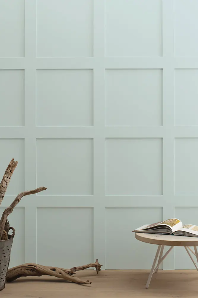
Benjamin Moore Woodlawn Blue HC-147 is a soft, muted blue-green. It sits right at that intersection where blue and green meet without fully committing to either one, and that’s exactly what makes it so interesting.
On most walls, it reads as a dusty, calm blue with a noticeable green presence underneath. It’s not a loud color. It’s more like the color of still water on a cloudy morning, or the faded shutters on an old New England house.
Is It a Warm or Cool Color?
Woodlawn Blue leans cool. The blue-green combination naturally pulls it toward the cooler side of the spectrum, which means it tends to feel refreshing and calm in a room rather than cozy and warm. That said, the muted, slightly dusty quality of this color keeps it from feeling cold or clinical. It has enough softness to feel livable and relaxed.
LRV of Benjamin Moore Woodlawn Blue
LRV stands for Light Reflectance Value, and it’s a number that tells you how much light a paint color bounces back into a room. The scale runs from 0 (pure black, absorbs everything) to 100 (pure white, reflects everything). The higher the number, the lighter and brighter the color will feel on your walls.
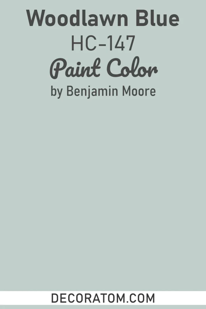
The LRV of Benjamin Moore Woodlawn Blue HC-147 is 60.65, which puts it solidly in the medium-light range. In practical terms, this means it won’t darken a room noticeably, and it holds up well even in spaces that don’t get a flood of natural light. It’s light enough to keep things feeling open, but it still carries enough color depth to make a real statement on the wall.
Undertones of Benjamin Moore Woodlawn Blue
Woodlawn Blue carries green undertones, and they’re pretty apparent once you start looking for them. This is not a pure, sky blue, because the green running underneath it gives it that blue-green, almost aqua quality that the color is known for.
In certain lighting, the green can push forward quite strongly, making the color read more sage-adjacent. In other conditions, it pulls back and the blue takes over.
There’s also a subtle gray undertone present, which is what gives this color its muted, historic quality. Without that gray, it would be much more saturated and tropical. The gray tones it down and gives it that aged, timeless character that makes it work so well in traditional and transitional spaces.
How Different Types of Lighting Affect Benjamin Moore Woodlawn Blue
Lighting changes Woodlawn Blue quite a bit, and it’s worth thinking about before you commit.
In natural north-facing light, which is cool and indirect, this color can lean more toward a muted gray-green. The blue softens, and the green and gray undertones come forward. It still looks beautiful, but it shifts noticeably.
In south-facing rooms with warm, generous natural light, Woodlawn Blue really sings. The warmth from the light balances out the cool undertones, and the color feels bright, fresh, and inviting without looking washed out.
Under warm artificial light (like incandescent or soft white bulbs), the color can shift slightly warmer and the green tones become more prominent. It can take on a slightly more teal quality in these conditions.
Under cool LED or daylight bulbs, the blue dominates and the color stays crisp and clean.
If you’re seriously considering this color, I’d strongly recommend getting a sample and watching it at different times of day before making the final call.
Trim Colors to Pair With Benjamin Moore Woodlawn Blue
The right trim color can make Woodlawn Blue look intentional and polished. The wrong one can throw the whole room off. Here are three options that work really well:
- Benjamin Moore White Dove OC-17 — This is a warm, creamy white, and it pairs beautifully with Woodlawn Blue because the warmth balances the cool tones in the wall color. It softens the contrast without disappearing into the background.
- Benjamin Moore Chantilly Lace OC-65 — If you want a crisper, cleaner look, this bright white is a great choice. It creates a sharp, defined contrast against the blue-green walls, which works especially well in rooms with lots of natural light or a more modern aesthetic.
- Benjamin Moore Simply White OC-17 — This sits right between warm and bright, making it incredibly versatile. It complements Woodlawn Blue without pulling too far in either direction, and it works across a wide range of interior styles.
Colors Similar to Benjamin Moore Woodlawn Blue
Finding the right blue-green is a process, and I think a lot of people end up going through several samples before they land on the one that feels right. If you’ve fallen for the general vibe of Woodlawn Blue but want to explore what else is out there in that same family, there are some great options worth considering.
Similar colors in this range tend to share that same dusty, muted quality where blue and green blur together into something soft and historically influenced. The differences between them can be subtle but meaningful. Some lean slightly bluer, some push more into green territory, and others carry a touch more gray.
Comparing them side by side in your specific space is really the only way to know which one is the right fit. Paint colors behave differently depending on the room, the light, and what’s around them, so what looks identical on a chip can read quite differently on the wall.
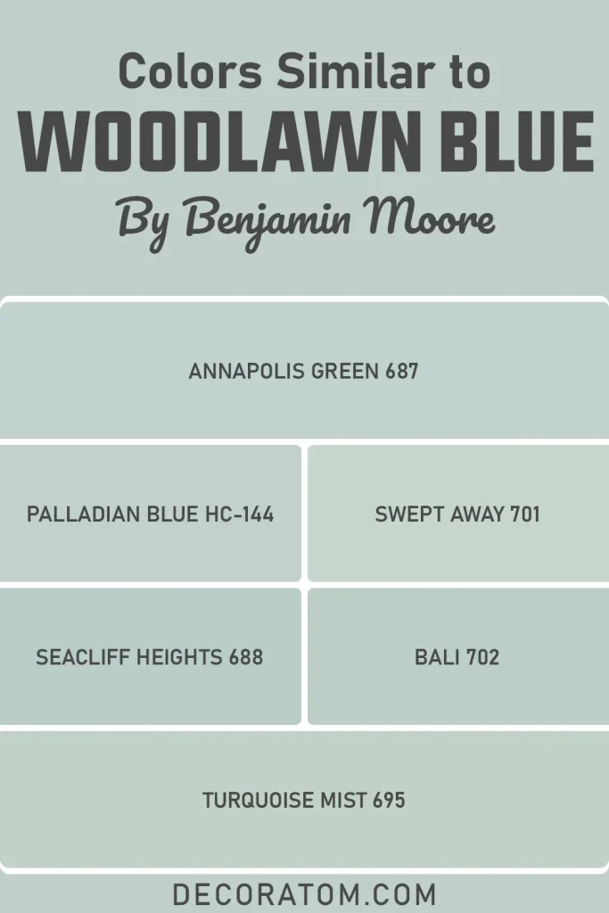
Here are six colors similar to Woodlawn Blue:
- Annapolis Green 687 – Benjamin Moore
- Palladian Blue HC-144 – Benjamin Moore
- Swept Away 701 – Benjamin Moore
- Seacliff Heights 688 – Benjamin Moore
- Bali 702 – Benjamin Moore
- Turquoise Mist 695 – Benjamin Moore
Colors that Go With Benjamin Moore Woodlawn Blue
One of the things that makes Woodlawn Blue such a practical choice is how well it plays with other colors. It doesn’t dominate a palette, and it doesn’t fight with its neighbors. Instead, it tends to anchor a room and let the other colors around it breathe.
When you’re building a coordinating palette around this color, you want to think about balance. Since Woodlawn Blue is cool and muted, it pairs well with warm neutrals that offset its coolness, crisp whites that highlight its freshness, and deeper, richer tones that give the overall palette some grounding and contrast.
A well-chosen coordinating color doesn’t just look nice next to Woodlawn Blue on a swatch card — it makes the whole room feel more cohesive and considered. Getting this part right is honestly what separates a room that looks designed from one that just looks painted.
Take the time to test your coordinating choices as samples on the wall alongside Woodlawn Blue before you commit to anything.
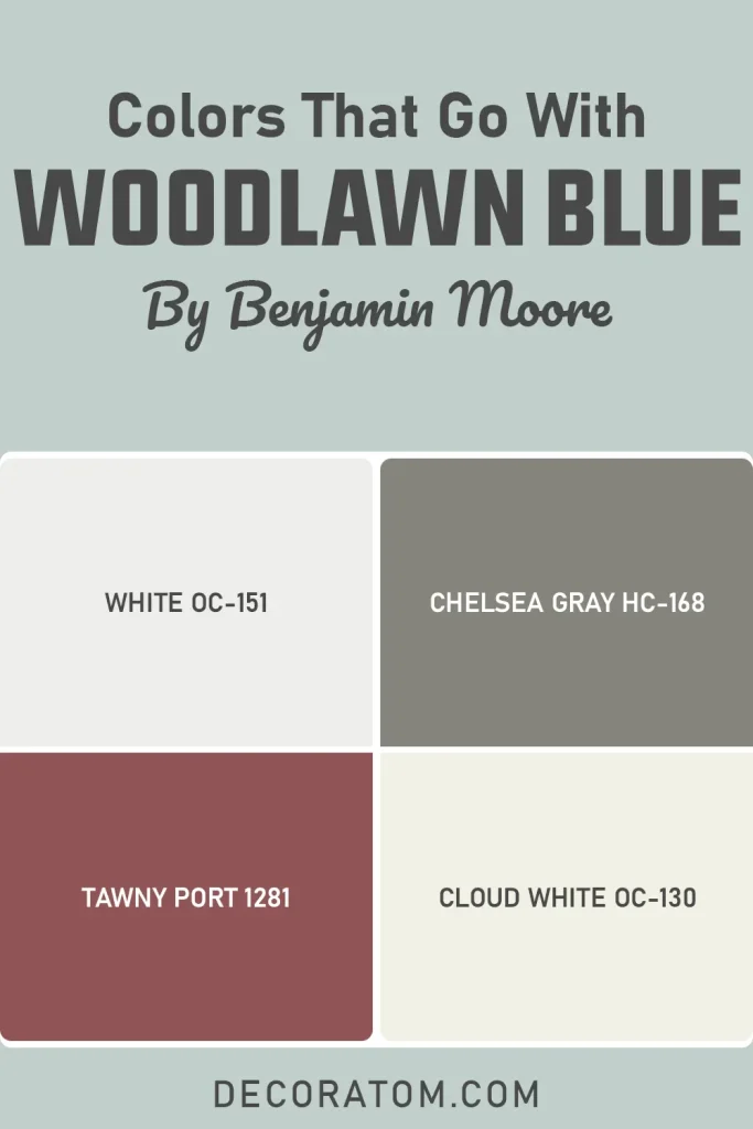
Here are four colors that go beautifully with Woodlawn Blue:
- White OC-151 – Benjamin Moore
- Chelsea Gray HC-168 – Benjamin Moore
- Tawny Port 1281 – Benjamin Moore
- Cloud White OC-130 – Benjamin Moore
Where to Use Benjamin Moore Woodlawn Blue?
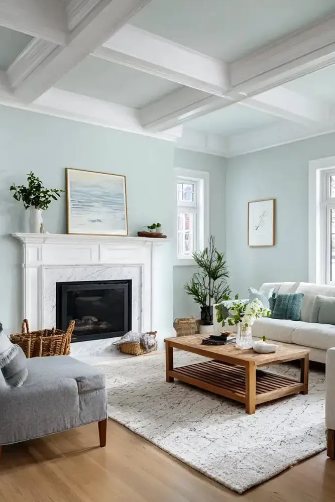
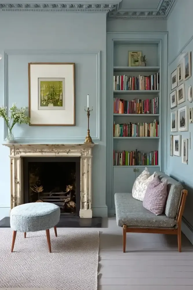
Woodlawn Blue is one of those colors that doesn’t box itself into one room. It has a personality that translates across a lot of different spaces in the home, and I think that’s part of why it keeps showing up in interior design circles. Here’s where I think it works best:
- Living Room — It brings a calm, collected energy to a living room without making it feel cold. Pair it with warm wood tones and natural textiles to keep the space feeling grounded.
- Bedroom — The cool, muted quality of this color makes it genuinely restful. It’s the kind of wall color that makes a bedroom feel like an actual retreat.
- Kitchen — As a kitchen cabinet color, Woodlawn Blue looks stunning. It adds character and color without going overboard, especially against white countertops or brass hardware.
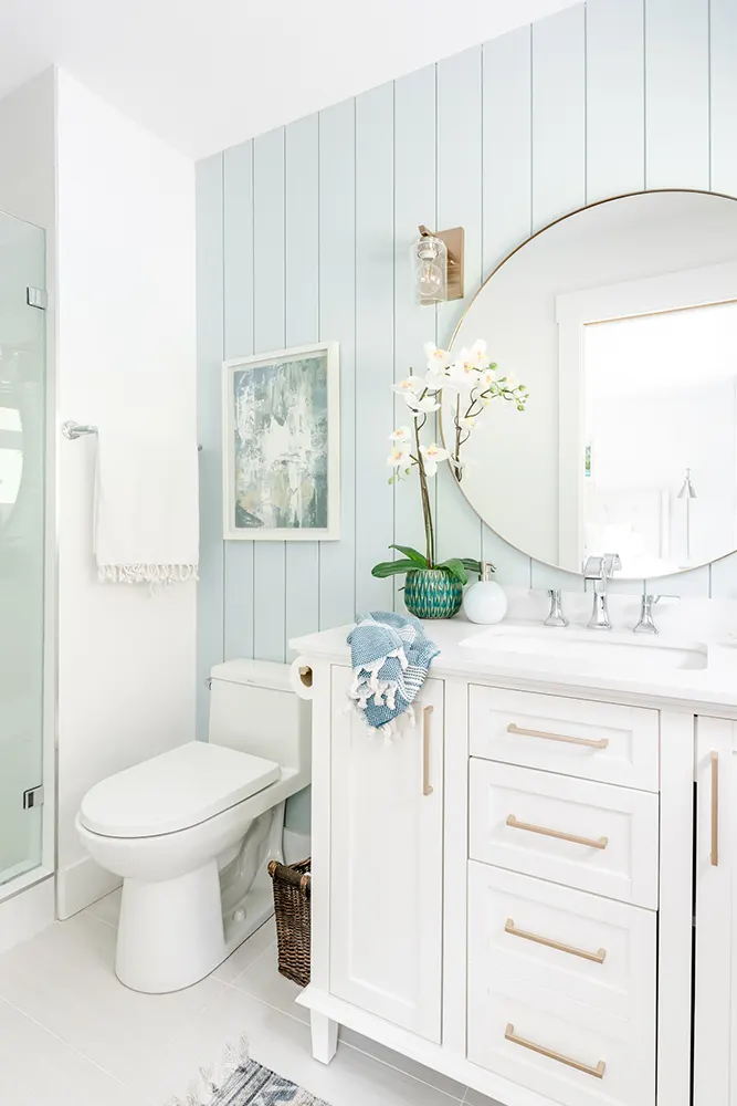
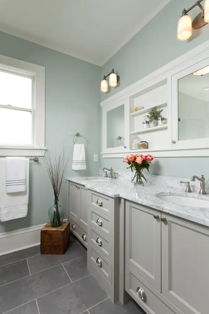
- Bathroom — It has a natural affinity with bathrooms because of its water-adjacent quality. It feels clean, fresh, and appropriately spa-like.
- Home Office — Cool colors are known to support focus and concentration, and Woodlawn Blue delivers that without making the space feel sterile.
- Exterior — This is historically where this color comes from, and it absolutely shines on the outside of a home, especially against white trim and black shutters.
- Dining Room — It creates an intimate but not heavy atmosphere in a dining room, which is harder to pull off than it sounds.
Why I Love Benjamin Moore Woodlawn Blue
Honestly? I love it because it doesn’t feel like a decision I’d ever regret. A lot of paint colors are exciting in the moment and exhausting three years later. Woodlawn Blue doesn’t do that. It has this timeless, settled quality that just works — in old houses, in new builds, in rooms with a lot of furniture, and in rooms that are barely furnished.
I also love that it’s not instantly categorizable. When people walk into a room painted in Woodlawn Blue, they don’t always immediately say “oh, blue” or “oh, green.” There’s a little bit of mystery to it. That nuance is something I genuinely appreciate in a paint color, because it means the room feels layered and interesting even before you’ve added a single piece of decor.
And then there’s the practical side: that LRV of 60.65 means it holds up in spaces that don’t get ideal natural light, which is a real consideration in most homes. It’s not a color that only works in a sun-drenched studio with floor-to-ceiling windows. It works in real rooms, for real people, and that matters to me more than almost anything else when I’m evaluating a paint color.
Final Thoughts
If you’re drawn to colors that feel calm, considered, and a little bit historic, Woodlawn Blue HC-147 deserves a serious spot on your shortlist. It’s not a flashy color, and it’s not trying to be. What it is, is reliable in the best possible way. It brings something meaningful to a room without demanding all the attention, and it has the kind of staying power that makes it a genuinely smart investment for your home.
My honest advice: order a sample, put it up on a few different walls in the room you’re considering, and live with it for a couple of days. Watch how it changes through the morning, afternoon, and evening. I’m willing to bet that by the end of those two days, you’ll already know your answer. For most people, that answer ends up being yes.