
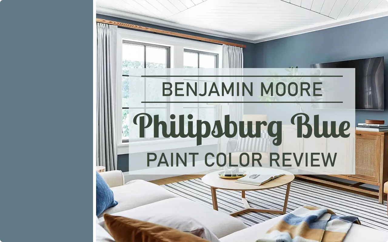
I have painted a lot of walls over the years, and I will be honest — most of the time, I second-guess my color choices at least once or twice before I commit. But with Philipsburg Blue HC-159 by Benjamin Moore, that hesitation never really showed up. From the moment I saw this color on a swatch card, something clicked. It felt considered, calm, and genuinely beautiful without trying too hard.
Philipsburg Blue is part of Benjamin Moore’s Historical Collection, which already tells you something about its character. These are colors that have stood the test of time, and this one is no exception.
It carries the kind of quiet confidence that a lot of trendy colors just cannot pull off. It does not scream for attention, but once it is on your walls, it holds the room together in a way that is hard to put into words until you actually see it.
What drew me in personally was how it manages to feel both fresh and familiar at the same time. It is the kind of blue that reminds you of old New England homes, of classic interiors done right, and of that one perfectly decorated room you walked into and immediately wanted to live in. There is real history in this color, and somehow it still feels completely relevant today.
In this review, I am going to walk you through everything I have noticed about Philipsburg Blue — how it looks in different lights, what colors work with it, where it shines the most, and why I genuinely think it deserves a spot on your shortlist if you are looking for a blue that has real depth and personality.
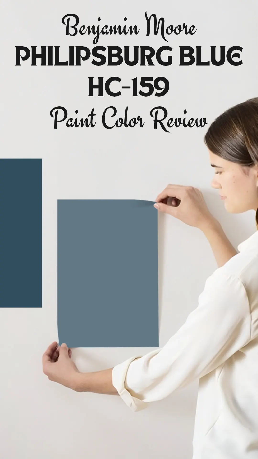
What Color is Benjamin Moore Philipsburg Blue?
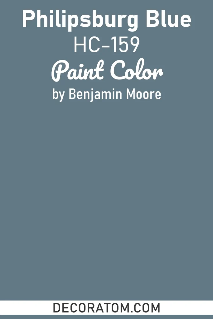
Philipsburg Blue HC-159 is a medium-toned, muted blue with a distinctly historic feel. It sits somewhere between a slate blue and a classic colonial blue — not too dark that it feels heavy, and not too light that it loses its character. Think of it as a blue that has been toned down just enough to feel sophisticated rather than loud.
Is It a Warm or Cool Color?
Philipsburg Blue leans cool. It has that natural coolness that most blue tones carry, but its muted, slightly grayish quality keeps it from feeling cold or stark. In certain lights, especially warmer artificial lighting, it can soften up quite a bit and feel more balanced. But at its core, yes — this is a cool-toned color.
LRV of Benjamin Moore Philipsburg Blue
LRV stands for Light Reflectance Value, and it is basically a number that tells you how much light a paint color bounces back into a room. The scale runs from 0 (pure black, reflects no light) to 100 (pure white, reflects all light). The higher the number, the lighter and brighter the color will feel on your walls.
Philipsburg Blue HC-159 has an LRV of 19.06, which puts it on the darker side of the scale. This means it absorbs a good amount of light rather than reflecting it back, so in smaller or poorly lit rooms, it can make the space feel more enclosed and intimate.
In a larger, well-lit room though, that depth works in its favor and gives the space a really grounded, rich quality. Just something to keep in mind before you commit to painting an entire room.
Undertones of Benjamin Moore Philipsburg Blue
Philipsburg Blue carries subtle gray and green undertones beneath its primary blue surface. The gray keeps it from reading as a bright or saturated blue, giving it that muted, aged quality that feels so at home in traditional and transitional spaces.
The green undertone is not obvious at first glance, but it tends to come forward in natural daylight — especially on overcast days — and gives the color a slightly earthy, almost coastal quality.
These undertones are a big part of what makes this color feel complex and layered rather than flat or one-dimensional.
How Different Types of Lighting Affect Benjamin Moore Philipsburg Blue?
Lighting plays a huge role with Philipsburg Blue, and I have seen it shift noticeably depending on the time of day and the light source in the room.
In natural north-facing light, which is cooler and more consistent, the color deepens and leans more toward a moody slate blue. The gray undertones become more prominent here.
In south-facing rooms with warm, bright sunlight, Philipsburg Blue softens noticeably. It picks up a bit more warmth and can almost read as a blue-gray rather than a true blue.
Under warm artificial lighting (like incandescent or warm LED bulbs), the color calms down and takes on a cozier, more relaxed tone. The green undertone tends to quiet down in this light.
Under cool or daylight LED bulbs, it stays truer to what you see on the swatch — a crisp, medium blue with gray depth.
I always recommend grabbing a sample pot and painting a large swatch on the wall before committing. Observe it at different times of day. Philipsburg Blue is one of those colors that genuinely looks different from morning to evening.
Trim Colors to Pair With Benjamin Moore Philipsburg Blue
Trim can either make or break a paint color, and with a medium-dark blue like Philipsburg Blue, getting the trim right matters. Here are the three that I think work best:
1. Benjamin Moore Chantilly Lace OC-65
This is one of the cleanest, crispest whites Benjamin Moore makes, and it creates a sharp, classic contrast against Philipsburg Blue. It makes the color pop without competing with it. If you want that timeless, colonial-style look, this is the combination to go with.
2. Benjamin Moore White Dove OC-17
If Chantilly Lace feels a little too bright for you, White Dove is a softer, warmer alternative. It pairs beautifully with Philipsburg Blue by balancing out its cool undertones with just a touch of warmth. The result feels more relaxed and lived-in rather than formal.
3. Benjamin Moore Simply White OC-17
Simply White sits between the two in terms of warmth and brightness. It has just enough warmth to complement the blue’s gray and green undertones without going too creamy. It is a safe, reliable choice that works in almost any room.
Colors Similar to Benjamin Moore Philipsburg Blue
Finding a backup option or a close match to Philipsburg Blue is something a lot of people look for — maybe you want to compare prices across brands, or you just want to see how similar options stack up before making a final call.
The thing about Philipsburg Blue is that its specific blend of gray, green, and blue undertones is not the easiest combination to replicate exactly. A color might look similar in a photo but read completely differently on the wall because of its undertone mix or its LRV.
That said, there are several colors from both Benjamin Moore and Sherwin Williams that come close. Some share the same muted quality, others match the depth of the tone, and a few carry similar gray-blue characteristics that give off the same kind of historic, grounded feel.
I have pulled together six options that I think are worth looking at side by side with Philipsburg Blue before you decide. Do not just trust the swatches online — pick up samples of the ones that interest you and test them in your specific lighting conditions.
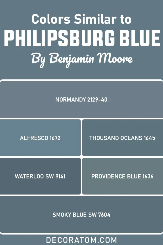
- Normandy 2129-40 – Benjamin Moore
- Alfresco 1672 – Benjamin Moore
- Thousand Oceans 1645 – Benjamin Moore
- Providence Blue 1636 – Benjamin Moore
- Waterloo SW 9141 – Sherwin Williams
- Smoky Blue SW 7604 – Sherwin Williams
Colors that Go With Benjamin Moore Philipsburg Blue
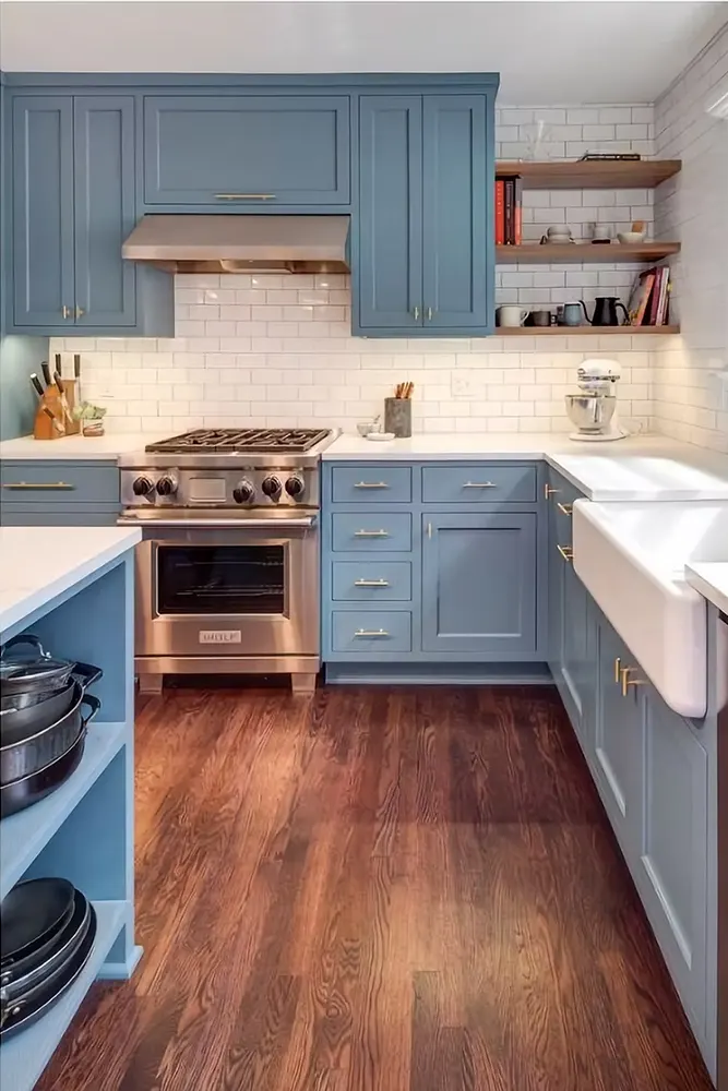
One of my favorite things about Philipsburg Blue is how well it plays with other colors. It is not a demanding color — it does not require everything around it to bend to its personality. Instead, it gives you real flexibility in how you build a palette around it.
That said, it does have preferences. Because it leans cool and carries those muted gray-green undertones, it tends to pair best with colors that either complement its coolness or offer a grounded contrast through warmth and neutrality.
The best coordinating colors for Philipsburg Blue are the ones that keep the overall palette feeling balanced and intentional. Warm off-whites and creamy neutrals are natural partners because they soften the blue’s coolness and add a sense of comfort to the space. Earthy tones and soft taupes also work well in adjacent rooms or as accent colors.
The goal is to create a palette that feels cohesive rather than color-blocked. I have put together a list of four Benjamin Moore colors that I think work really well alongside Philipsburg Blue, whether you are using them on trim, ceilings, adjacent walls, or furniture.
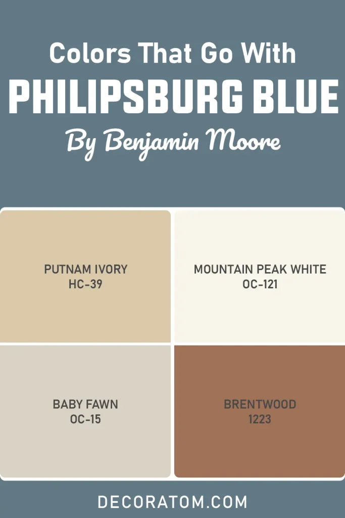
- Putnam Ivory HC-39 – Benjamin Moore
- Mountain Peak White OC-121 – Benjamin Moore
- Baby Fawn OC-15 – Benjamin Moore
- Brentwood 1223 – Benjamin Moore
Where to Use Benjamin Moore Philipsburg Blue?
Philipsburg Blue is a surprisingly versatile color for its depth. Here is where I think it really earns its place:
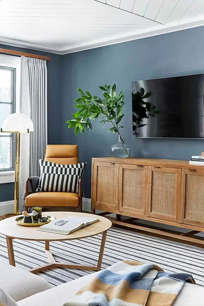
- Living Rooms: Its depth adds character and makes a living room feel intentional and put-together. It works especially well in rooms with good natural light and white or warm-toned trim.
- Dining Rooms: Dark, moody dining rooms are having a moment, and Philipsburg Blue is perfect for this. It creates a cozy, almost formal atmosphere that makes dinner feel like an event.
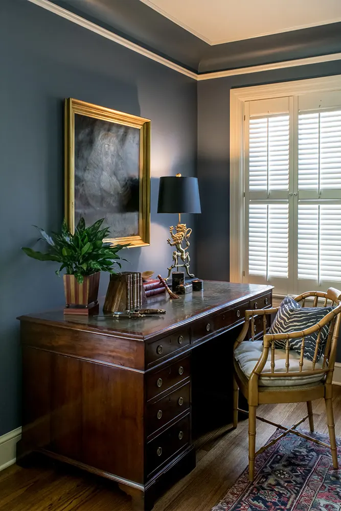
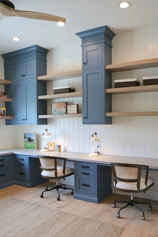
- Home Office: There is something about this color that makes a workspace feel serious but not sterile. It is focused without being cold, and I find it genuinely easy to concentrate in a room painted this shade.
- Bedrooms: In a bedroom, Philipsburg Blue brings a restful, calm quality. The muted tone keeps it from feeling too stimulating, and it pairs beautifully with white bedding and natural wood furniture.
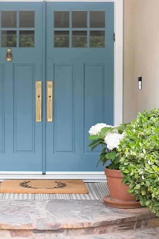
- Exteriors: This is one of those rare interior colors that also translates well outside. On a home’s exterior with white trim, it looks classic, elegant, and timeless — especially on colonial or craftsman-style homes.
- Entryways and Foyers: A small entryway painted in Philipsburg Blue makes an immediate impression. It sets a tone for the rest of the home the moment someone walks through the door.
Why I Love Benjamin Moore Philipsburg Blue
I want to be straightforward here — I do not fall in love with paint colors often. Most of the time, I am practical about it. Pick something that works, test it, move on. But Philipsburg Blue got to me a little, and I think it is because it does something that most colors at this depth do not do well: it stays livable.
A lot of dark or medium-dark colors feel great as an accent but start to feel oppressive when you live with them day after day. Philipsburg Blue does not do that. There is something in its muted, historical character that keeps it from being overwhelming. It feels like a color that has already settled in — like it has been on the walls for a hundred years and earned its right to be there.
I also love how it handles light. The way it shifts from a moody slate in the morning to something softer and more contemplative in the afternoon is genuinely enjoyable to watch. It keeps the room feeling dynamic without being unpredictable.
And honestly? It photographs beautifully. If you care about how your space looks in pictures — and I know I do — Philipsburg Blue is one of those colors that shows up consistently well in both natural and artificial light. It has real presence without being showy, and that balance is harder to find than you might think.
Final Thoughts
If you have made it this far, I am guessing you are seriously considering Philipsburg Blue for a room in your home — and I think that instinct is worth following through on. It is not the most obvious choice, and it is not the kind of color that gets the loudest reaction when you show someone the swatch. But once it is on the walls, in the right space, with the right trim? It speaks for itself.
The one thing I will say is this: do not skip the sample step. With an LRV of 19.06 and those layered undertones, Philipsburg Blue can surprise you depending on your room’s light conditions. Paint a large sample, live with it for a couple of days, and see how it moves through the light in your specific space.
For the right room and the right home, this color is close to perfect. It is historic without being stuffy, bold without being loud, and beautiful in a way that holds up over time. That is a combination worth painting your walls for.