
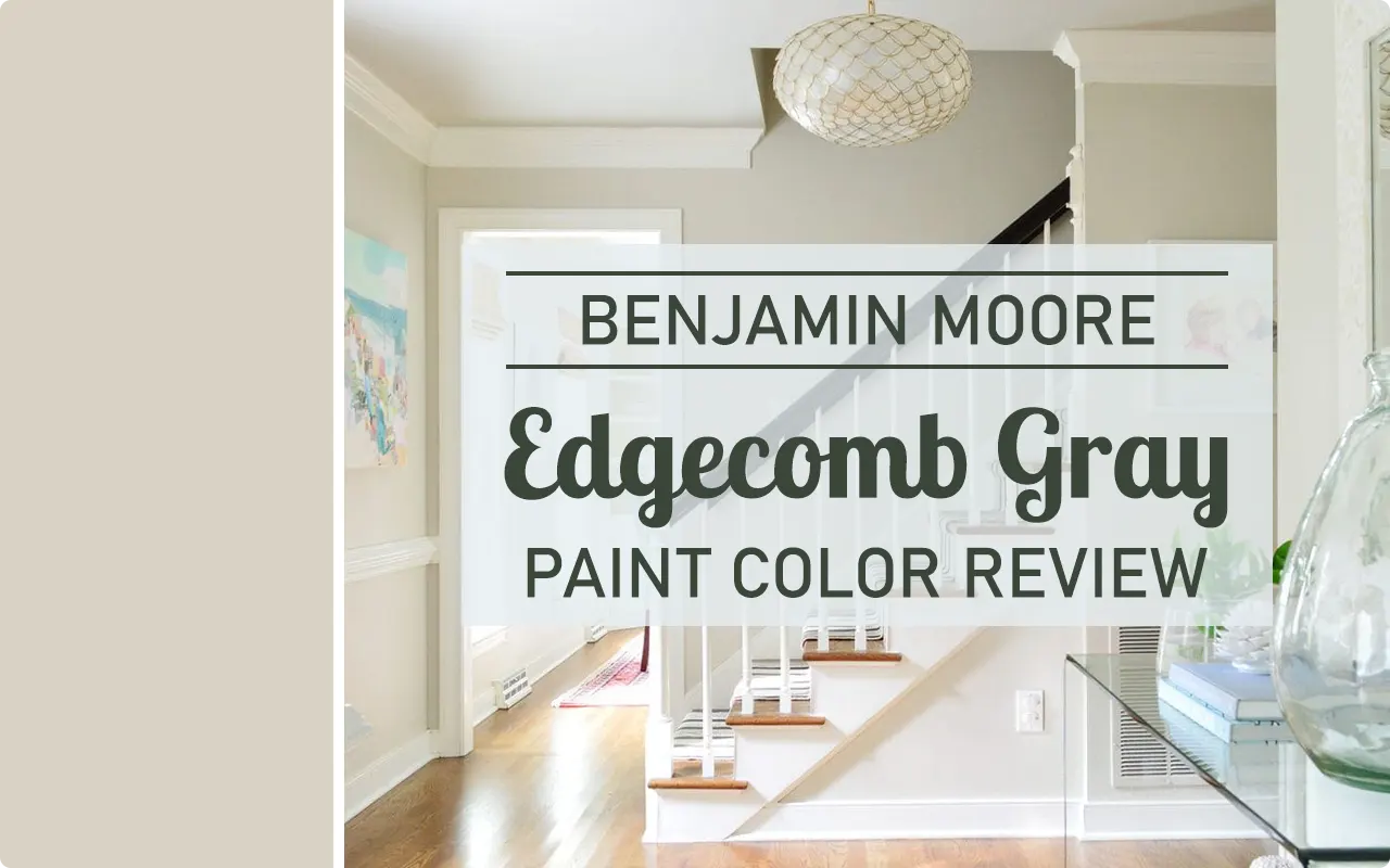
I’ll be honest — I didn’t fall in love with Edgecomb Gray the first time I saw it on a paint chip. It looked almost too quiet, too in-between. Not quite beige, not quite gray. I almost passed it over entirely. But then I saw it on an actual wall, in a real room, and something clicked.
Edgecomb Gray HC-173 is one of those colors that doesn’t show off. It just works. It has spent years sitting comfortably on “most popular” lists, and after living with it and studying it closely, I completely understand why.
This is not a color that tries to steal attention. It creates a backdrop that makes everything else in your room look more pulled together — your furniture, your trim, your art. It just quietly holds everything together.
It belongs to Benjamin Moore’s Historic Colors collection, which already tells you something about its character. These are colors with staying power, colors that have proven themselves over time.
Edgecomb Gray is not a trend. It’s a staple. And in this review, I’m going to walk you through everything you need to know before you commit to it — from how it behaves under different lighting to where it works best in a home.
What Color is Benjamin Moore Edgecomb Gray?
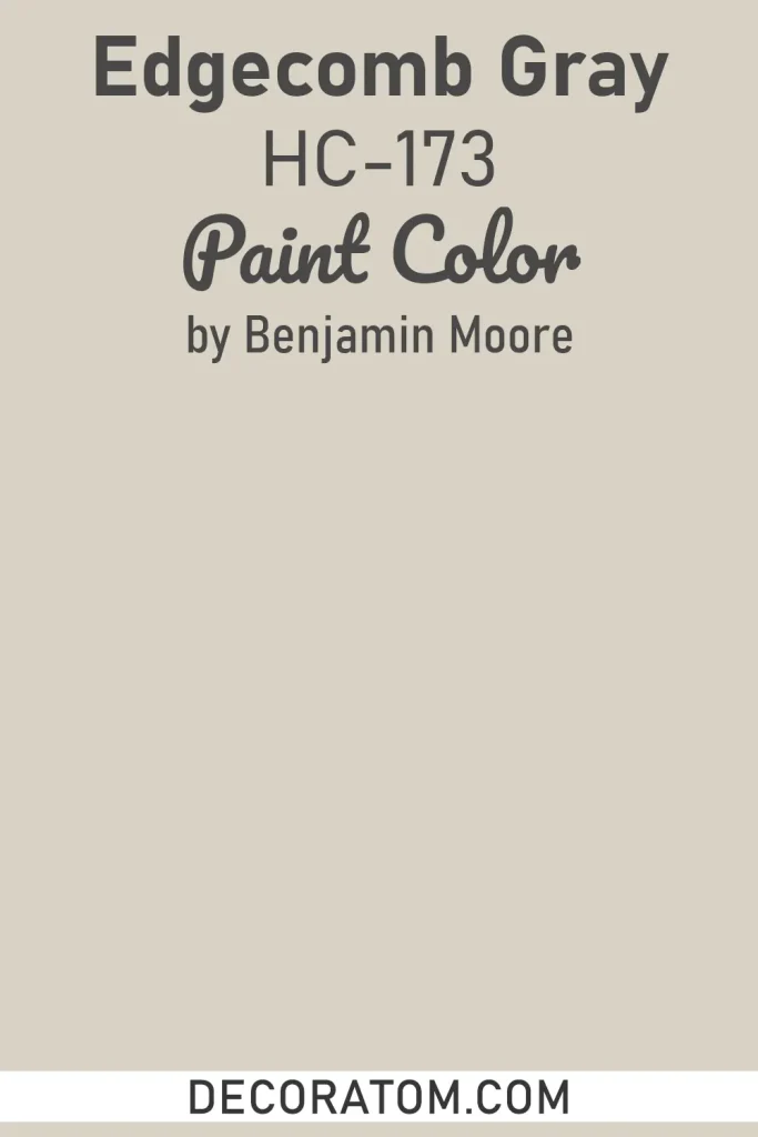
Edgecomb Gray is what I’d call a greige — a blend of gray and beige that refuses to fully commit to either side. In most rooms, it reads as a soft, light, neutral that leans more toward warm beige than cool gray. It has this dusty, muted quality to it that feels calm without feeling flat.
As for warm or cool — Edgecomb Gray is a warm color. It has beige and tan undertones that give it a cozy, grounded feel. You might catch a faint hint of green or gray depending on the light in your room, but at its core, it leans warm. That warmth is actually one of the reasons it’s so popular — it keeps a space from feeling cold or sterile, which is a real risk with straight grays.
LRV of Benjamin Moore Edgecomb Gray
LRV stands for Light Reflectance Value, and it simply tells you how much light a paint color reflects back into a room. The scale runs from 0 (pure black, reflects nothing) to 100 (pure white, reflects everything). The higher the number, the lighter and brighter the color will feel on your walls.
Edgecomb Gray has an LRV of 63.09. That puts it in the medium-light range — it’s not a deep or moody color by any stretch, but it’s not an off-white either. An LRV of 63 means it will reflect a decent amount of light back into your room, keeping the space feeling open and airy, while still bringing enough color to feel intentional and not washed out. It’s genuinely a sweet spot for most rooms.
How Different Types of Lighting Affect Benjamin Moore Edgecomb Gray?
Lighting is everything with Edgecomb Gray, and I cannot stress this enough — this color shifts depending on the light in your room, sometimes in ways that surprise you.
In rooms with strong natural light and a north-facing or south-facing exposure, it can lean slightly cooler and pull out those soft gray undertones. In a south or west-facing room flooded with warm afternoon light, it turns much more beige and almost golden in tone. That’s the nature of a greige — it’s reactive.
Under warm artificial lighting like incandescent or soft white LED bulbs, Edgecomb Gray feels cozy and decidedly beige-leaning. Under cool or daylight bulbs, it can read more like a true soft gray. This isn’t a flaw — it actually makes the color versatile — but it does mean you should sample it on your specific walls before committing. Paint a large sample board and watch it at different times of day. You’ll see what I mean.
Trim Colors to Pair With Benjamin Moore Edgecomb Gray
Trim can make or break a wall color, and with Edgecomb Gray, you want something that either gives it a clean contrast or ties into its warmth without competing.
Here are 3 trim colors I’d recommend:
1. Benjamin Moore Chantilly Lace OC-17
This is a crisp, bright white with a clean, almost blue-cool quality. Against Edgecomb Gray, it creates a sharp, polished contrast that makes the wall color look more defined and intentional. It’s a classic pairing.
2. Benjamin Moore White Dove OC-17
If Chantilly Lace feels too stark for your space, White Dove is a softer, slightly warm white that blends more seamlessly with Edgecomb Gray’s warm undertones. It creates a gentle transition rather than a hard line.
3. Benjamin Moore Simply White OC-17
Simply White sits between the two — it’s warm but still bright. It complements Edgecomb Gray without disappearing into it, and it gives the trim a clean, fresh look that works well in both traditional and more modern spaces.
Colors Similar to Benjamin Moore Edgecomb Gray
Finding a color similar to Edgecomb Gray is something people look for all the time — sometimes because of availability, sometimes because of price, and sometimes because you want to compare before you decide. The tricky part is that Edgecomb Gray lives in a very specific lane. It’s that warm, soft greige zone where colors can look almost identical on a chip but behave completely differently on a wall. Some lean more beige, some pull grayer, and some have undertones that only show up once they’re surrounded by your actual furniture and flooring.
When I look for similar colors, I’m trying to match three things: the warmth, the lightness, and that muted, dusty quality that keeps it from looking like a standard beige. The colors below come close to hitting all three. They won’t be exact — no two colors ever are — but if you’re sampling alternatives or looking for something in the same family, these are worth testing alongside Edgecomb Gray before you make a final call.
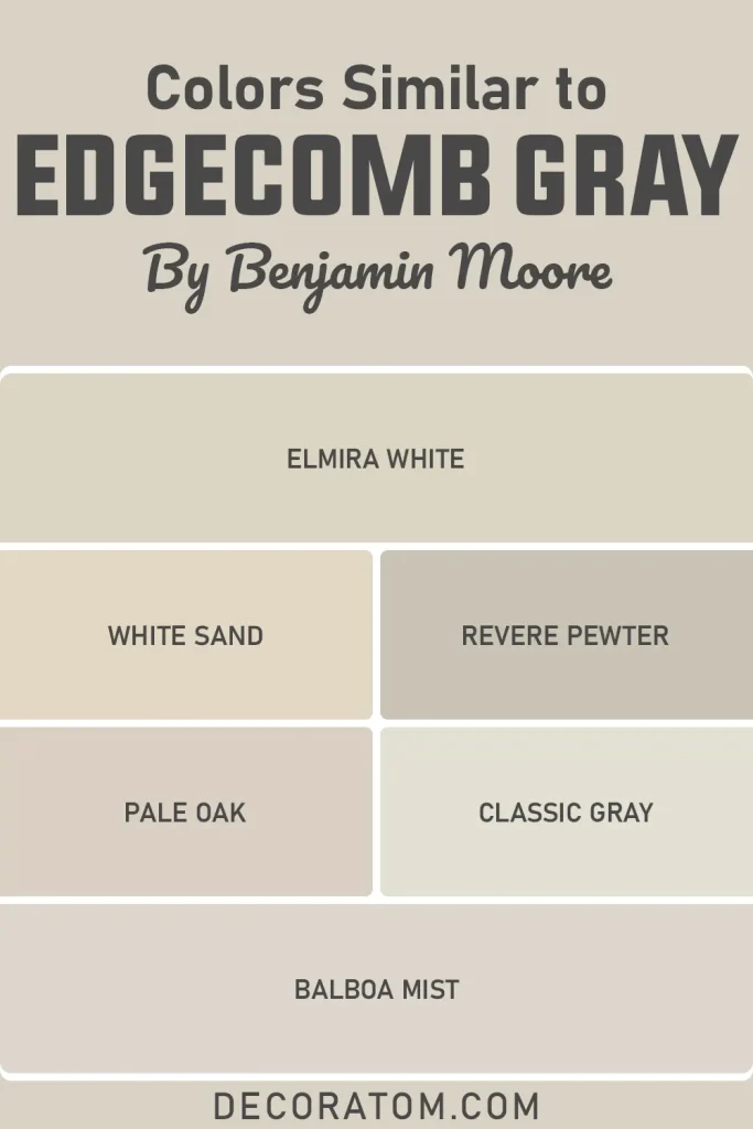
- Elmira White HC-84
- White Sand 964
- Revere Pewter HC-172
- Pale Oak OC-20
- Classic Gray 1548
- Balboa Mist 1549
Colors That Go With Benjamin Moore Edgecomb Gray
Edgecomb Gray is one of those wall colors that plays well with others, but that doesn’t mean you should pair it with just anything. The key is working with its warmth rather than against it. Cool, high-contrast colors can feel a little jarring next to it, while deeper warm tones or soft, quiet neutrals tend to feel like they belong together. When I think about coordinating colors for Edgecomb Gray, I’m thinking about creating a room that feels complete — not just a wall color sitting alone doing all the work.
The colors that work best alongside it are ones that either deepen the warmth, offer a soft contrast, or share that same calm, understated quality. You’re not going for anything loud here. Edgecomb Gray sets a certain mood in a room — relaxed, settled, comfortable — and the colors around it should support that feeling rather than fight it. Whether you’re choosing an accent wall color, a ceiling color, or a shade for your cabinetry, these four coordinating colors are worth serious consideration.
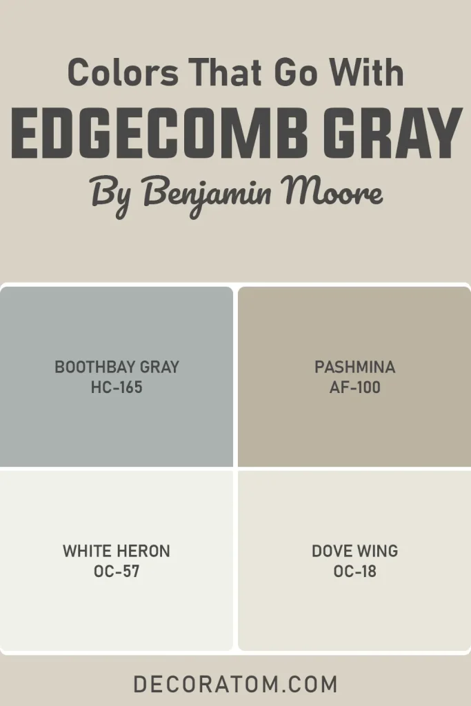
- Boothbay Gray HC-165
- White Heron OC-57
- Pashmina AF-100
- Dove Wing OC-18
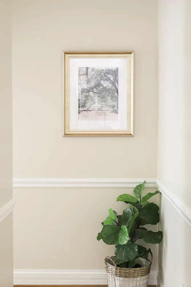
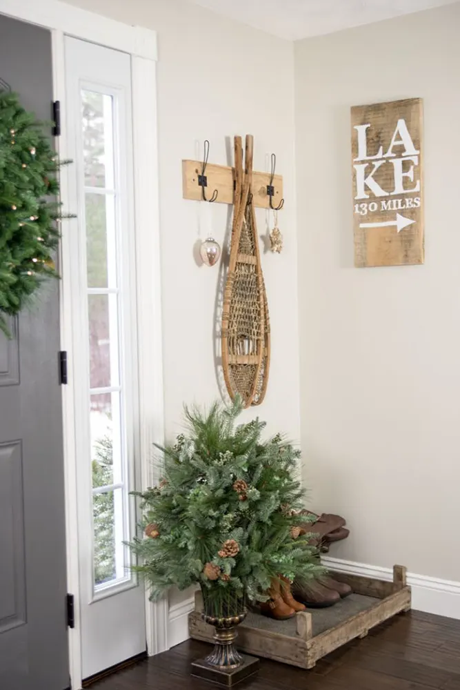
Where to Use Benjamin Moore Edgecomb Gray?
Edgecomb Gray is genuinely one of the most flexible neutrals I’ve come across — it’s not fussy about where it goes, and it tends to settle in naturally across a lot of different spaces.
- Living rooms: This is where Edgecomb Gray really earns its reputation. It creates a warm, welcoming base that works with wood tones, upholstered furniture, and layered textiles without clashing with any of it. It’s the kind of color that makes a living room feel finished.
- Bedrooms: The warmth in this color makes it genuinely relaxing in a bedroom setting. It doesn’t feel clinical, and it doesn’t feel heavy. It’s a good choice if you want a neutral that still has some personality without being distracting.
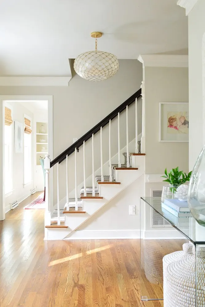
- Hallways and entryways: Edgecomb Gray handles lower-light spaces well, thanks to its LRV of 63. It won’t turn muddy in a darker hallway the way some greiges do. It keeps things feeling open.
- Home offices: If you work from home and want a background color that doesn’t pull your attention away from what you’re doing, this is a solid pick. It’s calm without being boring.
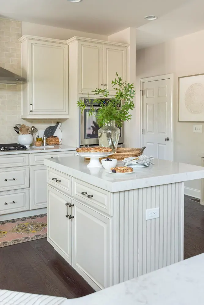
- Open-plan spaces: Because it’s such a balanced neutral, it transitions well between connected rooms — a kitchen flowing into a dining area, for example — without looking out of place in any of them.
- Exterior use: Edgecomb Gray also works on exteriors, especially on homes with white trim and natural wood or stone elements. It gives off that soft, classic New England look that holds up well across seasons.
Why I Love Benjamin Moore Edgecomb Gray
I’ve looked at a lot of paint colors over the years, and most of them feel like a commitment. You pick them, live with them, and then spend six months wondering if you should have gone a shade lighter or chosen something with less green in it. Edgecomb Gray has never once made me feel that way.
What I love most about it is that it stops the overthinking. You put it on the wall and it just looks right. Not exciting, not jarring — just right. And honestly, that’s what a neutral is supposed to do. The best neutrals are the ones you stop noticing because they’re doing their job so well in the background.
I also love how it handles different rooms differently. In a sunny room, it feels almost like a warm linen. In a shadier space, it picks up just enough gray to feel a little more grounded. It adapts without being unpredictable, and that’s a rare quality in a greige.
And then there’s the practicality of it. It goes with wood floors — light, medium, dark, it doesn’t matter. It works with cool gray furniture and warm brown furniture. It plays nicely with both cool whites and creamy whites on trim. I have genuinely struggled to think of a scenario where Edgecomb Gray looked wrong, and that kind of versatility is hard to find.
Final Thoughts
If you’ve made it this far, you probably already know Edgecomb Gray is worth considering. My honest take is this: if you’re looking for a neutral that is warm but not yellow, light but not white, and calm without being boring, this color delivers on all of that.
It’s not going to be for everyone. If you want something with a stronger personality or a more obvious gray tone, you might find it a little too quiet. But if what you’re after is a color that ties a room together and stops you from repainting in two years, Edgecomb Gray HC-173 is about as reliable as it gets.
Sample it. Put it on the wall. Watch it through a full day of light. I’m willing to bet it looks better on your wall than it did on that little paint chip.