
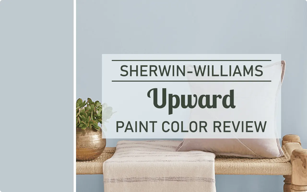
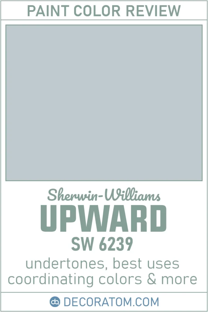
I’ve always been drawn to soft, soothing paint colors that feel like a breath of fresh air, and Sherwin-Williams Upward SW 6239 fits that feeling perfectly.
It’s a shade I discovered when I was looking for a light blue that wouldn’t feel too childish or too cold.
What I found in Upward was a surprisingly balanced and versatile color that can bring calm and character to just about any space.
In this post, I’m diving into all the details about this beautiful shade, from how it looks in different lighting, to what colors pair well with it, and where it works best in the home.
What Color is Sherwin Williams Upward?
Sherwin-Williams Upward is a soft, airy blue. It reminds me of a clear sky just after sunrise, light and fresh, but not too bright.
It has this slightly hazy, almost dreamy feel to it, which makes it really calming to look at.
It’s not an icy blue or one of those beachy turquoise shades. It’s a more muted, relaxed tone of blue that feels modern but still cozy.
Is It a Warm or Cool Color?
Sherwin-Williams Upward is definitely a cool color, but it’s not cold.
There’s a difference. Some cool blues can feel too sterile or flat, especially in big spaces with less natural light. But Upward has just enough softness in its tone that it keeps the room feeling welcoming.
Cool colors like this one tend to create a more relaxed and peaceful atmosphere, which is why Upward works so well in bedrooms, bathrooms, and other spaces where you want to unwind. So yes, it leans cool, but in a very calm, comforting way.
LRV of Sherwin Williams Upward
💥🎁 Christmas & Year-End Deals On Amazon !
Don't miss out on the best discounts and top-rated products available right now!
*As an Amazon Associate, I earn from qualifying purchases.
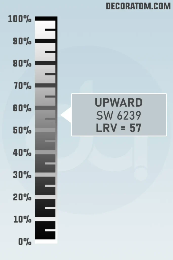
LRV stands for Light Reflectance Value, and it tells you how much light a paint color reflects on a scale from 0 to 100. The higher the number, the lighter the color. Pure white sits at the top around 100, and pure black is down at 0.
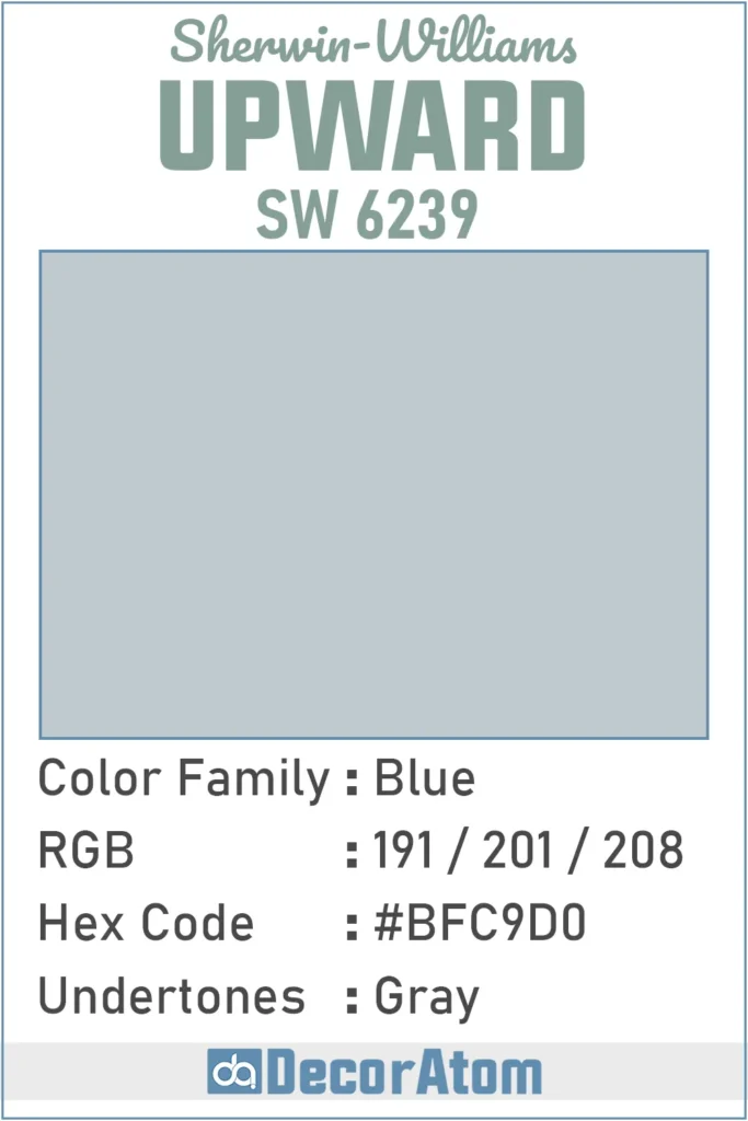
Sherwin-Williams Upward has an LRV of 57. That puts it right in the middle range, it’s light enough to brighten a room, but it still has enough pigment to show up as a real color on the walls.
It’s not too pale, and it’s not dark either. I’ve found this level of LRV makes Upward a safe and flexible choice, especially if you’re not sure how much light your space will get.
Color Family
Upward SW 6239 falls under the blue color family, no surprises there. But what makes it special is that it’s not just “basic blue.” It sits in that sweet spot where blue meets softness. It’s lighter than navy or denim and more grounded than baby blue or sky blue.
RGB Colors
Let’s break this down simply. The RGB values of a paint color tell you how much red, green, and blue are in it, that’s what makes up every color on a screen. For Sherwin-Williams Upward, the RGB values are:
Red: 191
Green: 201
Blue: 208
Hex Value
The hex value of Sherwin-Williams Upward is #BFC9D0. If you’ve ever worked on a website or digital design project, this is the code you’d use to get this exact shade of blue.
💥🎁 Christmas & Year-End Deals On Amazon !
Don't miss out on the best discounts and top-rated products available right now!
*As an Amazon Associate, I earn from qualifying purchases.
Undertones of Sherwin Williams Upward
Upward has very clear gray undertones. This is actually one of the reasons why I like it so much, the gray grounds the blue, keeping it from feeling too bright or too playful.
You’ll notice the gray more in low-light spaces or on cloudy days. It’s subtle, but it adds a little depth and maturity to the color. That’s what gives Upward that quiet elegance.
If you’re worried about your blue walls looking too colorful or “nursery-like,” the gray in this paint helps avoid that completely. It’s soft, but not sugary.
How Different Types of Lighting Affect Sherwin Williams Upward?
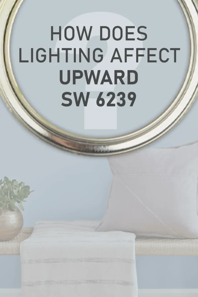
Lighting can completely change the way Sherwin-Williams Upward looks, and that’s something I learned the hard way when testing samples in different rooms.
In natural daylight, especially from north-facing windows, Upward tends to look a little cooler and more muted. That’s when you’ll notice the gray undertones most. It can almost take on a steely quality, which I actually love in a minimalist or Scandinavian-style space.
In south-facing rooms, where there’s more warm sunlight, Upward softens and warms up just a bit. The light brings out more of the blue, and it starts to feel a little more cheerful, still calm, but less moody.
Under artificial lighting, it depends on the bulb. If you use warm white bulbs, you might see the blue mellow out and lean more toward a soft gray-blue. With cool white or daylight LED bulbs, the blue feels sharper and cooler, almost like a fresh morning breeze.
Bottom line: always test it out in your space before committing. Lighting makes a bigger difference than you’d think, especially with nuanced colors like this one.
Trim Colors to Pair With Sherwin Williams Upward?
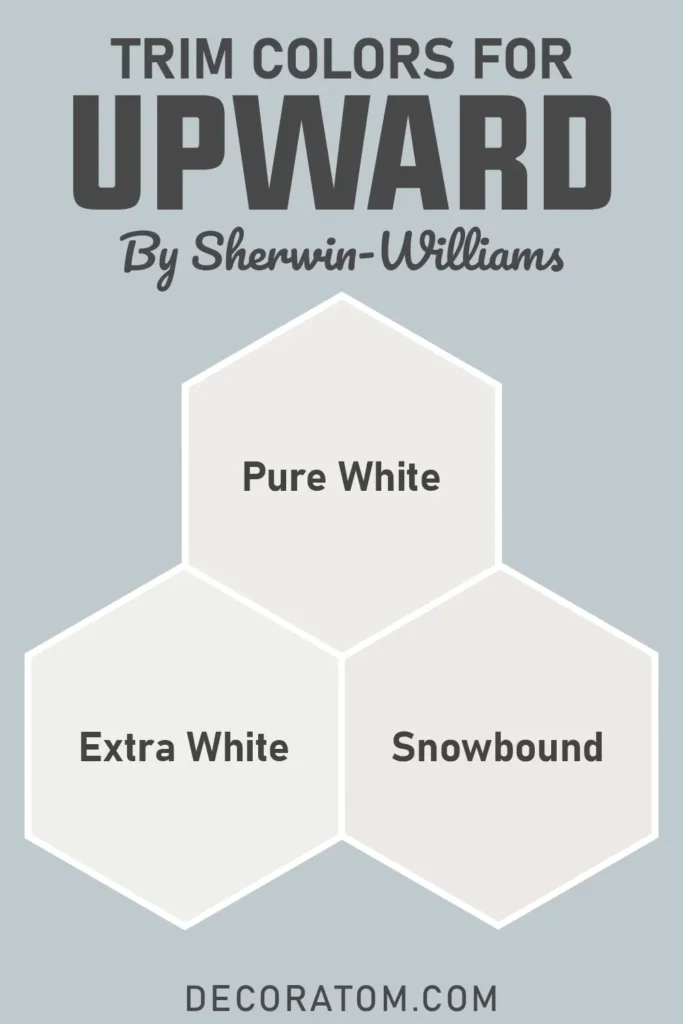
I’ve tried a few trim colors with Upward, and I keep coming back to crisp whites. They really make this blue pop without creating too much contrast.
My favorite pairing is with Sherwin-Williams Pure White (SW 7005). It’s clean, but not stark, and it complements the gray undertones in Upward beautifully.
If you want something even brighter and more classic, Extra White (SW 7006) gives a nice sharp contrast that feels fresh and modern.
On the other hand, if you prefer something a bit softer, Snowbound (SW 7004) is a warm white that still works really well, especially if you’re aiming for a cozier vibe.
Upward looks best with trim that doesn’t compete, think subtle, fresh, and clean. That way, it stays the main character without feeling heavy.
Colors Similar to Sherwin Williams Upward
💥🎁 Christmas & Year-End Deals On Amazon !
Don't miss out on the best discounts and top-rated products available right now!
*As an Amazon Associate, I earn from qualifying purchases.
If you’re drawn to Sherwin-Williams Upward, you’re probably after that soft, airy, and peaceful vibe it brings to a room. And I get it, there’s something about this shade that feels like a deep exhale.
But if you’re testing a few options before making your final choice, it really helps to compare Upward with similar shades from Sherwin-Williams and Benjamin Moore.
What makes a color “similar” to Upward usually comes down to a few things: the base blue tone, the presence of subtle gray undertones, and how light or muted the color is overall.
The colors I’ve listed below all live in that same calm and balanced zone. They aren’t overpowering blues, and they won’t make your space feel cold or dramatic.
Instead, they give off that same quiet energy, ideal for bedrooms, bathrooms, and even open-plan living spaces.
Some might lean slightly grayer, others a touch brighter or dustier, but all of them give you that dreamy, modern blue feel. I’d definitely suggest sampling a few alongside Upward to see how each plays with your natural light.
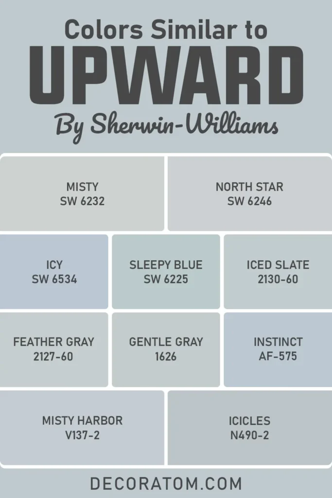
Here’s a list of 10 similar colors you can explore:
- Sherwin-Williams Misty SW 6232
- Sherwin-Williams North Star SW 6246
- Sherwin-Williams Icy SW 6534
- Sherwin-Williams Sleepy Blue SW 6225
- Benjamin Moore Iced Slate 2130-60
- Benjamin Moore Feather Gray 2127-60
- Benjamin Moore Gentle gray 1626
- Benjamin Moore Instinct AF-575
- Valspar Misty Harbor V137-2
- Behr Icicles N490-2
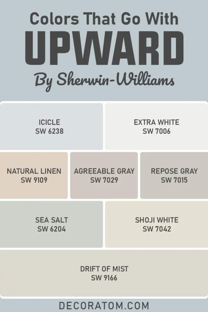
Colors that Go With Sherwin Williams Upward
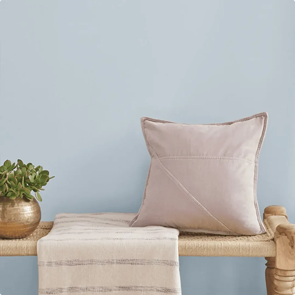
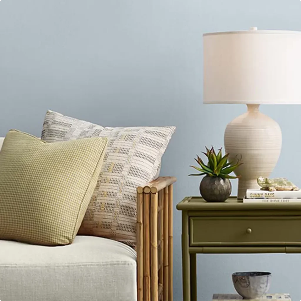
One of my favorite things about Sherwin-Williams Upward is how easy it is to pair with other colors. This is a blue that plays well with others, it doesn’t clash or compete, which makes it incredibly versatile for building out a full-color palette in your home.
Because of its soft gray undertone, Upward can coordinate beautifully with other muted colors, think warm whites, gentle grays, sandy taupes, and even soft greens.
I’ve found that Upward does best when it has a little contrast around it, either with crisp white trim, natural textures (like linen, rattan, or oak), or grounding neutrals like greige or beige.
That balance between cool and warm tones is what really makes a room feel intentional and layered.
When I was planning a recent space with Upward, I paired it with creamy off-whites and some light warm browns, the mix added depth without overwhelming the calm feel I wanted.
Whether you’re going coastal, farmhouse, or transitional, you’ll find a lot of flexibility here.
💥🎁 Christmas & Year-End Deals On Amazon !
Don't miss out on the best discounts and top-rated products available right now!
*As an Amazon Associate, I earn from qualifying purchases.
Here are 8 colors that pair well with Sherwin-Williams Upward, including a few I always return to:
- Icicle SW 6238
- Extra White SW 7006
- Natural Linen SW 9109
- Agreeable Gray SW 7029
- Repose Gray SW 7015
- Sea Salt SW 6204
- Shoji White SW 7042
- Drift of Mist SW 9166
Comparing Sherwin Williams Upward With Other Colors
When choosing the right paint color, especially one as subtle and nuanced as Sherwin-Williams Upward, it helps a lot to compare it directly with other popular shades.
Sometimes, two colors that seem almost identical on a swatch card can look completely different on the wall, trust me, I’ve been there.
Comparing paint colors allows you to see the differences in undertone, brightness, and overall feel. Even the smallest shift in gray, green, or blue can change how a room feels.
Below are six comparisons I’ve looked at closely myself. If you’re deciding between Upward and another favorite, these side-by-side breakdowns might help you feel more confident in your final choice.
Sherwin Williams Upward vs Misty SW 6232
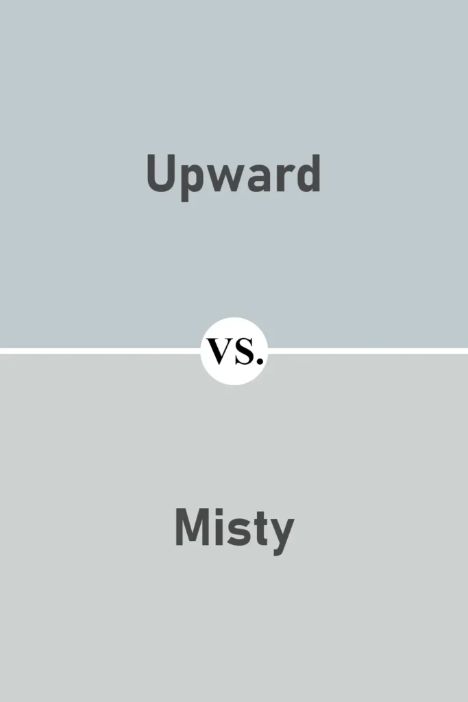
Both of these colors are soft, cool blues with a calming vibe, but Misty has stronger gray undertones than Upward.
When I look at them side by side, Misty feels more like a foggy sky, while Upward has just a little more color and clarity.
Misty can almost read as gray in low light, which is great if you want a more neutral backdrop. Upward, on the other hand, stays true to its blue roots and brings a little more personality into the space.
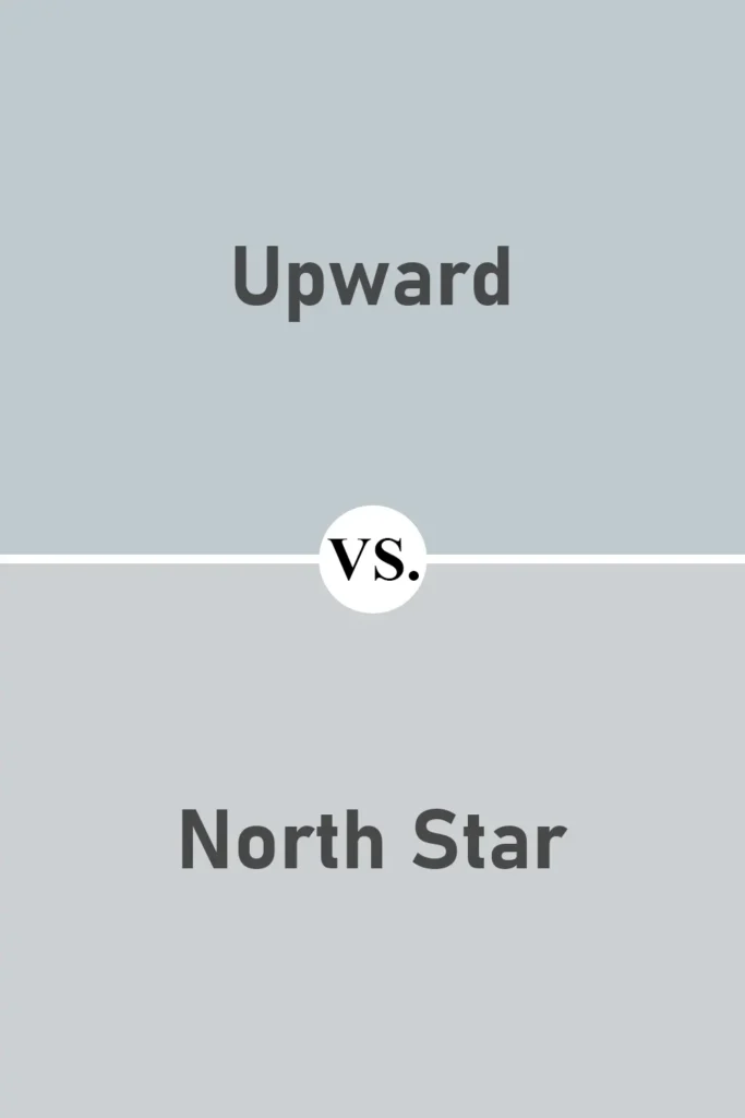
Sherwin Williams Upward vs North Star SW 6246
💥🎁 Christmas & Year-End Deals On Amazon !
Don't miss out on the best discounts and top-rated products available right now!
*As an Amazon Associate, I earn from qualifying purchases.
North Star is a bit cooler and sharper than Upward. It leans more toward an icy gray-blue, whereas Upward feels softer and more relaxed.
I’d say North Star has a slightly more modern or minimalist feel, great for a sleek space.
But if you’re after something a little warmer and more versatile, Upward is easier to blend with a wider range of palettes.
Sherwin Williams Upward vs Windy Blue SW 6240
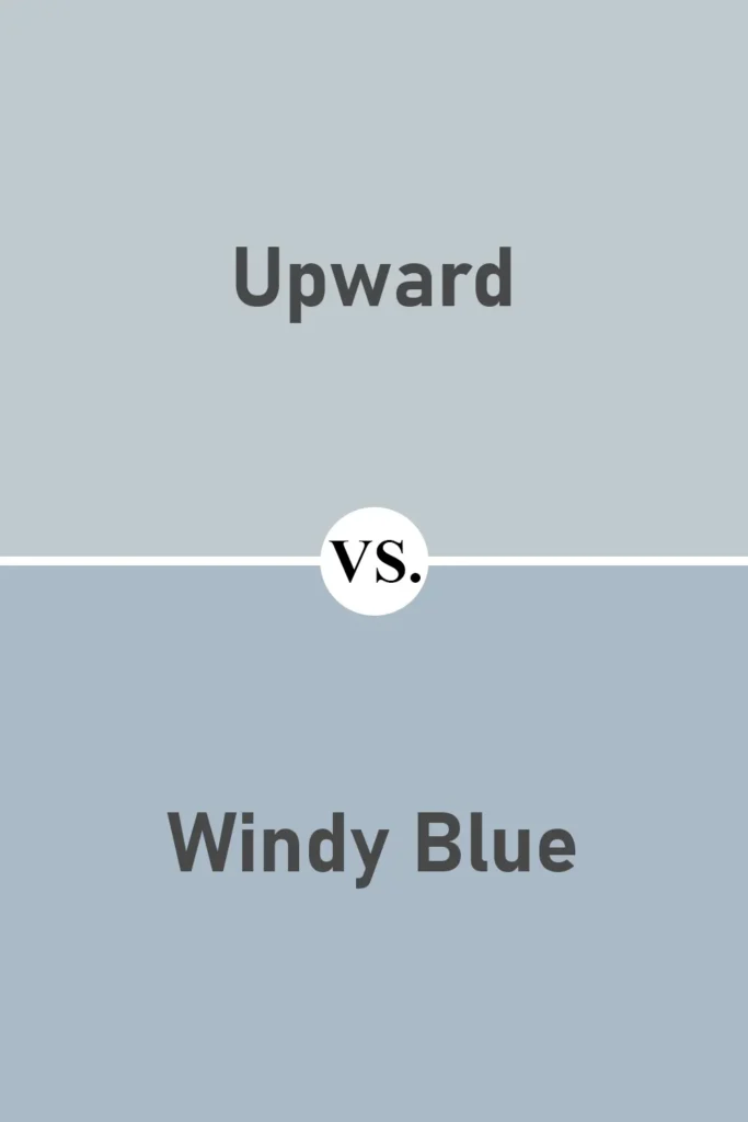
Now, Windy Blue is a close cousin to Upward, but it definitely has more saturation. It feels a touch deeper and a bit brighter.
If you want a blue that stands out more without going too dark, Windy Blue could be a great pick.
But for a more subtle, cloud-like effect, I still prefer Upward. It has that barely-there look that works beautifully in larger areas or more neutral rooms.
Sherwin Williams Upward vs Sleepy Blue SW 6225
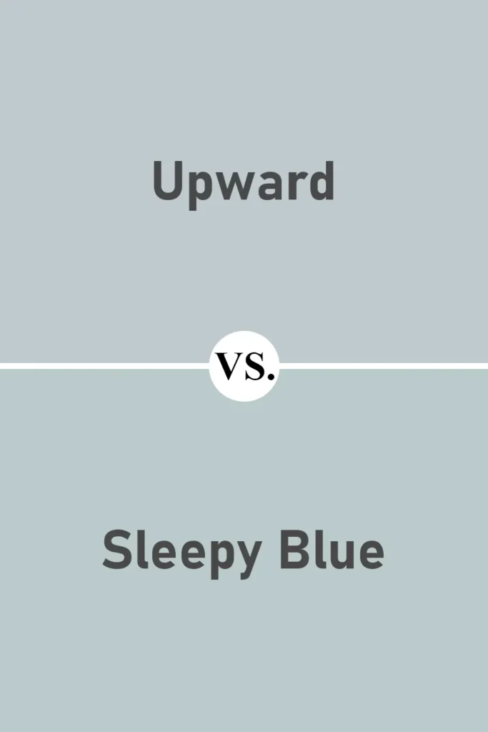
Sleepy Blue leans slightly greener than Upward, and it’s also a little darker. I like it for cozy spaces or accent walls. In contrast, Upward feels cleaner and lighter, a bit more open and airy.
If you’re stuck between the two, think about whether you want a touch of green warmth (Sleepy Blue) or a true cool blue (Upward).
Sherwin Williams Upward vs Olympus White SW 6253
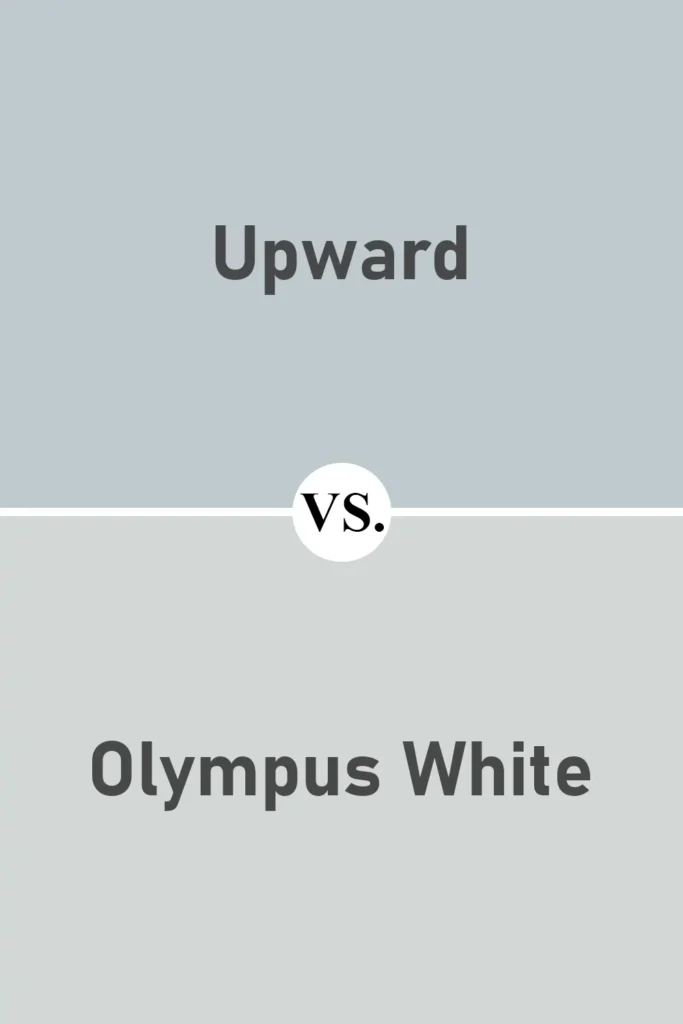
Olympus White is another close comparison, and in certain lights, it can look a lot like Upward. But it has even more gray in it, and sometimes it almost feels like a pale silvery gray with a hint of blue.
If you’re drawn to barely-there blues that read almost neutral, Olympus White is a strong contender. Still, I find Upward gives just enough color without tipping into full gray territory.
Sherwin Williams Upward vs Benjamin Moore Silver Cloud 2129-70
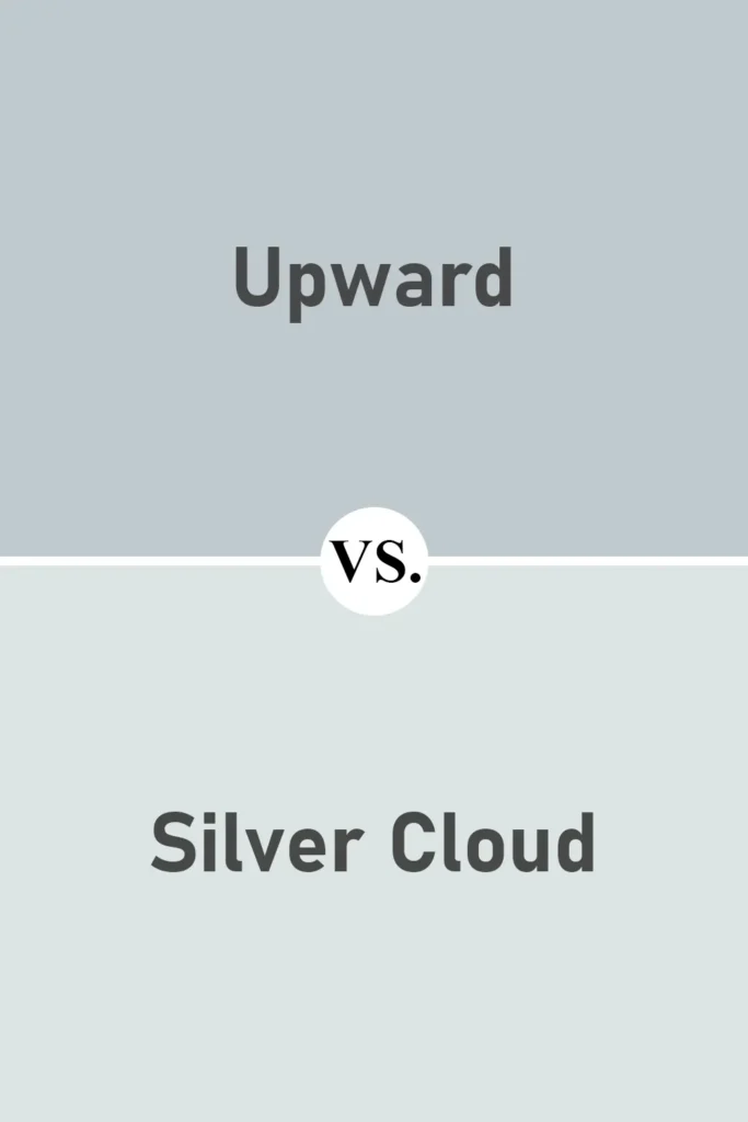
Silver Cloud is from Benjamin Moore’s palette, and it’s one I tested when I was looking at options like Upward. It’s a true cool blue-gray, elegant, polished, and slightly more formal.
Compared to Upward, Silver Cloud feels more grown-up and traditional. Upward has a bit more softness and approachability, especially for relaxed, everyday spaces.
Where to Use Sherwin Williams Upward?
One of the biggest reasons I keep coming back to Sherwin-Williams Upward is how incredibly adaptable it is. This isn’t one of those paint colors that only works in one very specific type of space.
Instead, it shifts beautifully depending on the lighting, the décor style, and even the materials around it. That softness and subtle blue-gray tone make it a safe but stylish choice for a variety of rooms, and yes, even the exterior.
I’ve tested this color in several areas of my home and have seen how it transforms from room to room. So, if you’re wondering where Upward might shine the most, here’s my take on how it performs in different spaces.
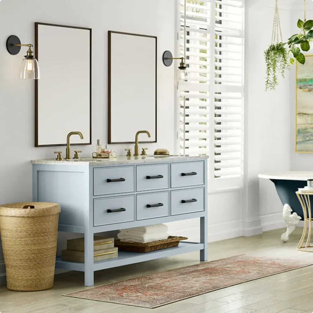
Sherwin Williams Upward in the Bedroom
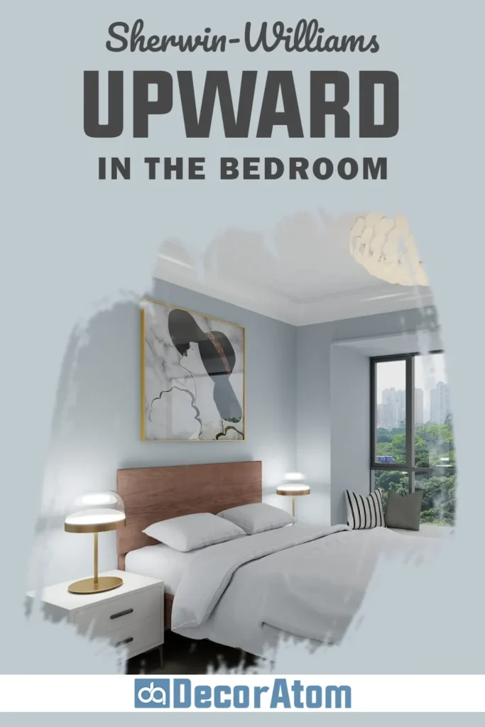
The bedroom is probably my favorite place to use Upward. It brings such a peaceful, restful vibe that instantly makes the room feel like a retreat. There’s something about this blue, it doesn’t shout for attention, but it quietly fills the space with calm.
When I used it in a guest bedroom, I paired it with soft white bedding and natural wood accents, and the entire room felt like a cloud.
Because of its gray undertone, it also doesn’t come off as too “baby blue,” which can sometimes make a bedroom feel a little too playful. Instead, it adds color in the most elegant, grown-up way.
Whether your style is coastal, minimalist, or even farmhouse, Upward is one of those shades that just works in a bedroom.
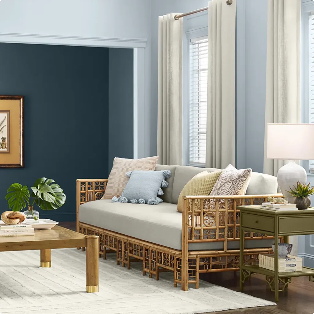
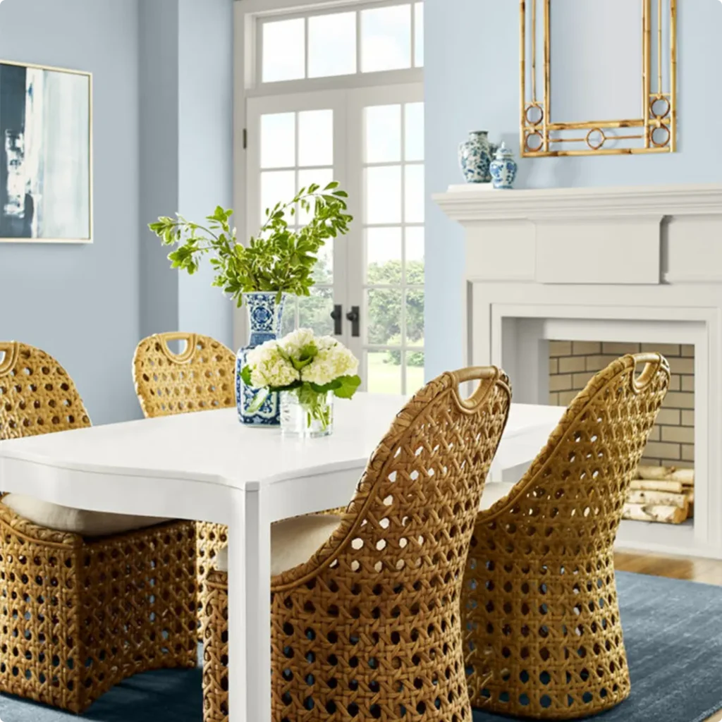
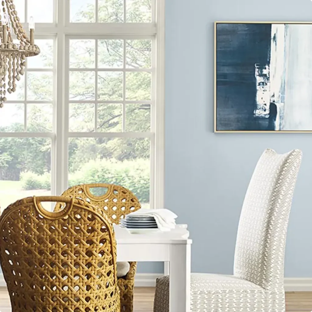
Sherwin Williams Upward in the Living Room
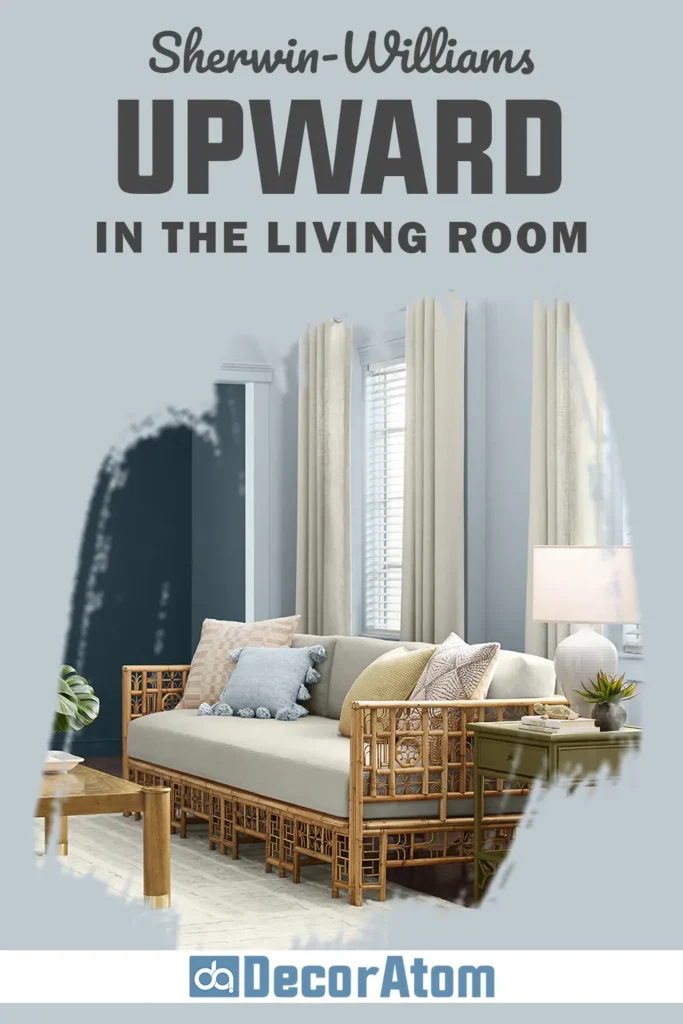
Living rooms can be tricky, you want a color that’s interesting enough to stand out but neutral enough to handle ever-changing throw pillows, rugs, and furniture.
Upward hits that perfect middle ground for me. It reads as a very soft blue with a cool undertone, so it creates a light and open feeling, especially in smaller living spaces.
When I used it in a living room, it made the walls feel like they were quietly glowing, not from being bright, but from how it softly bounced the natural light around.
I paired it with a beige couch, dark wood coffee table, and off-white curtains, and the mix was just serene. It gave the room a subtle personality without making it feel too stylized.
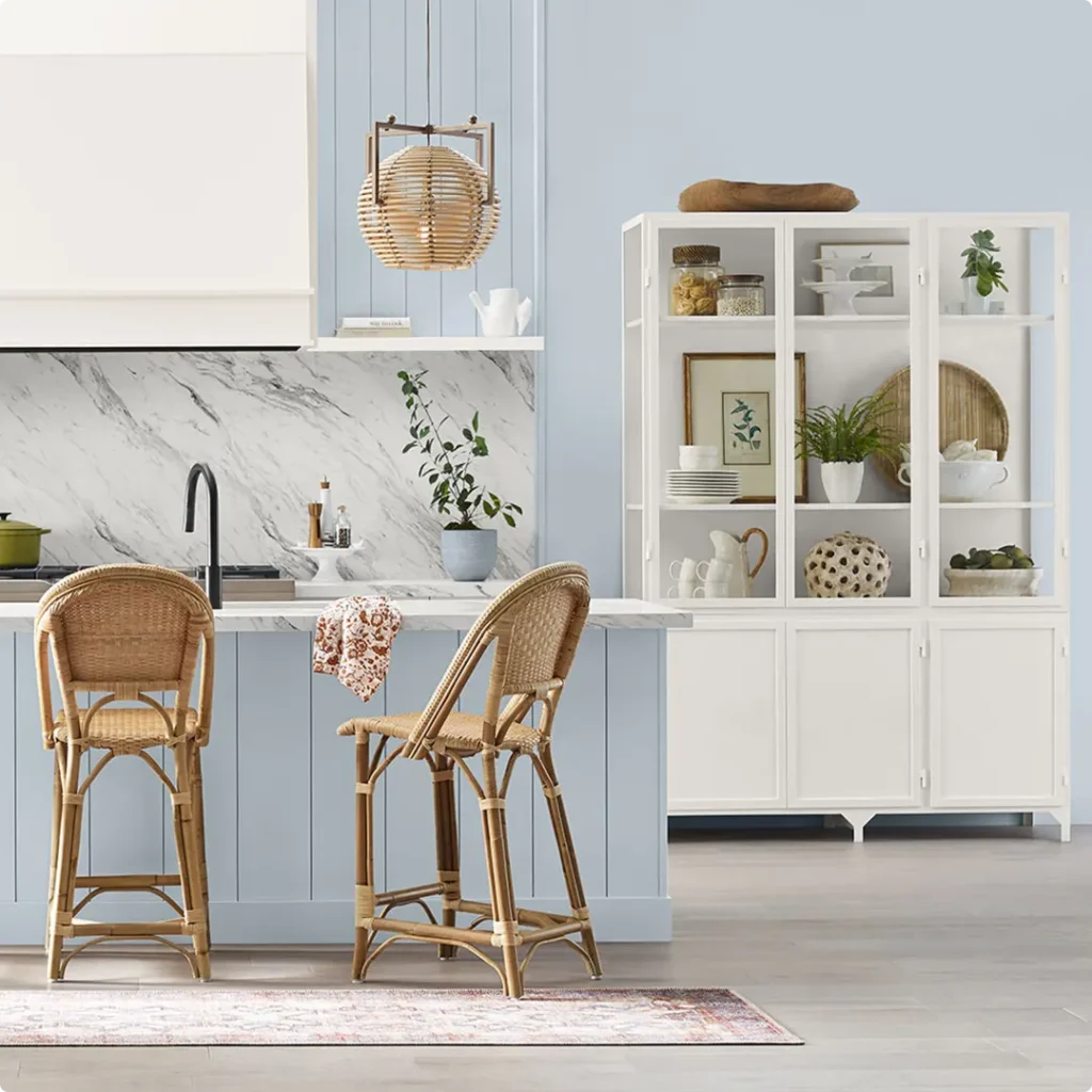
Sherwin Williams Upward in the Kitchen
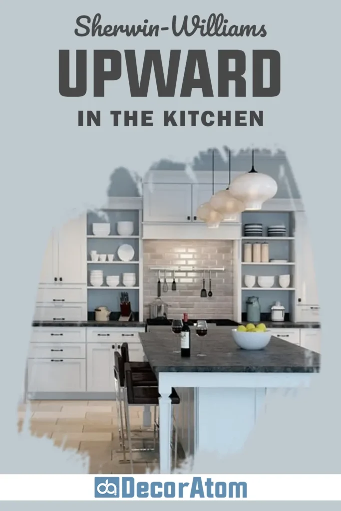
Kitchens are where things get fun, and a little risky when it comes to paint colors. But Upward is surprisingly kitchen-friendly, especially if you’re going for a fresh, airy look.
I’ve seen it used on upper cabinets, on walls behind white tile backsplashes, and even as a full wall color in kitchens with white cabinetry.
Every time, it brings a soft coolness that balances out warm wood tones and brass or gold hardware beautifully.
In one home I helped with, we used Upward on the walls and kept the cabinets bright white. The whole kitchen felt clean but not cold, a bit coastal, a bit modern, and completely timeless.
Sherwin Williams Upward in the Bathroom
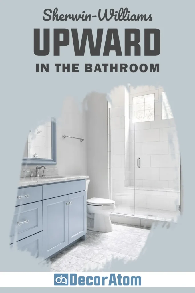
Bathrooms are one of the best places to try a cool, calming paint color, and Upward does not disappoint.
With its gray undertone, it keeps the space feeling clean and crisp, but it still adds just enough color to make things interesting. I love it paired with marble countertops, white or gray tile, and brushed nickel or chrome fixtures.
What I really like is that it never feels “too much” in a bathroom. It doesn’t overwhelm small spaces, and it doesn’t fight with tile patterns or accent colors.
In fact, it softens them. If you’re going for a spa-like vibe (and who isn’t?), Upward should be on your short list.
Sherwin Williams Upward for the Exterior
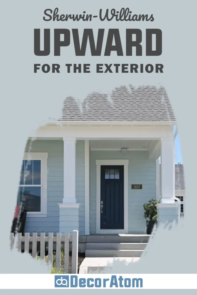
Now, let’s talk about curb appeal. I know a lot of people get nervous about using blue on the exterior, but Upward is one of the few shades that manages to feel bold and soft at the same time.
In bright sunlight, it looks like a very clean and crisp blue, not navy, not pastel, just a soft blue-gray that feels inviting and elegant.
I’ve seen it used on full house exteriors with white trim, on shutters with a white or light gray home, and even on front doors paired with darker siding.
It works particularly well with stone, brick, or siding in warm neutrals because it balances that warmth with its cool undertones. If you’re after a classic yet unique exterior look, Upward is worth sampling.
Why I Love Sherwin Williams Upward
There are a lot of blues out there, trust me, I’ve tried way too many paint samples to count. But Upward stands out to me for one big reason: it feels peaceful without feeling boring. That’s a rare combination.
I love how it shifts with the light throughout the day, cool and calm in the morning, soft and cozy in the evening. It brings color to a space, but in the most quiet and thoughtful way.
I never feel overwhelmed by it, and I always feel like the room is just a little more pulled together when this color is on the wall.
Plus, it plays well with so many other shades, whites, beiges, taupes, and even greens. Whether I’m designing a bedroom, a kitchen, or just painting a single accent wall, Upward always gives me that subtle, polished look I’m after.
Final Thoughts
Sherwin-Williams Upward SW 6239 might not be the loudest color in the room, but that’s exactly why I love it.
It’s soft, cool, and understated, the kind of shade that brings calm into your home without demanding all the attention.
Whether you’re using it in a bedroom to create a restful retreat, in a kitchen for a breath of fresh air, or even on the exterior to stand out in a classy way, Upward proves time and again that subtle doesn’t mean boring.
It’s the kind of color I always come back to when I want something easy to live with but still interesting.
And if you’re someone who appreciates calm, clarity, and just a little bit of quiet charm in your home, I think you’ll love it too.