
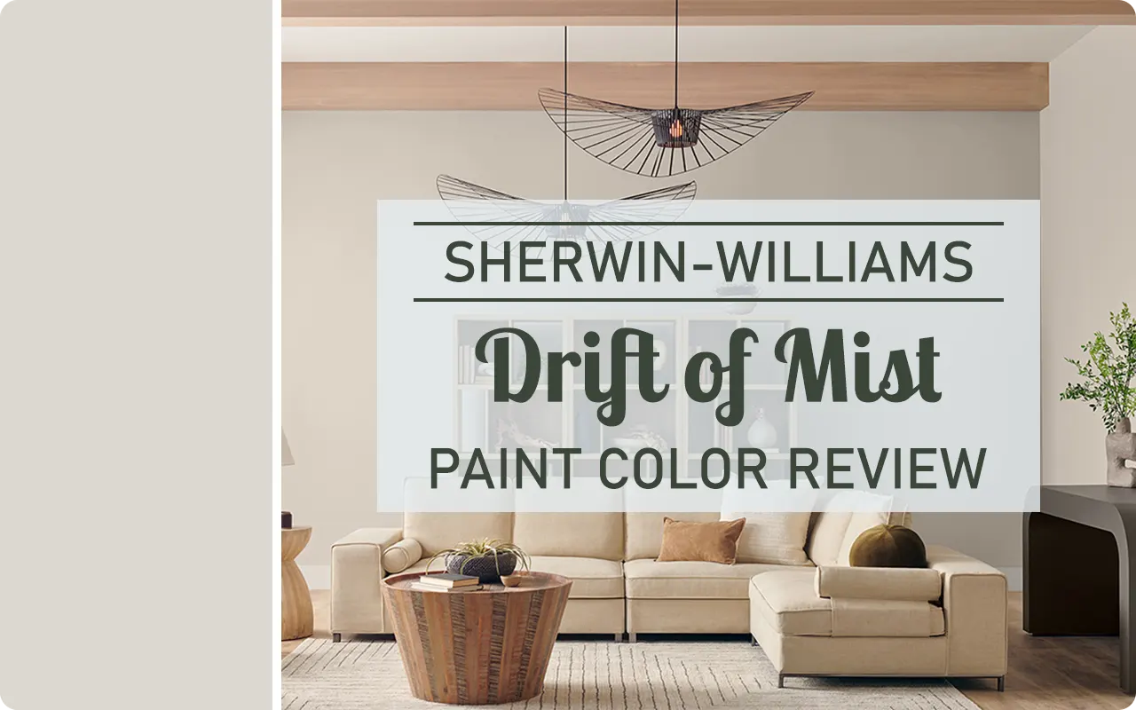
If you’re like me and always on the hunt for that “just right” neutral paint color—one that doesn’t feel too cold, too dark, or too beige—then Sherwin-Williams Drift of Mist SW 9166 might be worth a closer look.
This soft, gentle shade sits right in that sweet spot where gray meets greige, giving off a subtle, airy vibe without being stark or sterile.
Whether you’re repainting an entire home or refreshing just one space, Drift of Mist has a calming, elegant presence that feels timeless and effortless.
In this review, I’m breaking down everything I’ve learned about Drift of Mist—from how it looks in different lighting to what undertones it carries, and even which colors it pairs best with.
If you’re considering this shade for your own walls, you’re in the right place.
*This post contains affiliate links. For more details see my full disclosure.
How to Know if a Paint Color Is Right for You?
Would you like to sample Drift of Mist SW 9166 paint color? I recommend using Samplize. They offer 12″x12″ peel-and-stick paint swatches that make testing colors super simple. Just stick it on your wall, move it around if needed, and when you’re done—peel it off and toss it. No mess, no cleanup. It’s quick, easy, and way more convenient!

Advantages of using peel and stick paint samples:
- EASY TO USE: Simply move your SAMPLIZE paint sample around the room to test under a variety of lighting conditions.
- AFFORDABLE: Budget-friendly solution and no more buying inaccurate swatches, rollers, wasted paint.
- SUPER FAST DELIVERY: Depending on your location, 1 day delivery is possible.
- ORDER FROM HOME: Save a trip to the store looking for samples.
- NO MESS: SAMPLIZE uses real paint samples with zero-mess
- NO WASTE: No leftover cans or wasted paint.
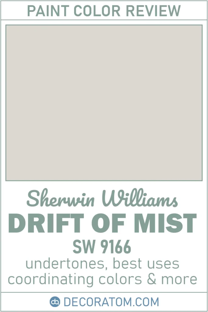
What Color is Sherwin Williams Drift of Mist SW 9166? (February 2024 Color of the Month)
Drift of Mist SW 9166 is best described as a soft, light gray with a warm, almost earthy undertone.
It has a quiet presence—not flashy or bold, but definitely not boring either. Think of it as a misty morning sky or a weathered stone path. It doesn’t lean heavily into blue or beige, which makes it a beautifully balanced neutral.
If you’ve ever wanted a color that adds a gentle layer of warmth and sophistication to a room without demanding attention, this is it.
What I love most about it is how versatile it is. Drift of Mist looks great in modern homes, traditional spaces, and everything in between.
It’s subtle enough to cover large walls without overwhelming the space, yet it still gives just enough color to feel cozy and inviting.
Is It a Warm Or Cool Color?
Drift of Mist falls into the “warm neutral” category, but it’s not overly warm. It has a gentle warmth that keeps it from looking cold or sterile, especially in rooms with minimal sunlight.
At the same time, it doesn’t go too yellow or tan like some warm colors tend to do.
What makes it interesting is that it can adapt slightly depending on the room’s lighting and surrounding colors.
In a north-facing room, it might lean a touch more gray, giving off a cooler vibe.
In a south-facing room with warm natural light, it tends to show more of its soft beige side.
But overall, Drift of Mist has a calm, warm undertone that makes it feel welcoming and easy to live with.
LRV of Sherwin Williams Drift of Mist SW 9166
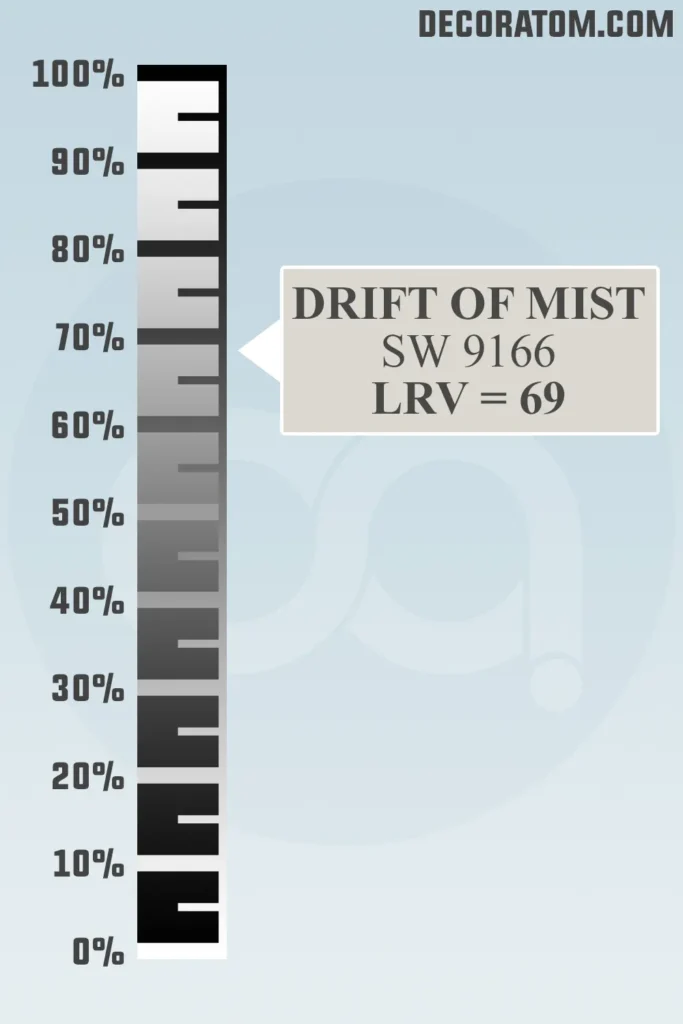
Let’s talk about LRV, or Light Reflectance Value. I know it sounds technical, but it’s actually pretty simple.
LRV is a number from 0 to 100 that tells us how much light a color reflects. The higher the number, the lighter and more reflective the color is.
Drift of Mist has an LRV of 69, which means it reflects a good amount of light without being stark white.
This makes it a great choice for rooms that could use a little brightness but still want a hint of color on the walls.
It helps make a space feel open and fresh without going full-on white or overly bright.
It’s a nice balance—light enough to keep things airy, but with enough body to feel grounded.
Color Family
Sherwin-Williams Drift of Mist belongs to the neutral color family. That means it doesn’t swing dramatically in any direction—it’s not too cool, not too warm, and it doesn’t scream gray, beige, or taupe.
It lives comfortably in that in-between zone, which is part of why it works so well in a variety of settings.
Because it’s a neutral, Drift of Mist acts like a chameleon—it adapts to its environment. If your décor leans warm, it will look more creamy and soft.
If your furnishings are cool-toned, it can appear a little more crisp and gray. That’s the magic of a well-balanced neutral—it plays well with almost everything.
RGB Colors
If you’re curious about what actually makes up the color Sherwin-Williams Drift of Mist SW 9166, let’s take a look at its RGB values—which stand for red, green, and blue. Drift of Mist has an RGB value of 220 / 216 / 208.
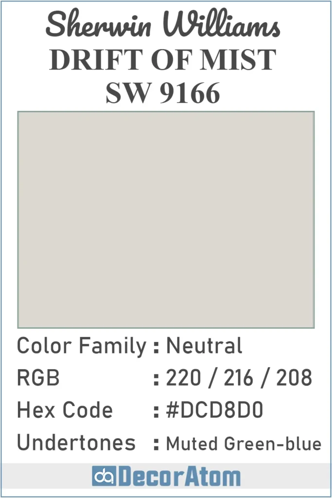
Hex Value
The hex value for Drift of Mist is #DCD8D0. If you’ve ever worked with colors on a website or graphic design project, you’ve probably seen these six-digit codes before. They’re just another way of representing RGB values in a format used on digital screens.
Undertones of Sherwin Williams Drift of Mist SW 9166
Undertones are where things can get tricky with neutral paint colors, and Drift of Mist is no exception.
While it first appears to be a simple light gray or greige, once it’s on the wall, you’ll start to notice subtle undertones of muted green and blue—especially depending on the light and the surrounding decor.
Now don’t worry, it’s not going to look like sage or sky blue. These undertones are very soft and stay tucked in the background.
In some lighting, the green will show up a bit more, giving the room a slight natural, earthy feel.
In cooler lighting, the blue undertone might peek through, especially if paired with other cool tones like gray or blue fabrics and furniture.
How Does Lighting Affect Sherwin Williams Drift of Mist SW 9166?
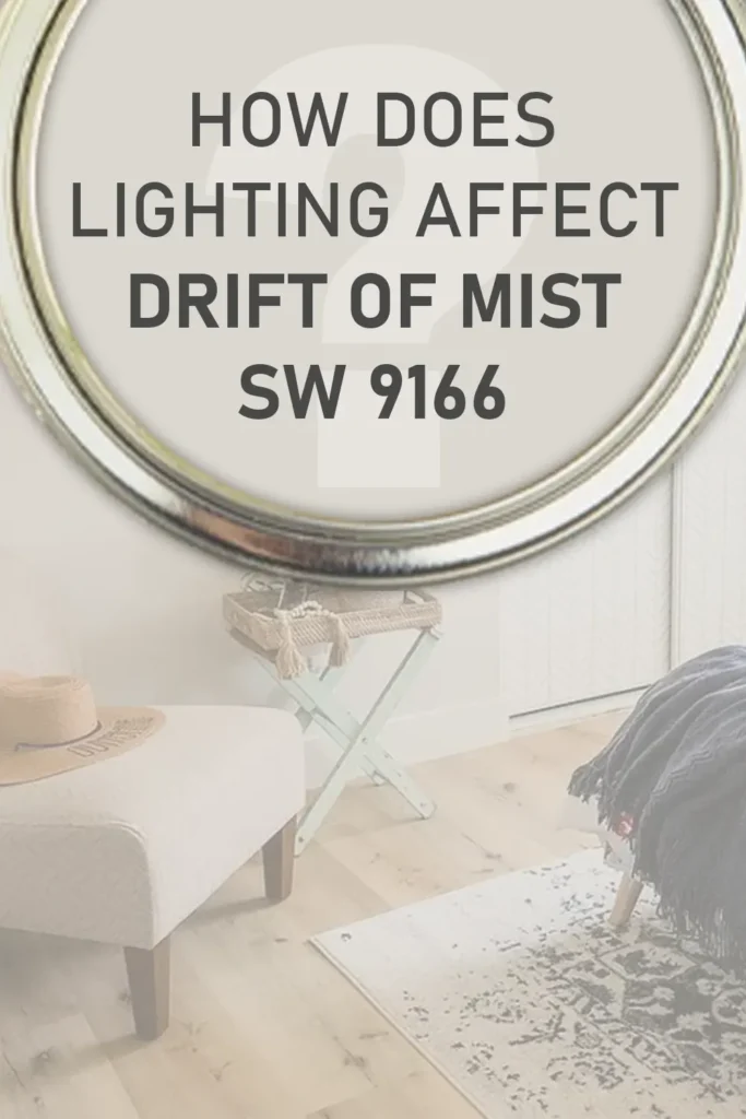
Lighting plays a huge role in how Drift of Mist looks in your space. In fact, I’d go so far as to say that this is one of those colors that really changes personality depending on the light.
In natural light, especially in rooms that face south or get steady sunlight throughout the day, Drift of Mist looks its warmest. You’ll see more of that creamy undertone and maybe even a slight green tint, but still subtle and soft. It feels fresh and airy without being too bright.
In north-facing rooms or spaces with cool artificial light, this color leans a bit cooler. That’s when the faint blue undertone might surface, giving it a slightly crisper, more gray appearance. Still pretty, still soft—but a little more reserved.
In low light or shaded areas, it can take on a more subdued, almost taupe-like appearance. The muted undertones help it avoid looking dingy, though, which is something I always appreciate in a neutral. It has enough depth to stay elegant, no matter what.
If you’re unsure how it will behave in your home, I highly recommend testing a sample on multiple walls and checking it throughout the day as the light shifts. That’s really the best way to see how Drift of Mist will work in your specific space.
Trim Colors to Pair With Sherwin Williams Drift of Mist SW 9166?
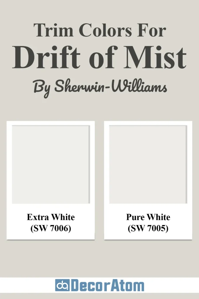
One of the things I really love about Drift of Mist is how easily it pairs with trim colors. You’ve got a few different directions you can go, depending on the style you’re aiming for.
If you’re going for a classic and crisp look, pair Drift of Mist with a bright white trim like Sherwin-Williams Extra White (SW 7006). This combination feels clean and timeless—it’s perfect for modern, transitional, or coastal styles. The contrast isn’t harsh, but it’s enough to make the walls pop just slightly against the trim.
For something a little softer and more subtle, try Sherwin-Williams Pure White (SW 7005). This is a warm white that complements the undertones in Drift of Mist beautifully. It still gives definition to the trim, but in a more muted, harmonious way—great if you’re leaning into an organic or serene style.
Also Read: Pure White SW 7005 Paint Color Review
And if you’re after a more monochromatic or low-contrast look, Drift of Mist on the trim as well can actually work. This creates a cozy, enveloping feel that’s modern and understated—especially in smaller spaces or bedrooms where you want a peaceful vibe.
Colors Similar to Sherwin Williams Drift of Mist SW 9166
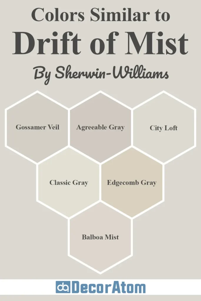
Drift of Mist sits in that magical zone of color where it’s neutral but not boring, warm but not beige, and soft without fading into the background.
Because of its balanced tone and subtle undertones, there are a few paint colors out there that feel very similar—whether you’re looking for slight variations or testing a few samples before committing.
Below, I’ve rounded up six similar colors—a mix of Sherwin-Williams and Benjamin Moore options—that carry the same quiet elegance as Drift of Mist. I’ll walk you through each and compare how they stack up side-by-side.
1. Sherwin-Williams Gossamer Veil

Gossamer Veil comes just one step darker than Drift of Mist and belongs to the same color strip. While Drift of Mist is soft and airy, Gossamer Veil leans a little more into the greige category.
It has a bit more depth and reads slightly warmer on the wall. If you love Drift of Mist but want a little more contrast, Gossamer Veil could be a great fit.
2. Sherwin-Williams Agreeable Gray
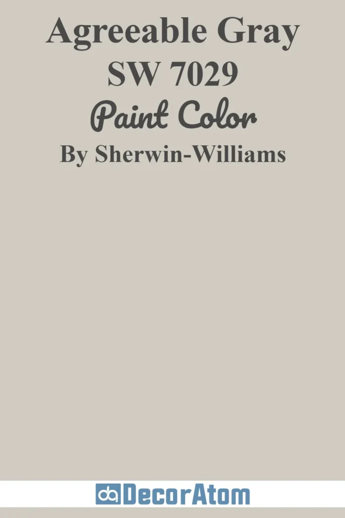
Agreeable Gray is a hugely popular neutral, and for good reason. It has more beige warmth compared to Drift of Mist and slightly more depth, thanks to its lower LRV.
While Drift of Mist feels lighter and more misty (as the name suggests), Agreeable Gray feels cozier and more grounded. It’s great for open-concept homes but may feel a touch heavier than Drift of Mist in smaller or low-light spaces.
Also Read: Agreeable Gray SW 7029 Paint Color Review
3. Sherwin-Williams City Loft

City Loft is a close cousin to Drift of Mist. It shares that airy gray-beige balance and reads as a warm, soft neutral.
The difference lies in the undertones—City Loft tends to pull more peach or pink in warm light, while Drift of Mist carries subtle green and blue. So, if you’re testing both, pay close attention to how they shift throughout the day.
4. Benjamin Moore Classic Gray
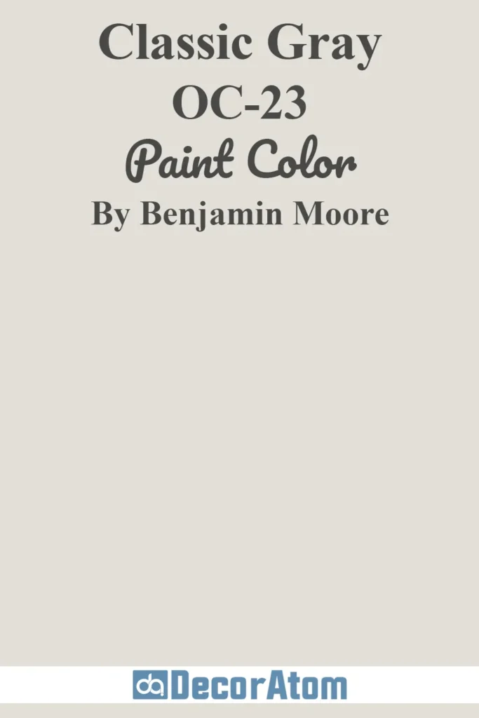
Classic Gray is a beautiful near-white neutral that works similarly to Drift of Mist in bright, airy spaces. Both colors are soft, subtle, and elegant.
However, Classic Gray leans ever-so-slightly cooler and has less of the green-blue undertone that Drift of Mist has. It’s a great alternative if you want a color that feels more like a “barely-there” gray.
5. Benjamin Moore Edgecomb Gray
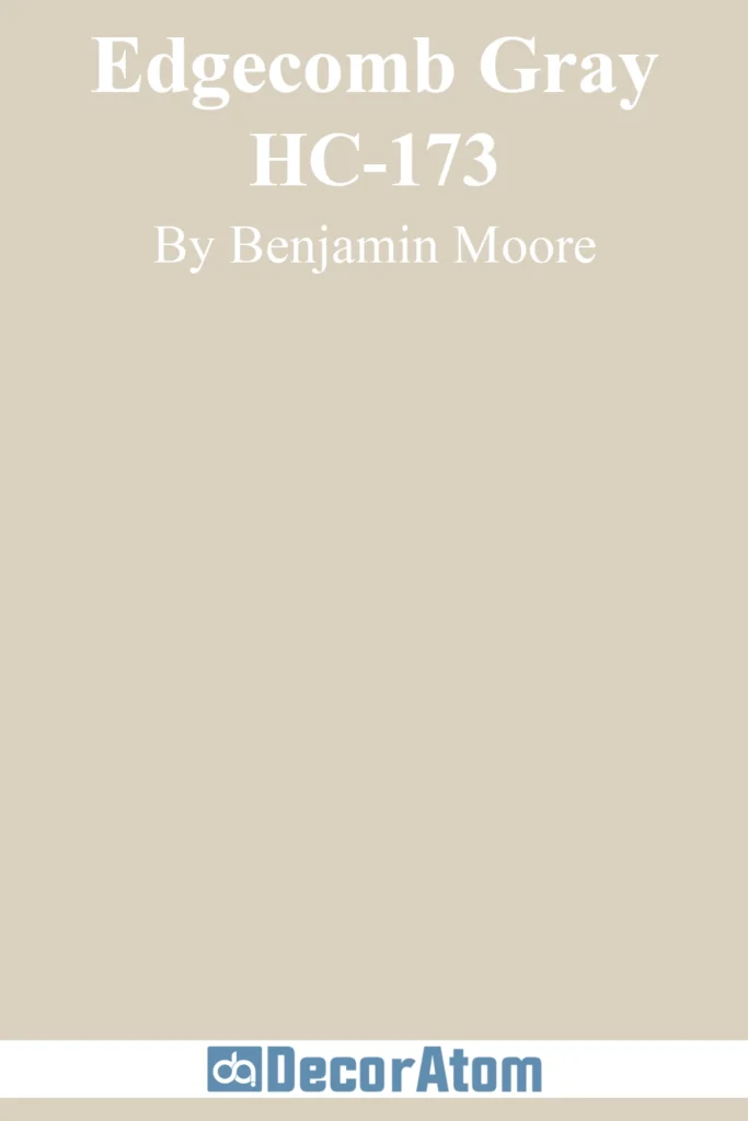
Edgecomb Gray is one of Benjamin Moore’s most versatile warm grays. It leans a bit more beige than Drift of Mist, and its undertones are a mix of taupe and cream.
Compared side-by-side, Edgecomb Gray feels warmer and more traditional, while Drift of Mist feels slightly fresher and more modern. Still, both are beautiful choices for neutral walls.
6. Benjamin Moore Balboa Mist
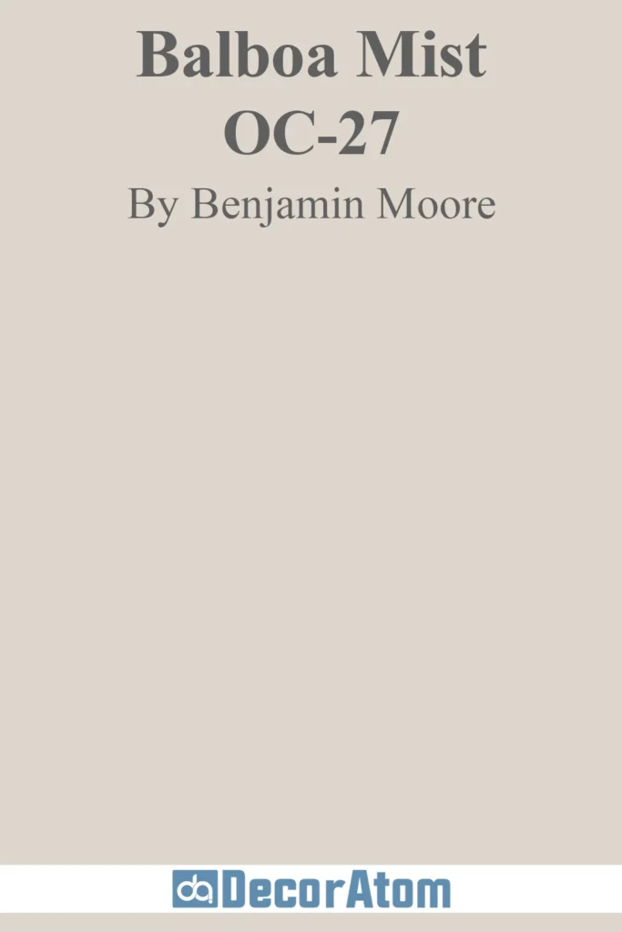
Balboa Mist is another light greige that dances between warm and cool, depending on the light. Compared to Drift of Mist, it has more of a violet undertone, which gives it a more sophisticated or even slightly feminine feel.
Drift of Mist, on the other hand, keeps things more grounded with its earthy undertones. If you’re deciding between the two, Balboa Mist is a bit moodier; Drift of Mist is more relaxed and neutral.
Colors that Go With Sherwin Williams Drift of Mist SW 9166
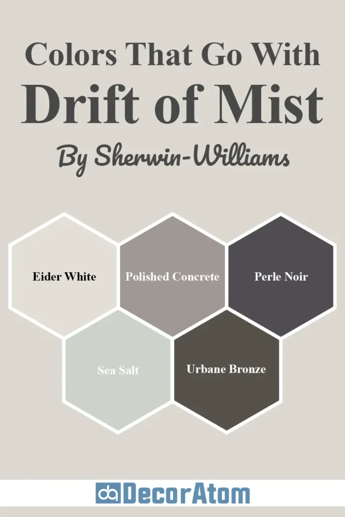
When you find a neutral like Drift of Mist, one of the best things about it is how well it plays with other colors. It’s flexible, understated, and makes the perfect backdrop for bolder hues or layered neutrals.
Whether you’re creating a calming color palette or adding depth and personality with accent walls and decor, Drift of Mist can handle it all.
Here are five coordinating colors that pair beautifully with Drift of Mist:
1. Eider White
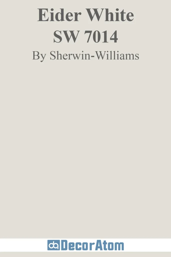
Eider White is a soft off-white with a touch of gray and the faintest purple undertone. When paired with Drift of Mist, it creates a gentle contrast that still feels cohesive.
Eider White works beautifully on trim or ceilings if you want something a bit warmer and more blended than a stark bright white.
It also makes a lovely pairing in bedrooms or living rooms for a layered neutral effect.
2. Polished Concrete
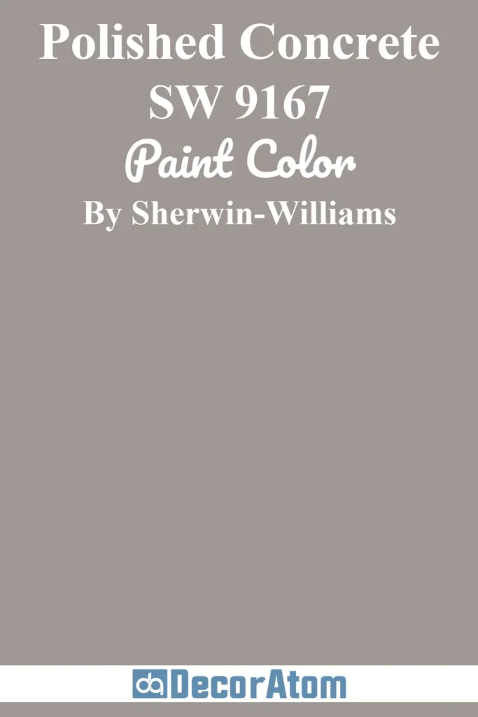
This color is right next to Drift of Mist on the Sherwin-Williams color strip and has a slightly deeper, moodier gray tone.
Polished Concrete adds a sophisticated depth when used as an accent wall or cabinetry color.
It grounds the lightness of Drift of Mist while still keeping everything in the same harmonious color family.
3. Perle Noir
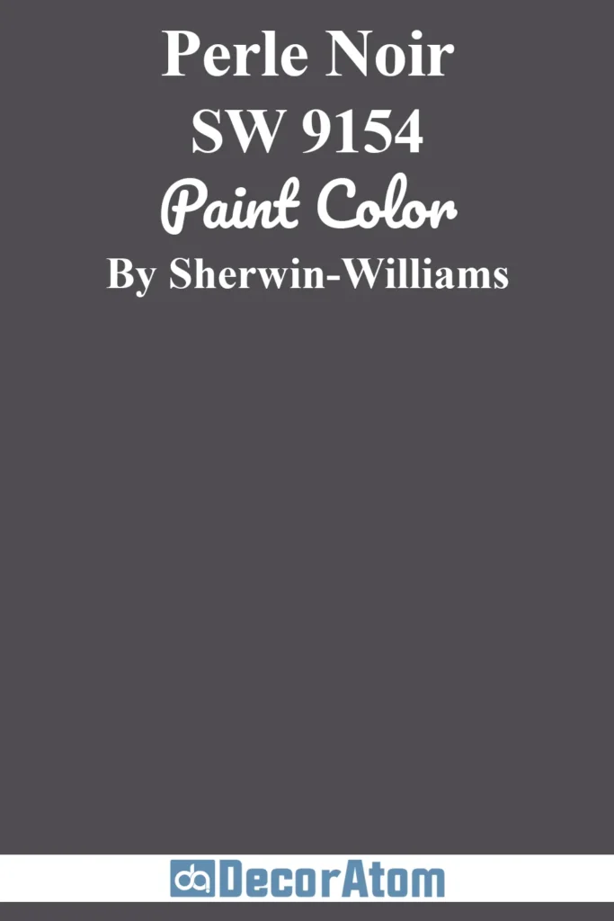
Now, this one is bold—but in the best way. Perle Noir is a deep charcoal black with subtle warmth.
If you’re looking to add contrast and drama, pairing Drift of Mist with Perle Noir can be absolutely stunning.
Think black interior doors, furniture, or light fixtures against soft neutral walls. It gives that modern edge without being too stark or high-contrast.
4. Sea Salt
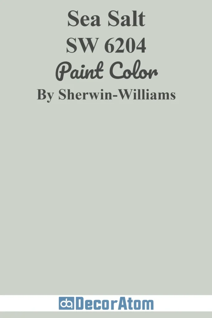
Sea Salt is a soft, muted green with a touch of blue—perfect for coastal or serene interiors. When used alongside Drift of Mist, the green-blue undertones of both colors play together nicely without clashing.
This combo feels very natural, soothing, and spa-like. It works great in bathrooms, bedrooms, or even laundry rooms.
Also Read: Sea Salt SW 6204 Paint Color Review
5. Urbane Bronze
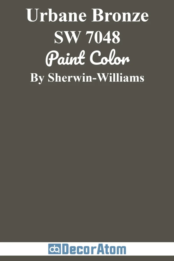
Urbane Bronze is a deep, earthy brown-gray that was Sherwin-Williams’ Color of the Year not too long ago. It pairs beautifully with Drift of Mist for a modern yet cozy feel.
Use it on accent walls, cabinets, or even built-ins to add richness and dimension without overpowering the space.
Comparing Sherwin Williams Drift of Mist SW 9166 With Other Colors
Choosing paint colors often comes down to comparing a few favorites side-by-side. Even the subtlest difference in undertone, depth, or warmth can completely change how a color feels in your home.
Drift of Mist is a unique neutral with green-blue undertones, but there are other popular shades that are often considered alongside it.
Let’s walk through a few of those comparisons to help you see the subtle (and not-so-subtle) differences:
Sherwin Williams Drift of Mist vs Crushed Ice
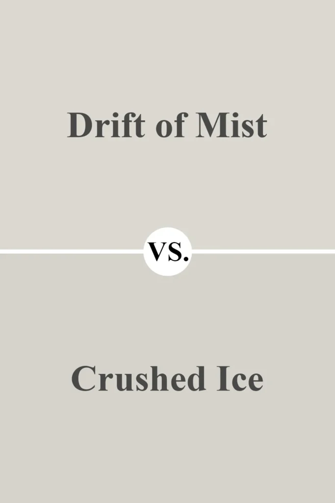
Crushed Ice is cooler and grayer than Drift of Mist. While Drift of Mist has soft warmth and those earthy green-blue undertones, Crushed Ice feels a bit sharper and more modern.
It works better in homes that lean into cooler palettes with blue, gray, and black accents. Drift of Mist, on the other hand, is more versatile if you’re blending warm and cool elements.
Sherwin Williams Drift of Mist vs Alabaster
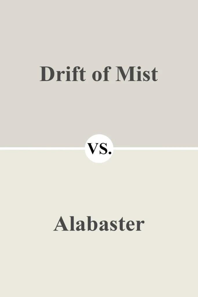
Alabaster is a creamy off-white with warm, beige undertones. It’s much lighter than Drift of Mist and tends to read as a soft white on the wall.
If you’re looking for a barely-there neutral that still has some warmth, Alabaster is beautiful.
But if you want more contrast or a color that stands out a bit from white trim, Drift of Mist gives you more body.
Also Read: Alabaster SW 7008 Paint Color Review
Sherwin Williams Drift of Mist vs Repose Gray
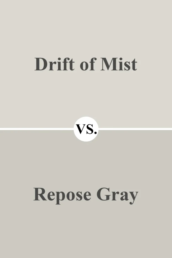
Repose Gray is often considered a go-to greige, but it’s noticeably darker and more saturated than Drift of Mist.
It also has a slight purple undertone, especially in cool light, which can surprise people.
Drift of Mist stays more neutral and leans softer and lighter overall. For spaces that need more brightness or feel a bit small, Drift of Mist is usually the better fit.
Also Read: Repose Gray SW 7015 Paint Color Review
Sherwin Williams Drift of Mist vs Aesthetic White
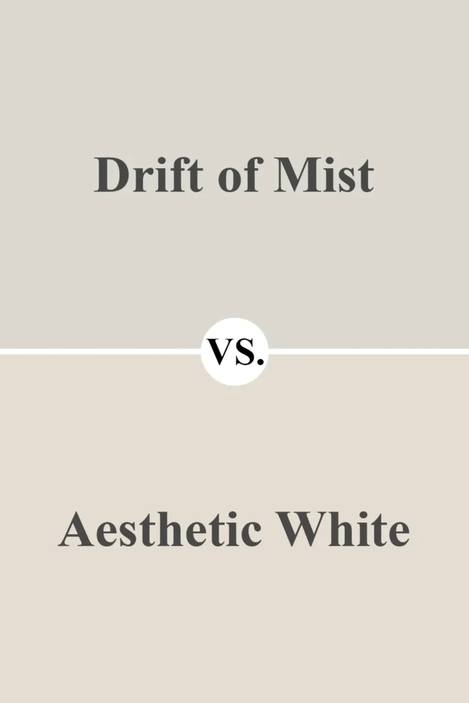
These two are close in tone and feel, but Aesthetic White leans a bit warmer and creamier. It doesn’t have the same green-blue undertones and instead feels a bit more traditional.
Drift of Mist is a touch cooler and more modern, making it feel a little more adaptable across different design styles.
Also Read: Aesthetic White SW 7035 Paint Color Review
Sherwin Williams Drift of Mist vs Shoji White
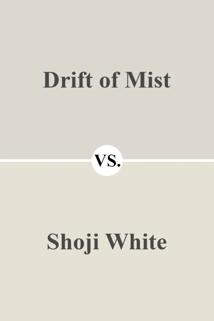
Shoji White is warmer and more beige. It brings more of a creamy undertone into play, while Drift of Mist is lighter and a bit crisper.
If you want your walls to feel soft and warm, Shoji White is lovely. But if you’re looking for a color that feels light and natural without too much warmth, Drift of Mist might win.
Sherwin Williams Drift of Mist vs Snowbound

Snowbound is a soft, warm white with slight pink undertones. Compared to Drift of Mist, it looks much lighter—almost like a true white in some spaces.
These two actually pair well together, with Snowbound as trim or cabinetry and Drift of Mist on the walls.
But in terms of overall tone, Snowbound is much closer to white, while Drift of Mist is more clearly a pale neutral.
Where to Use Sherwin Williams Drift of Mist?
Drift of Mist is one of those rare paint colors that feels right at home just about anywhere.
It’s subtle but not bland, light but not stark, and neutral enough to act as a backdrop without ever feeling cold. That’s why I think it works beautifully in every room of the house—and even on the exterior.
If you’ve been wondering where this paint really shines, let me walk you through some of the best places to use Drift of Mist in your home.
I’ll also share how it behaves in each setting, so you can get a clearer picture of what to expect on your walls.
Sherwin Williams Drift of Mist in the Bedroom
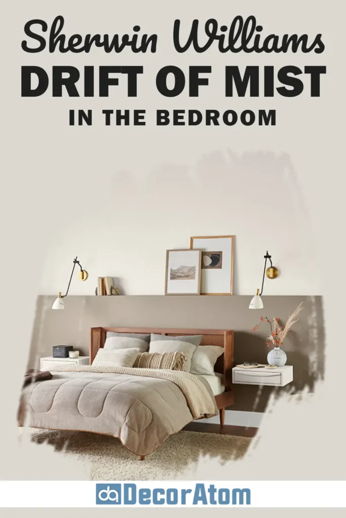
Drift of Mist in a bedroom creates an atmosphere that feels calm, cozy, and effortlessly sophisticated.
It’s not too dark, so it won’t weigh down the space, but it still brings enough warmth and character to keep the room from feeling sterile.
In the morning light, it gives off a clean and slightly airy appearance, while in the evening, the undertones deepen slightly, adding a restful, cocoon-like vibe.
I love it paired with soft whites, muted greens, or even navy blue for contrast. If you’re going for a bedroom that feels like a peaceful retreat, Drift of Mist is a fantastic starting point.
Sherwin Williams Drift of Mist in the Living Room
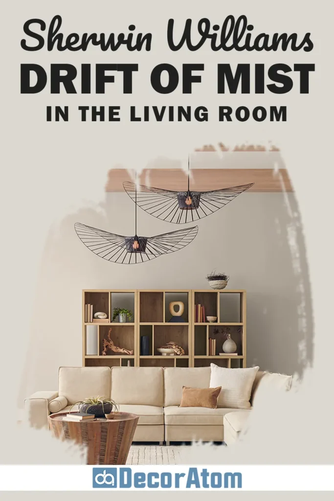
Living rooms can be tricky—you want them to feel warm and welcoming, but also put-together. Drift of Mist strikes that balance perfectly.
It offers a light, refined backdrop that lets your furniture, art, and textures take the spotlight without competing with them.
In open-concept living spaces, it transitions really well from one room to another. It also works great with both warm-toned wood floors and cooler elements like gray sofas or metal fixtures.
And thanks to its soft undertones, it reflects natural light beautifully without ever looking too bright or washed out.
Sherwin Williams Drift of Mist in the Kitchen
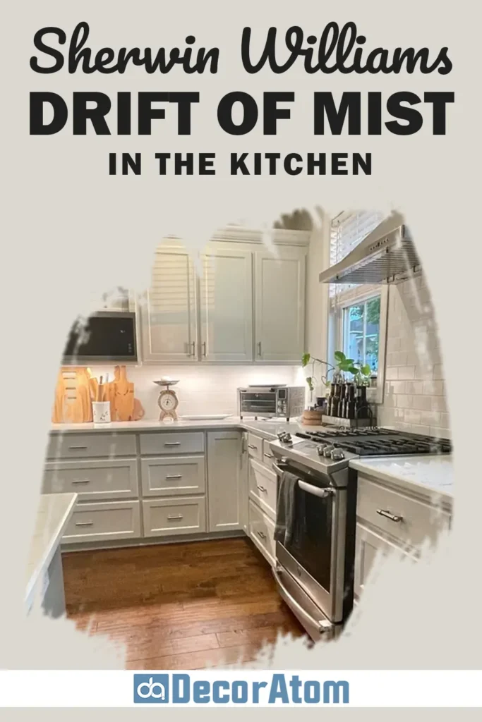
Kitchens often need a color that can bridge the gap between cabinets, countertops, and backsplash—and Drift of Mist is one of the few that can do that effortlessly.
Whether you’ve got white shaker cabinets, warm wood tones, or even a darker kitchen island, this color pulls everything together with its gentle warmth.
On the walls, it gives the kitchen a clean and open feel, but still has enough depth that it won’t disappear next to white trim or cabinetry.
I’ve also seen it used on lower cabinets or even all-over cabinetry paired with a white quartz countertop—it’s understated and timeless.
Sherwin Williams Drift of Mist in the Bathroom
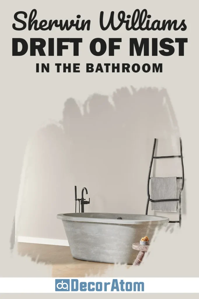
Bathrooms benefit from colors that feel fresh and clean, but also a little soft and comforting. Drift of Mist is a great fit here because it provides that spa-like calm without feeling too icy or clinical.
It pairs really well with white tile, brushed nickel or matte black fixtures, and soft textiles like white or gray towels.
Whether you have a window letting in natural light or you’re working with artificial lighting, Drift of Mist holds its own and maintains a beautiful tone throughout the day.
It’s also a lovely choice for smaller bathrooms or powder rooms if you want to make the space feel a bit bigger.
Sherwin Williams Drift of Mist for the Exterior

Yes—Drift of Mist works wonderfully outside too! While you might think it’s too light at first glance, it actually reads as a soft, neutral greige on exteriors, especially in full sunlight.
It’s light enough to stay cool and modern, but not so pale that it washes out.
For trim, it pairs well with brighter whites like Extra White or Pure White, and for shutters or doors, darker colors like Urbane Bronze or Perle Noir really make it pop.
On a modern farmhouse, coastal cottage, or even a transitional-style home, Drift of Mist gives that timeless curb appeal without going full white or beige.
Why I Love Sherwin Williams Drift of Mist
What I love most about Drift of Mist is how it manages to do so much while staying so simple. It’s neutral, but never boring.
It’s light, but never cold. And no matter where I use it, it adapts like a pro—changing just enough with the light and surrounding colors to always feel right.
There’s also a softness to this shade that’s hard to find in other light neutrals. It brings an understated elegance to a space, like it’s quietly saying, “I’ve got this covered”—without shouting for attention.
Whether I’m going for cozy and calm or crisp and refined, Drift of Mist always gives me a beautiful foundation to build on.
It’s one of those colors I keep coming back to, especially when I’m stuck or overwhelmed with options. When in doubt, Drift of Mist has never let me down.
Click here to get a Peel & Stick paint sample of Drift of Mist SW 9166
Final Thoughts
If you’re searching for a versatile, calming, and effortlessly elegant neutral paint color, Sherwin-Williams Drift of Mist SW 9166 deserves a spot on your shortlist.
With its soft green-blue undertones, balanced warmth, and light reflectivity, it brings a subtle sophistication to any room—without overwhelming your space.
Whether you’re designing a cozy bedroom, a polished kitchen, or even freshening up your exterior, Drift of Mist can do it all.
It’s one of those rare neutrals that feels fresh and grounded at the same time.
And once you see it on your walls, chances are you’ll understand why so many people (myself included) keep coming back to it.