
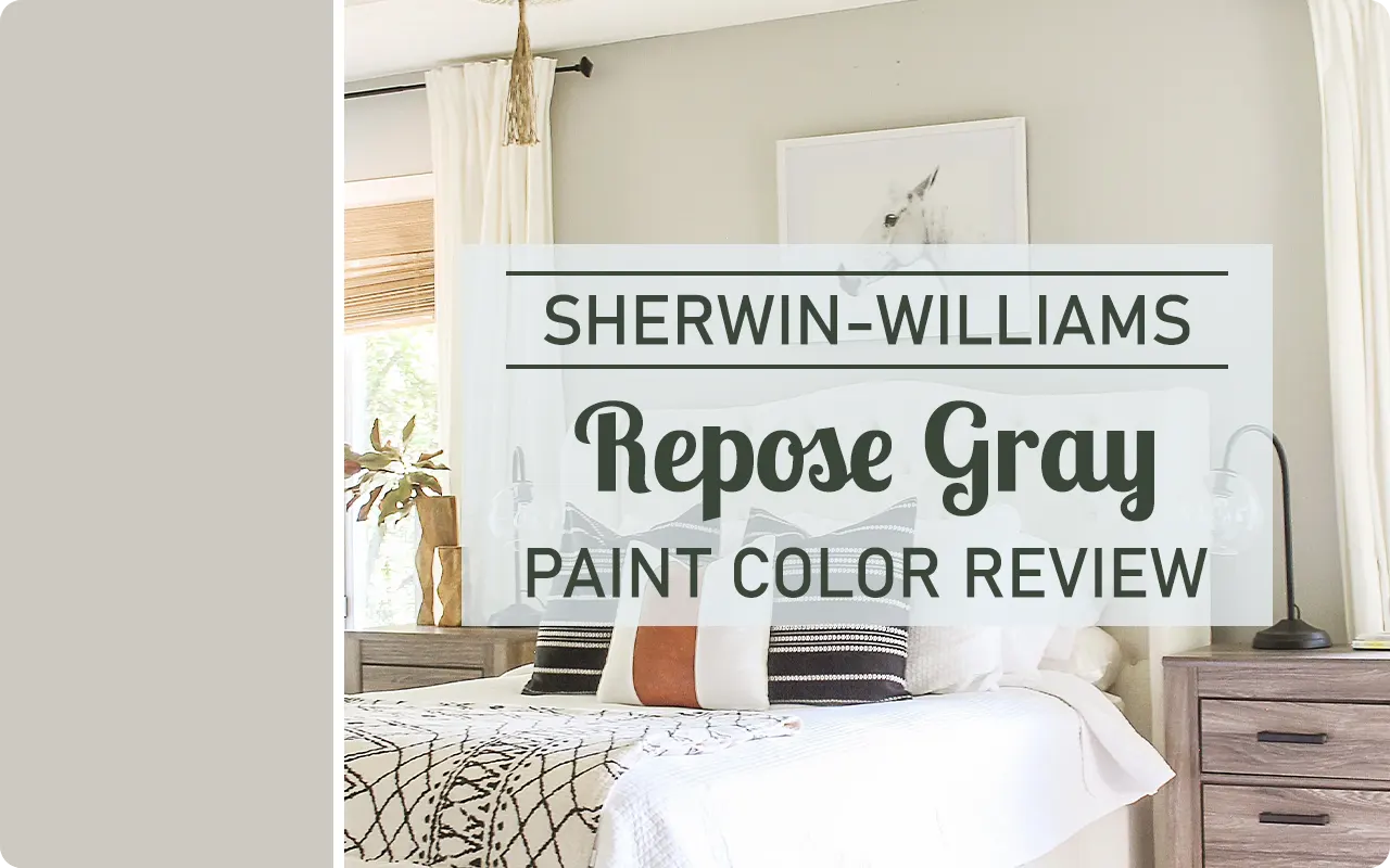
If you’ve spent any time scrolling through Pinterest home makeovers or Instagram-worthy interiors, there’s a good chance you’ve come across Repose Gray by Sherwin-Williams.
It’s one of those timeless, crowd-pleasing colors that always seems to work—no matter the style of the home or the room you’re painting.
I first stumbled upon Repose Gray when I was hunting for a neutral that didn’t feel too cold or too beige.
I wanted something balanced—light enough to keep a space airy, but still grounded enough to add character.
And that’s where Repose Gray shines. It’s versatile, it plays well with both warm and cool tones, and it doesn’t scream for attention.
Instead, it creates a calming, welcoming backdrop that lets everything else in your room stand out.
In this post, I’m breaking down exactly what kind of color it is, how it behaves in different lighting, and why so many people (myself included!) keep coming back to it.
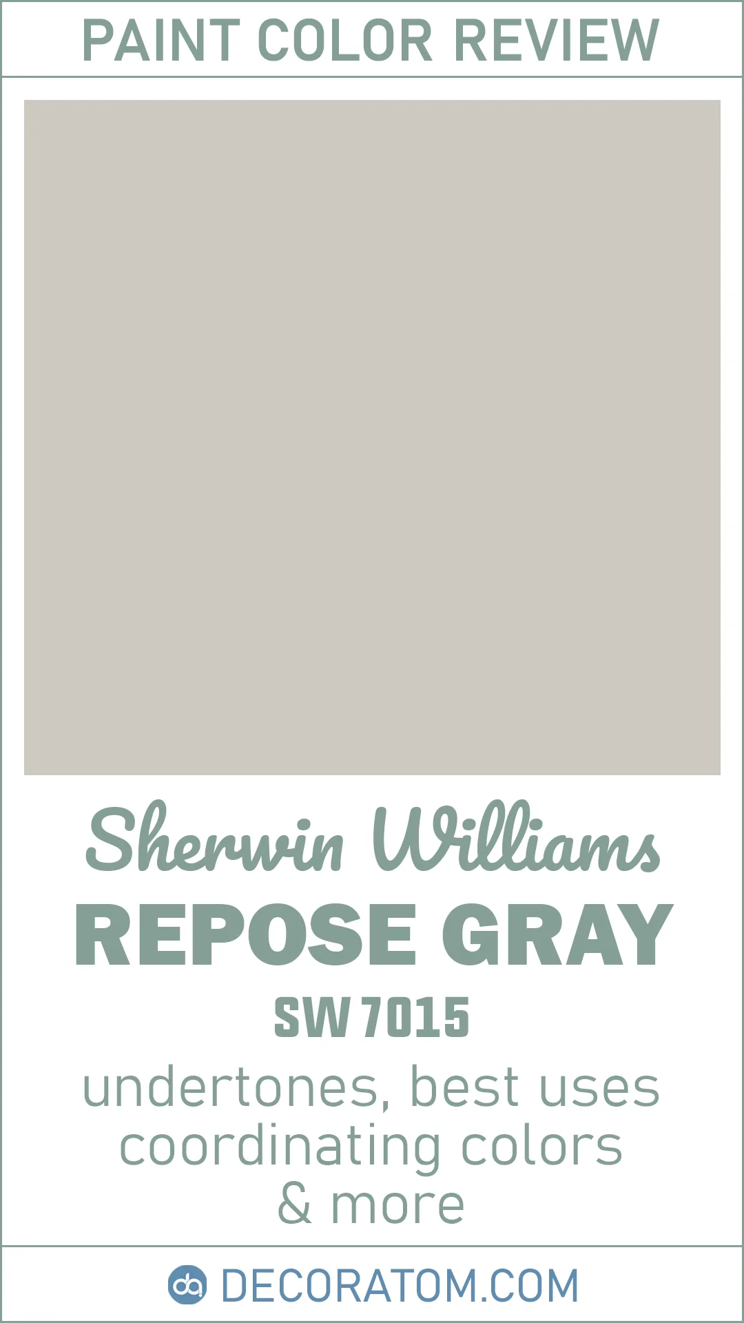
What Color is Sherwin-Williams Repose Gray SW 7015?
Repose Gray is a soft, light-to-medium gray with just a hint of warmth. It’s not a flat or steely gray that might remind you of concrete or stainless steel.
Instead, it has a gentle, almost cozy feel to it. You’ll notice it leans slightly toward a greige—meaning it’s a mix of gray and beige—but the gray is definitely the dominant tone here.
The best part is that Repose Gray feels very balanced. It doesn’t pull too much in one direction, which makes it super adaptable.
It can look more traditional or modern depending on your furniture, flooring, and decor. In some spaces, especially with natural light, you may even catch a whisper of a purple or taupe undertone, but it’s very subtle.
Overall, this color feels calm, soft, and incredibly livable.
Is It a Warm or Cool Color?
Repose Gray is technically a warm gray, but it sits very close to the middle of the warm-cool spectrum. That’s what makes it such a go-to paint color for so many different styles of homes. It has just enough warmth to prevent it from feeling chilly, but not so much that it looks beige or creamy.
In south-facing rooms or spaces with warm lighting, the warm undertones in Repose Gray become more noticeable. It might even feel slightly beige in the late afternoon glow.
On the flip side, in a north-facing room with cooler light, it holds onto its gray character a bit more and can feel more neutral or even slightly cool.
That’s the beauty of it—it adjusts to the space without ever feeling out of place. It’s this adaptability that has made it a favorite for whole-house color schemes and open floor plans where you need something that plays well with a variety of elements.
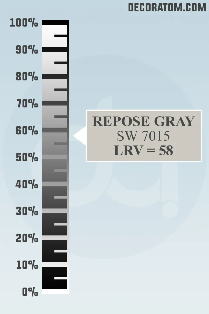
LRV of Sherwin-Williams Repose Gray SW 7015
💥🎁 Christmas & Year-End Deals On Amazon !
Don't miss out on the best discounts and top-rated products available right now!
*As an Amazon Associate, I earn from qualifying purchases.
Let’s talk about LRV, which stands for Light Reflectance Value. I know that might sound a little technical, but here’s a simple way to understand it: LRV is a number between 0 and 100 that tells you how much light a paint color reflects.
A lower number means the color is darker and absorbs more light, while a higher number means it’s lighter and reflects more light.
Repose Gray has an LRV of 58, which puts it in the light-to-medium range. It’s not super bright like a white or off-white, but it’s still light enough to keep a room feeling open and airy.
This LRV makes it ideal for almost any room—you can use it in living rooms, bedrooms, hallways, and even bathrooms without worrying that it’ll make the space feel too dark.
It offers just the right amount of contrast against white trim and ceilings while still keeping things soft and relaxed.
Undertones of Sherwin-Williams Repose Gray SW 7015
Undertones can be sneaky, and with Repose Gray, they definitely play a subtle but important role in how this color feels in a space.
At its core, Repose Gray is a warm gray (or greige), but what makes it unique is its soft undertone blend. It carries slight hints of brown, beige, and a touch of purple—sometimes even a bit of blue depending on the lighting.
Now, don’t let the mention of purple scare you. It’s not bold or obvious, but in certain lights—especially cooler, north-facing ones—you might see a faint purple or taupe cast.
This is what gives Repose Gray that sophisticated, slightly modern edge, without veering into icy or cold territory. It also means this color tends to shift ever so slightly depending on what else is in the room, like wood tones, lighting, and even flooring.
It’s this kind of layered undertone that makes Repose Gray feel dimensional. It doesn’t fall flat on the wall. Instead, it has a softness and depth that helps it feel interesting without being overpowering.
How Does Lighting Affect Sherwin-Williams Repose Gray SW 7015?

Lighting has a big impact on Repose Gray, and it’s one of the reasons I always recommend testing it on your own walls before fully committing.
What looks perfect in one house can read a bit differently in another just based on natural and artificial light.
Here’s how it tends to behave in different lighting situations:
- North-facing rooms: These spaces tend to have cooler, bluer natural light, and in this light, Repose Gray can lean slightly cooler as well. You may notice a touch more of the gray and even a slight purple undertone coming forward. It can feel elegant and moody here, but still soft and neutral.
- South-facing rooms: These rooms get warmer, yellow-toned light throughout the day, which tends to bring out the warmer side of Repose Gray. It can look almost creamy or beige-ish in certain moments, which gives it a cozy and inviting feel.
- East-facing rooms: These get bright, clear light in the morning and cooler light later in the day. Repose Gray may shift with the sun—looking warm and soft early on, and slightly cooler in the afternoon.
- West-facing rooms: These rooms get softer light in the morning and much warmer light as the sun sets. Repose Gray can appear noticeably warmer in the late afternoon glow, sometimes even showing a hint of brown or taupe.
Artificial lighting also matters. Warm LED or incandescent bulbs will pull out more of Repose Gray’s soft, warm side, while cool LEDs may emphasize the gray or even slightly violet undertones.
Always try a large sample in the space where you plan to paint to see how the color interacts with your light sources.
Trim Colors to Pair With Sherwin-Williams Repose Gray SW 7015
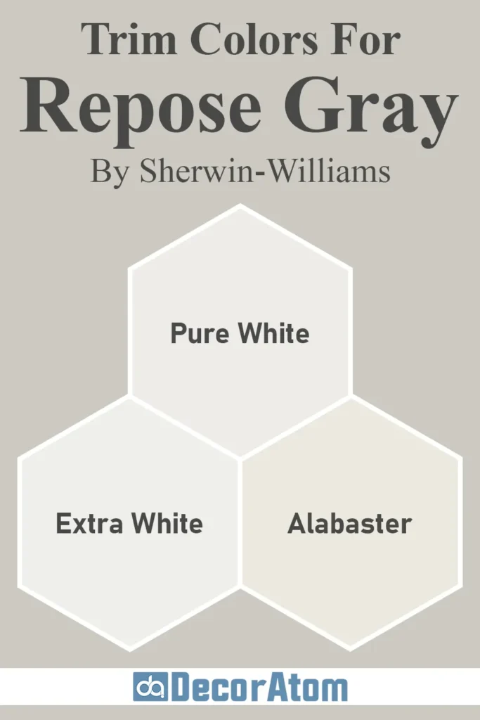
Repose Gray looks fantastic with crisp white trim—it’s a classic pairing that never goes out of style. My favorite trim color to use with Repose Gray is Sherwin-Williams Pure White (SW 7005). It’s clean and bright without feeling stark or cold, which complements the warmth in Repose Gray beautifully.
Another great option is Sherwin-Williams Extra White (SW 7006) if you want a brighter, more modern contrast. It’s cooler and cleaner than Pure White, and it really sharpens up the edges of your space—especially if you’re going for a more contemporary or minimal look.
If you’re into softer, creamier trim with a more traditional or cottage-style vibe, you could consider Sherwin-Williams Alabaster (SW 7008). It’s warmer and creamier, which brings out the beige undertones in Repose Gray and creates a cozy, layered look.
Each of these trim options gives a slightly different feel, so it really depends on the look you’re after. But no matter which way you go, Repose Gray pairs effortlessly with white trims—it’s part of what makes it so easy to work with.
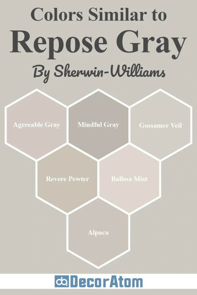
Colors Similar to Sherwin-Williams Repose Gray SW 7015
💥🎁 Christmas & Year-End Deals On Amazon !
Don't miss out on the best discounts and top-rated products available right now!
*As an Amazon Associate, I earn from qualifying purchases.
Before settling on Repose Gray, it’s a good idea to look at a few close alternatives. Even slight shifts in undertone or depth can make a big difference in how a gray feels in your space.
Maybe you want something a touch warmer, a smidge lighter, or maybe just a slightly cooler option for comparison.
Here are six similar colors—some from Sherwin-Williams, some from Benjamin Moore—that you might want to consider. I’ll also explain how each one compares to Repose Gray so you can see where they’re alike and where they differ.
1. Sherwin-Williams Agreeable Gray (SW 7029)
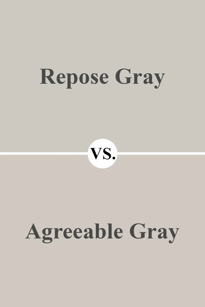
Agreeable Gray is often compared to Repose Gray, and for good reason—they’re both warm grays (greiges) that fall in a similar lightness range. However, Agreeable Gray leans just a little warmer and has more noticeable beige undertones.
If you want a gray that feels a bit cozier and less likely to show cool or purple tones, Agreeable Gray might be a better fit. It’s more of a true greige, while Repose Gray holds onto a touch more gray.
2. Sherwin-Williams Mindful Gray (SW 7016)
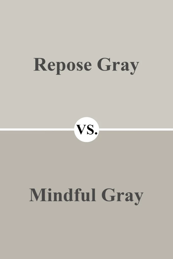
Mindful Gray is just one shade darker than Repose Gray on the same color strip. It shares a lot of the same DNA, but it has a bit more depth and feels more grounded.
If Repose Gray is a bit too light for your space or you want more contrast against white trim, Mindful Gray is a great alternative. It still has that soft warmth, but you’ll notice it reads a little richer and slightly more dramatic.
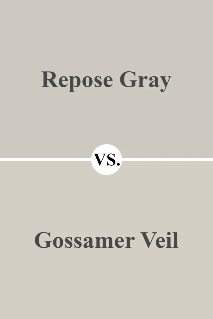
3. Sherwin-Williams Gossamer Veil (SW 9165)
💥🎁 Christmas & Year-End Deals On Amazon !
Don't miss out on the best discounts and top-rated products available right now!
*As an Amazon Associate, I earn from qualifying purchases.
Gossamer Veil is a lighter and slightly warmer gray than Repose Gray. It’s a good choice if you’re looking for something soft and airy that still has some warmth.
It doesn’t show the same subtle purple undertones that Repose Gray sometimes does, so if you want something simpler and more straightforward, this one’s worth a look.
4. Benjamin Moore Revere Pewter (HC-172)
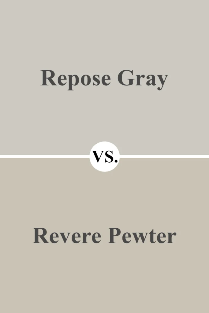
This is one of Benjamin Moore’s most iconic greiges. Revere Pewter is warmer and a bit more beige than Repose Gray. It has an earthier tone, especially in rooms with less natural light.
If you’re going for a traditional, warm, and cozy feel, Revere Pewter might be a better match than the slightly cooler and more modern-feeling Repose Gray.
5. Benjamin Moore Balboa Mist (1549)
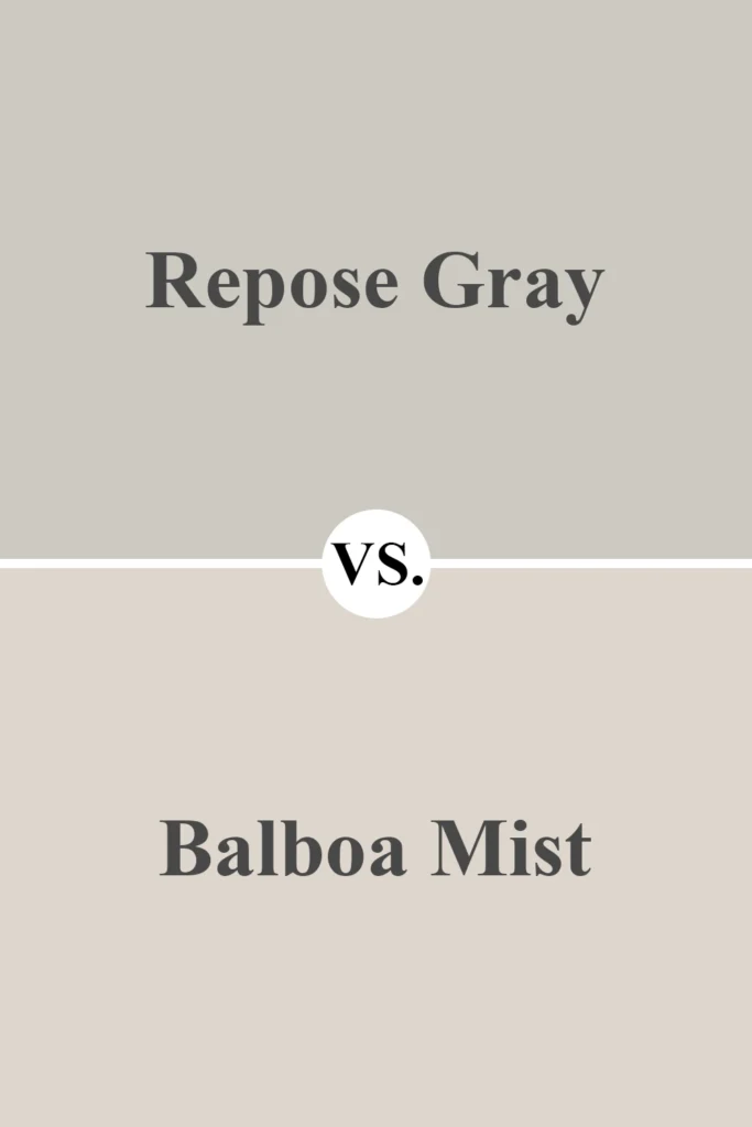
Balboa Mist is a gorgeous light gray with warm undertones and a soft, airy feel. Compared to Repose Gray, it’s a little lighter and doesn’t lean as much into the gray side.
Balboa Mist feels a touch more off-white in bright spaces, while Repose Gray retains more of its gray character. If you’re looking for something just a hair more subtle and lighter, Balboa Mist is a beautiful option.
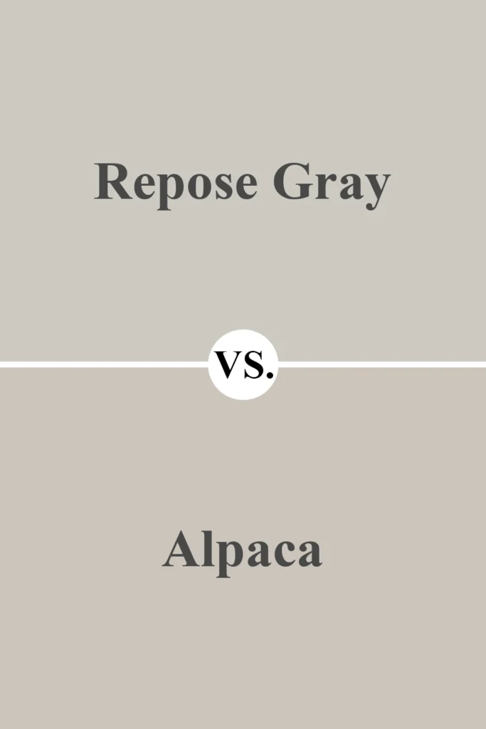
6. Sherwin-Williams Alpaca (SW 7022)
💥🎁 Christmas & Year-End Deals On Amazon !
Don't miss out on the best discounts and top-rated products available right now!
*As an Amazon Associate, I earn from qualifying purchases.
Alpaca is a warm gray that’s similar in depth to Repose Gray, but it pulls more brown and taupe. Some people find Alpaca too taupe or muddy, especially if they were expecting a true gray.
But if you like a warm, earthy greige with very soft undertones and less of that purple cast, Alpaca might feel more grounded than Repose Gray.
Colors that Go With Sherwin-Williams Repose Gray SW 7015
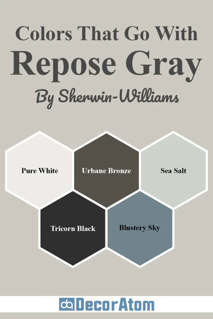
One of the reasons Repose Gray is so popular is because it’s incredibly versatile—it plays well with a wide range of colors.
You can pair it with other neutrals for a soft and serene vibe, or use it as a subtle backdrop to more vibrant colors.
Because it sits right on that lovely line between warm and cool, it balances beautifully with both earthy tones and crisp accents.
If you’re building a whole-home color palette or just want a few accent ideas to match with Repose Gray, here are five colors that work beautifully alongside it:
1. Sherwin-Williams Pure White (SW 7005)
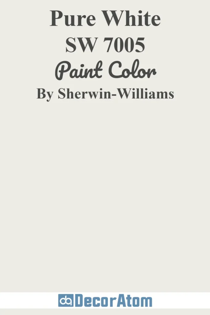
Let’s start with a classic pairing. Pure White is a clean, soft white that makes an excellent trim or ceiling color with Repose Gray.
It has just a touch of warmth, so it doesn’t feel stark or clinical, but it’s still crisp enough to create a fresh contrast. This combo is timeless—it works in traditional homes, modern spaces, and everything in between.
2. Sherwin-Williams Urbane Bronze (SW 7048)

💥🎁 Christmas & Year-End Deals On Amazon !
Don't miss out on the best discounts and top-rated products available right now!
*As an Amazon Associate, I earn from qualifying purchases.
If you’re looking for something moody and bold to add drama, Urbane Bronze is a stunning choice. This deep, warm bronze has gray and brown undertones that echo some of the softness in Repose Gray but deepen the palette.
It works well on an accent wall, cabinetry, or even front doors and exteriors. When paired together, these two colors create a grounded, sophisticated, and cozy feel.
3. Sherwin-Williams Sea Salt (SW 6204)
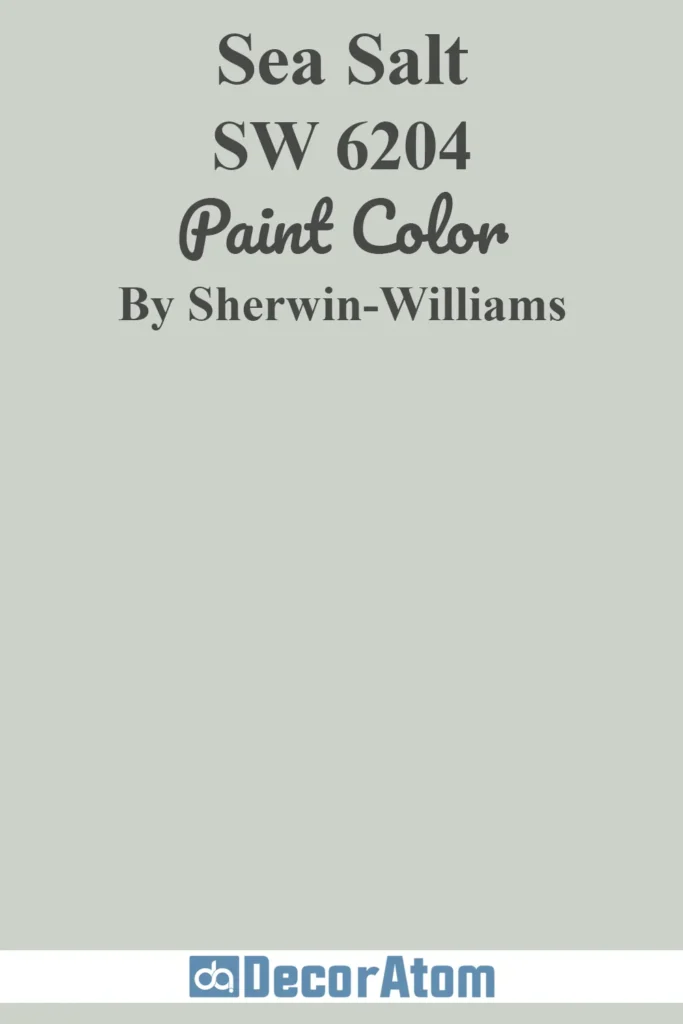
Sea Salt is a soft greenish-blue with a peaceful, coastal vibe. It has enough color to add personality but still feels calm and understated.
When paired with Repose Gray, the result is soothing and serene. I especially love this combination in bathrooms and bedrooms where you want a spa-like, relaxing atmosphere.
4. Sherwin-Williams Tricorn Black (SW 6258)

If you’re going for a modern look, you can’t go wrong with a sharp contrast like Tricorn Black. It’s a true, rich black with very little undertone, so it makes a statement when used for doors, hardware, fixtures, or even a painted accent wall.
Repose Gray provides the softness and balance that keeps Tricorn Black from feeling too intense or harsh.
5. Sherwin-Williams Blustery Sky (SW 9140)
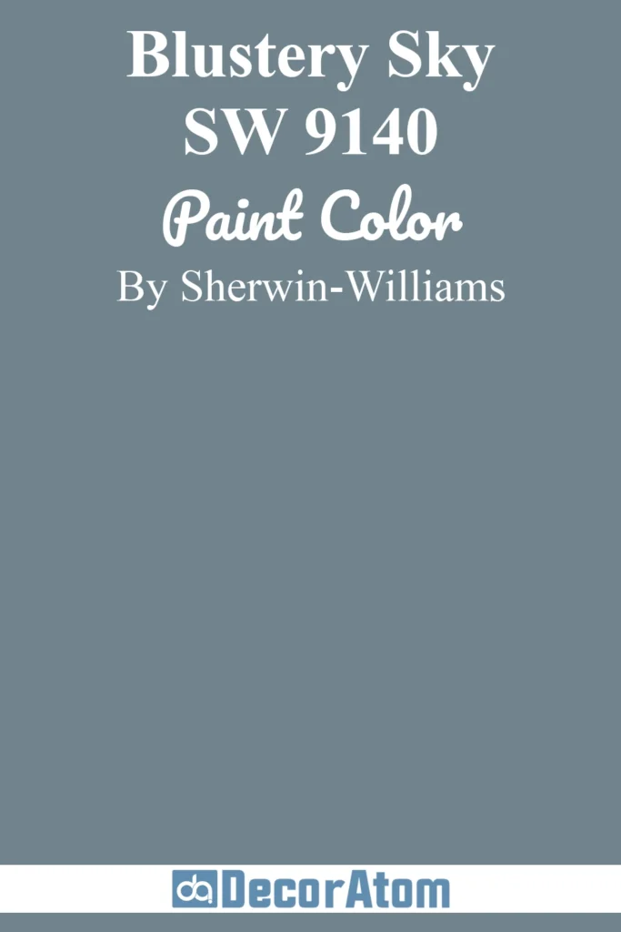
Blustery Sky is a muted, stormy blue that brings a cool, calm edge to a Repose Gray palette. The gray-blue tone complements Repose Gray’s purple and blue undertones without overwhelming the space.
It’s a perfect match if you want a bit more color without going too bold. I’ve seen this pair work beautifully in dining rooms and home offices.
Where to Use Sherwin-Williams Repose Gray SW 7015?
Repose Gray isn’t just a “nice gray”—it’s a flexible, easygoing color that can work in just about every room of the house (and even outside it).
Its soft warmth makes it feel comfortable and welcoming, while the touch of gray gives it that clean, modern vibe people love. It adapts beautifully depending on your lighting and decor.
Let’s break it down room by room, because how this color feels really depends on how and where you use it.
Sherwin-Williams Repose Gray in the Bedroom
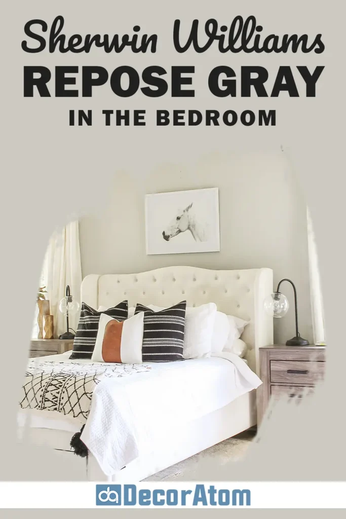
In the bedroom, Repose Gray brings a calm, serene presence that helps you unwind. It doesn’t compete for attention—it just quietly sets the tone. In rooms with lots of natural light, it looks soft and elegant.
In low light, it feels cozy without becoming too dark. I love it paired with white bedding, soft textures, and natural wood accents.
Add touches of navy, blush, or warm caramel for a more styled, layered look.
Sherwin-Williams Repose Gray in the Living Room
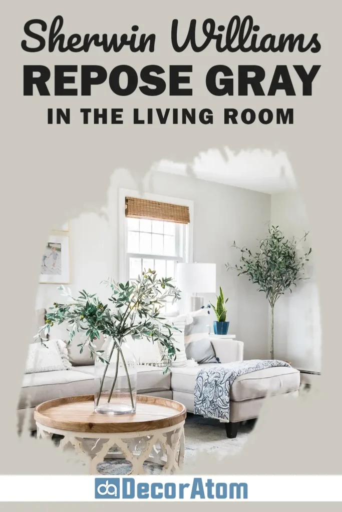
This is one of the best spaces for Repose Gray, in my opinion. It gives your living room a sophisticated, polished base but still feels inviting and homey.
If you like neutral furniture or want a paint color that will work with whatever seasonal decor you bring in, this one has your back.
It plays well with wood tones, black accents, brass fixtures, and even pops of color—like rust, olive green, or indigo.
Sherwin-Williams Repose Gray in the Bathroom
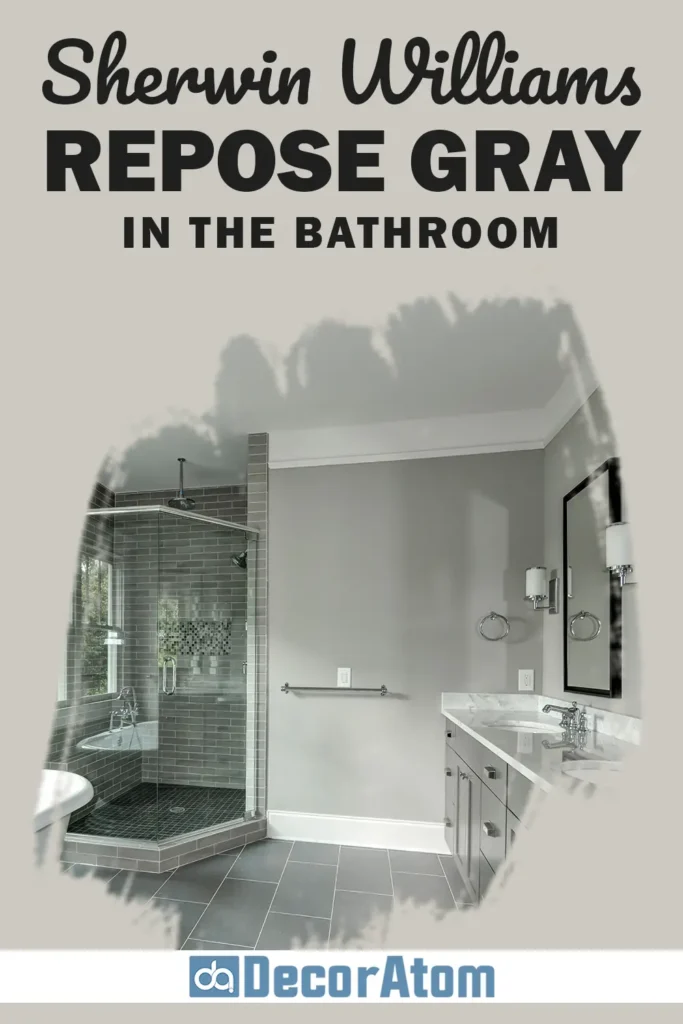
Bathrooms benefit from Repose Gray’s soft elegance. It keeps things clean and calm without leaning too cool like some traditional grays do.
This is especially important in small spaces where you don’t want to feel boxed in. Repose Gray works well with white subway tile, marble counters, and brushed nickel fixtures.
If your bathroom gets cooler light (like from a north-facing window), be prepared for the undertones to lean just a little cooler—but still lovely.
Sherwin-Williams Repose Gray in the Kitchen

Kitchens are another perfect setting. Whether you use it on the walls or on cabinets, Repose Gray feels timeless. It brings subtle warmth to the space while still looking crisp.
If your kitchen leans more traditional or farmhouse, pair it with creamy white cabinets and warm wood floors.
For a more modern look, it works beautifully with flat-panel cabinets, black hardware, and sleek countertops. It’s a “yes” from me for kitchens of all styles.
Sherwin-Williams Repose Gray for the Exterior
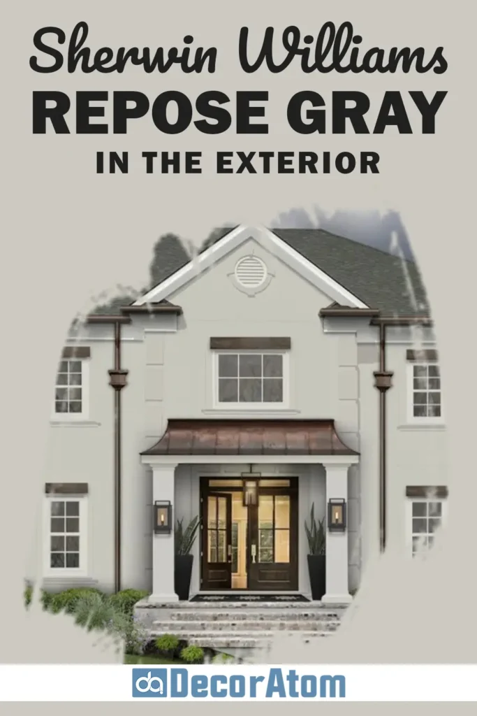
You might not expect it, but Repose Gray can look absolutely stunning on a home’s exterior. It reads a bit lighter in direct sunlight, and that subtle warmth really shines through.
It pairs nicely with white trim (Pure White again is a great choice), black shutters, or even natural stone.
This color is neutral enough for HOA-approved palettes but still gives your house a fresh, modern edge. If you live in a wooded or rustic area, it blends beautifully with natural surroundings too.
Final Thoughts
Sherwin-Williams Repose Gray SW 7015 is one of those rare paint colors that’s stood the test of time—and it’s easy to see why. It strikes the perfect balance between warm and cool, between modern and classic.
It’s light enough to keep a space feeling open, but rich enough to add depth and character. And the best part? It works in just about every room, with just about every style.
Whether you’re repainting a single wall or building a whole-home color scheme, Repose Gray gives you a reliable, flexible foundation.
It plays nicely with trim colors, accents, and wood tones—and it has just enough undertone to keep it interesting without being unpredictable.
If you’re looking for a paint color that’s subtle but stylish, neutral but not boring, warm but not beige, Repose Gray is a winner.