
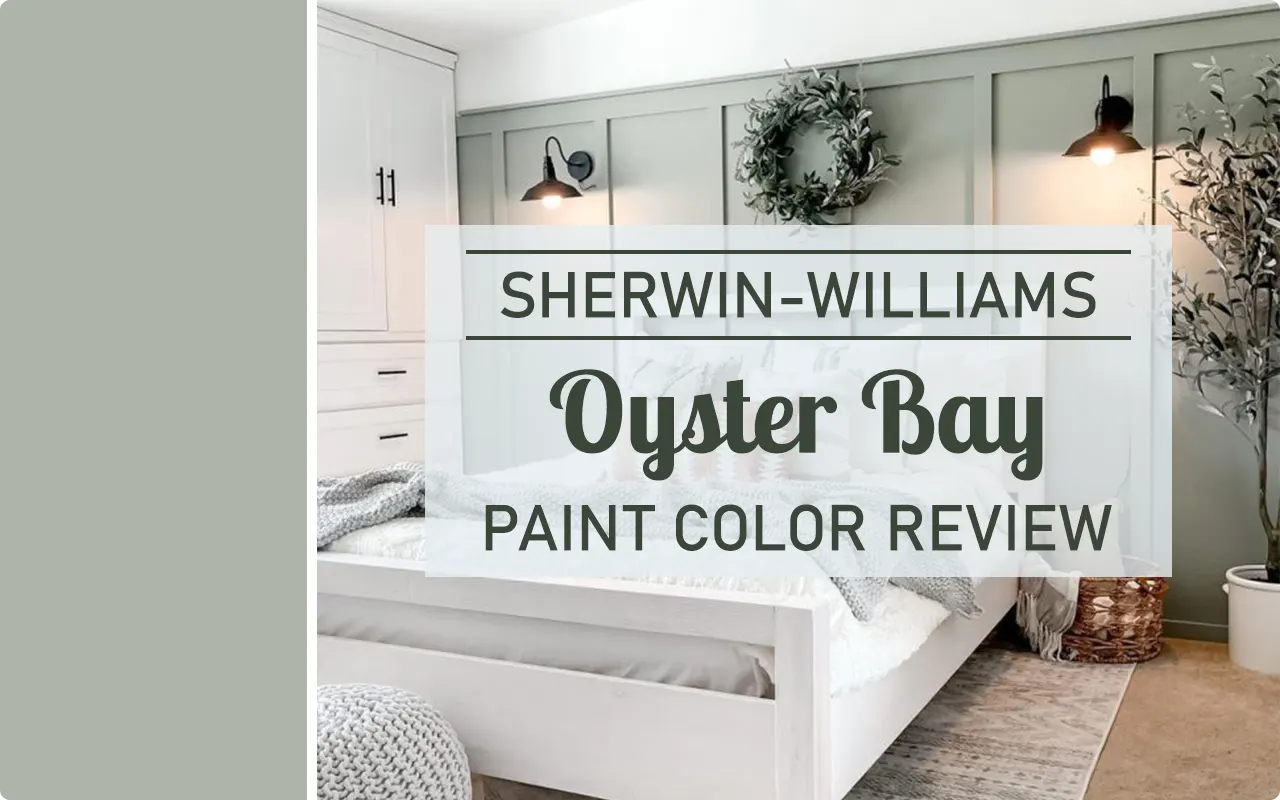
Let me be honest with you, Sherwin-Williams Oyster Bay SW 6206 is one of those colors that quietly sneaks into your life and then refuses to leave.
I’ve used it in a few different spaces now, and every time, it brings a sense of calm that’s hard to describe unless you’ve seen it on a wall yourself.
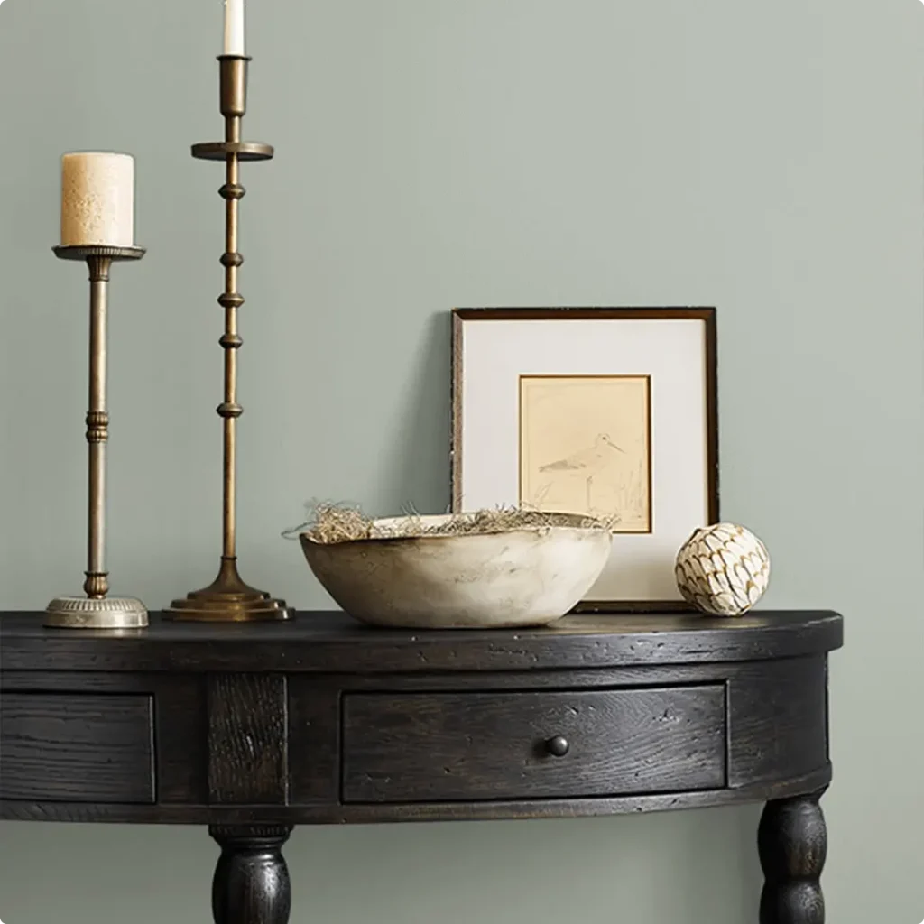
It has just the right mix of softness and moodiness, which makes it incredibly versatile. Whether you’re going for a coastal feel, a spa-like vibe, or something earthy and grounded, Oyster Bay just seems to adapt beautifully.
If you’re curious about what makes this color so special, or whether it’s the right fit for your home, I’ve broken it all down in this review, from its undertones to how it looks in different lighting. Let’s dig in.
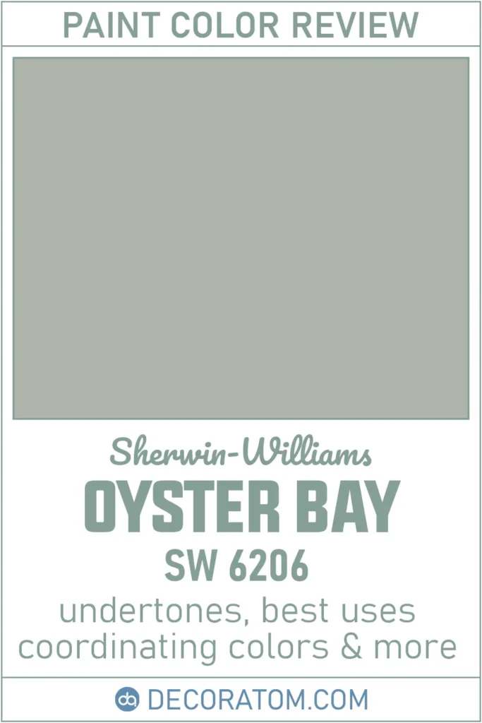
What Color is Sherwin Williams Oyster Bay SW 6206?
Oyster Bay is a soft green paint color with a muted, almost dusty appearance. When I look at it, I don’t just see green, I see hints of gray and a whisper of blue peeking through in certain lights. It’s not a bold, in-your-face green.
It’s more laid-back, like the color of sea glass that’s been weathered over time. I’d call it a gentle and relaxing green that leans into cool tones without feeling too cold.
What I love most about it is that it doesn’t scream for attention, but it definitely makes a statement.
It can shift a little depending on where you use it and what kind of lighting it’s in, but at its core, it’s a soft, grayed-out green that works really well in calm, serene spaces.

How to Know if a Paint Color Is Right for You?
Would you like to sample Oyster Bay SW 6206 paint color? I recommend using Samplize. They offer 9”x14.75”” peel-and-stick paint swatches that make testing colors super simple. Just stick it on your wall, move it around if needed, and when you’re done, peel it off and toss it. No mess, no cleanup. It’s quick, easy, and way more convenient!

Advantages of using peel and stick paint samples:
- EASY TO USE: Simply move your SAMPLIZE paint sample around the room to test under a variety of lighting conditions.
- AFFORDABLE: Budget-friendly solution and no more buying inaccurate swatches, rollers, wasted paint.
- SUPER FAST DELIVERY: Depending on your location, 1 day delivery is possible.
- ORDER FROM HOME: Save a trip to the store looking for samples.
- NO MESS: SAMPLIZE uses real paint samples with zero-mess
- NO WASTE: No leftover cans or wasted paint.
Is It a Warm or Cool Color?
Oyster Bay is definitely a cool-toned paint color. You’ll especially notice this in rooms that don’t get much warm natural light, the green leans more slate-like, and the blue undertones start to show up more clearly.
That said, it’s not icy or cold. It still feels inviting and soft, which is part of its charm.
I’ve found that in south-facing rooms or spaces with a lot of warm light, it can mellow out a bit and feel slightly more balanced. But overall, if you’re looking for a color that has a cool, calming presence, Oyster Bay is a solid choice.
LRV of Sherwin Williams Oyster Bay SW 6206
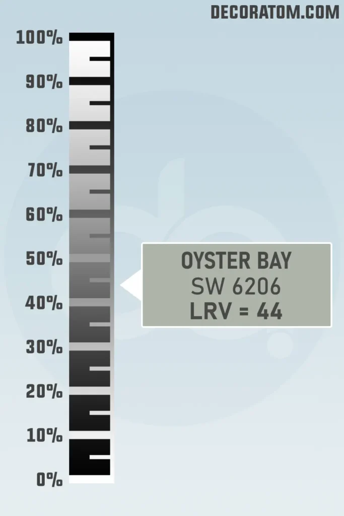
LRV stands for Light Reflectance Value, which is basically a number that tells you how much light a paint color reflects. The scale runs from 0 (pure black) to 100 (pure white). So, the higher the number, the lighter and brighter the color will appear.
Oyster Bay has an LRV of 44. That puts it right in the mid-range, not too light, not too dark. It’s enough to bring depth and mood to a room without making it feel heavy.
I’d say it’s the sweet spot if you want color on the walls but still want to keep things airy and relaxed.
Color Family
Sherwin-Williams Oyster Bay SW 6206 belongs to the green color family.
But not just any green, it’s a muted, cool-toned green that’s softened by gray and touched by blue. Think of it as part of the “nature-inspired” branch of greens. It doesn’t feel too vibrant or grassy. Instead, it leans more organic and subdued, like eucalyptus leaves or foggy coastal landscapes.
RGB Colors
The RGB values of Sherwin-Williams Oyster Bay are 174, 179, and 169.
Hex Value
For anyone working with design software, mood boards, or just trying to color match online, the hex value of Sherwin-Williams Oyster Bay is #AEB3A9.
Undertones of Sherwin Williams Oyster Bay SW 6206
Now let’s talk undertones, because this is where Oyster Bay gets really interesting.
Even though it’s officially a green, it has distinct slate-blue undertones. These undertones are what give it that cool, coastal vibe.
You’re not going to see anything too warm or yellowy sneaking in here. Instead, you’ll notice a quiet depth, especially when the light hits it a certain way.
In north-facing rooms or places with cooler light, the blue comes forward more noticeably, making the color feel misty and calming. In warmer rooms, the green still stays dominant, but you may catch glimpses of gray softening the overall tone.
These undertones are what make Oyster Bay so versatile. It’s not a straightforward sage green, it’s more layered than that, and that’s why I keep coming back to it.
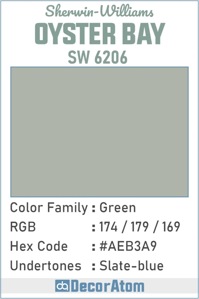
How Different Types of Lighting Affect Sherwin Williams Oyster Bay SW 6206?
Lighting makes a big difference with any paint color, but with a color like Oyster Bay, which sits in that delicate balance between green, gray, and blue, it really transforms from one room to another.
In natural daylight, especially in south-facing rooms, Oyster Bay appears lighter and more traditionally green. It still has that cool vibe, but the gray and blue tones take a back seat, letting the soft green shine through. It’s fresh and inviting.
In north-facing rooms, the color shifts cooler. This is where you’ll see those slate-blue undertones show up more prominently. The gray becomes more noticeable too, giving it a slightly moodier, more sophisticated look.
Under warm artificial lighting (like soft white bulbs), it leans greener again, but in a more muted way. It feels cozier without losing that soothing tone.
On the other hand, under cool LED lighting, the blue and gray tones tend to push forward, making the space feel crisp and airy, sometimes even a little stormy if the room doesn’t get a lot of light.
What I love is that this color doesn’t go flat or dull in low light. It holds its depth and character throughout the day, which makes it a dependable choice if you want something peaceful and elegant.
Trim Colors to Pair With Sherwin Williams Oyster Bay SW 6206?
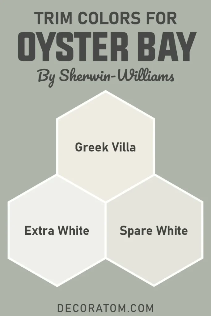
Finding the right trim color is key to making Oyster Bay shine, and thankfully, it plays well with a number of whites and off-whites.
If you want a clean and classic contrast, go with a bright white like Sherwin-Williams Extra White SW 7006. It’ll create a fresh, modern look that really outlines Oyster Bay’s soft green in a crisp way.
For something a bit softer and more traditional, I love Greek Villa SW 7551. It’s warm enough to add coziness without clashing with the cool undertones in Oyster Bay. The two together look polished and calming.
You can also consider Spare White SW 6203, which shares some of the same cool undertones. It’s not a stark white, more of a whispery soft tone, so it pairs beautifully if you’re going for a tone-on-tone palette that’s subtle and easy on the eyes.
I’ve personally used all three depending on the room, and it really depends on the look you’re going for. Bright and clean? Go with Extra White. Calm and earthy? Greek Villa or Spare White are fantastic options.
Colors Similar to Sherwin Williams Oyster Bay SW 6206
If you’re drawn to Sherwin-Williams Oyster Bay, chances are you’re someone who appreciates subtlety, colors that feel calm, layered, and organic. And I totally get that.
Oyster Bay has a soft elegance to it that’s not easy to find in just any green. But sometimes you want to explore a few close options, especially if you’re testing colors on your walls and trying to land on the perfect tone for your space.
There are a handful of colors, from Sherwin-Williams, Benjamin Moore and Behr, that give off a very similar vibe. These shades usually sit in that soft green-gray-blue zone.
Some may lean a little more gray, some a touch more blue, and some just a bit lighter or darker than Oyster Bay. But all of them carry the same tranquil, grounded energy.
What I like to do is sample at least two or three similar tones next to each other. Even the slightest shift in undertone or depth can make a big difference once it’s up on the wall. It’s always worth seeing how each color plays out with your home’s lighting, flooring, and furniture.
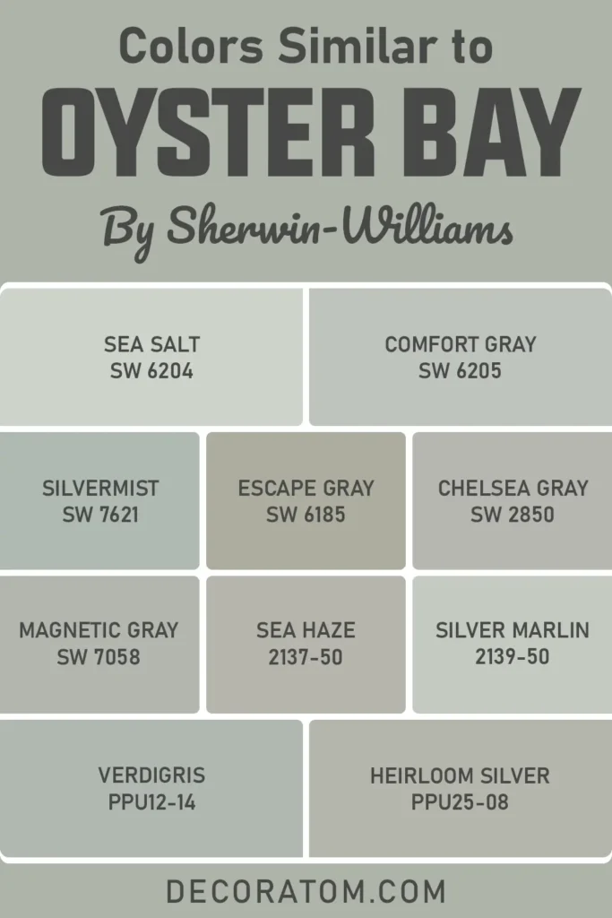
Here are 10 colors that are similar to Oyster Bay:
- Sherwin-Williams Sea Salt SW 6204
- Sherwin-Williams Comfort Gray SW 6205
- Sherwin-Williams Silvermist SW 7621
- Sherwin-Williams Escape gray SW 6185
- Sherwin-Williams Chelsea gray SW 2850
- Sherwin-Williams Magnetic Gray SW 7058
- Benjamin Moore Sea haze 2137-50
- Benjamin Moore Silver Marlin 2139-50
- Behr Verdigris PPU12-14
- Behr Heirloom silver PPU25-08
Colors that Go With Sherwin Williams Oyster Bay SW 6206
Pairing colors with Oyster Bay is one of my favorite parts because it’s surprisingly versatile. Even though it’s a cool-toned green with slate-blue undertones, it has enough softness and depth to coordinate beautifully with a wide range of colors, both warm and cool. That’s a rare trait in a paint color.
If you’re aiming for a calm, coastal feel, you can pair it with soft whites, misty blues, or pale grays. Want something more earthy and grounded? Bring in muted taupes, sandy beiges, or natural wood tones. Oyster Bay doesn’t dominate, it complements.
One approach I really like is using a soft white for trim and ceiling (like Spare White or Greek Villa), then bringing in a warmer neutral on furniture or cabinetry, such as Prairie Grass. That combination creates balance, cool on the walls, warm in the accents.
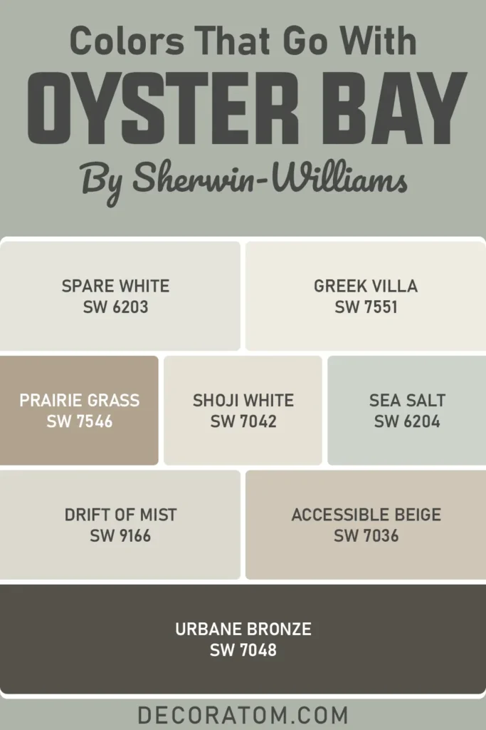
Here’s a list of 8 Sherwin-Williams colors that go beautifully with Oyster Bay:
- Spare White SW 6203
- Greek Villa SW 7551
- Prairie Grass SW 7546
- Shoji White SW 7042
- Sea Salt SW 6204
- Drift of Mist SW 9166
- Accessible Beige SW 7036
- Urbane Bronze SW 7048
Comparing Sherwin Williams Oyster Bay SW 6206 With Other Colors
One of the best ways to understand a paint color is by comparing it side-by-side with others in the same family.
Sherwin-Williams Oyster Bay sits in that subtle green-gray-blue zone, but the way it behaves in a space can be very different from colors that may look similar on a swatch.
I’ve done this comparison myself, lining up samples in the same room, and I can tell you, the undertones, depth, and warmth all start to stand out once they’re up on the wall.
So, let’s take a closer look at how Oyster Bay compares to six other popular paint colors. These comparisons will help you get a feel for what makes Oyster Bay unique, and whether it’s truly the right fit for your space.
Sherwin Williams Oyster Bay vs Sea Salt
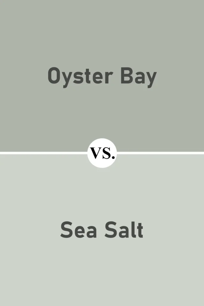
These two colors are often mentioned in the same breath, and for good reason. Sea Salt is lighter, with an LRV of 63 compared to Oyster Bay’s 44, which means it reflects a lot more light and feels brighter on the walls.
While both colors share that soft green base and blue-gray undertones, Sea Salt feels more like a pale, airy coastal hue, whereas Oyster Bay is deeper and more grounded.
I see Oyster Bay as more sophisticated, better for adding depth, while Sea Salt gives off a breezy, beachy vibe.
Sherwin Williams Oyster Bay vs Comfort Gray
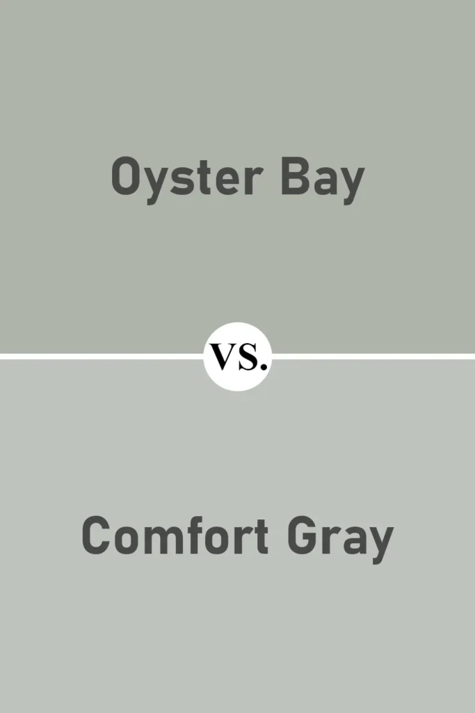
Comfort Gray is actually one step up from Sea Salt on the color strip, so it’s closer in depth to Oyster Bay. But when you place them side by side, Comfort Gray leans a little more blue, while Oyster Bay pulls slightly greener and grayer.
Comfort Gray also feels a bit cooler overall. If you want a more classic green-gray with a slate finish, Oyster Bay is the winner. But if you like that touch of stormy blue, Comfort Gray might suit you better.
Sherwin Williams Oyster Bay vs Silvermist
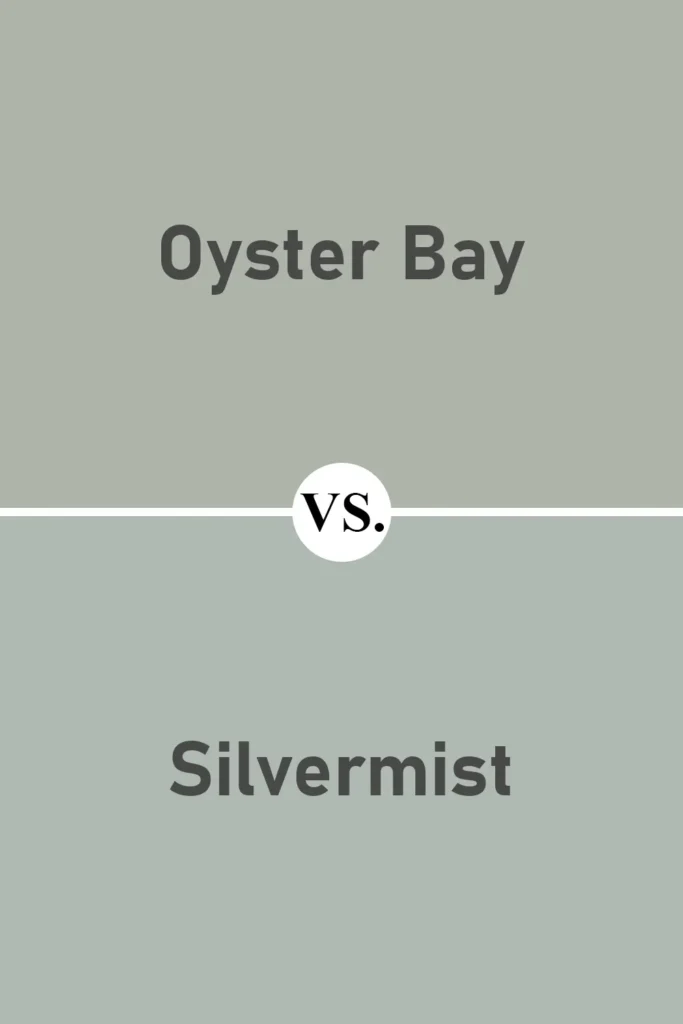
Silvermist has a very similar mood to Oyster Bay, soft, moody, and serene, but it shifts more clearly toward blue.
In a north-facing room, Silvermist can even read as a dusty blue, while Oyster Bay remains more balanced between green and gray.
I’ve used both in different projects, and Silvermist feels a touch more modern, while Oyster Bay brings in that earthy, grounded feel.
Sherwin Williams Oyster Bay vs Acacia Haze
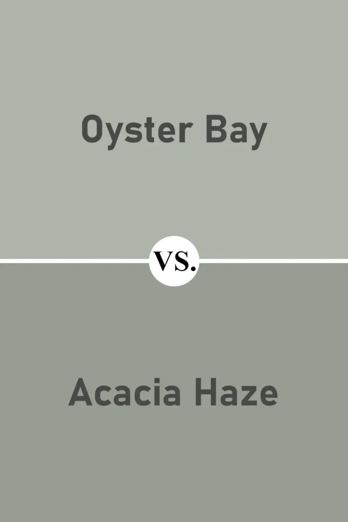
Acacia Haze is darker and more olive-toned than Oyster Bay. It feels much more distinctly green, and the gray undertones are heavier.
While Oyster Bay is soft and layered, Acacia Haze has a bit more drama and shadow to it. I like Acacia Haze for more masculine spaces or when I want that rich, heritage-inspired color.
But for something softer and more versatile, Oyster Bay is the better choice.
Sherwin Williams Oyster Bay vs Retreat
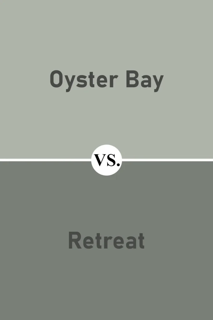
Retreat is noticeably deeper than Oyster Bay, it has a much lower LRV and leans toward a moody sage green. If Oyster Bay is peaceful and spa-like, Retreat feels bold and foresty.
I’d use Retreat in a cozy library or an accent wall, but Oyster Bay works beautifully in a full room without feeling overwhelming. The two are related, but Retreat is much heavier.
Sherwin Williams Oyster Bay vs Healing Aloe (Benjamin Moore)
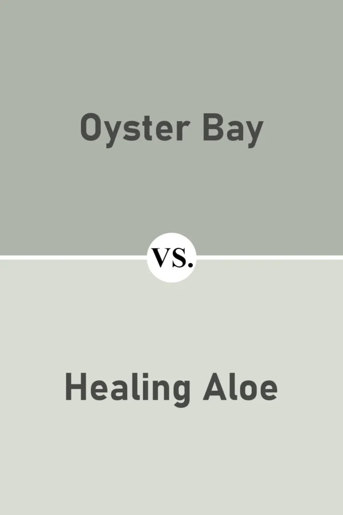
Healing Aloe is Benjamin Moore’s answer to those looking for a soft, calming green with blue undertones, similar to Sea Salt. Compared to Oyster Bay, Healing Aloe is lighter and fresher.
It’s perfect for airy spaces where you want just a whisper of color. Oyster Bay, on the other hand, has more weight and richness, which makes it feel more substantial on the wall. Both are great options, but they give off very different energy.
Where to Use Sherwin Williams Oyster Bay SW 6206?
One of the reasons I keep coming back to Oyster Bay is because it works just about anywhere. It’s one of those rare colors that feels equally at home in a cozy bedroom or on the exterior of a house.
Thanks to its blend of green, gray, and slate-blue undertones, it can be styled to feel airy, spa-like, elegant, or earthy, depending on where and how you use it.
Let’s walk through some of the best places to use Sherwin-Williams Oyster Bay and what kind of atmosphere it creates in each space.
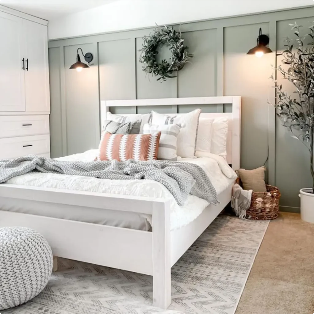
Sherwin Williams Oyster Bay In the Bedroom

I think Oyster Bay was made for the bedroom. If you’re looking for a wall color that calms your mind at the end of the day and sets a peaceful tone in the morning, this color delivers.
I’ve used it in a guest bedroom before, and everyone who stayed there commented on how serene the room felt, like checking into a quiet coastal retreat.
It works beautifully with white or off-white bedding, woven textures, and natural wood furniture. The green creates a sense of calm, while the gray and blue undertones keep it from feeling too vibrant.
Whether you go for minimalist styling or more layered, boho textures, Oyster Bay sets the tone for a bedroom that feels restful and grounded.
Sherwin Williams Oyster Bay In the Living Room
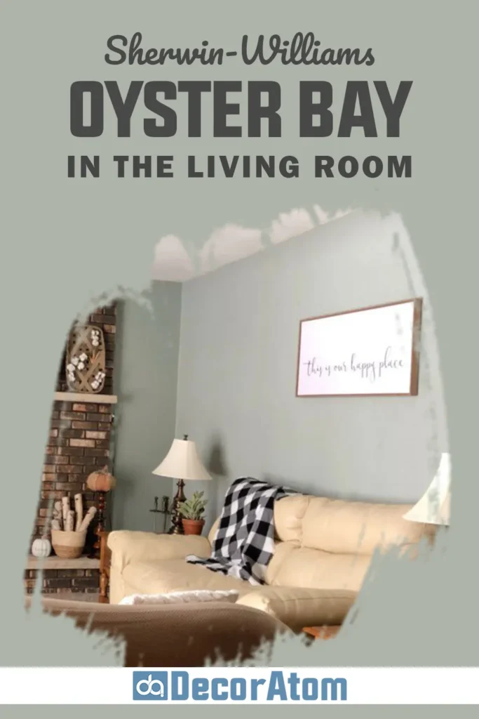
Using Oyster Bay in the living room can instantly shift the vibe of the space. It brings character and color without being overwhelming, and it plays really well with both traditional and modern decor.
In my own experience, pairing it with soft neutrals, like creamy whites, warm wood tones, or linen sofas, creates a warm, welcoming environment that feels intentional but relaxed.
If you have a lot of natural light in your living room, you’ll notice how this color changes throughout the day. In morning light, it leans more green, while evening shadows bring out that gray-blue softness. It’s the kind of shade that encourages you to slow down, sink into the couch, and stay a while.
Sherwin Williams Oyster Bay in Kitchen

I absolutely love seeing Oyster Bay in a kitchen, especially when it’s used on cabinetry. If you’re tired of white cabinets but don’t want to commit to something super bold, this color is the perfect in-between. It has enough depth to stand out but remains subtle enough to live with every day.
You can also use it on the walls with white cabinetry, and it creates a soft contrast that feels clean yet cozy.
It’s especially beautiful when paired with marble or quartz countertops and brushed brass or matte black hardware. And if your kitchen opens up to a dining or living area, Oyster Bay provides a smooth, seamless transition that ties the spaces together.
Sherwin Williams Oyster Bay In the Bathroom

Bathrooms are all about atmosphere, and Oyster Bay has that soothing, spa-like feel that works beautifully in these smaller spaces. I once used it in a half-bath with white shiplap and a round mirror above a simple vanity, and the result felt elevated but calm. It gives off a clean, coastal feel without trying too hard.
In full bathrooms, it pairs well with white subway tile, soft stone floors, and brushed nickel fixtures. Whether your style leans farmhouse, coastal, or even more traditional, this color helps turn the bathroom into a quiet, relaxing escape.
Sherwin Williams Oyster Bay For the Exterior

If you want to stand out in the best way possible, Oyster Bay on the exterior is a total win. It’s not as common as typical whites, grays, or beiges, but it still feels timeless.
I’ve seen it used on Craftsman-style homes, cottages, and even modern farmhouses, and it always turns heads in the best way. It works especially well when paired with white trim or soft taupe accents.
The muted green tone blends with nature beautifully, so it doesn’t clash with landscaping or greenery around the home. And the best part? It holds up well in different lighting, looking fresh during the day and rich and grounded in the evening.
Why I Love Sherwin Williams Oyster Bay SW 6206
There are a lot of paint colors I like, but few that I genuinely love. Oyster Bay is one of those colors that feels like home to me. It’s not flashy, but it always leaves an impression.
It’s soft but never boring. I can use it in almost any room, and it always adds that sense of calm I’m looking for, without washing things out or fading into the background.
What I really appreciate is how adaptable it is. No matter the style, coastal, transitional, farmhouse, or modern, Oyster Bay can work its magic.
It’s the kind of color that doesn’t compete with the rest of the room, but instead enhances it. And once it’s up on the walls, it’s the kind of shade that just feels right.
Click here to get a Peel & Stick paint sample of Oyster Bay SW 6206
Final Thoughts
If you’re considering Sherwin-Williams Oyster Bay SW 6206, I’ll say this, it’s one of those colors that quietly surprises you. It doesn’t need to shout to make a statement. It creates mood, depth, and serenity all at once.
Whether you’re painting a bedroom, bathroom, or your whole house, Oyster Bay brings a sense of balance and sophistication that’s hard to find. It’s soft without being bland, cool without feeling cold, and stylish without trying too hard.
I’ve used it again and again, and every time, it becomes a favorite all over again. If you’re on the fence, grab a sample, test it out on your wall, and see how it behaves in your space, I have a feeling you’ll fall in love with it too.