

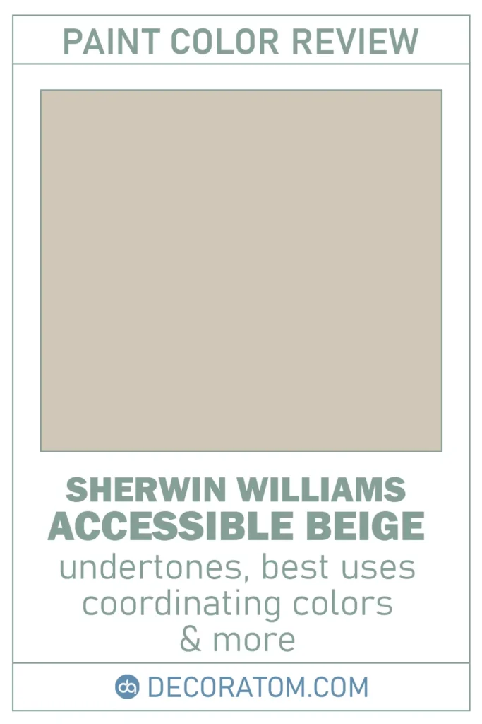
Let’s talk about one of my all-time favorite paint colors: Sherwin-Williams Accessible Beige SW 7036.
Don’t let the word “beige” fool you—it’s not that dull, outdated beige you might be thinking of. This one has a soft, balanced charm that makes it feel fresh, warm, and incredibly versatile.
Whether you’re looking to update a single room or trying to pull together an entire home color palette, Accessible Beige is the kind of color that quietly pulls everything together without overwhelming the space.
In this post, I’m going to break it all down for you—from the undertones and light reflectance to where it works best and what colors pair beautifully with it. Let’s dive in!
*This post contains affiliate links. For more details see my full disclosure.
What Kind of Color Is Sherwin Williams Accessible Beige?
Accessible Beige is what I’d describe as a soft, muted beige with a twist.
It’s not too yellow, not too brown, and it’s definitely not that builder-grade beige from the early 2000s.
Instead, it’s more of a light, sandy neutral that has just enough warmth to feel cozy—but with a touch of gray that keeps it modern and grounded.
It’s like the beige that decided to grow up, calm down, and become more sophisticated. It doesn’t scream for attention, but it adds a quiet, peaceful elegance to any space.
If you’re looking for something subtle and timeless, this color checks all the boxes.
Get a Peel & Stick paint sample of Accessible Beige
Is It a Warm or Cool Color?
This one leans warm, but with a twist. Sherwin-Williams Accessible Beige has enough gray in it to cool things down slightly, which helps it feel balanced.
It’s not a yellowish beige, and it doesn’t have that pink or orange undertone that some beiges bring to the table. Instead, it feels soft and earthy—more like a taupe-beige hybrid.
So if you’re worried about your space feeling too warm or too cold, Accessible Beige hits that sweet spot right in the middle.
It adds warmth to a room without making it feel stuffy, and the subtle gray undertone helps it adapt really well to a variety of lighting conditions and accent colors.

💥🎁 Christmas & Year-End Deals On Amazon !
Don't miss out on the best discounts and top-rated products available right now!
*As an Amazon Associate, I earn from qualifying purchases.
The Only Paint Color Samples You Need – Real Paint Without the Mess!
Ever wished paint sampling was as easy as sticking a sticker? Guess what? Now it is! Get Samplize’s unique peel & stick paint samples delivered overnight!
LRV of Sherwin Williams Accessible Beige
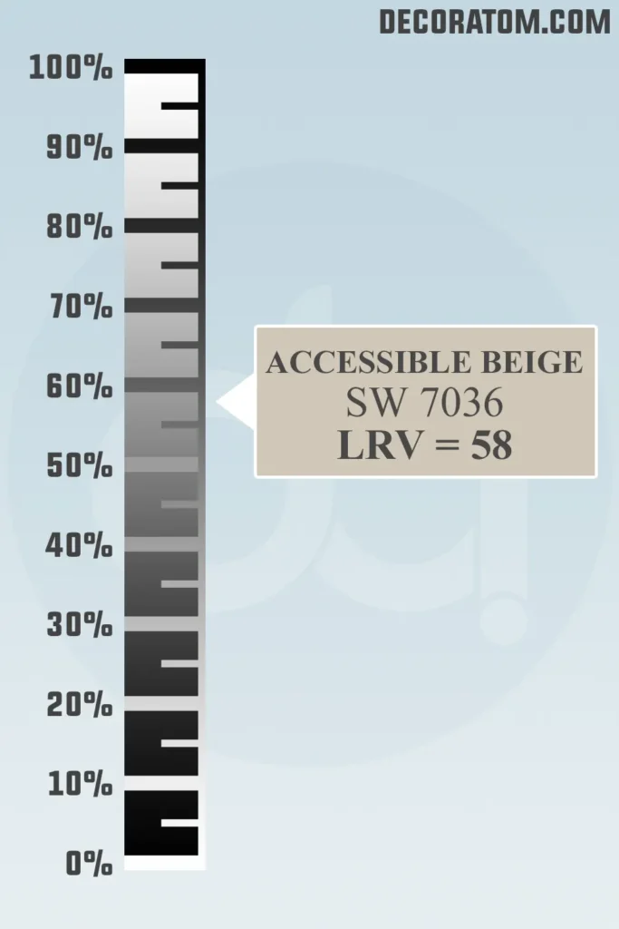
Let’s talk about LRV, or Light Reflectance Value—don’t worry, it’s not as technical as it sounds.
LRV is basically a number from 0 to 100 that tells us how much light a paint color reflects. The higher the number, the more light it bounces around a room.
Sherwin-Williams Accessible Beige has an LRV of 58, which puts it just on the lighter side of the scale. That means it reflects a decent amount of light without being too bright or washed out.
It’s ideal if you want a soft, cozy backdrop that still feels open and airy. It won’t darken a space, but it won’t make it feel stark either—another reason why it’s so easy to live with.
Color Family
Accessible Beige belongs to the neutral color family. But within that broad category, it sits somewhere between a warm beige and a taupe.
It’s one of those chameleon-like colors that works beautifully in almost any room because it’s not too strong or too specific.
Its neutrality is what makes it so approachable—it doesn’t fight with other colors, and it creates a calm, cohesive vibe wherever you use it.
RGB Colors
Let’s break this down simply. RGB stands for Red, Green, and Blue, and it’s the combination of those three color values that make up any paint color when viewed digitally or on screen.
For Sherwin-Williams Accessible Beige, the RGB values are:
- Red: 209
- Green: 199
- Blue: 184
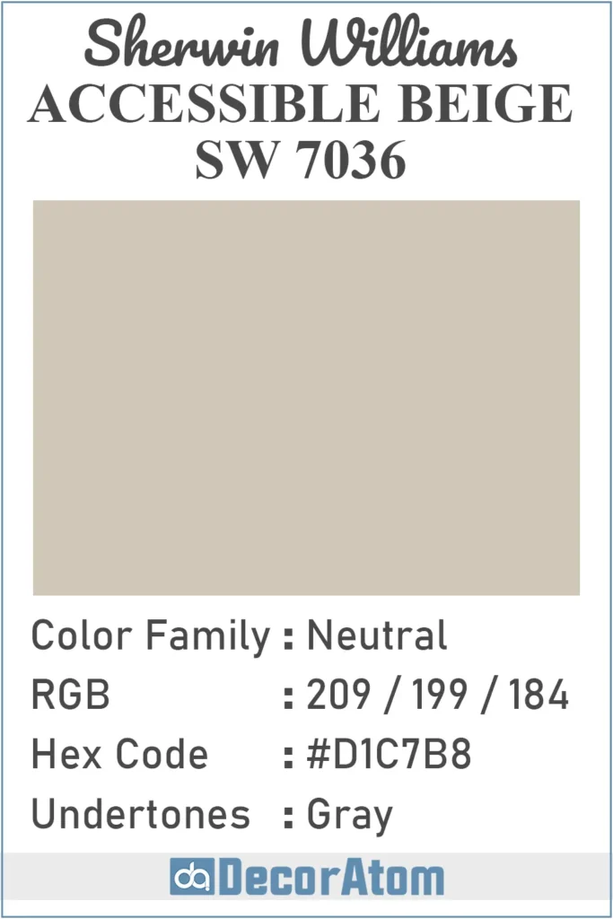
Hex Value
The hex value for Sherwin-Williams Accessible Beige is #D1C7B8.
Undertones of Sherwin Williams Accessible Beige
Now, undertones are one of those things that can make or break a paint color—especially neutrals. With Accessible Beige, the undertone is gray, and that’s a big reason why this beige feels updated and modern.
The gray undertone keeps the color from feeling too warm, too yellow, or too traditional.
It adds a grounding effect that makes Accessible Beige feel calm, soft, and slightly cooler than your average beige. But don’t worry—it’s not a cold gray by any means.
This subtle gray undertone gives the color more flexibility. It means the color can work with both warm and cool palettes, and it doesn’t shift too drastically depending on what it’s paired with. That’s a huge plus when you’re trying to tie a space together.
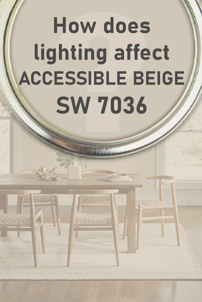
How Does Lighting Affect Sherwin Williams Accessible Beige?
💥🎁 Christmas & Year-End Deals On Amazon !
Don't miss out on the best discounts and top-rated products available right now!
*As an Amazon Associate, I earn from qualifying purchases.
Lighting is everything when it comes to paint, and Accessible Beige is one of those colors that really responds to its environment.
- In natural light (especially southern-facing rooms), Accessible Beige will look warm and soft. You’ll see more of its beige personality, and it’ll feel inviting without being overly yellow.
- In north-facing rooms, which tend to bring in cooler light, the gray undertones will show up a bit more. This can make the color feel a tad more subdued and cooler—almost taupe-like—but still very cozy.
- Artificial lighting plays a role too. Under warm incandescent or soft white LED bulbs, it’ll lean a little warmer and more beige. Under cooler white LEDs, you might notice more of that gray influence.
Trim Colors to Pair With Sherwin Williams Accessible Beige?
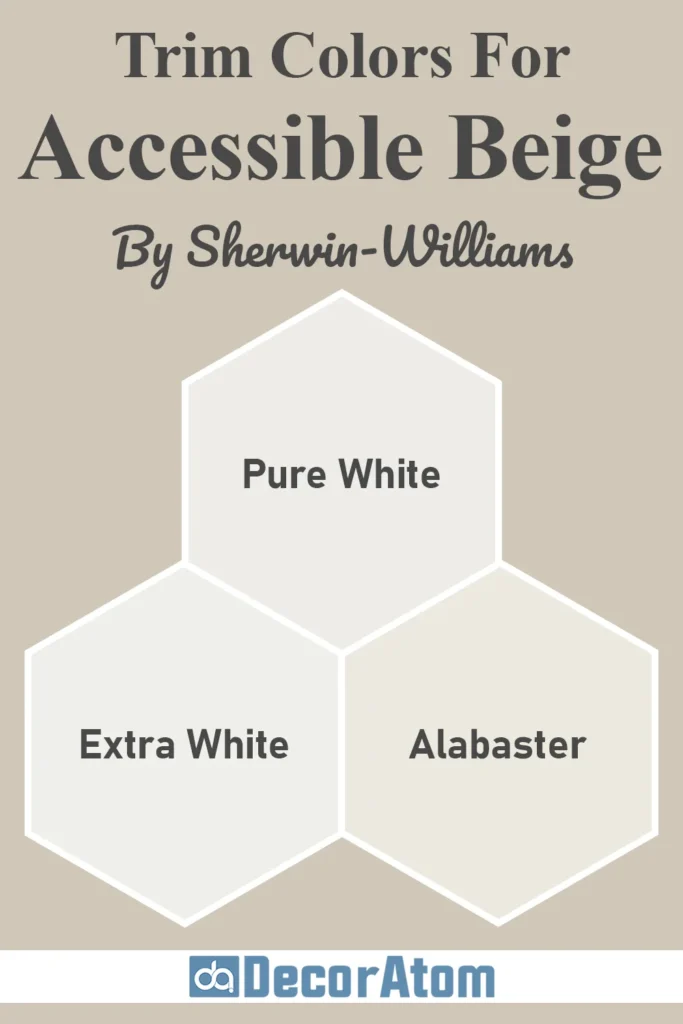
Choosing the right trim color can really make Accessible Beige shine. I always recommend going for a crisp white or a soft off-white—something that gives you a clean contrast without clashing.
Here are some trim colors that work beautifully:
- Sherwin-Williams Pure White (SW 7005): This is one of my favorites. It’s clean, bright, and just slightly softened so it pairs perfectly with Accessible Beige’s muted warmth.
- Sherwin-Williams Alabaster (SW 7008): If you want something a little warmer and creamier than Pure White, Alabaster is a fantastic choice. It creates a soft, seamless transition with Accessible Beige and feels super cozy.
- Sherwin-Williams Extra White (SW 7006): This one is brighter and has a cooler feel. If you want more contrast or are aiming for a slightly more modern, sharp look, Extra White does the trick.
Trim color makes a big difference in how the wall color reads, so take the time to sample a few whites and see which one complements your lighting and overall design the best.
Colors Similar to Sherwin Williams Accessible Beige
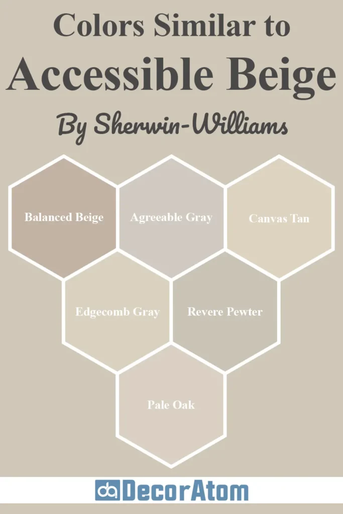
If you’re drawn to Accessible Beige but want to explore a few similar options—maybe for variation in different rooms or just to compare undertones—you’re not alone.
That’s actually one of the first things I did before fully committing to this color.
Paint colors can shift dramatically depending on lighting, decor, and flooring, so it’s helpful to know what other shades are out there in the same ballpark.
Here are six similar colors—a mix from both Sherwin-Williams and Benjamin Moore—that sit close to Accessible Beige in tone and warmth.
1. Sherwin-Williams Balanced Beige (SW 7037)

💥🎁 Christmas & Year-End Deals On Amazon !
Don't miss out on the best discounts and top-rated products available right now!
*As an Amazon Associate, I earn from qualifying purchases.
This color is just one step deeper than Accessible Beige. It shares a similar warm, grounded feel, but leans slightly more brown.
If you like the idea of Accessible Beige but want something with a bit more depth for a cozier or more dramatic look (especially in larger rooms), Balanced Beige is a great option.
Think of it as Accessible Beige’s older sibling—it has a little more mood.
Get a Peel & Stick paint sample of Balanced Beige
2. Sherwin-Williams Agreeable Gray (SW 7029)

Agreeable Gray is often grouped with Accessible Beige because they’re both go-to neutrals, but there’s a noticeable difference.
Agreeable Gray has more gray and a touch less warmth. It leans cooler and reads more like a greige (a true mix of gray and beige).
If you want a color that feels a bit more modern and crisp, especially in bright daylight, Agreeable Gray might suit you better.
Get a Peel & Stick paint sample of Agreeable Gray
3. Sherwin-Williams Canvas Tan (SW 7531)

Canvas Tan is lighter and slightly more yellow-toned than Accessible Beige. It lacks the gray undertone, which makes it feel a bit sunnier and airier.
If your space doesn’t get a lot of natural light and you want something that lifts the room visually, Canvas Tan is worth considering.
It has more of a traditional beige feel compared to the soft, muted look of Accessible Beige.
Get a Peel & Stick paint sample of Canvas Tan
4. Benjamin Moore Edgecomb Gray (HC-173)
💥🎁 Christmas & Year-End Deals On Amazon !
Don't miss out on the best discounts and top-rated products available right now!
*As an Amazon Associate, I earn from qualifying purchases.
This is probably one of the most popular Benjamin Moore colors that gets compared to Accessible Beige.
It’s a beautiful greige with a similar softness, but with just a bit more gray and a slightly cooler undertone.
It’s great for open-concept homes where you want a consistent color that changes slightly with the light.
If you want a cooler neutral with a timeless feel, Edgecomb Gray is a strong contender.
Get a Peel & Stick paint sample of Edgecomb Gray
5. Benjamin Moore Revere Pewter (HC-172)

Revere Pewter is deeper and more gray than Accessible Beige. It’s one of those colors that works in nearly every room, but in low-light spaces, it can read more cool.
If you’re torn between warm and cool, Revere Pewter sits right on the edge.
Accessible Beige is warmer and a bit softer, while Revere Pewter is more versatile when paired with bold colors or cooler tones.
Get a Peel & Stick paint sample of Revere Pewter
6. Benjamin Moore Pale Oak (OC-20)
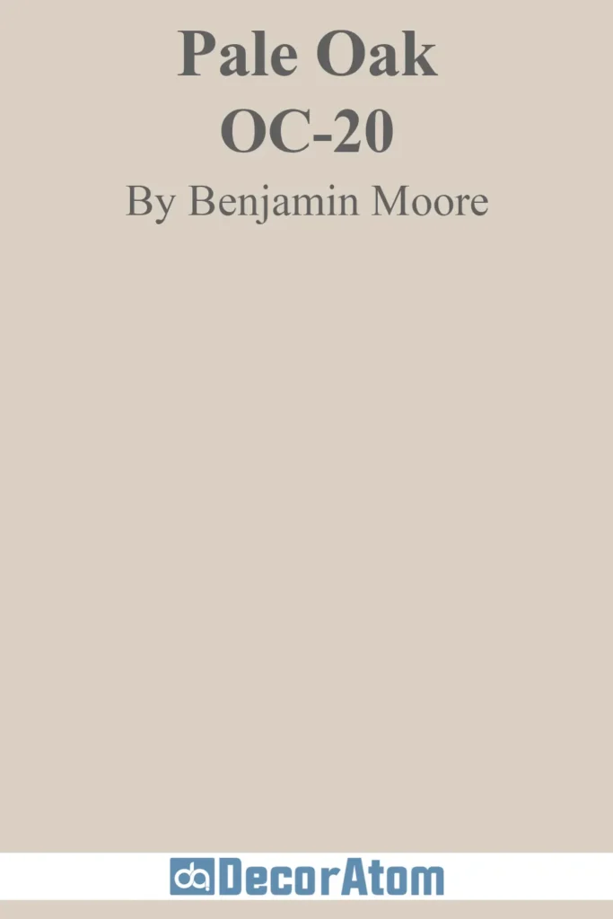
Pale Oak is a lighter, softer alternative to Accessible Beige. It leans more taupe with subtle pink or purple undertones in certain lighting.
It’s a good choice if you want a barely-there neutral that still has warmth but stays very light and airy.
Accessible Beige has more visible beige and grounding gray, while Pale Oak is more ethereal and delicate.
Get a Peel & Stick paint sample of Pale Oak
Colors that Go With Sherwin Williams Accessible Beige

💥🎁 Christmas & Year-End Deals On Amazon !
Don't miss out on the best discounts and top-rated products available right now!
*As an Amazon Associate, I earn from qualifying purchases.
One of the best things about Accessible Beige is how easy it is to build a palette around it.
Whether you’re going for a soft and subtle aesthetic or want to play with bolder colors, this neutral gives you plenty of flexibility.
Since it has both warm beige and gray undertones, it pairs beautifully with a variety of hues.
Here are five colors that work really well with Accessible Beige, each bringing something different to the space:
1. Sherwin-Williams Sea Salt (SW 6204)
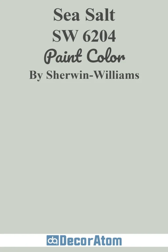
This soft, muted green-blue is an absolute dream next to Accessible Beige.
Sea Salt has a spa-like quality that balances beautifully with the grounded warmth of Accessible Beige.
Together, they create a serene, beachy, and organic look—perfect for bedrooms, bathrooms, or even casual living spaces.
Get a Peel & Stick paint sample of Sea Salt
2. Sherwin-Williams Urbane Bronze (SW 7048)

For contrast and depth, Urbane Bronze is a bold, earthy dark brown-gray that complements Accessible Beige without clashing.
It’s great for accent walls, cabinetry, or even exterior trim.
Accessible Beige provides a light, neutral base while Urbane Bronze adds drama and richness.
Get a Peel & Stick paint sample of Urbane Bronze
3. Sherwin-Williams Comfort Gray (SW 6205)
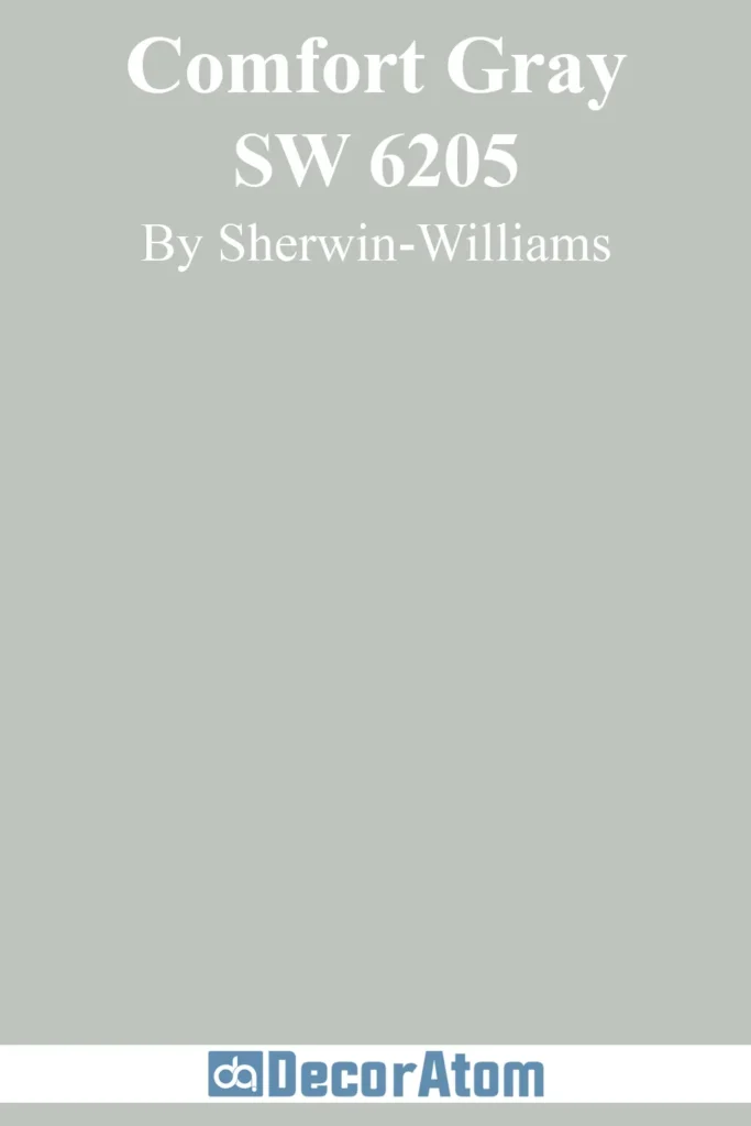
Despite the name, Comfort Gray leans more green-blue than actual gray. When placed near Accessible Beige, it helps create a cool, calming contrast.
This pairing is ideal for coastal-inspired themes or spaces where you want to introduce color without it feeling too loud.
Get a Peel & Stick paint sample of Comfort Gray
4. Sherwin-Williams Pure White (SW 7005)
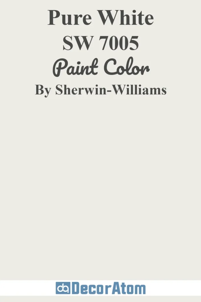
A classic, clean white like Pure White helps trim, cabinetry, and ceilings look crisp next to Accessible Beige.
It enhances the warmth of the beige without competing for attention. If you want to keep things minimal and cohesive, this is a go-to combo.
Get a Peel & Stick paint sample of Pure White
5. Sherwin-Williams Retreat (SW 6207)

Retreat is a deep, muted green that adds a cozy, grounded feel. When used with Accessible Beige, it offers a nature-inspired palette that’s both modern and timeless.
This combo works beautifully in bedrooms, offices, or entryways where you want a bit of personality without going over the top.
Get a Peel & Stick paint sample of Retreat
Where to Use Sherwin Williams Accessible Beige?
What I love about Sherwin-Williams Accessible Beige is its versatility.
It’s not one of those colors that only works in a narrow set of styles or lighting conditions.
Whether you’re working with a modern farmhouse vibe, a cozy traditional space, or something more transitional, this color plays well almost anywhere.
Let’s take a closer look at where you can use it—and why it works in each spot:
Sherwin Williams Accessible Beige In the Bedroom
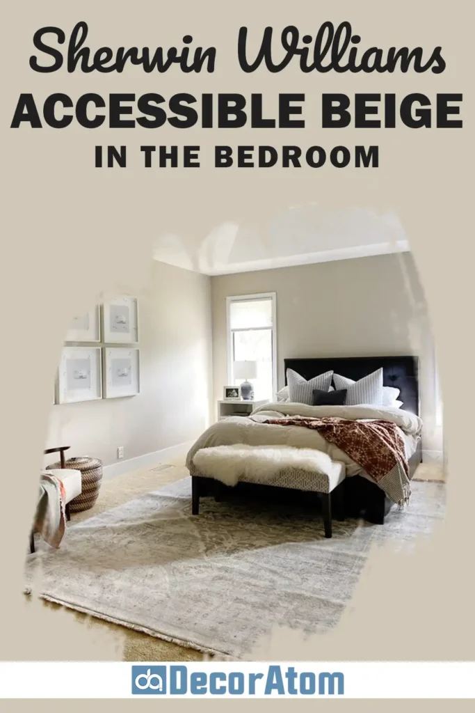
In a bedroom, Accessible Beige creates a calming and restful atmosphere. The soft beige tone mixed with a hint of gray makes the space feel warm without being too golden or yellow.
It pairs well with neutral bedding, natural wood furniture, and soft textiles like linen or cotton.
If your bedroom gets a lot of morning sun, the color will glow softly and feel warm and peaceful.
At night, it takes on a more muted tone, creating a perfect backdrop for cozy lighting. It’s ideal if you’re going for a minimalist, relaxing retreat.
Sherwin Williams Accessible Beige In the Living Room
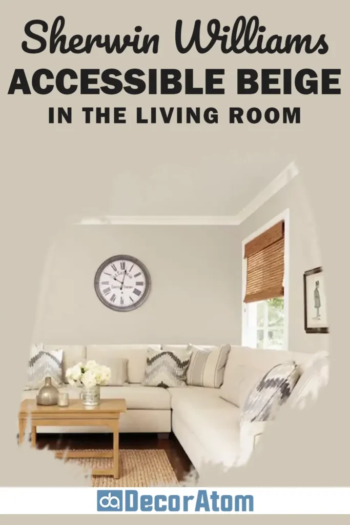
The living room is one of the most common spaces where I’ve seen Accessible Beige shine.
It’s neutral enough to let your furniture and decor stand out, but still adds just enough warmth to keep things from feeling cold.
Pair it with light or medium wood tones, creamy white trim, and layered textures (like woven rugs, throw blankets, and soft pillows) for a cohesive, inviting look.
It also adapts easily—whether your style is classic, boho, or transitional, this color fits right in.
Sherwin Williams Accessible Beige In the Bathroom
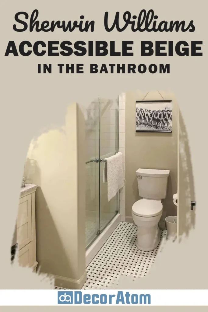
For bathrooms, especially smaller ones or those without natural light, Accessible Beige adds warmth without making the space feel cramped.
It gives just enough color to define the walls, but stays soft and clean.
Paired with white subway tile, marble counters, or black fixtures, it becomes the perfect supporting color—subtle yet stylish.
You can also bring in soft sage greens or light blues in your towels and accessories to round out the look.
Sherwin Williams Accessible Beige in Kitchen
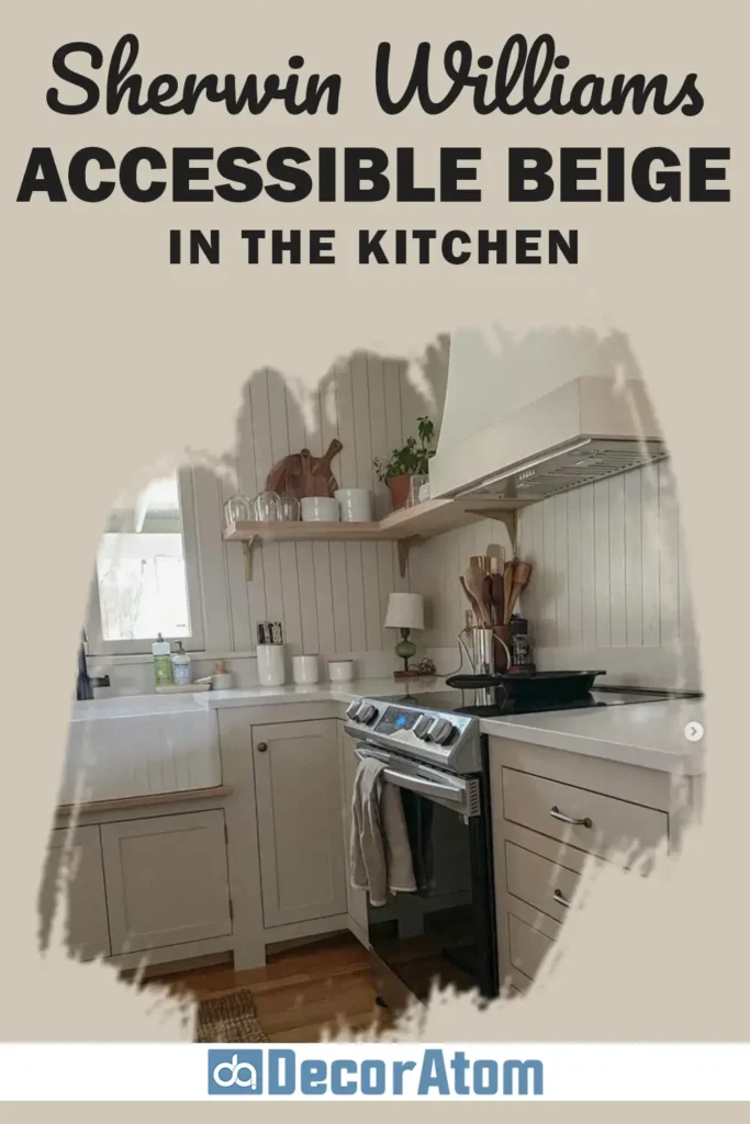
In the kitchen, Accessible Beige can be used on the walls, cabinets, or even the backsplash.
It’s a great neutral that doesn’t clash with appliances or finishes, whether you have stainless steel, brushed gold, or matte black.
If you’re updating oak cabinets or trying to coordinate with natural stone countertops, Accessible Beige can help tone things down and tie the room together.
It has a natural elegance that works well with both traditional and modern kitchen designs.
Sherwin Williams Accessible Beige For the Exterior
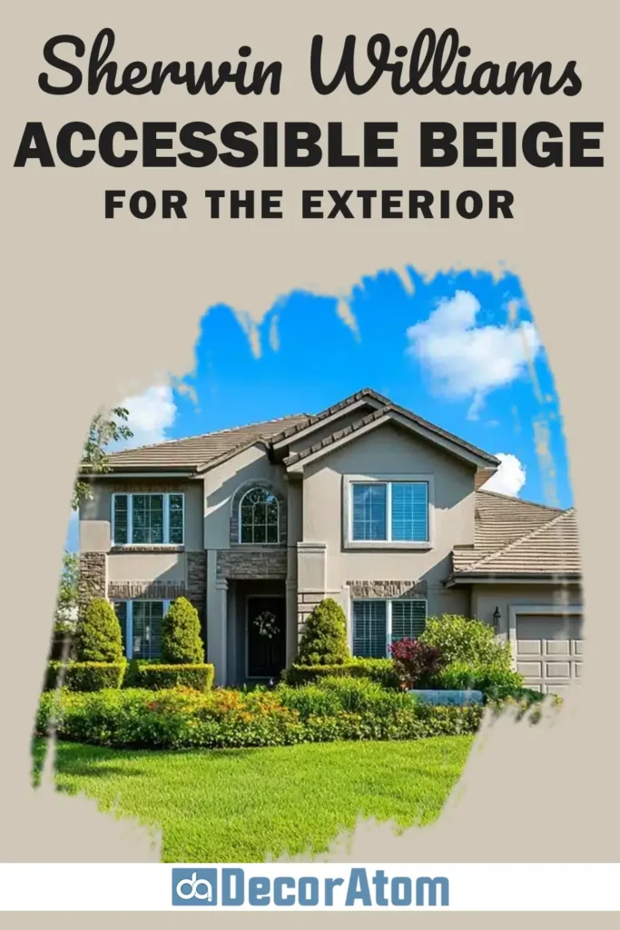
Using Accessible Beige on the exterior is a smart choice if you want a warm, timeless look.
It works beautifully as a main house color, especially when paired with white or off-white trim and darker accent colors on shutters or doors.
It doesn’t go too yellow in bright sunlight, which is a big plus. Instead, it gives off a soft, inviting presence—like a cozy cottage or a well-kept suburban home.
It also plays well with landscaping, stone, and brick elements.
Comparing Sherwin Williams Accessible Beige With Other Colors
If you’re anything like me, choosing a paint color isn’t just about what looks good on a swatch—it’s about how that color stacks up against other options.
Comparing similar shades side by side can reveal subtle undertones, depth differences, and how each one behaves in natural and artificial light.
Sherwin-Williams Accessible Beige often comes up in conversations around greiges, warm neutrals, and transitional colors.
So let’s take a closer look at how it compares to six other popular paint colors from both Sherwin-Williams and Benjamin Moore.
Sherwin Williams Accessible Beige vs Agreeable Gray (SW 7029)
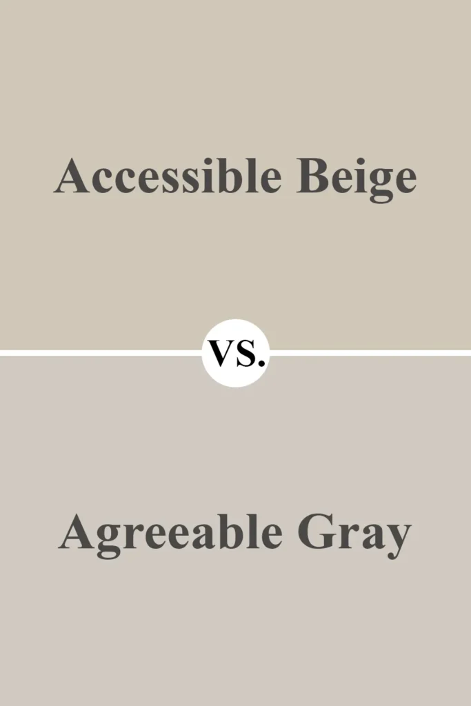
Both of these colors are incredibly popular—and I can understand why. They’re neutral, adaptable, and timeless.
But the differences between them become noticeable once you see them in the same room.
Accessible Beige is definitely warmer. It leans more into the beige family with a subtle gray undertone that softens it.
Agreeable Gray, on the other hand, is more of a true greige—meaning it sits squarely between gray and beige, but with a stronger gray presence.
In a room with warm lighting, Agreeable Gray can feel more muted or even a touch cool, while Accessible Beige stays grounded and cozy.
If you want your walls to feel warmer and more traditional, Accessible Beige is the better choice. But if you prefer a cleaner, more modern feel, especially with cool accents or grays, Agreeable Gray might be your go-to.
Get a Peel & Stick paint sample of Agreeable Gray
Sherwin Williams Accessible Beige vs Balanced Beige (SW 7037)
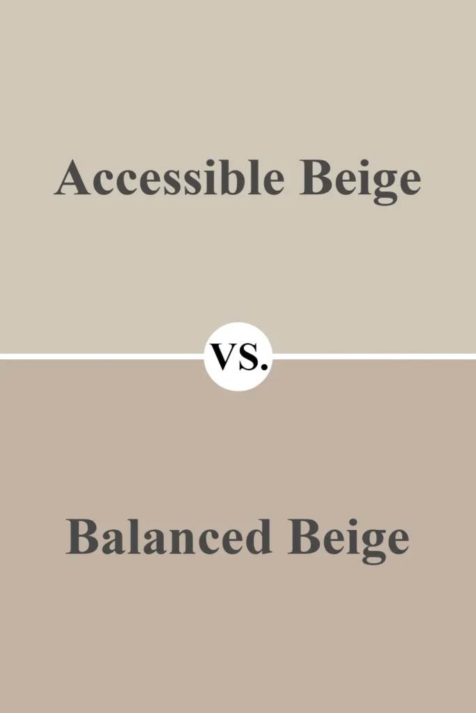
Balanced Beige is essentially a deeper, richer version of Accessible Beige.
Both share the same undertone structure—warm with a hint of gray—but Balanced Beige has more depth.
It reads darker on the walls and can feel cozier in large or well-lit spaces.
I personally think of Balanced Beige as the perfect follow-up if you love Accessible Beige but want a slightly more dramatic look.
It’s also a great option for accent walls or rooms where you want a little more mood.
Accessible Beige, by comparison, feels lighter and a bit more open, which makes it great for small rooms or open-concept areas.
Get a Peel & Stick paint sample of Balanced Beige
Sherwin Williams Accessible Beige vs Revere Pewter (Benjamin Moore HC-172)
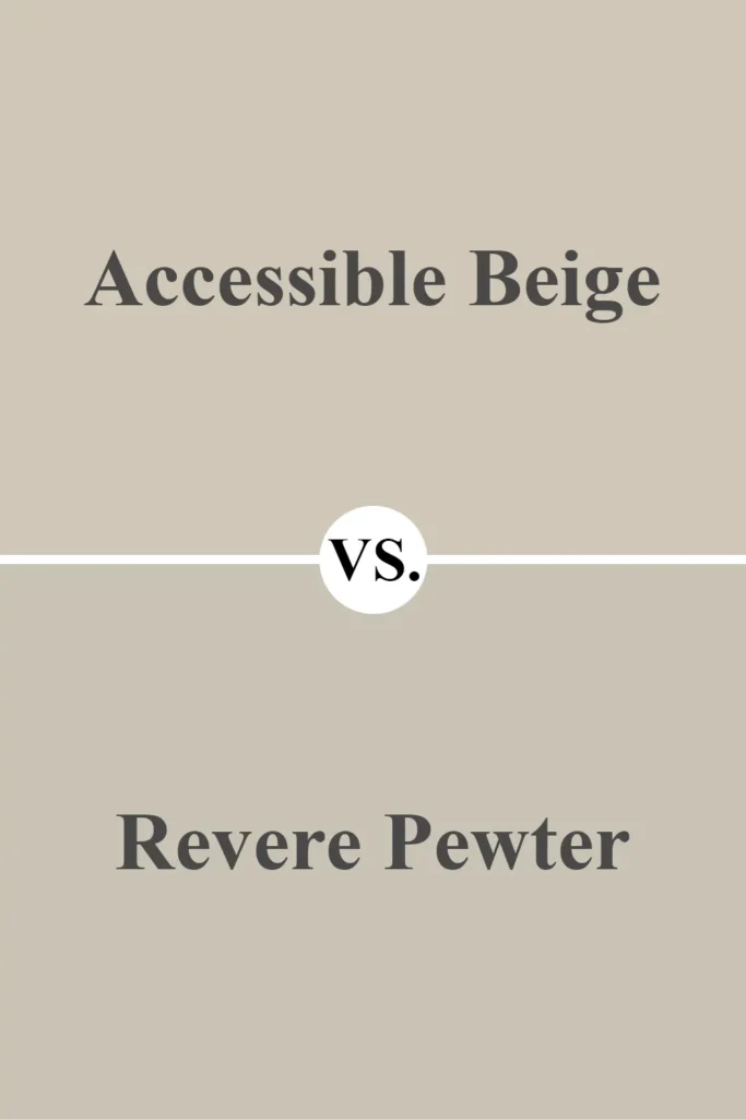
Revere Pewter has a reputation for being the ultimate greige, and it’s easy to see why—it walks a fine line between warm and cool.
Compared to Accessible Beige, Revere Pewter is noticeably more gray and has a slightly cooler undertone overall.
In south-facing rooms, Revere Pewter can feel balanced and calm, while Accessible Beige leans warmer.
In north-facing light, Revere Pewter can sometimes pull blue or greenish-gray, whereas Accessible Beige stays warmer and more consistent.
If you’re working with warmer flooring or wood tones, Accessible Beige might be the better choice. But if you want something that can shift slightly cooler and blend with grays or blues, Revere Pewter could be a better fit.
Get a Peel & Stick paint sample of Revere Pewter
Sherwin Williams Accessible Beige vs Pale Oak (Benjamin Moore OC-20)
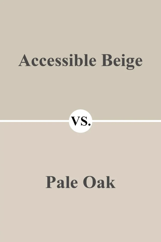
Pale Oak is much lighter and airier than Accessible Beige. It leans toward taupe and can occasionally show hints of pink or violet undertones, especially in cooler lighting.
Accessible Beige has a stronger beige base with gray to balance it, while Pale Oak feels softer and more delicate.
If your space doesn’t get a lot of natural light and you want to keep things feeling bright and soft, Pale Oak might be a better option.
But for a more grounded neutral that still feels light, Accessible Beige provides more visual structure without becoming too bold.
Get a Peel & Stick paint sample of Pale Oak
Sherwin Williams Accessible Beige vs Shoji White (SW 7042)
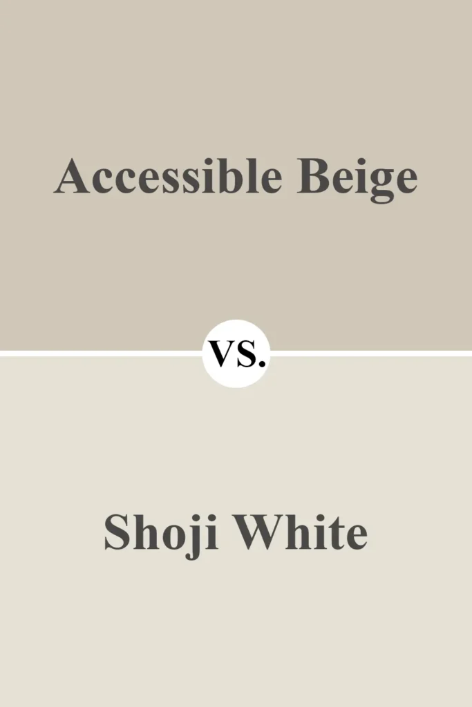
Shoji White is more of an off-white than a true beige or greige. It has a creamy, warm undertone and is often used when you want a light neutral with some substance. Compared to Accessible Beige, Shoji White feels much brighter and airier.
While Accessible Beige creates a more noticeable contrast with white trim, Shoji White sometimes blends in, especially with softer whites.
If you’re designing a space with a lot of natural light and want something understated and creamy, Shoji White is lovely. But Accessible Beige is better if you want a mid-tone that gives a bit more definition.
Get a Peel & Stick paint sample of Shoji White
Sherwin Williams Accessible Beige vs Edgecomb Gray (Benjamin Moore HC-173)
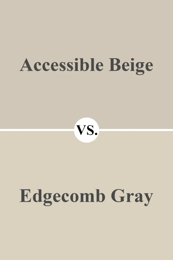
Edgecomb Gray and Accessible Beige are incredibly close in tone and feel. Both are warm, neutral greige colors that can adapt beautifully in different lighting.
But where Accessible Beige has a little more beige and warmth, Edgecomb Gray leans just a touch grayer and cooler.
If you’re looking at both, it really comes down to the mood of your space. For cozier, warmer rooms, I’d go with Accessible Beige.
For slightly more refined, airy spaces, Edgecomb Gray offers a subtle elegance without feeling stark.
They’re both winners—it’s just a matter of which side of warm vs. cool you want to lean.
Get a Peel & Stick paint sample of Edgecomb Gray
Why I Love Sherwin Williams Accessible Beige
Honestly, the reason I keep coming back to Accessible Beige is simple: it just works.
I’ve used it in multiple rooms, and it never feels too much or too little. It’s warm without being yellow, neutral without being flat, and versatile without being boring.
Whether it’s morning light streaming into the kitchen or cozy lamps at night in the living room, this color shifts in a way that feels intentional and elegant.
It also plays well with a huge variety of other colors—soft greens, deep blues, crisp whites, or even black. That kind of flexibility makes designing a cohesive home so much easier.
I don’t have to overthink things. Accessible Beige gives me a calm, welcoming backdrop to build everything else around.
Get a Peel & Stick paint sample of Accessible Beige
Final Thoughts
If you’re on the fence about Sherwin-Williams Accessible Beige, I’ll say this: it’s one of the most reliable, livable paint colors I’ve ever used.
It doesn’t chase trends or scream for attention, but instead provides a sophisticated base that adapts to your space and personal style.
Whether you’re redecorating a single room or painting an entire house, Accessible Beige offers the kind of warmth and balance that feels just right. And that’s exactly what I want from a paint color—something timeless, beautiful, and easy to love.