

I first ran into Gentleman’s Gray on a paint chip that got shuffled into a stack of samples I was carrying home from the hardware store, and honestly, I almost missed it. It looked plain in that tiny square, just a dark smudge among a dozen other dark smudges.
Then I got it home, taped it to a wall under real light, and it stopped me mid-step. This is not a color that reads the same twice. One hour it looks like a deep navy, the next it settles into something closer to charcoal with a whisper of teal hiding underneath.
I’ve painted with a lot of colors over the years, but few of them have made me stand in a room just staring at the wall the way this one did. That’s really why I wanted to write about it.
It deserves more than a quick mention in a roundup post. It’s a color with layers, and I want to walk you through every one of them, the good and the tricky, so you know exactly what you’re signing up for if you bring it into your home.

What Color is Benjamin Moore Gentleman’s Gray?
Gentleman’s Gray, 2062-20, is a deep, blackened blue that Benjamin Moore files under its Color Preview collection.
Despite the name suggesting a straightforward gray, it’s really a navy at its core, one that’s been pushed dark enough to pick up smoky, almost teal-tinged qualities along the way.
It reads less like a paint chip color and more like the shade of a stormy evening sky, something moody and dressed up rather than flat and utilitarian.
Is It a Warm or Cool Color?
It’s a cool color through and through. The blue base keeps it firmly on the cool side of the spectrum, and you’ll feel that the moment it’s up on a wall.
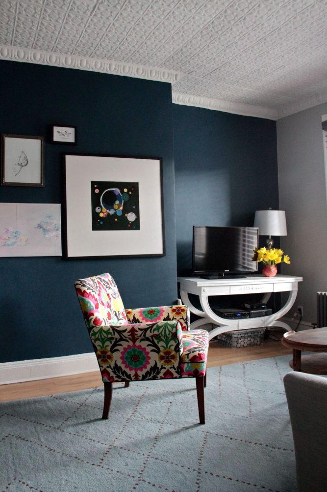
LRV of Benjamin Moore Gentleman’s Gray
LRV stands for Light Reflectance Value, and it’s basically a measure of how much light a paint color bounces back into a room versus how much it soaks up. The scale runs from 0, which is pure black and absorbs everything, up to 100, which is pure white and reflects nearly all of it.
Gentleman’s Gray sits at an LRV of 7.26, which puts it firmly in the deep, light-absorbing end of the scale.
In practical terms, this means the color won’t do you any favors in a room that’s already short on natural light. It’s a color that needs light to be pointed at it, not a color that will help create light on its own.
Undertones of Benjamin Moore Gentleman’s Gray
This is where the color gets interesting, and honestly a little tricky to pin down. Gentleman’s Gray carries cool undertones that lean toward both blue and green at once, which is what gives it that blackened teal quality people keep mentioning when they talk about this shade.
It’s not a clean, single-note navy. There’s a murkiness to it, in the best possible sense, like looking into deep water. Depending on the light and what’s sitting next to it on the wall, you might catch more of the green creeping through, or you might lose it entirely and just see a rich, near-black blue.
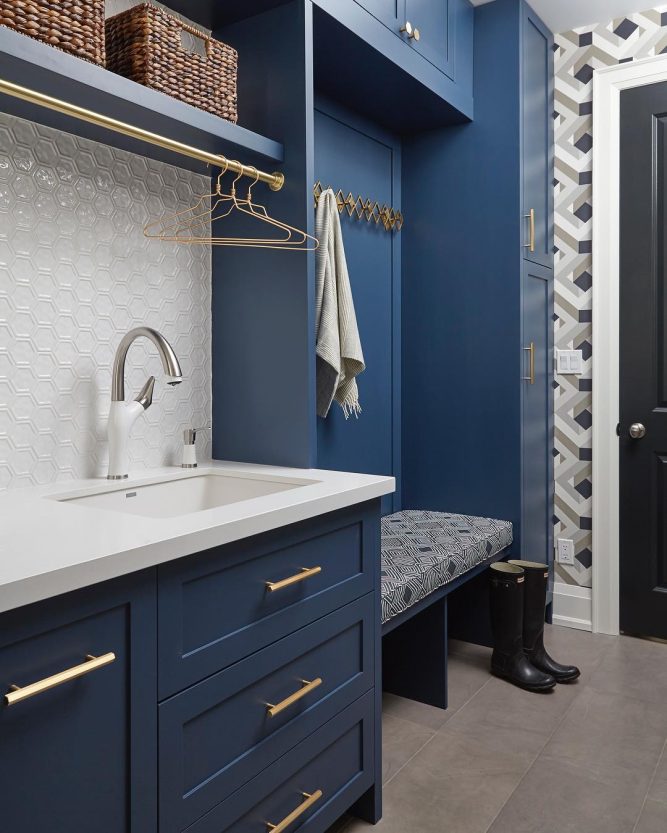
How Different Types of Lighting Affect Benjamin Moore Gentleman’s Gray?
Lighting changes this color more than most, so it’s worth thinking through room by room. In a south-facing room, where sunlight pours in for most of the day, Gentleman’s Gray opens up and shows off its blue side more clearly, feeling less heavy than you’d expect.
East-facing rooms catch that cooler morning light, and in those hours the color can look sharp and distinctly blue, then mellow into a truer gray as afternoon rolls in.
West-facing rooms get the warm glow of late-day sun, and that warmth softens the color, making it feel cozier and a bit less severe by evening.
North-facing rooms are the ones to watch out for, since they get flat, cool light with no direct sun, and in that setting Gentleman’s Gray can edge close to looking black. If your space is north-facing, I’d test a large sample before committing to a full room.
Trim Colors to Pair With Benjamin Moore Gentleman’s Gray
Trim is where you can either sharpen this color up or let it fade into the background, so picking the right white or off-white matters more than people expect. Here are three that work beautifully with it.
White Dove (OC-17) is my first pick, and it’s a classic for a reason. It has just enough warmth to keep the pairing from feeling cold, and it gives Gentleman’s Gray a soft, tailored edge without competing with it.
Chantilly Lace (OC-65) goes the opposite direction. It’s a crisp, true white with almost no undertone at all, so it creates strong, clean contrast against the deep navy-teal of the wall color. If you want a more graphic, modern look, this is the pairing to reach for.
Simply White (OC-117) lands somewhere in between the two. It has a gentle warmth that’s subtler than White Dove, and it works especially well if the rest of your trim or millwork already leans toward warm wood tones.
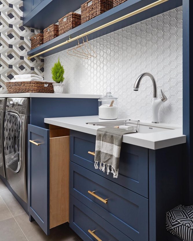
Colors Similar to Benjamin Moore Gentleman’s Gray
If Gentleman’s Gray feels like it’s almost right but not quite, it’s worth knowing what else lives in that same neighborhood of deep, moody blues. These colors share that blackened, smoky quality, but each one shifts the formula slightly, some pulling more toward pure navy, some leaning heavier into gray, and a couple flirting more openly with green.
I like keeping a short list like this on hand because paint color can look completely different depending on the room, the cabinetry, or the light you’re working with, so having close alternatives gives you room to adjust without starting your search from scratch.
A few of these are from Benjamin Moore’s own family of related shades, and a couple come from Sherwin Williams for anyone who prefers to shop that brand instead.
None of them are identical twins to Gentleman’s Gray, but all of them sit close enough on the color wheel that they’d scratch the same itch if this particular shade isn’t quite landing for your space.
- Twilight 2058-10
- Blue Note 2129-30
- Hudson Bay 1680
- In the Midnight Hour 1666
- Dark Night SW 6237
- Naval SW 6244
Colors that Go With Benjamin Moore Gentleman’s Gray
Coordinating colors are different from similar colors. Instead of looking for shades that resemble Gentleman’s Gray, this is about finding colors that sit comfortably alongside it in the same room, whether that’s on an adjacent wall, the ceiling, or a piece of trim.
Because Gentleman’s Gray is such a saturated, dark color, it tends to do best next to shades that either soften it or ground it, rather than colors that try to match its intensity.
Warm neutrals give it a sense of balance, while soft grays keep everything feeling cohesive without disappearing into sameness.
I’ve found that a well-chosen coordinating palette can completely change how a dark color like this reads in a home, turning it from something that feels closed-in to something that feels intentional and layered. Here are four Benjamin Moore colors that pair naturally with it.
- Danville Tan HC-91
- Gray Mirage 2142-50
- Pike’s Peak Gray 2127-50
- Silver Chain 1472
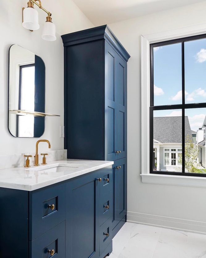
Where to Use Benjamin Moore Gentleman’s Gray?
Because this color is dark and full of personality, it works best when you’re intentional about where you put it. Here’s where I’d point you first.
- Home offices and libraries, where the color adds a sense of focus and quiet weight to the room
- Dining rooms, especially for evening entertaining, since the depth of the color feels dramatic under lamplight or candlelight
- Kitchen cabinetry, particularly on an island or a lower bank of cabinets paired with a lighter countertop
- Front doors, where a single dark, saturated color can make a real style statement from the curb
- Accent walls in bedrooms or living rooms, giving you the drama of the color without covering every surface
- Powder rooms, where a smaller, enclosed space can handle a bold, dark color without feeling overwhelming
Why I Love Benjamin Moore Gentleman’s Gray
I keep coming back to how alive this color feels. So many dark paints just sit there, flat and one-note, but Gentleman’s Gray shifts depending on the hour, the season, even the mood of the room it’s in.
There’s something almost theatrical about it, like it knows how to hold a room’s attention without needing bright color to do it.
I love that it can feel formal in a dining room and then turn cozy and enveloping in a small reading nook, all without changing a single thing about the paint itself. It’s the kind of color that rewards you for paying attention to it, and that’s rare.
Final Thoughts
Gentleman’s Gray isn’t a color you pick on a whim, and I don’t think it’s meant to be.
It asks for a bit of planning around lighting, trim, and the mood you’re going for, but once you get those pieces right, it pays you back with a depth and richness that a lot of paint colors simply can’t match.
If you’re drawn to moody, sophisticated spaces and you’re not afraid of a little drama on your walls, I think you’ll end up loving it as much as I do.