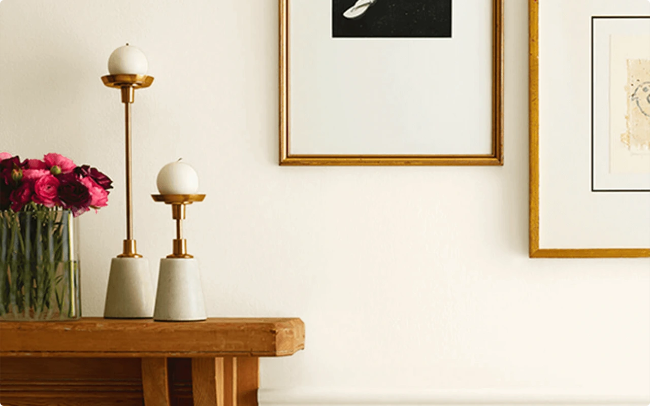
Cream paint colors are like the banana bread of the paint world, safe, cozy, and somehow always a crowd-pleaser. You can never really mess it up (well, unless you pick the wrong undertone, but we’ll get to that later).
For me, cream is the color that just… calms everything down. It’s softer than stark white, but not as heavy as beige. Think of it like wrapping your walls in a cozy sweater. And honestly, the older I get, the more I just want my house to feel like a cozy sweater.
Anyway, if you’ve been staring at paint chips and wondering, “Do I want a white-white or like… a creamy white? Or wait, is that just beige pretending to be white?” Yeah, I’ve been there. The good news is, cream paint colors are way more versatile than you might think.
*This post contains affiliate links. For more details see my full disclosure.
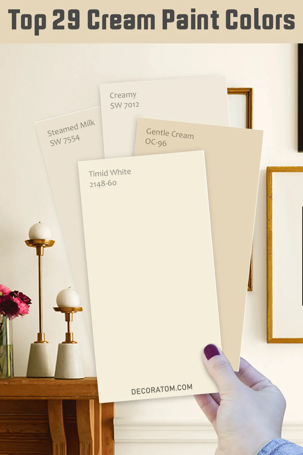
What are Cream Paint Colors?
Let’s break this down. Cream is basically what happens when white paint and a hint of yellow have a baby. It’s warm, soft, and not as harsh as a bright white that makes you feel like you’re living inside a hospital corridor (no thanks).
Now, not all creams are created equal. Some lean buttery and warm, like, “Hello, farmhouse kitchen.” Others are a little more muted, almost like a pale oatmeal that works with modern, minimalist spaces. And then there are the chameleons: in daylight they look fresh and clean, but under warm bulbs at night, suddenly they’re cozy and glowing.
In short, cream is that middle ground between crisp white and “uh-oh, is this beige?” and that’s why so many designers keep going back to it.
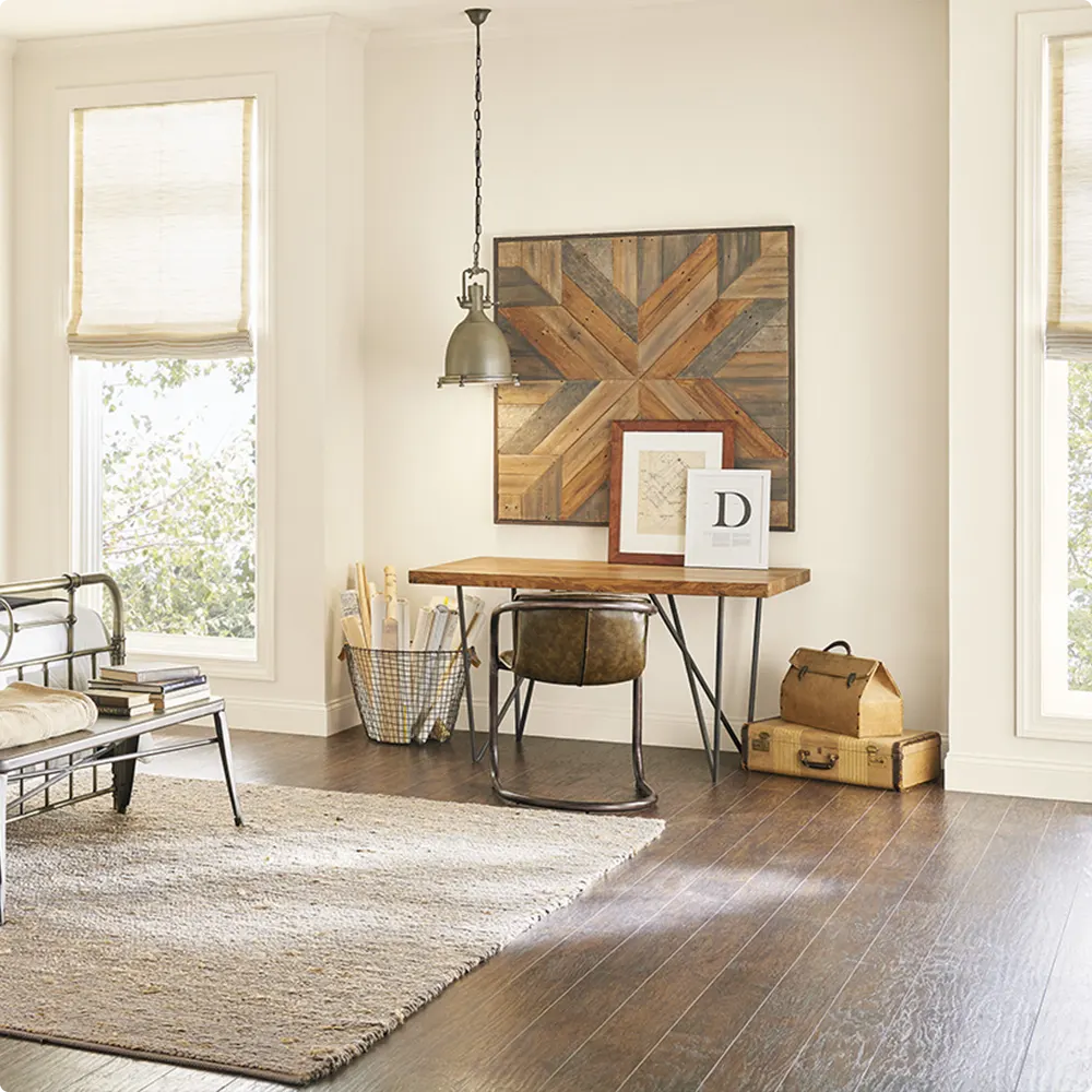
Where to Use Cream Paint Colors?
Oh, the possibilities. Cream is one of those “any room, anytime” kinds of colors.
Living Rooms
Instantly cozy without making it feel like a cave. Works especially well if you’ve got big windows and natural light.
Bedrooms
If you want that hotel-room vibe but without feeling sterile, cream is your friend. Toss in some linen bedding and boom, instant sanctuary.
Kitchens
Cream cabinets with brass hardware? Chef’s kiss. (Side note: learned the hard way that actual white cabinets + kids = fingerprints forever.)
Exteriors
A cream house with black shutters is like the ultimate classic. It looks clean but still welcoming, not like you’re running a medical clinic out of your home.
Honestly, you could even paint your bathroom cream and make it feel like a spa instead of a place where you argue with your shower curtain.
💥🎁 Christmas & Year-End Deals On Amazon !
Don't miss out on the best discounts and top-rated products available right now!
*As an Amazon Associate, I earn from qualifying purchases.
Colors to Pair with Cream
Here’s where it gets fun. Cream is kind of like that friend who gets along with everyone—seriously, you can mix it with almost anything.
Wood Tones
Dark walnut, light oak, rustic pine, cream loves them all. It’s like peanut butter and jelly.
Black Accents
A little black mixed in (think window frames, a bold front door, or even just picture frames) keeps cream from feeling too sweet or washed out.
Blues & Greens
Cream walls + a muted sage green sofa = chef’s kiss. Navy blue also works if you want contrast without going wild.
Pinks & Blushes
This combo feels soft and romantic without turning into a candy shop.
Grays
Pairing cream with a soft gray can balance warmth and coolness, perfect if you can’t decide which team you’re on.
Basically, cream plays well with both warm and cool palettes, which is why people never get sick of it.

How To Choose The Right Cream Paint Color?
Okay, so here’s the deal: cream might sound simple, but it can actually be sneaky. Undertones will make or break your walls.
Look At the Undertones
Some creams have a yellow tint (hello, sunny farmhouse). Some lean pink or peach (romantic but tricky if you don’t like that vibe). Others are more neutral, which is usually the safest bet.
Test It Everywhere
And I mean everywhere. I once thought I found “the one” in the paint store… until I painted a swatch in my north-facing bedroom and it turned into full-on banana yellow. Swear I almost cried. Always test in different rooms and at different times of day.
Think About Your Lighting
Natural light = cooler, crisper cream. Warm bulbs = golden glow. If you’ve got both, pick a color that doesn’t look weird under either.
Match It to Your Stuff
If you already have furniture, rugs, or cabinets, make sure your cream isn’t clashing. Cream can sometimes make white trim look dingy, so test that too.
And honestly? Don’t overthink it. Pick 2–3 samples, slap them on your wall, and see which one makes you happiest when you walk into the room. That’s the real test.
The Only Paint Color Sample You Need!
The best way to see if a paint color works for your home is to test it on your wall. Look at it over a few days in different lighting; morning, afternoon, and evening, to see how it really feels.
You can do this by getting a sample from the paint store and using a brush put it up on the walls, but then you are left with a can that you can’t do anything with. Those samples are used with poor-quality paint and aren’t meant for use on your walls permanently.

Instead, I recommend going with Samplize. They are a company that will send you a 9”x14.75” peel and stick swatch of a paint color that you can stick to the wall. When you are done just peel it off and throw it away.
It’s easy and much less messy!
Top 29 Cream Paint Colors
Now, I’ve tested a bunch of creams over the years (too many, probably, I think my neighbors judged me for all the random paint patches on the side of my house). But after lots of trial, error, and “what was I thinking?” moments, I’ve narrowed it down.
These are some of the best cream paint colors out there, classic, reliable, and versatile enough to fit just about any style.
Benjamin Moore Cream Paint Colors
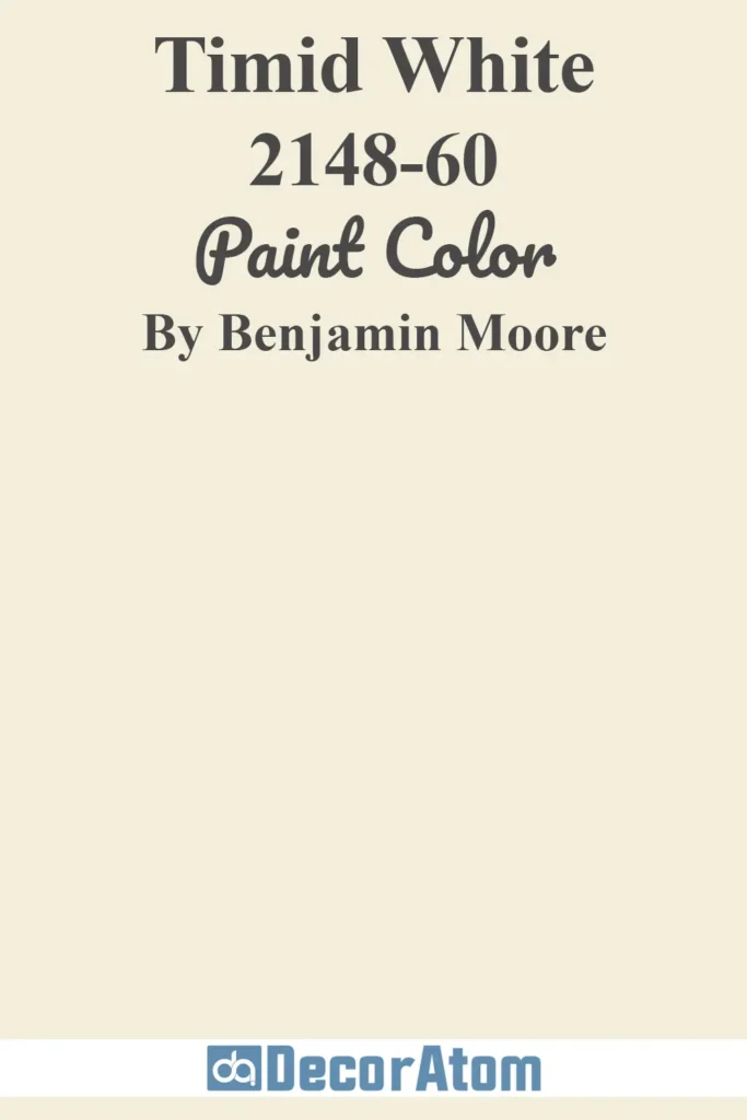
1. Timid White
💥🎁 Christmas & Year-End Deals On Amazon !
Don't miss out on the best discounts and top-rated products available right now!
*As an Amazon Associate, I earn from qualifying purchases.
The name cracks me up, timid white. Like, is it shy? But honestly, it’s such a soft, whispery cream that it almost melts into the background in the nicest way. It’s perfect if you’re scared of color (hi, commitment issues) but don’t want stark builder-grade white. Think cozy guest bedroom or a hallway that feels like a warm hug instead of a sterile doctor’s office.
Get a sample of Timid White
2. Navajo White
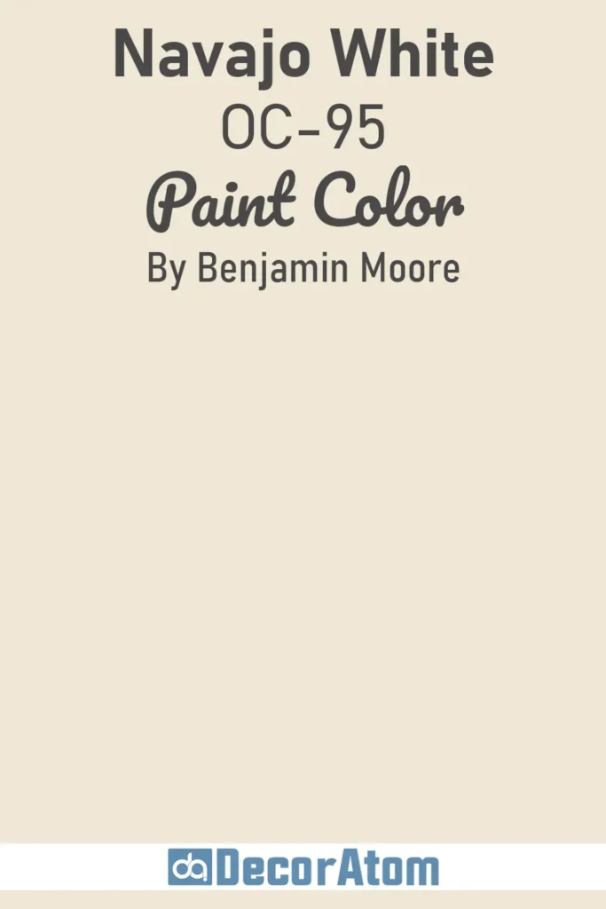
This one is basically a classic. It leans a bit warmer, almost like it’s been kissed by the desert sun (that sounded cheesy, but it’s true). I’ve seen it in older homes with lots of wood trim, and wow, it just works. It doesn’t scream “cream!” but it softens everything around it. Definitely one of those “safe but never boring” choices.
Get a sample of Navajo White
3. Gentle Cream
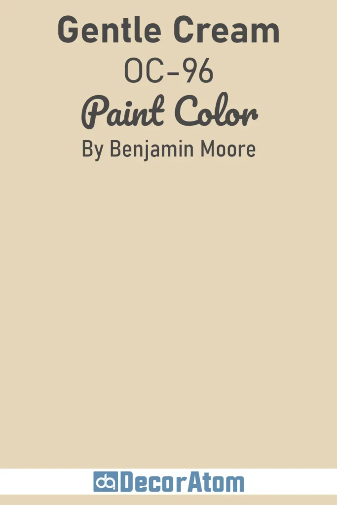
Gentle Cream feels like the color equivalent of putting on your comfiest sweater. It’s warm, but not yellow-banana warm, if you know what I mean. More of that soft, buttery vibe. I’ve used it in a dining room once, and honestly, the walls kind of glowed at night with candles lit. Instant cozy dinner-party atmosphere.
Get a sample of Gentle Cream
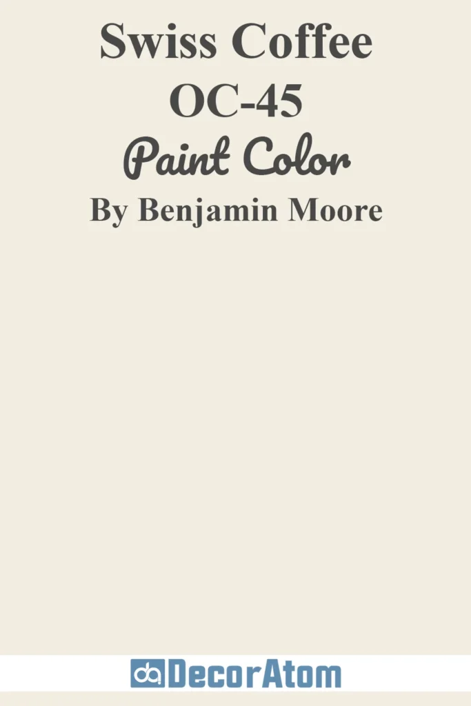
4. Swiss Coffee
💥🎁 Christmas & Year-End Deals On Amazon !
Don't miss out on the best discounts and top-rated products available right now!
*As an Amazon Associate, I earn from qualifying purchases.
Now, Swiss Coffee is famous for a reason, it’s like the influencer of cream paints. Everyone’s tried it at least once. It’s creamy without being too beige, warm without going gold. The only thing is, it does shift depending on your light. In some rooms it’s dreamy, in others it’s like, “wait, why is this looking peachy?” So, test those swatches, my friend.
Get a sample of Swiss Coffee
5. White Dove
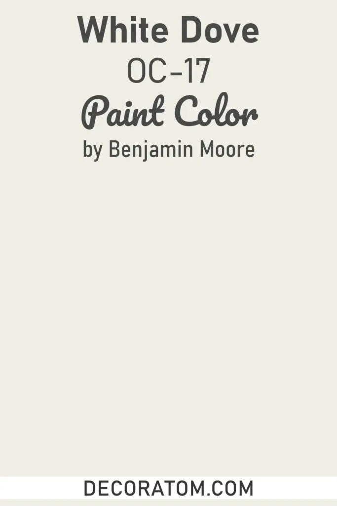
Okay, White Dove is another crowd favorite. It’s not technically marketed as “cream,” but it definitely leans warm enough to make the cut here. If you want your trim, doors, or even whole walls to feel timeless (without veering into yellow), this is a no-brainer. It’s like the little black dress of paint colors, always looks good.
Get a sample of White Dove
6. Indian White
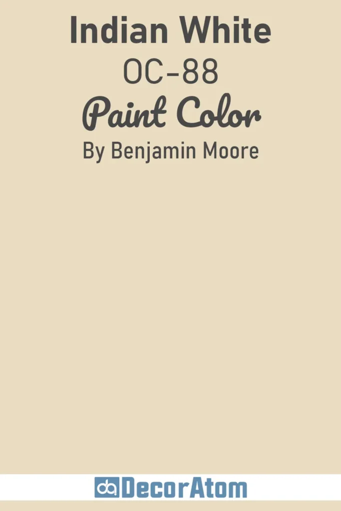
This one has a slightly more earthy undertone, which I actually love. It feels grounded, like it belongs in a room with terracotta pots, linen curtains, and maybe a slightly messy bookshelf. It’s cream, but cream with a touch of sophistication. I imagine it in a sunroom with plants, so, so good.
Get a sample of Indian White
7. Winter Wheat

💥🎁 Christmas & Year-End Deals On Amazon !
Don't miss out on the best discounts and top-rated products available right now!
*As an Amazon Associate, I earn from qualifying purchases.
Despite the name, it’s not cold at all. Winter Wheat is warm and golden, like a soft field right before harvest (okay, I sound like a Hallmark movie now). But really, it adds depth without being overwhelming. If Navajo White feels too classic and Gentle Cream feels too cozy, this one sits right in the middle.
Get a sample of Winter Wheat
8. Acadia White
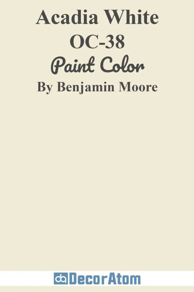
This one is sneaky, it looks pretty pale at first glance, but then you notice that little creamy warmth hiding underneath. I think of it as a “sophisticated cream.” It doesn’t shout for attention but quietly makes the room feel elegant. I’ve seen it in kitchens with marble countertops, and let me tell you, it’s chef’s kiss.
Get a sample of Acadia White
9. Windham Cream

Ah, Windham Cream. This one definitely has personality, it leans a little more yellow, but in a cheerful, “good morning sunshine” way. I wouldn’t paint my whole house with it (too much of a good thing), but as an accent room or a space you want to feel bright and uplifting? Totally worth it.
Get a sample of Windham Cream
10. Mayonnaise
💥🎁 Christmas & Year-End Deals On Amazon !
Don't miss out on the best discounts and top-rated products available right now!
*As an Amazon Associate, I earn from qualifying purchases.
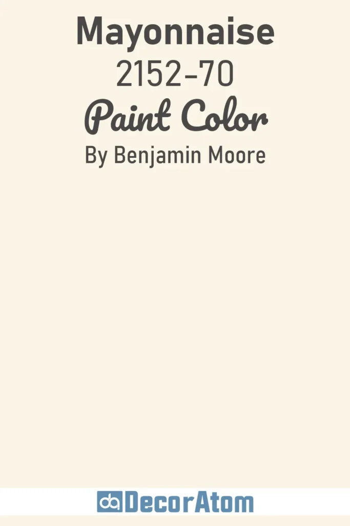
Yes, it’s literally called Mayonnaise. And yes, it makes me laugh every time. But surprisingly, it’s a really good cream. It’s smooth, warm, and… okay, kind of delicious-looking on the wall. Not too yellow, not too beige, just that perfect in-between. If you can get past the name, it’s a winner.
Get a sample of Mayonnaise
11. Ivory White
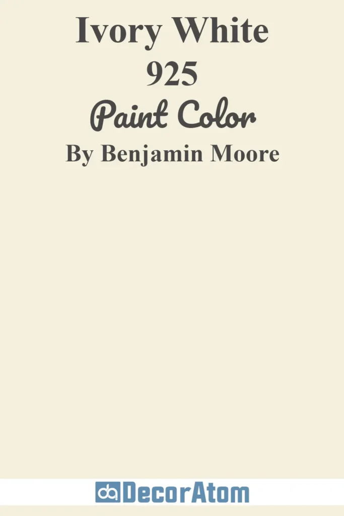
Ivory White feels like the slightly more sophisticated cousin of plain white. It’s got enough warmth to soften a space without tipping over into “old beige office walls” territory. Great for people who want cream but still want things to feel crisp and clean.
Get a sample of Ivory White
12. Sugar Cookie
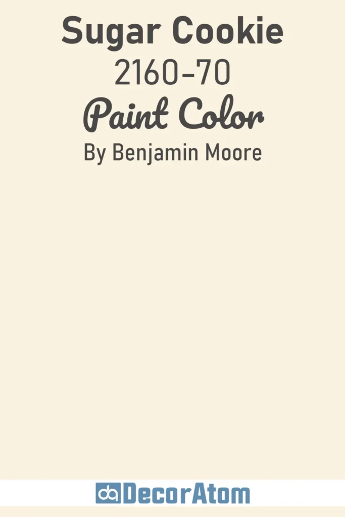
The name says it all, it’s soft, sweet, and makes you want to sit down with a cup of tea (and maybe an actual cookie). It leans warm, but not overly so. I’ve seen it in nurseries, and it feels like the kind of backdrop that just makes the whole room cozy without trying too hard.
Get a sample of Sugar Cookie
13. Linen White
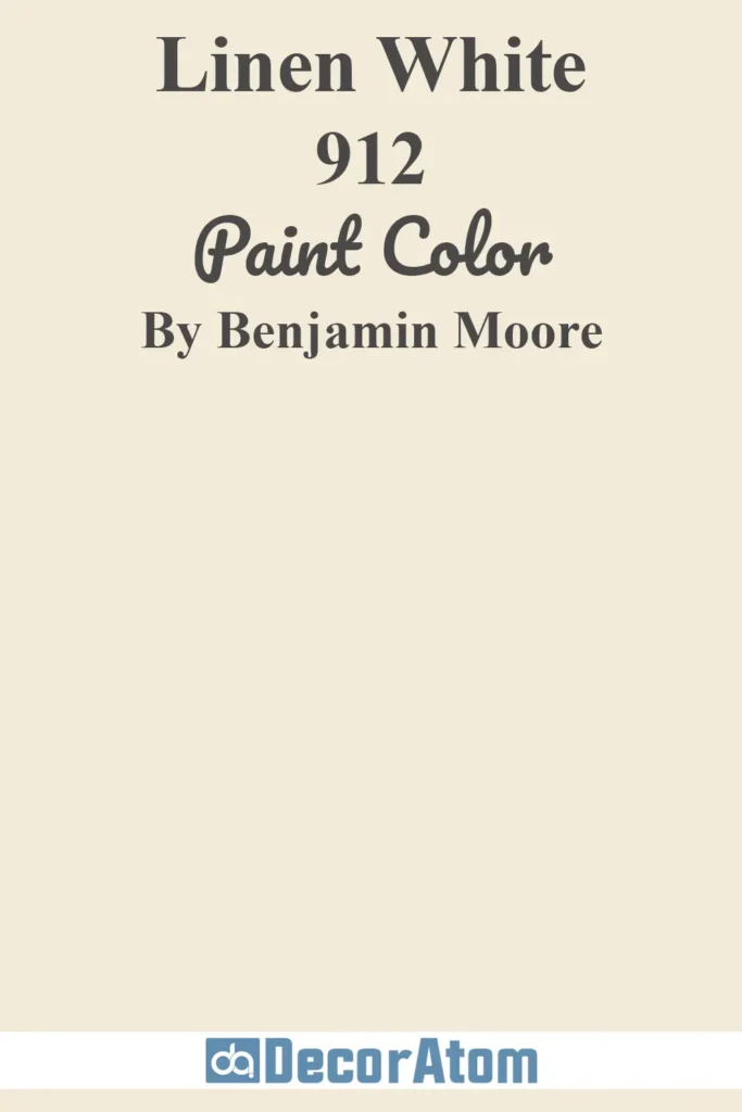
Okay, this one is a classic. It’s been around forever, and people still love it because it just… works. Linen White has that lived-in, vintage-y feel. It’s cream that feels like it’s been there forever, in the best way. If you have an older home, this might be your go-to.
Get a sample of Linen White
14. Natural Cream
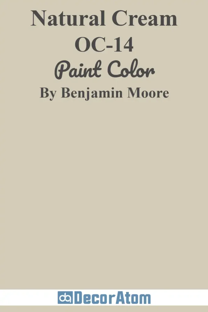
This one is interesting because it straddles the line between cream and greige. It’s cream, but with a soft gray undertone that keeps it from looking too yellow. Super versatile. I’d totally use this in a modern living room with clean lines, it balances cozy and contemporary so well.
Get a sample of Natural Cream
15. Seashell
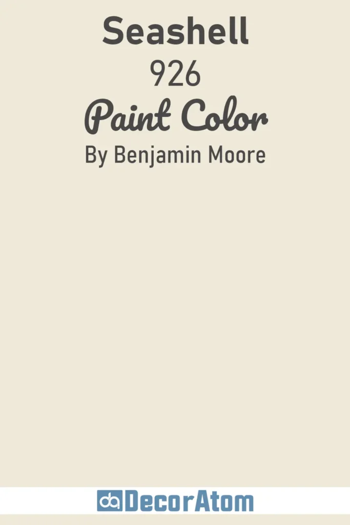
Seashell is a very light, airy cream that reminds me of, well, seashells on the beach. It’s got that subtle warmth without being obvious. Perfect for a bathroom or bedroom if you want a spa-like vibe. Add some soft blues or sandy tones with it, and boom, you’re basically at the ocean.
Get a sample of Seashell
Sherwin Williams Cream Paint Colors
16. Alabaster
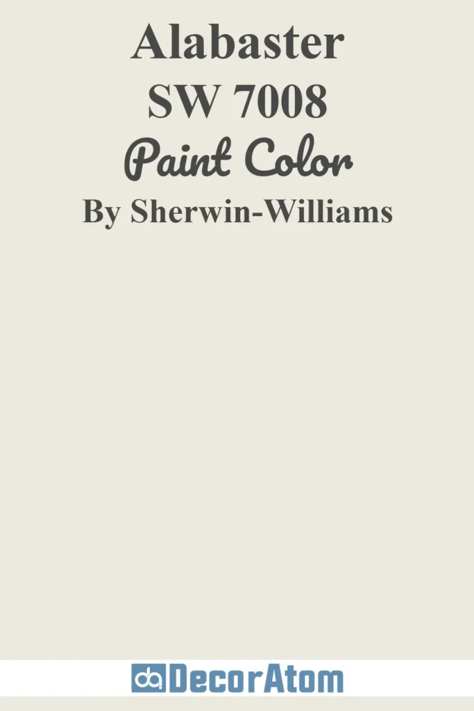
Sherwin Williams Alabaster is basically the Beyoncé of creamy whites. Everyone knows it, everyone loves it, and for good reason. It’s soft, warm, not too yellow, not too gray, it’s like the Goldilocks of paint colors. I’ve seen whole houses painted in Alabaster and they look straight out of an interior magazine. The only downside? Your neighbor probably has it too. But hey, that’s just proof it works.
Get a sample of Alabaster
17. Creamy
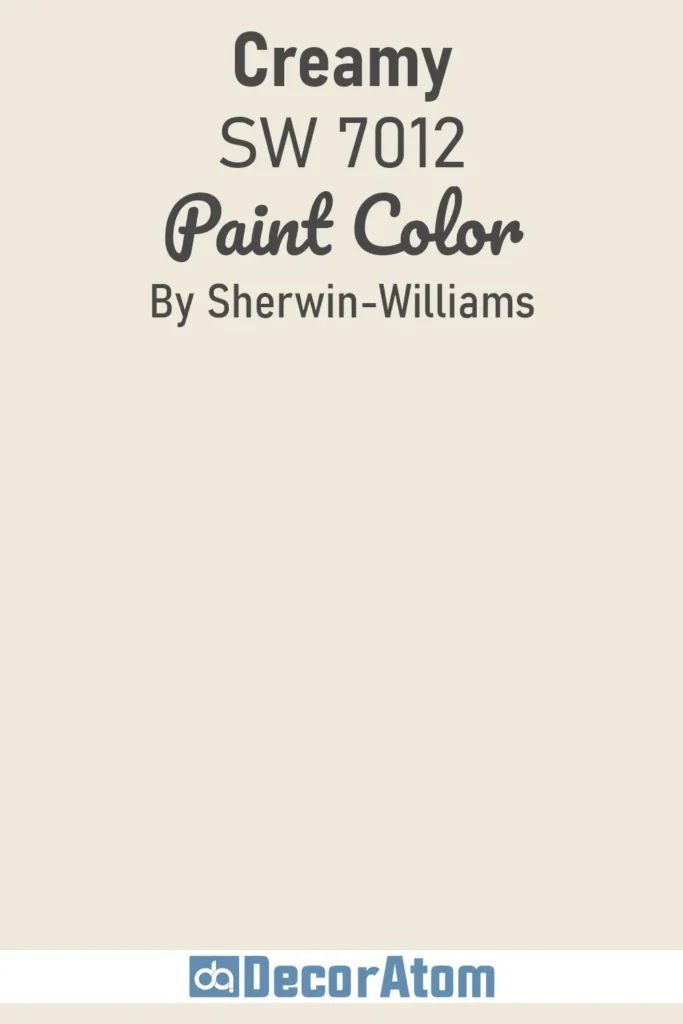
And here we have… Creamy. Could the name be any more on the nose? It’s smooth, velvety, and, yep—creamy. I like this one because it doesn’t go too yellow, but still has enough warmth to keep your space from feeling like a hospital corridor. Imagine this in a kitchen with warm wood cabinets and brass hardware, instant cozy Pinterest board.
Get a sample of Creamy
18. Antique White
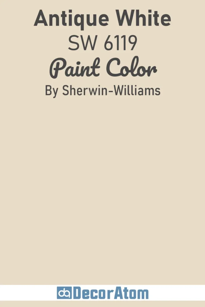
This one has old-world charm written all over it. Antique White leans a little deeper and has that vintage, slightly candlelit vibe. If you’ve got a historic home or you want to fake that “been here forever” character, this is a good pick. It’s cream, but cream with a story, like the walls have seen some things.
19. White Flour

Sherwin Williams really went with the baking aisle inspiration here. White Flour is soft, warm, and, let’s be honest, the kind of color that looks like a fresh loaf of bread. It’s lighter than Creamy but still has that gentle, buttery undertone. Perfect for kitchens, bedrooms, or anywhere you want a fresh-baked vibe (minus the carbs).
Get a sample of White Flour
20. Steamed Milk
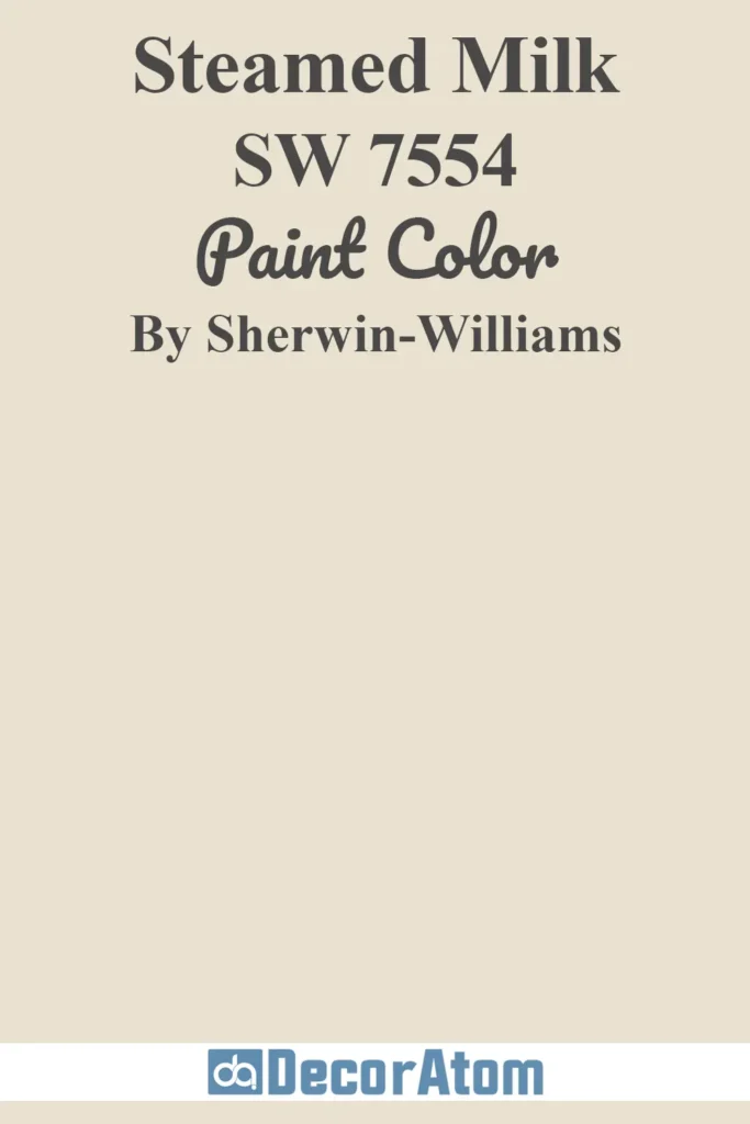
I don’t know who at Sherwin Williams names these paints, but they clearly snack a lot. Steamed Milk is a cozy, frothy cream that feels calm and balanced. It doesn’t lean too yellow, doesn’t go gray, it’s just creamy in the middle. I picture it in a reading nook with a blanket, cup of tea, and maybe… yeah, some steamed milk.
Get a sample of Steamed Milk
21. Dover White
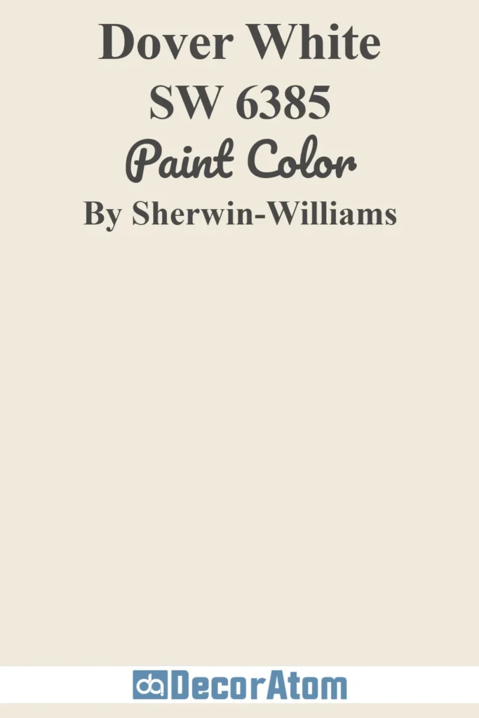
Dover White has been around forever. It’s a tried-and-true, slightly warmer cream that people use on everything from trim to exteriors. The thing is, it can skew yellow depending on your light, so swatch before you commit. But when it works? It’s warm and welcoming, like a front porch light that never burns out.
Get a sample of Dover White
22. Casa Blanca
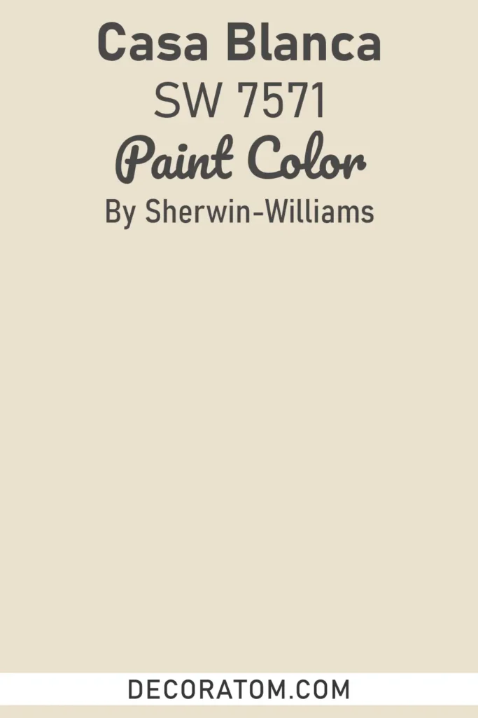
Casa Blanca is cream with a little sophistication. It’s warm, yes, but also subtle, like the difference between a plain cotton tee and a linen button-up. This color looks fantastic paired with earthy tones or terracotta accents. Picture a Spanish-style home with arches and tile floors, yep, that’s Casa Blanca living its best life.
Get a sample of Casa Blanca
23. Roman Column
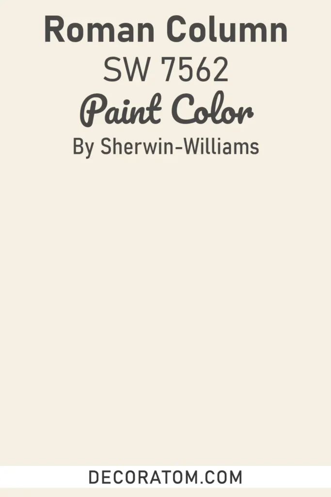
This one is smooth, elegant, and has just enough warmth to keep it from being stark. Roman Column is cream that doesn’t feel fussy, it feels like it could live in a modern home just as easily as a traditional one. Great for open floor plans where you need a consistent, balanced backdrop.
Get a sample of Roman Column
Behr Cream Paint Colors
24. Heavy Cream
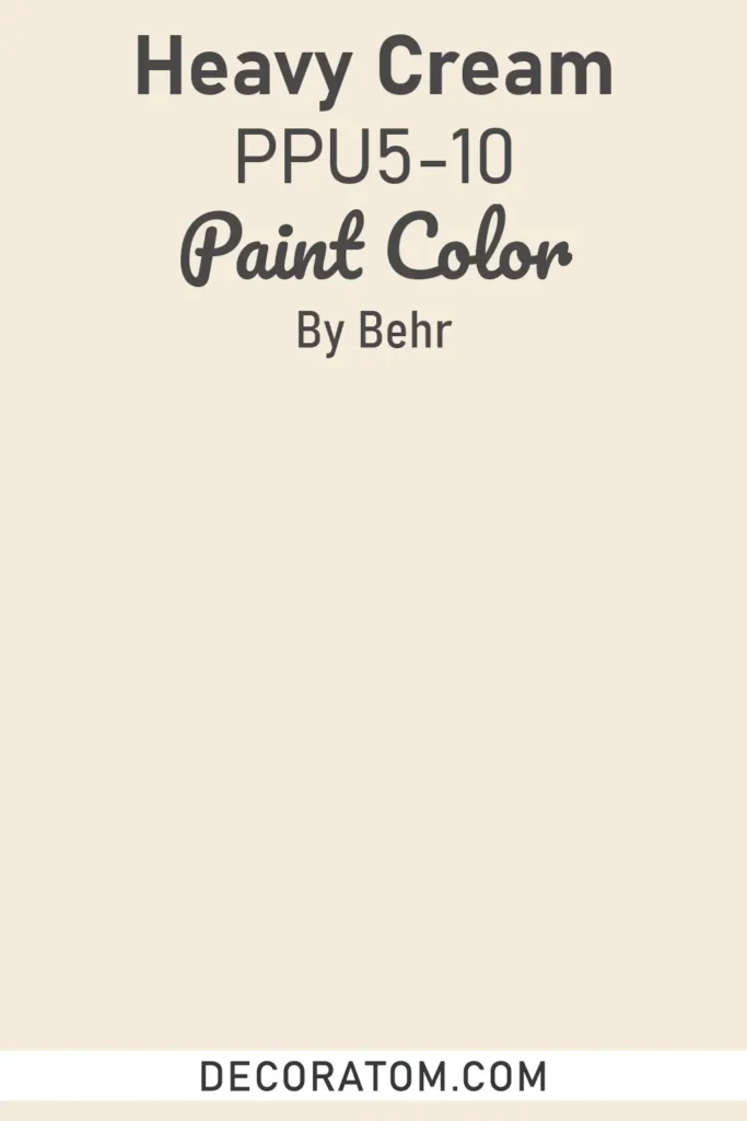
Behr Heavy Cream is rich and full-bodied (yep, I’m describing paint like wine now). It’s deeper than your typical cream, which makes it perfect if you don’t want your walls to disappear completely. Use it in a dining room or cozy den where you want that warm, cocoon-like feel. It’s cream with presence.
25. Polar Bear
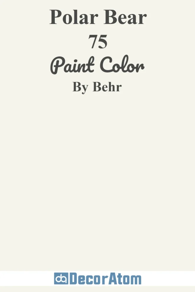
Okay, Polar Bear sounds like it should be icy, but it’s actually a warm off-white that edges into creamy territory. It’s brighter than Heavy Cream, so it’s a good choice if you want warmth but still want your walls to feel fresh and light. Bonus: it’s one of Behr’s most popular shades, so you know it’s not just me hyping it.
26. Eggshell Cream
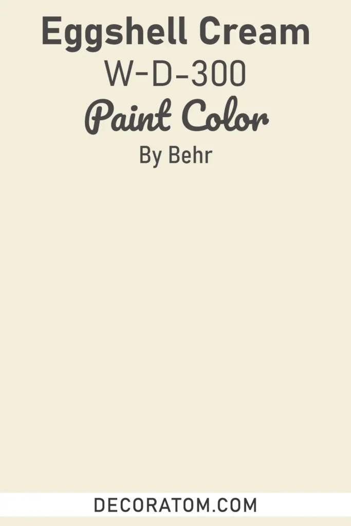
Eggshell Cream is exactly what you think it is, soft, warm, and kind of delicate. It’s the paint equivalent of cracking open a farm-fresh egg (sorry if that’s too visual, but it’s true). Lovely in bedrooms or bathrooms where you want gentle warmth without overpowering the space.
Farrow & Ball Cream Paint Colors
27. School House White
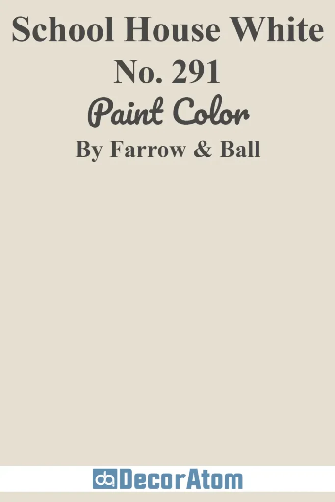
Now we’re in fancy territory. School House White is creamy but muted, like cream with a tiny drop of gray. It feels vintage, like the walls of an old schoolhouse (go figure) but with that Farrow & Ball sophistication. It’s not bright, it’s not flashy, but it has this lived-in timelessness that makes your house feel grounded.
28. Dimity
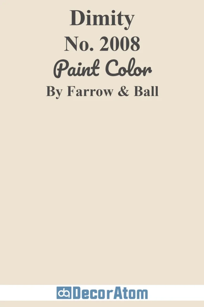
Dimity has this little blush undertone that makes it feel soft and romantic. It’s cream, but cream with a whisper of pink, so subtle you might not notice until the sunlight hits it just right. I think it’s beautiful in bedrooms, especially if you want a warm neutral that feels cozy but also a little fancy.
29. Tallow
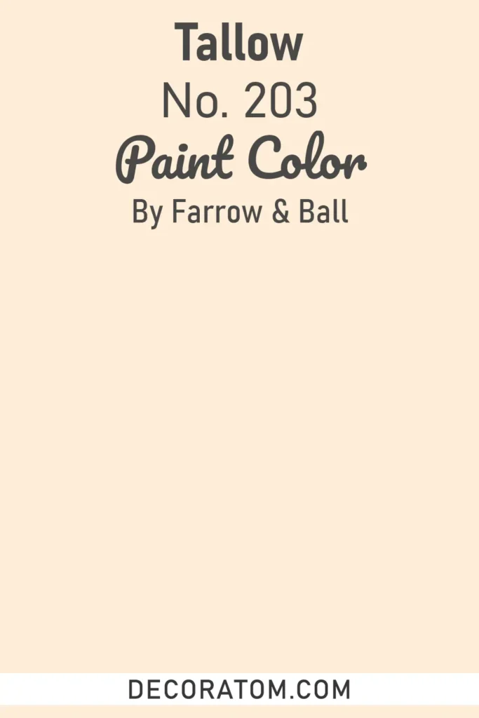
Tallow is basically candlelight in a can. It’s warm, glowy, and just radiates coziness. Honestly, if you’ve ever wanted your walls to feel like they’re giving you a hug, this is it. Perfect for living rooms or spaces where you want to lean into that soft, inviting vibe. Yes, it’s pricey because it’s Farrow & Ball, but honestly? Worth it.
Final Thoughts
So here’s the thing about cream paint: it’s never just cream. It’s like the chameleon of the paint world. Sometimes it leans a little warm and cozy, sometimes it feels fresh and airy, and sometimes it surprises you with a whisper of pink or gold that only shows up when the sun hits just right.
And honestly, that’s why I love it. Cream gives you all the softness of white without the “did I just move into a hospital wing?” vibes. It’s forgiving. It works with wood tones, modern furniture, vintage finds, whatever you’ve got going on in your house. Plus, let’s be real, when your walls are painted a shade called Sugar Cookie or Steamed Milk, how can you not smile every time you say it out loud?
If I can give you one piece of advice, it’s this: don’t skip the samples. Cream can change like a moody teenager depending on your lighting, and what looks dreamy on Pinterest might look like a banana peel in your living room. Swatch it big, stare at it morning to night, and then commit.
At the end of the day, the “best” cream paint color isn’t just about trends or what designers are raving about, it’s about what feels right in your home. Whether that’s Alabaster, White Dove, or even something fancy like Tallow, the goal is the same: to make your space feel warm, welcoming, and a little bit like a hug.
And isn’t that what we all want when we walk through the door?

