There are certain paint colors that just feel like home the moment you see them—and for me, Sherwin-Williams Creamy SW 7012 is one of those shades.
It’s soft, subtle, and gives off this warm, welcoming vibe that works almost anywhere in the house.
I’ve used it in multiple spaces over the years, and every time, it brings a gentle glow that’s both calming and uplifting.
In this post, I’m diving into everything you need to know about this popular color—what it really looks like, how it behaves in different lighting, what colors pair beautifully with it, and more.
If you’re considering Creamy for your next project, stick with me. I’m breaking it all down in plain, easy-to-follow language so you can decide if this creamy classic is the right fit for your space.
Also Read: 31 Most Popular Sherwin Williams Paint Colors
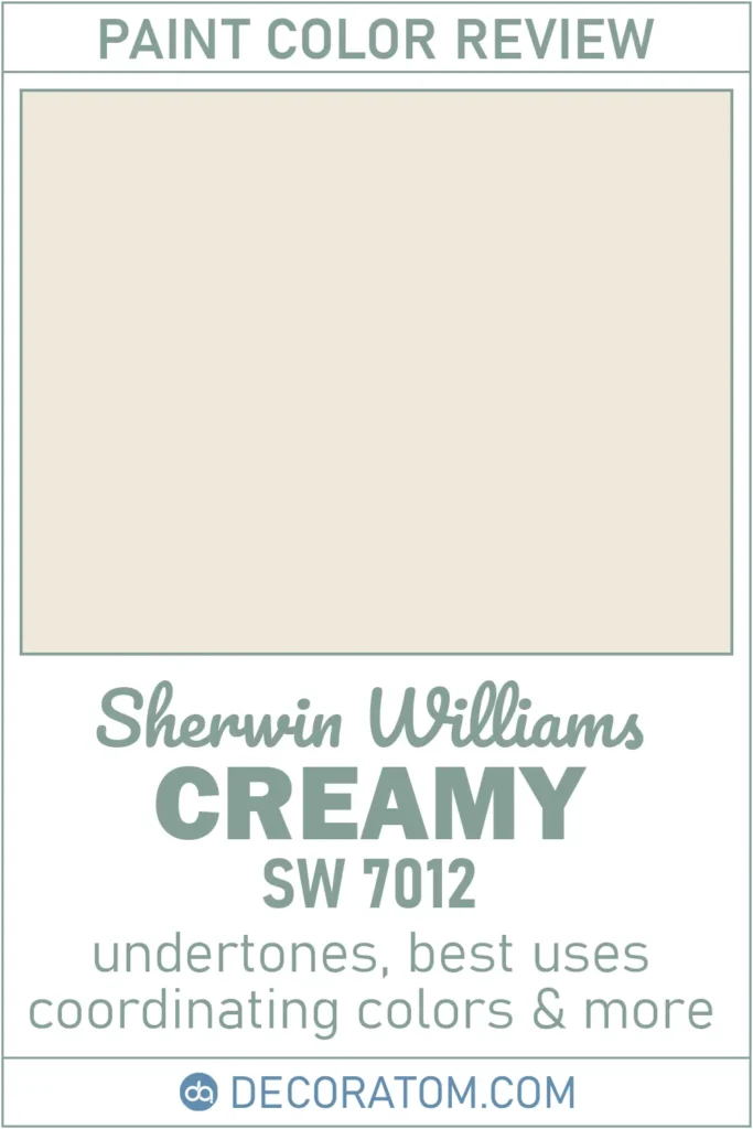
What Color is Sherwin Williams Creamy SW 7012?
Creamy SW 7012 is exactly what its name suggests—a soft, buttery off-white with a gentle touch of warmth. It doesn’t have that stark, bright white look that can sometimes feel too harsh.
Instead, Creamy feels smooth and subtle, like a warm spoonful of vanilla custard.
It sits comfortably in the off-white family, which means it’s light enough to keep your space feeling open and airy, but it also has just enough body to add character.
I’d describe it as the kind of color that can easily blend into the background or be the star of the show, depending on how you use it.
It’s clean but not sterile, simple but not flat—and that’s what makes it such a versatile and beloved paint color.

Is It a Warm or Cool Color?
Sherwin Williams Creamy SW 7012 is definitely a warm color. You can sense that right away when you see it on the wall.
It has soft yellow undertones that give it a gentle, cozy feel. Unlike cooler whites that might lean gray or blue, Creamy feels inviting and comforting.
I’ve always found it to be the kind of shade that makes a room feel sunny and relaxed—even on a cloudy day.
If you’re trying to create a space that feels soft, natural, and welcoming, Creamy is a fantastic choice. It brings warmth without going too yellow or too beige.
LRV of Sherwin Williams Creamy SW 7012
💥🎁 Christmas & Year-End Deals On Amazon !
Don't miss out on the best discounts and top-rated products available right now!
*As an Amazon Associate, I earn from qualifying purchases.
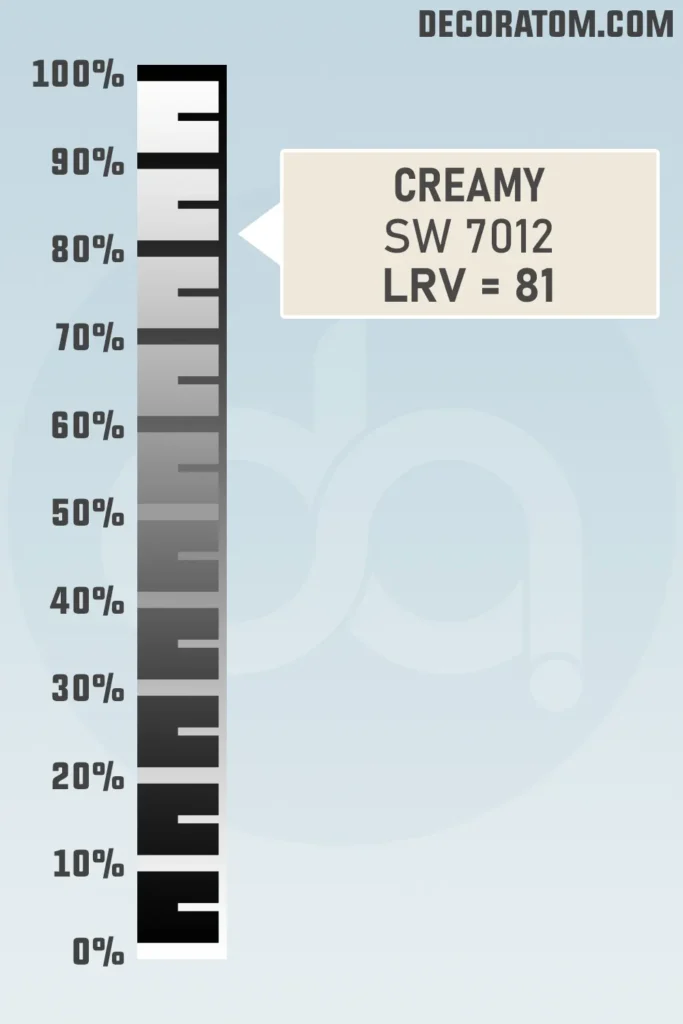
Let’s talk about LRV for a second. LRV stands for Light Reflectance Value, and it’s basically a number that tells you how much light a paint color will reflect.
The scale runs from 0 (which is pure black and absorbs all the light) to 100 (which is pure white and reflects the most light).
Creamy SW 7012 has an LRV of 81, which means it reflects a good amount of light. It’s not the brightest white out there, but it’s definitely in the light range.
That makes it a great option if you want your space to feel open and bright, without going with a stark white. I’ve used it in both small and large rooms, and it always helps the light bounce around in a soft, flattering way.

Color Family
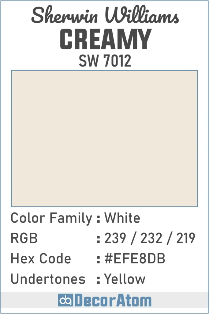
Sherwin Williams Creamy belongs to the White color family, though it’s definitely on the warmer, softer end of that category.
It’s not your crisp, gallery-style white—it’s more of an off-white with a creamy twist.
RGB Colors
Let’s talk a bit about the RGB values of Sherwin-Williams Creamy SW 7012. These numbers—239 / 232 / 219—basically tell us how much red, green, and blue make up this color. And looking at these values, it’s easy to see why Creamy feels so soft and warm.
The red (239) and green (232) are slightly higher than the blue (219), which helps create that warm, yellowish glow Creamy is known for.
Hex Value
If you’re doing any digital work or creating mood boards online, you’ll probably come across something called a hex code. For Sherwin-Williams Creamy SW 7012, the hex value is #EFE8DB.

💥🎁 Christmas & Year-End Deals On Amazon !
Don't miss out on the best discounts and top-rated products available right now!
*As an Amazon Associate, I earn from qualifying purchases.
Undertones of Sherwin Williams Creamy SW 7012
Undertones can totally change how a color feels in your space—and Creamy SW 7012 has soft yellow undertones.
That’s what gives it its warmth and subtle glow. It’s not an in-your-face yellow, though. It’s more like a gentle warmth that comes through in certain lighting.
These yellow undertones are what make Creamy feel cozy rather than stark. It doesn’t lean gray or cool, and it won’t come off icy or sterile. Instead, it has a subtle sun-kissed touch that helps your room feel comfortable and lived-in.
I’ve noticed that in rooms with lots of natural light, those undertones are more noticeable, giving the space a buttery softness.
In darker rooms, the yellow shows up more subtly, but it still keeps the paint from feeling cold. That little bit of yellow makes all the difference—it’s what separates Creamy from flat or boring whites.
How Different Types of Lighting Affect Sherwin Williams Creamy SW 7012?
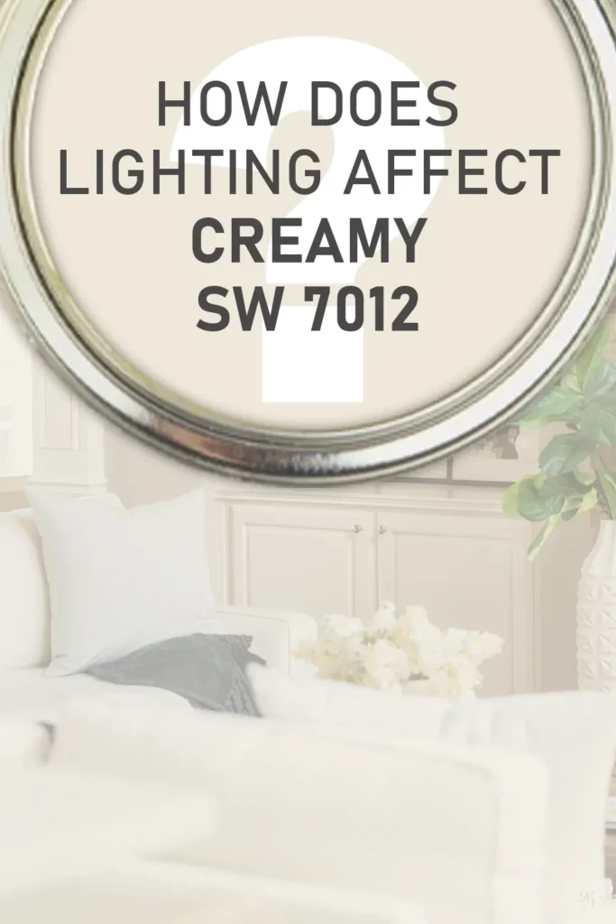
Lighting makes a huge difference with Creamy SW 7012, and honestly, this is one of those colors that shifts just enough to be interesting—but not so much that it becomes unpredictable.
In natural light, especially from south-facing windows, Creamy tends to look its warmest. That yellow undertone comes through gently and gives the whole room a welcoming, sunlit feel.
It’s like the walls are giving off a soft, golden hug. In north-facing rooms, where the light is cooler, Creamy holds up surprisingly well. It doesn’t turn gray or flat. Instead, it just softens a bit, and the yellow tones are more muted. It still feels warm, but a little more understated.
When you switch to artificial lighting, things depend on the bulb. Warm white bulbs (2700K–3000K) really enhance the creamy, cozy feeling.
The yellow undertone is more noticeable under these lights, which works beautifully in bedrooms, living rooms, or any space where you want a calm, intimate vibe.
Cooler LED lights, on the other hand, can neutralize the warmth a little. Creamy still looks nice, but the cozy factor takes a slight step back.
One thing I’ve learned from using this shade over the years is this: sample it in the room, at different times of day. It’s a flexible color, but it’s always good to know how it plays with your specific lighting before committing to a full gallon.
Trim Colors to Pair With Sherwin Williams Creamy SW 7012?
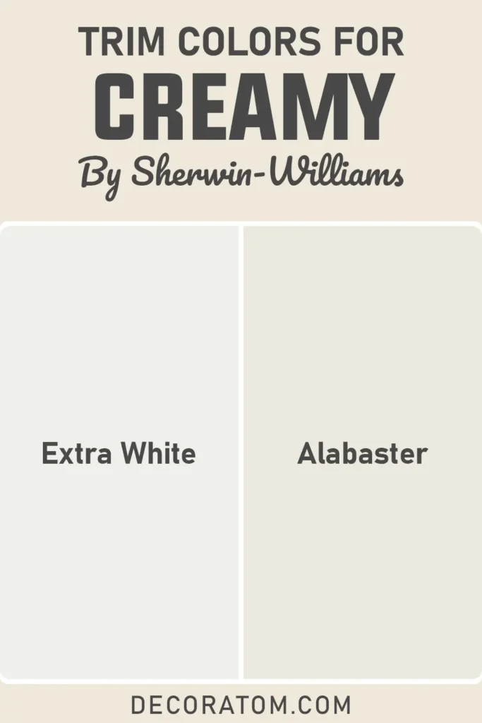
When it comes to pairing trim colors with Creamy SW 7012, the right contrast can really make the walls pop—or keep everything soft and seamless, depending on the look you’re going for.
If you want a clean, crisp contrast, go for a bright white trim like Sherwin-Williams Extra White (SW 7006). This choice gives you that fresh edge and defines the walls nicely without clashing. It’s a great look if you like that classic, tailored style—especially in more formal spaces.
On the flip side, if you’re going for a more tone-on-tone or softer look, Sherwin-Williams Alabaster (SW 7008) is a fantastic match. Alabaster is just a touch warmer, so it blends more gently with Creamy. The two create a very peaceful, soothing vibe that works beautifully in bedrooms or casual living spaces.
Personally, I’ve used both approaches depending on the feel I wanted for the room. Crisp white for a brighter, more traditional look, and soft white for that cozy, lived-in aesthetic. The nice thing about Creamy is that it’s not picky—it plays well with both.
Colors Similar to Sherwin Williams Creamy SW 7012

💥🎁 Christmas & Year-End Deals On Amazon !
Don't miss out on the best discounts and top-rated products available right now!
*As an Amazon Associate, I earn from qualifying purchases.
If you’ve fallen in love with Creamy SW 7012, but want to explore some close alternatives before making a final decision, I totally get it—I’ve been there too.
There are a number of colors out there that share Creamy’s soft warmth and versatility, but each one has its own little twist that can make a big difference depending on your lighting, decor, and personal taste.
When I compare similar shades, I usually look at the undertones, LRV (light reflectance value), and overall warmth or coolness. Creamy has that soft yellow undertone and a high LRV of 81, which makes it bright without being harsh.
So when I search for similar options, I look for colors in the off-white or light neutral family that also lean warm, without slipping too far into beige or looking too stark.
Some colors are just a little lighter or darker. Others might have creamier yellow tones, while a few lean more neutral or beige but still live in the same ballpark as Creamy.
I always recommend comparing a few samples on the wall side by side—you’d be surprised how two colors that look identical on a screen or chip can behave completely differently once they’re up on your wall.
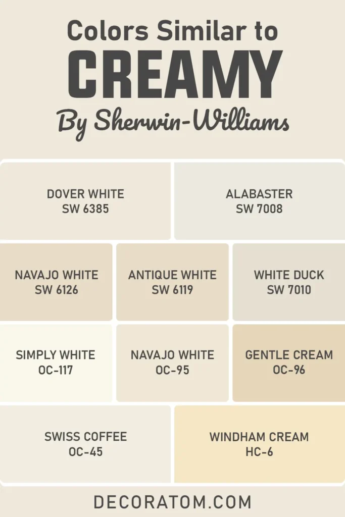
Here’s a list of 10 paint colors similar to Sherwin Williams Creamy SW 7012 from both Sherwin-Williams and Benjamin Moore:
- Sherwin Williams Dover White SW 6385
- Sherwin Williams Alabaster SW 7008
- Sherwin Williams Navajo White SW 6126
- Sherwin Williams Antique White SW 6119
- Sherwin Williams White Duck SW 7010
- Benjamin Moore Simply White OC-117
- Benjamin Moore Navajo White OC-95
- Benjamin Moore Gentle Cream OC-96
- Benjamin Moore Swiss Coffee OC-45
- Benjamin Moore Windham Cream HC-6
Colors that Go With Sherwin Williams Creamy SW 7012

Finding the right coordinating colors for Creamy SW 7012 is honestly one of my favorite parts of the process. This shade is incredibly flexible, which makes it a dream to pair with other colors.
Whether you’re building a whole-room palette or just adding accents through furniture, decor, or trim—Creamy plays well with a lot of shades.
Because of its yellow undertones and warm personality, it pairs best with earthy tones, soft muted colors, and deeper neutrals. You can use it with soft greens, taupes, muted blues, terracotta, and even some darker browns.
What I love about Creamy is that it can anchor a space and provide balance when paired with stronger, richer hues—or it can blend effortlessly into a calm, all-neutral look with similar soft tones.
If you’re someone who likes a little drama, you can pair it with bold accent walls or darker colors like Studio Taupe SW 7549 or Reynard SW 6348 to bring some depth and sophistication to your space.
But if you’re leaning toward something lighter and airier, colors like dusty greens or muted blues can keep things feeling tranquil and breezy.
💥🎁 Christmas & Year-End Deals On Amazon !
Don't miss out on the best discounts and top-rated products available right now!
*As an Amazon Associate, I earn from qualifying purchases.
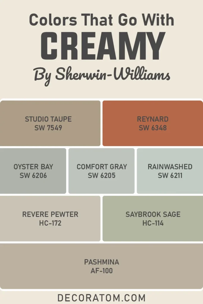
Here are 8 coordinating colors that pair beautifully with Sherwin Williams Creamy SW 7012:
- Sherwin Williams Studio Taupe SW 7549
- Sherwin Williams Reynard SW 6348
- Sherwin Williams Oyster Bay SW 6206
- Sherwin Williams Comfort Gray SW 6205
- Sherwin Williams Rainwashed SW 6211
- Benjamin Moore Revere Pewter HC-172
- Benjamin Moore Saybrook Sage HC-114
- Benjamin Moore Pashmina AF-100
Comparing Sherwin Williams Creamy SW 7012 With Other Colors

Choosing between two similar paint colors can honestly feel overwhelming at times—I’ve gone down the rabbit hole myself, comparing undertones, finishes, and how they change with the light.
And while Creamy is a beautiful color on its own, it helps to see how it stacks up against other popular choices.
So let’s dive into some of the most common comparisons people make when looking at Creamy SW 7012.
These are all colors that fall into the soft white, off-white, or neutral categories—but they each bring their own vibe. I’m going to break them down one by one so you can see the subtle differences and figure out which one might be right for you.
Sherwin Williams Creamy vs Alabaster
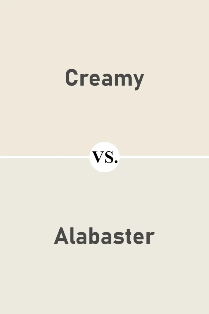
This is probably one of the most common comparisons—and for good reason. Both Creamy and Alabaster SW 7008 are warm whites, but they behave slightly differently.
Alabaster leans more neutral and has a slightly more balanced undertone. It doesn’t show as much yellow as Creamy does.
If you want something warm but still soft and a little more subtle, Alabaster might feel a bit more calming. Creamy, on the other hand, has more noticeable warmth, which makes it feel cozier, especially in low-light rooms.
Sherwin Williams Creamy vs Dover White
💥🎁 Christmas & Year-End Deals On Amazon !
Don't miss out on the best discounts and top-rated products available right now!
*As an Amazon Associate, I earn from qualifying purchases.
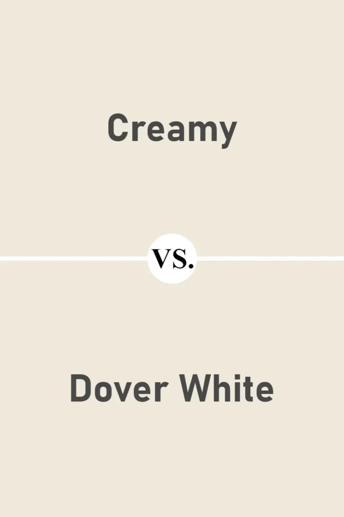
Now here’s a pair that can look super close on a swatch but feel different on the wall. Dover White SW 6385 is warmer and more yellow than Creamy.
It has stronger golden undertones, which can make it feel too warm in some lighting. Creamy is more restrained and elegant in comparison—it’s warm, yes, but more balanced.
I’ve found that Dover White can sometimes look too yellow, especially under warm bulbs or in direct sunlight, while Creamy keeps a softer profile.
Sherwin Williams Creamy vs White Duck
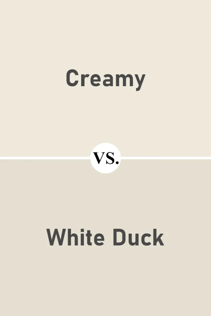
White Duck SW 7010 is a more muted, greige-leaning off-white. Compared to Creamy, it feels cooler and more neutral.
If you’re trying to avoid any strong yellow undertones but still want a warm, soft white, White Duck is a great alternative.
It doesn’t have the same creamy glow as Creamy (no pun intended), but it offers a more relaxed, earthy look. It works beautifully in modern and farmhouse-style homes.
Sherwin Williams Creamy vs Antique White
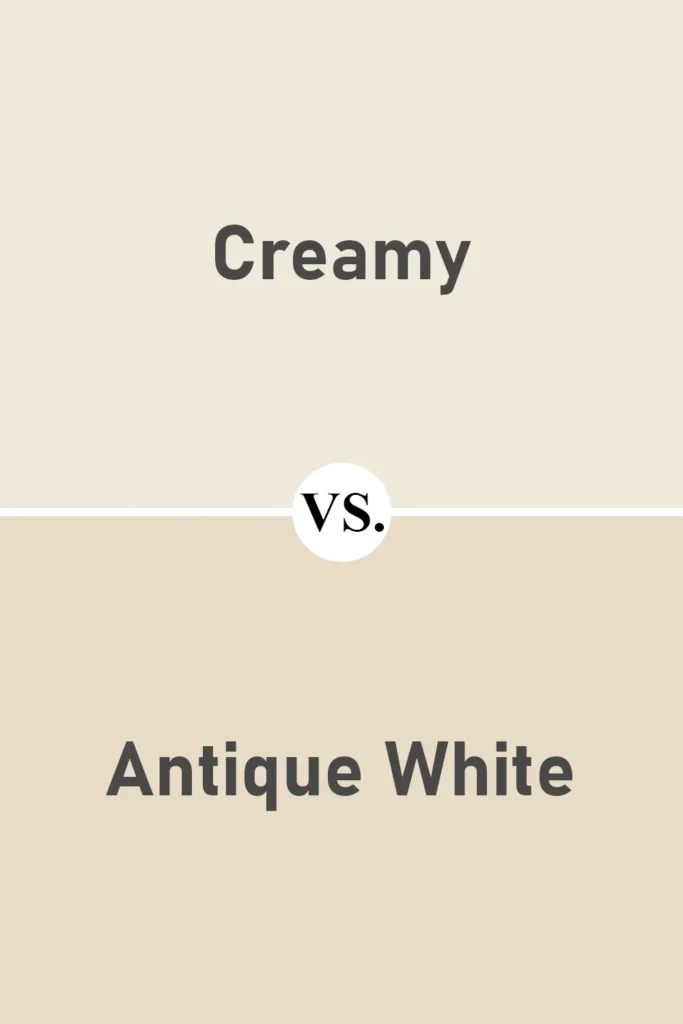
Antique White SW 6119 is deeper and darker than Creamy. It leans into the beige family and has a more pronounced brown undertone.
When I’ve used Antique White, I found it to feel richer and more traditional, while Creamy reads lighter and a little fresher.
If you’re trying to brighten a space, Creamy is the better choice. But if you’re going for a more vintage or old-world feel, Antique White adds that depth and warmth.
Sherwin Williams Creamy vs Benjamin Moore Swiss Coffee
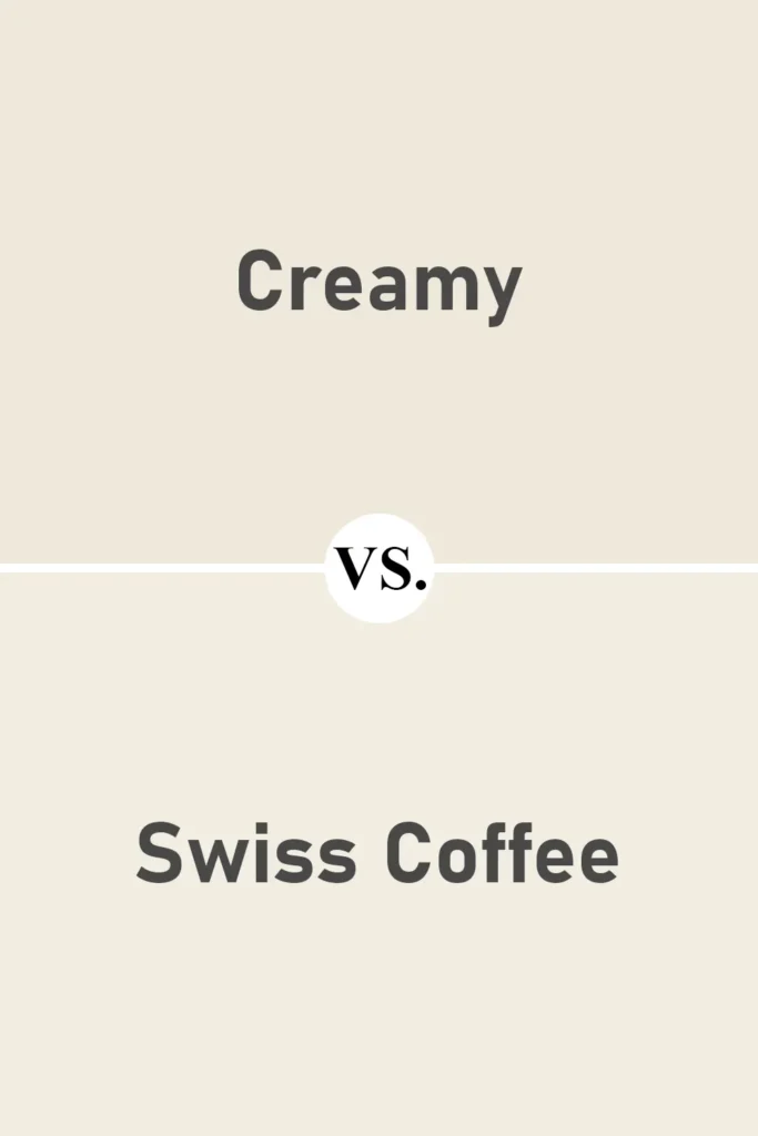
Swiss Coffee OC-45 from Benjamin Moore is often compared with Creamy because it’s another warm off-white that’s loved for its softness.
But Swiss Coffee tends to lean more neutral—it has less yellow and a slightly more balanced tone overall. Creamy feels warmer and more golden, while Swiss Coffee feels softer and a little milkier.
I personally think Swiss Coffee works better in modern spaces, while Creamy shines in traditional, cottage, or farmhouse-style rooms.
Sherwin Williams Creamy vs Benjamin Moore Simply White
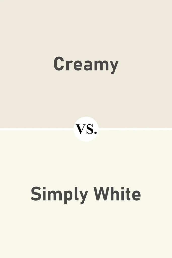
Simply White OC-117 is much crisper and brighter than Creamy. It’s a clean white with very minimal undertone and a much higher LRV.
If you put them side by side, you’ll instantly see the difference—Simply White feels fresh and airy, while Creamy has that mellow, warm feel. They serve completely different purposes in a space.
Simply White is great when you want that pure, gallery-wall brightness. Creamy is better when you want to soften things up and add a gentle warmth to the room.
Where to Use Sherwin Williams Creamy SW 7012?
One of the reasons I keep coming back to Sherwin Williams Creamy SW 7012 is because it’s so incredibly versatile. There are paint colors that only look good in certain types of spaces—but Creamy isn’t one of them.
It’s that rare off-white that works just as beautifully in a cozy bedroom as it does on a sunlit exterior. Its softness brings warmth without overpowering a space, and it complements both traditional and modern styles.
So whether you’re refreshing a single room or doing a full-home makeover, Creamy can be a reliable, elegant backdrop. Let me walk you through how I’ve seen (and used) this color in different parts of the home.
Sherwin Williams Creamy in the Bedroom

In the bedroom, Creamy creates a calming and cozy vibe that’s perfect for winding down. It’s warm enough to feel inviting but still light enough to keep the room feeling fresh and open.
I’ve painted bedrooms in Creamy paired with soft beige or sage green bedding, and the result was a tranquil retreat that didn’t feel sterile or flat.
If you’re someone who likes your bedroom to feel soft and restful without going too dark, Creamy is a wonderful base.
It plays especially well with natural textures like linen, wood, and woven accents—creating that relaxed, effortless feel we all want in a bedroom.
Sherwin Williams Creamy in the Living Room

Living rooms are often the heart of the home, and Creamy really shines in that space. What I love most is how it reflects natural light during the day and glows softly under warm bulbs at night.
It’s the kind of color that can hold its own if your furniture and décor are bold and colorful—but it also provides a warm, neutral backdrop if you’re going for a more toned-down look.
I’ve used Creamy in living rooms with white trim and medium-toned hardwood floors, and it created such a warm and balanced space.
It also pairs beautifully with brass or matte black hardware, so if your living room includes a mix of textures and finishes, Creamy helps everything feel cohesive.
Sherwin Williams Creamy in the Kitchen

Kitchens can be tricky because you need a paint color that’s clean but still has personality. Creamy hits that balance just right.
It’s not too stark, which means it won’t make your kitchen feel cold or clinical. Instead, it softens the space in a way that still feels bright and fresh.
I’ve seen it used on both kitchen walls and cabinets, and in both cases, it looks timeless and elegant.
If you’ve got white or marble countertops, Creamy blends in beautifully without looking too yellow.
And if your kitchen has wood accents—like butcher block countertops or open shelves—Creamy brings out the richness in those materials.
It’s a great choice for kitchens that get a mix of natural and artificial light because it adjusts so gracefully.
Sherwin Williams Creamy in the Bathroom

Bathrooms are often small and enclosed, so paint colors can really affect how they feel. Creamy brings a soft glow to bathrooms without making the space feel overly warm or dingy.
It reflects light in a way that opens up the room, which is especially helpful in bathrooms without much natural light.
In one of our guest bathrooms, I used Creamy on the walls with white subway tile and brushed gold fixtures.
The space felt elegant but also approachable—not too modern, not too old-fashioned. It gives you that clean feeling you want in a bathroom but with a little more warmth and depth than a stark white.
Sherwin Williams Creamy for the Exterior

If you’re thinking of using Creamy on your home’s exterior—yes, it works out there too! I’ve seen this color used on full exteriors, trim, shutters, and even porch ceilings.
It looks soft and classic in daylight, and it doesn’t come off too yellow in the sun (which can sometimes happen with warmer whites).
On a traditional-style home with stone or brick accents, Creamy complements the natural materials without clashing.
And on modern farmhouse-style homes, it provides that clean white look without being blindingly bright. Paired with darker trim or a contrasting front door, it adds warmth and character while still keeping things timeless.
Why I Love Sherwin Williams Creamy SW 7012
Honestly, Creamy SW 7012 just feels like home to me. There’s something about the way it quietly transforms a space without demanding attention.
It has a softness that puts people at ease, whether it’s a bedroom, kitchen, or even the outside of a house. I’ve used this color on multiple projects, and it’s never let me down.
It’s not flashy. It doesn’t chase trends. It’s dependable, subtle, and beautiful in its simplicity. And I think that’s what makes it so special.
You don’t always notice Creamy right away—but after spending time in a room painted in this color, you realize just how much it adds to the atmosphere. It makes spaces feel calm, lived-in, and loved.
Final Thoughts
If you’re looking for a warm, soft white that’s easy to live with and works in almost any room, Sherwin Williams Creamy SW 7012 is a standout choice.
It offers just the right amount of warmth without being overwhelming, and its versatility makes it a go-to in my paint toolbox.
From cozy bedrooms to sunny kitchens and everything in between, Creamy brings comfort, light, and timeless appeal.
I always recommend testing it in your own space before committing—because lighting and surroundings can change how it reads.
But more often than not, Creamy ends up being the favorite. It’s one of those colors you can rely on year after year, no matter how your style evolves.

