
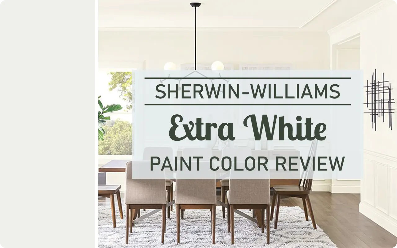
If you’ve been on the hunt for the perfect bright white paint, Sherwin-Williams Extra White SW 7006 might already be on your radar, and if it’s not, it should be.
I’ve used this color in several spaces, and it’s become one of my go-to whites for a reason.
It’s crisp, clean, and incredibly versatile, which makes it a strong contender for both walls and trim.
Whether you’re working on a modern refresh, a coastal-inspired look, or just want a true white that doesn’t feel too sterile, Extra White has a lot to offer.
In this post, I’ll walk you through everything you need to know about this color, from its undertones and lighting behavior to how it compares with other whites and what spaces it works best in.
What Color is Sherwin Williams Extra White SW 7006?
Sherwin-Williams Extra White SW 7006 is a very bright white paint color. It looks fresh, clean, and crisp without coming off as harsh.
This isn’t a creamy or soft white, it’s more of a sharp white that feels modern and polished.
If you’re picturing something like freshly cleaned white bedsheets or a brand-new blank canvas, that’s the kind of brightness Extra White brings into a space.
It’s the kind of white that stands out against other whites and makes trim, ceilings, or cabinets look extra sharp and neat.
How to Know if a Paint Color Is Right for You?
Would you like to sample Extra White SW 7006 paint color? I recommend using Samplize. They offer 9”x14.75”” peel-and-stick paint swatches that make testing colors super simple. Just stick it on your wall, move it around if needed, and when you’re done, peel it off and toss it. No mess, no cleanup. It’s quick, easy, and way more convenient!

💥🎁 Christmas & Year-End Deals On Amazon !
Don't miss out on the best discounts and top-rated products available right now!
*As an Amazon Associate, I earn from qualifying purchases.
Advantages of using peel and stick paint samples:
- EASY TO USE: Simply move your SAMPLIZE paint sample around the room to test under a variety of lighting conditions.
- AFFORDABLE: Budget-friendly solution and no more buying inaccurate swatches, rollers, wasted paint.
- SUPER FAST DELIVERY: Depending on your location, 1 day delivery is possible.
- ORDER FROM HOME: Save a trip to the store looking for samples.
- NO MESS: SAMPLIZE uses real paint samples with zero-mess
- NO WASTE: No leftover cans or wasted paint.
Is It a Warm Or Cool Color?
Sherwin-Williams Extra White leans cool. That doesn’t mean it looks icy or blue like some ultra-cool whites, but it does have subtle cool undertones.
This cooler feel helps it look crisp and clean—especially in rooms with natural daylight.
If you compare it side-by-side with a warmer white (like Alabaster or Pure White), you’ll notice Extra White has more of a bluish or neutral clarity rather than any yellow or creamy warmth.
It’s a great pick if you want your white to feel modern and sharp rather than soft or cozy.
LRV of Sherwin Williams Extra White SW 7006
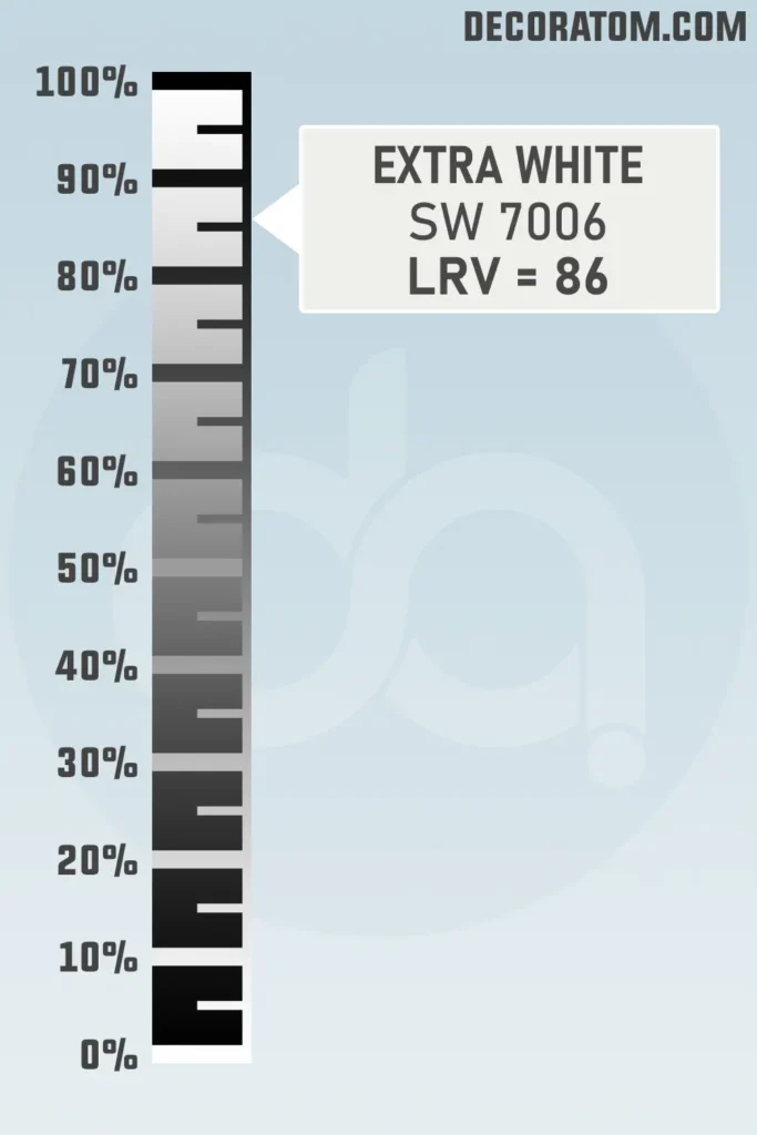
Let’s talk about LRV, which stands for Light Reflectance Value. This is basically a number that tells you how much light a color reflects. The higher the number, the lighter and more reflective the paint color is.
Sherwin-Williams Extra White has an LRV of 86. That’s quite high, which means it reflects a lot of light.
This makes it a great choice if you want to brighten up a darker room or make a space feel larger and airier.
It’s one of the brightest whites in Sherwin-Williams’ collection, which is why it’s often used on ceilings, trim, and even walls when you want that ultra-fresh look.
Color Family
Sherwin-Williams Extra White SW 7006 belongs to the white color family. Now, “white” might sound simple, but there are actually many shades within the white family—some lean warm, some cool, some muted, and some clear and bright.
Extra White is part of the brighter, cooler side of the white family. It doesn’t have the softness or creaminess that warmer whites might have.
Instead, it brings a crisp, neutral look that works really well with cool-toned colors like grays, blues, and even some greige tones.
It’s the kind of white that’s often used in modern homes, minimalist spaces, or anywhere you want a clean and clear finish.
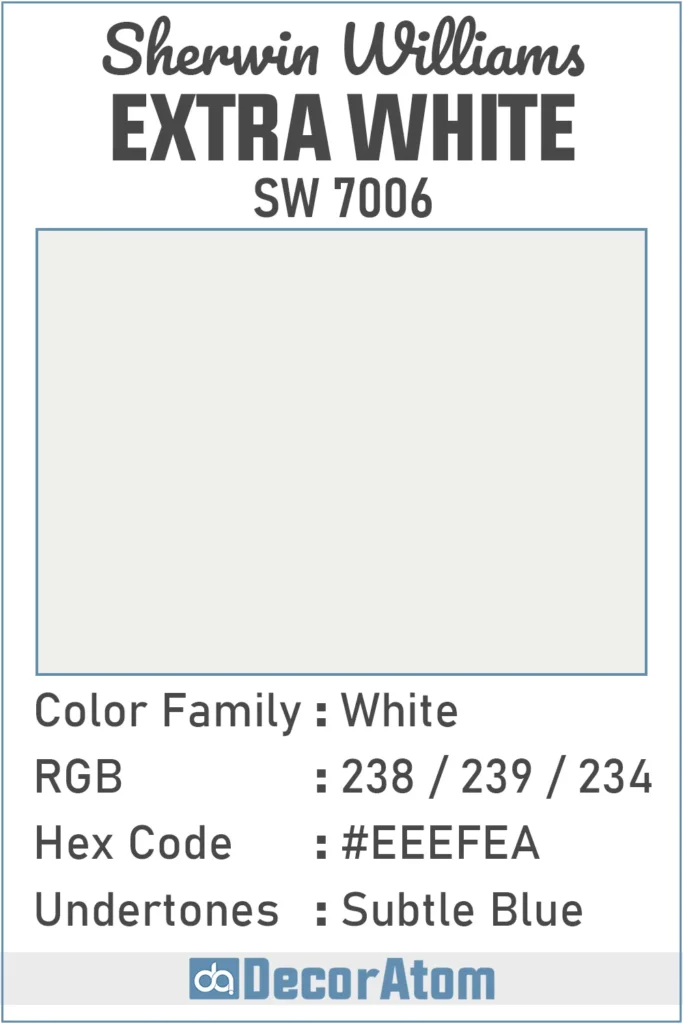
RGB Colors
The RGB value for Sherwin-Williams Extra White SW 7006 is 238 / 239 / 234. What does that mean in plain English? Well, RGB stands for Red, Green, and Blue—the three colors that mix together to create every shade you see on a screen.
For Extra White, the red (238), green (239), and blue (234) values are all very close to each other and sit on the higher end of the scale (which goes from 0 to 255).
💥🎁 Christmas & Year-End Deals On Amazon !
Don't miss out on the best discounts and top-rated products available right now!
*As an Amazon Associate, I earn from qualifying purchases.
Hex Value
The Hex value for Sherwin-Williams Extra White SW 7006 is #EEEFEA. If you’ve ever worked with colors for web design, digital graphics, or anything online, you’ve probably seen hex codes before. They’re simply six-digit codes used to represent colors on screens.
Undertones of Sherwin Williams Extra White SW 7006
Let’s talk undertones, because this is where white paint colors get tricky. Sherwin-Williams Extra White has subtle blue undertones. They’re not loud or in-your-face, but they’re there—and they do affect how this color looks in different spaces.
In natural light, that bluish tint can make the white look extra crisp and refreshing. But in a room with cool artificial lighting, like fluorescent bulbs or north-facing light, the blue undertones might become more noticeable.
Some people love that—it gives a sleek, modern feel. Others might find it a little too cool if they’re going for a warmer, cozier vibe.
So if you’re using Extra White on your walls or cabinets, it’s good to test it out first. Those subtle blue undertones are what help it stand apart from creamier or warmer whites, and they’re a big reason why this color pairs so well with cool-toned palettes.
How Different Types of Lighting Affect Sherwin Williams Extra White?
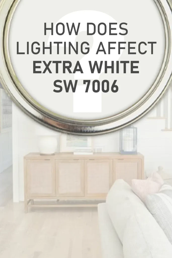
Lighting plays a huge role in how Sherwin-Williams Extra White looks in your space. It’s one of those colors that really reacts to its environment. Here’s how it behaves under different types of lighting:
North-Facing Light: North-facing rooms get cooler, more diffused light, which tends to bring out Extra White’s blue undertones even more. In this kind of lighting, it can feel a little cooler and sharper. Not icy, but definitely not warm.
South-Facing Light: South-facing rooms get warm, golden light throughout the day. This helps balance out Extra White’s cool undertones and gives it a more neutral, slightly softened appearance. It still looks crisp, but without the chilly edge.
East-Facing Light: These rooms get warm morning light and cooler afternoon shadows. So Extra White may start the day looking warmer and slowly cool off as the sun moves. This makes it an interesting, ever-so-slightly changing white depending on the time of day.
West-Facing Light: With cooler mornings and golden, warm light in the evening, Extra White can shift again—sometimes looking clean and neutral early on, then gaining a warm glow later in the day.
Artificial Lighting: Under warm artificial light (like incandescent bulbs), Extra White might lose some of its blue undertones and appear closer to a pure white. But under cool LED or fluorescent lighting, the blue undertone can become more obvious, making the space feel cooler overall.
Bottom line? Test it in your space. Grab a sample, paint a large swatch on each wall, and watch how it shifts throughout the day. It’s a subtle white, but lighting can definitely pull different nuances out of it.
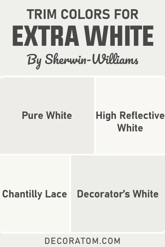
Trim Colors to Pair With Sherwin Williams Extra White?
💥🎁 Christmas & Year-End Deals On Amazon !
Don't miss out on the best discounts and top-rated products available right now!
*As an Amazon Associate, I earn from qualifying purchases.
Now, you might be thinking, “Can I use Extra White on both the walls and the trim?” And yes, you absolutely can! But if you’re looking for trim colors to pair with Extra White rather than match it, here are a few options that work beautifully:
1. Extra White itself
Yep, it’s super popular for trim. If you want a seamless, clean look, using Extra White for both walls and trim gives that modern, gallery-style finish.
2. Sherwin-Williams Pure White
This is a softer, warmer white that adds a gentle contrast without being too bold. It’s still clean, but slightly less cool than Extra White.
3. Sherwin-Williams High Reflective White
If you want to go even brighter than Extra White, High Reflective White is about as stark and clean as it gets. It can make Extra White on the walls feel a bit more grounded by contrast.
4. Benjamin Moore Chantilly Lace
A beautiful clean white that sits in a similar brightness range but leans a touch more neutral. It can work great for trim if you’re mixing brands.
5. Benjamin Moore Decorator’s White
This one has a slight cool undertone as well, which makes it a nice match in tone and feel to Extra White, especially in cooler, modern spaces.
Choosing the right trim color really comes down to whether you want contrast or cohesion. If you’re after that timeless, polished look, Extra White on trim and walls is a classic. But adding a slightly softer or brighter white can help create subtle definition.
Colors Similar to Sherwin Williams Extra White
When you’re trying to find a white paint color, it can feel like all whites look the same at first glance—but they’re absolutely not. Even within bright whites, there are subtle differences in undertones, reflectivity, and overall feel.
If you like Sherwin-Williams Extra White SW 7006 but want to explore similar options, there are a few worth looking at.
Some of these alternatives are slightly cooler, some slightly warmer, and others may be even crisper. It really depends on the look you’re going for.
For example, if you love the crispness of Extra White but want something with even less undertone, you might look at High Reflective White.
On the other hand, if you want to soften the look just a touch while keeping that clean white aesthetic, something like Benjamin Moore’s Chantilly Lace might be a great fit.
These similar whites often get used in place of one another because the differences are so subtle—but they can make a big impact depending on your lighting, trim color, or overall palette. It’s always a smart move to sample 2–3 whites before committing.
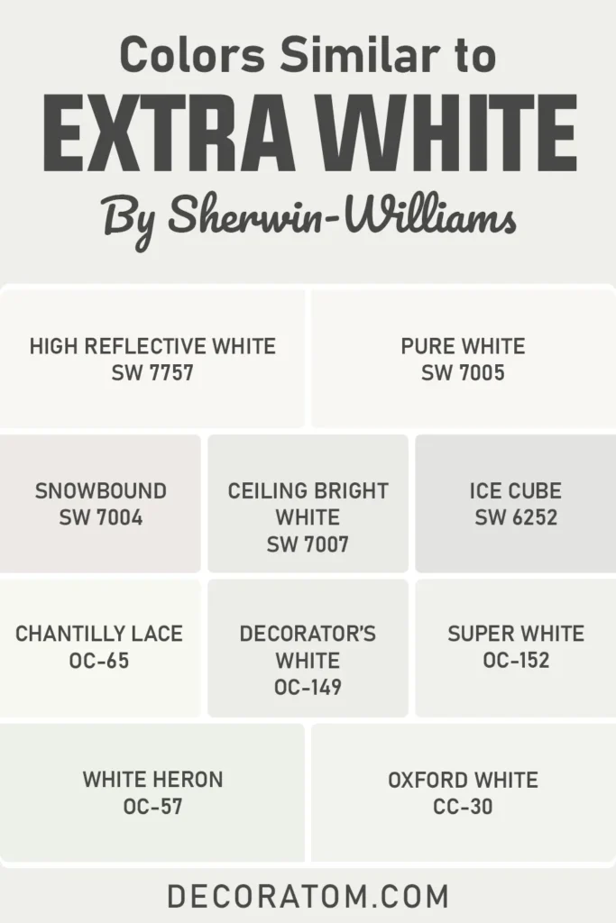
Here are 10 colors similar to Sherwin Williams Extra White:
- Sherwin-Williams High Reflective White SW 7757
- Sherwin-Williams Pure White SW 7005
- Sherwin-Williams Snowbound SW 7004
- Sherwin-Williams Ceiling Bright White SW 7007
- Sherwin-Williams Ice Cube SW 6252
- Benjamin Moore Chantilly Lace OC-65
- Benjamin Moore Decorator’s White OC-149
- Benjamin Moore Super White OC-152
- Benjamin Moore White Heron OC-57
- Benjamin Moore Oxford White CC-30
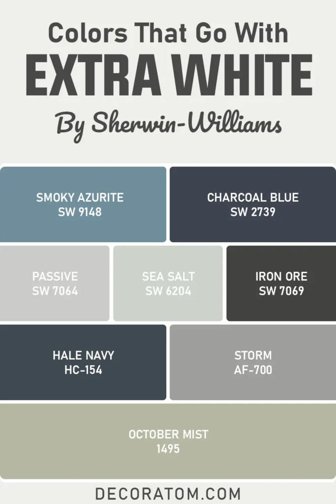
Colors that Go With Sherwin Williams Extra White
Sherwin-Williams Extra White SW 7006 is one of those whites that plays really well with others—especially cooler, more modern tones.
Because it leans slightly cool with its subtle blue undertones, Extra White looks best when it’s paired with colors that complement that crisp clarity. Think deep blues, steely grays, muted greens, or even dusty pastels.
The key here is balance. Extra White acts as a clean, quiet backdrop, which allows bolder or moodier shades to really shine.
I personally love using it next to darker accent colors like navy or charcoal—it just pops in a really elegant way. But it also works beautifully with soft neutrals and coastal-inspired tones if you want something more laid-back.
When building a color palette around Extra White, you want to look at contrast and temperature.
Avoid pairing it with super warm tones like yellows or earthy beiges unless you’re intentionally mixing warm and cool (which can work but needs planning). Cooler grays, stormy blues, sage greens, and even black accents work amazingly well.
💥🎁 Christmas & Year-End Deals On Amazon !
Don't miss out on the best discounts and top-rated products available right now!
*As an Amazon Associate, I earn from qualifying purchases.
Here are 8 colors that go with Sherwin Williams Extra White:
- Sherwin-Williams Smoky Azurite SW 9148
- Sherwin-Williams Charcoal Blue SW 2739
- Sherwin-Williams Passive SW 7064
- Sherwin-Williams Sea Salt SW 6204
- Sherwin-Williams Iron Ore SW 7069
- Benjamin Moore Hale Navy HC-154
- Benjamin Moore Storm AF-700
- Benjamin Moore October Mist 1495
Comparing Sherwin Williams Extra White With Other Colors
If you’ve been staring at swatches of white paint and feeling like you’re losing your mind—you’re not alone. Picking a white paint color can feel overwhelming because the differences are subtle but surprisingly impactful once they’re on the wall.
Sherwin-Williams Extra White SW 7006 is often on the shortlist for many homeowners and designers, but how do you know if it’s the right one for your space?
That’s where comparisons come in. Looking at Extra White next to other popular white shades helps highlight the unique qualities of each one, whether it’s a warm or cool undertone, a softer appearance, or a higher reflectivity.
Below, I’ve broken down how Extra White stacks up against six other well-known whites from Sherwin-Williams and Benjamin Moore, so you can get a clearer picture of which one might suit your style and lighting best.
Sherwin Williams Extra White vs Pure White
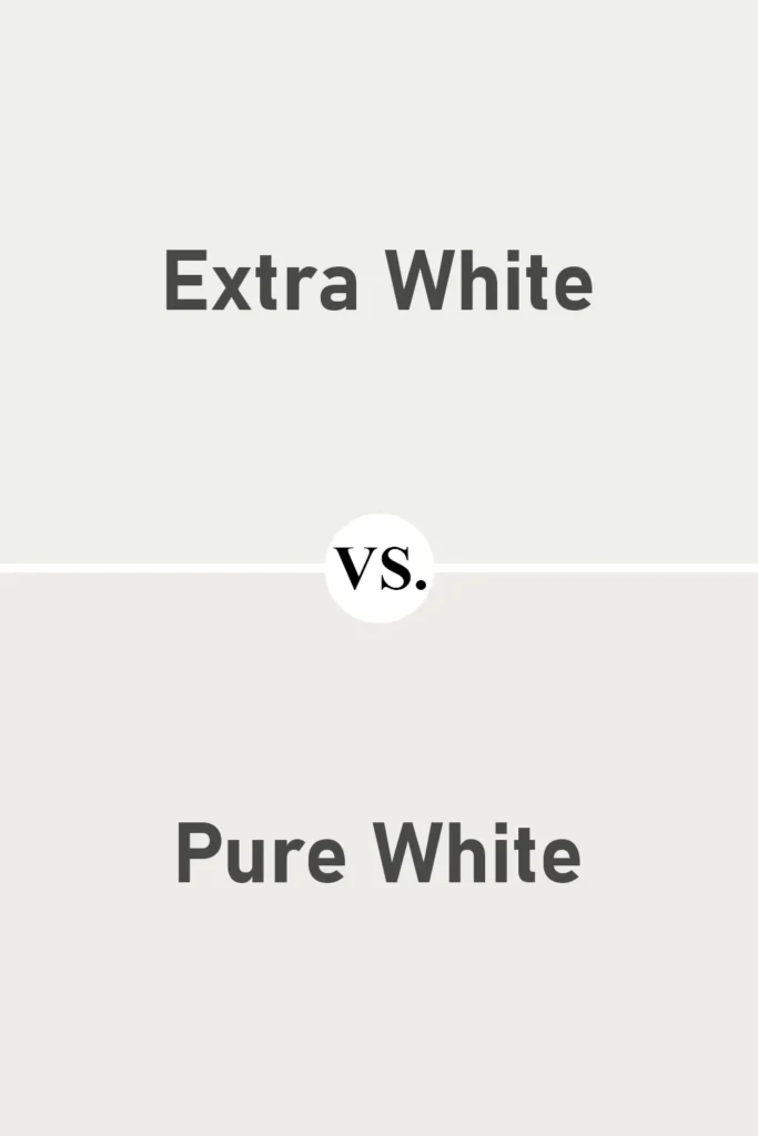
This is a comparison I come back to often. Extra White and Pure White are both bright, popular whites, but they behave differently. Extra White has subtle blue undertones, which give it a crisp, slightly cool feel. It’s often used for trim or in modern interiors where you want a clean, sharp look.
Pure White, on the other hand, is much softer. It still reads as white, but there’s just a hint of warmth thanks to its very faint yellow undertones. This makes it a more forgiving white in spaces with varied lighting or warmer accents, like beige or oak flooring.
If you’re working with cool tones or want a gallery-white effect, Extra White is a great choice. But if you’re looking for a white that bridges the gap between warm and cool, Pure White might be a better fit.
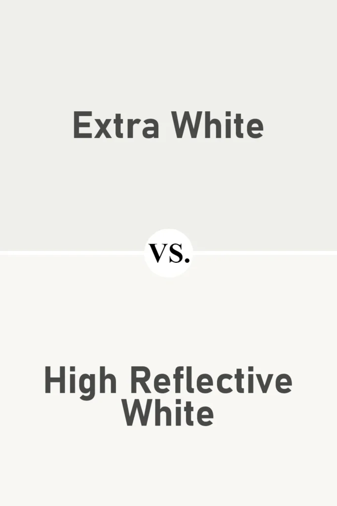
Sherwin Williams Extra White vs High Reflective White
💥🎁 Christmas & Year-End Deals On Amazon !
Don't miss out on the best discounts and top-rated products available right now!
*As an Amazon Associate, I earn from qualifying purchases.
Now this comparison is all about brightness. High Reflective White is the brightest white Sherwin-Williams offers, with an LRV of 93 compared to Extra White’s 86. If you’re looking for a true white—something ultra-clean with almost no undertone, High Reflective White delivers.
Extra White is still very bright, but it has a slight cool tint, making it feel a bit more structured. High Reflective White is as close to pure white as paint gets, but that can sometimes make it feel a little stark or clinical in certain settings.
If you’re painting trim, ceilings, or want the walls to reflect tons of light, High Reflective White might win. But for a slightly softer, more balanced white that still feels modern, Extra White is often easier to work with.
Sherwin Williams Extra White vs Snowbound
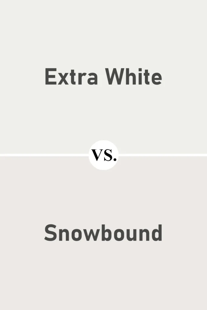
Snowbound is a white that leans warm with soft gray undertones. When placed next to Extra White, the difference is immediately noticeable, Snowbound feels cozier and more muted, while Extra White looks brighter and cooler.
Snowbound is a great choice if you want a white that won’t feel too stark but still looks clean and modern. It works beautifully with warm woods, creamy neutrals, and soft taupes.
Extra White is better suited to cool or contemporary spaces. It stands out more and feels crisper. The decision between the two comes down to mood, Extra White is sharper and more architectural, while Snowbound is softer and more relaxed.
Sherwin Williams Extra White vs Alabaster
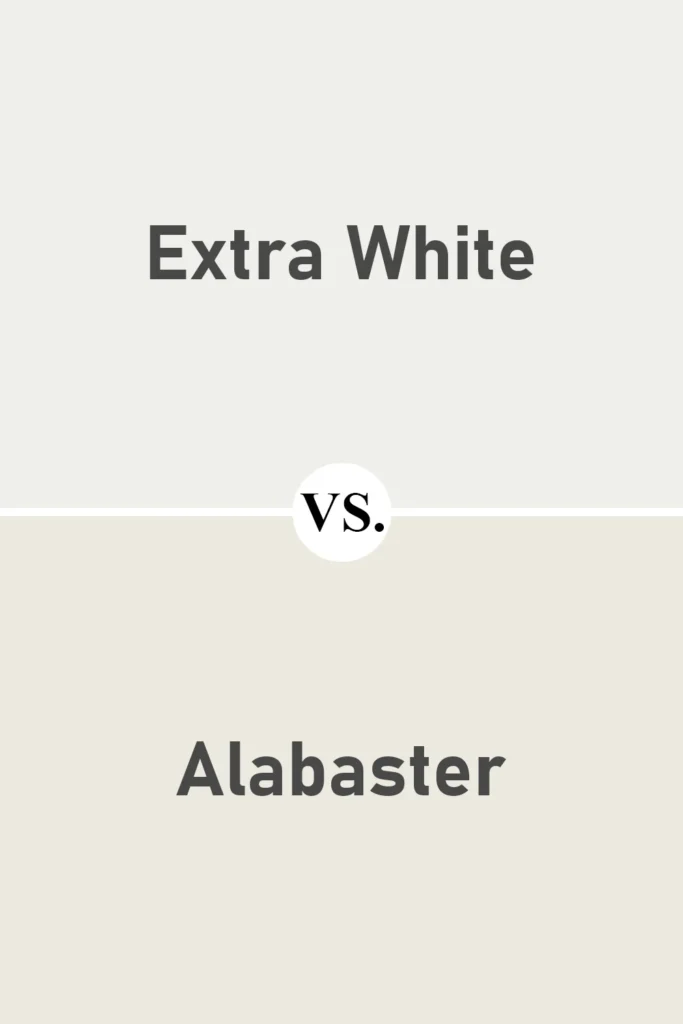
Alabaster is one of Sherwin-Williams’ most popular whites, and for good reason, it’s warm, creamy, and inviting. When you place it next to Extra White, it almost looks like a beige or off-white in comparison.
Alabaster has noticeable warmth, making it ideal for traditional, farmhouse, or cozy-style interiors. It plays well with other warm tones like golds, browns, and soft greens.
Extra White, by contrast, is much cooler and cleaner. It’s better suited for modern or coastal styles, or anywhere you want that crisp “white white” look. Choosing between the two really depends on the vibe of your space: soft and warm, or sharp and fresh.
Sherwin Williams Extra White vs Benjamin Moore Chantilly Lace
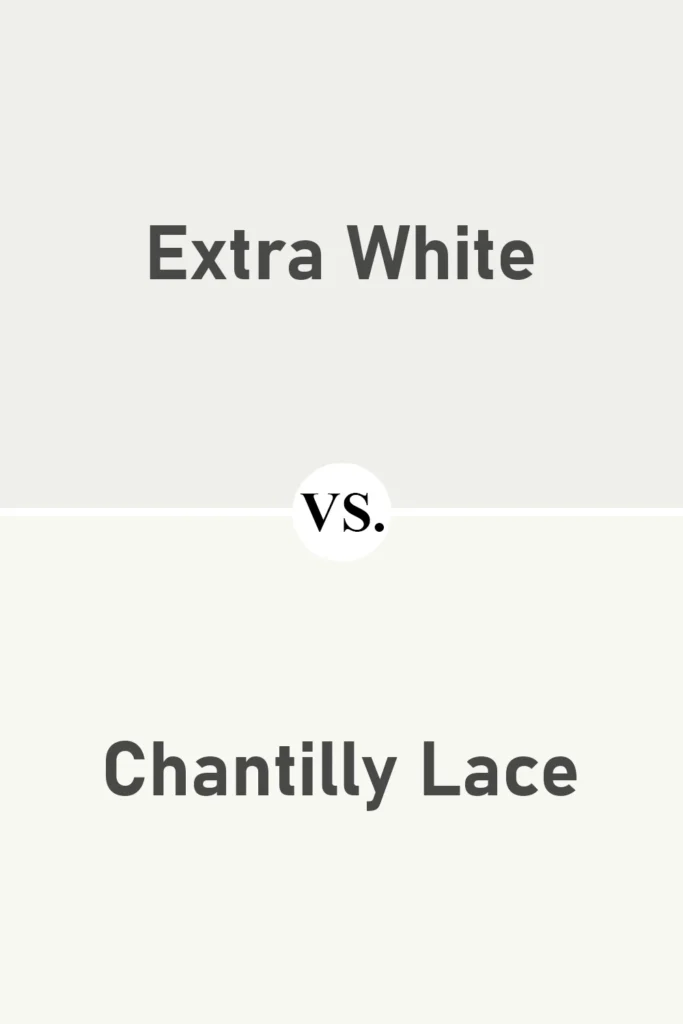
Chantilly Lace from Benjamin Moore is often compared to Extra White, and the two are quite close. They both fall into the category of bright whites with cool, subtle undertones. But Chantilly Lace feels just a touch more neutral in many spaces, making it incredibly versatile.
Extra White can show a bit more blue or coolness under certain lighting conditions, while Chantilly Lace tends to hold its balance without leaning too warm or too cool. It’s like the chameleon of whites, elegant, clean, and rarely tricky.
If you’re mixing brands and want a close match to Extra White but with a bit more flexibility, Chantilly Lace is a safe bet.
Sherwin Williams Extra White vs Benjamin Moore Decorator’s White
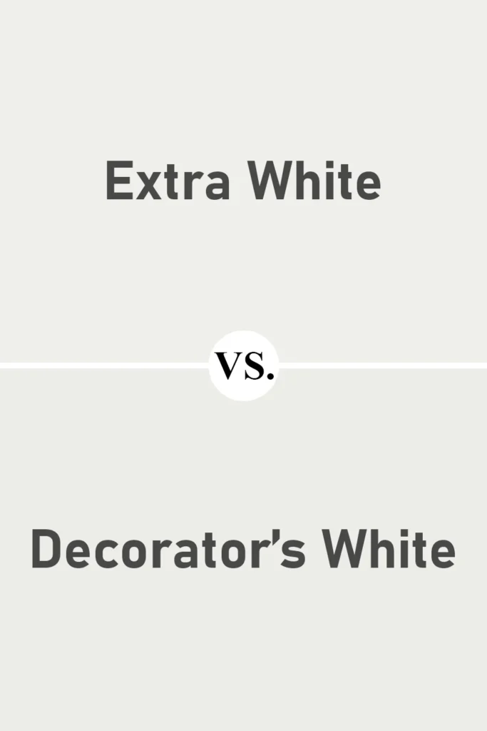
Decorator’s White is another cool white from Benjamin Moore, but this one brings a bit more gray to the table. When compared to Extra White, Decorator’s White looks more muted and toned down. It doesn’t reflect quite as much light and can appear a bit shadowy in dim rooms.
Extra White is lighter, cleaner, and a bit more “obvious” as a white. It’s the kind of paint that stays bright throughout the day, especially in natural light. Decorator’s White, on the other hand, is a good option if you want something more subtle and less stark, but still modern and cool-toned.
This comparison really highlights how undertones and LRV work together. Extra White pops, while Decorator’s White recedes just slightly into the background.
Where to Use Sherwin Williams Extra White?
When I think about white paint that’s both flexible and statement-making, Sherwin-Williams Extra White SW 7006 checks all the boxes. Its crisp, cool-leaning tone makes it perfect for modern spaces, but it’s also neutral enough to work in a wide variety of rooms and styles.
What I love most is that it’s clean without being clinical and bright without looking washed out. It’s a reliable backdrop that lets other elements in a room shine, whether that’s your furniture, décor, or natural light.
Let’s look at how Extra White performs in different areas of the home.
Sherwin Williams Extra White in the Bedroom

Extra White in the bedroom offers a bright, airy feeling that’s perfect if you’re aiming for a minimalist or modern look. It reflects a lot of light, which can make a small bedroom feel bigger and more open.
If your bedroom gets a lot of natural daylight, this white will look especially crisp and refreshing. It’s also an ideal choice if you like to use color through textiles, your bedding, rugs, or artwork will stand out beautifully against the clean backdrop.
Just keep in mind, if your room faces north and gets cooler light, Extra White might lean a bit too cool unless you balance it out with warm wood tones or cozy textures.
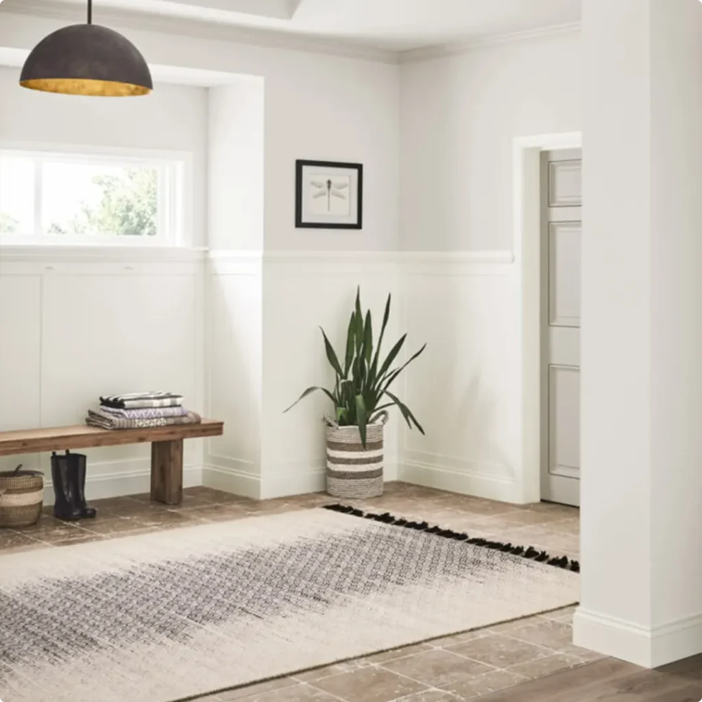
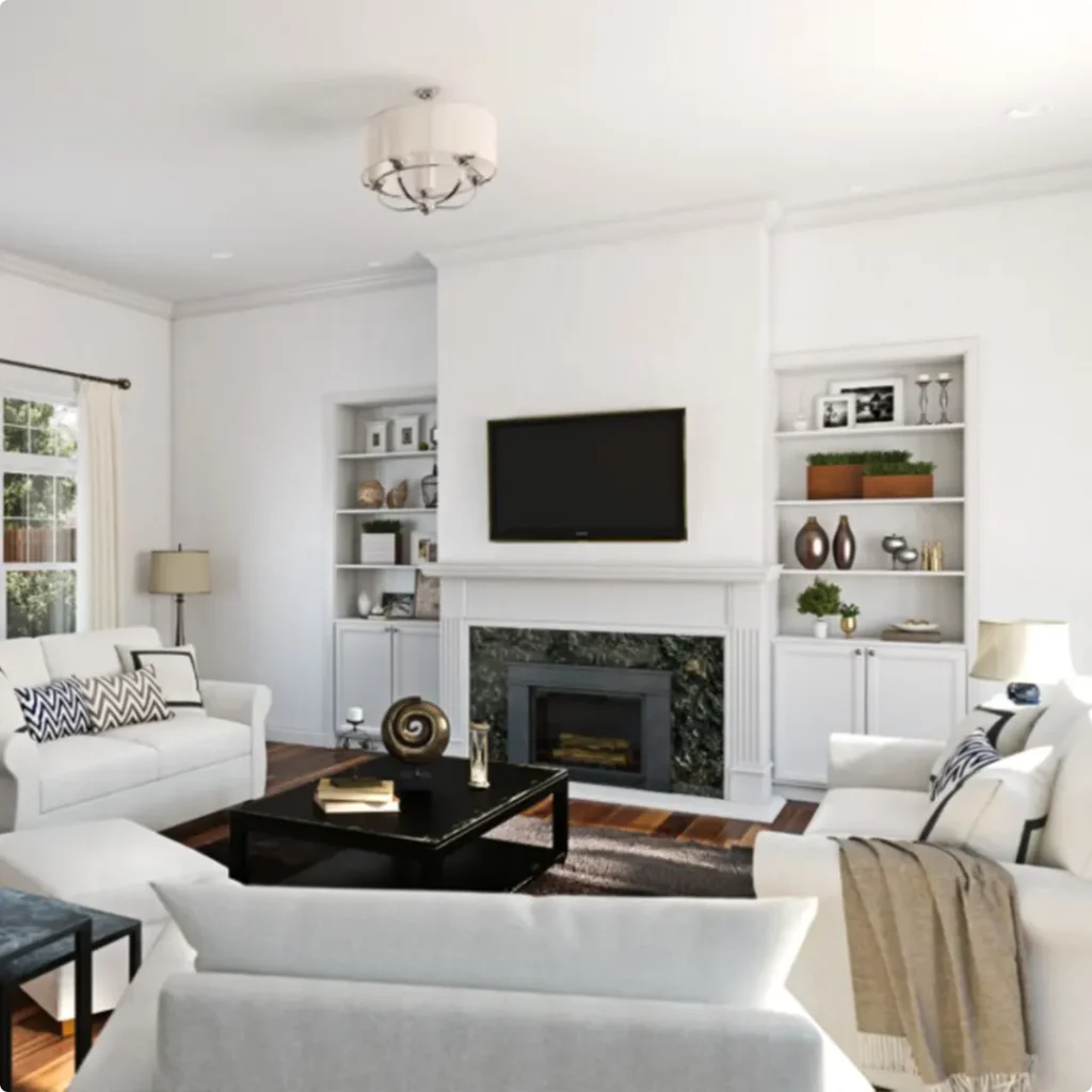
Sherwin Williams Extra White in the Living Room

Using Extra White in a living room can totally transform the space, it makes everything feel fresh, modern, and polished. If you love a neutral foundation that lets you play with accent colors, this is a fantastic option.
Pair it with bold artwork, layered textiles, or pops of greenery for a dynamic, lived-in look. It also works incredibly well with modern furniture, especially if you like sleek lines, glass, metals, or monochromatic themes.
One thing to consider: if your living room has limited natural light, you might want to test this shade first, it can feel stark under certain lighting, but that’s easy to warm up with the right lighting and furniture.
Sherwin Williams Extra White in the Kitchen

There’s something really timeless and clean about a white kitchen, and Extra White delivers just that. It looks amazing on cabinets, walls, or even ceilings, especially when paired with black hardware, marble countertops, or stainless steel appliances.
I’ve seen it used in both contemporary and farmhouse kitchens, and it holds up in either setting. Because it has subtle blue undertones, it works especially well with cool finishes like chrome or polished nickel.
If your kitchen gets a lot of warm light, Extra White can help balance the warmth and keep things feeling fresh and clean. It’s also a dream for creating a light, open-concept kitchen that blends into nearby spaces.
Sherwin Williams Extra White in the Bathroom

Bathrooms are one of my favorite places to use Extra White. It enhances natural light beautifully and makes the space feel spa-like and serene. It’s clean, crisp, and easy to pair with almost any tile or fixture finish.
If you’re using marble, white subway tile, or gray flooring, Extra White ties it all together seamlessly. It’s also a great backdrop for colorful towels or bath accessories if you like to change your look with the seasons.
Just a heads-up, because bathrooms often have artificial lighting, make sure your bulbs aren’t too cool-toned, or the walls might come off a little stark. A soft, warm bulb can create a nice balance.
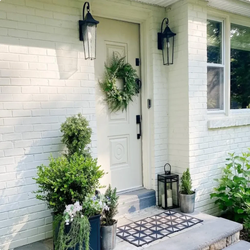
Sherwin Williams Extra White for the Exterior

Yes, Extra White can be used outside too, and wow, does it look sharp. It creates a bold, fresh exterior that pops against landscaping and dark trim.
If you’re going for a modern farmhouse, coastal, or minimal style, this color adds a lot of curb appeal. Since it’s a very bright white, it reflects a lot of sunlight, which can help keep your exterior cooler in warm climates.
It pairs beautifully with black shutters, gray stonework, or even navy blue accents. Just keep in mind that bright whites like Extra White can look almost blinding in direct sun, so it’s a good idea to test it on a small section before committing to the whole house.
Why I Love Sherwin Williams Extra White SW 7006
I keep coming back to Sherwin-Williams Extra White for a reason, it’s dependable. It gives me the kind of blank canvas I want without feeling flat or boring. It’s bright, crisp, and clean, but not sterile.
I love how it brings out the richness of other colors in the room, whether it’s deep navy, soft sage, or natural wood tones.
And because it’s so reflective, it makes rooms feel bigger and more open, especially important in smaller or darker areas. Plus, it works everywhere: walls, trim, cabinetry, ceilings, you name it.
What makes me trust this color again and again is how versatile it is. It doesn’t matter if I’m designing a modern space, a coastal vibe, or a more traditional layout, it fits right in.
And even though I’ve tried lots of other whites, Extra White always lands at the top of my list when I want something fresh and timeless.
👉 Get a Peel & Stick paint sample of Extra White SW 7006
Final Thoughts
Sherwin-Williams Extra White SW 7006 might seem like “just another white” at first, but once you use it, you realize how much thought and versatility it brings to a space.
It’s clean, modern, and just cool enough to feel crisp without going cold. Whether you’re painting a single room, an entire home, or just the trim, Extra White offers a dependable, beautiful finish that pairs well with nearly every color and style.
If you’re debating which white to go with, definitely test a few, but don’t be surprised if you come back to this one.
It’s one of those rare whites that actually lives up to its name. Extra bright, extra flexible, extra timeless. It’s a solid pick for almost any project.