
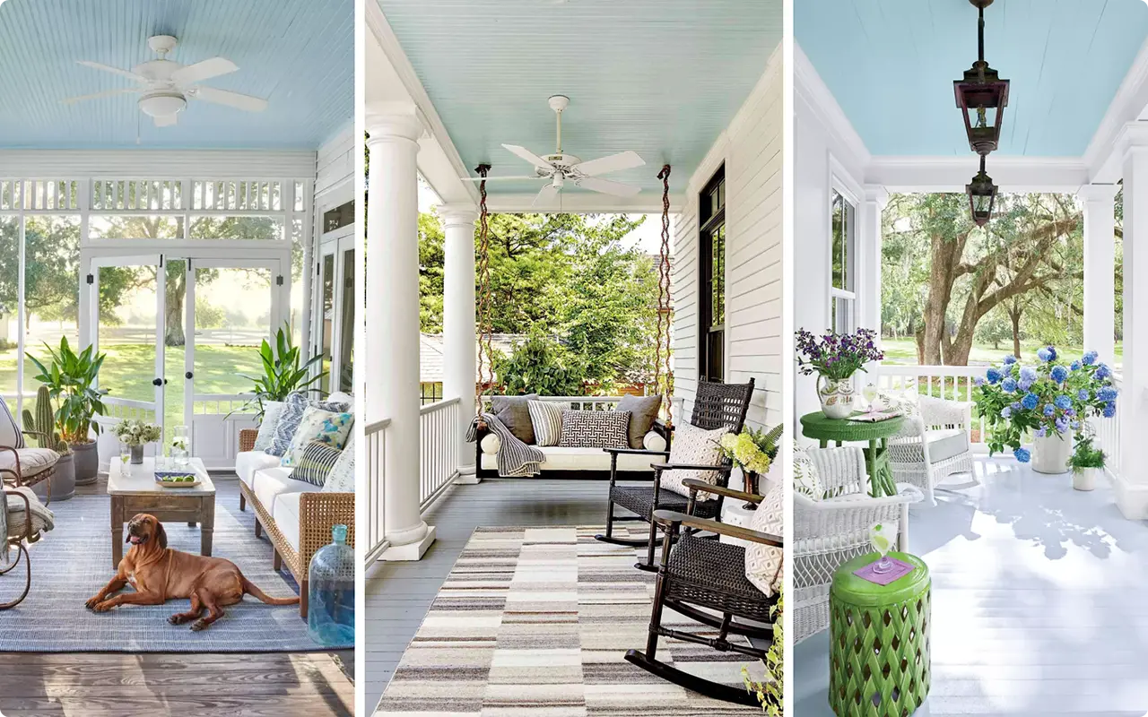
There’s something about haint blue paint colors that instantly makes a space feel calm, breezy, and full of charm.
I’ve always been drawn to those soft sky-like blues you see on old Southern porch ceilings—the kind that make you stop and take a deep breath.
At first, I just loved how peaceful they looked. But then I learned about the history behind haint blue, and I was hooked.
Rooted in Southern tradition and Gullah culture, haint blue was believed to protect homes from spirits—or “haints”—by mimicking water or the open sky.
Today, it’s just as popular for its aesthetic appeal as it is for its folklore. Whether you’re painting a porch, bedroom ceiling, or even kitchen cabinets, the right haint blue shade can add a subtle, elegant touch that’s hard to beat.
In this post, I’m sharing 17 of the best haint blue paint colors I’ve found—some classic, some a bit unexpected, but all absolutely beautiful.
If you’re dreaming of adding that light and airy feeling to your home, you’ll find plenty of inspiration here.
What are Haint Blue Paint Colors?
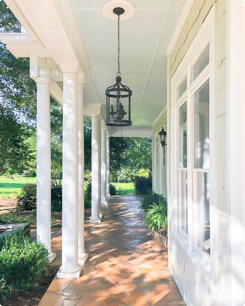
If you’ve ever walked up to a Southern-style porch and noticed a pale blue ceiling, chances are you’ve seen haint blue in action.
Haint Blue isn’t just a pretty color—it’s rooted in deep cultural history. The word “haint” comes from the Gullah tradition, referring to restless spirits or “haunts” that people once believed could enter the home.
To protect themselves, they painted their porch ceilings—and sometimes doors and window frames—in soft shades of blue meant to mimic water or sky, which haints supposedly couldn’t cross.
Over time, haint blue has evolved into more than just folklore. It’s now a beloved design choice, often found in coastal, farmhouse, and cottage-style homes.
Haint blue paint colors are typically soft and calming, falling somewhere between pale blue, green-blue, or gray-blue shades.
Whether you’re honoring a tradition or just looking for a tranquil color that evokes open skies and breezy afternoons, haint blue is timeless and full of charm.
Where to Use Haint Blue Paint Colors?
While porch ceilings are the traditional spot for haint blue, I’ve seen this color work beautifully in so many areas of the home. Here are a few of my favorites:
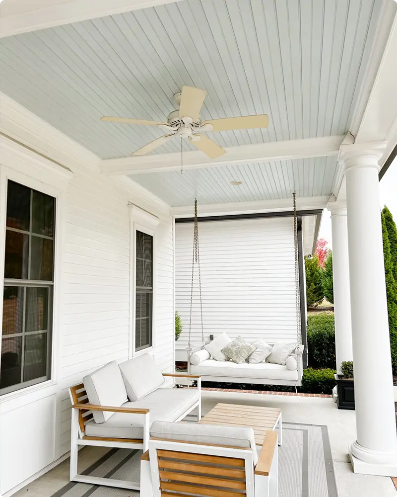
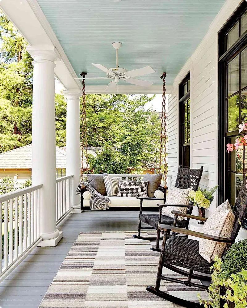
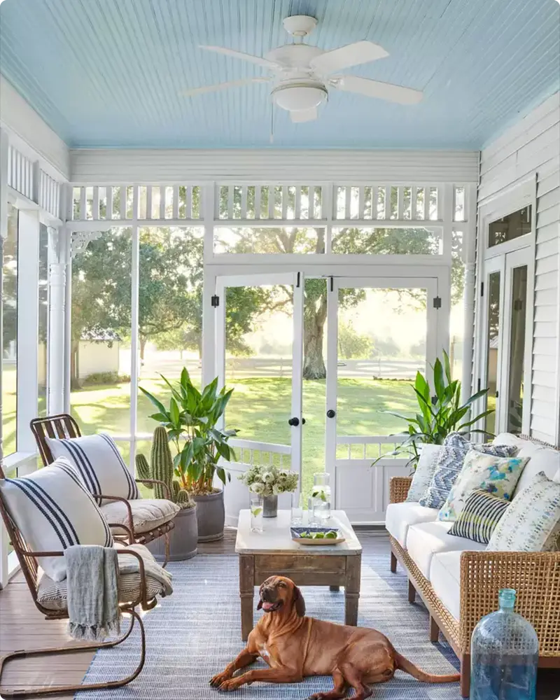
Porch Ceilings – This is where haint blue truly shines. It reflects the sky and adds a cheerful, calming vibe.
Front Doors & Shutters – A subtle haint blue door adds a welcoming touch and can give your entryway personality without overwhelming it.
Bathrooms & Powder Rooms – These soft blues create a spa-like, serene atmosphere.
Bedrooms – Especially in spaces where you want a relaxing, airy feel. Haint blue walls or ceilings can be soothing and light-enhancing.
Kitchens or Cabinets – I love a pop of haint blue on lower cabinets or islands. It brings a fresh, coastal energy.
The best part? Haint blue is versatile. Whether you use it in small doses or go all in, it’s a color that brings light and calm to any room.
💥🎁 Christmas & Year-End Deals On Amazon !
Don't miss out on the best discounts and top-rated products available right now!
*As an Amazon Associate, I earn from qualifying purchases.
Colors to Pair with Haint Blue
Haint blue pairs surprisingly well with a wide range of colors. It all depends on the look you’re going for. Here are a few combinations I’ve used (or admired) that really bring out the beauty of haint blue paint colors:
Crisp White – A classic Southern pairing. White trim or siding makes haint blue pop, especially outdoors.
Soft Grays – For a more muted, modern look, pair haint blue with warm or cool grays.
Warm Beiges or Creams – This keeps things neutral but adds warmth that complements the blue tones.
Navy or Deep Blue Accents – Creates depth and contrast without clashing.
Natural Wood – Whether it’s light oak or rich walnut, wood tones make haint blue feel grounded and timeless.
Greens – Sage, olive, or mint green can create a fresh, nature-inspired palette.
Stick with soft, airy hues for a traditional or coastal look, or bring in contrast with deeper shades if you’re feeling bold.
Tips for Choosing the Best Haint Blue Paint Colors
Picking the right haint blue paint color can feel tricky, especially with so many shades to choose from. Here are some tips I always follow:
1. Test in Natural Light
Haint blue looks different depending on where it’s used. A color that’s perfect outdoors might feel too green or gray inside. Always swatch it first and check how it looks at different times of day.
2. Know the Undertones
Some haint blues lean green (like Sea Salt), while others have a touch of gray or violet. Decide whether you want a cooler or warmer feel in your space.
3. Consider the Surroundings
Look at your trim, floor, and roof color if you’re painting outside—or the furniture and finishes indoors. The right haint blue should work with those elements, not fight against them.
4. Stick to Soft & Muted Tones
Haint blue isn’t neon or bold. It should feel breezy and soft. Think of the sky on a clear day or water in the distance.
5. Use It in the Right Proportion
Sometimes, a little haint blue goes a long way. If you’re nervous, try it on a ceiling or accent wall first.
Top 17 Haint Blue Paint Colors
Here are my favorite Haint Blue paint colors to decorate with.
1. Sherwin Williams Rainwashed SW 6211

Rainwashed is one of those colors that feels like a deep breath. It leans toward a soft green-blue, and while it’s technically in the blue family, the subtle green undertone adds a natural, almost misty quality to it.
I’ve seen this one used in coastal bedrooms and spa-style bathrooms where the goal is calm and clarity. What I love most is that it never feels too cold or too gray—it stays fresh and uplifting, especially in rooms with a lot of natural light.
If you want a haint blue that doesn’t feel “baby blue,” this one’s worth sampling.
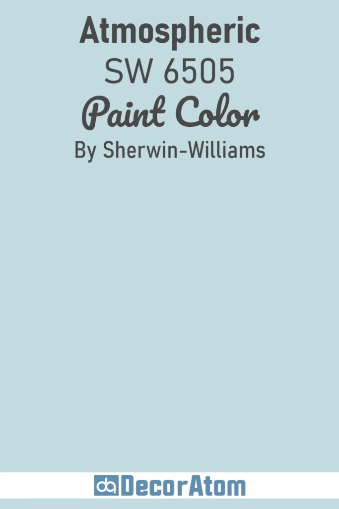
2. Sherwin Williams Atmospheric SW 6505
💥🎁 Christmas & Year-End Deals On Amazon !
Don't miss out on the best discounts and top-rated products available right now!
*As an Amazon Associate, I earn from qualifying purchases.
Atmospheric is as dreamy as its name suggests. It leans more clearly toward a true blue, but it’s still soft enough to work beautifully on porch ceilings or light-filled bedrooms.
This color reminds me of a clear spring sky right after the clouds have moved on—light, fresh, and filled with airiness.
It’s a little cooler than some haint blues, so I tend to recommend it in spaces that get warmer sunlight, where it can balance things out beautifully without feeling stark.
3. Sherwin Williams Lauren’s Surprise SW 6791
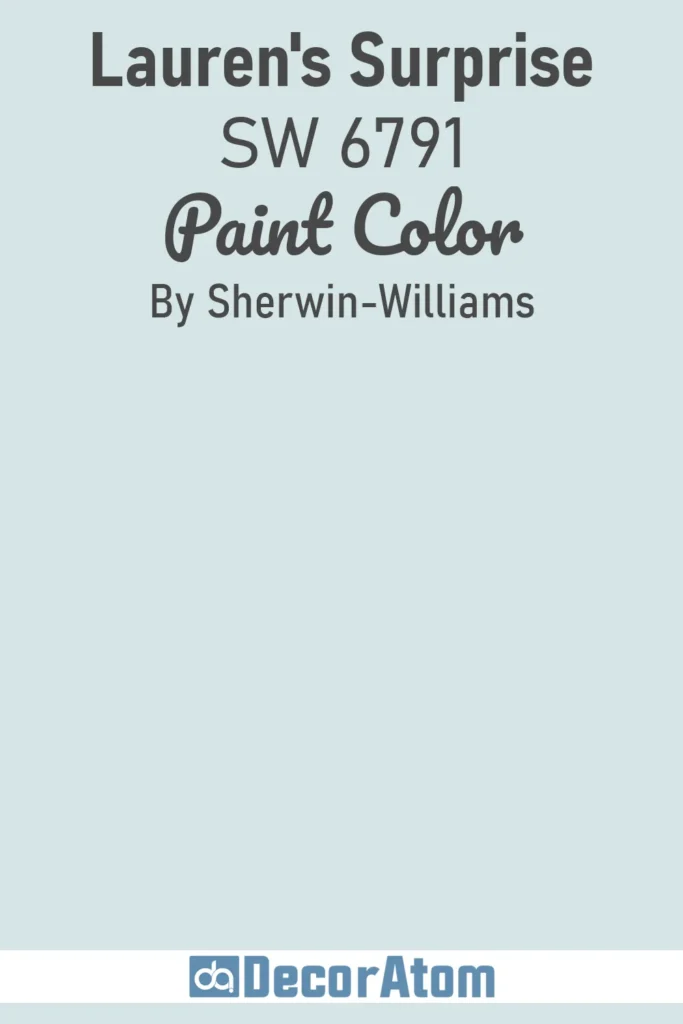
If you’re craving a cheerful, slightly more vibrant take on haint blue, Lauren’s Surprise might just win you over.
This one has more saturation than traditional haint blues, but it still manages to feel soft and playful rather than bold or overwhelming.
There’s a youthful quality to this shade—it almost has a vintage charm when used on a front door or even bathroom cabinetry.
I wouldn’t use it in a super formal room, but in casual or coastal spaces, it’s a delightful surprise indeed.
4. Sherwin Williams Porch Ceiling SW 9063
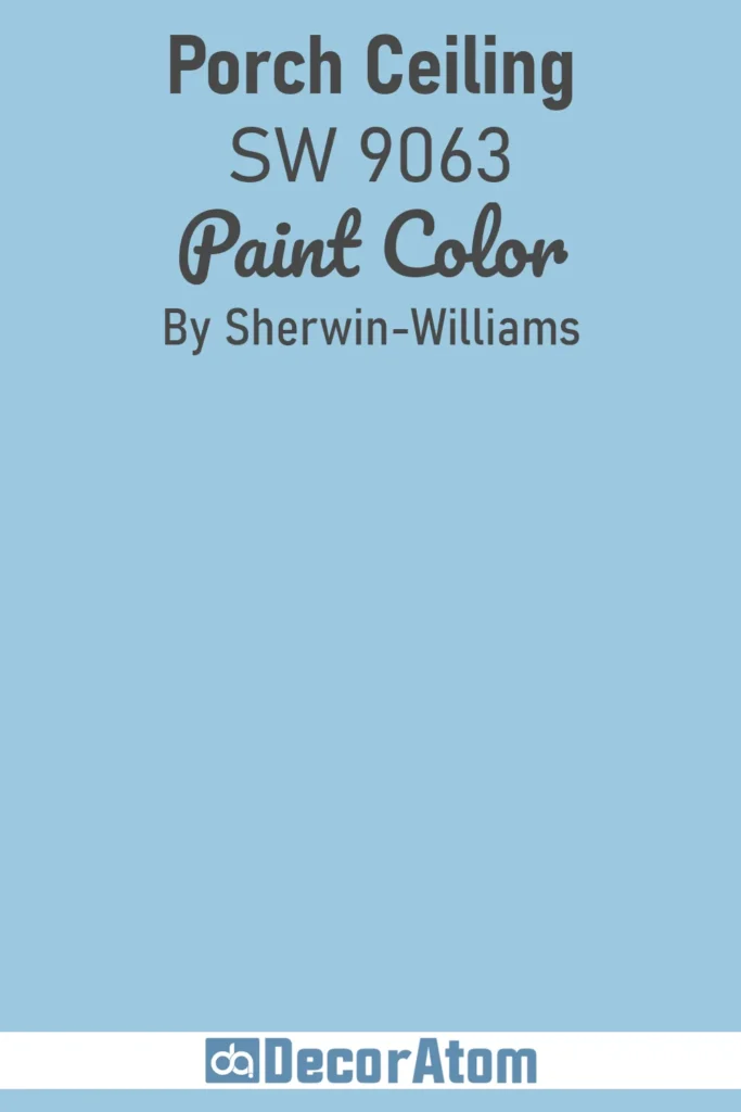
This is the official nod to the haint blue tradition—literally designed with porch ceilings in mind. What I love about this color is how balanced it feels. It’s not too green, not too gray, and not too saturated.
It mimics the open sky just enough to create that classic Southern charm on any covered porch.
I’ve used this shade on ceilings, yes—but it also looks lovely inside sunrooms or even laundry rooms where you want that touch of gentle color that still feels neutral.
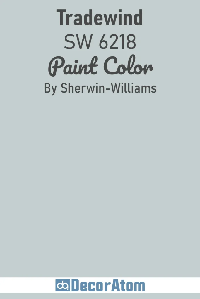
5. Sherwin Williams Tradewind SW 6218
💥🎁 Christmas & Year-End Deals On Amazon !
Don't miss out on the best discounts and top-rated products available right now!
*As an Amazon Associate, I earn from qualifying purchases.
Tradewind is soft, breezy, and leans more toward a cool blue-gray. It has just enough warmth to keep it from feeling icy, but it’s definitely on the cooler side compared to others on this list.
I find this shade works beautifully in bedrooms, especially when paired with white trim or soft greige accents. There’s a coastal elegance to Tradewind—it doesn’t scream for attention, but it leaves an impression of calm and quiet refinement.
6. Sherwin Williams Sea Salt SW 6204
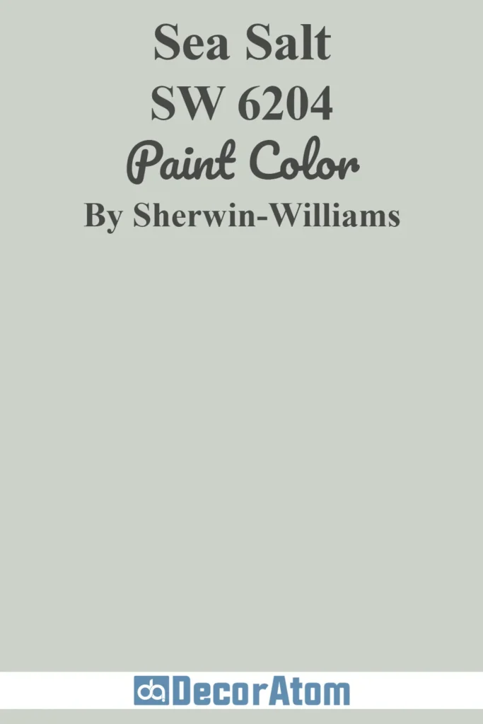
I debated including Sea Salt since it’s often seen more as a green-gray, but in certain lighting, it reads like the softest watery blue. That’s part of its magic—it shifts throughout the day, much like the ocean.
It’s wildly popular for a reason. It brings in that relaxing, spa-like vibe while still feeling earthy and grounded.
I’ve used it in bathrooms, entryways, and even kitchens where I wanted something subtle that still carried personality. It’s perfect if you love the haint blue look but want something a little more grown-up and versatile.
7. Benjamin Moore Pool Blue 2052-50
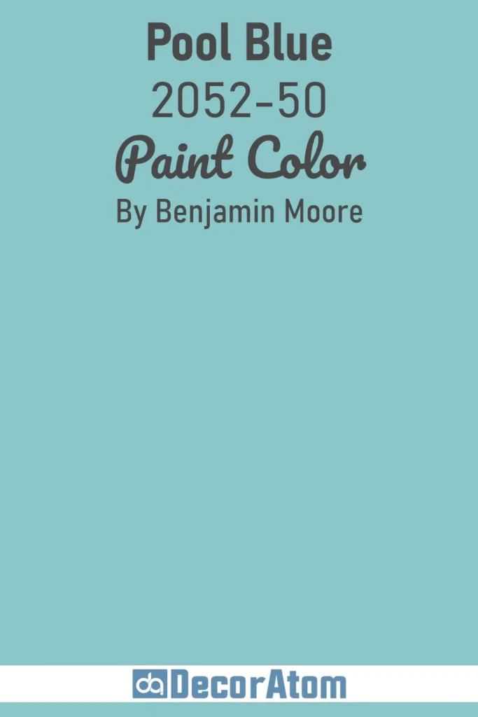
Pool Blue brings more playfulness to the haint blue family. It’s got that crystal-clear swimming pool energy—bright, cheerful, and a little more saturated than some of the softer hues on this list.
I wouldn’t call it loud, but it definitely has more personality. This color works beautifully on porch ceilings if you want that charming, welcoming Southern look with a slightly bolder twist.
It also looks amazing in kids’ rooms or creative spaces where you want the color to do some of the talking.
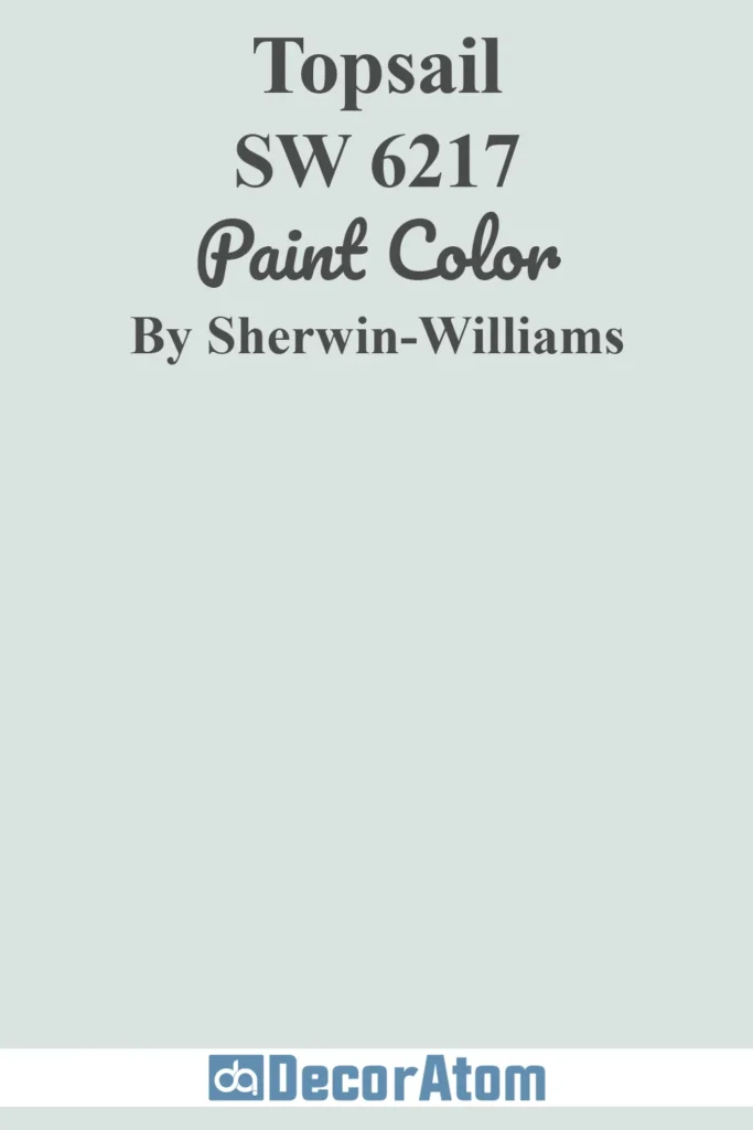
8. Sherwin Williams Topsail SW 6217
💥🎁 Christmas & Year-End Deals On Amazon !
Don't miss out on the best discounts and top-rated products available right now!
*As an Amazon Associate, I earn from qualifying purchases.
Topsail is often overlooked, but it’s one of those perfect light blues that seems to work everywhere. It has a breezy, slightly nautical feel that fits right into coastal design, but what I love most is its flexibility.
Topsail isn’t too green or gray, which means it reads clearly as a soft blue in most spaces. Use it in a beachy bathroom, above a wainscoted wall in a hallway, or on a ceiling to mimic open skies.
It’s the kind of color that doesn’t try too hard—and that’s exactly why it works.
9. Sherwin Williams Niebla Azul SW 9137
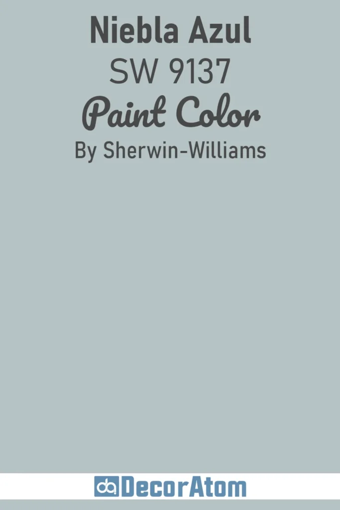
Niebla Azul brings a little depth to the table. It’s a soft, smoky blue with subtle gray undertones that give it a moody, atmospheric quality without feeling dark.
If most haint blues feel a bit too airy for you, this is a fantastic option. I’ve seen it used in more modern or transitional homes where the goal is calm but also a little bit of drama.
Try it in a bedroom or study with layered whites and soft wood tones—it’s beautiful and unexpectedly grounding.
10. Benjamin Moore Palladian Blue HC-144
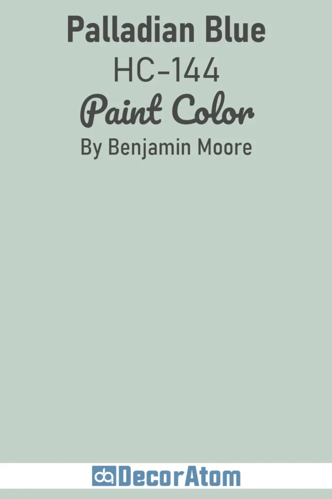
Palladian Blue is a long-time favorite in the haint blue world. It’s a green-blue that feels elegant, serene, and just a little bit antique.
This color is incredibly versatile—it reads differently depending on the light, sometimes leaning more green, other times more blue, but always soft and peaceful.
I’ve seen it on porch ceilings, bathroom walls, and even entire living rooms. There’s a gentle grace to this color that never goes out of style. If you want a haint blue that feels classic and a bit refined, this one is hard to beat.
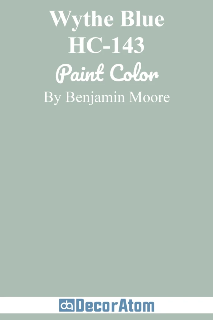
11. Benjamin Moore Wythe Blue HC-143
💥🎁 Christmas & Year-End Deals On Amazon !
Don't miss out on the best discounts and top-rated products available right now!
*As an Amazon Associate, I earn from qualifying purchases.
Wythe Blue is one of those shades that can completely transform a space. It leans a bit more green than what many people expect from a haint blue, but that’s part of its appeal.
There’s a vintage quality to it—like something you’d see in a historic Charleston home or an old seaside cottage. What makes it so versatile is its depth.
It has enough color to stand on its own, whether on walls, cabinetry, or even exteriors, but it still feels soft and relaxed. If you’re after a haint blue with a slightly bolder presence, Wythe Blue is a strong contender.
12. Benjamin Moore Blue Allure 771
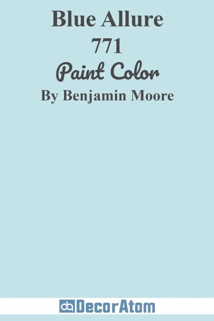
Blue Allure is bright, clear, and full of energy without being overwhelming. It’s more saturated than a traditional haint blue, but it still fits the category thanks to its soft, sky-like appearance when used in the right context.
I find this one especially beautiful in sunrooms or laundry rooms—anywhere you want to inject a bit of freshness.
It plays really well with white trim or beadboard, giving off that clean, inviting, Southern porch vibe. If you’re not afraid of a bit more color, Blue Allure is a lively and lovely option.
13. Benjamin Moore Smoke 2122-40
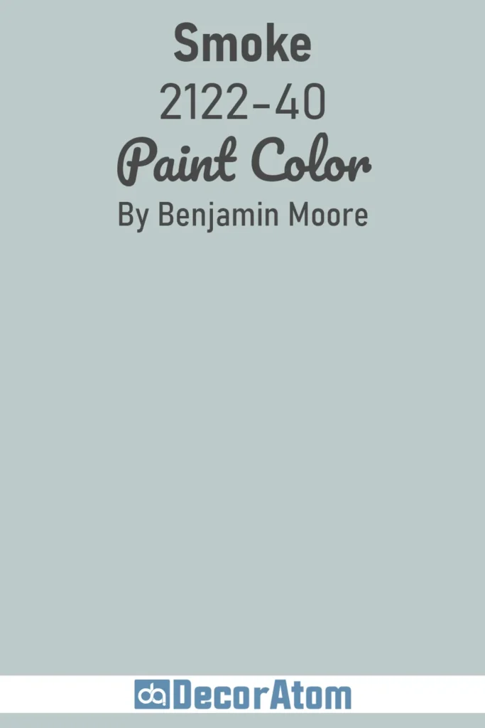
Smoke is on the more sophisticated end of the haint blue spectrum. It’s a misty, gray-blue that brings a moody, almost foggy atmosphere to a space.
While it doesn’t have the brightness of some other shades on this list, it makes up for that with depth and character. I love it in bedrooms or libraries where you want something soothing but not too sweet.
It pairs beautifully with natural woods, warm metals, and creamy whites. Smoke gives you that haint blue essence, but with a more mature, grounded feel.
14. Benjamin Moore Woodlawn Blue HC-147

Woodlawn Blue is the kind of color that never really goes out of style. It has a soft blue-green-gray mix that keeps it firmly in the haint blue category, while still feeling versatile enough for just about any room.
It’s one of those paint colors that seems to adapt to its surroundings—calming and subtle in daylight, cozy and muted in the evening.
I’ve seen it used in dining rooms, nursery walls, and even on kitchen islands, and it always brings a touch of tranquility. If you’re looking for a true chameleon that fits the haint blue mood without being overly trendy, this one is it.
15. Behr Sky Light View MQ3-53
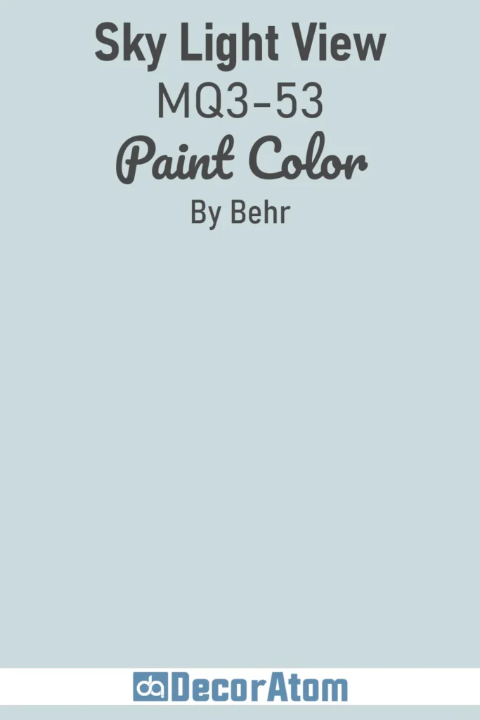
Sky Light View is a beautiful soft blue with just a whisper of green undertone, and it’s a wonderful budget-friendly choice if you’re looking for a haint blue without going the designer route.
It’s crisp, fresh, and reminds me of a quiet spring morning. It has that light-reflecting quality you want for porch ceilings or sunlit spaces, and it feels cheerful without being loud.
This one would be stunning in a hallway with white trim or even in a cozy reading nook. It’s one of those shades that simply makes a space feel a bit more open and airy.
16. Farrow & Ball Parma Gray No. 27
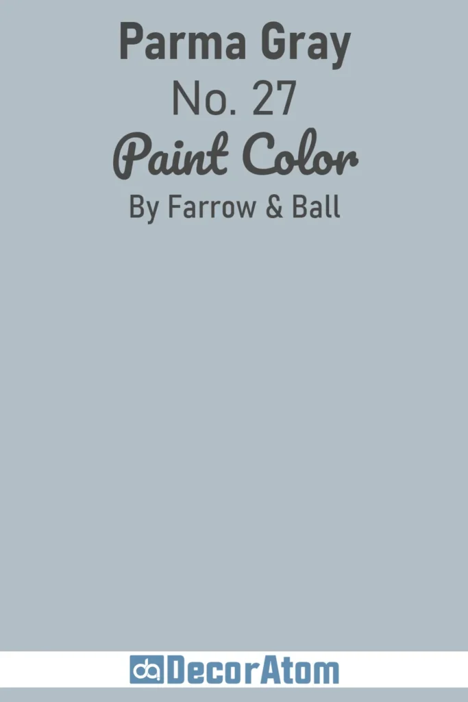
Parma Gray is elegance in a can. Despite the name, it’s really more of a blue than a gray—soft, refined, and with a slight formality that makes it feel timeless.
It’s an excellent option if you’re going for a classic, high-end look while still staying true to the soft, airy spirit of haint blue.
I’ve seen it used in traditional homes, often paired with crown molding and vintage furniture, and it creates a serene, balanced atmosphere. The richness of Farrow & Ball’s pigment really makes this color glow, especially in natural light.
17. Farrow & Ball Dix Blue No. 82
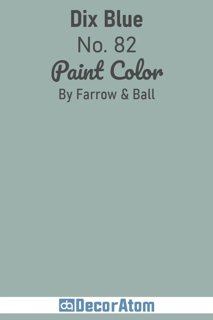
Dix Blue rounds out this list with a gorgeous mix of blue and green that leans into the historic charm of haint blue while offering a slightly more dramatic twist.
It’s deeper and moodier than the others here, but it still feels light enough to belong. What sets it apart is the way it holds its color throughout the day—it doesn’t fade into grayness but instead keeps that soft, sea-glass quality.
I’d recommend it for accent walls, cabinetry, or even an entryway if you want something a bit unexpected. It’s rich, but never overpowering—and it adds a touch of vintage flair wherever it goes.
Final Thoughts
Haint blue paint colors offer more than just visual appeal—they bring with them a sense of history, charm, and quiet elegance.
What makes haint blue so versatile is its subtle range. From pale green-blues like Sea Salt to more refined tones like Palladian Blue or Parma Gray, there’s a version of haint blue to complement nearly any style of home—from classic coastal to transitional or farmhouse.
As with any paint choice, context matters. Take the time to test samples, observe them in natural light, and consider how each tone interacts with your existing finishes. A color that feels right on a front porch ceiling may not translate the same way indoors, and vice versa.
In the end, haint blue remains a timeless option for those seeking softness, serenity, and a touch of tradition. Whether you use it on a ceiling, in a bathroom, or throughout an entire room, it’s a color that never feels out of place—only quietly beautiful.