
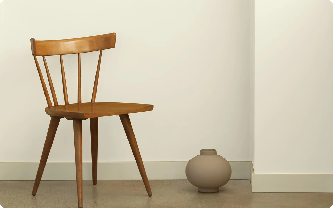
White paint may seem like the simplest choice for walls, but in reality, it’s one of the most nuanced.
The right white can elevate a space, making it feel brighter, cleaner, and more refined.
The wrong one can leave a room looking flat, sterile, or just a little “off.”
That’s why selecting the perfect white requires a careful balance of undertone, light, and overall aesthetic.
Benjamin Moore offers an impressive range of white paint colors — from crisp and clean to soft and warm — each with subtle characteristics that affect how they look on the wall.
Whether you’re designing a minimalist interior, refreshing a traditional space, or layering a modern palette, there’s a white that will bring your vision to life.
In this post, I’ve curated 17 of the best white paint colors for walls by Benjamin Moore.
Each one stands out for its versatility, beauty, and how well it performs in real spaces.
Along with each color, I’ll share its undertones, LRV (light reflectance value), and what makes it a strong choice depending on the room, lighting, and overall design goals.
If you’re looking for a timeless white that works with your space — not against it — this list is a great place to start.
Why Designers Love White Paint Colors for Walls?
White is far from boring — in fact, designers often consider it the most versatile and transformative color in their toolbox. Why?
Because white walls have this rare ability to make a space feel both expansive and intimate, depending on the light and surroundings.
A soft white can wrap a room in warmth and calm, while a brighter, cleaner white can create that airy, gallery-like backdrop we see in modern homes.
Designers also love white because it gives furnishings, artwork, and architectural details a chance to shine. It doesn’t compete; it complements.
Whether it’s a traditional home with crown molding or a minimalist loft with exposed concrete, there’s a white paint that enhances the character of the space.
And since white reflects light so well, it naturally brightens rooms, making everything feel a little more open and fresh.
Where to Use White Paint Colors
White paint works just about anywhere — but it’s especially impactful in rooms where you want to create a sense of lightness, balance, or calm.
Living rooms, bedrooms, and kitchens are natural fits, but white can also bring surprising charm to more unexpected spaces like laundry rooms, hallways, or even bathrooms.
In north-facing rooms where the light can feel cooler, a warmer white helps offset the gray tones.
South-facing rooms, which get lots of warm sunlight, can handle cleaner or cooler whites without feeling cold.
And in open floor plans, using white can unify different zones while still allowing flexibility to layer in texture and color with furniture and decor.
White is also a great solution for ceilings and trims — or even as an all-over wall and trim color for a modern, monochromatic look.
Colors to Pair with White Paint
One of the best things about white walls? They play well with others. White is a natural backdrop for nearly any color palette, which gives you endless styling freedom. Here are a few pairings that always feel fresh and intentional:
- With soft neutrals: Pair whites with beiges, tans, and taupes for a calm, tonal space.
- With bold accents: Crisp white walls let deep blues, emerald greens, or even black shine without overwhelming the room.
- With warm earth tones: Terracotta, clay, muted rusts, and sandy hues pair beautifully with creamy, warm whites.
- With pastels: Soft blush, sage green, and powder blue take on a dreamy, modern edge when layered over white walls.
- With natural textures: Think wood beams, jute rugs, and linen fabrics — they all pop beautifully against white while creating visual warmth.
Because white is so neutral, the right pairing depends on the mood you want to create — cozy, crisp, serene, or bold.
What Is The Most Popular Benjamin Moore White Paint Color For 2025?
For 2025, Chantilly Lace (OC-65) continues to reign as one of the most popular Benjamin Moore white paint colors — and for good reason.
It’s ultra-bright, clean, and remarkably neutral. With no obvious undertones, Chantilly Lace brings clarity and crispness to walls without skewing too warm or too cool.
Designers and homeowners alike gravitate toward it for modern, minimal spaces where that high-reflective quality makes rooms feel spacious and open.
It’s also an ideal choice when you want a fresh backdrop to highlight art, furniture, or layered decor without any color interference.
That said, Simply White (OC-117) and White Dove (OC-17) are right behind it in popularity — both offering a bit more warmth and softness for cozier, lived-in vibes.
How To Choose The Best White Paint Colors For Walls?
Choosing the right white paint might sound simple… until you realize just how many whites are out there. The key is to consider your room’s lighting, the overall vibe you want, and the undertones at play.
Here’s how to narrow it down:
1. Start with your lighting.
- North-facing rooms can feel cool, so lean into warmer whites with yellow or beige undertones.
- South-facing rooms are flooded with light, so clean whites or cooler tones can balance the warmth.
- East- and west-facing rooms change throughout the day — a soft, balanced white works best.
2. Consider the undertones.
Every white has a subtle undertone — yellow, pink, gray, blue, or even green. These can be barely noticeable, but they’ll show up in your space depending on the light and the colors around them. Compare whites side-by-side to spot these shifts.
3. Think about the mood.
Want a cozy, welcoming room? Go for a warmer white. Craving a sleek, modern aesthetic? Choose a crisp, cool white.
4. Sample, sample, sample.
Always test a few whites in your space. Paint swatches directly on the wall or use large sample sheets. Look at them at different times of day — morning, afternoon, and night — to see how they shift in natural and artificial light.
5. Match to your trim and finishes.
If your trim, cabinets, or ceilings are already painted a specific white, make sure your wall color complements it. You can match it for a seamless look or choose a subtle contrast for dimension.
Top 17 White Paint Colors For Walls By Benjamin Moore
Here are my favorite White paint colors from Benjamin Moore to decorate with.
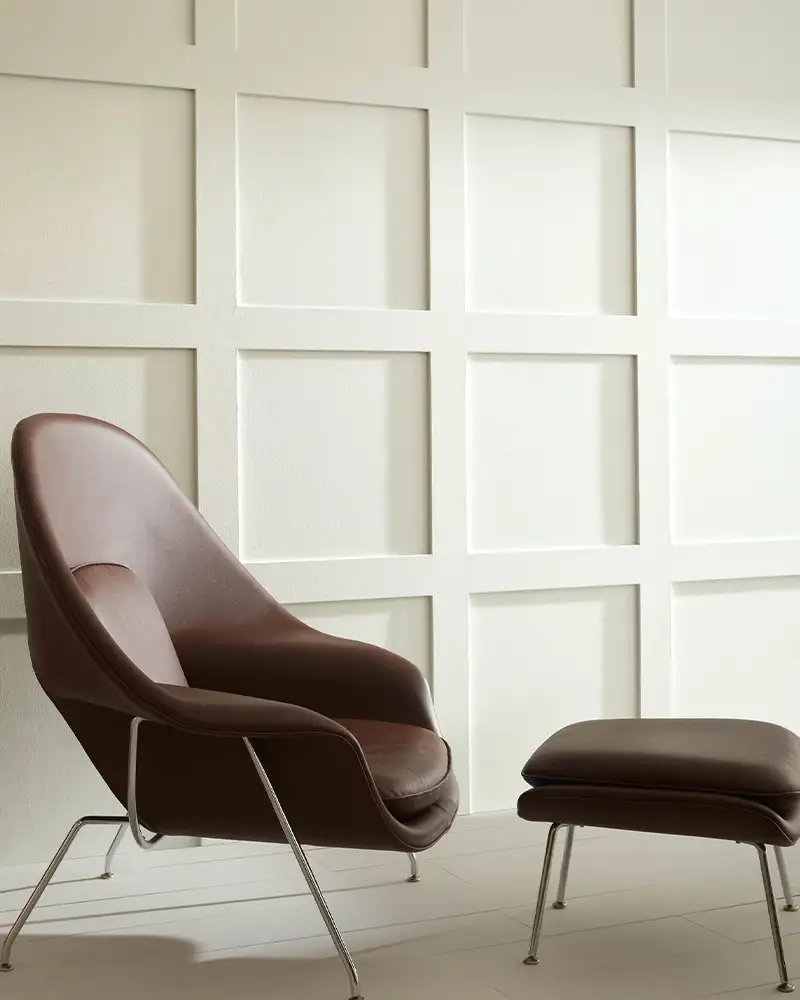
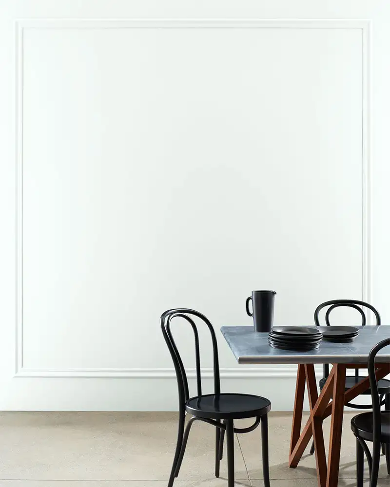
1. Chantilly Lace (2121-70)
If you’re looking for that clean, gallery-white kind of feel, Chantilly Lace is as crisp and bright as it gets.
With an LRV of 90, it’s one of Benjamin Moore’s brightest whites.
It doesn’t lean too warm or cool — it sits right in that sweet spot of neutrality, making it a favorite for minimalist spaces, trim, and modern walls.
But don’t mistake it for stark — in a well-lit space, it feels airy and pure, while in dimmer rooms, it holds onto its clarity without going dingy.
No sneaky undertones here, which is part of its charm.
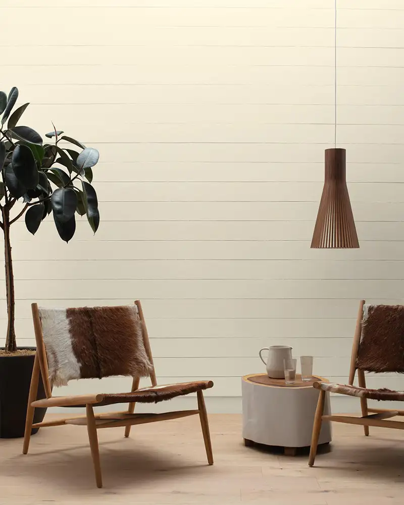
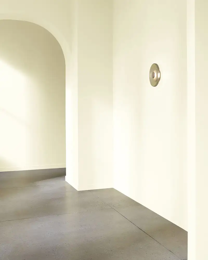
2. Simply White (2143-70)
There’s a reason Simply White was Benjamin Moore’s Color of the Year — it just works.
Its LRV sits at 89.5, making it a soft yet bright white. What makes it unique is the faint yellow undertone that peeks through, especially in natural light.
That warmth adds a welcoming glow without tipping too creamy.
On walls, Simply White feels fresh but never sterile — perfect for open-concept spaces or rooms that need a little warmth without losing that white-on-white aesthetic.
3. White Dove (OC-17)

White Dove has a timeless softness that feels elegant without trying too hard.
It has an LRV of 83.16, so it’s still light and airy, but not ultra-bright.
It leans warm, with subtle greige undertones that help it adapt to just about any environment.
On walls, it brings a soothing, creamy warmth that works beautifully in both traditional and modern settings.
It plays especially well with muted color palettes and cozy neutrals — it’s a go-to for a reason.
4. Pale Oak (OC-20)
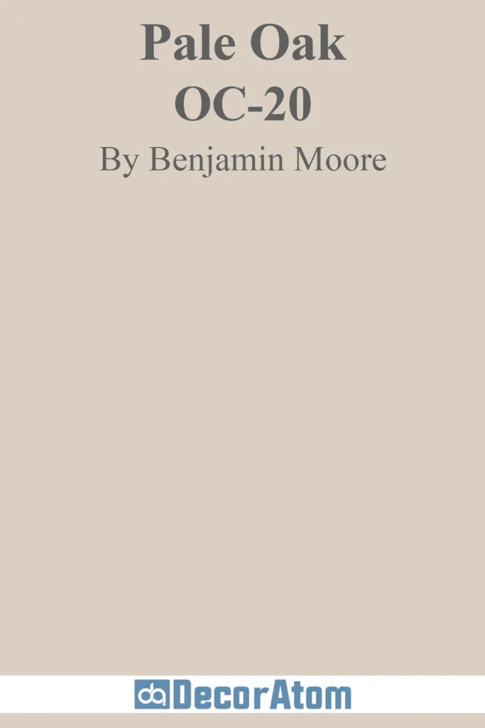
Pale Oak blurs the line between soft white and warm greige.
With an LRV of 68.64, it’s not a bright white, but it holds its own in natural light.
Its pink-purple undertones are subtle, but they can show up depending on your lighting — especially in cooler, shadowy spaces.
On walls, it reads soft, serene, and understated.
It’s a beautiful choice for someone who wants the warmth of a white without feeling too stark or too beige.
5. Gray Owl (2137-60)

Gray Owl is one of those modern classics that gives you just enough color without overwhelming the space.
Its LRV is 64.51, so it’s a bit deeper than the whites above, and more of a pale gray with soft green-blue undertones.
In bright light, it can lean cool, while in warmer light, it balances out nicely.
It’s a solid choice for walls if you want a hint of cool sophistication while still keeping things neutral and light.
6. Baby Fawn (OC-15)
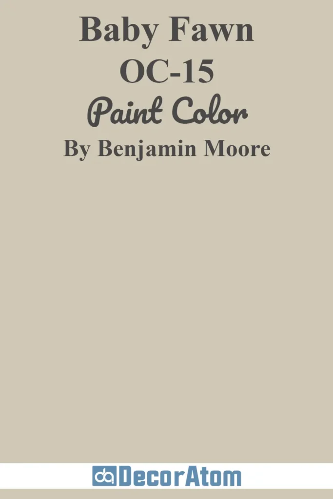
This shade walks the line between soft beige and warm greige, making it incredibly versatile for walls.
Its LRV is 63.09, so it’s more of a mid-toned off-white that still feels light in well-lit rooms.
It has taupe undertones that lend it a grounded, earthy quality.
Baby Fawn is one of those comforting, lived-in colors that makes a room feel cozy without going full-on tan or brown.
7. Cloud White (967)

Cloud White is one of those easy, go-anywhere whites. It has an LRV of 85, which gives it a nice brightness without being stark.
The soft yellow undertones warm it up just enough, making it feel inviting and homey.
On walls, Cloud White reads creamy and soft — not too cool, not too beige.
It’s a fantastic option if you want a white that feels a little warmer and more approachable than pure white.
8. Timid White (2148-60)
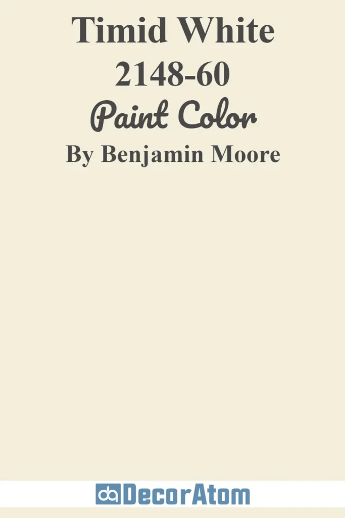
Despite its name, there’s nothing shy about Timid White — it’s just gracefully understated.
With an LRV of 82.45, it brings a soft glow to walls without feeling too bright.
Its undertones are a quiet blend of warm pink and beige, which gives it a barely-there warmth.
It works especially well in bedrooms or spaces where you want a gentle, soothing white that leans more romantic than clinical.
9. White Opulence (OC-69)
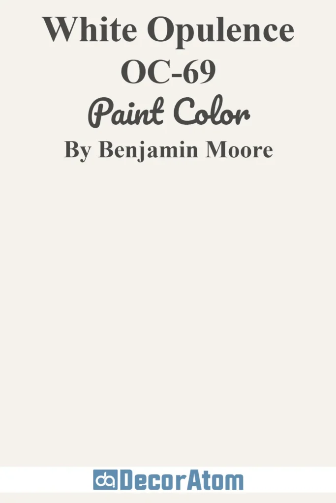
White Opulence is a soft white with the faintest hint of pink that can give a room a gentle elegance.
With an LRV of 87.67, it’s plenty light and fresh, but it doesn’t try to be a blank slate.
Those warm undertones give it character — it can read a touch blush in certain lights, especially in morning or evening sun.
It’s a beautiful choice for spaces where you want a subtle feminine or graceful touch without going full-on color.
10. Alabaster (OC-129)
Benjamin Moore’s Alabaster (not to be confused with Sherwin Williams’ version) leans creamy and cozy.
Its LRV is 85, keeping it nice and light, but the yellow-beige undertones warm it up considerably.
It’s a fantastic option for spaces that need a little softness — think dining rooms, bedrooms, or anywhere you want warmth without a strong color presence.
It’s rich without feeling heavy and inviting without veering too traditional.
11. Ivory Tusk (2153-70)
Ivory Tusk brings a delicate warmth to the walls — like a soft morning light caught on white linen.
With an LRV of 84.63, it’s in the brighter off-white range, but its creamy yellow undertones give it a subtle glow.
This color works beautifully in spaces that need a little uplift without going full white.
It’s especially nice in living rooms or bedrooms with warm-toned wood or soft neutral decor.
Think of it as a whisper of ivory — never overwhelming, always elegant.
12. Decorator’s White (CC-20)
Decorator’s White is a designer favorite for a reason.
It sits at an LRV of 82.68 and leans slightly cool, thanks to a hint of gray and a barely-there blue undertone.
It’s a perfect contrast to warmer whites on trim or cabinetry, but it also holds its own beautifully on walls in sleek, modern spaces.
If your home has cooler light or you lean into clean, monochromatic palettes, Decorator’s White gives you that crisp, tailored look without feeling icy.
13. Ivory White (925)
Ivory White is a classic soft white that brings a creamy, calm presence to any room.
Its LRV is 83.32, making it light and bright, but the warmth in its undertone keeps it from feeling too stark.
It has just enough beige-yellow to lend softness without veering into golden territory.
On walls, it feels gentle and grounded — lovely in traditional or transitional homes where you want a subtle nod to warmth.
14. Linen White (912)
This one has stood the test of time — Linen White is cozy, creamy, and full of character.
With an LRV of 80.94, it’s not the brightest white, but that’s part of its charm.
It leans distinctly warm, with rich yellow-beige undertones that give it a buttery softness.
Linen White works beautifully in older homes, country-style interiors, or any space where you want a lived-in, welcoming vibe.
On walls, it feels nostalgic and comforting without feeling dated.
15. Paradise Beach (911)
Paradise Beach is a bit of a hidden gem. It sits comfortably in the off-white range with an LRV around 84, giving it a soft, sandy glow.
There’s a creamy warmth in this shade that feels relaxed and casual, with just a kiss of peach or beige underneath depending on the light.
On walls, it adds a sunny, mellow backdrop that feels inviting and slightly coastal — like that perfect beach house neutral that pairs well with natural textures and soft pastels.
16. White Blush (904)
White Blush is one of those whites that surprises you — at first glance, it looks soft and subtle, but in certain lighting, a warm pink-peach undertone gently comes through.
Its LRV is 84.74, so it reflects a lot of light while still carrying that warmth.
It’s a lovely pick for bedrooms, nurseries, or any space where you want a romantic or serene vibe without going overtly rosy. Think of it as white with a flushed glow.
17. Powder Sand (2151-70)
As the name suggests, Powder Sand is soft, warm, and calming — like walking barefoot on a pale beach.
With an LRV of 86.55, it lands in the mid-to-bright off-white category, and it carries beige and taupe undertones that keep it feeling grounded.
It works especially well in spaces with a lot of natural light, where it can shift gently throughout the day.
It’s a great wall color for anyone who wants warmth, lightness, and a touch of earthiness all rolled into one.