
You know that feeling when you walk into someone’s hallway and it just… works? Like, it’s not trying too hard, but it’s also not boring? That’s usually because they figured out the magic of two-tone walls.
Hallways get forgotten a lot. We treat them like those in-between spaces that don’t really matter. Just slap on some beige paint and call it a day, right? But here’s the thing, your hallway is basically the first impression of your home. It connects every room. People see it every single time they walk through your house.
Two-tone walls are this sneaky way to add character without doing anything too crazy. You’re basically splitting the wall into two colors, and somehow it makes the whole space feel more intentional. More put-together. Sometimes it’s dramatic, sometimes it’s subtle. Depends on what you’re going for.
I’ve seen people stress about this for weeks, thinking they need to hire a designer or something. But honestly? It’s just paint. Two colors. A line somewhere in the middle. The hard part is picking which colors and where to split them, but once you see a few examples, it starts to click.
The best part is how flexible this whole idea is. You can go soft and neutral, or you can pick colors that make people stop and stare. You can use paneling, or just tape off a straight line. You can follow the “rules” or completely ignore them.
In this post, I’m sharing a bunch of real hallways that nailed the two-tone thing. Different styles, different vibes, different color combos. Some will speak to you, some won’t. That’s the point. You’ll see what’s possible, and hopefully something will make you think, “Yeah, I could do that.”

What Is a Two-Tone Wall?
It’s just splitting your wall into two different colors instead of painting the whole thing one shade. Usually there’s a horizontal line somewhere, maybe halfway up, maybe lower. You see it a lot with darker colors on the bottom and lighter ones on top, but you can flip that around if you want.
The idea is pretty simple. You’re creating visual interest by breaking up the wall. Sometimes people add paneling or molding to the bottom section, sometimes they just paint a clean line between the colors. Either way works.
It’s been around forever, honestly. Old houses did this all the time with wainscoting and wallpaper. Now we’re just doing it with paint and calling it intentional design. But it does make a space feel more thoughtful, like you actually planned how the room would look instead of just picking one color and moving on.
Where Should I Split the Two Colors on My Hallway Wall?
Most people put the split around 32 to 36 inches from the floor, which is basically chair rail height. But honestly, it depends on your ceiling height and what looks right to your eye. Lower splits make ceilings feel taller. Higher splits can make narrow hallways feel less cramped. There’s no perfect rule here.
I’ve seen people go as low as 24 inches, which gives you more of that dramatic upper color. And I’ve seen splits that go up to 48 inches or more, especially in hallways with really high ceilings. You want the proportions to feel balanced, not like you just randomly picked a spot.
One trick is to use painter’s tape and mock it up before you commit. Move it up and down the wall, step back, and see what feels right. Take a photo if that helps. Your hallway might have quirks, like a weird door frame or a window, that affect where the line should go. Trust your gut on this one.
Can Two-Tone Walls Make a Narrow Hallway Look Bigger?
Yeah, they can. If you go lighter on top and darker on the bottom, it draws the eye upward and makes the space feel taller. Keeping the top half light and bright also reflects more light, which helps. Just avoid going too dark on both halves in a really narrow space, or it might feel like a tunnel.
The darker bottom section also has this grounding effect. It anchors the space without making the whole hallway feel closed in. And if you add white or light-colored paneling on the bottom, that can actually make the walls feel like they’re receding a bit, which tricks your brain into thinking there’s more space.
Another thing, vertical lines can make a hallway feel narrower, so stick with that horizontal split. It widens things visually. And if your hallway is really tight, maybe skip super bold colors on top and stick with soft neutrals or pastels. You want to open it up, not box it in. Light colors reflect, dark colors absorb. Just something to keep in mind when you’re planning your palette.
17 Stylish Two-Tone Wall Ideas for Hallways
Soft Gray and White

The panel molding on the bottom half is what really sells this look. You get that crisp white wainscoting doing all the heavy lifting while the soft gray floats above it. Those botanical prints feel right at home with this color combo, like the walls were made for them. It’s one of those setups that works in old houses and new builds without trying too hard.
Slate Blue and White

This hallway uses board and batten paneling to break things up, and honestly, it’s a smart move. The slate blue on top feels calm without being boring. White paneling below keeps everything bright. That crystal chandelier and the gallery wall make it feel a bit fancy, but not in a stuffy way.
Taupe and White
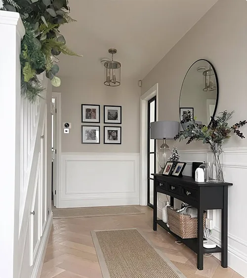
Here’s a neutral take that doesn’t put you to sleep. The taupe up top is warm but not loud, and the white paneling grounds it. I like how the black console table and that big mirror add some contrast. It’s clean, simple, and you could pair it with pretty much any decor style you’re into.
Blush Pink and White
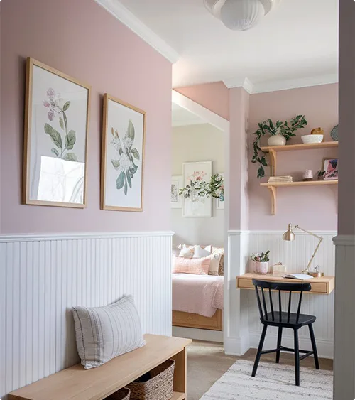
If you want something softer, this blush and white combo delivers. The pink is just enough to feel cozy without screaming “baby nursery.” White beadboard below keeps things light and adds texture. Those floating shelves and botanical prints tie it all together. It’s sweet but still grown-up.
Sage Green and Cream

That Sage Green paired with Cream paneling is giving me all the calm vibes. The color sits somewhere between earthy and elegant, which is a hard balance to hit. A cream chair and simple side table keep the look unfussy. Sometimes you just need a hallway that doesn’t fight for attention, you know?
Mustard Yellow and White
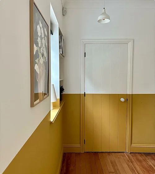
Mustard yellow isn’t for everyone, but when it works, it really works. Here it’s on the bottom half with white up top, which is kind of the reverse of what you usually see. It’s bold without being obnoxious. The wood floors warm it up even more, and that little shelf for keys or mail is just practical.
Sage Green and White

Another sage moment, but this time with flat panels on the lower half instead of molding. The soft green feels fresh and natural, especially with that plant in the corner. White on top keeps things airy. It’s one of those color combos that makes a hallway feel bigger than it actually is.
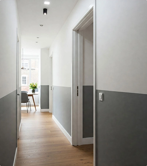
Charcoal and Beige

This is for people who like things a bit moodier. Charcoal on the bottom, beige on top, it’s subtle but interesting. The wood floors and that simple bench keep it grounded. Not every hallway needs to be bright and cheerful, and this proves it.
Terracotta and Cream

This one’s got personality. A deep terracotta on the bottom with Cream up top creates this really warm, inviting vibe. The Cream paneling keeps it from feeling too intense. That art and the little wooden bench add character. It’s the kind of hallway that makes you want to slow down instead of just rushing through.
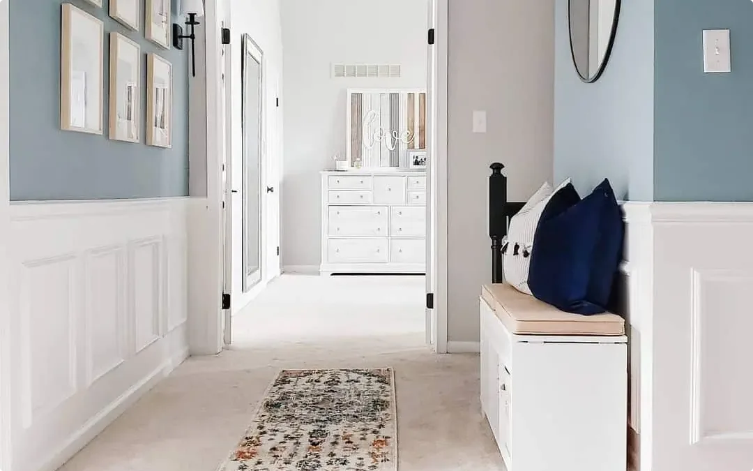
Navy Blue and White

Navy and white is a classic for a reason. The deep blue walls feel dramatic, and the white wainscoting balances it out. That bold zebra print on a neon yellow background? Chef’s kiss. It’s proof that you can go dark in a hallway and still keep it interesting.
Peach and Soft Blue

This is playful without being childish. Peach ceiling, blue walls, it’s a combo you don’t see every day. The paneling adds structure, and that quirky chandelier ties the whole thing together. If you’re tired of neutrals, this is your sign to try something different.
Peach and Navy

Soft peach up top, Navy paneling below, it’s got that vintage-meets-modern thing going on. The herringbone floor is gorgeous, and those deep Navy panels feel rich without being heavy. It’s a softer take on two-tone walls that still has plenty of personality.
Coral and Green

Coral walls and sage green paneling? Unexpected, but it works. The colors are bold enough to stand out but still feel balanced together. The herringbone floor and that elegant chandelier make it feel a bit formal, but in a good way. It’s like the hallway is dressed up for dinner every day.
White and Dark Gray
Sometimes simple is best. White up top, Dark Gray on the bottom—clean, modern, and super easy to live with. The wood floor adds warmth so it doesn’t feel cold or sterile. It’s one of those looks that won’t go out of style in five years, which is honestly refreshing.
Mauve and White
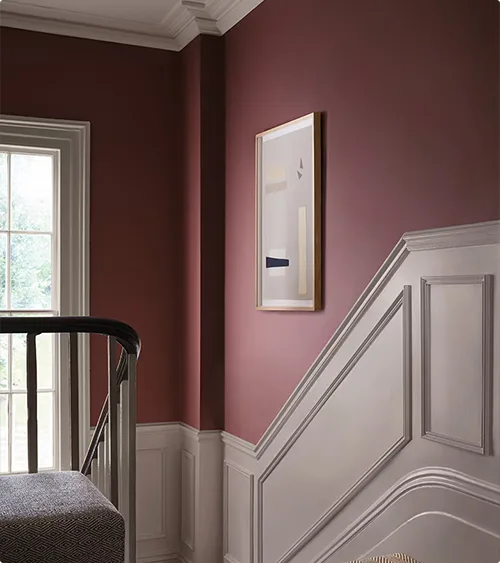
This mauve shade is deeper than you’d expect, almost dusty rose but richer. The white paneling below lightens it up. It’s got that slightly moody, slightly romantic vibe. The staircase railing and that mirror keep it from feeling too heavy or dated.
Green and Beige

Forest green paneling with beige textured wallpaper, it’s got layers, literally. Those hanging flower baskets are such a fun touch. The green feels grounded and natural, and the beige keeps it from getting too dark. It’s cozy in a way that makes you want to linger.
Terracotta and White
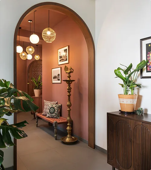
That arched doorway framing the terracotta nook is doing all the work here. White walls in the main space let the terracotta shine. The mix of hanging lights and plants gives it that warm, bohemian feel. It’s proof that two-tone walls don’t always have to be side-by-side, sometimes depth works better.
FAQs About Two-Toned Wall Ideas for Hallways
Is this trend going to look dated in a few years?
Two-tone walls have been around forever, so I wouldn’t call it a “trend” exactly. The color choices might change over time, but the concept itself is pretty timeless. Stick with colors you actually love instead of whatever’s trendy right now, and you’ll be fine. Worst case, it’s just paint, you can always change it later.
How do I get a clean line between the two colors?
Good painter’s tape is your best friend here. Use the blue or green stuff, not the cheap tan tape. Press it down really well along the edge so paint doesn’t seep under. Here’s a trick—after you tape, paint along the tape line with the base color first. Let it dry, then paint your top color over it. Any bleed-through will be the same color as what’s already there, so your line stays sharp. Peel the tape off while the paint is still slightly wet, not bone dry.
Should the darker color go on top or bottom?
Most people put the darker color on the bottom, and there’s a reason for that. It feels grounded and hides scuffs better, especially in a hallway where stuff gets bumped around. Lighter on top keeps things feeling open and bright. But rules are meant to be broken. I’ve seen darker colors on top that look incredible, especially in hallways with a lot of natural light. Just think about your space and do what makes you happy when you walk through that hallway every day.
Can I do two-tone walls in a hallway with lots of doors?
Yeah, you totally can. It just takes a bit more planning. You’ll need to decide if you’re going to paint the door frames or keep them separate from the two-tone treatment. Some people wrap the color around the door frames, which looks really cohesive. Others paint the frames white or a neutral color to break things up. The tricky part is keeping your line level across all those interruptions. Use a level and measure from the floor at multiple points. It’ll be tedious, but worth it.
Do I need to use paneling or molding for two-tone walls?
Nope, not at all. Paneling looks great and adds texture, but you can absolutely just paint two colors with a clean line between them. Some people use a thin piece of trim to cover the seam, which makes it look more finished. But if you’re going for a modern, minimal vibe, skip the molding entirely.