
You know when you see a house and it just feels right? Like it has this quiet confidence, a gentle vibe that makes you want to sit on the porch and stay awhile?
That’s exactly what happens when a home is dressed in soft pastel colors. These aren’t your flashy, in-your-face hues—they’re the kind of shades that whisper elegance and warmth without trying too hard.
I’ve always been drawn to pastels for exteriors because they bring this perfect mix of fresh and timeless, playful but calm.
Whether you’re dreaming of a beachy retreat or just want to add a little personality to your street, these 19 pastel colors will show you just how much subtlety can pack a punch.
Let’s dive into my favorite shades that have me rethinking what a pastel house can really look like.
Also Read: 29 Trending Exterior House Colors You’ll Love
Why You Will Love A Pastel Painted House
Pastel-painted homes have a way of instantly lifting your mood and brightening up the neighborhood.
One of the biggest reasons to love pastels is their versatility—they can work beautifully on a variety of architectural styles, from quaint cottages to sleek modern designs.
Pastels also have a softness that welcomes you in, making your home feel cozy and approachable without being too loud or flashy. Plus, these colors reflect light wonderfully, which can make your house appear larger and more open.
If you’re worried about trends, pastel exteriors have a classic charm that rarely goes out of style.
Finally, pastel shades pair so well with natural materials like wood and stone, giving you endless options to personalize your home’s look.
Most Popular Trim Paint Color For A Pastel Painted House
When it comes to trim colors that complement pastel exteriors, crisp white often reigns supreme.
White trim adds a clean, fresh frame to pastel walls and enhances their soft, airy feel. It provides a subtle contrast without overpowering the gentle hues and helps define architectural details like window casings, doors, and moldings.
For a slightly warmer look, off-white or cream trims can create a seamless, elegant transition that feels inviting and classic.
On the other hand, some homeowners prefer to go bold with darker trims—like charcoal gray or navy—to add depth and a modern twist.
Ultimately, the choice depends on your home’s style and personal taste, but white and off-white trims remain timeless favorites for pastel-painted houses.
Top Pastel Paint Colors For A Home Exterior
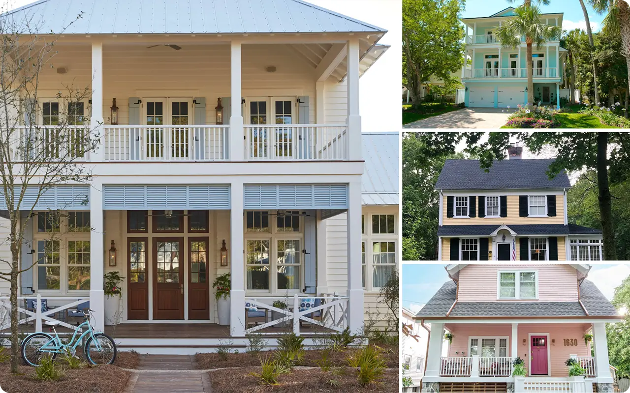
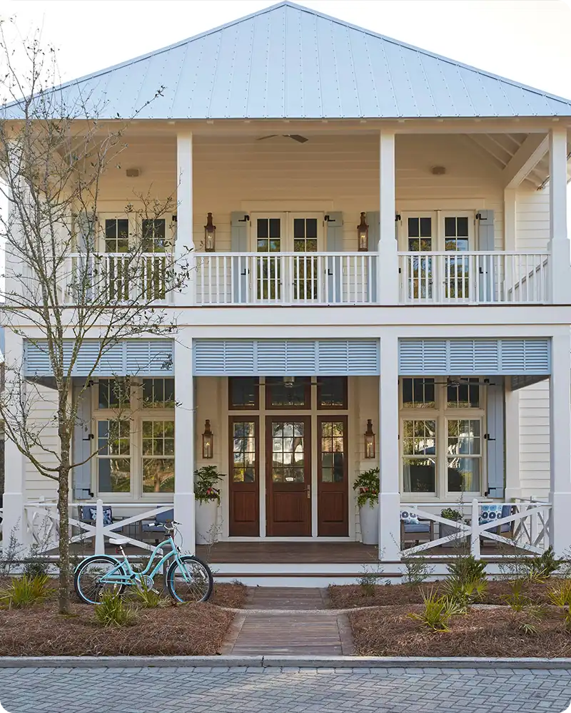
Here are the top 19 soft pastel house exterior colors to inspire your next painting project. These colors are soft enough to feel subtle but vibrant enough to make a statement.
1. Blush Pink
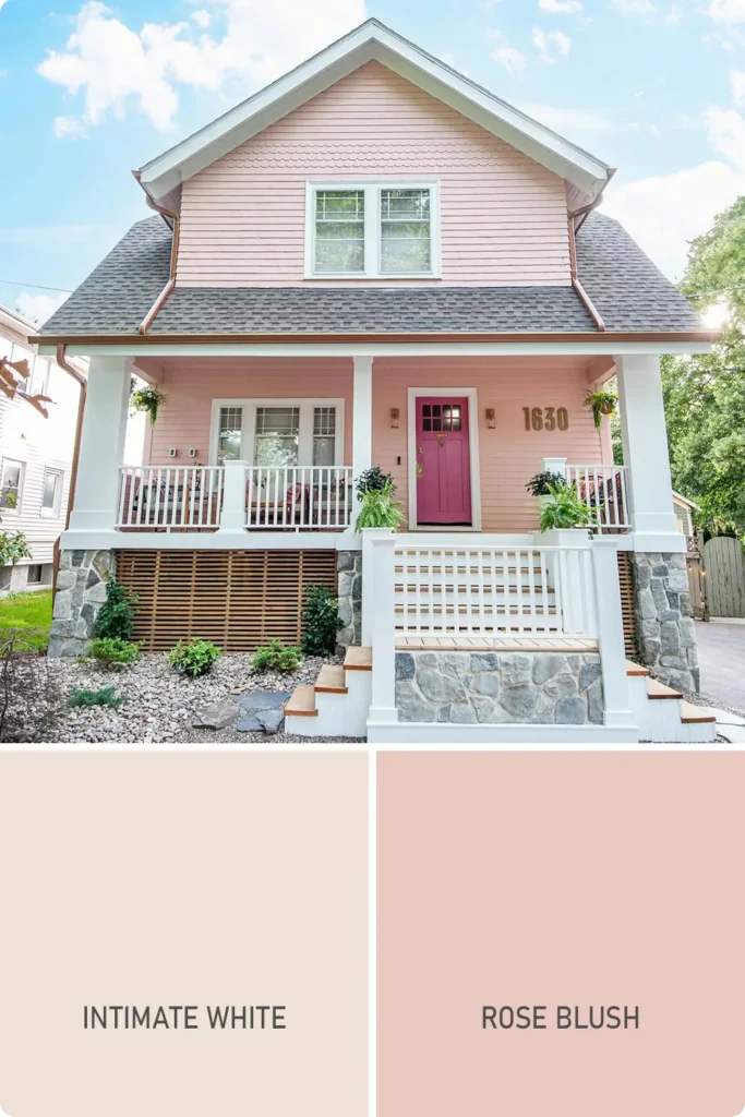
Blush pink isn’t just for interiors—it’s an unexpectedly elegant choice for the outside of a home, too. This soft, romantic shade adds instant charm without being overly sugary.
On the exterior, it reads more neutral than you might expect, especially when paired with white trim, natural wood accents, or copper hardware.
I love how it works on both small cottages and modern townhomes—it’s gentle but never boring. Think Parisian elegance meets warm Southern hospitality.
Shades to consider:
- Sherwin-Williams Intimate White
- Benjamin Moore Rose Blush
2. Powder Blue
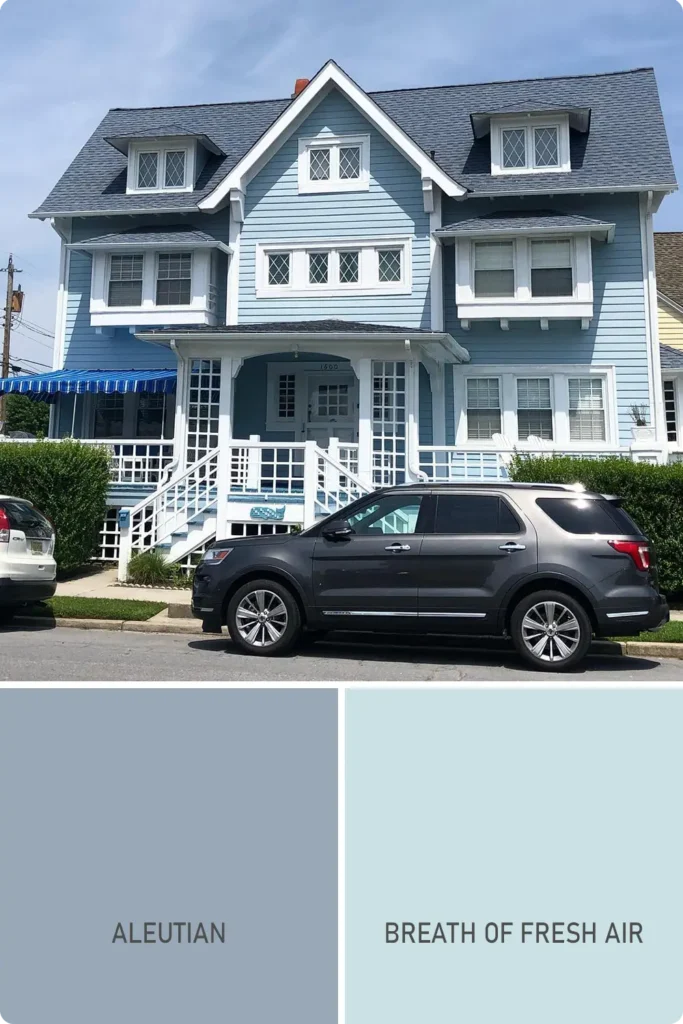
Powder blue is that delicate, airy blue that feels like a deep breath on a spring morning. It brings a sense of peace and calm, making your home look instantly approachable.
I’ve seen it work beautifully on traditional colonial homes as well as beachy bungalows.
It’s especially striking with white or soft gray trim, and if you want a playful contrast, a bright yellow or coral front door really pops against this serene shade.
Shades to consider:
- Sherwin-Williams Aleutian
- Benjamin Moore Breath of Fresh Air
3. Seafoam Green
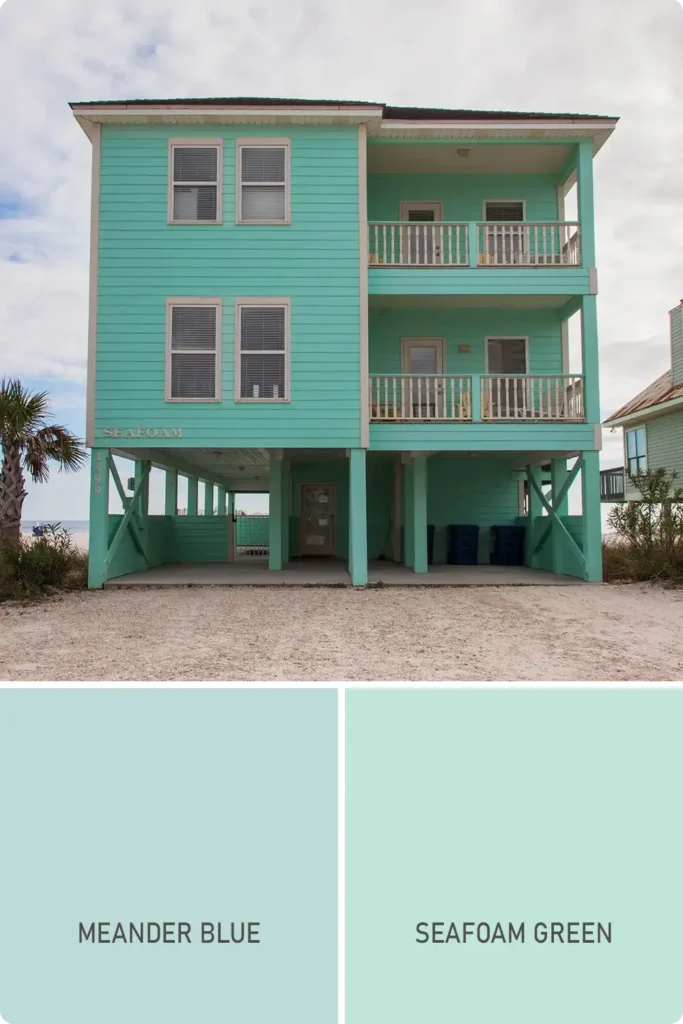
There’s something inherently fresh about seafoam green. It’s like the color of a soft ocean breeze—cool, light, and just a little whimsical.
This pastel tone pairs beautifully with coastal landscapes, but I’ve also seen it used on landlocked cottages to bring a little of that laid-back beachy spirit inland.
Pair it with crisp white trim or warm wood tones for a natural balance. It also plays well with darker shutters or metal roofing for a bit more contrast.
Shades to consider:
- Sherwin-Williams Meander Blue
- Benjamin Moore Seafoam Green
Also Read: 21 Best Green Exterior Paint Colors
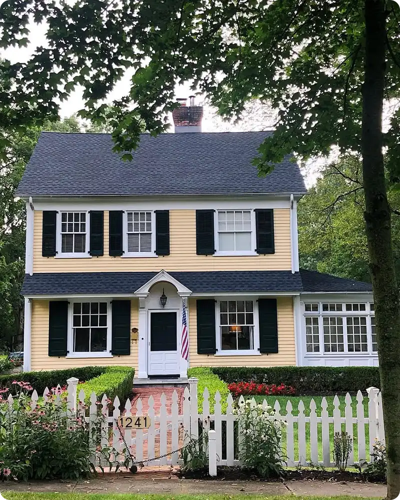
4. Pale Yellow
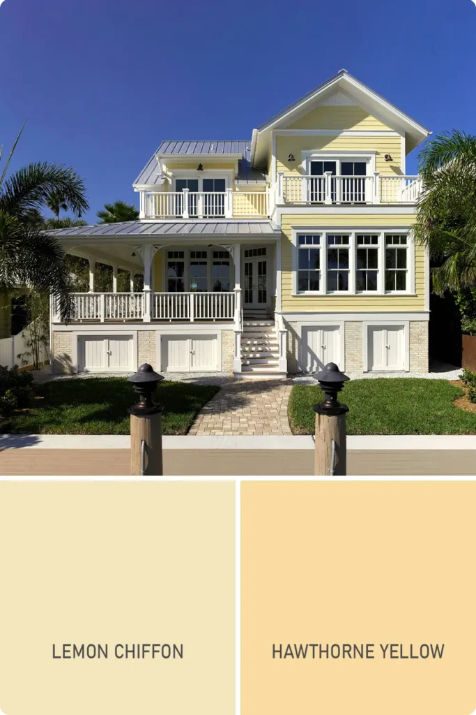
If you want your home to radiate warmth and welcome without going full-on bold, pale yellow is a classic.
It has this sunwashed softness that makes it feel cheerful but refined. I especially love how it looks in older neighborhoods—there’s something timeless about a pale yellow home with black shutters or a navy door.
It’s one of those shades that makes your house feel like the friendly one on the block, and it works year-round.
Shades to consider:
- Sherwin-Williams Lemon Chiffon
- Benjamin Moore Hawthorne Yellow
5. Lavender Gray
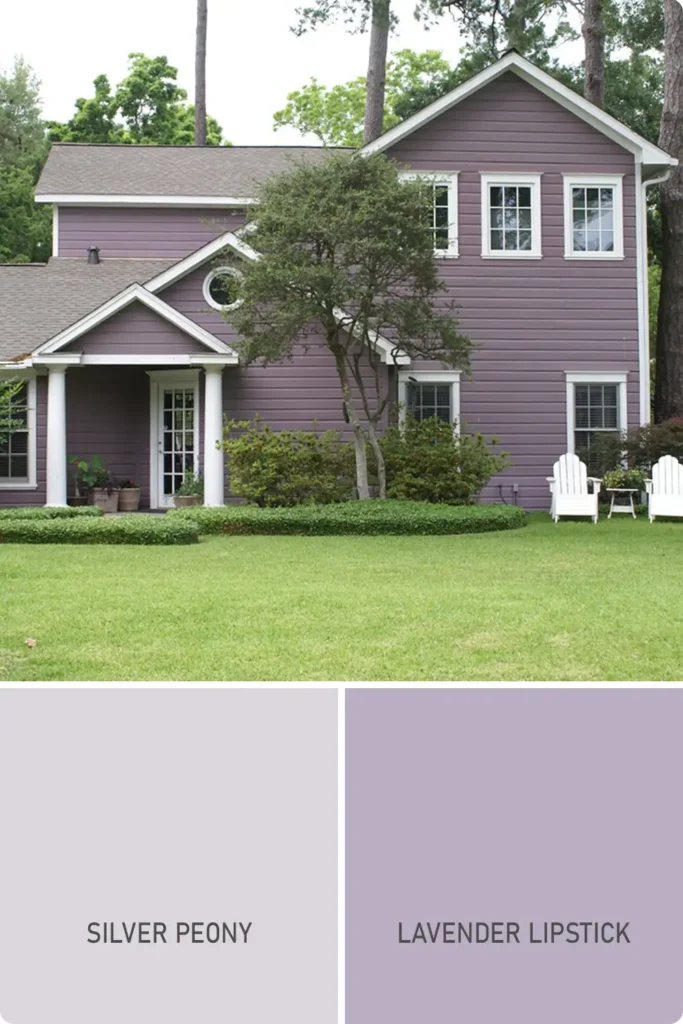
Lavender gray is where moody meets mellow. It’s a subtle fusion of dusty purple and soft gray that reads sophisticated and serene.
If you’re looking for a pastel tone that still feels grounded and grown-up, this is a great option. It adds a layer of interest without screaming for attention.
I’ve seen it work beautifully with slate or charcoal trim, and even a plum-colored front door can elevate the whole look.
Shades to consider:
- Sherwin-Williams Silver Peony
- Benjamin Moore Lavender Lipstick
6. Peach
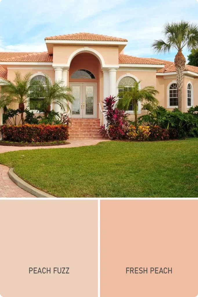
Peach is often underrated, but when done right, it creates a glow that’s both inviting and unique.
It has this gentle warmth that’s more mature than pink but softer than orange.
On stucco homes, it almost looks sun-kissed, and when paired with teal, white, or brass accents, it takes on a stylish, slightly Mediterranean feel.
If you want something cheerful but sophisticated, peach is a color worth considering.
Shades to consider:
- Sherwin-Williams Peach Fuzz
- Benjamin Moore Fresh Peach
7. Mint Green
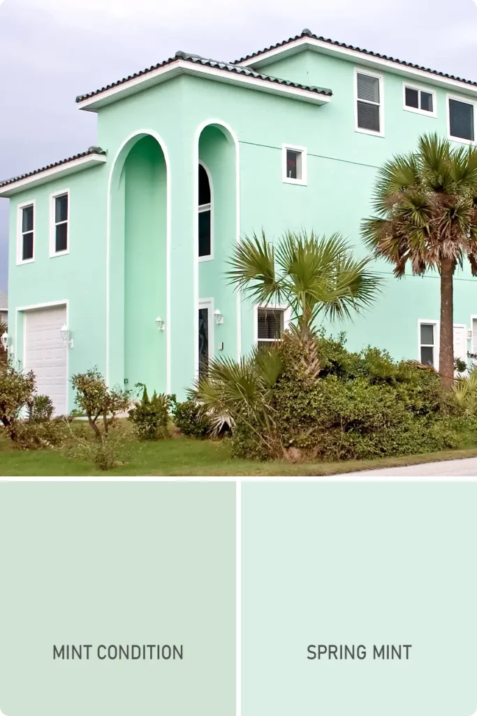
Mint green feels like springtime in a color. It has this refreshing, retro charm—almost like a vintage kitchen appliance, but in the best possible way.
When used on an exterior, it can soften sharp architectural lines and make even a boxy home feel approachable.
I especially love mint paired with creamy whites or even soft gold hardware for a touch of glam. It’s light, it’s lively, and it’s a real mood-lifter.
Shades to consider:
- Sherwin-Williams Mint Condition
- Benjamin Moore Spring Mint
Also Read: 13 Best Mint Green Paint Colors
8. Dusty Rose
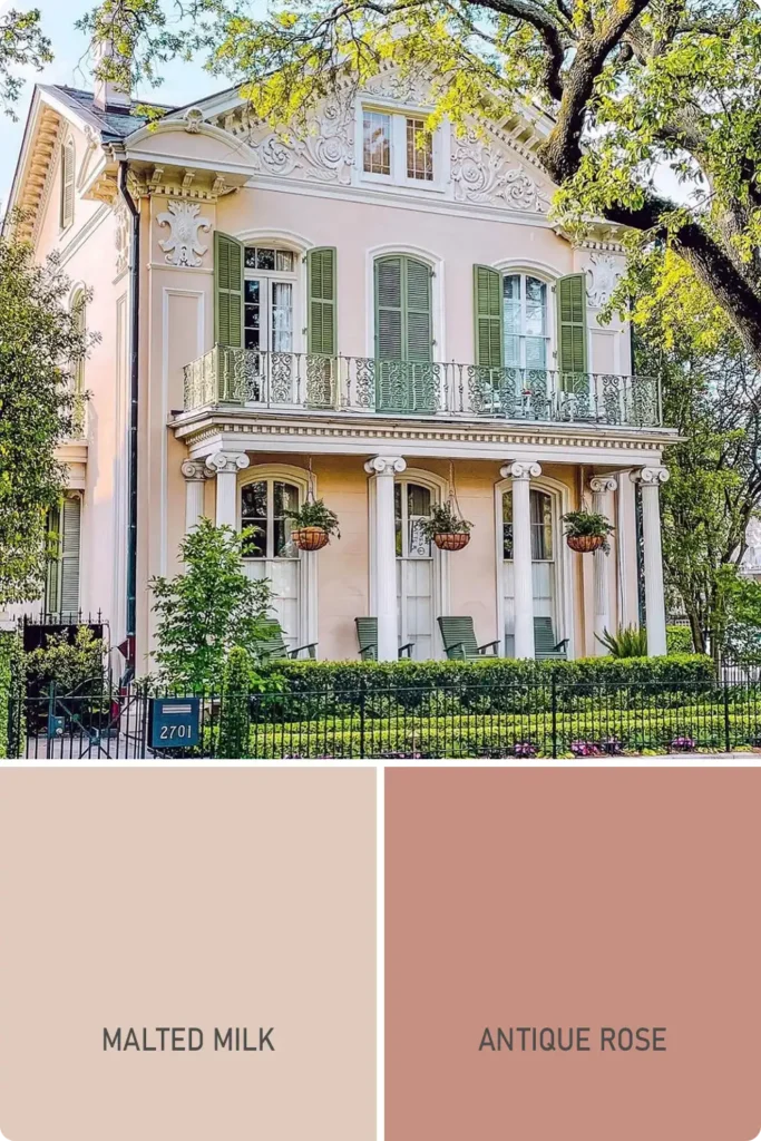
Dusty rose walks the line between neutral and color—it’s pink with the saturation dialed down just enough to feel earthy and grown-up.
It brings a certain romantic depth to a home without being too bright or bubblegum.
On exteriors, it looks amazing with soft browns, warm whites, or even black accents if you want a little contrast. It’s cozy, welcoming, and just unexpected enough to stand out.
Shades to consider:
- Sherwin-Williams Malted Milk
- Benjamin Moore Antique Rose
9. Sky Blue
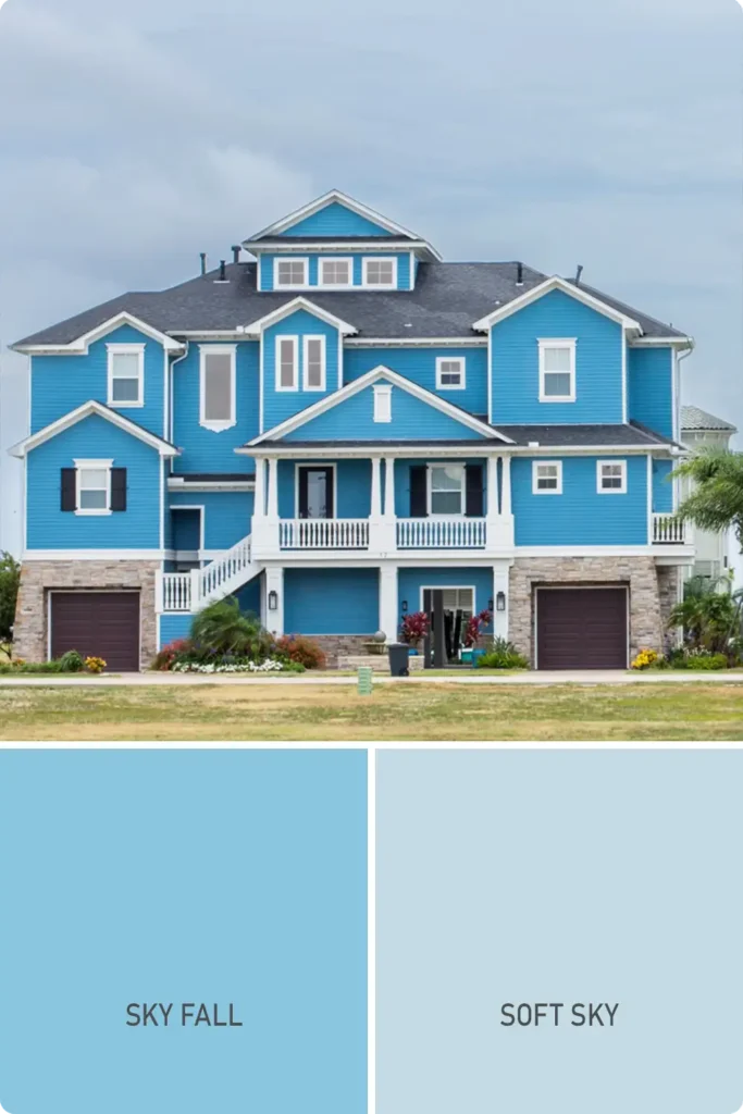
Sky blue is what I’d call the true classic of pastel exteriors. It’s timeless, clean, and works in almost any region or architectural style.
Whether you’re renovating a beach cottage or sprucing up a mid-century ranch, sky blue makes the whole place feel brighter and more relaxed.
It pairs perfectly with bright white trim, but don’t be afraid to throw in a colorful front door—sunflower yellow, coral, or even navy can be fun accents.
Shades to consider:
- Sherwin-Williams Sky Fall
- Benjamin Moore Soft Sky
10. Coral Blush
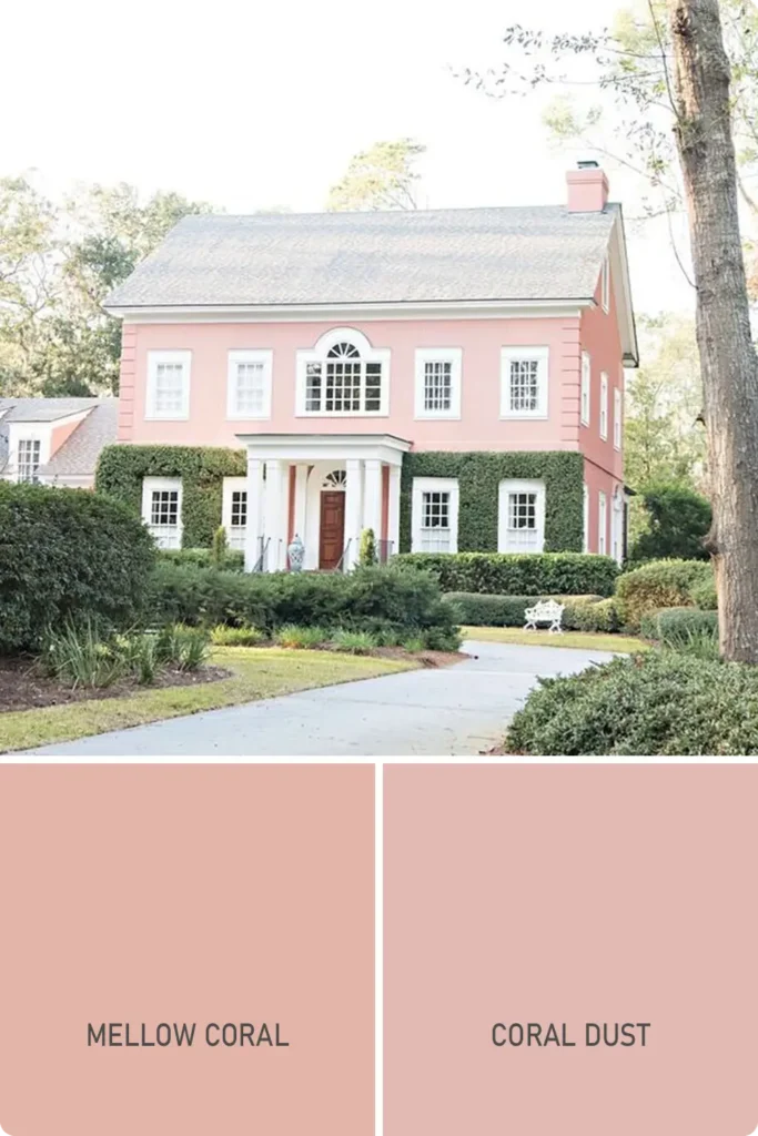
Coral blush is warm, radiant, and full of personality. It’s not quite pink, not quite orange—somewhere in between, and all the better for it.
This shade feels joyful and modern, especially when paired with crisp white details or sandy beige trim.
I’ve seen coral blush on both small beach homes and modern stucco builds, and in each case, it brings a burst of energy without overpowering the rest of the design.
Shades to consider:
- Sherwin-Williams Mellow Coral
- Benjamin Moore Coral Dust
11. Pistachio Green
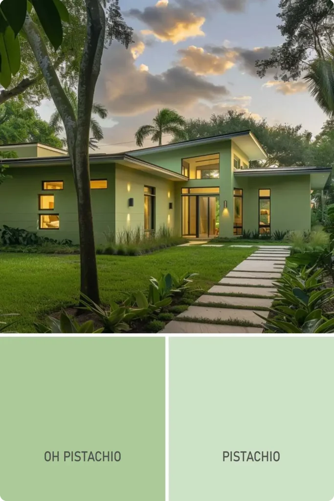
Pistachio green is playful and full of vintage character.
It has a nostalgic charm—think old-school ice cream parlors or retro kitchen vibes—but somehow feels fresh and modern when used on a home’s exterior.
It works beautifully with cream or off-white trim, and adding bronze fixtures or dark green shutters gives it a more grounded feel.
It’s a pastel, yes, but one with a personality that doesn’t get lost in the background.
Shades to consider:
- Sherwin-Williams Oh Pistachio
- Benjamin Moore Pistachio
12. Baby Blue
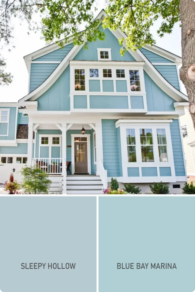
Baby blue is as gentle as it sounds, but don’t mistake it for boring. It’s a soft, classic shade that reflects natural light beautifully and gives your home a clean, breezy appearance.
What I love about baby blue is how versatile it is—it suits both traditional architecture and more contemporary designs.
Pair it with bright white, dove gray, or even a bold navy door to give it structure and dimension.
Shades to consider:
- Sherwin-Williams Sleepy Hollow
- Benjamin Moore Blue Bay Marina
13. Soft Teal
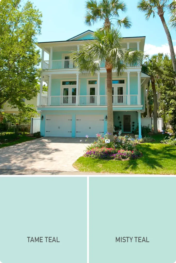
Soft teal blends the calming nature of blue with the earthy richness of green, resulting in a color that’s tranquil yet grounded.
It’s perfect if you want a pastel that feels cool without being cold. On exteriors, this color adds depth while still maintaining a sense of softness.
White or ivory trim keeps it fresh, but I’ve also seen it paired with terracotta roof tiles and warm woods for a more Mediterranean feel.
Shades to consider:
- Sherwin-Williams Tame Teal
- Benjamin Moore Misty Teal
14. Apricot

Apricot has a golden warmth that sits somewhere between peach and beige—it’s subtle, inviting, and looks especially beautiful in late afternoon sunlight.
This color works well in both dry climates and coastal settings, and it tends to age gracefully, never feeling dated.
Add white shutters, a light sage door, or terracotta accents to really make it pop. It’s a quiet standout that feels welcoming without being flashy.
Shades to consider:
- Sherwin-Williams Avid Apricot
- Benjamin Moore Peach Parfait
15. Buttercream
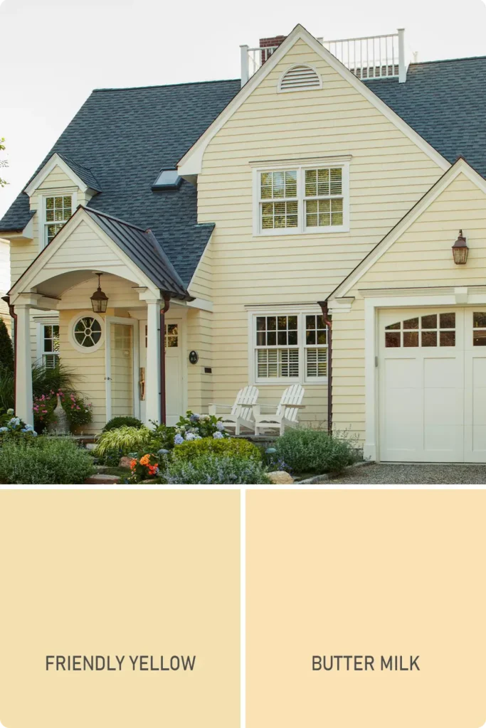
Buttercream is the coziest of the yellows. Unlike pale lemon, this shade leans more toward ivory with a warm, creamy undertone.
It works like a neutral but adds a soft glow that gives your exterior a sunny, timeless charm.
This color pairs beautifully with black window frames, olive green doors, or warm gray trim. It’s understated but radiant—the kind of color that always feels like home.
Shades to consider:
- Sherwin-Williams Friendly Yellow
- Benjamin Moore Butter Milk
16. Soft Sage Green
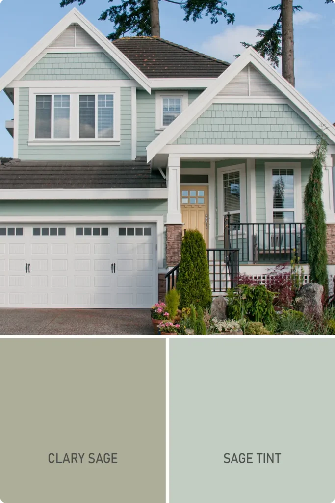
Soft sage green is calm, earthy, and endlessly versatile.
It’s one of those pastels that feels rooted in nature—making it ideal for homes surrounded by trees, gardens, or mountains.
It blends in without disappearing and gives off a serene, modern-cottage aesthetic. Pair it with matte black fixtures, white trim, or even light wood doors for a mix of softness and sophistication.
Shades to consider:
- Sherwin-Williams Clary Sage
- Benjamin Moore Sage Tint
Also Read: 23 Best Light Sage Green Paint Colors
17. Faded Aqua
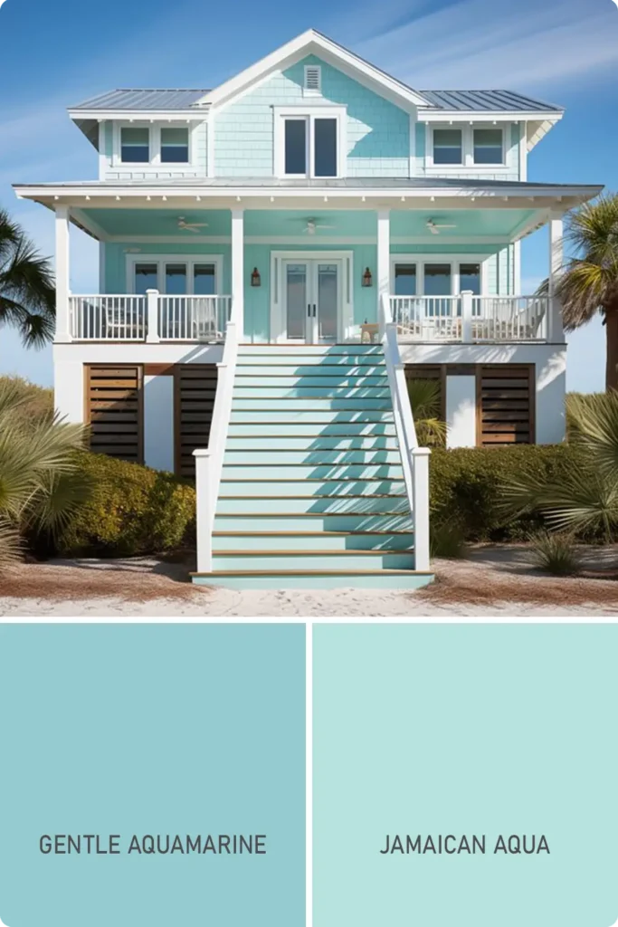
Faded aqua brings a lived-in, coastal feel that’s hard to resist.
It has a slight vintage patina to it—like the paint has been gently sunwashed over time. This pastel works especially well on beach houses, craftsman homes, or any exterior where you want a relaxed and breezy vibe.
I love how it looks with driftwood tones, sandy beige, or soft charcoal gray details. It’s ocean-inspired but not overly themed.
Shades to consider:
- Sherwin-Williams Gentle Aquamarine
- Benjamin Moore Jamaican Aqua
18. Icy Lilac
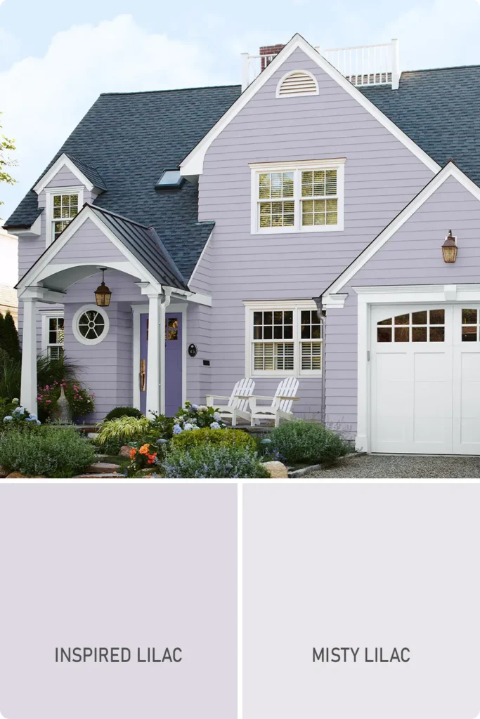
Icy lilac is delicate, cool, and just a touch whimsical. It’s not a color you see every day on home exteriors, which makes it all the more charming when done right.
With the right lighting, it shifts between pale lavender and soft gray—creating an ethereal glow.
This color is especially pretty with silvery trim, marble steps, or soft blue-gray shutters. It gives your home a graceful, fairy-tale appeal without feeling too precious.
Shades to consider:
- Sherwin-Williams Inspired Lilac
- Benjamin Moore Misty Lilac
19. Cool Pink
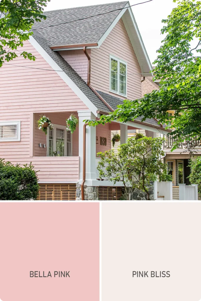
Cool pink is sleek and modern—it’s not as warm as blush, but it brings just enough color to catch the eye in a sophisticated way.
I’ve seen this work really well on contemporary homes with clean lines, paired with white brick, concrete, or matte black fixtures.
It also looks amazing as a pop of color in an otherwise minimalist palette. This pastel pink feels bold and confident, without ever shouting for attention.
Shades to consider:
- Sherwin-Williams Bella Pink
- Benjamin Moore Pink Bliss
Also Read: 25 Best Benjamin Moore Exterior Paint Colors