

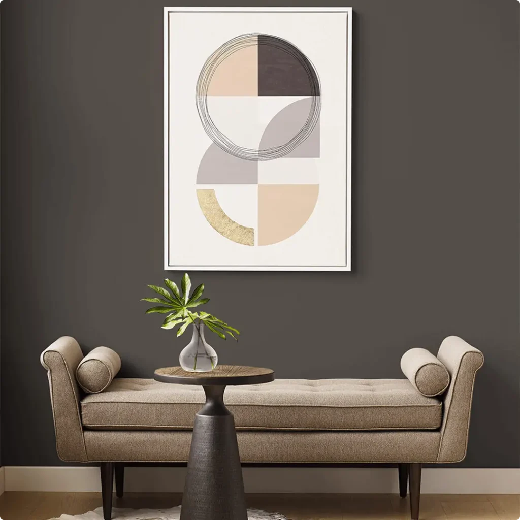
I’ve always had a soft spot for paint colors that make a bold, grounded statement without screaming for attention, and Sherwin-Williams Urbane Bronze SW 7048 does exactly that.
It’s rich, calm, and feels like that quiet confidence you wish every room could have. When I first saw it used on an accent wall, I knew I had to dig deeper and see what made this color so unique.
So if you’re thinking about using Urbane Bronze in your home, or just curious if it might be the right shade for your space, you’re in the right place.
In this post, I’ll walk you through everything I’ve learned about it, from how it looks in different lighting to the best trim colors to pair it with.
What Color is Sherwin Williams Urbane Bronze?
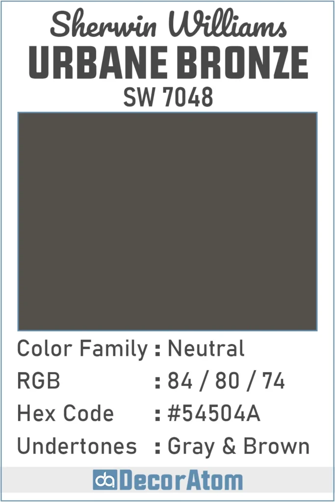
Let’s keep it simple: Urbane Bronze is a deep, earthy charcoal color with strong hints of brown and gray.
It’s not quite black, and definitely not flat or dull. To me, it feels like a mix of weathered wood and stone, natural, grounded, and slightly mysterious.
It doesn’t jump out right away like a vibrant color would, but the longer you look at it, the more depth and richness you notice. That’s what I love about it.
It’s the kind of color that adds instant sophistication without being flashy.
Is It a Warm Or Cool Color?
Urbane Bronze leans warm. Even though it has some gray in it, the strong brown undertones keep it from feeling cold or stark.
When I used it in a space with warm wood floors and soft lighting, it felt cozy and inviting, like a comforting cocoon.
In cooler settings, like with natural daylight or crisp white trim, it still holds onto its warmth but becomes a bit more moody and dramatic.
So yes, it’s a warm color, but with enough depth to play well in a variety of settings.
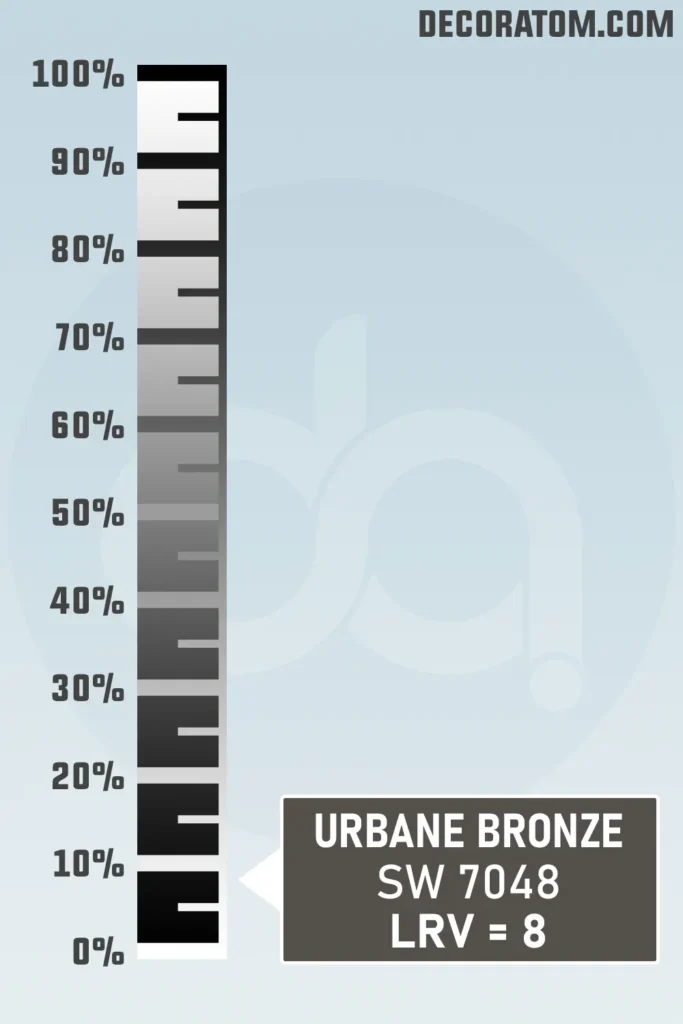
LRV of Sherwin Williams Urbane Bronze
💥🎁 Christmas & Year-End Deals On Amazon !
Don't miss out on the best discounts and top-rated products available right now!
*As an Amazon Associate, I earn from qualifying purchases.
If you’re new to paint color lingo, let me break this down quickly. LRV stands for Light Reflectance Value. It’s a number that tells us how much light a color reflects.
On a scale of 0 to 100, the higher the number, the lighter the color. White would be close to 100, while black would be near 0.
Urbane Bronze has an LRV of 8, which means it’s a very dark color. It doesn’t reflect much light at all, so it will naturally make a room feel more intimate and grounded.
It’s something to keep in mind if you’re planning to use it in a space without much natural light, it can feel even darker in those areas. But in the right spot, it adds incredible depth and richness.
Color Family
Urbane Bronze falls under the neutral color family. But let me clarify, neutral doesn’t mean boring. In fact, neutrals like Urbane Bronze are some of the most versatile and beautiful colors to work with. Because it blends gray and brown so seamlessly, it becomes a strong, earthy anchor in any color palette.
RGB Colors
When you’re digging into the technical side of paint colors, RGB values are pretty helpful. RGB stands for Red, Green, and Blue, the three colors of light that mix together to create every color you see on a screen. For Sherwin-Williams Urbane Bronze, the RGB values are 84 / 80 / 74.
Hex Value
If you’re working with digital design tools, or just curious how Urbane Bronze shows up on screens, you’ll want to know its hex value. For Urbane Bronze, it’s #54504A.
💥🎁 Christmas & Year-End Deals On Amazon !
Don't miss out on the best discounts and top-rated products available right now!
*As an Amazon Associate, I earn from qualifying purchases.
Undertones of Sherwin Williams Urbane Bronze
Now, let’s talk undertones, because they’re what can make or break how a color looks in your space.
Urbane Bronze has a beautiful blend of gray and brown undertones. And I’ll be honest, this combo is exactly what gives the color its richness.
The brown brings in that earthy, organic warmth. It feels like soil, wood, and other grounded elements from nature.
Meanwhile, the gray adds a smoky, modern vibe, toning down the brown just enough to make Urbane Bronze feel sophisticated rather than rustic.
Depending on what’s around it, furniture, trim, lighting, you might see the brown stand out more, or the gray might take the lead. But they’re always working together quietly in the background, creating a complex, elegant depth.
How Different Types of Lighting Affect Sherwin Williams Urbane Bronze?
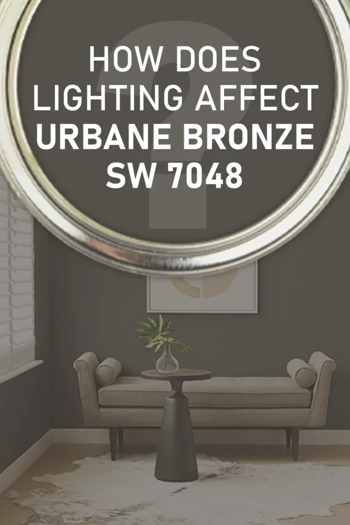
Lighting has a huge influence on how Urbane Bronze behaves. I’ve seen this color shift its personality depending on the time of day or the kind of bulbs in the room.
Natural Light (South-facing rooms): In spaces with good natural sunlight, especially warm southern light, Urbane Bronze softens a little. The brown undertones become more noticeable, and the color feels warmer and more inviting.
Natural Light (North-facing rooms): In cooler natural light, like what you get from a north-facing window, the gray undertones step forward. It can start to look a little more charcoal or even slightly shadowy, which can be super dramatic and cozy, if that’s the look you’re going for.
Warm Artificial Light: With warm bulbs, like soft whites or Edison-style lights, the color warms up again. The brown tones glow just enough to make a room feel relaxed and comfortable.
Cool Artificial Light: Under cooler or daylight-toned LEDs, it leans more gray. This gives it a crisp, modern edge, but it can feel a little more muted or serious. That’s not a bad thing, it just depends on the vibe you want.
So, if you’re planning to use Urbane Bronze, I really recommend testing it in your space first and watching it throughout the day. It’s one of those colors that responds to its surroundings in a really interesting way.
Trim Colors to Pair With Sherwin Williams Urbane Bronze?
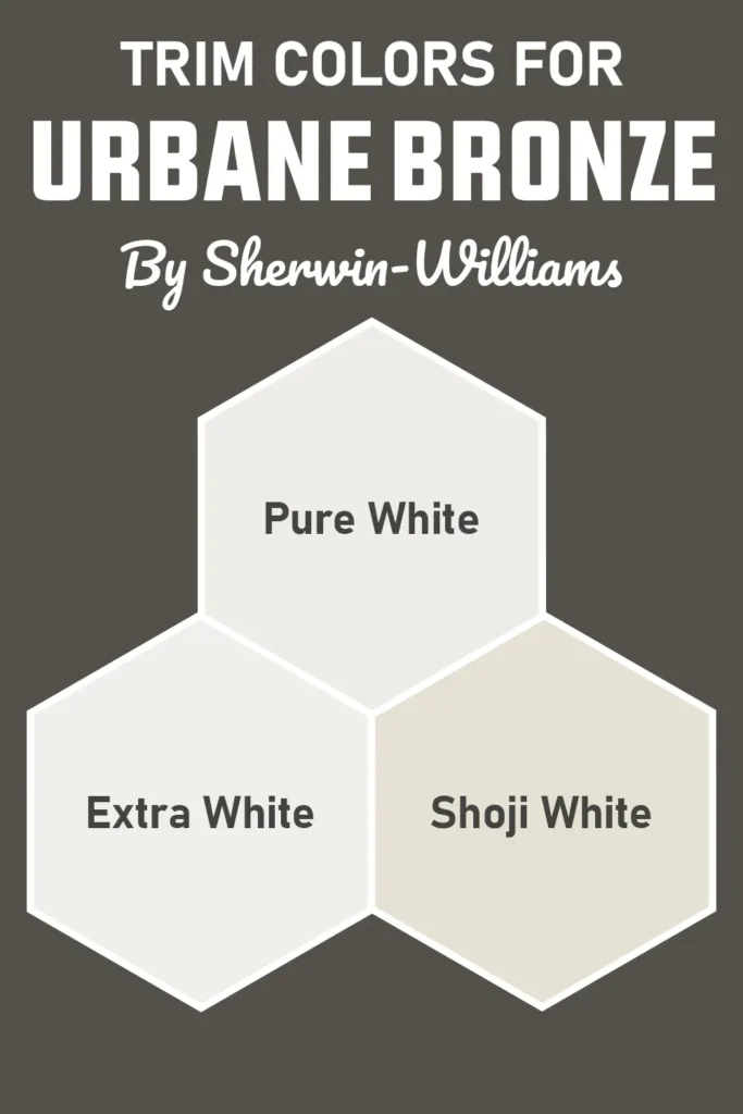
One of the things I love most about Urbane Bronze is how beautifully it pairs with the right trim color. Because it’s so dark and earthy, the trim you choose can completely change the room’s feel.
Here are some of my go-to trim color ideas:
Crisp White Trim: This is the classic choice. Something like Extra White SW 7006 or Pure White SW 7005 creates a bold contrast and keeps the space feeling clean and balanced. The white really pops against Urbane Bronze, giving the walls more presence.
Warm Off-Whites or Creams: If you want a softer, cozier look, warm whites like Shoji White SW 7042 work beautifully. They blend gently with the warmth in Urbane Bronze without feeling stark.
Tone-on-Tone: For a moody, seamless look, you could even go darker, maybe a slightly lighter charcoal or taupe. This creates a very rich, enveloping feel, especially in a study or bedroom.
Natural Wood Trim: Urbane Bronze and wood? Match made in heaven. Light to mid-toned woods (like oak or walnut) highlight the color’s earthy quality and add a natural warmth that makes the whole space feel grounded.
Choosing trim is really about what kind of mood you want the space to have. High contrast will feel fresh and modern; softer tones will lean warm and cozy. Either way, Urbane Bronze gives you a strong foundation to build from.
Colors Similar to Sherwin Williams Urbane Bronze
💥🎁 Christmas & Year-End Deals On Amazon !
Don't miss out on the best discounts and top-rated products available right now!
*As an Amazon Associate, I earn from qualifying purchases.
When I first started exploring Urbane Bronze, I couldn’t help but look around for other colors that captured a similar vibe.
Sometimes you want the same rich, moody aesthetic, but maybe just a touch lighter, cooler, or warmer depending on your space. That’s where similar colors come in—they give you flexibility while staying in the same design zone.
Colors similar to Urbane Bronze typically fall into the dark neutral category. They tend to mix deep browns, grays, or charcoals with subtle undertones.
You’ll find that some of these shades lean more gray, others lean more brown, and a few have a slight green or taupe feel, depending on the brand. What they all share, though, is that same grounded, earthy elegance that Urbane Bronze is known for.
These kinds of shades are perfect when you want a strong, dramatic color without going fully black.
I personally like exploring similar shades when I’m working with different lighting situations in multiple rooms and want a cohesive flow without using the exact same color over and over.
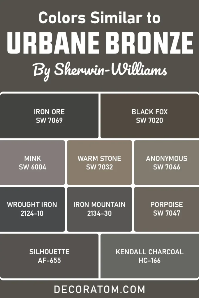
Here are 10 similar paint colors you might want to check out:
- Sherwin Williams Iron Ore SW 7069
- Sherwin Williams Black Fox SW 7020
- Sherwin Williams Mink SW 6004
- Sherwin Williams Warm Stone SW 7032
- Sherwin Williams Anonymous SW 7046
- Sherwin Williams Porpoise SW 7047
- Benjamin Moore Wrought Iron 2124-10
- Benjamin Moore Iron Mountain
- Benjamin Moore Silhouette
- Benjamin Moore Kendall Charcoal
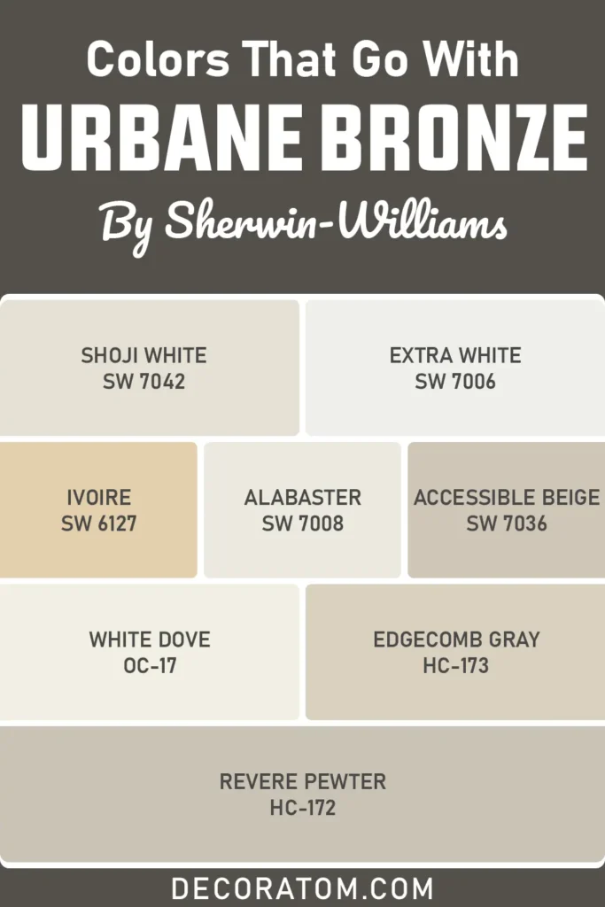
Colors that Go With Sherwin Williams Urbane Bronze
Finding the right colors to pair with Urbane Bronze is all about balance.
Since Urbane Bronze is such a dark, grounded neutral, it works best when combined with lighter, softer tones that let it take the lead without overpowering the space.
Think of it as the anchor in your palette, the bold piece that brings stability, while the coordinating colors support and elevate it.
When I’m building a color scheme around Urbane Bronze, I usually start with warm whites, soft beiges, or muted earth tones. These create that beautiful contrast and warmth that makes a space feel cohesive and inviting.
For a more modern or minimal feel, crisp whites and cool neutrals work great too, they help Urbane Bronze pop and feel clean. You can also mix in subtle greens or taupes if you want something more nature-inspired or calming.
And of course, don’t forget about your finishes and decor, wood tones, metals, and fabrics all influence how your color pairings come together in the real world.
💥🎁 Christmas & Year-End Deals On Amazon !
Don't miss out on the best discounts and top-rated products available right now!
*As an Amazon Associate, I earn from qualifying purchases.
But in terms of paint? Here are 8 coordinating colors that pair really well with Urbane Bronze:
- Sherwin Williams Shoji White SW 7042
- Sherwin Williams Extra White SW 7006
- Sherwin Williams Ivoire SW 6127
- Sherwin Williams Alabaster SW 7008
- Sherwin Williams Accessible Beige SW 7036
- Benjamin Moore White Dove OC-17
- Benjamin Moore Edgecomb Gray HC-173
- Benjamin Moore Revere Pewter HC-172
Comparing Sherwin Williams Urbane Bronze With Other Colors
I’ve learned that comparing paint colors side-by-side is one of the most helpful ways to really understand what makes each shade unique.
Especially with dark neutrals like Urbane Bronze, subtle shifts in undertone and depth can completely change the feel of a room.
So if you’re stuck between a few options, these direct comparisons will help you decide which color fits best in your space.
Here’s how Urbane Bronze stacks up against a few other popular Sherwin-Williams colors:
Sherwin Williams Urbane Bronze vs Iron Ore SW 7069
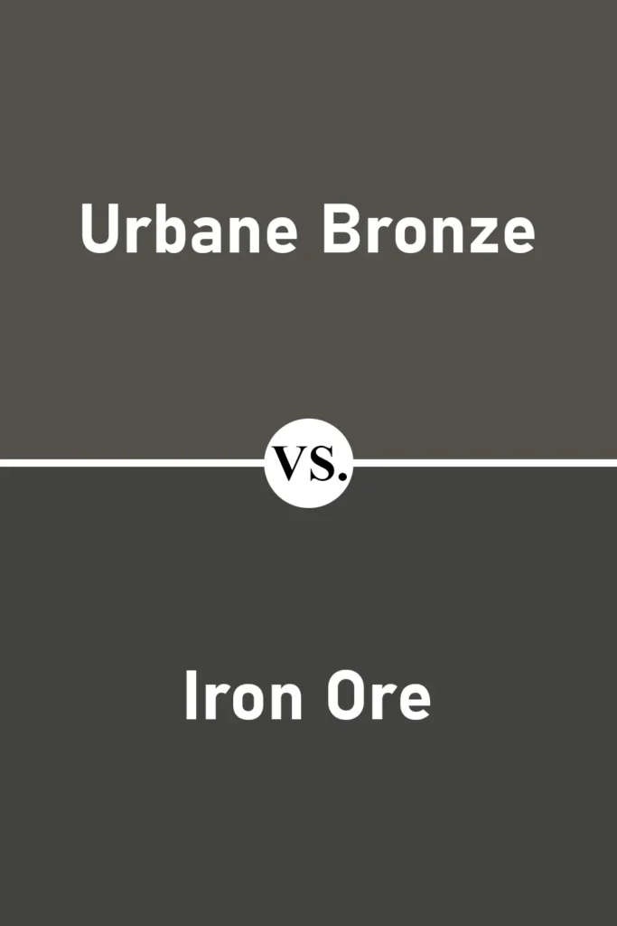
These two are both dark and bold, but Iron Ore is even deeper and closer to black.
While Urbane Bronze has noticeable brown and gray undertones that give it warmth, Iron Ore feels more like a soft black with a cooler, slightly bluish undertone.
If you’re looking for a true statement color that borders on black but still has some softness, Iron Ore is worth considering. But for a warmer, more earthy feel, Urbane Bronze wins for me.
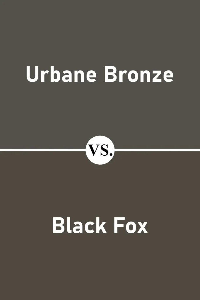
Sherwin Williams Urbane Bronze vs Black Fox SW 7020
💥🎁 Christmas & Year-End Deals On Amazon !
Don't miss out on the best discounts and top-rated products available right now!
*As an Amazon Associate, I earn from qualifying purchases.
Black Fox is very similar to Urbane Bronze but has a slightly darker and moodier vibe. It’s a touch more muted and can sometimes lean a little more charcoal-brown depending on lighting.
If you want something almost identical to Urbane Bronze but just a smidge richer, Black Fox is a great alternative. Personally, I find Urbane Bronze slightly more versatile thanks to its balanced undertones.
Sherwin Williams Urbane Bronze vs Anonymous SW 7046
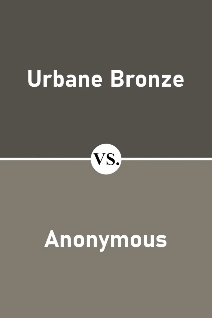
Anonymous is a lighter, more approachable cousin to Urbane Bronze. It still has that earthy, grounded feel but comes with a lot more softness.
I’d choose Anonymous for larger areas or if you want something that still has depth without going full-on dark. Urbane Bronze, on the other hand, is bolder and brings more drama to a space.
Sherwin Williams Urbane Bronze vs Warm Stone SW 7032
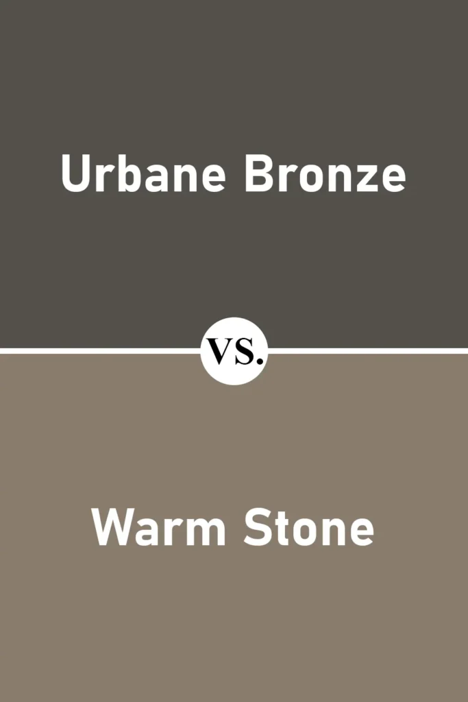
Warm Stone is warmer and noticeably lighter than Urbane Bronze. It has more of a chocolate brown feel, while Urbane Bronze feels grayer and more modern.
I’d lean toward Warm Stone if your space has a lot of wood and warm tones already, and you’re going for that traditional cozy look. Urbane Bronze works better in contemporary or transitional settings.
Sherwin Williams Urbane Bronze vs Peppercorn SW 7674
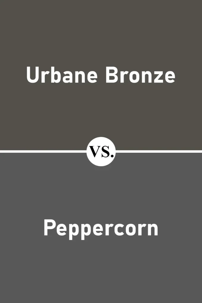
Peppercorn leans more gray, and it’s cooler overall compared to Urbane Bronze. If you’re looking for a darker gray that doesn’t feel as earthy or brown, Peppercorn is a great option.
It’s moodier and more industrial, whereas Urbane Bronze keeps one foot planted in nature. These two colors have very different vibes, even though they’re both deep and rich.
Sherwin Williams Urbane Bronze vs Gauntlet Gray SW 7019
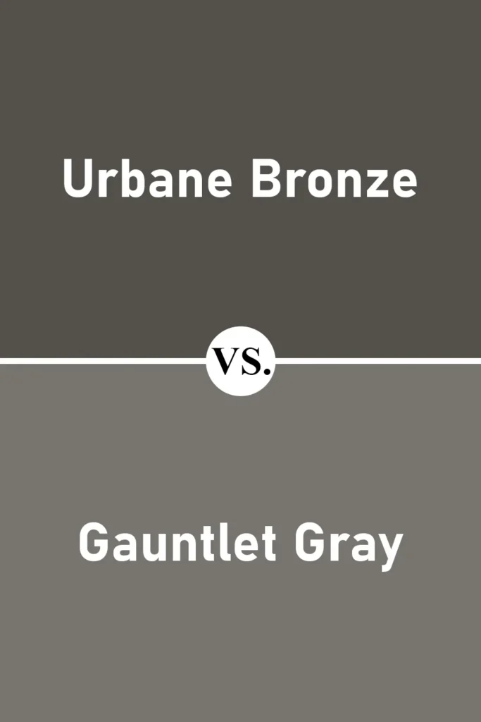
Gauntlet Gray is significantly lighter than Urbane Bronze and definitely more on the cool-gray side. It doesn’t have the same level of warmth or earthiness.
If your space gets a lot of natural light and you want something dark but not too heavy, Gauntlet Gray might work. But if you’re aiming for cozy and dramatic, Urbane Bronze still takes the lead in my book.
Where to Use Sherwin Williams Urbane Bronze?
One of the best things about Urbane Bronze is how flexible it is. It’s not one of those colors that only works in modern spaces or only in traditional homes.
This shade has a way of blending into a variety of styles depending on how you use it. Whether you’re going bold with a full-room application or just using it for an accent wall or cabinetry, Urbane Bronze brings instant depth and character.
And while it’s dark, it’s not cold or flat, it has warmth, complexity, and a lot of soul. So, let me share how I think it works in different areas of the home.
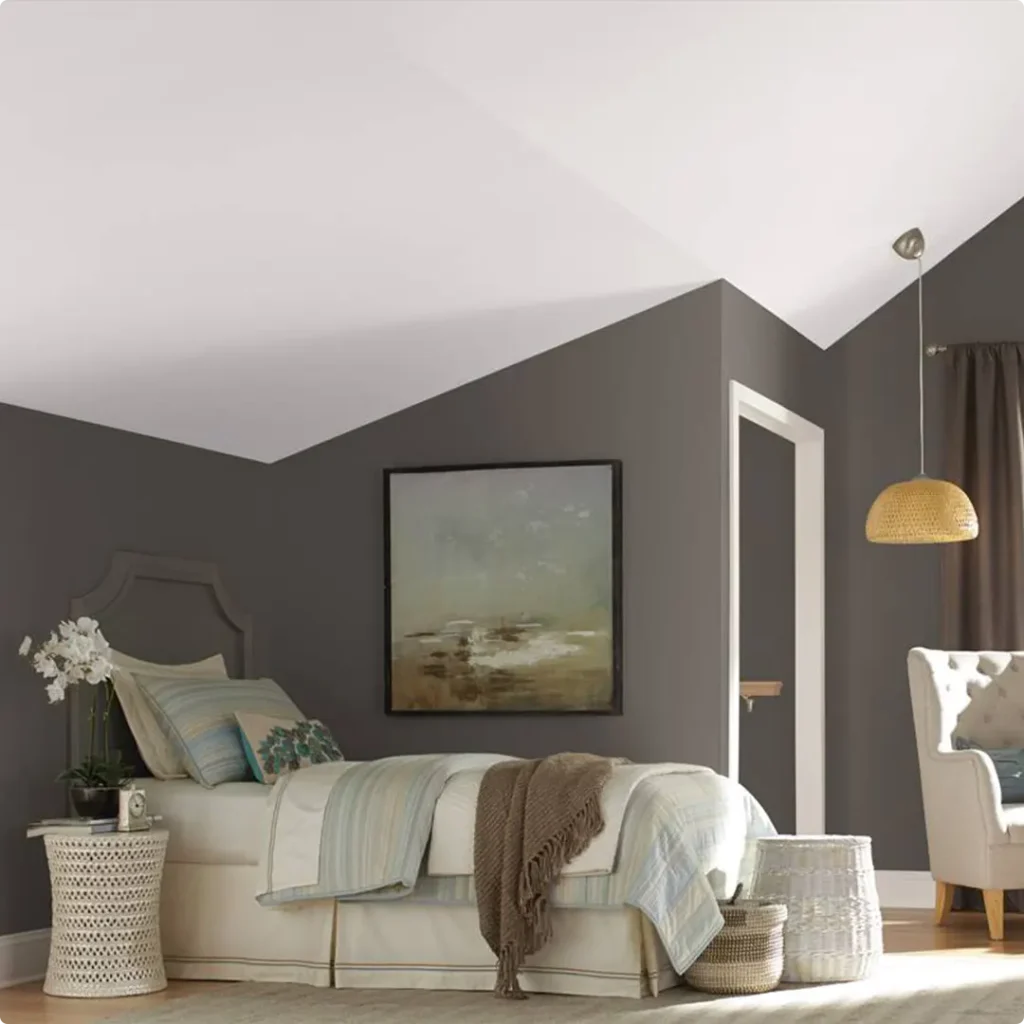
Sherwin Williams Urbane Bronze in the Bedroom
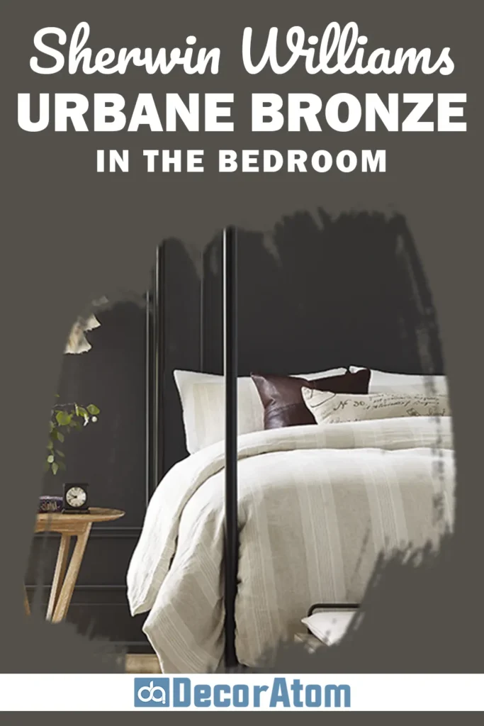
In the bedroom, Urbane Bronze feels like a weighted blanket for the walls. It’s cozy, intimate, and helps create a calm, grounded space, exactly what I want in a room where I unwind at the end of the day.
I’ve used it as an accent wall behind the bed, and it instantly added a sense of luxury without needing a ton of decor. Paired with soft whites, muted taupes, or natural wood furniture, the room felt both restful and elegant.
If you’re someone who loves a moody bedroom that still feels warm and welcoming, this color might surprise you. Just be sure to bring in lighter bedding or lamps to keep the space from feeling too heavy.
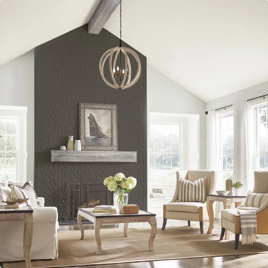
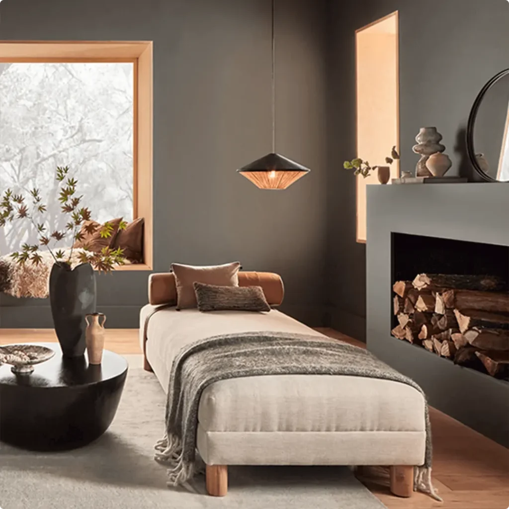
Sherwin Williams Urbane Bronze in the Living Room
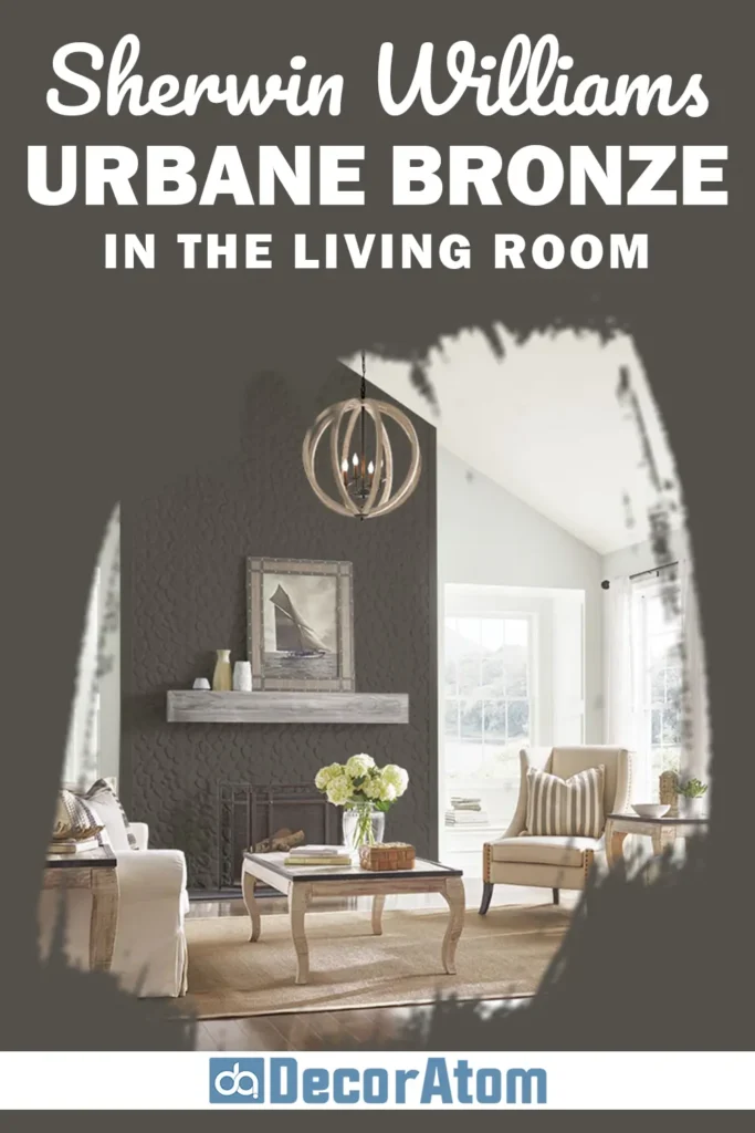
Now, the living room is where this color can really shine. I’ve seen it used on full walls in open-concept spaces, and it creates this grounded, sophisticated backdrop for everything else.
Whether you’re going for a modern vibe with metal accents or something more rustic with wood and texture, Urbane Bronze works beautifully. It has a way of pulling furniture and art together so the whole room feels curated.
Personally, I think it looks amazing with leather sofas, natural linen curtains, or even a bold gallery wall. And if you’re hesitant to go all-in, start with built-ins, a fireplace surround, or an accent wall, you’ll still get the drama without overwhelming the space.
Sherwin Williams Urbane Bronze in the Kitchen
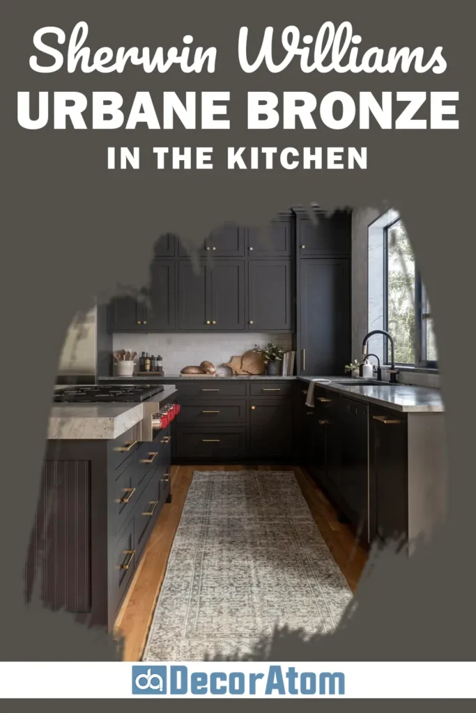
I’ll be honest, using a dark color in the kitchen can feel risky at first. But Urbane Bronze proves it’s worth the leap.
I’ve seen this shade used on lower cabinets or kitchen islands, and it adds a rich, sophisticated layer without taking over.
When paired with lighter uppers or white countertops, it creates a beautiful contrast that makes the whole kitchen feel custom and high-end. It also looks stunning with brass hardware or wood shelves.
And if you’ve got a lot of natural light in your kitchen, this color really comes alive, it never feels too dark or flat. Just make sure your lighting plan is solid so the space stays functional.
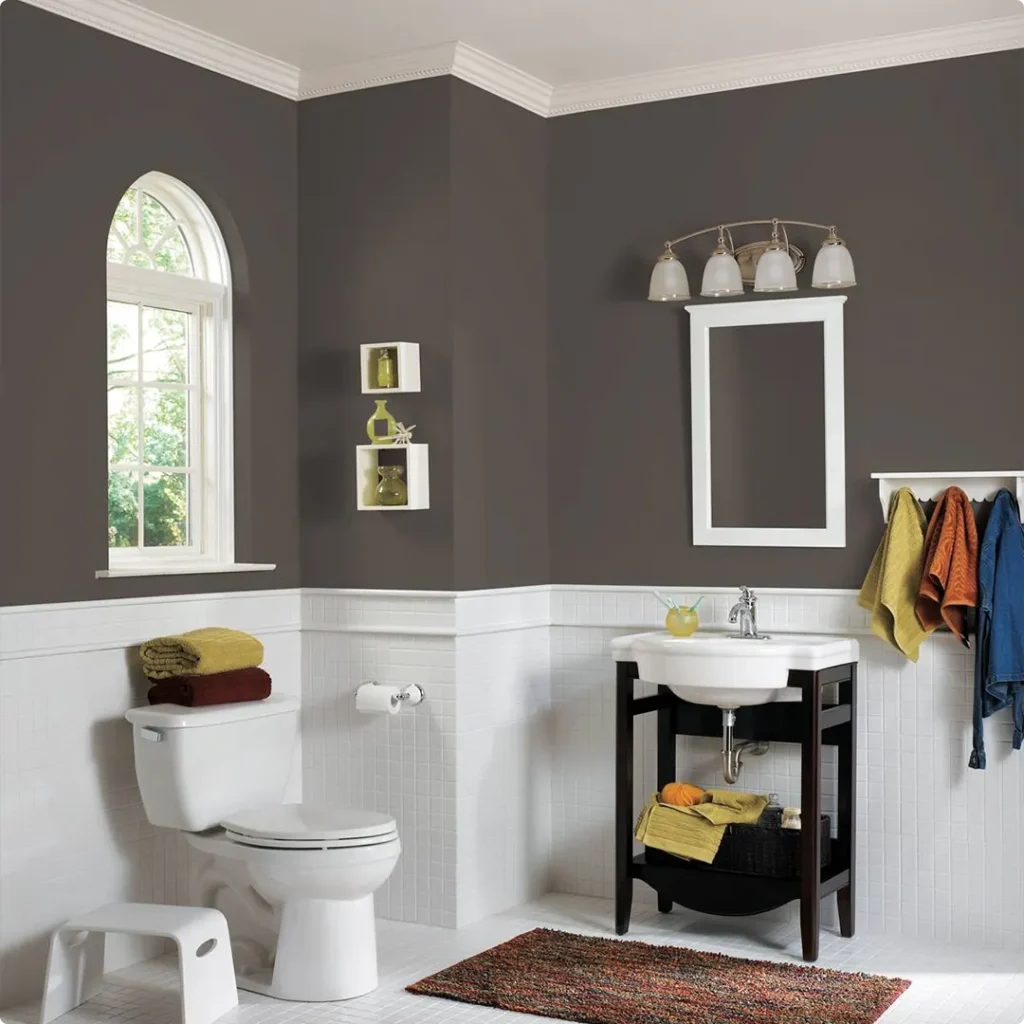
Sherwin Williams Urbane Bronze in the Bathroom
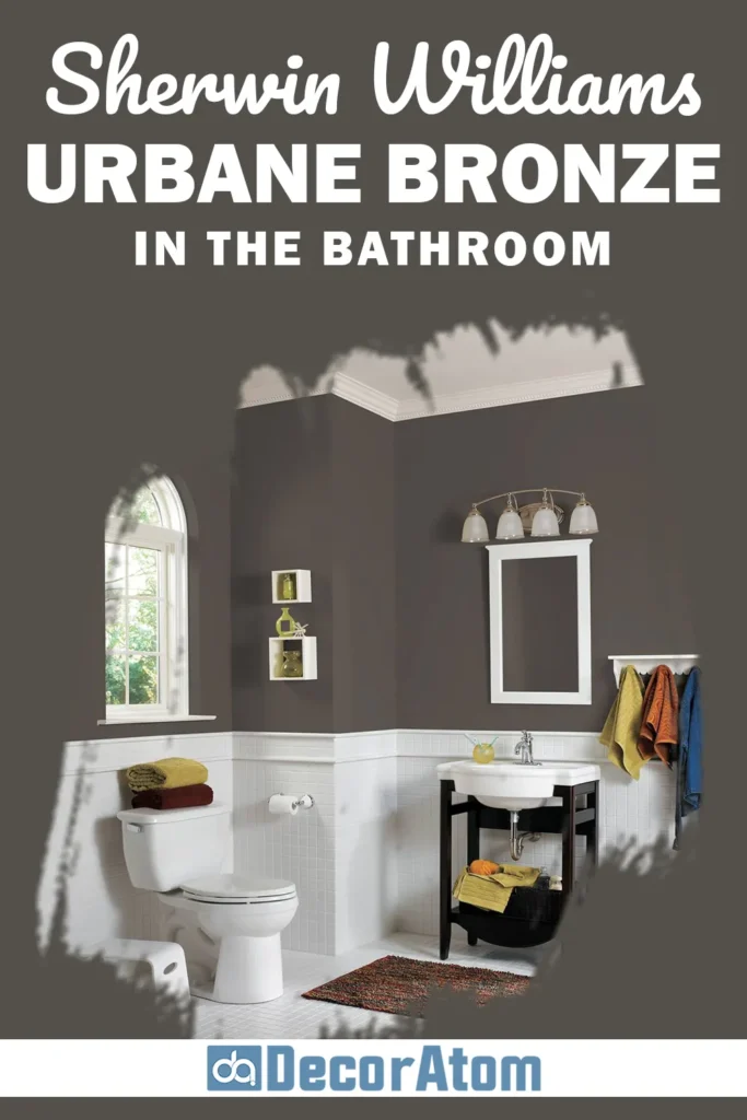
Bathrooms are one of my favorite places to take design risks, and Urbane Bronze can totally transform a small or large bathroom into something unforgettable.
I once saw it used in a powder room with brass fixtures and a wood vanity, and the vibe was moody, spa-like, and full of personality. In larger bathrooms, it can be used on vanities or even walls, especially if you pair it with lots of natural textures, think stone, wood, and white tile.
It gives the space a mature, grounded feeling that makes you want to slow down and enjoy your routine. It’s especially effective if you’re trying to get away from that sterile, all-white look.
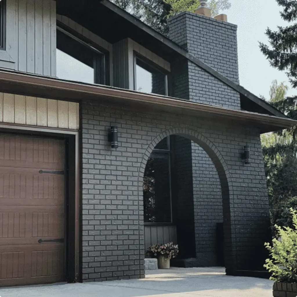
Sherwin Williams Urbane Bronze for the Exterior
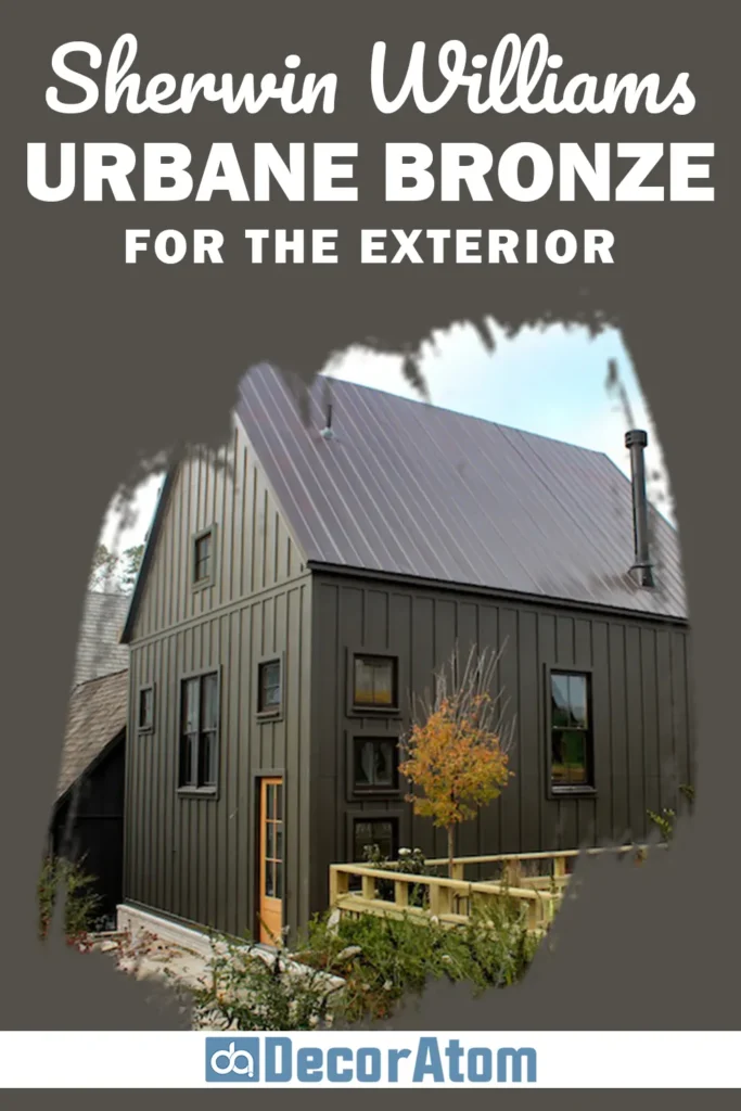
Now this is where Urbane Bronze really blew me away. On exteriors, it’s bold, modern, and quietly striking. It doesn’t scream for attention, but you can’t ignore it either.
I’ve seen it used on everything from mid-century homes to craftsman bungalows, and it always brings a sense of calm and strength. It pairs beautifully with stonework, warm wood accents, and light trim colors like Extra White SW 7006.
If you’re looking for an exterior color that’s timeless but still makes a confident statement, Urbane Bronze is one of those rare shades that feels grounded in nature and architecture at the same time.
Why I Love Sherwin Williams Urbane Bronze
There’s something about Urbane Bronze that just clicks with me. It’s not just the depth of the color, or the way it plays with light, or even how versatile it is (though all of that helps).
What I love most is that it brings this quiet confidence into a room. It doesn’t try too hard. It doesn’t need to.
Whether I use it in a cozy reading nook or a sleek kitchen, it always makes the space feel complete, like everything belongs.
And I think that’s what great paint colors do. They don’t just fill a wall, they support everything else you put into the room.
Urbane Bronze does that in a way that’s warm but refined, grounded but sophisticated.
It’s earthy, but never dull. And every time I use it, I find a new reason to appreciate it even more.
Final Thoughts
If you’re searching for a deep, moody paint color that still feels approachable and versatile, Sherwin Williams Urbane Bronze is 100% worth considering.
It’s a color that’s full of nuance, part warm brown, part soft gray, and completely grounded. It works across so many spaces and styles, whether you’re going for modern, traditional, or somewhere in between.
I’ve used it enough to know it’s not just a trend, it’s the kind of timeless color that grows with your space.
So if you’re thinking about giving your home a little more depth, mood, and personality, Urbane Bronze just might be your perfect match. I know it’s been mine.