
*This post contains affiliate links. For more details see my full disclosure.
If you’ve been searching for a bold, dramatic black paint color that doesn’t play around with undertones or mood swings—Tricorn Black SW 6258 by Sherwin-Williams might just be the winner.
This color has made a serious name for itself in the design world, and once you start using it, it’s easy to see why. It’s deep, rich, and unapologetically black.
No weird green or brown shifts, no odd tints in certain lighting—it just does what a true black paint is supposed to do.
In this review, I’ll walk you through everything I’ve learned about this powerful color.
From how it behaves in different rooms to what colors pair well with it—I’m covering it all in a clear, simple way.
No fluff, just real talk from someone who’s worked with Tricorn Black and has a lot of thoughts to share.
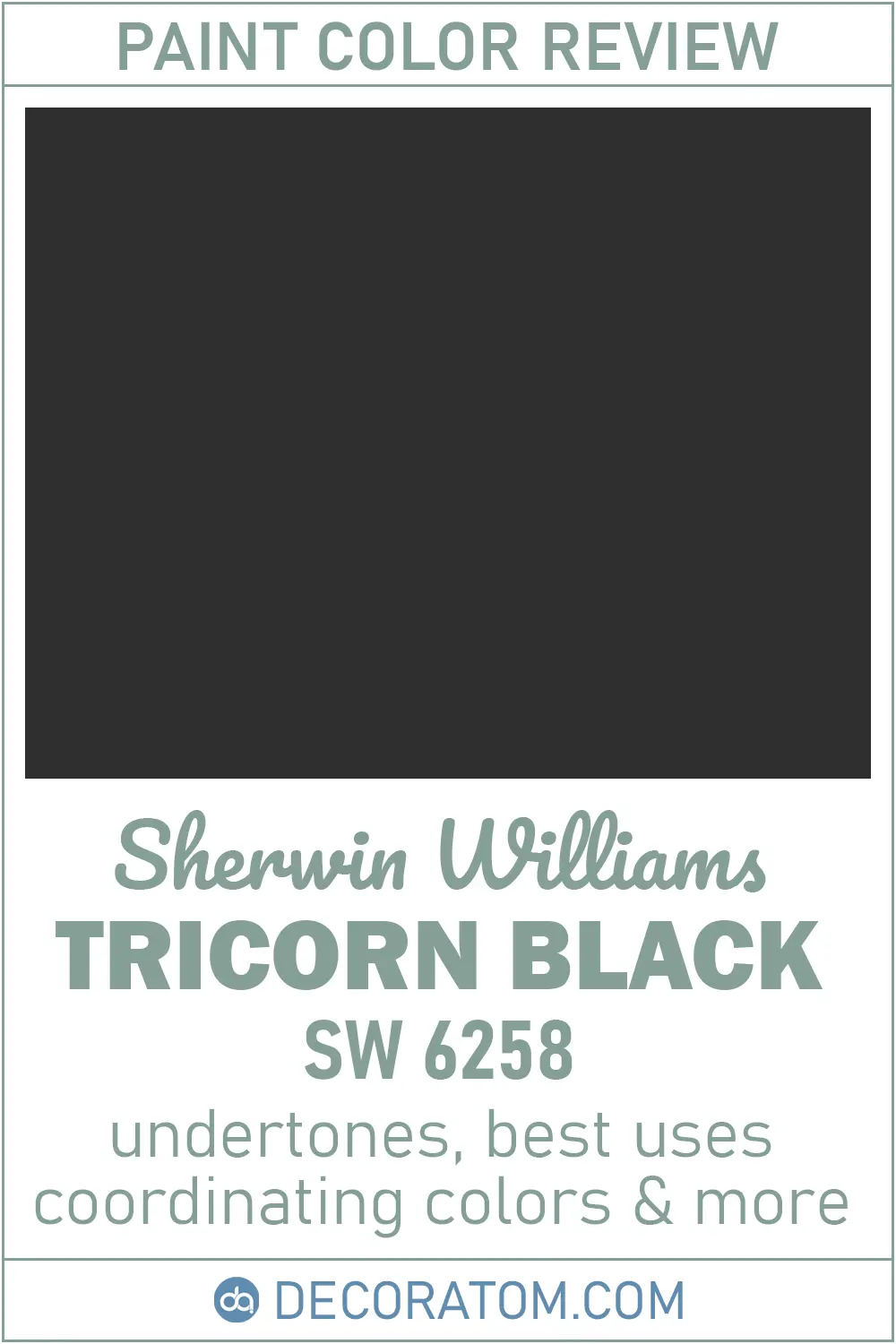
What Color is Sherwin Williams Tricorn Black SW 6258?
Let’s keep it simple: Tricorn Black is a pure, true black paint color.
It doesn’t lean blue, it doesn’t look green, and it won’t surprise you with purple or brown undertones halfway through the day. It’s just black—clean and classic.
What makes it stand out from other black paints is how balanced and rich it feels.
Some black paints can look dusty or soft when applied, but Tricorn Black has a bold, solid look that feels luxurious and modern at the same time.
Get a Peel & Stick paint sample of Tricorn Black
How to Know if a Paint Color Is Right for You?
The best way to see if a paint color works for your home is to test it on your wall. Look at it over a few days in different lighting—morning, afternoon, and evening—to see how it really feels.
You can do this by getting a sample from the paint store and using a brush put it up on the walls, but then you are left with a can that you can’t do anything with. Those samples are used with poor-quality paint and aren’t meant for use on your walls permanently.

Instead, I recommend going with Samplize. They are a company that will send you a 12X12 peel and stick swatch of a paint color that you can stick to the wall. When you are done just peel it off and throw it away.
It’s easy and much less messy!
💥🎁 Christmas & Year-End Deals On Amazon !
Don't miss out on the best discounts and top-rated products available right now!
*As an Amazon Associate, I earn from qualifying purchases.
Is It a Warm Or Cool Color?
This is a great question because black can actually swing either warm or cool depending on its base. But Sherwin-Williams Tricorn Black is what I’d call a neutral black. It’s incredibly balanced and doesn’t clearly lean warm or cool.
That said, in certain lighting conditions, it might look slightly cool just because of how shadows interact with the color. But overall, it sits right in the middle.
This makes it super versatile—you can pair it with warm whites, cool grays, earthy tones, or bold jewel shades, and it still looks cohesive.
LRV of Sherwin Williams Tricorn Black
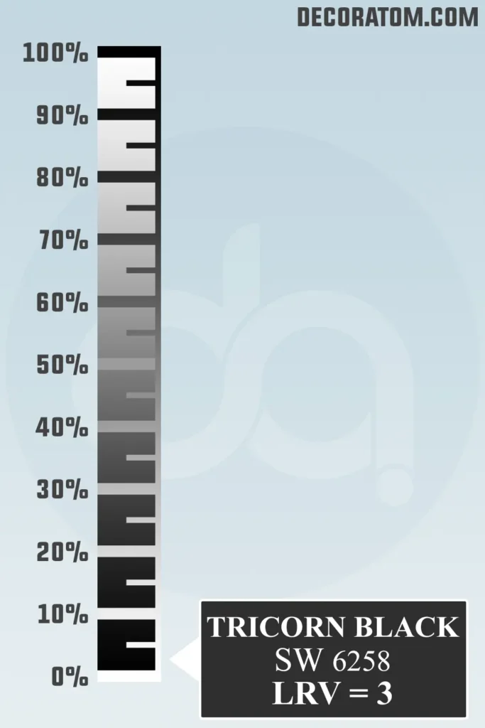
Let’s talk about LRV, or Light Reflectance Value. It’s a scale from 0 to 100 that tells you how much light a color reflects.
The closer the number is to 100, the more light the paint reflects (think bright white). The closer it is to 0, the more light it absorbs (think deep, dark colors).
Tricorn Black has an LRV of 3, which means it reflects very little light. It’s nearly at the bottom of the scale, which is expected for a deep black color like this.
So if you use it in a room, expect it to make a bold statement, especially if there isn’t a lot of natural light. But with the right lighting and design balance, it can look incredibly sleek and sophisticated.
Color Family
Tricorn Black SW 6258 belongs to the Neutral color family, and that’s part of its magic.
Being a neutral black means it doesn’t show obvious undertones of blue, red, brown, or green—so it plays nicely with almost any other color in your palette.
This neutrality is exactly why designers love it. It acts like a grounding shade that gives contrast, structure, and depth to a space without clashing or feeling out of place.
Whether you’re aiming for modern minimalism, moody drama, or even a timeless traditional style—this neutral black can adapt and elevate the look.
RGB Colors
If you’re curious about the technical makeup of Tricorn Black, its RGB values are 47 / 47 / 48. That simply means:
- Red: 47
- Green: 47
- Blue: 48
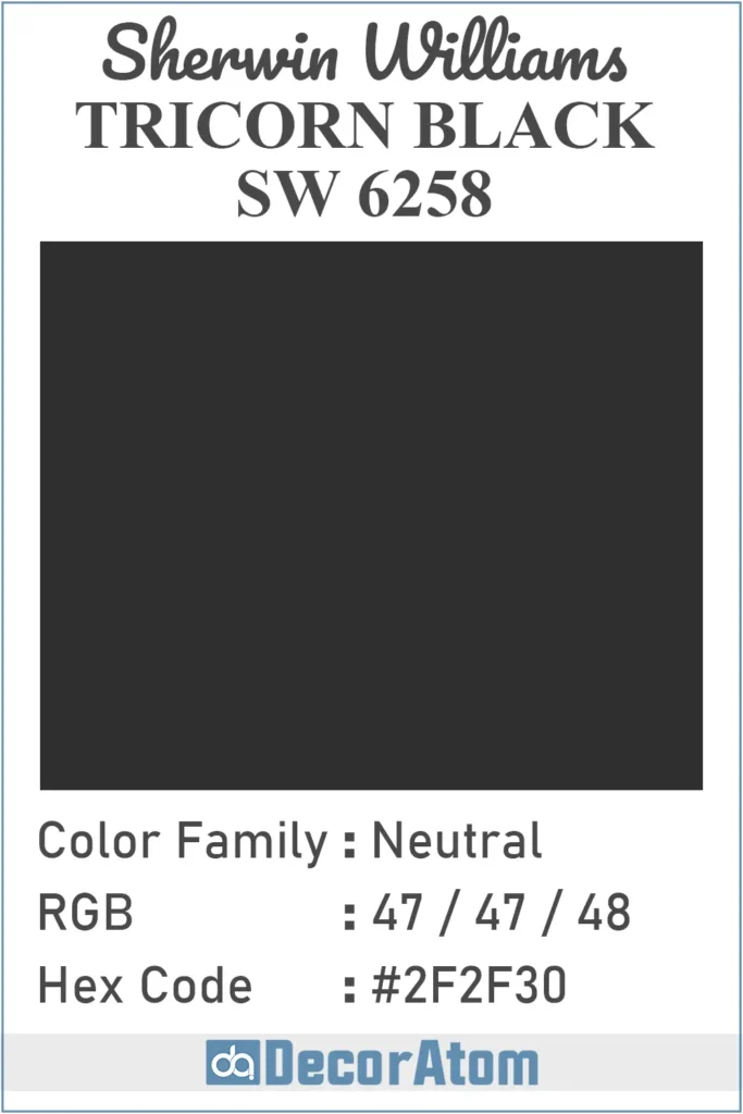
Hex Value
If you’re looking at Tricorn Black for digital designs or want to use it for online color planning, its Hex value is #2F2F30.
Here’s what that means: each pair in the hex code represents the intensity of red, green, and blue—just like the RGB values. The hex #2F2F30 lines up nicely with the RGB values (47, 47, 48), and again, that tiny difference at the end (the 30) reflects the tiniest increase in blue.
Undertones of Sherwin Williams Tricorn Black
Now, let’s talk about undertones—and here’s the good news: Tricorn Black has virtually no strong undertones.
This is one of the biggest reasons it’s such a designer favorite. Unlike many blacks that might lean brown, green, blue, or even purple under certain lighting, Tricorn Black stays true to black. It doesn’t shift or surprise you.
If there’s any undertone at all, it might lean ever so slightly cool, but even that’s barely detectable unless you’re analyzing it under different color temperatures.
Because it doesn’t fight with other colors, it’s incredibly easy to pair with warm or cool tones in your decor—whether you’re going with bright whites, creamy neutrals, jewel tones, or even soft pastels.
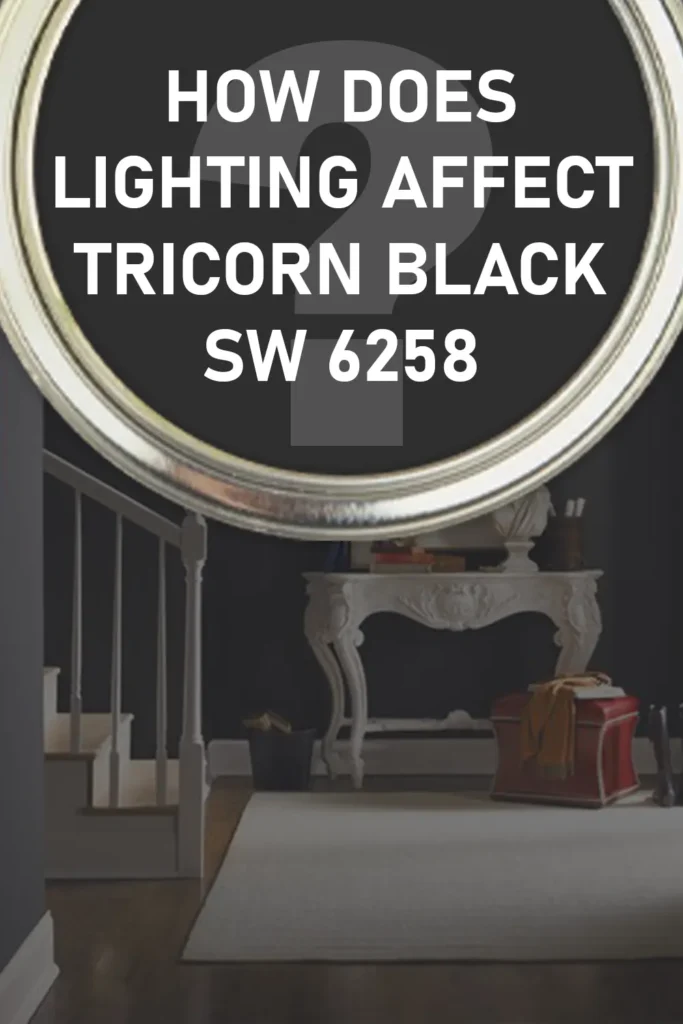
How Does Lighting Affect Sherwin Williams Tricorn Black?
💥🎁 Christmas & Year-End Deals On Amazon !
Don't miss out on the best discounts and top-rated products available right now!
*As an Amazon Associate, I earn from qualifying purchases.
Lighting can make or break any paint color—and black is no exception. Tricorn Black, being so dark with an LRV of just 3, will absorb a lot of light, no matter what type of lighting you have. But the type of light still plays a role.
Here’s how it usually behaves:
- In natural light: If you have a space with lots of natural daylight, Tricorn Black will show up as a strong, deep, clean black. It won’t look faded, and it won’t pull any weird undertones. It’s dramatic but still crisp.
- In artificial light: Under warm lighting (like soft white bulbs), it might take on a slightly warmer cast, though still not enough to look brown or murky. Under cooler lighting (like daylight bulbs), it can appear even more sharp and modern, sometimes with a barely-there coolness to it.
- In low-light spaces: It can make a room feel very moody and cocoon-like, especially if used on all the walls. If you’re going for a cozy, dramatic look, that’s a win. But if you want to keep the space open and airy, you’ll want to balance it out with lighter elements—like white trim or plenty of reflective surfaces.
Trim Colors to Pair With Sherwin Williams Tricorn Black
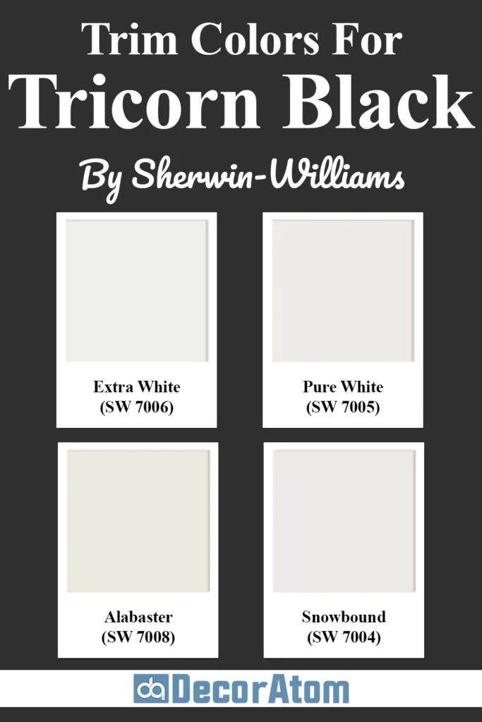
Pairing the right trim color with Tricorn Black can make a world of difference—it’s all about contrast and balance. Because this black is so neutral and clean, crisp white trims are the go-to pairing, and for good reason.
Here are a few tried-and-true Sherwin-Williams trim colors that look beautiful with Tricorn Black:
- Extra White (SW 7006) – This is a bright, clean white with cool undertones. It gives you a sharp contrast against Tricorn Black, which works well if you want a modern, high-impact look—especially for interior doors, baseboards, or crown molding.
- Pure White (SW 7005) – This white is slightly softer than Extra White and has a touch of warmth without looking creamy. It’s a great choice if you want a little bit of softness in the contrast. I personally love this one with Tricorn Black on walls and Pure White on trim—it feels balanced and fresh.
- Alabaster (SW 7008) – If you’re working in a more traditional or cozy space, Alabaster is a warmer white that still contrasts nicely with Tricorn Black. It gives a slightly softer, more welcoming vibe than the cooler whites, and it works well in farmhouse or transitional-style homes.
- Snowbound (SW 7004) – This one sits right between cool and warm—still white, but with a softness that doesn’t feel stark. It’s a beautiful choice if you’re going for a classic look with just a hint of warmth.
Colors Similar to Sherwin Williams Tricorn Black
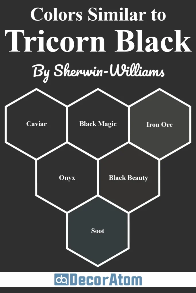
Sometimes, you want the look and feel of Tricorn Black but with a slightly different twist—maybe something a little warmer, cooler, or with a subtle undertone that suits your space better. That’s where similar paint colors come in.
Below, I’ve picked 6 similar black paint colors—three from Sherwin-Williams and three from Benjamin Moore—and I’ll walk you through how each one stacks up next to Tricorn Black.
While these colors may seem nearly identical at first glance, the subtle differences can become very noticeable once they’re on your walls or cabinetry.
1. Sherwin-Williams Caviar SW 6990
Caviar is another rich black, but it leans just a little warmer than Tricorn Black.
The warmth isn’t overly dramatic, but if you’re placing it next to wood tones or warmer whites, you might notice it softens the space a bit more than Tricorn.
It has a similar LRV (3) but feels ever-so-slightly more luxurious and velvety because of those subtle brown undertones.
2. Sherwin-Williams Black Magic SW 6991
Black Magic is very close in depth to Tricorn Black, but where Tricorn is neutral, Black Magic has just a touch of warmth—almost like a faded charcoal in some lights.
It’s a great option if you want something that still feels bold but isn’t quite as stark or modern as Tricorn Black. Think of it as a black with personality, while Tricorn stays clean and classic.
3. Sherwin-Williams Iron Ore SW 7069
Iron Ore is more of a deep charcoal than a true black. It’s noticeably lighter than Tricorn Black, with an LRV of 6, so it’s better suited for spaces where you still want drama but don’t want to go all the way black.
It also has subtle warm gray undertones that can bring softness and depth, especially in natural light.
4. Benjamin Moore Onyx 2133-10
Onyx is Benjamin Moore’s answer to a true black. It’s extremely close in tone to Tricorn Black and very neutral in its undertone.
If you’re deciding between the two, the difference might come down to brand preference or the finishes you prefer.
Onyx works beautifully in the same types of spaces as Tricorn and is often used on doors and exteriors for a crisp, architectural look.
5. Benjamin Moore Black Beauty 2128-10
Black Beauty is a warm, deep black that has a little bit of brown and gray in its base.
Compared to Tricorn Black, it reads a bit cozier and can soften the look of a room, especially in traditional or transitional designs.
If you want a more inviting black that still offers contrast, this one’s a solid option.
6. Benjamin Moore Soot 2129-20
Soot is another strong black that falls between a charcoal and a true black. It’s a little softer than Tricorn Black, especially in bright rooms.
It has a slight blue-gray undertone that shows up in certain lighting, which can add a cool, moody vibe. Tricorn Black, in contrast, remains more neutral and doesn’t shift quite as much.
Colors that Go With Sherwin Williams Tricorn Black

💥🎁 Christmas & Year-End Deals On Amazon !
Don't miss out on the best discounts and top-rated products available right now!
*As an Amazon Associate, I earn from qualifying purchases.
When it comes to coordinating colors, Tricorn Black is surprisingly versatile.
Because it doesn’t lean too warm or too cool, it works well with a wide range of shades—from warm whites and cool grays to earthy greens and bold jewel tones.
Whether you’re working on a modern kitchen, a cozy bedroom, or an inviting entryway, the right pairing can make this color really sing.
Here are 5 colors that work beautifully with Tricorn Black, along with how and where they might fit in:
1. Sherwin-Williams Alabaster (SW 7008)
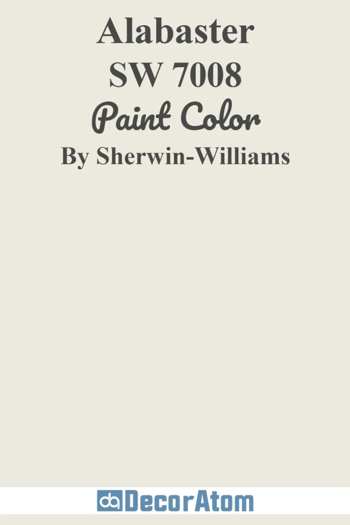
Alabaster is a creamy, warm white that pairs wonderfully with Tricorn Black. The soft contrast keeps things from feeling too stark, which is especially nice in traditional or farmhouse-style homes.
Use Alabaster for walls and Tricorn Black for trim, doors, or cabinetry for a cozy, balanced look.
2. Sherwin-Williams Repose Gray (SW 7015)
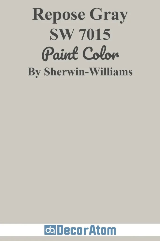
Repose Gray is a light-to-medium gray with subtle warmth. It’s a beautiful neutral that won’t compete with the richness of Tricorn Black.
Together, they create a modern, calming palette perfect for bedrooms or living rooms. This pair also works great in offices or home libraries where you want sophistication without harsh contrast.
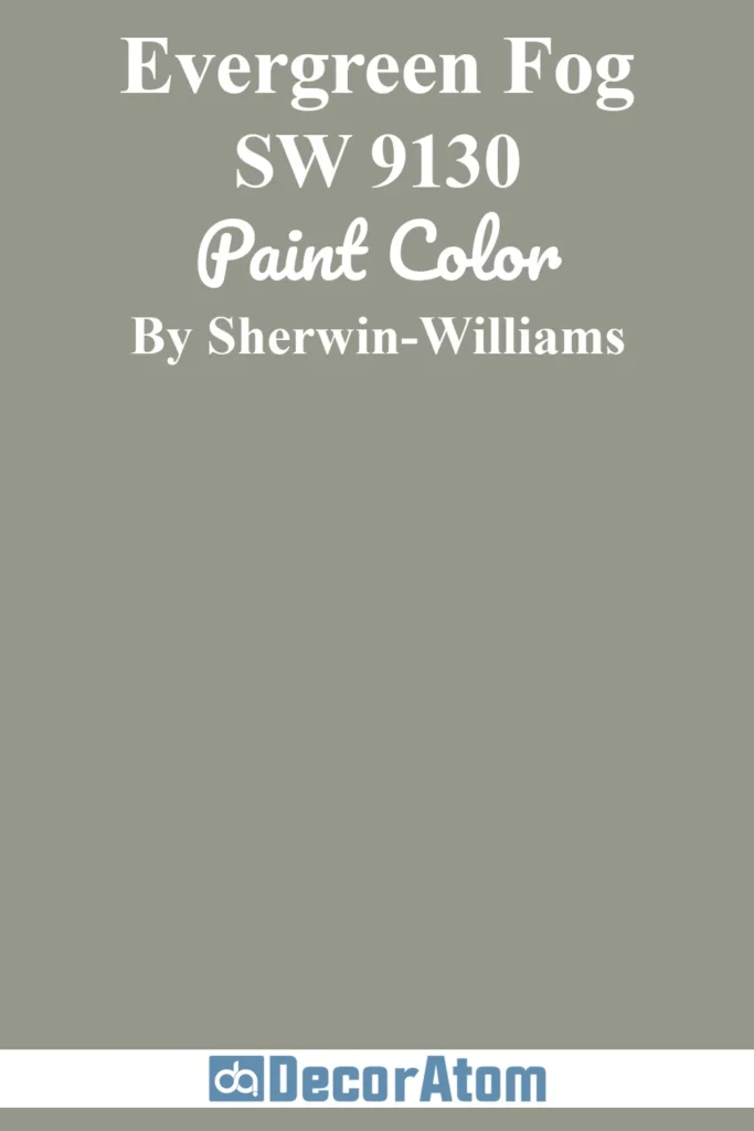
3. Sherwin-Williams Evergreen Fog (SW 9130)
💥🎁 Christmas & Year-End Deals On Amazon !
Don't miss out on the best discounts and top-rated products available right now!
*As an Amazon Associate, I earn from qualifying purchases.
This muted green-gray is Sherwin-Williams’ 2022 Color of the Year, and it looks stunning next to the boldness of Tricorn Black.
Evergreen Fog adds a soft, organic feel and helps tone down the drama of black while still feeling elegant and upscale. It’s ideal for accent walls, furniture, or even cabinetry.
4. Sherwin-Williams Urbane Bronze (SW 7048)
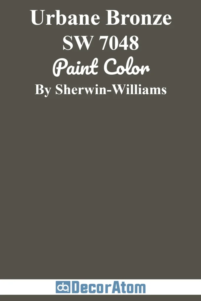
Urbane Bronze is a warm, dark brown-gray with an earthy richness. When paired with Tricorn Black, the combo feels moody, modern, and super sophisticated.
Think masculine studies, luxe bathrooms, or even exteriors with lots of texture.
5. Sherwin-Williams Shoji White (SW 7042)

Shoji White is a warm white with subtle beige undertones. It’s a great choice if you want a slightly softer look than a crisp white like Extra White.
Shoji White and Tricorn Black together feel calm and welcoming, making this duo perfect for entryways, kitchens, or hallways.
Comparing Sherwin Williams Tricorn Black With Other Colors
Comparing black paint colors might seem unnecessary at first—they’re all black, right? But in reality, every black has its own personality. Undertones, depth, and finish all affect how a black color will look in your space.
Let’s break down how Sherwin-Williams Tricorn Black stacks up next to some other popular dark shades.
These side-by-side comparisons can help you decide which one best suits your design goals.
Tricorn Black vs Sherwin-Williams Caviar SW 6990
💥🎁 Christmas & Year-End Deals On Amazon !
Don't miss out on the best discounts and top-rated products available right now!
*As an Amazon Associate, I earn from qualifying purchases.
Tricorn Black is a true neutral black with no strong undertones. Caviar, on the other hand, has a slightly warmer, softer feel.
If you’re trying to decide between the two, think about your room’s natural lighting and whether you want a hint of warmth.
Caviar works beautifully in traditional spaces or anywhere you want a black that’s just a little more forgiving.
Tricorn Black vs Sherwin-Williams Black Magic SW 6991
Black Magic is also a deep black, but it carries a slight red undertone—very subtle, but noticeable in warm lighting.
Tricorn Black remains more neutral, so it’s the better option if you don’t want any undertone surprises.
Black Magic might be great for interiors that use warm metallics, wood tones, or soft whites.
Tricorn Black vs Sherwin-Williams Iron Ore SW 7069
This comparison comes down to depth and intensity. Tricorn Black is much darker and closer to a true black, while Iron Ore is more of a charcoal.
If you’re going for a bold, dramatic statement, Tricorn Black is the way to go. But if you want something a little softer or less intense, Iron Ore is a great alternative.
Tricorn Black vs Benjamin Moore Onyx 2133-10
Onyx is probably the closest Benjamin Moore match to Tricorn Black. Both are deep, neutral blacks with minimal undertones.
If you’re trying to decide between the two, the main factors might be brand preference or sheen options, since both colors perform very similarly in different types of lighting.
Tricorn Black vs Benjamin Moore Wrought Iron 2124-10
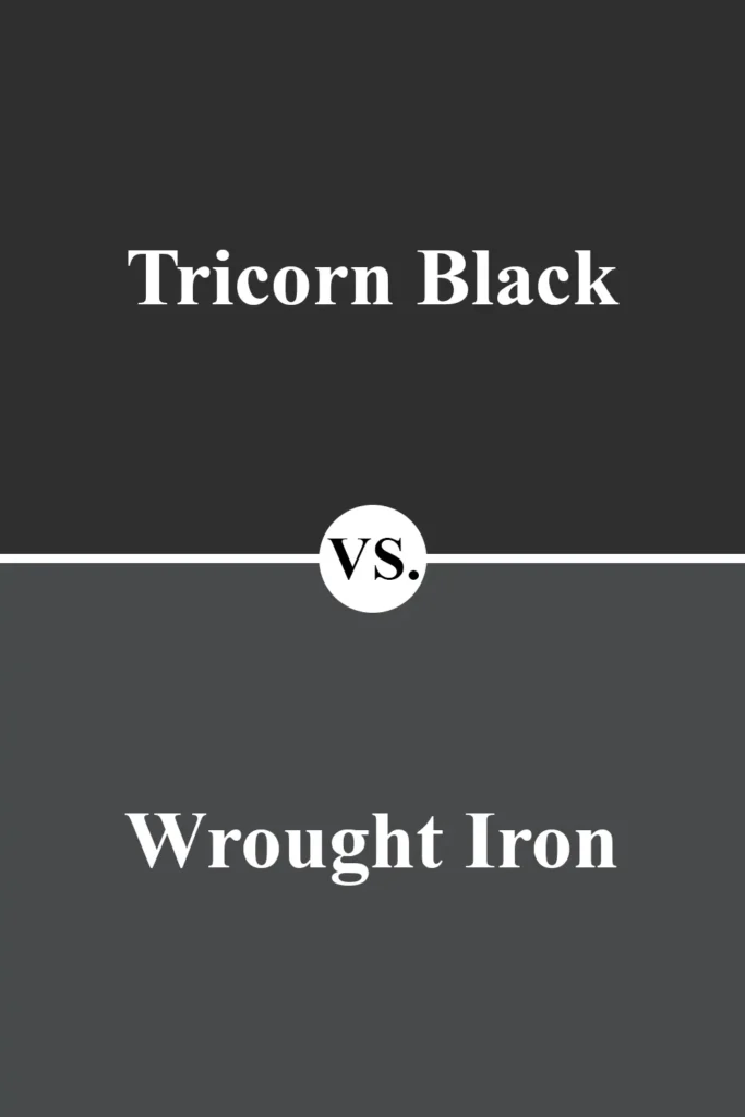
Wrought Iron is more of a charcoal-black than a true black. Compared to Tricorn, it’s lighter and has cool undertones that can pull slightly blue or gray depending on the light.
It’s a good option if you want something less intense but still dramatic. Tricorn is better if you want that unmistakable, true-black impact.
Tricorn Black vs Sherwin-Williams Black Fox SW 7020
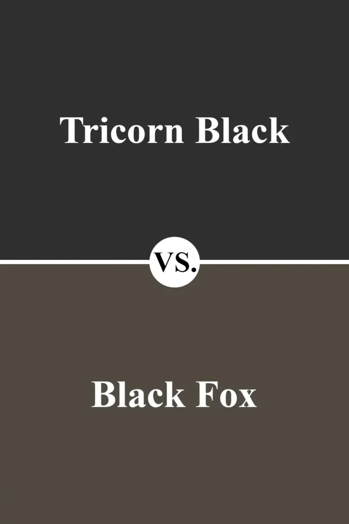
Black Fox is a rich, dark brown-black. It’s significantly warmer than Tricorn Black and can almost read like a very dark taupe in certain lighting.
Use Black Fox if you want a cozier, earthier feel. Stick with Tricorn if you want a more modern, high-contrast look.
Where to Use Sherwin Williams Tricorn Black?
Tricorn Black is one of those rare colors that can truly go anywhere. Whether you’re drawn to modern minimalism or you love traditional charm, this color brings depth, drama, and elegance into a space.
It works beautifully in both large and small doses—you can use it on a single accent wall, a whole room, cabinets, or even exteriors.
The key is to be intentional with your placement. Because it’s a deep, saturated black with a neutral undertone, it doesn’t feel cold or sterile.
Instead, it offers a bold statement while playing well with a wide range of other hues. Let’s look at how this color shines in different parts of the home:
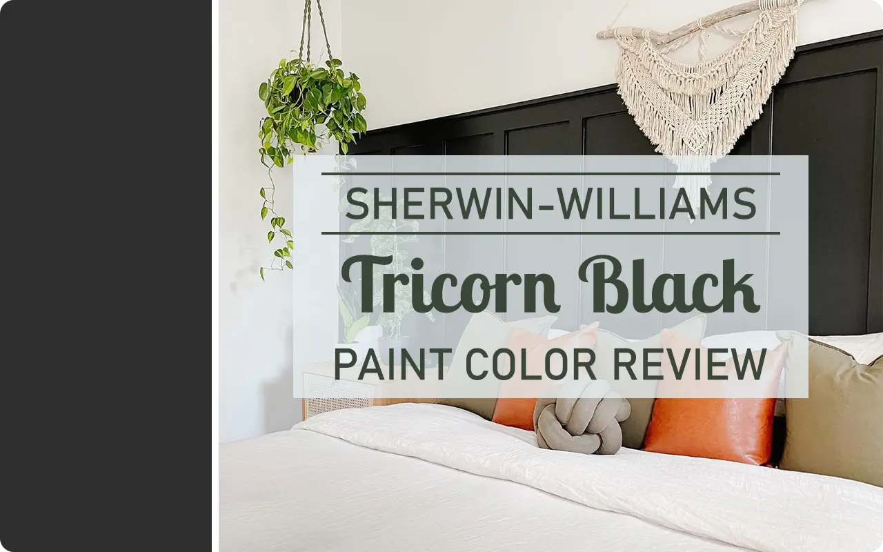
Sherwin Williams Tricorn Black in the Bedroom
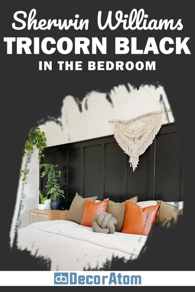
Using Tricorn Black in the bedroom might feel bold, but it’s actually one of the most effective ways to create a cozy, cocoon-like atmosphere.
Whether you’re painting all four walls or just an accent wall behind the bed, Tricorn Black provides a grounding, calming presence that promotes rest and relaxation.
Pair it with warm white linens, layered textures, and soft lighting to avoid a stark or overly moody look.
If you want a slightly more luxurious vibe, gold or brass light fixtures and deep wood tones (like walnut or espresso) can elevate the entire space.
Even just painting your interior doors or baseboards in Tricorn Black can instantly give your bedroom a boutique-hotel feel.
Sherwin Williams Tricorn Black in the Living Room
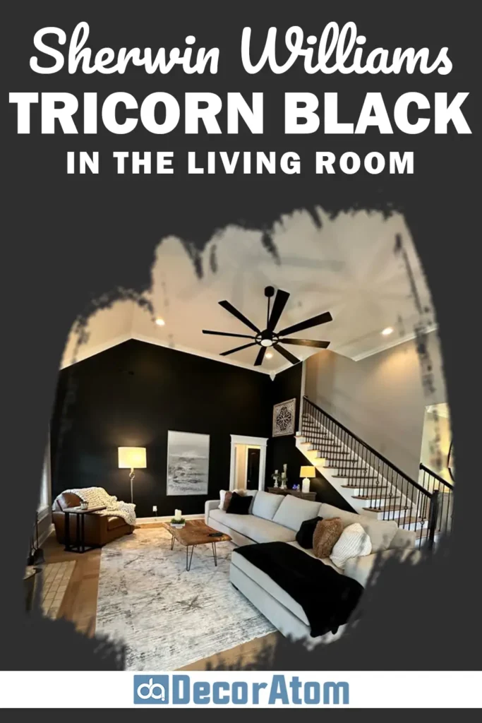
In the living room, Tricorn Black can create a sense of structure and sophistication. It’s an especially great choice if you have large windows or an open floor plan where natural light helps balance the color’s richness.
You can use it for a dramatic media wall, to frame a fireplace, or even on all the walls if the space gets enough light. It also makes an incredible color for built-in bookshelves or window trim—it frames the room and draws your eye to architectural features without being overwhelming.
To soften the look, pair Tricorn Black with light neutral furniture, warm-toned woods, or earthy decor pieces. Adding plenty of natural textures—like linen, jute, or leather—keeps the space from feeling too stark.
Sherwin Williams Tricorn Black in the Kitchen
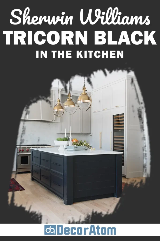
Tricorn Black truly shines in kitchens, especially for cabinets, islands, and range hoods. It brings a sleek, modern feel to the space while still feeling timeless.
Black kitchen cabinets with brass or matte black hardware feel elegant and bold, particularly when paired with white countertops or natural stone backsplashes.
If you don’t want to go full-black, try painting just the lower cabinets or a central island in Tricorn Black and keep the upper cabinets light. This creates contrast without darkening the entire space.
Tricorn Black also works well with both stainless steel and warm metallic finishes.
It brings out the best in everything around it—and it’s surprisingly easy to clean, which is a practical bonus in busy kitchens.
Sherwin Williams Tricorn Black in the Bathroom
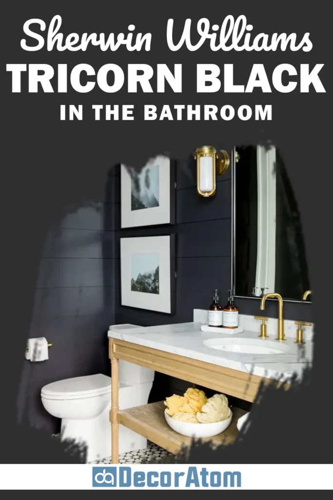
Bathrooms are the perfect place to experiment with dark, moody colors, and Tricorn Black is a beautiful choice.
Whether you use it on the walls, vanity, or even interior doors, it creates a spa-like, dramatic effect.
It also looks fantastic with marble, subway tile, and metallic fixtures—making it a favorite for both modern and traditional bathroom styles.
If your bathroom is small, don’t be afraid of going dark! Tricorn Black actually recedes visually, which can make tight spaces feel more expansive when paired with proper lighting.
To maintain balance, make sure you bring in plenty of white or light-toned elements—such as towels, mirrors, or tiles—to contrast the boldness of the black.
Sherwin Williams Tricorn Black for the Exterior
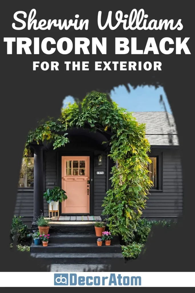
Tricorn Black on the exterior of a home is nothing short of stunning. It’s bold, modern, and surprisingly versatile.
Whether you’re painting the entire house black for a dramatic farmhouse or modern cabin look, or just the front door or shutters for a pop of contrast, Tricorn Black offers a timeless, high-end feel.
This color is also fantastic on garage doors, trim, and window frames. It makes greenery, stonework, and architectural lines stand out beautifully.
One of the reasons it works so well outdoors is because of its neutral undertone—it won’t go too blue or too brown in natural light.
Just make sure to use a proper exterior finish and test it in your lighting conditions, as black can look different depending on the time of day and surroundings.
Why I Love Sherwin Williams Tricorn Black
What I love most about Tricorn Black is that it’s both neutral and bold at the same time.
It doesn’t lean too cool or too warm, and that balance makes it incredibly easy to work with. Whether I’m trying to create contrast, add elegance, or define a space, Tricorn Black always delivers.
It doesn’t shout for attention, but it commands it. It’s the perfect backdrop for highlighting art, furniture, or beautiful textures. And it’s just as at home in a minimalist city loft as it is in a cozy countryside cottage.
I also appreciate how versatile it is—on walls, cabinets, doors, furniture, and exteriors. It adapts to its environment, yet always adds a dose of sophistication.
And honestly, sometimes it’s the smallest uses—a painted door, a black baseboard, or a picture frame—that make the biggest impact.
Final Thoughts
Sherwin-Williams Tricorn Black is more than just a paint color—it’s a design tool. Its rich, true-black tone can transform a space with depth, contrast, and timeless style.
Whether you use it as an accent or a full-room statement, this color creates a sense of grounded sophistication that few other shades can match.
If you’re looking for a black that feels confident, balanced, and endlessly versatile, Tricorn Black should definitely be on your radar.
It’s not just a trend—it’s a classic that continues to earn its place in beautiful, thoughtful design.