
If you’re looking for a white paint color that feels soft, modern, and just a little bit unique—Snowbound SW 7004 might be the one.
It’s one of Sherwin-Williams’ most popular white shades, and for good reason. It’s not a blinding, stark white, nor is it too creamy or yellow.
It lives somewhere in that perfect middle ground, which makes it incredibly versatile.
Whether you’re painting your walls, trim, cabinets, or even exteriors, Snowbound offers a fresh, clean look that still feels warm and inviting.
I’ve seen this color work beautifully in all kinds of spaces—from cozy bedrooms to sleek kitchens—and in both modern and traditional homes.
If you’re trying to figure out whether Snowbound is right for your space, I’ve got you covered in this post. Let’s dive into the details.
*This post contains affiliate links. For more details see my full disclosure.
What Color is Sherwin Williams Snowbound?
At first glance, Snowbound looks like a soft white. But when you take a closer look, you’ll notice that it has a subtle hint of gray in it.
That touch of gray keeps it from feeling too bright or cold, and it gives the color a bit more depth than a standard plain white.
It’s not a bright hospital white. Instead, it has a slightly muted, cozy feel, which makes it easier on the eyes—especially in rooms with lots of natural light.
Snowbound doesn’t lean heavily into any one direction, but it can pick up different undertones depending on the lighting and surrounding colors.
Think of it as a fresh, slightly warm white with a soft, elegant vibe. It still reads as white, but with just enough softness to keep it from feeling stark or sterile.
Click here to get a Peel & Stick paint sample of Snowbound

How to Know if a Paint Color Is Right for You?
The best way to see if a paint color works for your home is to test it on your wall. Look at it over a few days in different lighting—morning, afternoon, and evening—to see how it really feels.
You can do this by getting a sample from the paint store and using a brush put it up on the walls, but then you are left with a can that you can’t do anything with. Those samples are used with poor-quality paint and aren’t meant for use on your walls permanently.

💥🎁 Christmas & Year-End Deals On Amazon !
Don't miss out on the best discounts and top-rated products available right now!
*As an Amazon Associate, I earn from qualifying purchases.
Instead, I recommend going with Samplize. They are a company that will send you a 12X12 peel and stick swatch of a paint color that you can stick to the wall. When you are done just peel it off and throw it away.
It’s easy and much less messy!
Is It a Warm or Cool Color?
Snowbound is considered a warm white, but it’s not overly warm. It doesn’t have strong yellow, beige, or cream undertones like some other warm whites.
Instead, it has a tiny bit of gray and a touch of pinkish undertone that gives it a gentle warmth.
In north-facing rooms (which have cooler light), Snowbound can sometimes look a little more gray or even slightly cool. In south-facing rooms or spaces with warm lighting, it softens up and shows off that cozy side.
So while it’s technically a warm white, it’s not so warm that it feels creamy or off-white. It really sits in a nice balanced spot—warm enough to feel inviting, but still crisp enough to feel modern and clean.
LRV of Sherwin Williams Snowbound
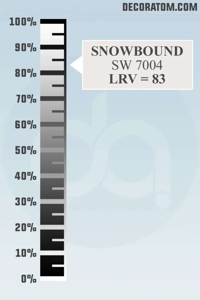
Now let’s talk about something called LRV, or Light Reflectance Value. It sounds technical, but it’s actually pretty simple.
LRV is a number between 0 and 100 that tells you how much light a color reflects. The higher the number, the lighter the color. So a color with an LRV of 100 would be pure white, and a color with an LRV of 0 would be absolute black.
Snowbound has an LRV of 83, which means it reflects a lot of light—making it a great option if you want to brighten up a space. It’s not the brightest white out there, but it’s definitely up there.
Its LRV gives it the ability to make rooms feel more open and airy, especially in smaller spaces or rooms without much natural light.
Color Family
Sherwin Williams Snowbound belongs to the white color family.
RGB Colors
The RGB color breakdown for Sherwin-Williams Snowbound is 237 / 234 / 229.
Now if that sounds like a bunch of numbers, don’t worry—here’s what it actually means in real life. RGB stands for Red, Green, and Blue—the three primary colors used in digital screens and color formulas. So in this case:
- Red: 237
- Green: 234
- Blue: 229
That combination tells us Snowbound is a very light color, almost all the way up on the brightness scale, but it leans just slightly warmer because the red and green are a tiny bit stronger than the blue. That subtle difference is part of what gives Snowbound its soft, warm feel rather than a cool or icy tone.
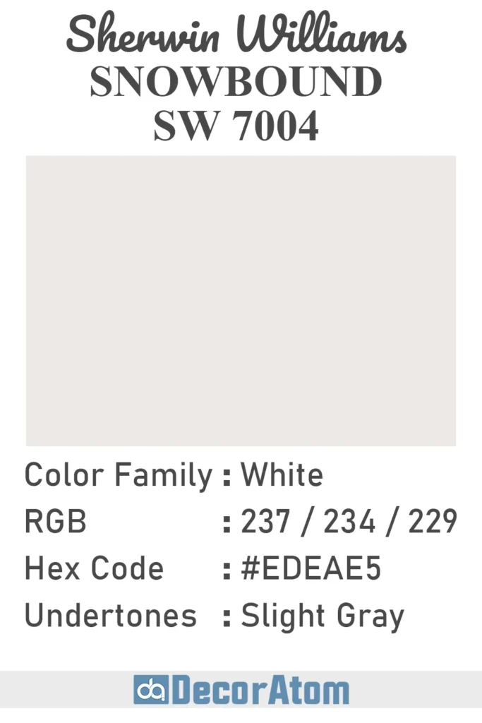
Hex Value
The hex value of Sherwin-Williams Snowbound is #EDEAE5.
Undertones of Sherwin Williams Snowbound
Snowbound is a white paint, but like most whites, it has undertones—those subtle hints of color that come through depending on lighting and surroundings.
In the case of Snowbound, the undertones are soft gray with a slight pink or taupe hue. This is what gives it that cozy, slightly warm appearance.
It’s not an icy blue-gray white, nor is it a yellow or creamy white. That pinkish-gray undertone is subtle but definitely noticeable in certain settings.
You might not spot the undertones right away on a paint chip, but once it’s up on a wall and the lighting hits it, you’ll notice it’s not a pure white.
It has a softness and warmth that come from those undertones—and depending on what’s around it (like wood tones, furniture, or even other whites), it can lean slightly warmer or cooler.
If you’re pairing Snowbound with other whites, you’ll definitely want to compare undertones side by side, especially if you’re using it for walls and pairing it with white trim.
How Does Lighting Affect Sherwin Williams Snowbound?
💥🎁 Christmas & Year-End Deals On Amazon !
Don't miss out on the best discounts and top-rated products available right now!
*As an Amazon Associate, I earn from qualifying purchases.
Lighting plays a huge role in how Snowbound looks in your home.
- In north-facing rooms, which tend to have cooler, bluish light, Snowbound can show more of its gray or even pinkish undertones. It might feel slightly more muted or cooler in these spaces.
- In south-facing rooms, where the natural light is warmer and more golden, Snowbound softens and shows off its warmth. The pinkish undertones become less noticeable, and the overall color feels creamy and welcoming.
- In rooms with artificial lighting, the color can shift quite a bit depending on the type of bulbs you use. Warm white bulbs will highlight the softer side of Snowbound, while cool or daylight bulbs might make it appear a little crisper or even slightly gray.
Because of its chameleon-like behavior, it’s always smart to test this color in different areas of your room before painting everything. Paint a few sample patches on your wall and look at them throughout the day—morning, afternoon, and evening. Snowbound is beautiful, but it definitely reacts to light in noticeable ways.
Trim Colors to Pair With Sherwin Williams Snowbound
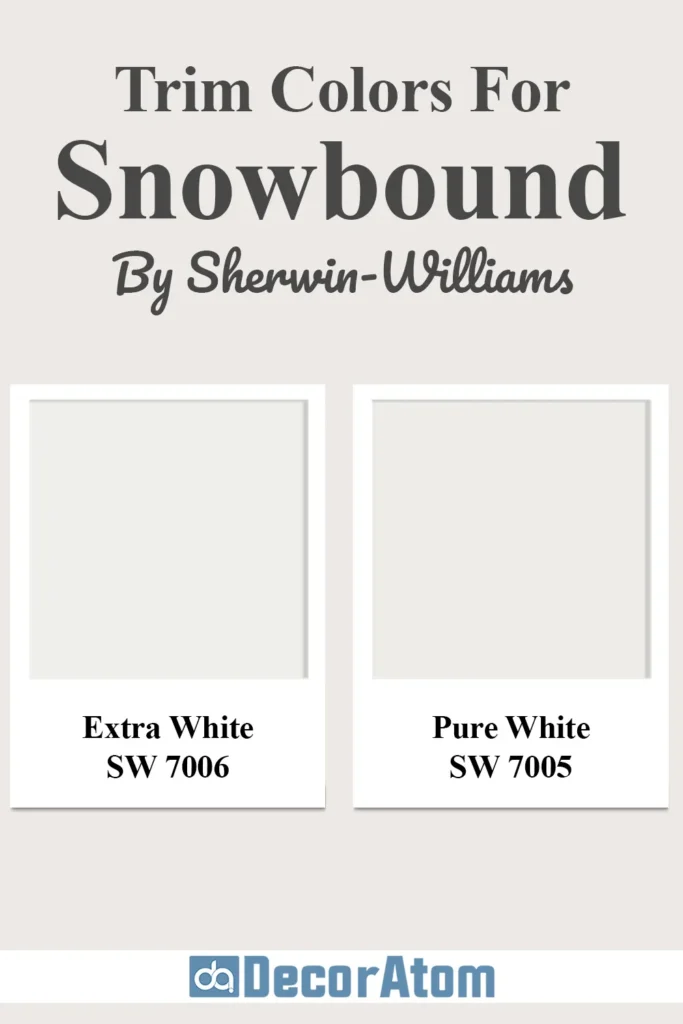
If you’re using Snowbound on your walls, the right trim color can make all the difference. You want a white that either complements or contrasts in a clean and intentional way.
Here are some trim color ideas that work beautifully with Snowbound:
- Extra White SW 7006 – This is a bright, clean white with very little undertone. It pairs well with Snowbound and gives a subtle contrast while still feeling cohesive. It’s a great choice if you want the trim to pop just a little.
- Pure White SW 7005 – This is a soft, neutral white without strong undertones. It works really well as a trim color next to Snowbound because it’s crisp but not stark. It won’t clash with the pinkish-gray undertones of Snowbound.
- Snowbound on Trim and Walls – Some people choose to use Snowbound for both walls and trim, especially if they want a seamless, minimalist look. If you go this route, just use a different sheen—like eggshell for the walls and semi-gloss for the trim—to create a subtle distinction through texture rather than color.
When choosing a trim color, it’s always a good idea to sample both the wall and trim colors side-by-side to see how they play together in your lighting. Snowbound is flexible, but undertones in the wrong trim color can shift the whole vibe.
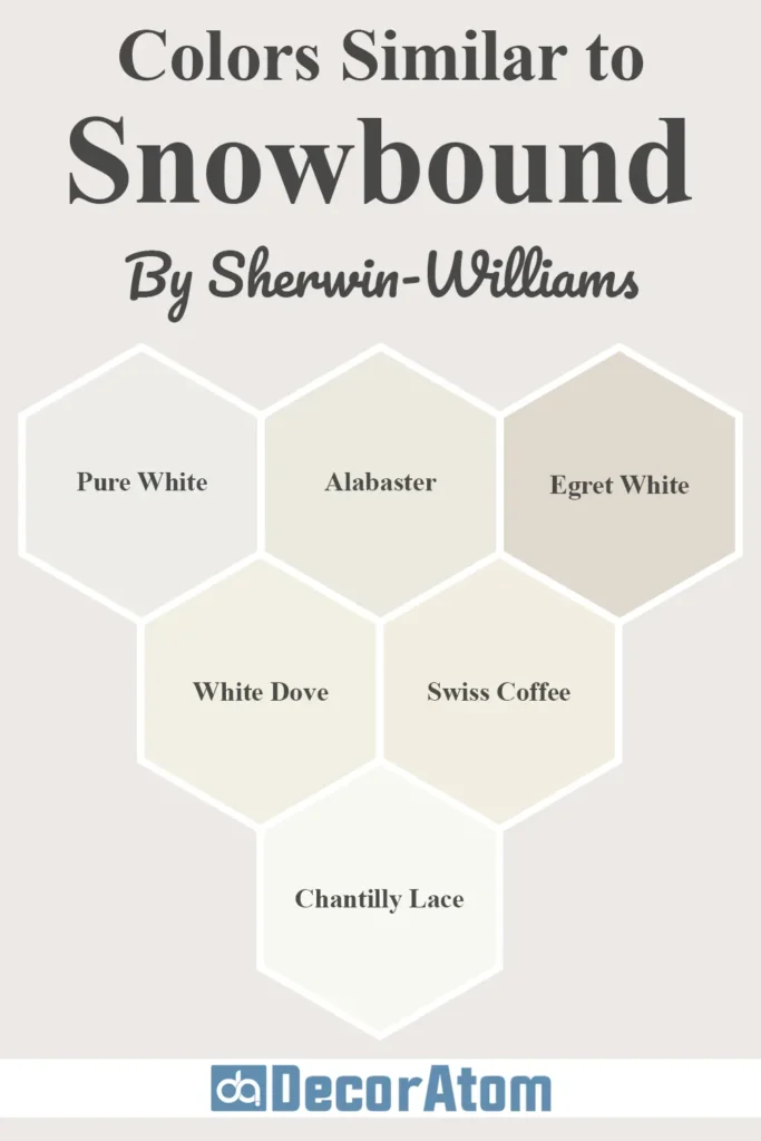
Colors Similar to Sherwin Williams Snowbound
When you’re narrowing down white paint colors, it’s easy to get overwhelmed—especially because so many whites look nearly identical on a paint chip but very different once they’re on your walls.
If Snowbound SW 7004 has caught your eye, but you’re curious about close alternatives, there are a few options from both Sherwin-Williams and Benjamin Moore that are worth comparing.
Some of these colors have similar vibes, while others differ in undertone just enough to give you another direction if Snowbound doesn’t feel quite right in your space.
Here are 6 colors that are similar to Snowbound:
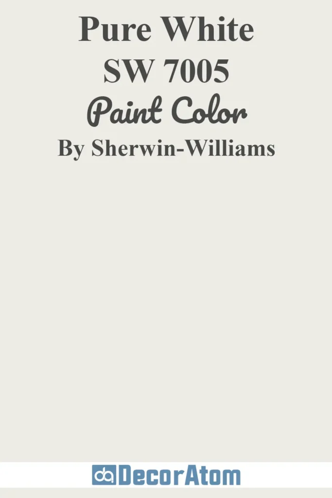
1. Sherwin-Williams Pure White SW 7005
💥🎁 Christmas & Year-End Deals On Amazon !
Don't miss out on the best discounts and top-rated products available right now!
*As an Amazon Associate, I earn from qualifying purchases.
Pure White is one of Sherwin-Williams’ most popular whites, and it’s slightly brighter and cleaner than Snowbound. It has just a touch of warmth but with more neutral undertones.
If you like the idea of a soft white but Snowbound feels too pink or taupe in your space, Pure White could be a more neutral alternative.
Snowbound has more noticeable pink/gray undertones, while Pure White stays more balanced and feels fresher. Snowbound feels a little more muted and cozy in comparison.
Get a Peel & Stick paint sample of Pure White
2. Sherwin-Williams Alabaster SW 7008
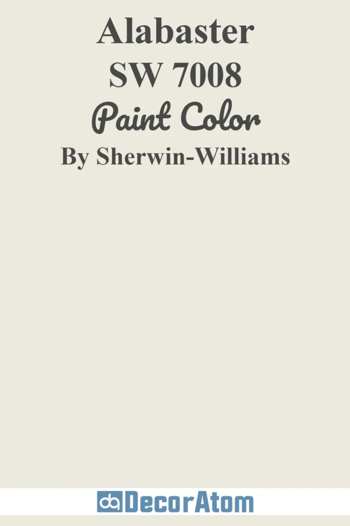
Alabaster is another soft white with warmth, but it leans creamier than Snowbound. It has yellow-beige undertones that give it a warm, inviting feel.
While Snowbound has cool-to-neutral undertones with a touch of taupe, Alabaster is distinctly creamier. If you’re looking for a warmer feel without the pinkish hue, Alabaster might be a better choice.
Get a Peel & Stick paint sample of Alabaster
3. Sherwin-Williams Egret White SW 7570
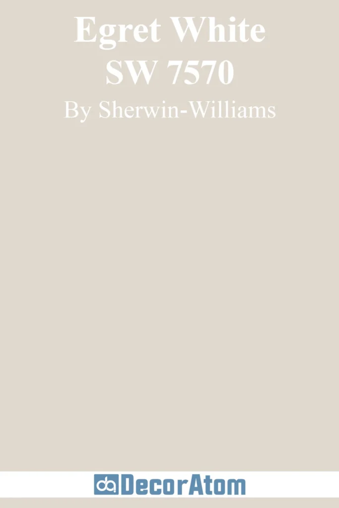
Egret White is a warm greige that sits right on the edge between white and light gray. It’s a bit darker than Snowbound and has taupe and gray mixed in, giving it a cozy vibe.
Egret White is noticeably deeper and moodier than Snowbound. It’s great if you like the tone of Snowbound but want something with more depth and stronger greige undertones.
Get a Peel & Stick paint sample of Egret White
4. Benjamin Moore White Dove OC-17

💥🎁 Christmas & Year-End Deals On Amazon !
Don't miss out on the best discounts and top-rated products available right now!
*As an Amazon Associate, I earn from qualifying purchases.
White Dove is Benjamin Moore’s go-to warm white. It has soft creamy undertones, but unlike Alabaster, it stays a bit more muted and doesn’t read overly yellow.
White Dove and Snowbound are both warm whites, but White Dove has more of a beige-yellow undertone, while Snowbound has pink-gray. Snowbound is a little cooler and crisper; White Dove feels softer and more traditional.
Get a Peel & Stick paint sample of White Dove
5. Benjamin Moore Swiss Coffee OC-45

Swiss Coffee is another favorite from Benjamin Moore, and it leans distinctly warm with creamy, almost buttery undertones. It’s deeper than Snowbound and gives off more of a vintage or farmhouse vibe.
Swiss Coffee is definitely warmer and richer, almost veering into light beige territory. Snowbound is the lighter, more modern-looking of the two, while Swiss Coffee brings a traditional warmth.
Get a Peel & Stick paint sample of Swiss Coffee
6. Benjamin Moore Chantilly Lace OC-65

Chantilly Lace is one of the purest, brightest whites you can find. It has very little in the way of undertones, making it an ultra-clean white that works well in modern or high-contrast designs.
Chantilly Lace is far brighter and crisper than Snowbound. If you found Snowbound a little too soft or muted, Chantilly Lace might give you that clean, gallery-white feeling. On the other hand, Snowbound will feel warmer and less stark in most rooms.
Get a Peel & Stick paint sample of Chantilly Lace
Colors that Go With Sherwin Williams Snowbound
💥🎁 Christmas & Year-End Deals On Amazon !
Don't miss out on the best discounts and top-rated products available right now!
*As an Amazon Associate, I earn from qualifying purchases.
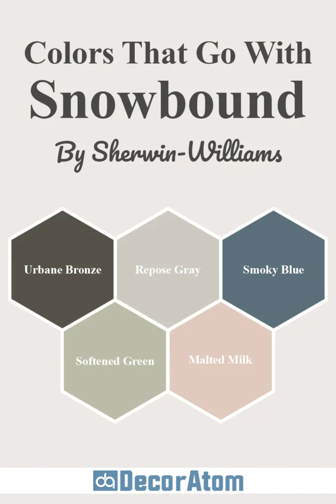
When you choose a wall color like Snowbound, you want to find colors that complement it and create the right mood in your home.
Because Snowbound has a soft white base with subtle pink and gray undertones, it works beautifully with certain warm grays, muted earth tones, deep moody hues, and even soft pastels.
The goal when pairing colors is to match the tone—so you don’t want to throw in super cool tones that might clash with Snowbound’s subtle warmth. Here are five coordinating colors that I think go beautifully with it:
1. Sherwin-Williams Urbane Bronze SW 7048

This is a bold, deep charcoal brown that creates a stunning contrast with Snowbound. It’s rich and earthy, with a warm base that ties in beautifully with Snowbound’s subtle warmth.
Why it works: Urbane Bronze brings depth and drama. If you’re using Snowbound on the walls, Urbane Bronze is perfect for an accent wall, built-ins, or even exterior shutters. Together, they feel grounded and modern.
Get a Peel & Stick paint sample of Urbane Bronze
2. Sherwin-Williams Repose Gray SW 7015

Repose Gray is a light gray with soft, warm undertones. It’s subtle, not too cold, and pairs effortlessly with whites that have a warm or neutral base—just like Snowbound.
Why it works: These two create a very harmonious palette. You could use Repose Gray in hallways or bedrooms and carry Snowbound into bathrooms or trim for a cohesive whole-house palette.
Get a Peel & Stick paint sample of Repose Gray
3. Sherwin-Williams Smoky Blue SW 7604
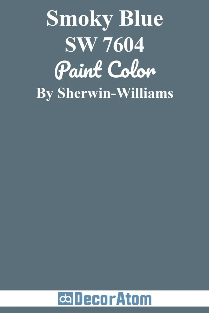
Smoky Blue is a medium-deep blue with a slightly muted, dusty finish. It’s not overly bright, which makes it a perfect color companion to the soft white of Snowbound.
Why it works: This pairing feels coastal, calming, and a little classic. Snowbound softens the boldness of Smoky Blue, while Smoky Blue gives Snowbound some visual interest and richness.
Get a Peel & Stick paint sample of Smoky Blue
4. Sherwin-Williams Softened Green SW 6177

Softened Green is a muted sage that brings a peaceful, natural element into a space. It’s understated, not too yellow or too blue, and works great with creamy or pink-toned whites.
Why it works: This pairing feels organic and serene. If you’re going for a modern farmhouse or soft cottage aesthetic, Snowbound and Softened Green are a great match.
Get a Peel & Stick paint sample of Softened Green
5. Sherwin-Williams Malted Milk SW 6057
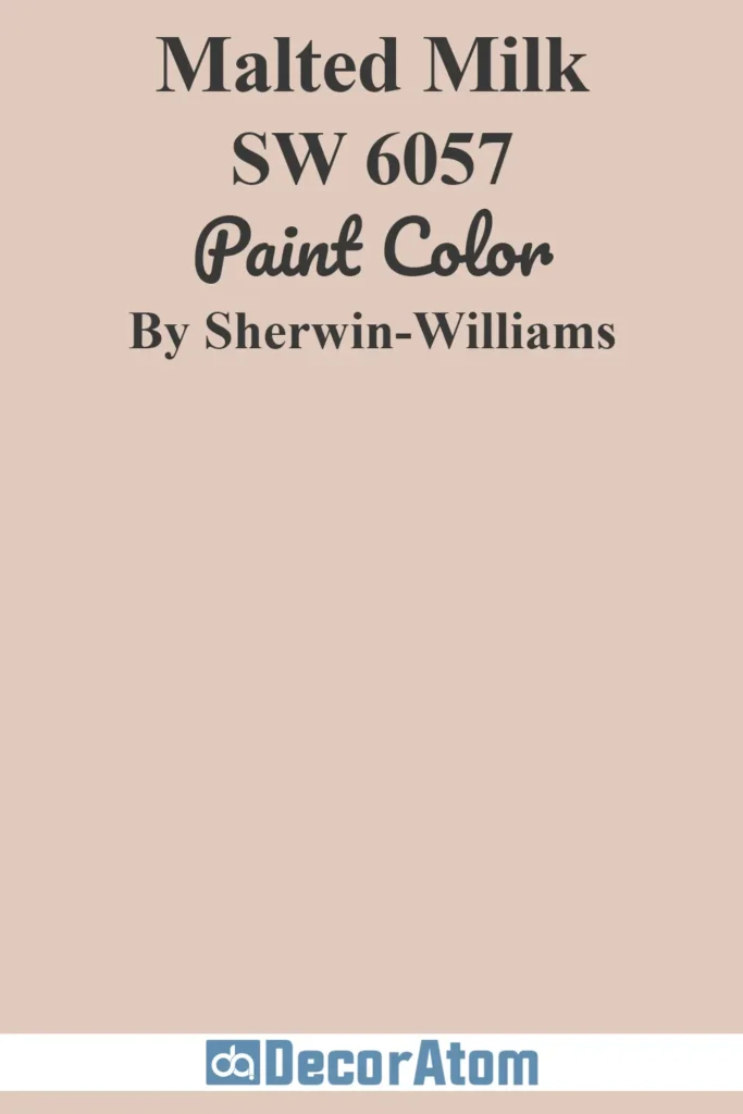
Malted Milk is a soft, dusty blush that reads as a neutral pink. It has a little brown in it, which keeps it grounded and not too “girly.”
Why it works: Snowbound’s pink-gray undertones make it the perfect wall color to pair with Malted Milk in a bedroom, nursery, or even powder room. It’s a modern take on a romantic palette.
Get a Peel & Stick paint sample of Malted Milk
Where to Use Sherwin Williams Snowbound?
If you’re wondering where Snowbound truly shines in the home, the answer is—just about anywhere. That’s one of the biggest reasons people love this color.
It’s versatile, soft, and neutral enough to flow beautifully across multiple rooms.
Whether you’re craving a fresh wall color or looking for the perfect cabinet or trim shade, Snowbound has the subtle warmth to create a cozy environment without feeling too yellow or too cold.
Let’s break it down room by room, because this color can do some amazing things depending on where you use it.
Sherwin Williams Snowbound in the Bedroom

A bedroom painted in Snowbound feels peaceful, clean, and modern. It’s not a stark, clinical white, so it doesn’t overwhelm the senses. Instead, it gives just enough softness to the walls to feel calm and inviting.
I love Snowbound in bedrooms with lots of natural textures—think light wood furniture, linen bedding, and woven rugs.
It acts like a soft canvas that lets other elements in the room shine, while still giving the space that serene, restful quality that a bedroom should have.
If your bedroom doesn’t get a ton of natural light, Snowbound still works, but it will lean a bit warmer—pulling out its subtle pink or taupe undertone. I think that warmth actually helps the room feel cozier, not darker.
Sherwin Williams Snowbound in the Living Room
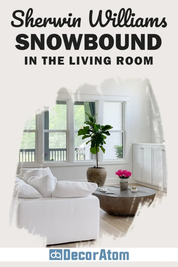
The living room is one of the best spots for Snowbound because it makes the space feel fresh and light, but also grounded.
It’s not one of those ultra-cool whites that makes a space feel icy. Instead, it pairs beautifully with everything from charcoal sofas to warm leather, natural wood, or even pops of color in your throw pillows and decor.
If your living room has big windows, Snowbound will read as a clean but warm white—balancing out strong daylight without being harsh. And in a room with less natural light, it still holds up without feeling dingy.
Snowbound also looks stunning if you’re going for a monochromatic look: white walls, white trim, and layered whites throughout your furniture and textiles. It creates a calm, sophisticated environment that doesn’t feel sterile.
Sherwin Williams Snowbound in the Bathroom

Bathrooms are all about feeling clean and fresh, and Snowbound fits right in. It’s especially nice in smaller bathrooms or powder rooms, where a soft white helps open up the space.
I’ve seen it look amazing on walls paired with marble tile or brushed brass hardware. It just has that slightly warm undertone that makes the space feel welcoming without skewing beige or yellow.
And if you have white cabinetry or trim in the bathroom, Snowbound pairs really well with other whites—especially if you use something like Pure White SW 7005 on the trim or cabinets.
The subtle contrast between the two adds depth without looking mismatched.
Sherwin Williams Snowbound in the Kitchen

Kitchens are tricky. You want a color that’s light and fresh, but not too sterile. That’s exactly why Snowbound is a great fit. It works well for both wall color and cabinetry.
On walls, it keeps the space feeling open and airy, especially if you have darker cabinets or floors.
On kitchen cabinets, Snowbound gives a creamy, soft white that feels modern and timeless. It’s not as bright as a true white, but it also doesn’t lean too yellow.
I’ve seen it paired with brass hardware and white countertops—and let me tell you, the combo is stunning.
Because Snowbound has a tiny bit of gray in its undertone, it also works beautifully with stainless steel appliances or soft gray backsplash tile.
Sherwin Williams Snowbound for the Exterior

Now, let’s talk curb appeal. Snowbound is one of those whites that looks elegant and timeless on the exterior. But it’s important to remember: exterior light really washes out paint colors.
So while Snowbound might look soft and warm inside, it will appear much brighter outside—closer to a crisp white in full sun.
That’s actually what makes it so useful. You can use it on siding for a clean, welcoming home, and pair it with dark trim (like Iron Ore or Tricorn Black) for contrast. Or flip the combo and use Snowbound as your trim with a darker siding color.
It’s an especially beautiful choice for farmhouse-style homes, coastal houses, or even mid-century designs. Just be prepared—it may look much lighter outside than you expect, so test it out first!
Comparing Sherwin Williams Snowbound With Other Colors
Comparing paint colors is one of the smartest steps you can take before committing to one. Sometimes, colors look great in isolation but feel off when you put them next to others or actually see them in your space.
Snowbound has a subtle character that sets it apart, but it also lives in a world where there are many soft whites with slightly different undertones and brightness levels.
Let’s look at how Snowbound stacks up against six other popular white and off-white paint colors:
Sherwin Williams Snowbound vs Alabaster SW 7008
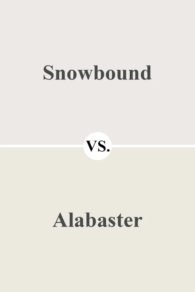
Alabaster is creamier and has yellow-beige undertones. It reads as a warm, almost antique white.
Alabaster feels more traditional and cozy. If you want warmth without gray or pink, Alabaster might be the way to go. Snowbound feels more modern and a bit cooler in comparison.
Sherwin Williams Snowbound vs Pure White SW 7005
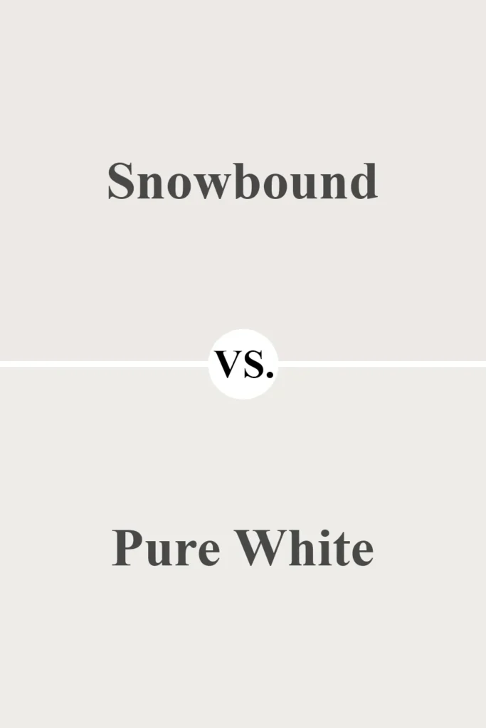
Pure White is cleaner and more neutral than Snowbound. It has a bit of warmth, but less of the pink/gray undertone that Snowbound shows.
Use Pure White if you want something closer to a neutral white. Use Snowbound if you prefer a soft white with subtle taupe-pink warmth.
Sherwin Williams Snowbound vs White Duck SW 7010
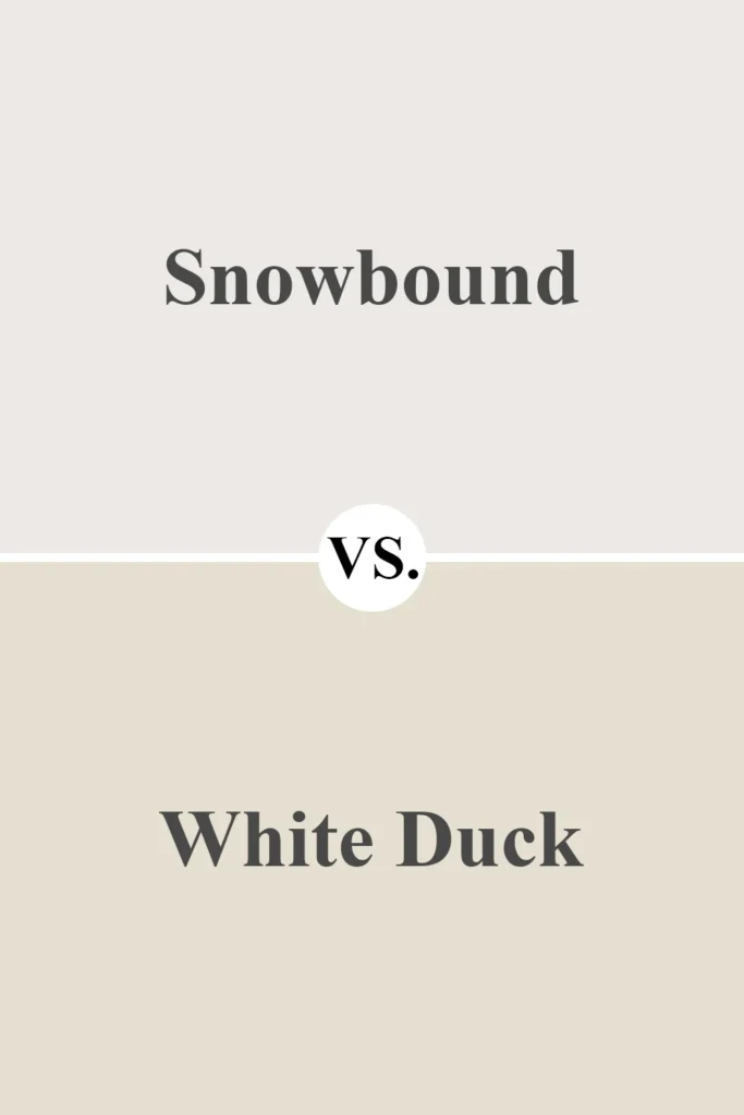
White Duck is a creamy, off-white with strong beige undertones.
White Duck is warmer and has more of a muted greige vibe. Snowbound is lighter and slightly cooler. White Duck can look dingy in darker rooms, while Snowbound stays fresh.
Sherwin Williams Snowbound vs Chantilly Lace OC-65 (Benjamin Moore)
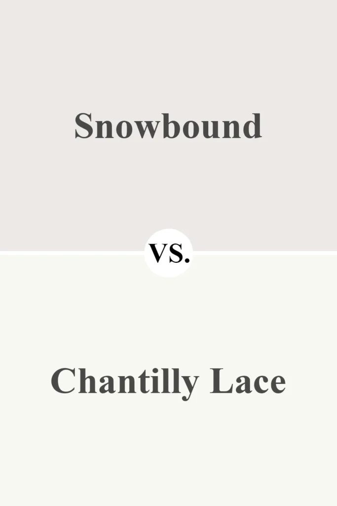
Chantilly Lace is one of the brightest, cleanest whites available. It’s a true neutral with almost no undertone.
If you want crisp and modern, go with Chantilly Lace. Snowbound is much softer and slightly pink in comparison. The two serve very different design goals.
Sherwin Williams Snowbound vs Swiss Coffee OC-45 (Benjamin Moore)
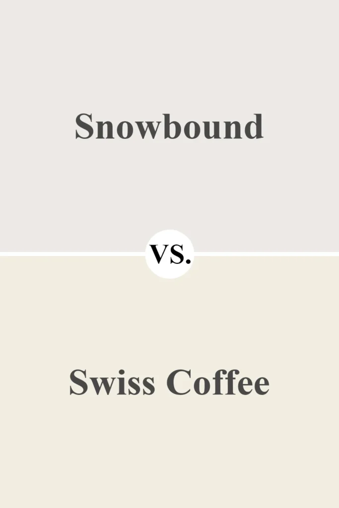
Swiss Coffee is creamier and darker, with stronger beige and yellow undertones.
Swiss Coffee is richer and more traditional. It leans cozy, while Snowbound is softer and more subdued. Side by side, Swiss Coffee looks much warmer and Snowbound looks much cooler.
Sherwin Williams Snowbound vs Egret White SW 7570
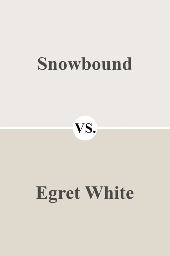
Egret White is a greige—so it’s much darker and taupe-based.
If you love the undertone of Snowbound but want something deeper, Egret White might be perfect. Snowbound is much lighter and functions as a true soft white, whereas Egret White is closer to a light taupe-gray.
Why I Love Sherwin Williams Snowbound
What I personally love about Snowbound is its soft, lived-in feel.
It’s white, yes—but not in a cold, clinical way. It has just enough warmth and softness to feel cozy, but not so much that it turns creamy or yellow.
That balance makes it incredibly versatile, whether you’re using it in a new build, a cozy farmhouse, or a modern refresh.
I also appreciate how it plays with light. In a bright room, it glows without being blinding.
In a darker room, it holds its own and still feels clean. It’s one of those colors that looks like you tried—without trying too hard.
And for someone like me, who wants a home that feels fresh but also welcoming, Snowbound hits that sweet spot perfectly.
Final Thoughts
Sherwin-Williams Snowbound SW 7004 is a soft, neutral white with subtle character that brings quiet elegance to any space.
Whether you use it in your bedroom, kitchen, bathroom, or even on the outside of your home, it adapts well to natural light, coordinates with a wide range of other colors, and gives your home that light and airy look without ever feeling too stark or cold.
It’s not the brightest white in the Sherwin-Williams lineup—but that’s what makes it special. It gives your rooms a sense of warmth, softness, and modern sophistication that’s both inviting and timeless.
If you’re considering it, definitely test a sample in your space. But don’t be surprised if it ends up being the one.