
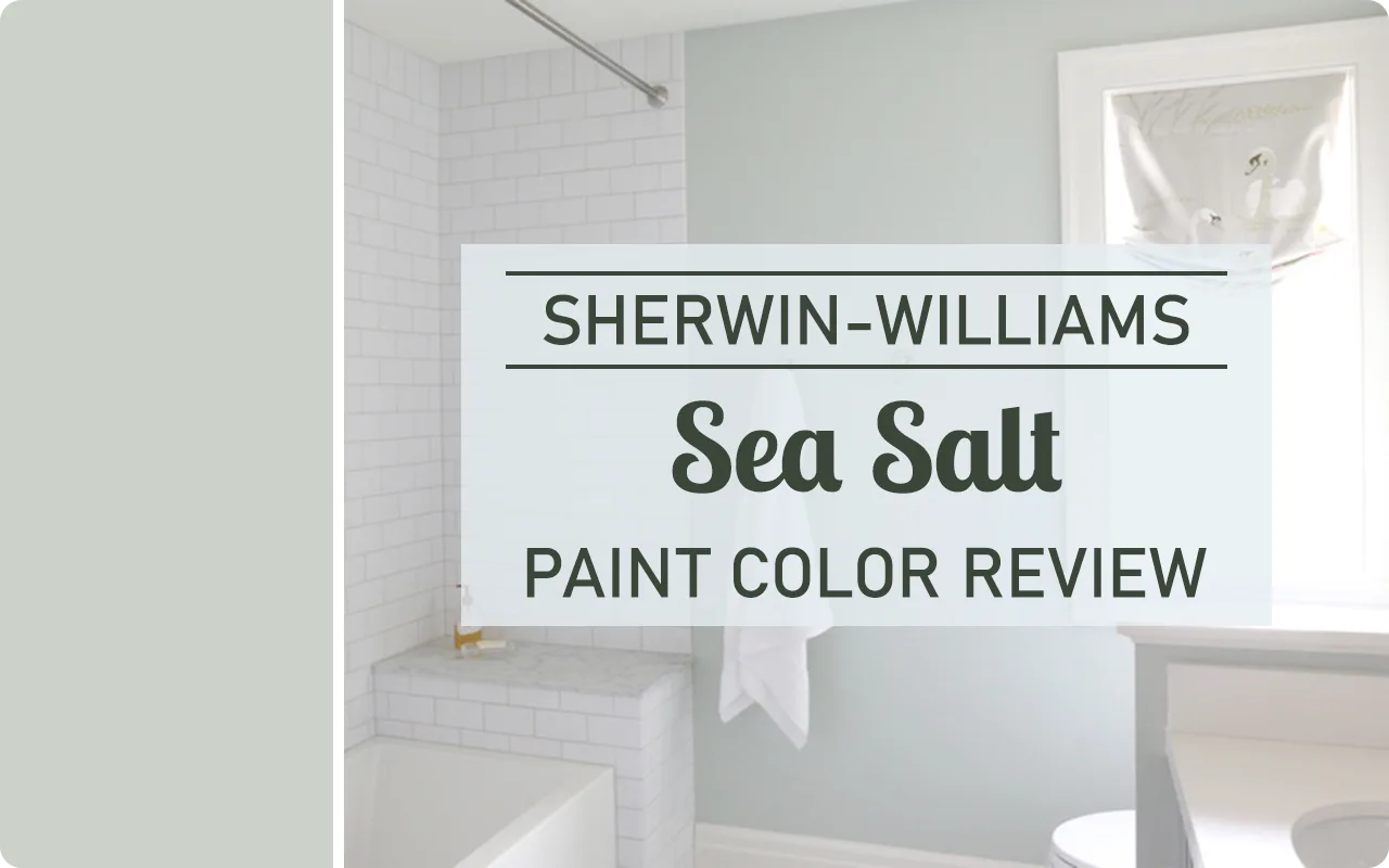
If you’ve been searching for a soft, calming paint color that whispers “relax,” then let me introduce you to Sea Salt SW 6204 by Sherwin-Williams.
This color has been one of the brand’s top picks for years, and once you see it on the wall, it’s easy to understand why. Sea Salt has this gentle, spa-like quality to it that makes any space feel lighter, fresher, and more peaceful.
Whether it’s going in a bathroom, bedroom, or even a cozy coastal-inspired living room, it somehow finds a way to blend right in while still standing out.
I’ve seen Sea Salt used in so many different types of homes, from modern farmhouses to beachy cottages, and it always brings that soft, tranquil vibe people are looking for.
It’s not a flashy color, but that’s the beauty of it. It doesn’t scream for attention. Instead, it quietly transforms a space into something serene and easy to live in.
What Color is Sea Salt SW 6204?
Sherwin-Williams Sea Salt is one of those colors that’s a little hard to pin down at first glance, but in a good way. At its core, it’s a muted green with soft blue and gray undertones.
The green is what comes through most clearly, but it has just enough blue mixed in to give it that peaceful, watery vibe, kind of like a misty ocean on a quiet morning.
It’s not a bold green or a true pastel. Instead, it sits right in that happy place where color meets calm.
Some people see more blue in it, especially in cooler lighting, while others notice the soft green more when there’s warm light in the room.
That little bit of gray that’s mixed in? It helps tone everything down, giving Sea Salt its trademark softness and making it feel more neutral and versatile.
So if you’re looking for a color that looks like it belongs in a spa or a peaceful seaside retreat, Sea Salt is a fantastic option.
It’s soothing, easy on the eyes, and changes just enough throughout the day to keep things interesting.
How to Know if a Paint Color Is Right for You?
Would you like to sample Sea Salt SW 6204 paint color? I recommend using Samplize. They offer 9”x14.75”” peel-and-stick paint swatches that make testing colors super simple. Just stick it on your wall, move it around if needed, and when you’re done, peel it off and toss it. No mess, no cleanup. It’s quick, easy, and way more convenient!

💥🎁 Christmas & Year-End Deals On Amazon !
Don't miss out on the best discounts and top-rated products available right now!
*As an Amazon Associate, I earn from qualifying purchases.
Advantages of using peel and stick paint samples:
- EASY TO USE: Simply move your SAMPLIZE paint sample around the room to test under a variety of lighting conditions.
- AFFORDABLE: Budget-friendly solution and no more buying inaccurate swatches, rollers, wasted paint.
- SUPER FAST DELIVERY: Depending on your location, 1 day delivery is possible.
- ORDER FROM HOME: Save a trip to the store looking for samples.
- NO MESS: SAMPLIZE uses real paint samples with zero-mess
- NO WASTE: No leftover cans or wasted paint.
Is It a Warm or Cool Color?
Sea Salt SW 6204 leans cool, but not in a sharp or icy way. Think of it more like a cool breeze coming through the window on a mild spring day—refreshing, but still soft.
The reason it feels cool is because of the blue and gray undertones. Blue is naturally a cooler color on the spectrum, and when you add that to a soft green base, you get a cool-toned blend that’s very calming.
That said, it’s not so cool that it makes a room feel cold or sterile. It still has a gentle, welcoming feel—especially when paired with warm wood tones, soft whites, or natural textures like linen and rattan.
In fact, it’s this balance that makes Sea Salt so popular. It’s cool enough to feel fresh, but soft enough to feel cozy. It brings the best of both worlds depending on how you style the room around it.
LRV of Sherwin Williams Sea Salt SW 6204
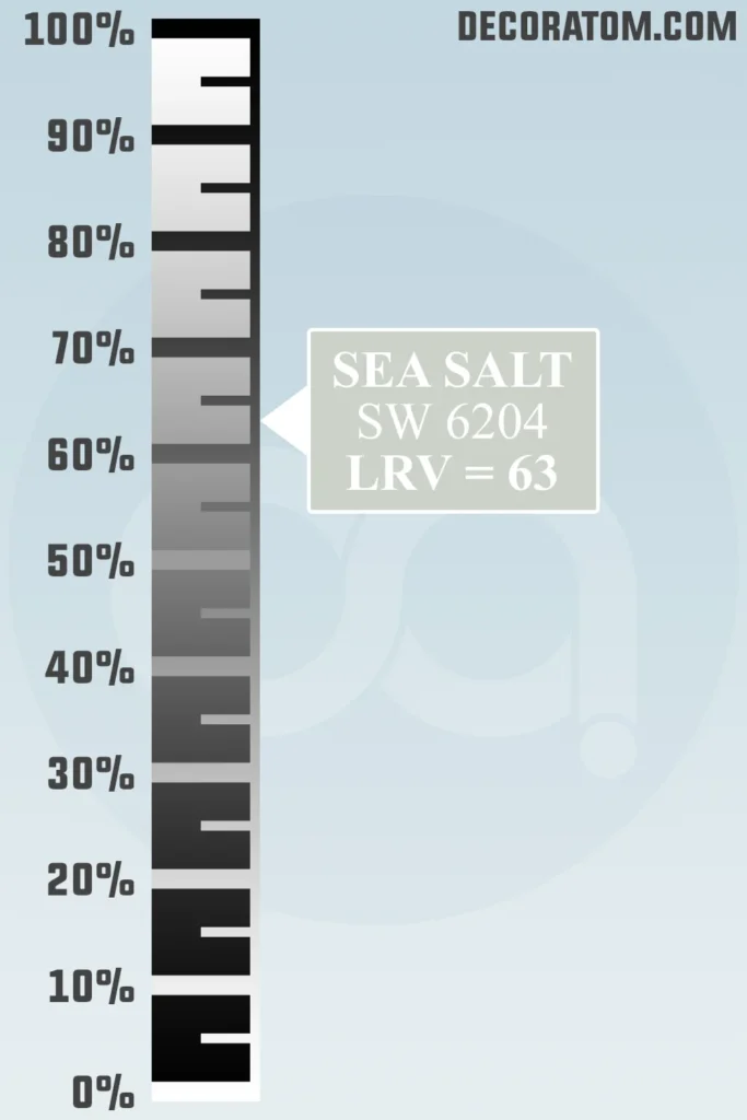
Let’s talk about LRV—don’t worry, I’ll keep it simple.
LRV stands for Light Reflectance Value, and it’s just a number (from 0 to 100) that tells us how much light a paint color reflects.
The higher the number, the more light it bounces back into the room. Pure white would be close to 100. A deep charcoal or black would be near 0.
Sea Salt has an LRV of 63. That puts it in the light to medium-light range, which means it reflects a good amount of light but still has enough depth to show color.
It won’t wash out completely in bright sunlight, and it won’t feel too heavy in a smaller space either.
In a nutshell? It’s light enough to brighten a room but still has enough personality to make the color noticeable. A great balance.
Undertones of Sherwin Williams Sea Salt SW 6204
One of the things that makes Sea Salt such a beautiful and chameleon-like color is its undertones.
Now, if you’ve ever painted a room thinking you were getting one color and ended up with something that looked totally different depending on the time of day—yep, that’s the undertones at play.
Sea Salt is primarily a soft green, but its most noticeable undertones are blue and gray. These undertones are what give it that calming, misty feel.
The blue pulls it into the cooler end of the spectrum, making it feel more serene and coastal, while the gray softens it and keeps it from reading as too bold or minty.
Here’s the thing: in some rooms, especially with cooler northern light or under artificial lighting, the blue undertones can come forward more, making Sea Salt feel like a pale greenish-blue. In other spaces—especially ones with warm, southern sunlight—it can lean more green, with just a whisper of blue behind it.
That gray undertone? It’s doing a lot of quiet heavy lifting. It keeps the color grounded and muted so it never feels neon or overly pastel.
That’s why Sea Salt works so beautifully in spaces meant for unwinding—bedrooms, bathrooms, reading nooks—places where you want the color to calm the room, not energize it.
How Does Lighting Affect Sherwin Williams Sea Salt SW 6204?
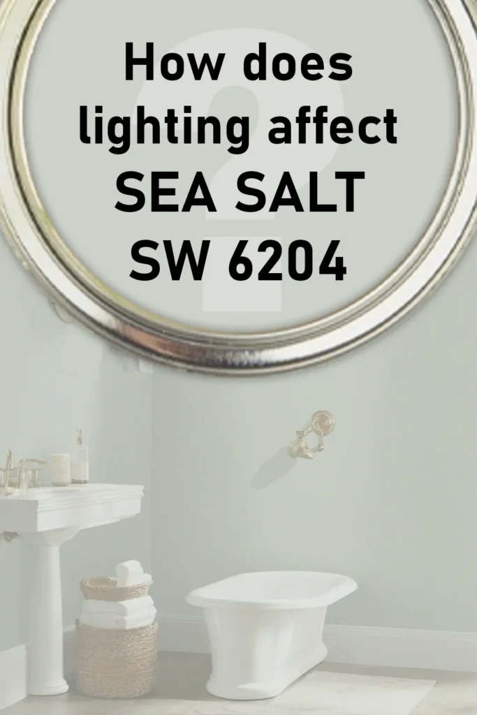
Lighting has a huge impact on how Sea Salt looks on your walls—and I mean huge. This color is sensitive in the best way, almost like it picks up little hints from its surroundings and shifts slightly to match the mood.
In natural light, the direction the light is coming from makes a big difference:
- North-facing rooms tend to have cooler, grayer light. In these spaces, Sea Salt often looks more blue-gray, and its cool undertones are more noticeable.
- South-facing rooms get warmer light throughout the day. Here, Sea Salt can lean more toward its soft green base, and it might feel a bit sunnier and more cheerful.
- East-facing rooms get warm light in the morning and cooler light later in the day. Sea Salt may start off looking warm and greenish in the morning, then shift cooler and bluer as the day goes on.
- West-facing rooms are the opposite—cooler in the morning and warmer in the afternoon and evening. So Sea Salt may appear cooler and more muted in the early part of the day, but develop a soft, almost silvery green glow later on.
Under artificial lighting, it really depends on your bulb temperature:
- Cool LED or fluorescent bulbs will make it look more blue.
- Warm incandescent or soft white bulbs will pull the green forward.
It’s one of those shades you definitely want to sample on the wall before committing. Test it in different spots, at different times of day. What looks like a peaceful seafoam green in one room could shift to a cooler gray-blue in another.
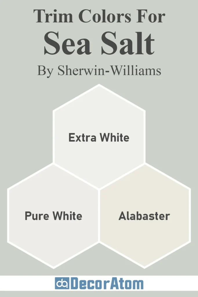
Trim Colors to Pair With Sherwin Williams Sea Salt SW 6204?
💥🎁 Christmas & Year-End Deals On Amazon !
Don't miss out on the best discounts and top-rated products available right now!
*As an Amazon Associate, I earn from qualifying purchases.
Sea Salt pairs beautifully with clean, soft, and classic trim colors. Because Sea Salt has such a gentle presence, it looks best when the trim feels light and fresh too. My go-to recommendations?
- Sherwin-Williams Extra White (SW 7006) – This is a crisp, clean white that gives a nice contrast to Sea Salt. It brightens up the edges of a room and gives the whole space a clean, fresh finish.
- Sherwin-Williams Pure White (SW 7005) – A slightly softer white with just a touch of warmth, which helps Sea Salt look a bit more green and grounded. This is perfect if you don’t want the trim to feel stark.
- Sherwin-Williams Alabaster (SW 7008) – A creamy, warm white that plays beautifully with the soft green-gray tones of Sea Salt. It’s an ideal choice if you want your space to feel cozy and inviting.
Stick with whites that are either neutral or warm. Cool whites can sometimes bring out too much blue in Sea Salt, especially if you already have cool lighting in the room.
Colors Similar to Sherwin Williams Sea Salt SW 6204
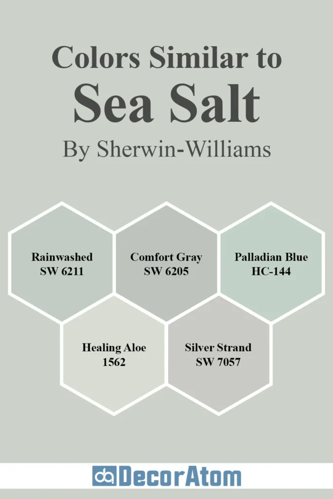
Now, let’s say you love the vibe of Sea Salt but want to explore a few similar options before locking in your decision. Maybe you’re looking for something slightly deeper, or a little bluer, or even more neutral—but still within that soft, spa-like family.
Here are five colors that are similar in spirit, tone, and mood—some from Sherwin-Williams and others from Benjamin Moore—along with detailed comparisons to help you spot the differences.
1. Sherwin-Williams Rainwashed (SW 6211)

If Sea Salt is a soft green with blue undertones, Rainwashed flips that recipe a bit—it’s more blue than green, but still has that gentle gray backdrop. It feels like a more coastal cousin to Sea Salt.
Rainwashed is a great choice if you want something with a stronger blue presence without going full baby blue. It works beautifully in bathrooms, bedrooms, or even laundry rooms.
Compared to Sea Salt, Rainwashed is noticeably bluer and reads cooler overall. Sea Salt leans greener and feels slightly warmer and more balanced between its tones.
2. Sherwin-Williams Comfort Gray (SW 6205)

💥🎁 Christmas & Year-End Deals On Amazon !
Don't miss out on the best discounts and top-rated products available right now!
*As an Amazon Associate, I earn from qualifying purchases.
Comfort Gray is the next color down on the paint strip right after Sea Salt, so it’s like Sea Salt’s slightly deeper sibling. It has the same mix of green, blue, and gray, but it’s richer and a bit moodier.
If you love Sea Salt but want more depth or contrast—maybe for a dining room or accent wall—Comfort Gray is a fantastic option.
Compared to Sea Salt, Comfort Gray is deeper and darker, with more visual weight. Sea Salt is airier and softer, especially in light-filled spaces.
3. Benjamin Moore Palladian Blue (HC-144)

This is a really popular Benjamin Moore shade that shares the same soft, coastal vibe as Sea Salt. Palladian Blue is a pale blue with a touch of green, making it feel like a calm sea breeze.
It tends to read slightly bluer than Sea Salt and can lean a bit more pastel in certain lights.
Compared to Sea Salt, Palladian Blue is cooler and more distinctly blue. Sea Salt has a more subtle, green-gray softness to it and doesn’t look quite as icy.
4. Benjamin Moore Healing Aloe (1562)

Healing Aloe is like Benjamin Moore’s answer to Sea Salt. It’s a pale greenish-gray with hints of blue, just like Sea Salt, but it has a slightly more silvery, airy quality.
It’s perfect in rooms with lots of natural light and pairs wonderfully with whites and natural textures.
Compared to Sea Salt, Healing Aloe is a bit more muted and gray. Sea Salt tends to look more green and has a touch more saturation.
5. Sherwin-Williams Silver Strand (SW 7057)

💥🎁 Christmas & Year-End Deals On Amazon !
Don't miss out on the best discounts and top-rated products available right now!
*As an Amazon Associate, I earn from qualifying purchases.
Silver Strand is another great alternative if you’re drawn to Sea Salt but want something that feels a little more refined and gray-forward.
It’s still in the green-blue-gray family but reads more silvery and subdued, almost like a very soft sage misted with gray.
Compared to Sea Salt, Silver Strand is more gray, while Sea Salt is lighter, softer, and has a bit more green-blue energy. Sea Salt brings a more cheerful freshness; Silver Strand feels more sophisticated and reserved.
Colors that Go With Sherwin Williams Sea Salt SW 6204
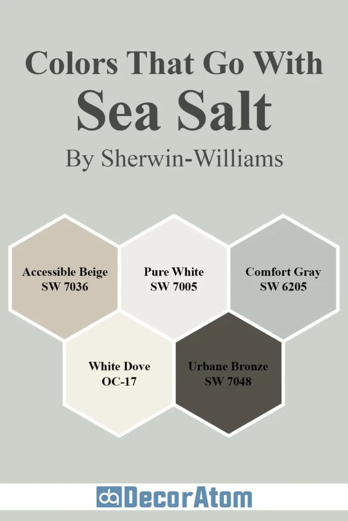
One of the best things about Sea Salt is how versatile and easy it is to pair with other colors. Because it’s a soft blend of green, blue, and gray, it plays well with both warm and cool tones.
Whether you’re going for a coastal vibe, a relaxed farmhouse look, or something spa-like and serene, Sea Salt can anchor your palette beautifully.
Here are five color companions that truly shine next to Sea Salt:
1. Sherwin Williams Accessible Beige (SW 7036)

If you want a warm neutral that doesn’t overpower Sea Salt’s cool, calming presence, Accessible Beige is a perfect match. It’s a warm greige that feels inviting without being too yellow or heavy.
When paired with Sea Salt, it brings balance—the warmth of Accessible Beige makes Sea Salt feel even fresher and cooler in contrast.
Why it works: The two colors create a soothing blend of warm and cool that feels organic and restful. This combo is especially gorgeous in open concept homes where rooms flow into each other.
2. Sherwin Williams Pure White (SW 7005)

💥🎁 Christmas & Year-End Deals On Amazon !
Don't miss out on the best discounts and top-rated products available right now!
*As an Amazon Associate, I earn from qualifying purchases.
Pure White is a go-to trim and cabinet color, but it also works beautifully on walls or ceilings next to Sea Salt.
It’s a soft, slightly warm white—not icy, not creamy—just a clean, fresh backdrop that lets Sea Salt shine.
Why it works: Sea Salt’s blue-green undertones look crisp and peaceful against Pure White. This pairing gives off spa-like energy and keeps the room feeling open and airy.
3. Sherwin Williams Comfort Gray (SW 6205)
This deeper, more saturated version of Sea Salt shares the same DNA—soft green, with blue and gray undertones—but has more richness. It’s ideal for accent walls, adjoining rooms, or even furniture.
Why it works: Using Comfort Gray with Sea Salt creates a layered look with subtle contrast. It keeps the palette cohesive, but with just enough depth to make things interesting.
4. Benjamin Moore White Dove (OC-17)

White Dove is one of those tried-and-true creamy whites that’s warm without being yellow. It softens up Sea Salt and complements its tranquil nature.
I especially love this combo in bedrooms and bathrooms where you want things to feel gentle and inviting.
Why it works: The warmth of White Dove balances Sea Salt’s cooler tones. Together, they feel elegant and serene, with just enough contrast to keep the space from looking too monotone.
5. Sherwin Williams Urbane Bronze (SW 7048)

This may seem like a bold choice, but hear me out. Urbane Bronze is a deep, earthy brown-gray with a modern edge.
When used alongside Sea Salt—on a front door, window trim, or even kitchen island—it adds drama and sophistication.
Why it works: The dark, grounding tone of Urbane Bronze highlights Sea Salt’s softness and freshness. It’s an unexpected but incredibly striking pairing that feels high-end and intentional.
Where to Use Sherwin Williams Sea Salt SW 6204?
So where does Sea Salt truly shine? Honestly, this is one of those rare paint colors that seems to work just about anywhere—indoors or out.
Its peaceful mix of soft green, blue, and gray makes it a calming choice for bedrooms and bathrooms, but also refined enough for common spaces and even exteriors.
Here’s a closer look at how Sea Salt performs in different areas of the home:
Sherwin Williams Sea Salt SW 6204 In the Bedroom
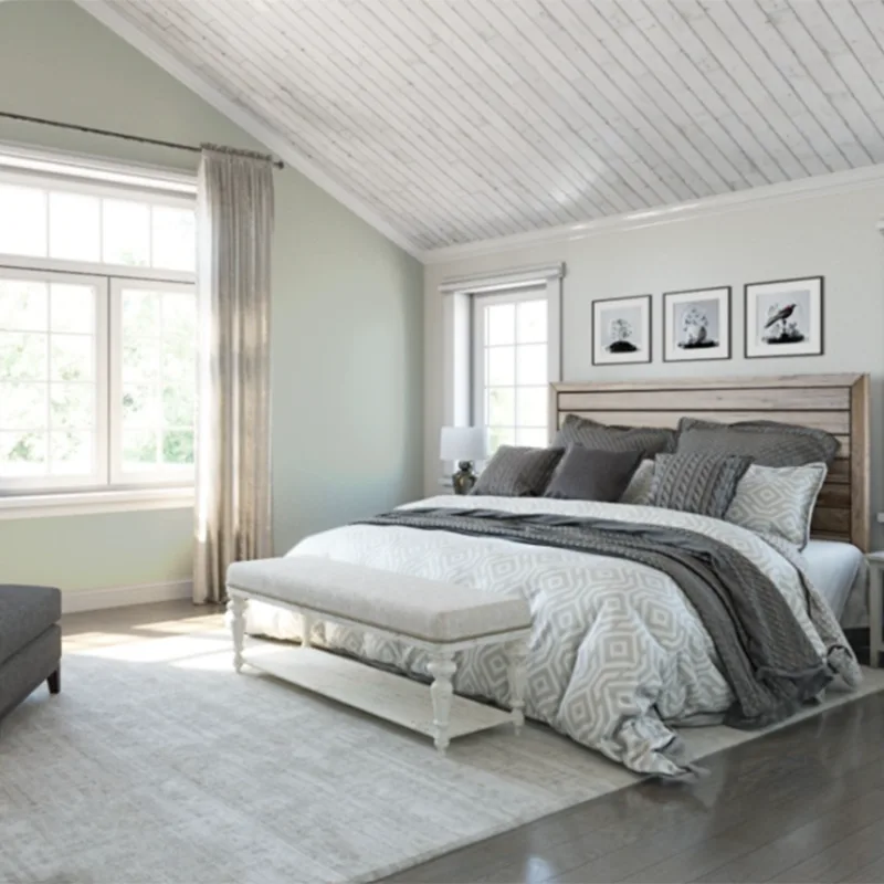
If you’re dreaming of a bedroom that feels like a coastal retreat or a spa escape, Sea Salt might be your perfect match. It creates a sense of peace the moment you walk in—soothing, not sterile.
It’s especially lovely in rooms that get plenty of natural light, where its undertones can dance across the walls throughout the day.
Pair it with white or cream bedding, natural wood furniture, and a few woven textures, and you’ve got the kind of bedroom you’ll want to lounge in all weekend.
It’s light enough to keep the room feeling open and airy, but has enough color to create interest without being overwhelming.
Sherwin Williams Sea Salt SW 6204 In the Bathroom
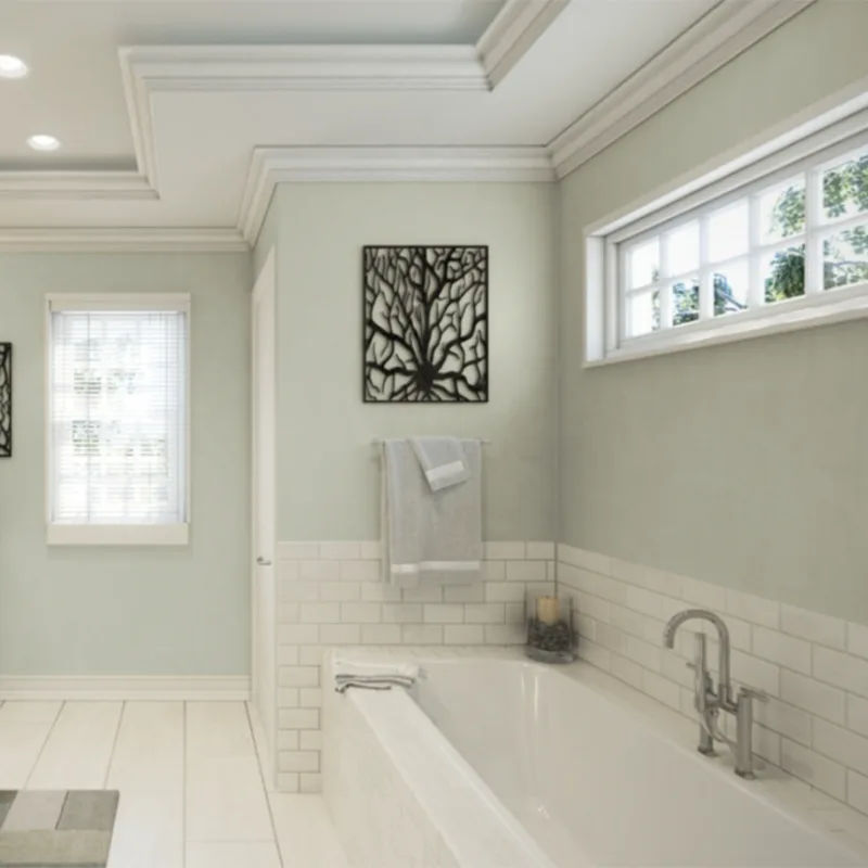
Bathrooms are one of Sea Salt’s favorite places to shine. That soft green-blue-gray combo feels clean, relaxing, and spa-like—everything you want in a bathroom.
Especially in smaller bathrooms or powder rooms, it can make the space feel fresh without needing much decor.
Pair it with soft white tiles, marble or quartz counters, and brushed nickel or brass hardware, and you’ll have a bathroom that looks like it was ripped from a luxury spa catalog.
Sea Salt also works beautifully with coastal or beach-inspired decor, but it’s versatile enough for more modern or traditional styles too.
Sherwin Williams Sea Salt SW 6204 In the Living Room
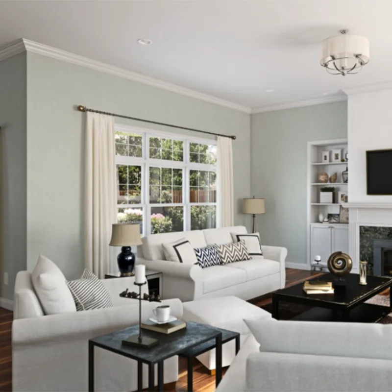
In a living room, Sea Salt is like a breath of fresh air. It’s light and calming, but still interesting. If you’re tired of gray but not quite ready for color overload, this is your sweet spot. It adds just enough hue to give the room personality without shouting for attention.
You can easily layer in soft beiges, warm woods, woven accents, and textured fabrics to keep things cozy. Sea Salt also plays well with both gold and black accents, so it can lean coastal, modern farmhouse, or even soft contemporary depending on your furniture and lighting.
Sherwin Williams Sea Salt SW 6204 For the Exterior

Yes—Sea Salt even works outdoors! On an exterior, it can give your home a light, airy presence. Think charming beach cottages, peaceful lake houses, or even Craftsman homes looking for a soft update.
It pairs wonderfully with crisp white trim, soft grays, and deeper accents like navy, charcoal, or bronze.
Just be aware that outside in full sun, Sea Salt can look a lot lighter and less colorful—almost like a soft gray-white with a hint of green. If you love that gentle look, it’s perfect.
Sherwin Williams Sea Salt SW 6204 in Kitchen and Kitchen Cabinets
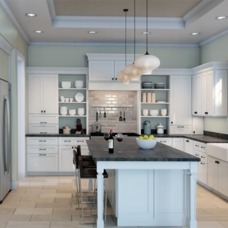
Now let’s talk kitchens—one of the most powerful places you can use color. Sea Salt can be an unexpected but delightful choice for kitchen walls, or even cabinetry.
On the walls, it keeps the space feeling open and clean, while giving a soft wash of color that pairs beautifully with white or wood cabinets.
For cabinets, Sea Salt can be stunning—especially in a cottage-style or coastal-inspired kitchen. It adds personality without overpowering. Picture it on lower cabinets with white uppers, or even on an island against a backdrop of crisp white walls.
Pair it with white subway tile, butcher block counters, or matte brass hardware for a fresh, timeless look that doesn’t feel cookie-cutter.
Click here to get a Peel & Stick paint sample of Sea Salt SW 6204
Final Thoughts
Sherwin Williams Sea Salt SW 6204 is one of those rare paint colors that truly feels like a breath of fresh air.
It’s soft and soothing, a little bit green, a little bit blue, with just enough gray to keep it grounded.
What makes it stand out is how adaptable it is—shifting gently with the light, and working its magic in just about every room.
Whether you’re creating a spa-like bathroom, a relaxed bedroom retreat, or a welcoming kitchen, Sea Salt brings a quiet kind of beauty that doesn’t try too hard—but always delivers.
It’s the kind of color that grows on you in the best way. And if you’re someone who’s been stuck in the gray-and-white rut but nervous about adding color, Sea Salt is your perfect first step into something a little more lively—without going bold.