
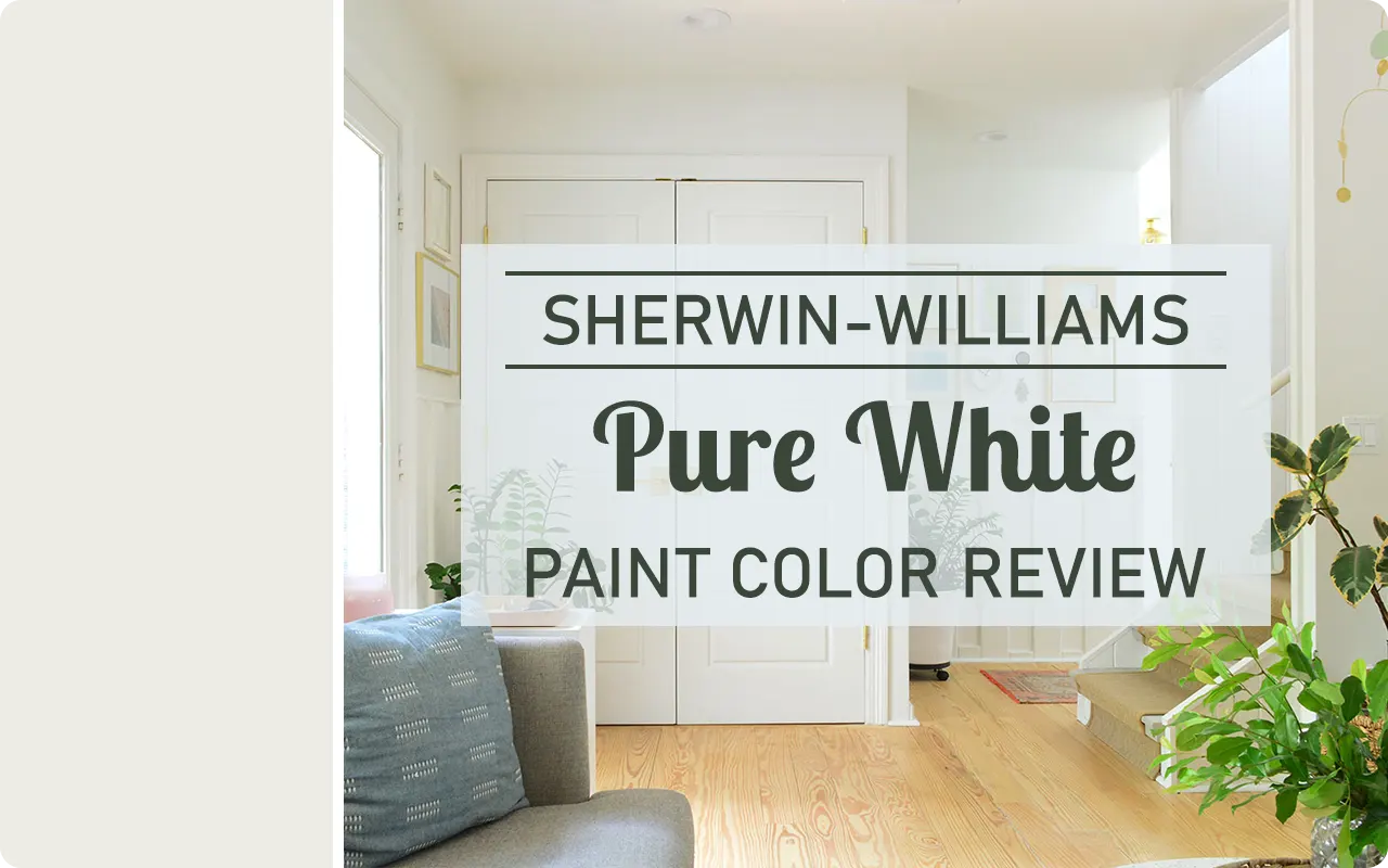
I can’t tell you how many times I’ve been asked, “What’s the perfect white paint color?” And honestly, that’s not an easy question to answer—white isn’t just white.
It comes in all kinds of undertones and finishes that can completely change how it looks in your space.
But if I had to pick a white that almost always plays nice and feels fresh without being too stark, I’d say Sherwin-Williams Pure White SW 7005 is a serious contender.
This is one of those colors that doesn’t scream for attention—but somehow manages to tie everything together beautifully. It’s crisp, soft, and clean, all at the same time.
Whether you’re painting trim, cabinets, ceilings, or even full walls, Pure White holds its own. It’s that kind of white that looks intentional—never cold, and never dingy.
What Color is Sherwin Williams Pure White SW 7005?
Despite the name “Pure White,” this color isn’t a harsh, blinding white straight out of a lab coat.
Instead, it’s a soft white with just a whisper of warmth, which helps it feel inviting rather than stark.
It has a touch of both yellow and black in its formula, and what that does is take away that icy edge you might find in cooler whites.
So when you look at Pure White on the wall, it reads as a true white—but it’s a gentle, breathable kind of white that doesn’t feel too sterile or overly bright.
It gives you that clean backdrop you might be looking for, without looking too “builder-basic.” It’s incredibly versatile, and it adapts beautifully in different rooms.
Is It a Warm or Cool Color?
Sherwin-Williams Pure White is technically a warm white, but it’s extremely subtle about it. Think of it as sitting right near the middle, but just leaning ever so slightly toward the warm side.
It doesn’t come across as yellow or creamy, but it definitely doesn’t have the chill that a cool white would.
That tiny touch of warmth is what makes it work so well in almost any room. It brings a sense of softness without leaning into beige or cream territory.
If your space gets a lot of cool, natural light (like from north-facing windows), that hint of warmth can keep the white from looking too gray or shadowy.
On the other hand, in a sunny room, it still holds onto that clean, fresh look without turning too yellow.
In short: it’s warm, but it never feels overly warm. It’s the “just right” kind of white that works for both modern and traditional homes.
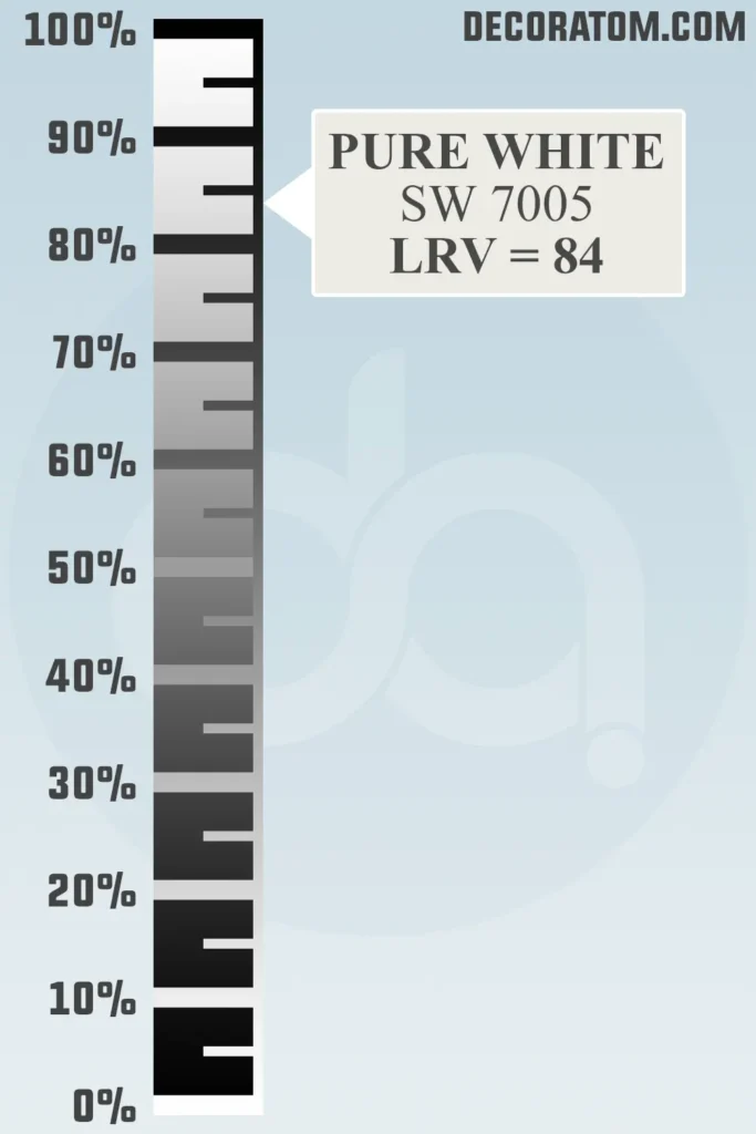
LRV of Sherwin Williams Pure White SW 7005
💥🎁 Christmas & Year-End Deals On Amazon !
Don't miss out on the best discounts and top-rated products available right now!
*As an Amazon Associate, I earn from qualifying purchases.
Let’s talk LRV for a quick second—don’t worry, I’ll keep it simple.
LRV stands for Light Reflectance Value. It’s a number between 0 and 100 that tells you how much light a paint color reflects. Zero is pure black, and 100 is a bright, true white. So, the higher the number, the lighter and more reflective the paint color is.
Now, Sherwin-Williams Pure White has an LRV of 84, which means it reflects a lot of light—making it a great option for brightening up a space.
It’s not the brightest white in the Sherwin-Williams lineup (that title would go to something like High Reflective White, which sits at 93), but 84 is still pretty high.
That slightly lower LRV compared to true bright whites gives Pure White its soft, approachable feel. It doesn’t glare in the sunlight or feel too intense under artificial lighting.
It’s got just enough softness to make it feel lived-in, while still looking clean and modern.
Undertones of Sherwin Williams Pure White SW 7005
Let’s get into the undertones—because if you’ve ever painted a room expecting one thing and getting another, you already know how sneaky undertones can be.
Sherwin-Williams Pure White has very subtle undertones of yellow and a hint of black. But here’s the thing: they don’t jump out at you.
The yellow gives it just enough warmth so it doesn’t feel icy or sterile, and the black cuts that warmth just enough to keep it from looking creamy or beige.
It’s like a balancing act—just enough of each to make it look like a true soft white without swinging too far in either direction.
When you look at it on the wall, especially next to cooler or brighter whites, you might pick up on that gentle warmth. But on its own? It just looks like a clean, classic white.
It doesn’t go peachy or yellow in most lighting situations, which is a big win if you’re trying to avoid a color that shifts too much throughout the day.
That’s what makes Pure White so user-friendly. It’s predictable and consistent—just what you want from a paint color that’s probably going on your trim, cabinets, or even your entire living room.
How Does Lighting Affect Sherwin Williams Pure White?
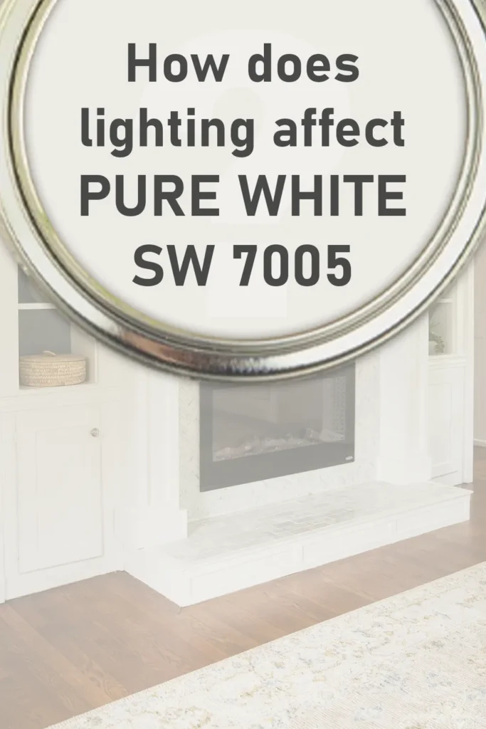
Lighting can completely change how any paint color looks—including Pure White.
In north-facing rooms, which naturally have cooler, bluish light, Pure White may appear slightly more crisp. That’s when the warmth in it becomes really helpful.
It keeps the room from feeling cold or shadowy. The yellow undertone gently counters the cool light, so you’re not left with a white that feels flat or gray.
In south-facing rooms, where the light is warmer and more golden throughout the day, Pure White can look a touch warmer. Not creamy or buttery, but just a little cozier.
It holds up well here because it doesn’t go too yellow or soft—it still maintains that clean look.
In east-facing rooms, which get bright morning light and cooler light in the afternoon, you might notice it feels brighter in the AM and a bit more muted later in the day.
And in west-facing rooms, where you get warmer light in the evening, it can feel a bit richer and softer toward sunset.
Artificial lighting also plays a role. Under warm LED or incandescent lights, it’ll look slightly more creamy—but again, it’s so soft you may barely notice.
Under cool fluorescent lighting, that warmth may tone down and lean more toward neutral.
The bottom line? Pure White adjusts well. It’s not one of those whites that turns drastically yellow or gray depending on the time of day. It’s more like a steady, soft white that stays balanced in all kinds of light.
Trim Colors to Pair With Sherwin Williams Pure White
Here’s the good news: Pure White is versatile enough to be both the main wall color and the trim color. A lot of people use it on walls and trim for a clean, seamless look—and it works beautifully because it’s not too stark.
But if you want contrast or you’re pairing it with a wall color and looking for the perfect trim, here are some ideas:
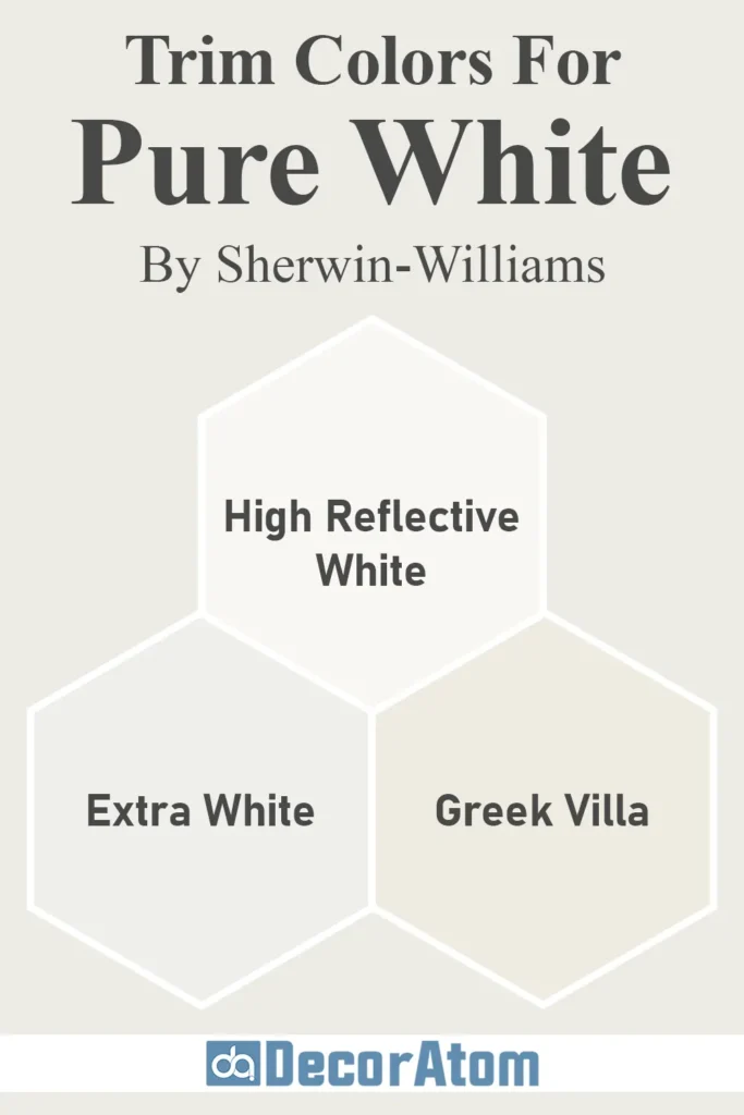
- High Reflective White SW 7757 – This is Sherwin-Williams’ brightest white. If you’re using Pure White on the walls, High Reflective White makes a great trim color because it’s super clean and gives you just a bit of contrast. It makes the walls feel slightly softer by comparison.
- Extra White SW 7006 – Slightly cooler than Pure White, but still clean and fresh. If you’re leaning toward cooler tones in the room (blues, grays, cooler neutrals), Extra White can be a crisp trim pairing.
- Greek Villa SW 7551 – If you’re going warmer and cozier with your palette, Greek Villa is a creamy, warm white that can act as a trim or ceiling color next to Pure White walls. The combination creates a soft, layered white-on-white look.
That said, Pure White is often the go-to for trim itself because it works so well with both cool and warm wall colors. If you’re looking for one trim color to use throughout your whole house and not think twice, Pure White is one of the best options.
Colors Similar to Sherwin Williams Pure White SW 7005
💥🎁 Christmas & Year-End Deals On Amazon !
Don't miss out on the best discounts and top-rated products available right now!
*As an Amazon Associate, I earn from qualifying purchases.
Sometimes you want to compare before you commit. Maybe you’re thinking, “Is Pure White too warm for my space?” or “Is there something even brighter or softer out there?” Totally valid.
While Pure White is a great all-around option, here are five similar colors—some from Sherwin-Williams, some from Benjamin Moore—that are worth looking at if you’re in the white paint aisle.
Let’s take a closer look at each one, and how it stacks up against Pure White:
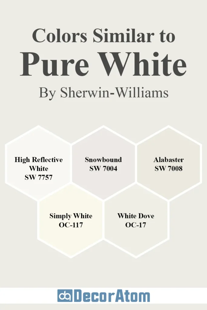
1. Sherwin-Williams High Reflective White SW 7757

This is the brightest white Sherwin-Williams offers, with an LRV of 93. It has no noticeable undertones and is often used when you want that sharp, bright white—think modern, high-contrast spaces.
Compared to Pure White: High Reflective White is cleaner and cooler. Pure White feels softer and slightly more muted. If you want a more delicate, subtle white, Pure White is the better choice. But if you want a really bright, gallery-style backdrop, High Reflective White is worth a look.
2. Sherwin-Williams Snowbound SW 7004

Snowbound is a soft white with cool, pinkish-gray undertones. Its LRV is 83, so it’s close in brightness to Pure White but leans a little more toward cool.
Compared to Pure White: Snowbound is cooler and may read more gray or shadowed in some lighting. Pure White, by contrast, stays more neutral and gentle. If your room already has cool tones, Snowbound could feel more cohesive. But Pure White gives you more flexibility across different lighting and color palettes.
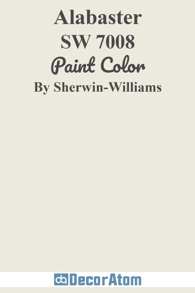
3. Sherwin-Williams Alabaster SW 7008
💥🎁 Christmas & Year-End Deals On Amazon !
Don't miss out on the best discounts and top-rated products available right now!
*As an Amazon Associate, I earn from qualifying purchases.
Alabaster is a warm, creamy white with a cozy feel. It has an LRV of 82, so it reflects slightly less light than Pure White and has more noticeable yellow-beige undertones.
Compared to Pure White: Alabaster is definitely warmer and can sometimes lean toward off-white. Pure White is cleaner and more neutral. If you’re going for a farmhouse or traditional look with warm tones, Alabaster might be the winner. For a more modern, flexible white, Pure White holds the edge.
4. Benjamin Moore Simply White OC-117

Simply White is one of Benjamin Moore’s most popular whites. It’s warm and bright, with a soft yellow undertone and an LRV of 91. It’s cheerful and fresh, but that yellow can come through more strongly in certain lighting.
Compared to Pure White: Simply White is brighter and has a more noticeable yellow tone. Pure White is slightly more subdued and less likely to shift in different lighting. If you want a white that feels a little sunnier, Simply White could be the one. For something more neutral and versatile, Pure White is still the safer bet.
5. Benjamin Moore White Dove OC-17

White Dove is a beloved creamy white with soft gray undertones and an LRV of 85. It has a cozy, classic feel that’s super popular in traditional homes.
Compared to Pure White: White Dove is creamier and slightly warmer. Pure White is cleaner and more neutral. If you’re looking for a white that feels soft and timeless but not stark, White Dove is a lovely option. But if you need something that walks the line between clean and soft, Pure White gives you more balance.
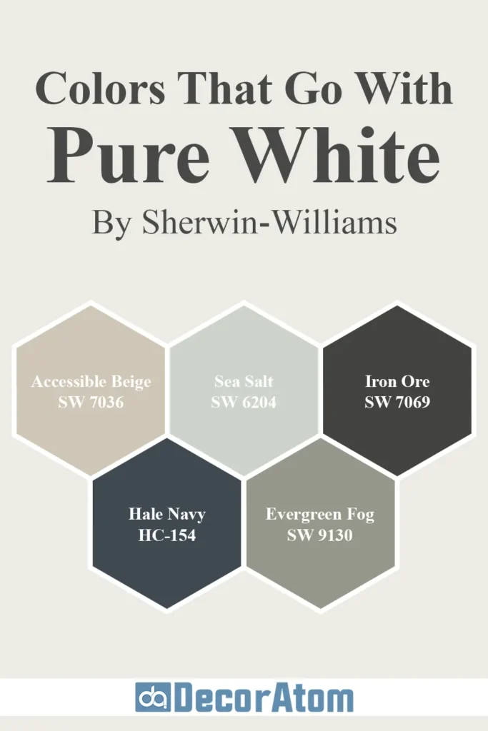
Colors that Go With Sherwin Williams Pure White
💥🎁 Christmas & Year-End Deals On Amazon !
Don't miss out on the best discounts and top-rated products available right now!
*As an Amazon Associate, I earn from qualifying purchases.
One of the best things about Sherwin-Williams Pure White is how easily it plays with other colors. It’s like the dependable friend who gets along with everyone at the party—bold colors, soft neutrals, warm tones, cool tones—you name it.
Because it’s such a balanced white, it works beautifully as a backdrop or as a complementary shade, depending on how you use it.
If you’re wondering what colors actually look amazing with Pure White, here are five I absolutely love pairing with it—whether you’re doing a full room or just accents and trim.
1. Sherwin-Williams Accessible Beige SW 7036

Accessible Beige is a warm, soft greige that leans more beige than gray. It has a calm, cozy vibe but still feels fresh and updated—not too brown, not too yellow. It works wonderfully in living spaces, bedrooms, and even hallways.
Why it works with Pure White: Pure White’s subtle warmth complements Accessible Beige perfectly. You get that crisp contrast between white trim and warm walls without anything feeling stark. It’s a timeless, neutral combo that feels welcoming and versatile.
2. Sherwin-Williams Sea Salt SW 6204

Sea Salt is a soft, muted green with a hint of gray and blue. It’s a spa-like, serene color that’s especially beautiful in bathrooms and bedrooms. It’s light enough to feel airy but brings just enough color to feel special.
Why it works with Pure White: Pure White helps Sea Salt feel brighter and more refreshing, almost like you’re standing near the ocean. This pairing is perfect for creating a relaxed, coastal-inspired palette that doesn’t feel too themed or overwhelming.
3. Sherwin-Williams Iron Ore SW 7069

💥🎁 Christmas & Year-End Deals On Amazon !
Don't miss out on the best discounts and top-rated products available right now!
*As an Amazon Associate, I earn from qualifying purchases.
Iron Ore is a bold, deep charcoal that almost reads black—but with more depth and softness. It’s dramatic, moody, and sophisticated. People often use it on cabinets, feature walls, or even exterior trim.
Why it works with Pure White: You get this striking contrast when you pair Iron Ore with Pure White, and it’s absolutely stunning. Pure White keeps the space from feeling too dark or heavy while giving Iron Ore the spotlight. This combo is ideal if you love contrast but want something more refined than just black and white.
4. Benjamin Moore Hale Navy HC-154

Hale Navy is one of those classic navy blues that never goes out of style. It has just the right amount of richness without being too dark or too bright. It works on cabinets, doors, accent walls, or even entire rooms if you’re bold.
Why it works with Pure White: This combo gives off a clean, nautical, high-contrast look. Pure White highlights Hale Navy’s richness and keeps the palette feeling crisp and sophisticated. It’s especially beautiful in kitchens, entryways, or formal dining rooms.
5. Sherwin-Williams Evergreen Fog SW 9130

Evergreen Fog is a soft, gray-green that feels earthy and grounded. It’s calming, trendy, and gives off a modern organic vibe. It was actually Sherwin-Williams’ Color of the Year in 2022.
Why it works with Pure White: Evergreen Fog’s muted tones shine next to Pure White’s clean backdrop. It’s a beautiful pairing for nature-inspired interiors, especially if you’re incorporating wood, natural fabrics, or soft lighting. It feels elegant and modern without being flashy.
Where to Use Sherwin Williams Pure White SW 7005?
Because Sherwin-Williams Pure White is so adaptable, it’s one of those rare colors you can use just about anywhere in your home.
Whether you’re painting a whole room, just the trim, or even your kitchen cabinets, it fits right in. It doesn’t scream for attention, but it quietly elevates everything around it.
Let’s walk through what makes it work so well in specific areas of the home—and how to get the most out of it in each space.
Sherwin Williams Pure White In the Bedroom
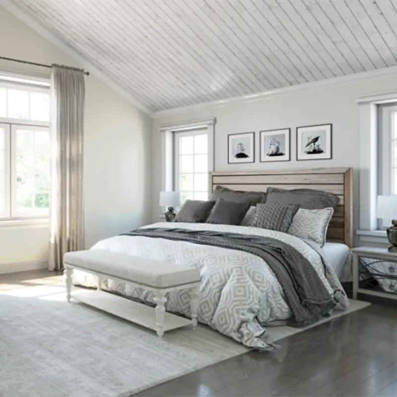
A bedroom painted in Pure White feels instantly fresh and calming. It’s not a clinical, sterile white, so it still feels cozy—but it’s clean enough to let soft textures and linens shine.
If you want a peaceful retreat, especially one with layered neutrals or subtle pops of color, Pure White sets the perfect backdrop.
Add warm wood tones, an upholstered headboard, and a few accent pillows in dusty blues or sage greens, and you’ve got a room that feels both grounded and airy. Plus, it reflects natural light beautifully, which is ideal if your bedroom doesn’t get a ton of sun.
Sherwin Williams Pure White In the Bathroom
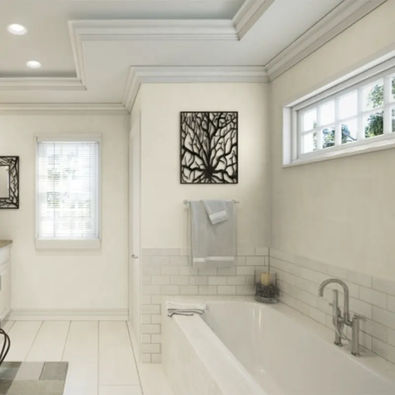
In the bathroom, lighting is everything—and Pure White works with all of it. Whether you have warm sconces or bright overhead lighting, Pure White bounces that light in a flattering way.
It doesn’t go too yellow or too gray, which is critical in spaces where color reflections can mess with how your skin tone looks in the mirror.
It also pairs really well with tile—white subway tile, marble, matte black fixtures, or soft greige flooring. If you’re after that clean, spa-like vibe without crossing into “doctor’s office” territory, Pure White strikes the right tone.
Sherwin Williams Pure White In the Living Room
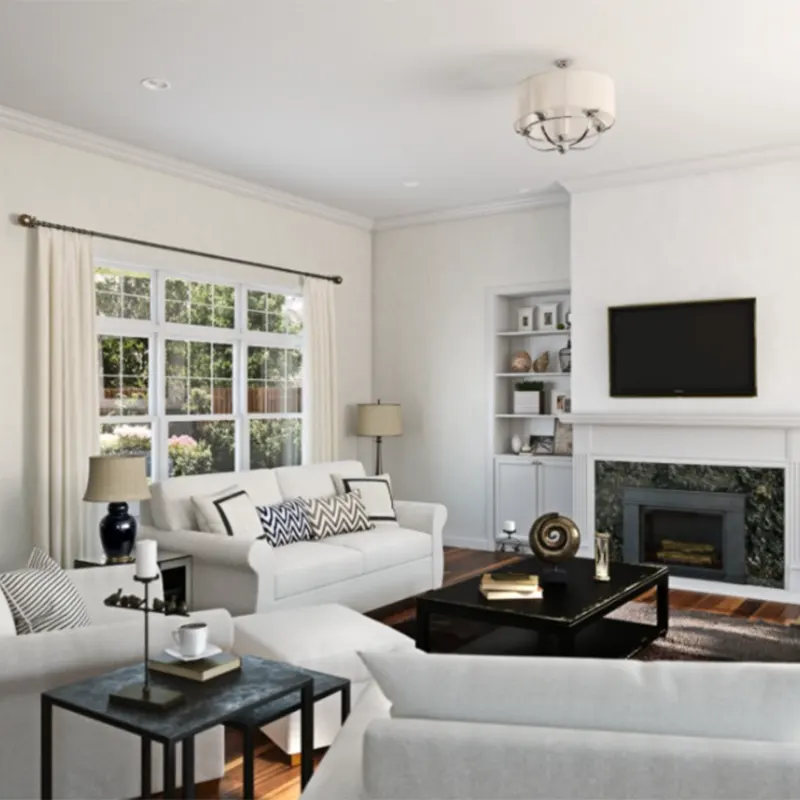
The living room is where Pure White truly shines. It’s a chameleon here—it can be crisp and modern with cool-toned accents, or warm and cozy with soft lighting and natural textures.
If you’ve got a lot of natural light, Pure White will reflect it without feeling harsh. If your space is darker, its gentle undertone will keep it from going dingy or shadowy.
It’s also the perfect canvas if you love switching up throw pillows, rugs, or artwork seasonally. It doesn’t compete—it just lets everything else breathe.
Sherwin Williams Pure White For the Exterior

This might surprise some people, but Pure White is also fantastic for exteriors. It’s clean and classic, and that soft undertone helps it look less blinding in full sunlight.
Super stark whites can sometimes look blue or harsh outside, especially when the sun hits them just right—but Pure White stays more grounded and warm.
Pair it with black or charcoal trim for that bold, modern farmhouse vibe. Or keep it traditional with soft gray shutters and a warm front door color. It gives you that fresh, timeless curb appeal that doesn’t feel trendy.
Sherwin Williams Pure White in Kitchen
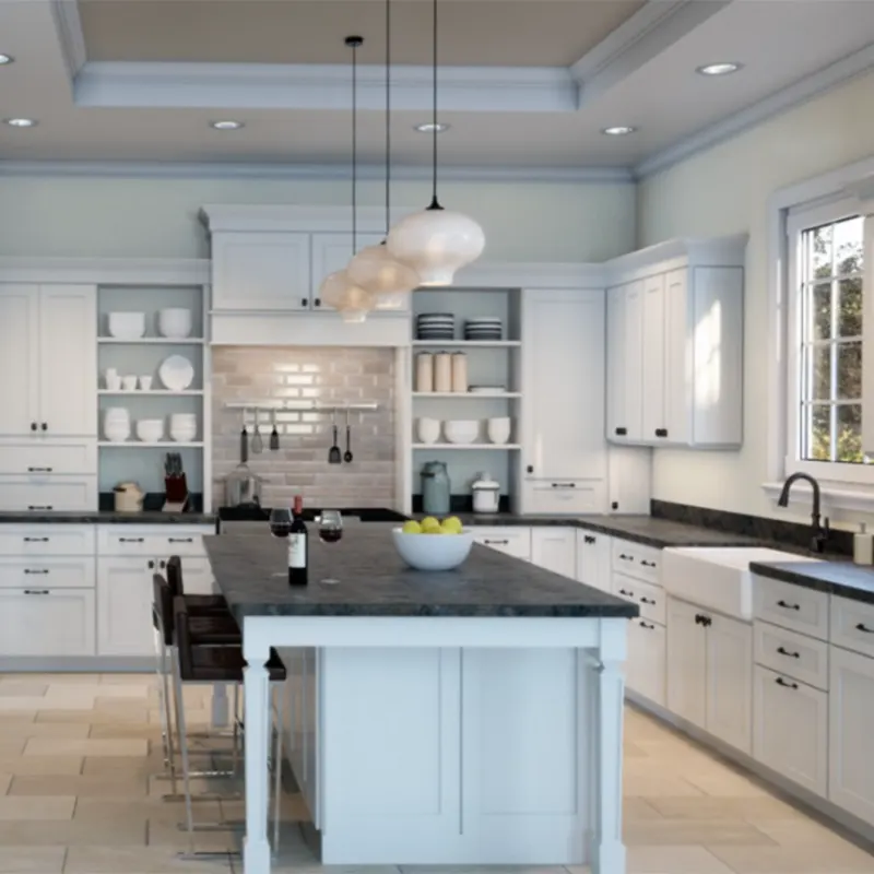
In the kitchen, Pure White can be your best friend. Whether you use it on cabinets, walls, or both, it gives you that bright, clean feel everyone wants in the heart of the home.
If you’re doing white cabinets, Pure White is a safe and beautiful choice—it looks amazing with both silver and brass hardware, and it works with just about any backsplash.
It also plays well with quartz or marble countertops, and doesn’t clash with cool or warm flooring. And if you’re painting the walls Pure White but going bold with the cabinets (think navy or black), it creates the perfect balance without stealing the show.
Final Thoughts
Sherwin-Williams Pure White SW 7005 isn’t just another white paint color—it’s one of those rare finds that works almost everywhere.
It’s clean but not cold, warm but not yellow, and neutral without being boring. That balance makes it easy to live with and even easier to decorate around.
Whether you’re freshening up your trim, repainting kitchen cabinets, or choosing the backdrop for your entire home, Pure White is one of those colors that just makes sense. It’s like a breath of fresh air—subtle, reliable, and always flattering.
If you’re looking for a white that won’t turn on you when the lighting shifts or your decor changes, Pure White is one of the safest (and prettiest) bets out there.