
*This post contains affiliate links. For more details see my full disclosure.
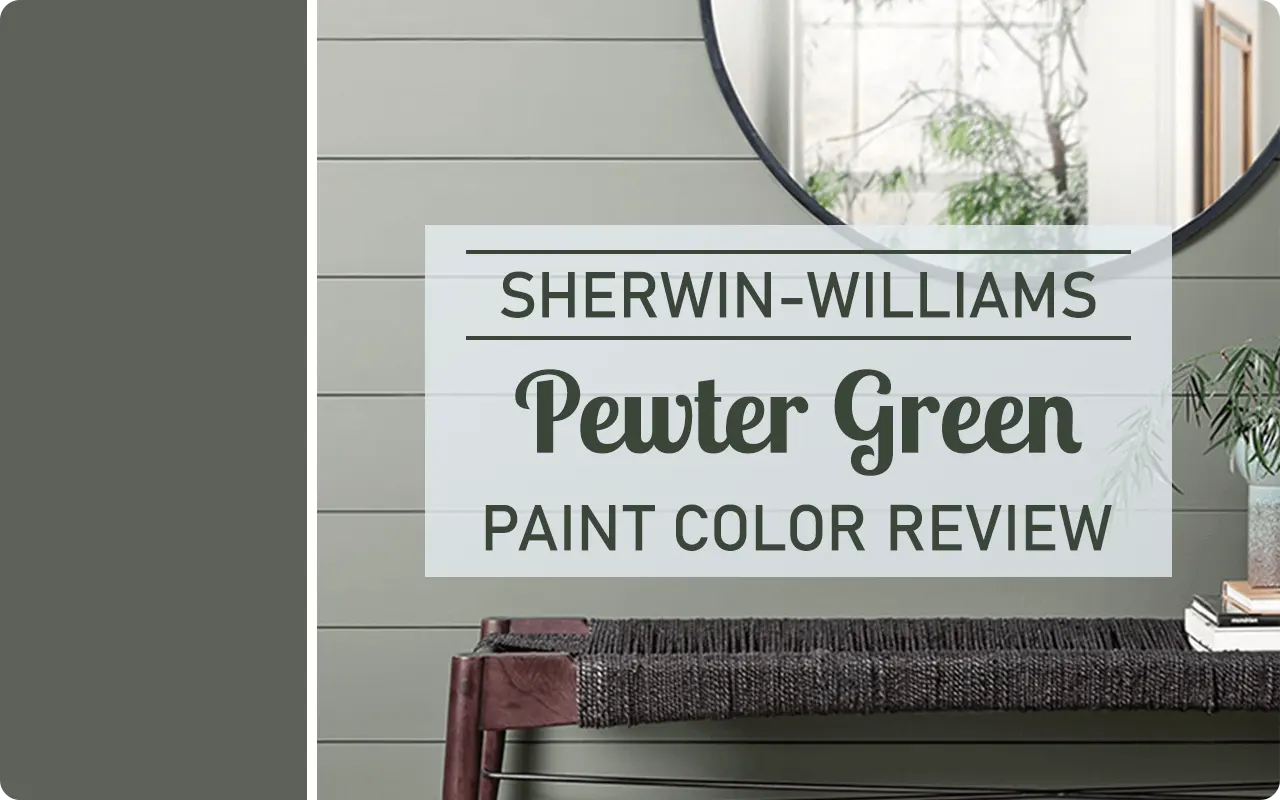
If you’re looking for a deep, rich green that feels grounded and timeless, Sherwin-Williams Pewter Green SW 6208 might just be the one.
It’s one of those colors that has the power to completely transform a space, whether you’re aiming for a cozy, nature-inspired retreat or a bold, moody moment in your home.
I’ve spent a lot of time with this color, observing how it behaves in different rooms and lighting, and I can confidently say, it’s not your average green.
There’s something elegant and calming about Pewter Green. It doesn’t scream for attention, but it quietly draws you in.
It works beautifully in traditional settings, yet it also feels modern when paired with the right accents.
In this post, I’m going to take you through everything I’ve learned about this shade, how it looks, what it pairs well with, where to use it, and why I personally love it.
Also Read: 17 Best Sherwin Williams Sage Green Paint Colors
What Color is Sherwin Williams Pewter Green?
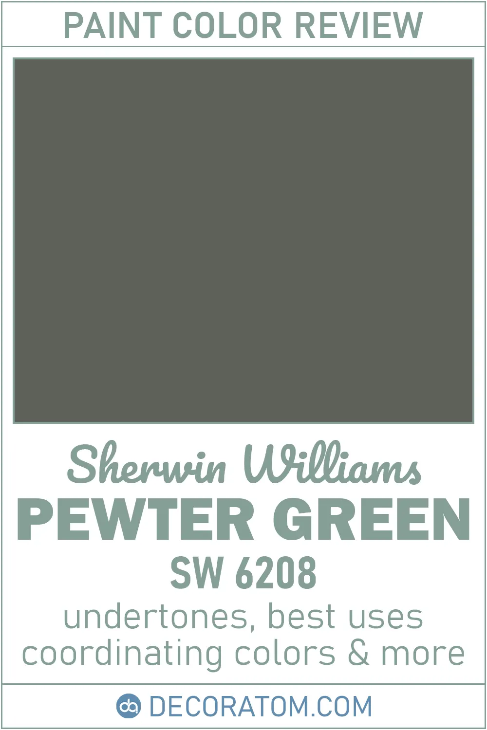
Sherwin Williams Pewter Green is a dark, muted green with a calm and sophisticated vibe.
It’s not the kind of green that feels bright or grassy. Instead, think of the deep green of pine trees or vintage army jackets, that rich, earthy green that feels rooted in nature.
It has a soft, slightly weathered look, which gives it a mature and grounded feel. Some might describe it as an olive green or sage green that’s been deepened and cooled down.
It’s a fantastic choice if you’re going for a moody, elegant look but don’t want anything too bold or dramatic.
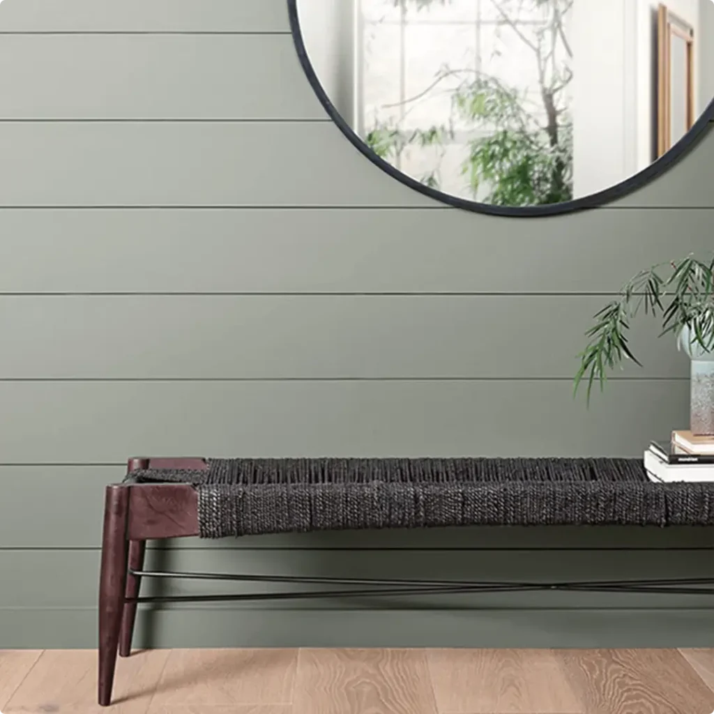
This color tends to feel cozy and enveloping, especially in smaller rooms. And what I love most is how versatile it is, it looks just as good in a rustic farmhouse kitchen as it does in a sleek modern bathroom.
How to Know if a Paint Color Is Right for You?
Would you like to sample Pewter Green paint color? I recommend using Samplize. They offer 12″x12″ peel-and-stick paint swatches that make testing colors super simple. Just stick it on your wall, move it around if needed, and when you’re done, peel it off and toss it. No mess, no cleanup. It’s quick, easy, and way more convenient!

Advantages of using peel and stick paint samples:
- EASY TO USE: Simply move your SAMPLIZE paint sample around the room to test under a variety of lighting conditions.
- AFFORDABLE: Budget-friendly solution and no more buying inaccurate swatches, rollers, wasted paint.
- SUPER FAST DELIVERY: Depending on your location, 1 day delivery is possible.
- ORDER FROM HOME: Save a trip to the store looking for samples.
- NO MESS: SAMPLIZE uses real paint samples with zero-mess
- NO WASTE: No leftover cans or wasted paint.
Is It a Warm Or Cool Color?
Pewter Green leans slightly cool, but it sits somewhere near the middle of the spectrum. It’s not icy or blue-toned like many cool colors, but it definitely doesn’t have the yellow or golden undertones you’d expect from a warmer green.
That hint of gray mixed into the base softens the green and keeps it from feeling too sharp or vibrant. Because of this balance, Pewter Green can work beautifully in a variety of settings.
It’s cool enough to feel fresh and crisp but warm enough to keep a space from feeling sterile or cold.
So if you’re worried about a room feeling too dark or chilly, Pewter Green won’t push it too far in that direction. It offers just enough balance to stay neutral and comforting.
LRV of Sherwin Williams Pewter Green
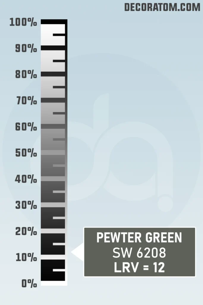
Let’s talk about the LRV, Light Reflectance Value. It sounds technical, but it’s pretty simple. LRV is a number between 0 and 100 that tells you how much light a color reflects.
The higher the number, the lighter the color. So pure white might be close to 100, while deep black is near 0.
Sherwin Williams Pewter Green has an LRV of 12, which means it’s on the darker end of the spectrum. It doesn’t reflect a lot of light, so it will absorb quite a bit of it instead. This gives it that rich, cozy, and dramatic look, especially in spaces with less natural light.
If you’re using Pewter Green in a room with lots of windows, it can still feel airy and bold. But in a darker space, it will lean more moody and intimate. It really just depends on the vibe you’re going for.
Color Family
Sherwin Williams Pewter Green falls into the green color family, but it’s not your classic bright green. It’s part of that beautiful, nature-inspired side of green. You could think of it as a soft forest green or a gray-green blend.

RGB Colors
If you’re someone who likes to understand the technical side of paint colors, let’s talk about the RGB values of Sherwin Williams Pewter Green.
RGB stands for Red, Green, and Blue, these are the primary colors used in digital color mixing. Every color on a screen is made up of a mix of these three.
For Pewter Green, the RGB values are:
Red: 94 / Green: 98 / Blue: 89
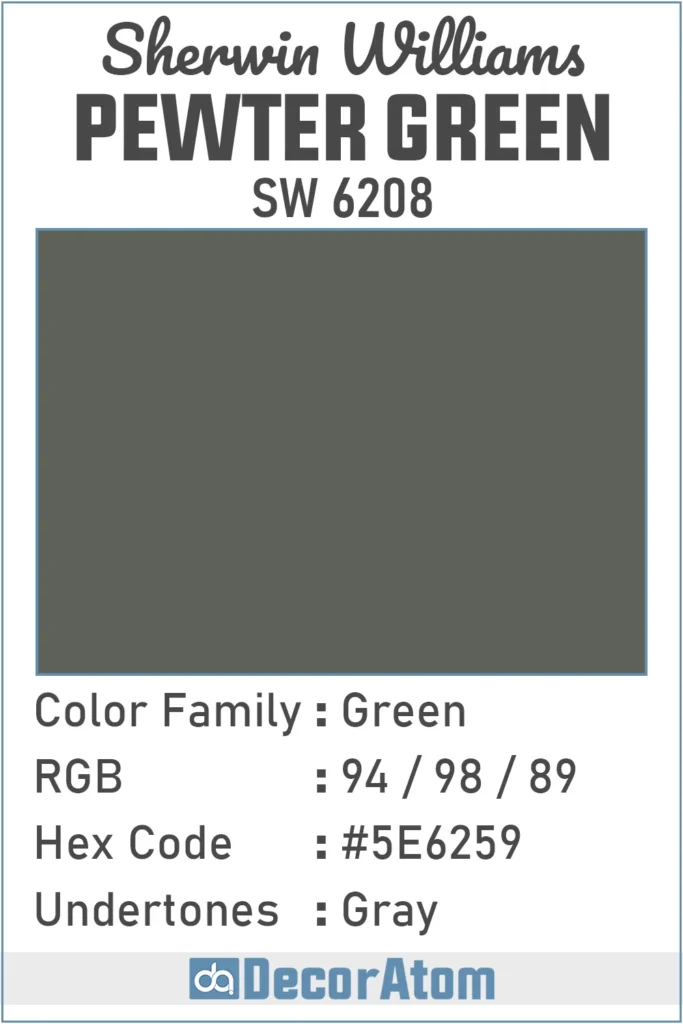
Hex Value
Now, let’s break down the Hex value, especially if you’re someone who’s designing digitally, creating mockups, or working with online design tools. The hex code for Sherwin Williams Pewter Green is #5E6259.
Undertones of Sherwin Williams Pewter Green
Let’s talk undertones, because this is what really gives a color its personality.
Pewter Green has gray undertones, and that’s a big reason why it feels so calm and sophisticated.
The gray softens the green and prevents it from feeling too bright or overwhelming. You won’t see any yellow or blue sneaking in here, just a clean, subtle gray that anchors the color beautifully.
What this means in real life is that Pewter Green tends to look more muted and balanced, even in different lighting. It doesn’t swing too cool or too warm. It’s the gray undertone that keeps it feeling grounded and versatile.
In fact, the gray influence is what makes Pewter Green work so well with other neutral tones like cream, off-white, taupe, or even warm wood finishes.
It plays nicely with a wide range of palettes because it doesn’t fight for attention, it just adds a quiet, elegant depth.
How Different Types of Lighting Affect Sherwin Williams Pewter Green?
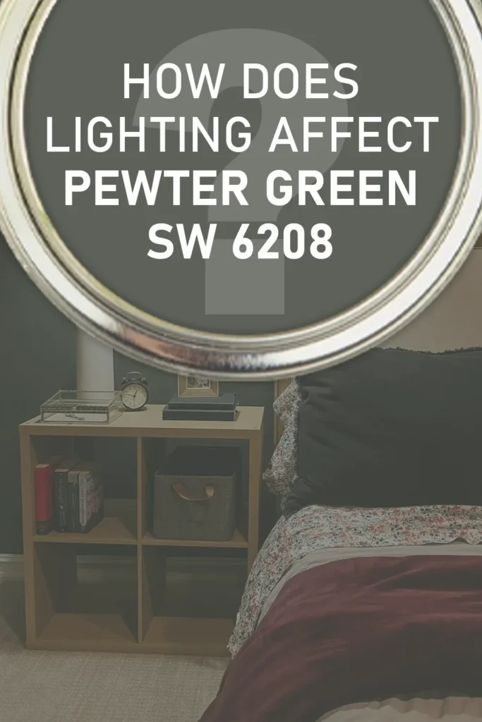
Lighting can completely change how Pewter Green looks in your home. This is one of those colors that shifts its personality depending on the type and amount of light it’s exposed to, so it’s important to test it in your own space before fully committing.
Here’s what I’ve noticed:
In natural daylight, especially from north-facing windows, Pewter Green tends to look cooler and more muted. The gray undertones show up a little more, giving it a sophisticated, slightly moody feel.
In south-facing rooms, where you get warmer light, it softens and warms up slightly. The green becomes more noticeable and takes on a bit of a cozy, earthy vibe, without becoming too yellow or olive.
Under artificial lighting, it really depends on the bulb temperature. Cool LED lights can bring out the gray tones and make the color feel a little more reserved. Warm white bulbs (like incandescent lighting) tend to highlight the green a bit more and make it feel richer and deeper.
In darker rooms with limited light, Pewter Green can feel quite dramatic and bold. The low LRV (Light Reflectance Value of 12) means it will absorb a lot of light, making it feel intimate and enveloping—but you’ll want to pair it with lighter furnishings or bright trims to keep things balanced.
This is definitely a color that rewards testing with swatches. Try it in different rooms, at different times of day, and see how it plays with your lighting conditions.
Trim Colors to Pair With Sherwin Williams Pewter Green?
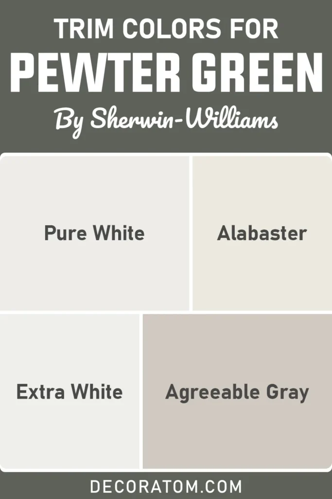
One of the easiest ways to elevate Pewter Green is by pairing it with the right trim color. Because it’s a deep and muted shade, using the right trim can either add contrast and brightness or maintain a softer, tonal look.
Here are a few tried-and-true options:
Crisp White Trim – A clean, bright white like Sherwin Williams Extra White (SW 7006) or Pure White (SW 7005) works beautifully. It adds contrast and makes Pewter Green pop without looking too harsh.
Off-White or Creamy Trim – If you want a softer, cozier look, try a warmer white like Alabaster (SW 7008). This gives the whole room a gentler, more welcoming feel.
Soft Grays or Taupes – For a more monochromatic and modern vibe, try something like Agreeable Gray (SW 7029) or Repose Gray (SW 7015). These create a quiet, tonal look that feels calm and curated.
Wood Trim – If you’re working with natural wood tones—like oak, walnut, or even whitewashed wood—Pewter Green is incredibly complementary. The earthy, organic look pairs beautifully with warm wood finishes, especially in farmhouse or rustic-inspired spaces.
Colors Similar to Sherwin Williams Pewter Green
If you love the look of Sherwin Williams Pewter Green but want to explore a few other options in the same family, you’re in good company.
Pewter Green has a very distinct personality—deep, muted, and grounded in nature—but there are quite a few shades that echo its vibe with subtle differences in depth, undertone, or temperature.
Maybe you’re looking for something just a touch lighter, or maybe Pewter Green feels a little too gray in your space. This is where similar shades come in handy. You’ll find that many of these alternatives carry that same moody green charm, but each one shifts slightly in tone.
Some will lean a bit warmer with more olive undertones, while others go cooler or a bit more gray. Even the smallest shift can make a big difference, depending on your lighting and what else is in the room.
When comparing similar greens, I always like to consider how they feel in a room. Pewter Green feels calm, classic, and slightly masculine.
If you like that grounded energy but want something softer or more versatile, you might opt for a green with a higher LRV or a bit more warmth. On the flip side, if you love dramatic depth, some deeper or grayer cousins of Pewter Green may suit you better.
Whether you’re comparing swatches side by side or testing them on your walls, these similar shades can help you fine-tune your decision.
Here are 10 similar colors to Sherwin Williams Pewter Green from both Sherwin Williams and Benjamin Moore:
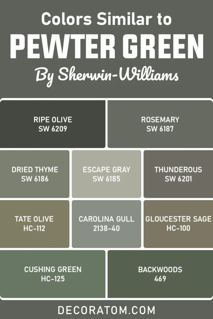
Sherwin Williams:
- Ripe Olive SW 6209
- Rosemary SW 6187
- Dried Thyme SW 6186
- Escape Gray SW 6185
- Thunderous SW 6201
Benjamin Moore:
- Tate Olive HC-112
- Carolina Gull 2138-40
- Gloucester Sage HC-100
- Cushing Green HC-125
- Backwoods 469
Colors that Go With Sherwin Williams Pewter Green
One of the reasons I keep coming back to Pewter Green is because it plays so well with others. It’s incredibly versatile when it comes to creating color palettes, whether you’re designing a serene bedroom, a cozy living space, or a sophisticated kitchen.
Since Pewter Green has that muted green base with gray undertones, it pairs beautifully with warm whites, creamy neutrals, soft grays, and even bolder accent colors like terracotta or dusty blush.
These combinations help bring out different facets of the green. Lighter neutrals brighten it up and help balance its depth, while deeper or warmer tones can complement it and create a richer, cozier vibe.
I especially love how Pewter Green pairs with earthy tones—think soft tans, muted browns, and warm terracotta. These combinations feel very organic and grounded. If you want something more modern or airy, try it with soft whites or grays, which help tone things down and bring a fresh contrast.
Another great strategy is to create a monochromatic look using other greens or blue-greens that share a similar undertone. This layering creates a peaceful, cohesive space that still feels dynamic.
And of course, I’ve included three colors that work wonderfully with Pewter Green: Spare White SW 6203, , and Silvermist SW 7621. These are perfect if you’re aiming for balance and elegance.
Here are 8 colors that go well with Sherwin Williams Pewter Green from Sherwin Williams and Benjamin Moore:
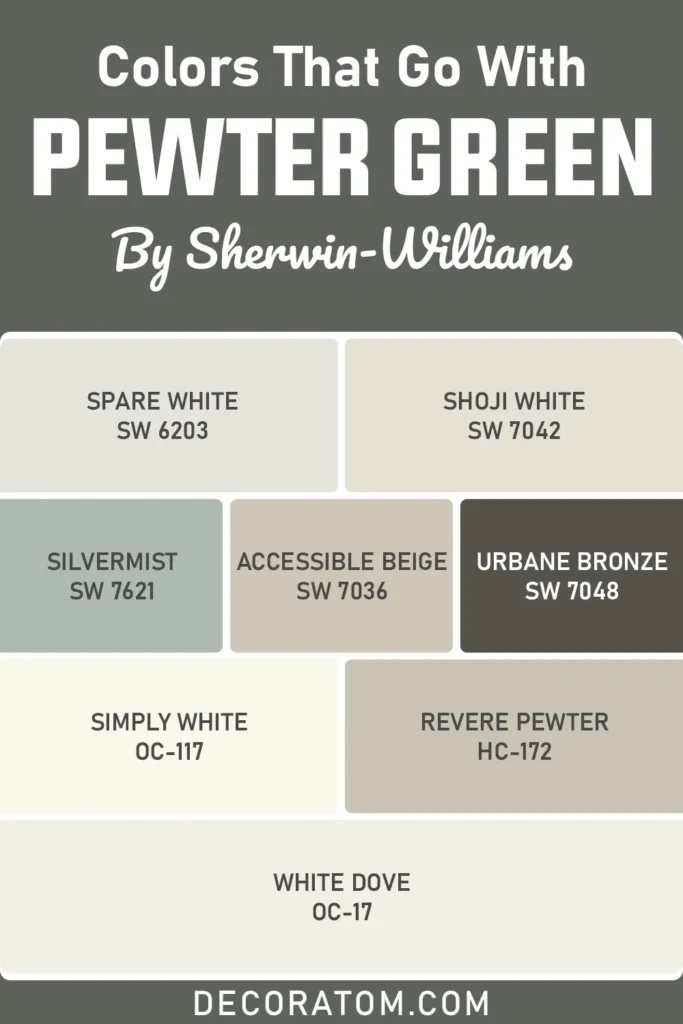
Sherwin Williams:
- Spare White SW 6203
- Shoji White SW 7042
- Silvermist SW 7621
- Accessible Beige SW 7036
- Urbane Bronze SW 7048
Benjamin Moore:
- Simply White OC-117
- Revere Pewter HC-172
- White Dove OC-17
Comparing Sherwin Williams Pewter Green With Other Colors
When choosing a paint color like Pewter Green, it’s easy to fall in love—but it’s also important to compare it side-by-side with other similar or popular colors. This is especially helpful if you’re stuck between two favorites or unsure how one green might look against another.
Pewter Green is unique because it balances depth with calmness, and has a soft gray undertone that makes it adaptable. But small differences in saturation, temperature, or reflectivity can completely change how a color works in your home.
So, here are six detailed comparisons to help you see exactly how Pewter Green stacks up against other well-known shades.
Sherwin Williams Pewter Green vs Ripe Olive

Ripe Olive is deeper and moodier than Pewter Green. While Pewter Green is a muted mid-to-dark green with noticeable gray influence, Ripe Olive has more intensity and drama.
It’s richer, bolder, and slightly warmer in tone. If you’re going for a truly deep, enveloping atmosphere, Ripe Olive might give you that extra punch. But if you want something that feels grounded yet more subdued, Pewter Green offers a softer presence.
Sherwin Williams Pewter Green vs Rosemary
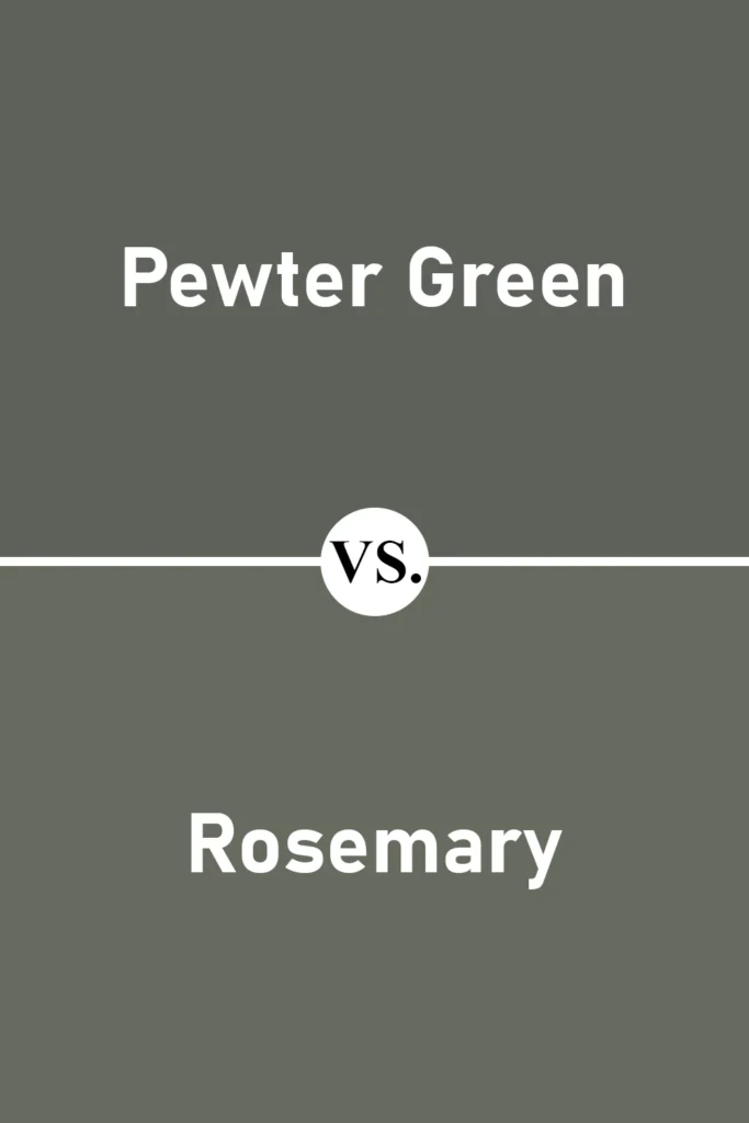
Rosemary is another beautiful green, but it leans more herbal and traditional. Compared to Pewter Green, Rosemary feels a bit warmer and less gray. It has a slightly fresher, garden-like vibe.
If you’re aiming for a space that feels lush and natural, Rosemary could be the pick. But for a look that leans more muted and elegant, Pewter Green still holds the edge.
Sherwin Williams Pewter Green vs Dried Thyme
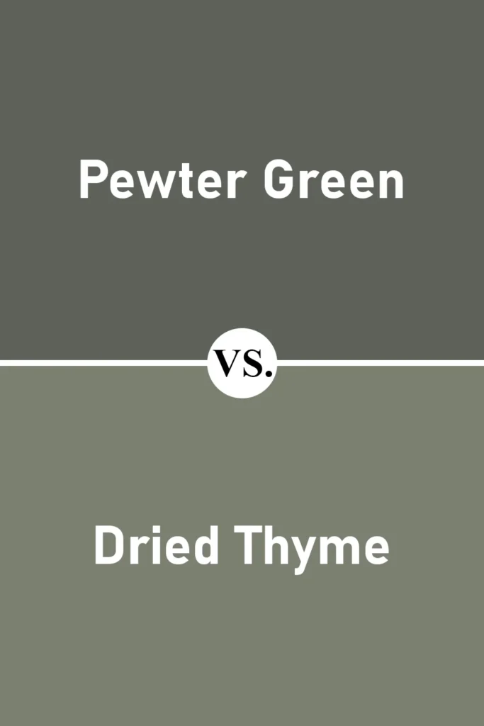
Dried Thyme is very close in tone to Pewter Green, but it introduces a bit more warmth and earthy olive tones. It still has a muted, grayed-out base, but it reads a little more brownish-green in some lighting.
Pewter Green feels a touch more crisp and modern, while Dried Thyme leans a bit rustic and soft.
Also Read: Dried Thyme SW 6186 Paint Color Review
Sherwin Williams Pewter Green vs Evergreen Fog
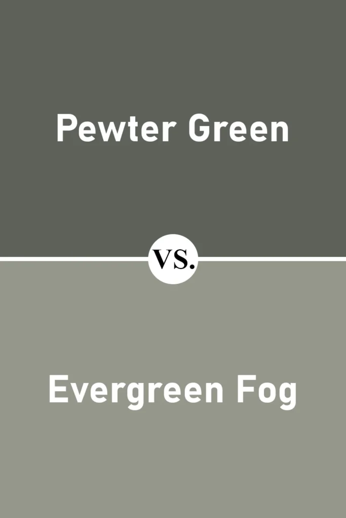
Evergreen Fog is noticeably lighter and softer than Pewter Green. It’s more of a gentle sage with gray undertones. This color brings an airy, subtle vibe to a space, whereas Pewter Green offers depth and drama.
If you love Pewter Green but find it a bit too dark for your walls, Evergreen Fog might be the perfect alternative.
Also Read: Evergreen Fog SW 9130 Paint Color Review
Sherwin Williams Pewter Green vs Benjamin Moore Backwoods
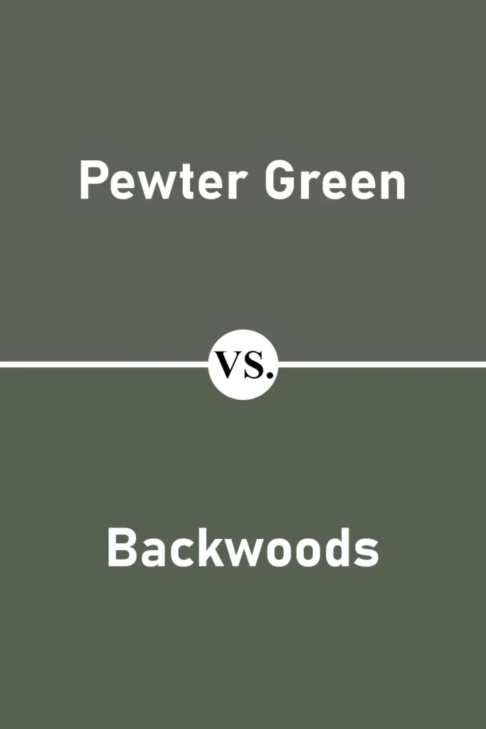
Backwoods is a rich forest green that feels slightly cooler and more saturated than Pewter Green. It doesn’t have the same gray softness, so it makes a stronger statement.
Pewter Green is more understated and adaptable, while Backwoods has a bit more of a classic green punch.
Sherwin Williams Pewter Green vs Benjamin Moore Carolina Gull
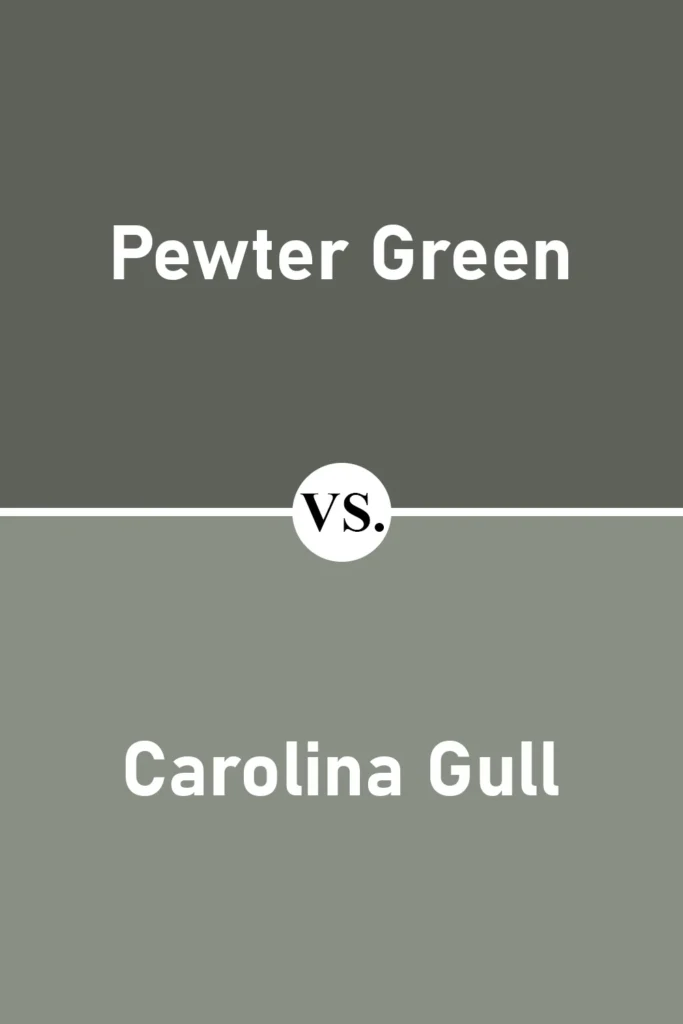
Carolina Gull is an interesting comparison because it blends green with a touch of blue-gray. It feels more coastal and breezy compared to the earthy, grounded tone of Pewter Green.
If you’re looking for a green with a subtle coastal vibe, Carolina Gull leans in that direction, while Pewter Green stays rooted in natural, forest-like tones.
Where to Use Sherwin Williams Pewter Green?
One of the reasons I keep coming back to Sherwin Williams Pewter Green is because it’s such a flexible, dependable shade. It doesn’t scream for attention—but it quietly transforms any space it’s used in.
Whether you’re after cozy, modern, traditional, or something in between, Pewter Green adapts beautifully.
Because of its lower LRV (just 12), Pewter Green is a deeper tone, so it works best in rooms where you want to create atmosphere, contrast, or a grounded, calming presence.
You don’t necessarily need huge amounts of natural light—but you do want to think about the balance. Pair it with light trims, wood tones, brass fixtures, or white cabinets to keep it fresh.
Let’s break it down room by room so you can get a feel for how it works in real spaces.
Sherwin Williams Pewter Green in the Bedroom
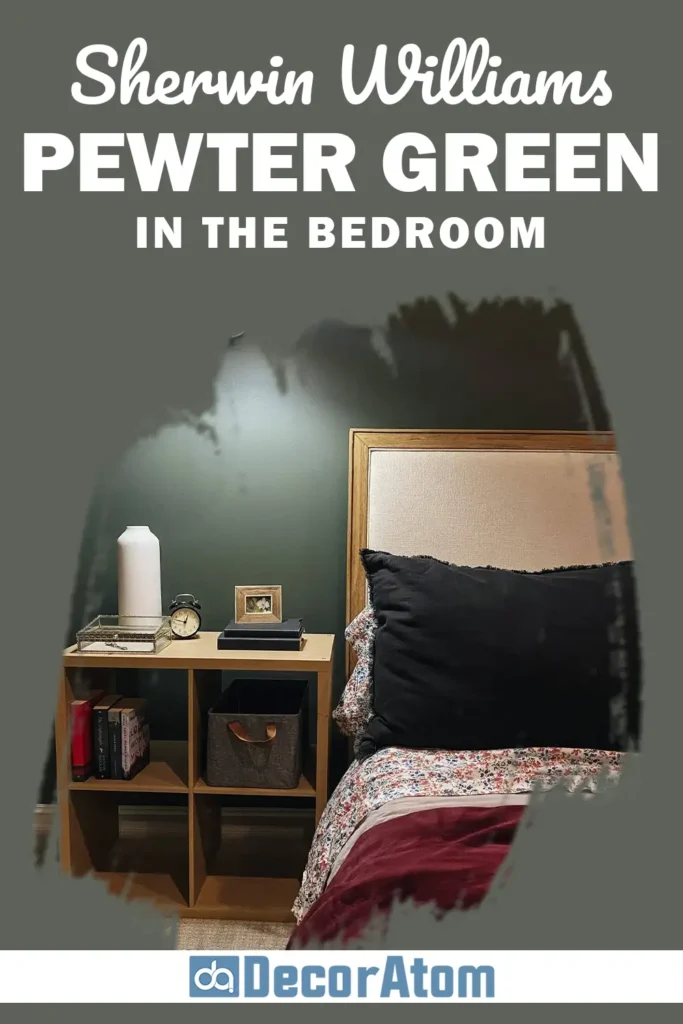
In the bedroom, Pewter Green creates an instant feeling of calm and retreat. It’s the kind of color that wraps you up and makes the space feel restful—like a deep breath at the end of a long day.
If you want a cozy, cocoon-like vibe, using Pewter Green on all the walls is a fantastic way to get there.
I’ve also seen it work beautifully as an accent wall behind the bed, especially paired with warm woods, creamy linens, and soft textures. The gray undertones keep it from feeling overly bold or saturated, so it stays soothing and grounded.
Sherwin Williams Pewter Green in the Living Room
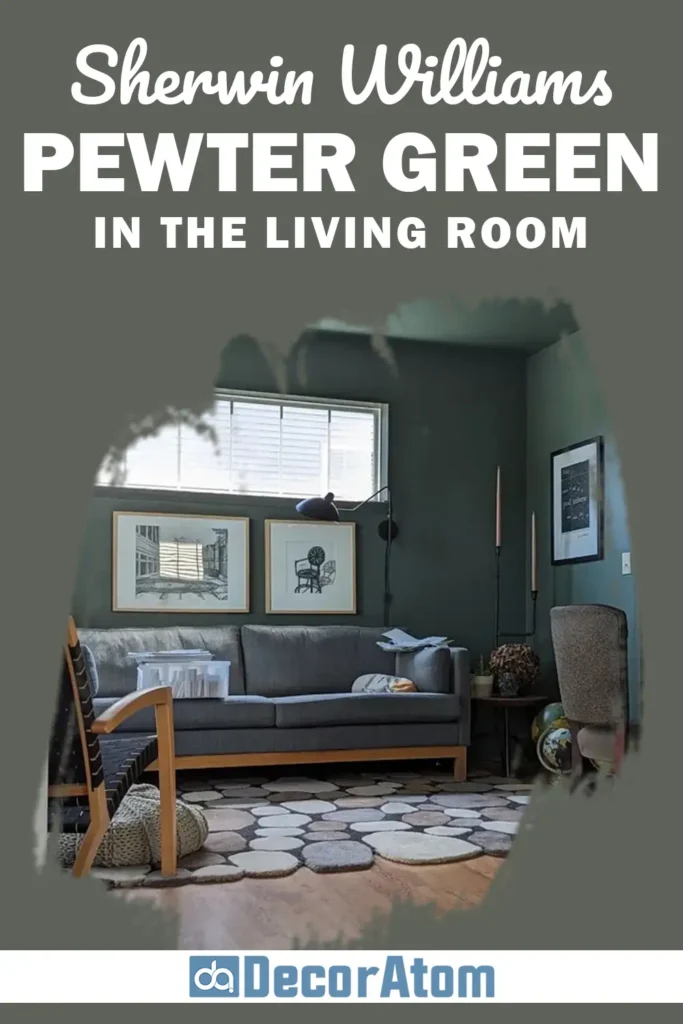
Using Pewter Green in the living room can bring a rich, welcoming feeling to your main gathering space. It’s one of those shades that looks expensive—even though it’s just paint. If you want to elevate the space without going ultra-dramatic, this is your color.
In rooms with good natural light, it creates a stunning contrast against white trim or lighter furniture. It also plays well with leather, brass, and natural textures like rattan or linen.
You can use it on the walls, or try it on built-ins, a fireplace, or even behind open shelving for a statement moment.
It works just as beautifully in cozy living rooms as it does in open-concept spaces—it has enough depth to stand on its own without feeling overpowering.
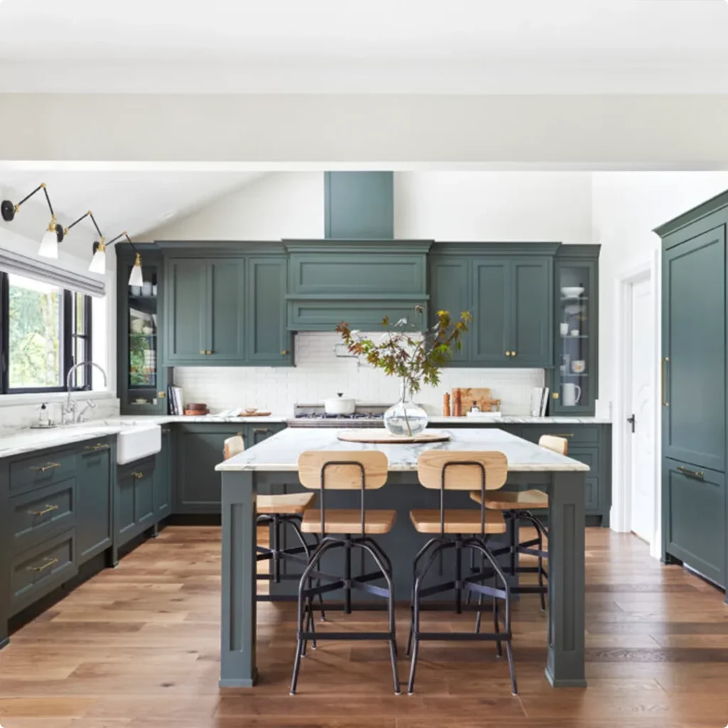
Sherwin Williams Pewter Green in the Kitchen
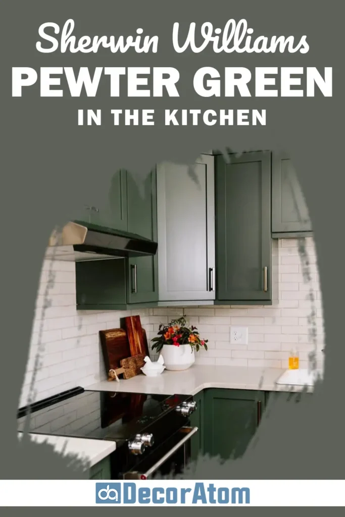
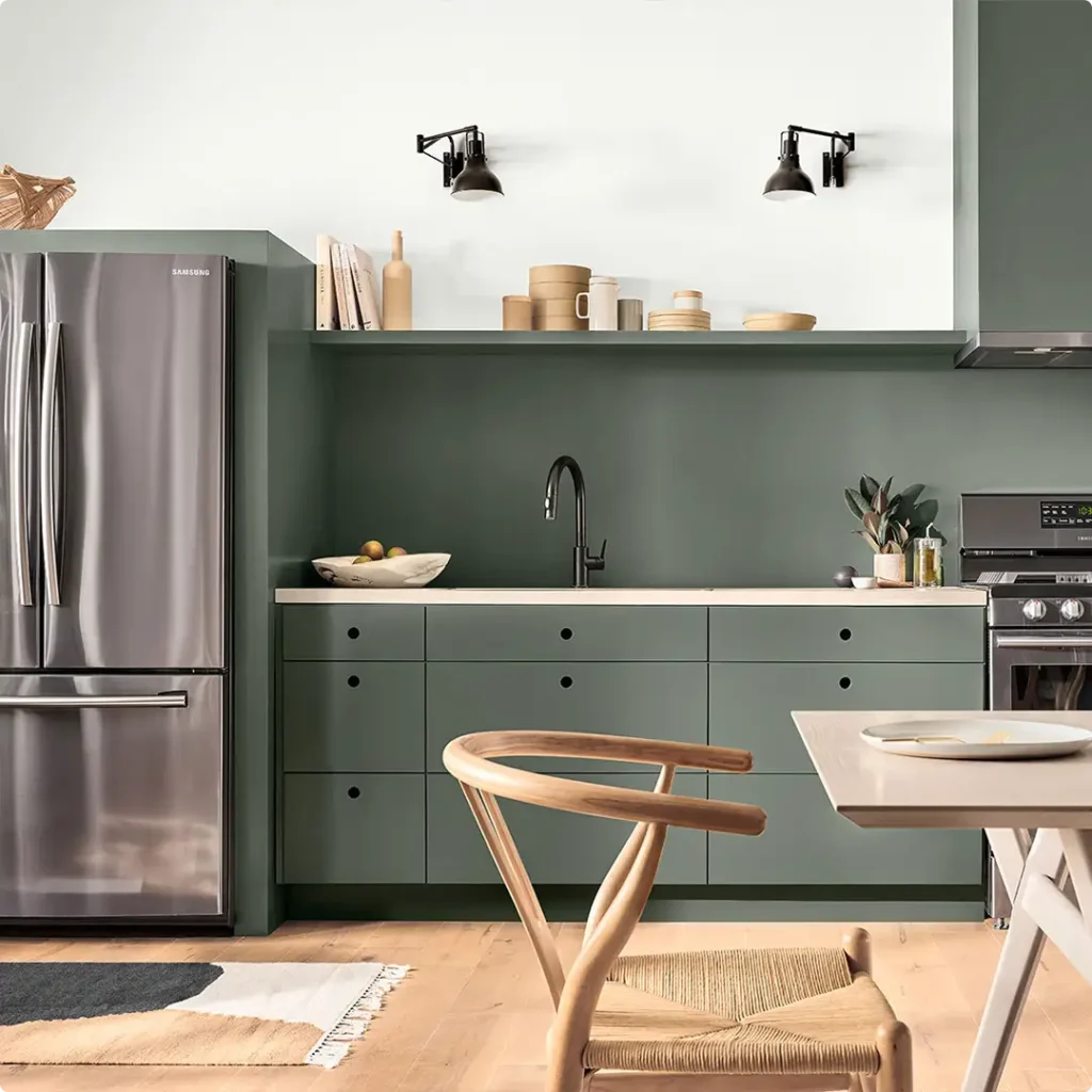
Pewter Green is one of my all-time favorite cabinet colors. If you’re thinking about painting your lower cabinets or an island, this shade brings serious sophistication. It’s a beautiful alternative to navy or charcoal, offering a more organic and earthy feel.
Pair it with white upper cabinets or marble countertops, and you’ve got a designer-level kitchen that feels custom and calming. It also pairs beautifully with brass or matte black hardware.
For an even moodier kitchen, you could take it all the way with full cabinets and walls in Pewter Green—it’s bold, but it works.
You can also use it on a pantry door, a hutch, or open shelving to introduce a pop of color without fully committing.
Also Read: 19 Best Sage Green Paint Colors for Kitchen Cabinets
Sherwin Williams Pewter Green in the Bathroom
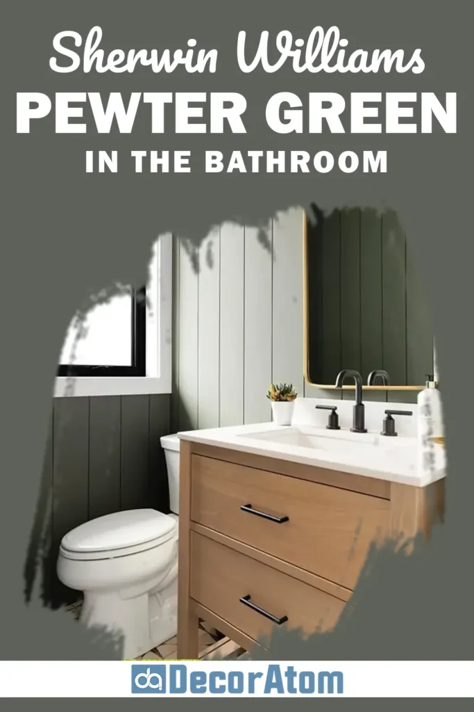
Bathrooms are such a great place to experiment with bolder colors like Pewter Green. Because it has a spa-like, natural quality, it turns even a small powder room into something special.
In a full bath, you could go for a rich and dramatic look by using Pewter Green on the walls and contrasting it with white tile or fixtures.
Or use it on a vanity cabinet for just a touch of color in an otherwise bright space. Add some gold or brass accents, and you’ve got a bathroom that feels thoughtfully designed.
It’s also fantastic for guest bathrooms or half-baths where you want to create a moody, inviting atmosphere. Even paired with modern elements like concrete or black fixtures, it holds its own and brings warmth to the space.
Also Read: 17 Best Paint Colors For Powder Rooms
Sherwin Williams Pewter Green for the Exterior
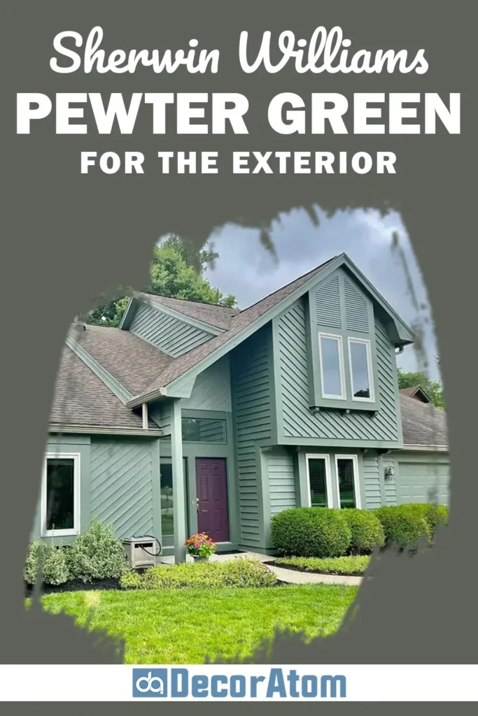
On the exterior, Pewter Green is a stunning alternative to the usual grays, whites, or blues. It gives your home a timeless, grounded look that blends beautifully with nature.
This shade works especially well on craftsman-style homes, cottages, cabins, and modern farmhouse exteriors. It looks great with warm woods, black windows, or crisp white trim. You can even pair it with stone or brick accents and it won’t compete—it enhances them.
Because it’s a deeper tone, it holds up well under strong sunlight and adds curb appeal without looking too trendy. Whether you’re using it for the full exterior, just the front door, or on shutters, Pewter Green brings a sophisticated, earthy charm that lasts.
Also Read: 23 Best Farmhouse Exterior Paint Colors
Why I Love Sherwin Williams Pewter Green
I love Pewter Green because it strikes the perfect balance. It’s bold without being loud, sophisticated without being cold, and classic without feeling outdated. There aren’t many colors that can do all of that at once—but this one does.
It feels like a connection to nature—grounded and calming—but with just enough edge to feel modern and intentional. I’ve used it in different rooms, different homes, and every time it adds depth and character.
It’s also incredibly versatile. Whether you’re working with white oak floors, a moody palette of charcoals and browns, or softer neutrals like Shoji White or Alabaster, Pewter Green adapts beautifully. It elevates every room it touches.
And honestly? It’s just a color that people remember. I’ve had guests ask what shade it is more times than I can count. It’s that kind of color—memorable, striking, and just plain beautiful.
Click here to get a Peel & Stick paint sample of Pewter Green SW 6208
Final Thoughts
Sherwin Williams Pewter Green SW 6208 isn’t just another muted green—it’s a color with personality, depth, and a lot of heart. It works across styles and spaces, and it always feels intentional.
Whether you’re looking to bring a rich touch to your kitchen cabinets, add warmth to your living room walls, or make a cozy bedroom retreat, this color delivers.
Its gray undertones make it soft enough to live with every day, while the green base brings that grounding, earthy feel we all crave. It can feel modern or classic, bold or serene—depending on how and where you use it.
If you’ve been searching for a color that feels calm, elevated, and timeless, I honestly think Pewter Green deserves a spot on your shortlist. Try a sample. Live with it in different light. I think you’ll see what I mean.