
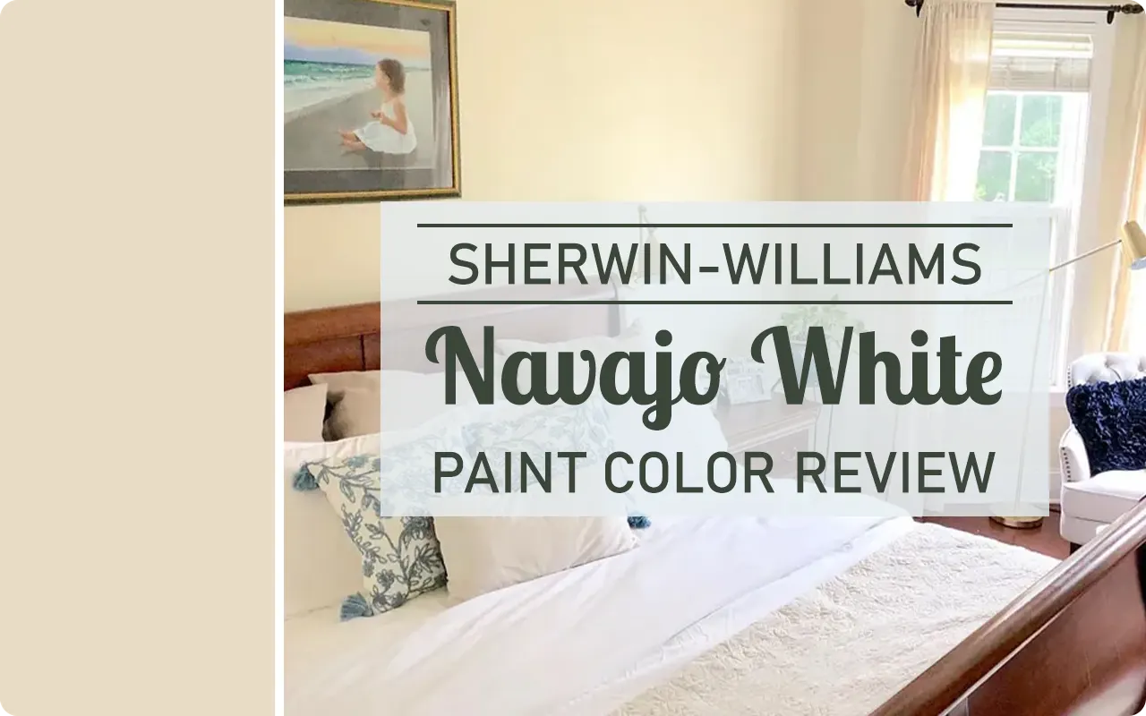
If you’re thinking about warming up a space with a cozy, inviting color, Sherwin-Williams Navajo White SW 6126 might be worth a closer look.
I know the name “white” can be a little misleading here—this isn’t your typical bright or crisp white. In fact, it leans more toward a soft, creamy neutral with subtle yellow and beige undertones.
It’s the kind of color that gives a room that soft, comforting glow—think warm candlelight or freshly baked shortbread.
I’ve seen this shade used beautifully in living rooms, bedrooms, and even kitchens where people want a classic look with a warm, lived-in vibe.
So let’s break it down and see if it might be the right fit for your home.
What Color is Sherwin Williams Navajo White SW 6126?
Sherwin-Williams Navajo White SW 6126 is a warm, creamy off-white that has strong beige and yellow undertones.
While the name says “white,” don’t expect it to look stark or clean like a gallery wall. This color has depth—it feels soft, mellow, and a little buttery, like warm vanilla pudding or lightly toasted cream.
It’s not too light, and it’s definitely not too dark. That makes it super versatile for traditional, farmhouse, and even vintage-inspired spaces.
If you’re after a color that brings warmth without feeling heavy, Navajo White does that beautifully.
Is It a Warm or Cool Color?
Sherwin-Williams Navajo White is definitely a warm color.
And when I say warm, I mean it literally adds a cozy, sunny feel to a space. The yellow-beige undertones give it that soft golden glow that feels like morning light pouring through the windows.
It doesn’t have any blue, gray, or cool tones in it—so if your room already feels chilly or you’re trying to balance cooler elements (like gray furniture or stone floors), this color can really help warm things up.
In contrast, if you already have a room with a lot of warm wood or south-facing light, Navajo White can sometimes enhance that warmth even more—so keep that in mind if you’re trying to tone things down.
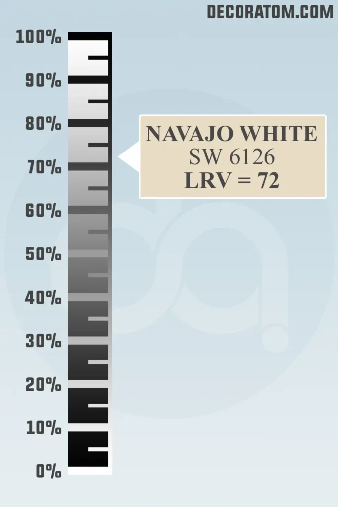
LRV of Sherwin Williams Navajo White SW 6126
💥🎁 Christmas & Year-End Deals On Amazon !
Don't miss out on the best discounts and top-rated products available right now!
*As an Amazon Associate, I earn from qualifying purchases.
LRV stands for Light Reflectance Value. It’s a scale from 0 to 100 that tells you how much light a color reflects. The higher the number, the lighter and brighter the color will appear.
For example, a bright white might be in the 80s or 90s, while a dark charcoal gray might fall below 20.
Sherwin-Williams Navajo White SW 6126 has an LRV of 72. That means it reflects a good amount of light, but not as much as a pure white.
It sits in that comfortable middle-high range, making it light enough to keep a room feeling open and airy, but with enough color to add warmth and depth to the walls.
Undertones of Sherwin Williams Navajo White SW 6126
Understanding undertones is key when choosing a paint color—especially with something like Sherwin Williams Navajo White SW 6126.
On the surface, it might just seem like a creamy off-white, but once you put it on your walls and see it in different lighting or next to other colors, the undertones really begin to show themselves.
So let’s break it down clearly.
At its core, Navajo White is a warm neutral. But what gives it that warmth? The yellow and beige undertones.
It’s not a pure white. In fact, once it’s up on a wall, especially in natural daylight, you’ll notice it leans more into the creamy yellow-beige territory.
It doesn’t have the crisp, cool feel of some off-whites that lean blue or gray. Instead, it gives off a soft, golden warmth that makes a room feel cozy and welcoming.
Now, here’s where it gets interesting:
- In bright natural light, the yellow undertones come forward more clearly, making it look lighter, sunnier, and almost buttery.
- In dim or artificial lighting, those yellow undertones can deepen slightly, making the color appear more beige or even a bit tan, depending on what’s surrounding it.
And while it’s definitely a warm color, it doesn’t veer into peach or pink undertones like some warm whites tend to. That’s what makes Navajo White more versatile in traditional and transitional spaces—it stays firmly in that yellow-beige lane.
But here’s an important tip: because of those yellow undertones, it can clash with cooler tones like icy grays or certain blues if you’re not careful.
It’s happiest when surrounded by other warm shades—browns, taupes, muted greens, or warm whites. So, if you’re pairing it with furniture or decor, try to lean warm rather than cool.
How Does Lighting Affect Sherwin Williams Navajo White SW 6126?
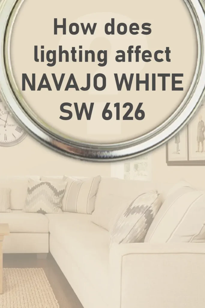
Lighting can really change how a paint color looks, and Navajo White is no exception. Since it’s a warm, creamy off-white with yellow and beige undertones, the light in your space will either enhance or slightly shift the way it comes across.
In north-facing rooms, which naturally get cooler, bluish light, Navajo White tends to look a little more muted. The warmth of the color helps balance out the cooler natural light, but it may appear more beige than creamy. It won’t feel cold, but the yellow undertone won’t be as strong—it’ll look more like a soft, neutral backdrop.
In south-facing rooms, which get warm, bright light all day, you’ll see the yellow and creaminess come through more clearly. This is where Navajo White really shines—literally.
The color can look sunnier, even a bit richer. If you’re painting a space that gets a ton of sunlight, just know that this color will lean more golden.
In east-facing rooms, where light is soft and warm in the morning but cooler in the afternoon, you’ll get a bit of both worlds. Navajo White will feel warm and cheerful earlier in the day, then slightly more neutral as the day goes on.
In west-facing rooms, you’ll get cooler shadows in the morning, and warmer, golden light in the afternoon. As the sun sets, this paint color can look especially glowy and cozy. The beige-yellow tones become more noticeable, creating a very warm atmosphere.
And of course, with artificial lighting, things depend on the bulb type. Warm white bulbs (2700K to 3000K) will enhance the creaminess and make it feel softer. Cooler bulbs (4000K and up) might pull out a little more beige and slightly tone down the yellow warmth.
So if you’re thinking about using Navajo White, it’s a good idea to test it in your space at different times of day, with the lights on and off, just to see how it behaves.
Trim Colors to Pair With Sherwin Williams Navajo White SW 6126?
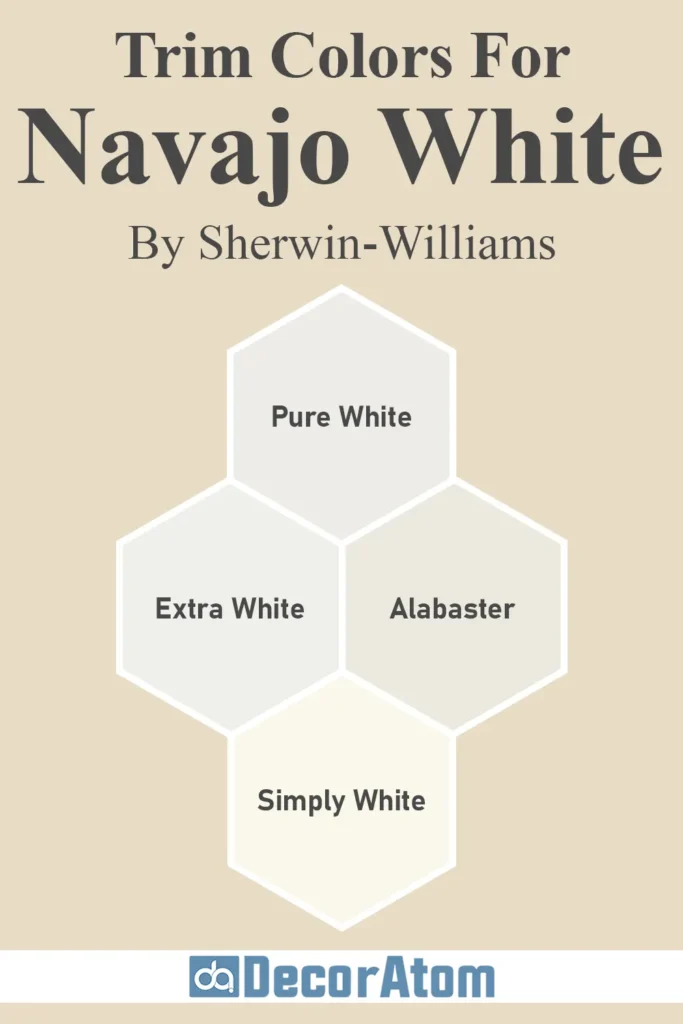
When it comes to trim colors, the right pairing can really bring out the best in Navajo White. Since this is a warm, creamy neutral, you’ll want a trim color that either complements that warmth or offers a subtle contrast without clashing.
Here are a few great options:
1. Sherwin-Williams Pure White (SW 7005)
This is one of the safest and most popular choices. It’s a soft white—not too stark—with a slight warmth that blends beautifully with Navajo White. It creates a gentle contrast while still keeping the overall palette warm and welcoming.
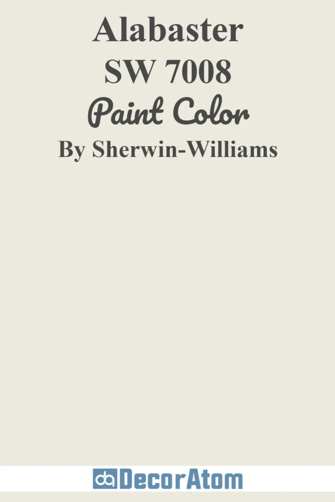
2. Sherwin-Williams Alabaster (SW 7008)
Alabaster is another warm white, and it’s very close in tone to Navajo White. Pairing them together gives a soft, monochromatic look that feels creamy and cohesive. Great for a traditional or farmhouse vibe.
3. Sherwin-Williams Extra White (SW 7006)
If you’re going for a cleaner, brighter contrast, Extra White has a crisper, cooler feel. It’s still a neutral white, but when used as trim, it will pop against Navajo White walls, giving a slightly more modern touch without being too stark.
4. Benjamin Moore Simply White (OC-117)
This is a beautiful crossover option if you’re okay mixing brands. Simply White is warm but not yellow—it plays well with the creamy warmth of Navajo White and keeps things feeling fresh and balanced.
Ultimately, think about the mood you’re going for. Want soft and classic? Stick with warmer whites like Alabaster. Want a bit of edge or contrast? Try something cleaner like Extra White.
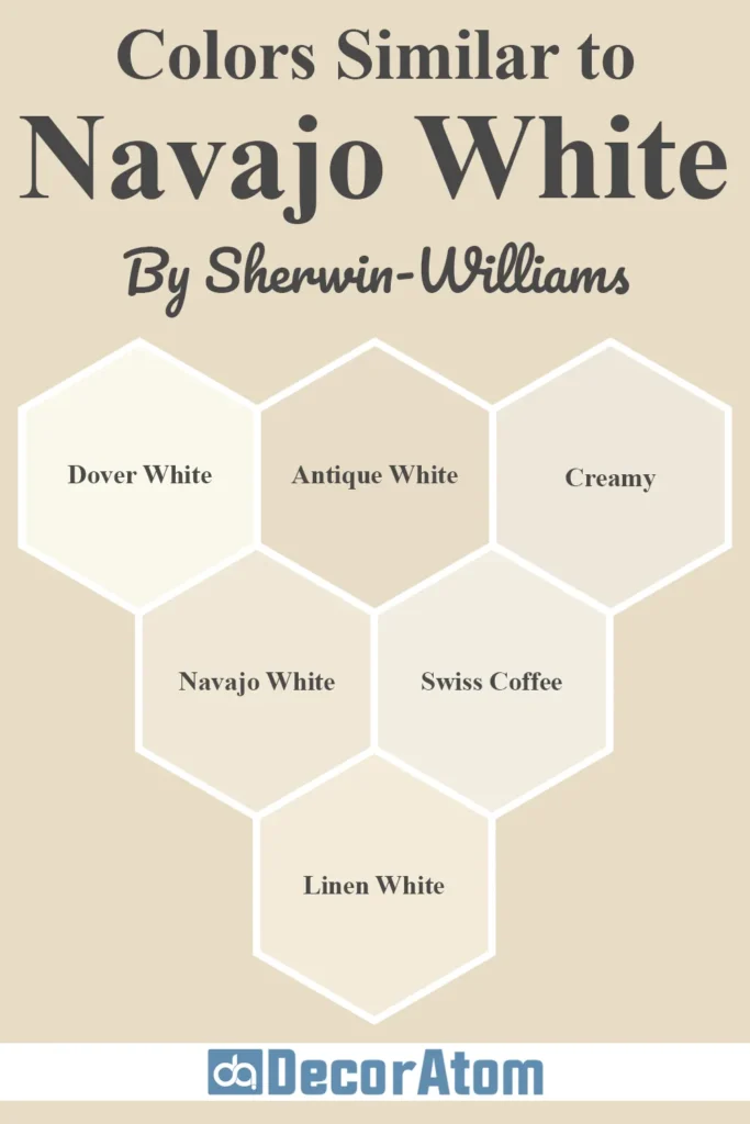
Colors Similar to Sherwin Williams Navajo White SW 6126
💥🎁 Christmas & Year-End Deals On Amazon !
Don't miss out on the best discounts and top-rated products available right now!
*As an Amazon Associate, I earn from qualifying purchases.
If you’re drawn to the cozy warmth of Sherwin Williams Navajo White SW 6126 but aren’t 100% sure it’s “the one,” you’re not alone. Sometimes we fall in love with a certain look, but want to explore a few close options before we commit.
And honestly, that’s a smart move—especially with creamy off-whites, because a small shift in undertone or depth can completely change the mood of a room.
Navajo White is known for its rich, buttery warmth. It has a soft yellow-beige base that gives it a welcoming and traditional feel. But depending on your lighting, furnishings, or personal taste, you might want something a bit lighter, slightly more muted, or less golden.
So let’s walk through six paint colors—from both Sherwin Williams and Benjamin Moore—that share similar traits with Navajo White.
I’ll break down how each one compares in terms of warmth, depth, and undertone, so you can better decide which one fits your space best.
1. Sherwin Williams Dover White (SW 6385)
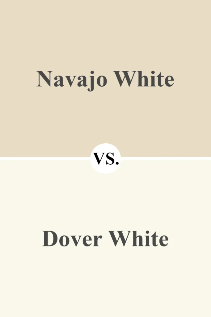
Dover White is often mentioned in the same breath as Navajo White, and for good reason. Both are creamy off-whites with a noticeable warmth, but they differ slightly in personality.
Dover White is a bit softer and lighter. While Navajo White leans more yellow-beige, Dover White pulls a little closer to ivory. It still has a warm base, but it doesn’t go quite as deep or golden.
If you want a creamy look that’s more subtle and airy, Dover White could be the better fit. It’s especially great for spaces where you don’t want the walls to appear “yellow” but still want that comforting warmth.
2. Sherwin Williams Antique White (SW 6119)
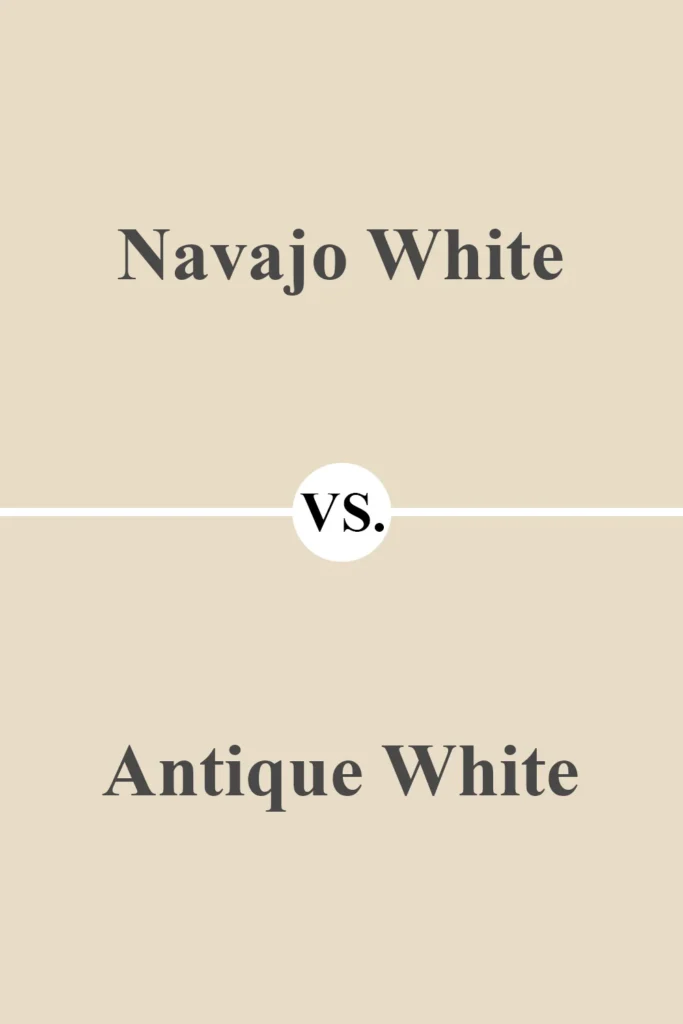
Now, if you love Navajo White’s depth but want something that feels more grounded, Antique White is worth considering. It’s a creamy beige with more beige than yellow, which gives it a quieter, more subdued warmth.
Compared to Navajo White, Antique White comes off a bit dustier—less cheerful, more earthy. It’s a good choice if you want a timeless color that won’t lean too golden in bright light.
In low light, Antique White holds its own and feels very traditional. Think of it as Navajo White’s slightly more mature sibling.
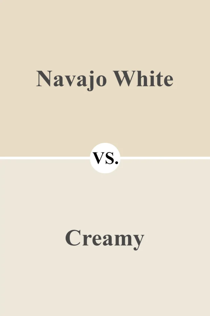
3. Sherwin Williams Creamy (SW 7012)
💥🎁 Christmas & Year-End Deals On Amazon !
Don't miss out on the best discounts and top-rated products available right now!
*As an Amazon Associate, I earn from qualifying purchases.
Creamy is one of Sherwin Williams’ most popular warm whites, and it’s a great alternative if you want something that feels a little more balanced and versatile.
Compared to Navajo White, Creamy is less yellow and more of a soft vanilla. It still has warmth, but it won’t ever feel overly golden.
This makes it easier to pair with both warm and cool colors in your decor. If Navajo White feels a little too deep or too warm for your space, Creamy tones things down just enough while keeping that cozy vibe.
4. Benjamin Moore Navajo White (OC-95)
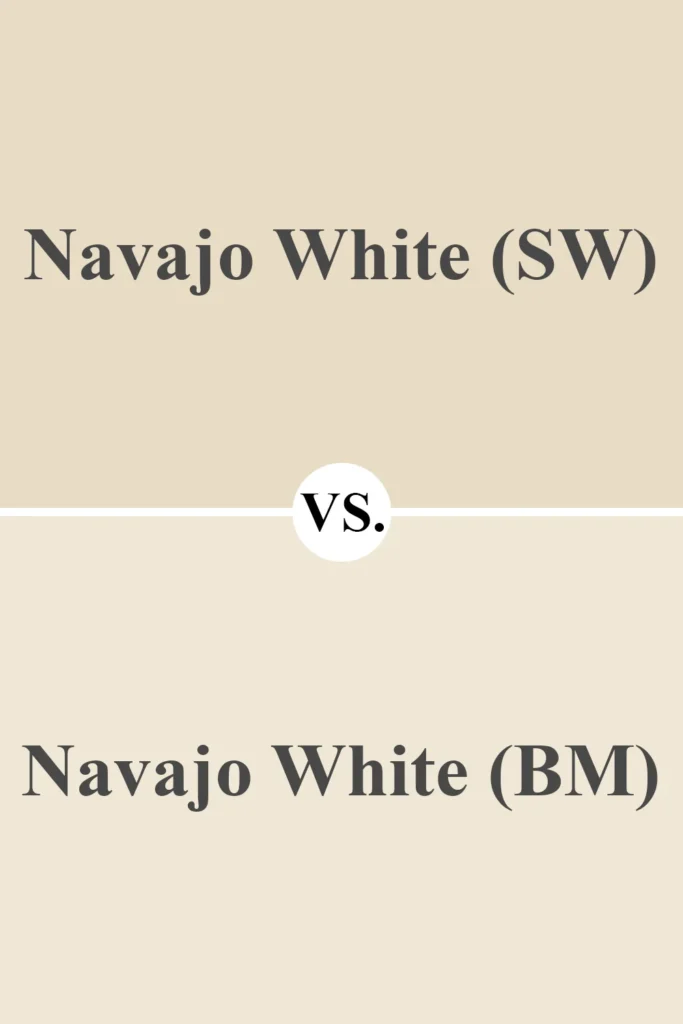
Yes, this might seem confusing—Benjamin Moore also has a color called Navajo White, but it’s not the same as the Sherwin Williams version.
BM’s Navajo White is lighter and softer. It leans more toward cream than beige and doesn’t have the same saturated yellow-beige tone as SW’s version.
It feels more subdued and airy, almost like a creamy antique white. If you want a similar look with less depth and a little more subtlety, this one might hit the sweet spot.
5. Benjamin Moore Swiss Coffee (OC-45)
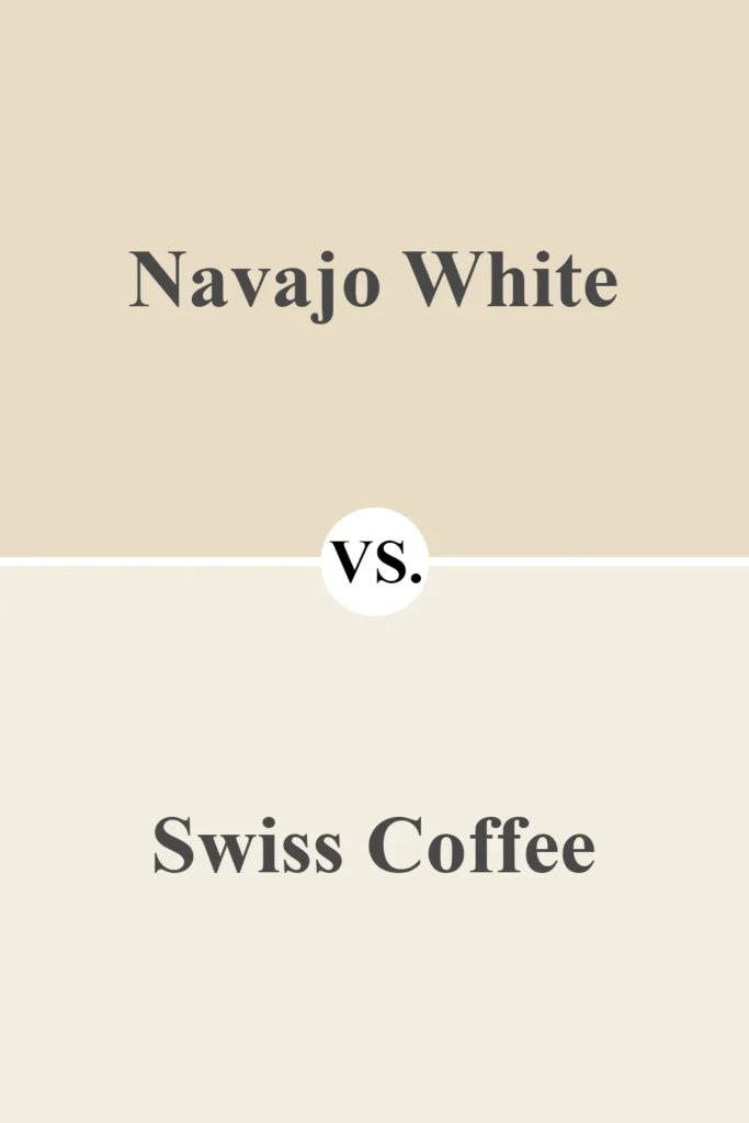
Swiss Coffee is a classic for a reason. It’s a warm, creamy off-white that sits nicely between white and beige. It has a touch of yellow, but not nearly as much as Sherwin Williams Navajo White.
When you compare the two, Swiss Coffee feels softer and more restrained. Navajo White comes off bolder and more golden, while Swiss Coffee is smoother and gentler.
This makes Swiss Coffee incredibly easy to use across many styles—whether you’re going for modern farmhouse, traditional, or transitional.
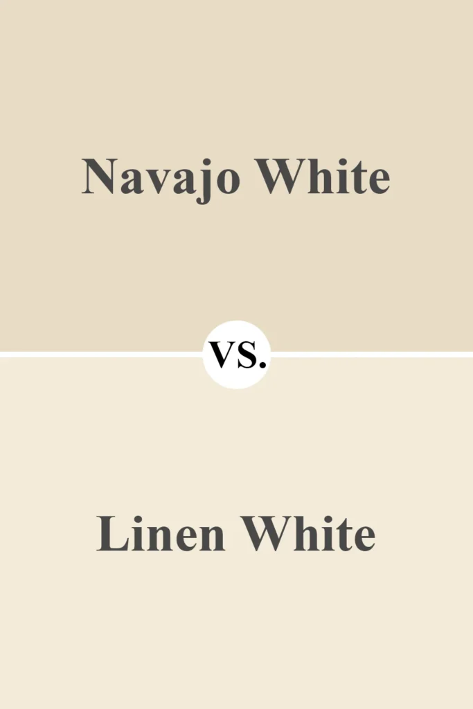
6. Benjamin Moore Linen White (912)
💥🎁 Christmas & Year-End Deals On Amazon !
Don't miss out on the best discounts and top-rated products available right now!
*As an Amazon Associate, I earn from qualifying purchases.
Linen White is probably the closest in spirit to Sherwin Williams Navajo White. It has that rich creaminess with strong yellow undertones, making it feel just as warm and inviting.
That said, Linen White reads a little lighter and less dense. Navajo White feels deeper, like it could almost flirt with being a tan in certain lighting, while Linen White floats more comfortably in the creamy off-white category.
If you love Navajo White but want something a bit brighter or less heavy on the walls, Linen White could be your answer.
Side-by-Side Comparison with Navajo White SW 6126
| Paint Color | Warmth | Undertone | Compared to SW Navajo White |
|---|---|---|---|
| SW Dover White | Warm | Creamy ivory | Lighter, less golden |
| SW Antique White | Warm | Beige with yellow | Deeper and more grounded |
| SW Creamy | Warm | Soft vanilla | Less yellow, more versatile |
| BM Navajo White | Warm | Creamy, muted | Lighter, less yellow-saturated |
| BM Swiss Coffee | Warm | Soft cream | More neutral, not as golden |
| BM Linen White | Warm | Yellow cream | Very similar, slightly brighter |
Colors that Go With Sherwin Williams Navajo White SW 6126
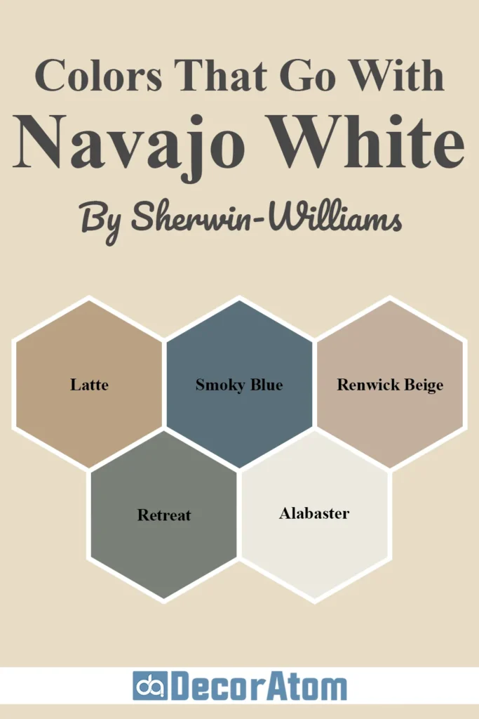
When it comes to decorating with a rich, creamy neutral like Sherwin Williams Navajo White SW 6126, pairing it with the right coordinating colors can take your space from “just fine” to truly pulled together.
Because Navajo White leans warm with yellow-beige undertones, it plays best with colors that either complement its warmth or contrast it in a soft, balanced way.
What I love about this shade is how flexible it can be. Whether you’re going for a cozy traditional style or something light and transitional, the right color pairings can really bring out the best in it.
Let’s go over five beautiful colors that work especially well with Navajo White—and I’ll walk you through why each one works.
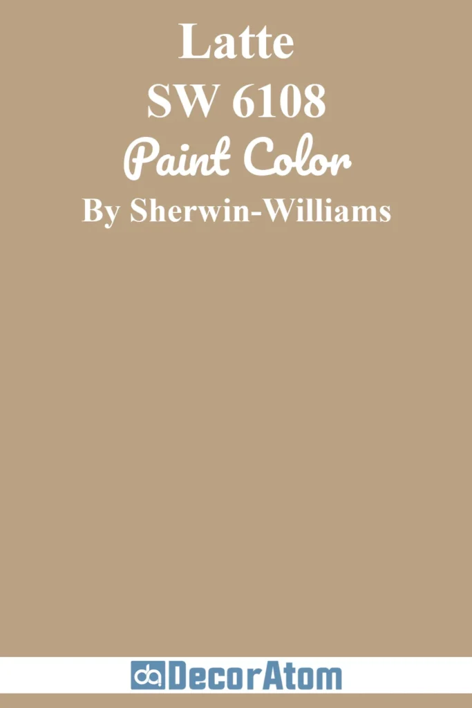
1. Sherwin Williams Latte (SW 6108)
💥🎁 Christmas & Year-End Deals On Amazon !
Don't miss out on the best discounts and top-rated products available right now!
*As an Amazon Associate, I earn from qualifying purchases.
If you want to lean into the warmth of Navajo White, Latte is a perfect cozy complement. It’s a medium tan with strong beige-brown undertones, and when paired with Navajo White, it creates a layered, monochromatic look that feels grounded and welcoming.
In a living room or dining space, this combo evokes that rich, earthy palette we often see in Mediterranean or traditional homes. Think warm wood furniture, creamy upholstery, and bronze accents—it all works effortlessly with these two colors side by side.
2. Sherwin Williams Smoky Blue (SW 7604)

For a more dramatic contrast, Smoky Blue is stunning against the creamy backdrop of Navajo White. This is a muted blue with gray undertones—it doesn’t scream “blue,” but it makes its presence known in a very sophisticated way.
Because Navajo White is warm and soft, the coolness of Smoky Blue helps create balance. This combination is great if you want to give your space a bit of depth and interest, especially in a bedroom or office. Add brass accents or natural textures like rattan or wood, and you’ve got a high-end, coastal-inspired palette.
3. Sherwin Williams Renwick Beige (SW 2805)
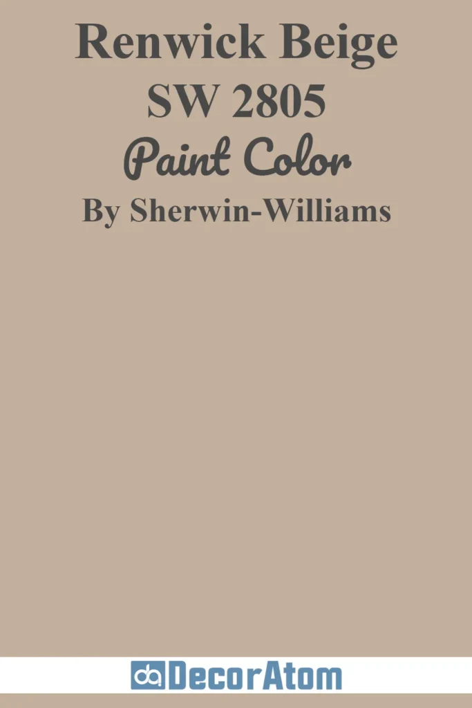
If you’re aiming for a vintage or historic feel, Renwick Beige pairs beautifully with Navajo White. It has an aged, slightly muddy tone that gives it a rustic charm, and together, these two colors create a look that feels lived-in and full of character.
This combo is especially nice in spaces where you want subtle warmth without going overboard. Use it in hallways, libraries, or transitional areas where you want a hint of color without overwhelming the space.
4. Sherwin Williams Retreat (SW 6207)

Looking for something a little more moody and modern? Try Retreat, a muted green-gray that feels earthy and grounded. This pairing brings in a biophilic feel—connecting your home to natural colors you’d find in the outdoors.
Retreat helps tone down the golden tones of Navajo White and offers a cooler, contemporary balance. I love this palette for bedrooms, mudrooms, or bathrooms—it’s calming but stylish, especially when paired with matte black or brushed nickel hardware.
5. Sherwin Williams Alabaster (SW 7008)
Finally, if you want a soft, clean white that won’t fight against Navajo White’s warmth, Alabaster is a go-to. It’s warm and creamy without looking yellow, and it’s ideal for trim, ceilings, or built-ins.
Where pure whites can sometimes make warm wall colors look dingy or dated, Alabaster blends right in while still giving that crisp edge you need for contrast. It’s subtle, soft, and never overpowering—basically a foolproof trim color for Navajo White.
Where to Use Sherwin Williams Navajo White SW 6126?
Now let’s talk about the fun part—where this color really shines. While Navajo White SW 6126 isn’t a bright white or modern greige, its warm character makes it perfect for spaces where you want to feel comfortable and at home.
I’ve seen this color used in everything from historic homes to cozy cottages, and it always brings a sense of warmth and familiarity.
That said, how it looks and feels can vary based on the room and lighting—so let’s explore how it works in different parts of the house.
Sherwin Williams Navajo White in the Bedroom
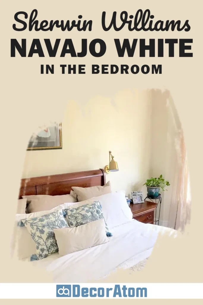
In a bedroom, Navajo White brings a soft, cozy ambiance that can make your space feel like a warm hug. If you want your bedroom to feel restful, this color wraps the room in a glow that feels both peaceful and welcoming.
Pair it with soft linens—think warm whites, pale taupes, or dusty blues—and you’ve got an environment that’s ideal for unwinding. Because it’s not a stark white, it also hides everyday wear-and-tear on the walls, which is a plus if you’re going for low maintenance.
Sherwin Williams Navajo White in the Living Room
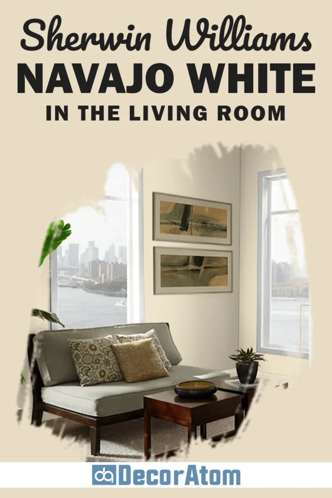
The living room is one of the best places to use Navajo White. It adds instant warmth and character, especially in spaces with traditional or transitional decor.
If you have lots of wood tones or antique pieces, this color will blend seamlessly with them.
It also works beautifully as a backdrop for gallery walls or built-in shelves. And when sunlight hits it during the day, the golden undertones come alive, creating a cheerful, lived-in look.
In the evening, it mellows out into a creamy neutral, making the room feel calm and cozy.
Sherwin Williams Navajo White in the Bathroom
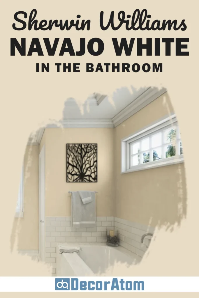
Bathrooms can be tricky, especially with lighting, but Navajo White actually performs quite well here—especially if you’re not going for a bright-white spa look. Instead, it creates a warm, inviting atmosphere that feels homey and clean.
Pair it with soft whites (like Alabaster or Swiss Coffee) for your trim, and add brass or oil-rubbed bronze fixtures for a bit of contrast.
If your bathroom gets natural light, it’ll look warmer during the day. In spaces with less light, it can lean a bit more beige, but not muddy.
Sherwin Williams Navajo White in the Kitchen
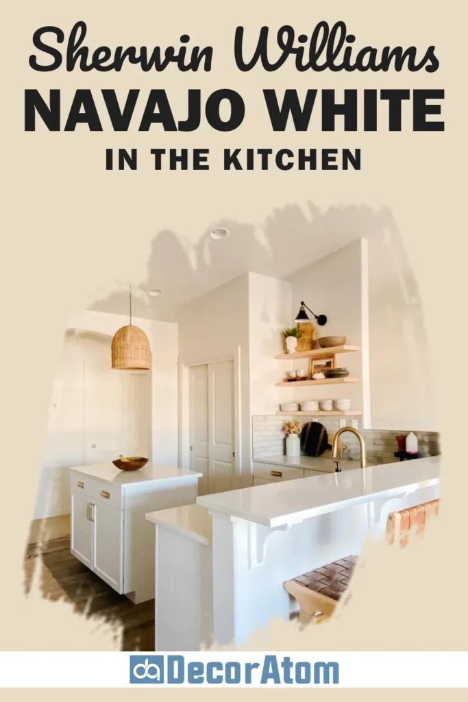
In kitchens, Navajo White can work beautifully on the walls or even on cabinetry, especially in farmhouse or classic styles. It creates a cozy, creamy background that complements wood finishes, stone countertops, and warm metals.
Just be mindful—because it has yellow undertones, it may clash with certain cool-toned finishes (like stark gray or blue-grays). But if your kitchen features warm woods, brass hardware, or beige-toned counters, Navajo White will tie everything together.
Sherwin Williams Navajo White for the Exterior
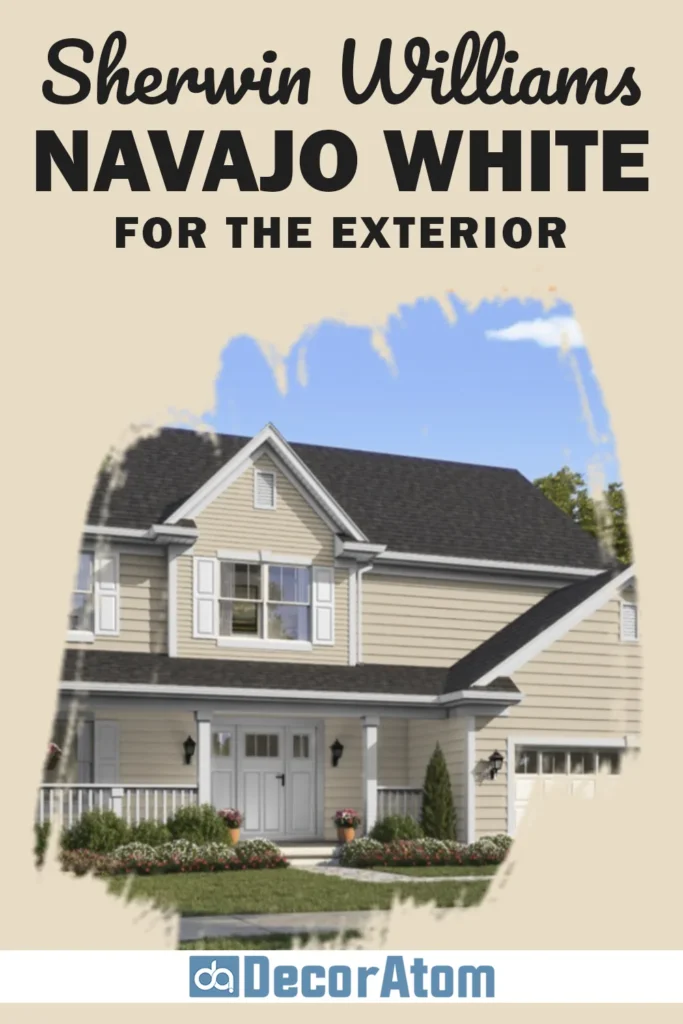
Exterior paint is where many people hesitate with warmer off-whites—but Navajo White can actually work really well outdoors, especially on traditional or Mediterranean-style homes.
It offers a classic, timeless look that feels sunny and inviting without looking too stark or modern.
Because it’s a bit deeper than your typical white, it handles direct sunlight without washing out completely. Pair it with deeper trim colors like Black Fox, Urbane Bronze, or even navy blue for shutters and doors, and it’ll stand out in a beautiful, welcoming way.
Final Thoughts
Sherwin Williams Navajo White SW 6126 is not your average off-white. It brings warmth, character, and a sense of tradition into your home.
While it’s not for every style—especially ultra-modern spaces—it shines in cozy, classic, or vintage-inspired interiors.
What makes this color so special is its ability to feel soft and comforting without being boring. It works well in a range of rooms, plays nicely with other warm tones, and can even hold its own on exteriors.
Whether you’re painting a single room or your whole house, Navajo White is one of those timeless shades that’s always going to feel “just right”—as long as you pair it with the right lighting, finishes, and supporting colors.