
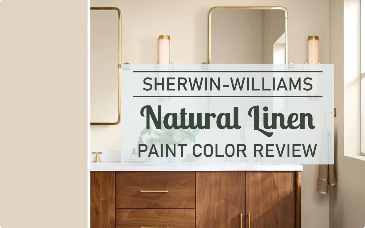
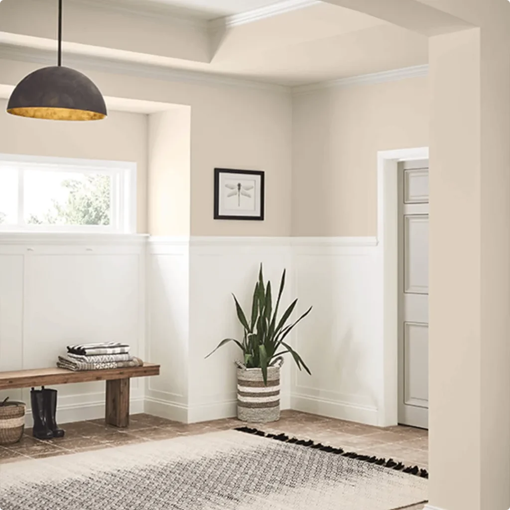
Sherwin-Williams Natural Linen SW 9109 is one of those colors that quietly wins you over. When I first came across it, I didn’t expect much. It looked simple, maybe too simple.
But once I saw it on a full wall in natural light, everything changed. There’s something calming about it, something easy on the eyes. It doesn’t scream for attention, and that’s exactly what makes it so beautiful.
In this post, I want to walk you through everything I’ve learned about Natural Linen, its personality, how it behaves in different lights, what undertones peek through, and where it truly shines in the home.
If you’re trying to decide whether it’s the right fit for your space, I hope this helps you see it from the lens of someone who’s really spent time with the color.
What Color is Sherwin Williams Natural Linen?
Natural Linen is a soft, muted neutral that sits somewhere between beige and creamy off-white. To put it simply, it’s a color that looks like, you guessed it, natural linen fabric.
It’s not pure white, but it’s also not brown or yellow. It’s that happy middle ground that feels cozy without being heavy. If you’re picturing a fresh, lightly sun-washed canvas or a light oatmeal tone, you’re pretty close.
It adds warmth to a space but stays gentle on the eyes. I find it super versatile because it adapts so well to its surroundings.
Is It a Warm or Cool Color?
Natural Linen is definitely a warm color. You’ll notice it immediately in how it brings a sense of softness and comfort into the room.
It has yellow and greige undertones that lean warm, so it never feels cold or clinical. If your space needs a bit of coziness, especially in rooms that feel too stark or gray, this color adds that touch of warmth without going too dark or too yellow.
In other words, it’s warm but not overwhelming. That’s a tricky balance to find, and Natural Linen gets it right.
LRV of Sherwin Williams Natural Linen
💥🎁 Christmas & Year-End Deals On Amazon !
Don't miss out on the best discounts and top-rated products available right now!
*As an Amazon Associate, I earn from qualifying purchases.
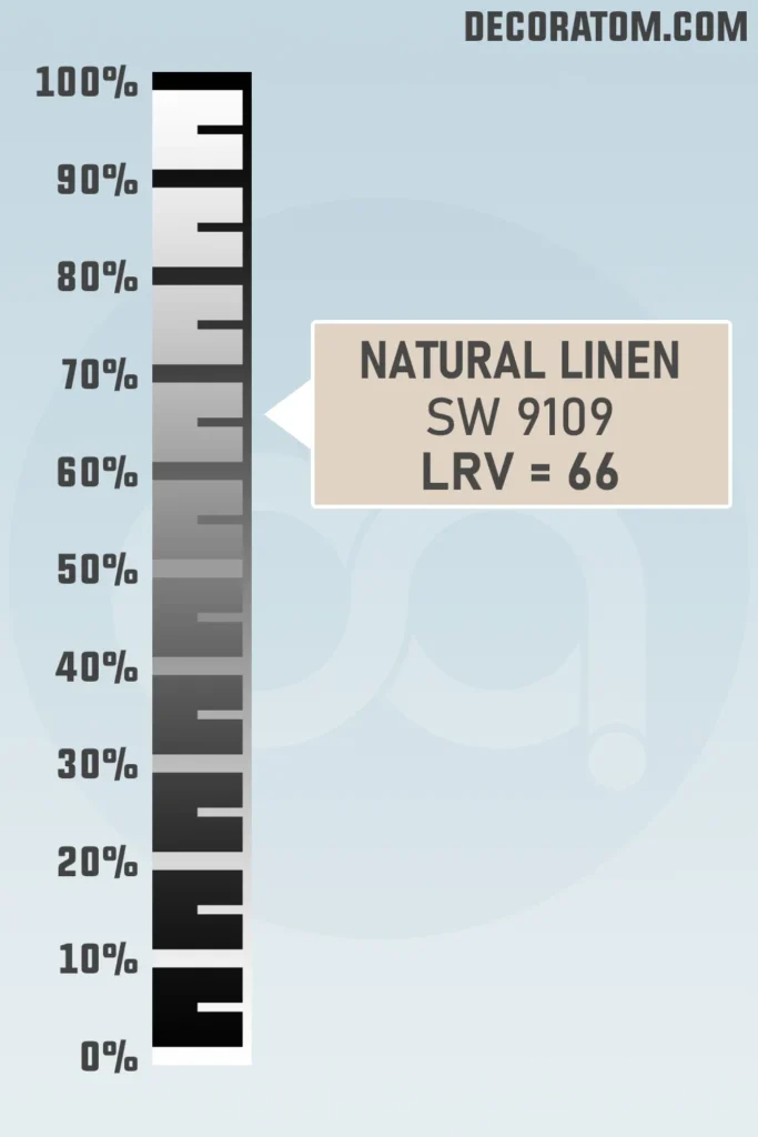
Let’s talk LRV for just a second. LRV stands for Light Reflectance Value, which is basically a number between 0 and 100 that tells you how much light a paint color reflects.
The higher the number, the lighter the color will feel in a room. Natural Linen has an LRV of 66, which means it reflects a decent amount of light but isn’t ultra-bright.
It’s right in that sweet spot where it still keeps things light and open, but adds just enough depth to give your walls some personality. If you want a soft neutral that won’t make your room feel washed out or gloomy, 66 is a great place to land.
Color Family
Natural Linen SW 9109 falls into the yellow color family, although it’s not a bold or sunny yellow at all. Instead, it carries a very toned-down yellow base that helps give it its warm, creamy vibe.
RGB Colors
Sherwin Williams Natural Linen SW 9109 has RGB values of 223 / 211 / 195. Now, if you’re not familiar with RGB, it simply stands for Red, Green, and Blue, the three primary colors used to create every color you see on a digital screen.
In this case, there’s more red and green than blue, which helps explain why the color feels so warm and soft. That balance gives it its creamy beige appearance.
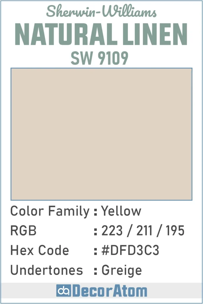
Hex Value
The hex value of Sherwin Williams Natural Linen is #DFD3C3. If you’re working on a digital mood board, designing something online, or coordinating your color palette with graphic elements, this hex code comes in super handy. It gives you the exact shade as it appears on a screen, without any guesswork.
Undertones of Sherwin Williams Natural Linen
Now let’s talk undertones, because this is where people either fall in love with a color, or feel caught off guard. Natural Linen has greige undertones.
That means it has a mix of gray and beige peeking through beneath its surface. It’s subtle, but once you notice it, you can’t unsee it, and honestly, that’s what gives this color its charm.
The beige keeps things warm and earthy, while the gray cools it down just enough to prevent it from looking too creamy or yellow. This combination makes Natural Linen incredibly versatile.
It can lean a little more gray in cool lighting and more beige in warm light. If you’re looking for a neutral that walks the line between classic and modern, this balance of greige undertones really helps it blend into both traditional and contemporary spaces.
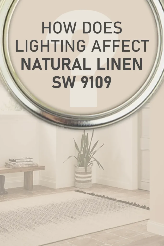
How Different Types of Lighting Affect Sherwin Williams Natural Linen?
💥🎁 Christmas & Year-End Deals On Amazon !
Don't miss out on the best discounts and top-rated products available right now!
*As an Amazon Associate, I earn from qualifying purchases.
Lighting makes a huge difference with Natural Linen, and I’ve seen it shift personalities depending on the time of day or where it’s used in the home. Here’s what I’ve noticed:
In natural daylight, especially in south-facing rooms, the color appears warmer and slightly creamier. The yellow-beige qualities become more noticeable, and the space feels sun-kissed and inviting.
In north-facing rooms, which tend to get cooler, bluish light, Natural Linen can show more of its gray-beige (greige) side. It still feels warm, but the undertones become more subdued, giving it a more sophisticated look.
Under warm artificial lighting, like soft white bulbs or lamps, the beige tones stand out more. It feels cozier, almost like a soft almond or warm linen fabric.
Under cool artificial lighting, such as daylight LED bulbs, the gray undertone becomes more visible. This is where you’ll really notice the greige balance in action.
Because of these shifts, I always recommend testing the color in your specific room and checking it throughout the day. What looks creamy and warm in the morning might lean more neutral or gray in the evening.
Trim Colors to Pair With Sherwin Williams Natural Linen?
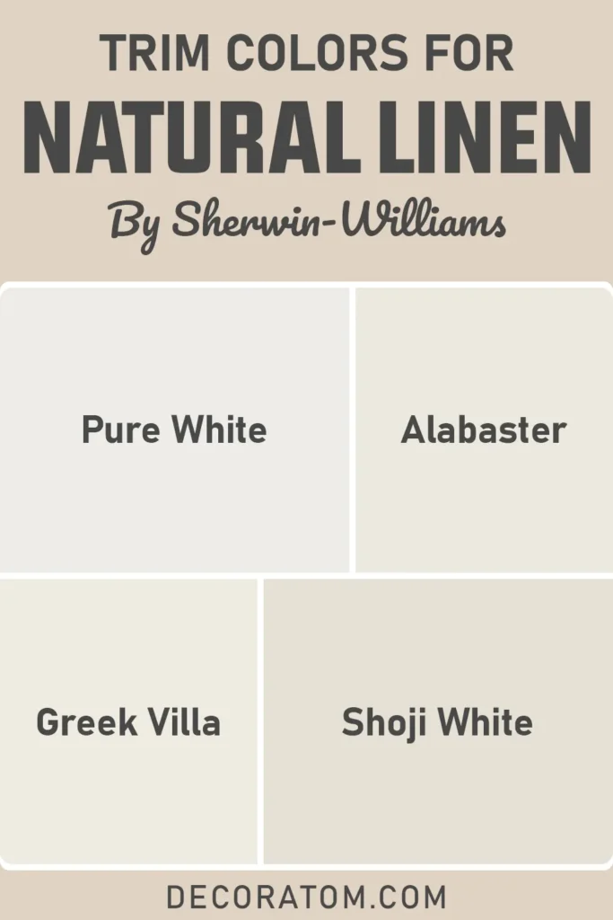
When it comes to trim, I love pairing Natural Linen with soft, creamy whites. Crisp whites can work too, but I find that warmer whites really bring out the best in Natural Linen’s tone. Here are a few trim color ideas that I think work beautifully:
Sherwin Williams Alabaster SW 7008 – This is my go-to for soft, warm trim. It has just enough warmth to blend beautifully without competing.
Sherwin Williams Pure White SW 7005 – This one’s a bit more neutral but still not stark. It adds a clean contrast while keeping the overall look soft.
Sherwin Williams Greek Villa SW 7551 – Another lovely off-white that feels light but warm. It helps create a cohesive and calm vibe, especially in open spaces.
Sherwin Williams Shoji White SW 7042 – If you want a more tonal, layered look, this works well. It doesn’t offer a sharp contrast but instead creates a smooth transition from wall to trim.
My personal favorite combo is Natural Linen on the walls with Alabaster trim, it just looks so clean and timeless without being too formal. It’s the kind of pairing that always gets compliments, and it makes a room feel thoughtfully pulled together without trying too hard.
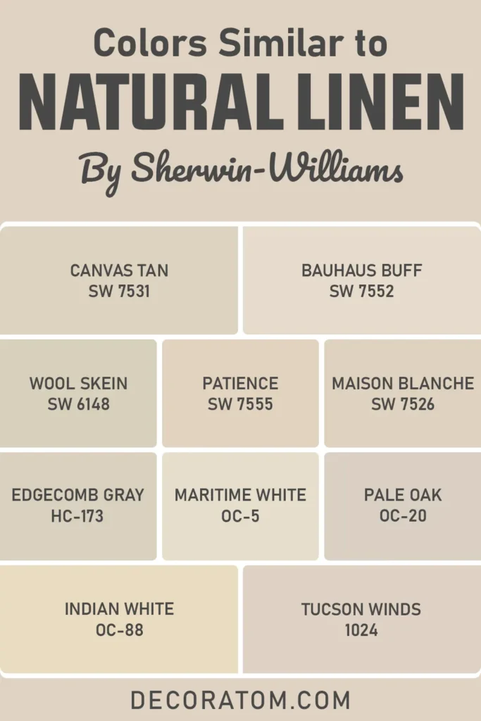
Colors Similar to Sherwin Williams Natural Linen
Finding a color that closely resembles Sherwin Williams Natural Linen SW 9109 isn’t always straightforward because its beauty lies in how subtly it balances warmth, softness, and greige undertones.
But if you’re looking for alternatives, maybe you’re already using Natural Linen in one room and want something just a tad different for another, there are some excellent similar shades that offer a comparable feel.
When I was first testing out neutrals for my space, I put Natural Linen side-by-side with several other beige and greige tones. What I discovered is that some colors leaned a little more yellow, while others leaned cooler or had more noticeable gray undertones.
But there are a few that walk that same fine line Natural Linen does. These similar shades can be great if you’re doing a whole-house color scheme and want slight variation from room to room without straying too far off the vibe.
Here’s a quick list of colors that share a similar mood or tone, some from Sherwin Williams, and some from Benjamin Moore. If you’re creating a cohesive palette or just exploring your options, these are worth sampling:
💥🎁 Christmas & Year-End Deals On Amazon !
Don't miss out on the best discounts and top-rated products available right now!
*As an Amazon Associate, I earn from qualifying purchases.
Similar Colors from Sherwin Williams and Benjamin Moore:
- Sherwin Williams Canvas Tan SW 7531
- Sherwin Williams Bauhaus Buff SW 7552
- Sherwin Williams Wool Skein SW 6148
- Sherwin Williams Patience SW 7555
- Sherwin Williams Maison Blanche SW 7526
- Benjamin Moore Edgecomb Gray HC-173
- Benjamin Moore Maritime White OC-5
- Benjamin Moore Pale Oak OC-20
- Benjamin Moore Indian White OC-88
- Benjamin Moore Tucson Winds 1024
Colors that Go With Sherwin Williams Natural Linen
Pairing the right colors with Sherwin Williams Natural Linen is one of my favorite parts of working with this shade. Because it’s such a versatile neutral, it plays well with a wide range of colors.
But to create a truly intentional and layered look, it helps to understand how the undertones in Natural Linen interact with other shades.
Since Natural Linen has warm greige undertones, I’ve found that earthy tones, muted greens, warm whites, and even deep accent shades can work beautifully.
In my living room, for example, I paired it with a soft white trim and added accents in deep taupe and olive green, everything came together in a way that felt warm and grounded. You can also go more modern by pairing it with charcoal tones or purples with gray undertones for contrast.
The key is to build a palette that enhances Natural Linen’s subtle warmth while adding enough variation to keep the space interesting.
Below is a list of eight Sherwin Williams colors that complement Natural Linen really well, including three that I always keep in my back pocket: Divine White, Antler Velvet, and Gris Morado.
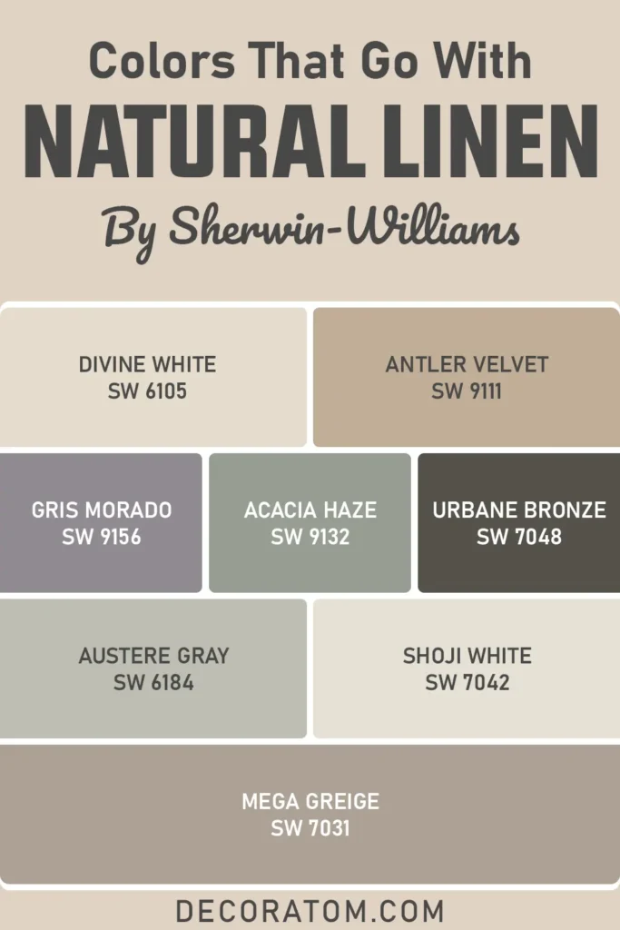
Colors That Go With Sherwin Williams Natural Linen:
- Sherwin Williams Divine White SW 6105
- Sherwin Williams Antler Velvet SW 9111
- Sherwin Williams Gris Morado SW 9156
- Sherwin Williams Acacia Haze SW 9132
- Sherwin Williams Urbane Bronze SW 7048
- Sherwin Williams Austere Gray SW 6184
- Sherwin Williams Shoji White SW 7042
- Sherwin Williams Mega Greige SW 7031
Comparing Sherwin Williams Natural Linen With Other Colors
I always think comparing paint colors side-by-side is one of the smartest things you can do before settling on a final choice.
You might fall in love with a color swatch or a photo online, but it’s not until you see how it stacks up next to similar shades that you really get a feel for what sets it apart.
Natural Linen is such a soft, subtle color that its differences become more obvious when compared to other neutrals in the same family.
Whether it’s warmer or cooler, creamier or grayer, lighter or darker, those comparisons help you figure out what fits your home’s lighting, style, and mood best. Below are six detailed comparisons that break it all down and hopefully make your decision easier.
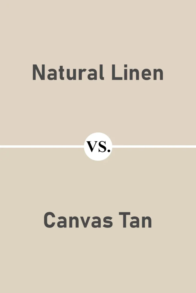
Sherwin Williams Natural Linen vs Canvas Tan SW 7531
💥🎁 Christmas & Year-End Deals On Amazon !
Don't miss out on the best discounts and top-rated products available right now!
*As an Amazon Associate, I earn from qualifying purchases.
Both Natural Linen and Canvas Tan fall into the warm neutral category, but they behave slightly differently. Canvas Tan leans more toward the beige side with a bit more yellow in its undertone.
It’s a little lighter and brighter overall, especially in spaces with strong natural light. Natural Linen, on the other hand, feels more balanced with its greige undertones, it doesn’t read as yellow, which gives it a more updated and slightly more sophisticated look.
If you’re aiming for a timeless but modern neutral, I think Natural Linen wins, but Canvas Tan is a great option for a sunnier, more traditional vibe.
Sherwin Williams Natural Linen vs Shoji White SW 7042
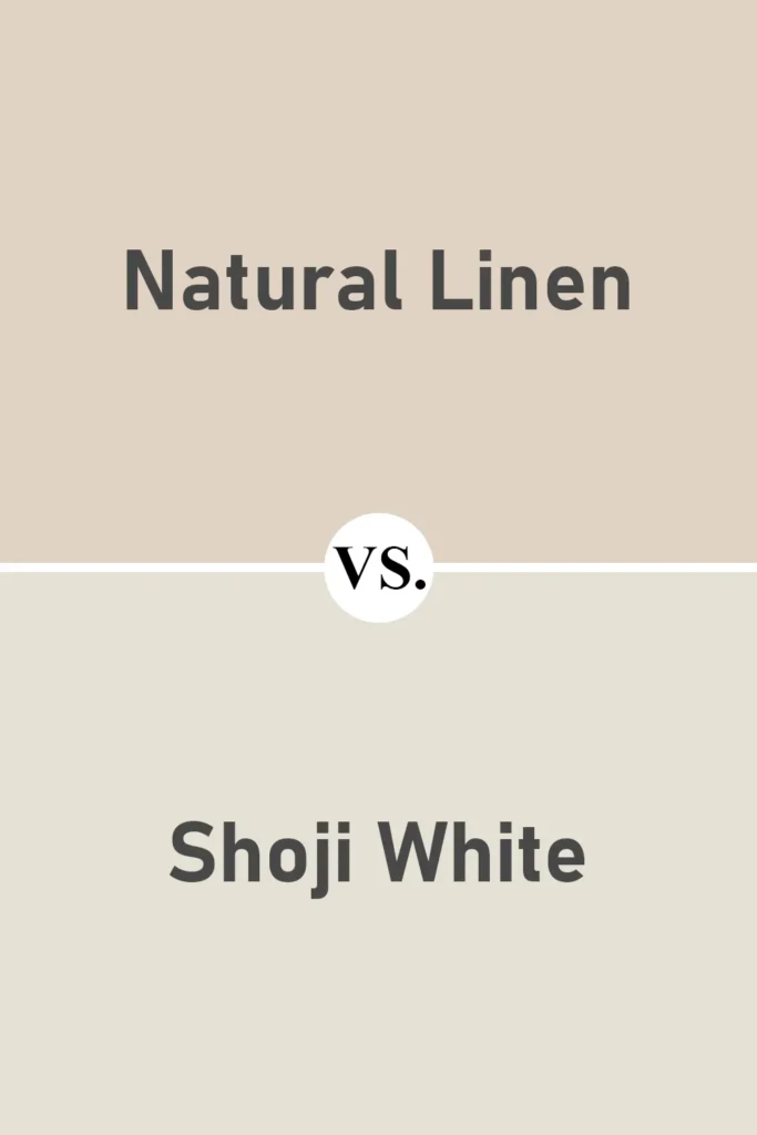
Shoji White is often considered a warm white, and when you compare it to Natural Linen, the difference becomes clear. Shoji White is lighter and closer to an off-white, while Natural Linen has more body and depth.
In fact, I’ve used Shoji White as a trim color with Natural Linen on the walls, and the contrast was just enough to define the edges without being too stark.
Shoji White is cooler and more subtle, whereas Natural Linen brings more warmth and saturation. So depending on what you want the wall to do, blend in or stand out, you’ll gravitate toward one or the other.
Sherwin Williams Natural Linen vs Aesthetic White SW 7035
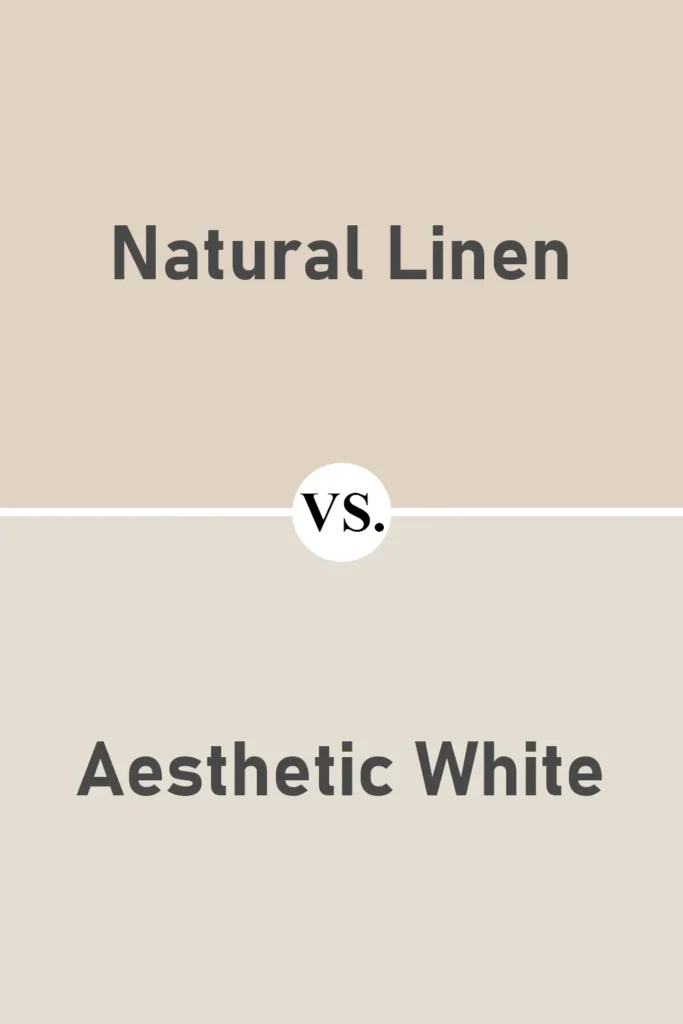
Aesthetic White is very close in tone to Natural Linen, and I remember having a hard time choosing between them.
What tipped the scale for me was that Aesthetic White leans a touch grayer and has a slightly more muted feel in certain lighting.
Natural Linen feels warmer and a bit more inviting, especially in spaces where I wanted that cozy backdrop without looking washed out.
Both are beautiful, but if you’re going for a softer, more “linen-like” color, Natural Linen feels more textural and nuanced.
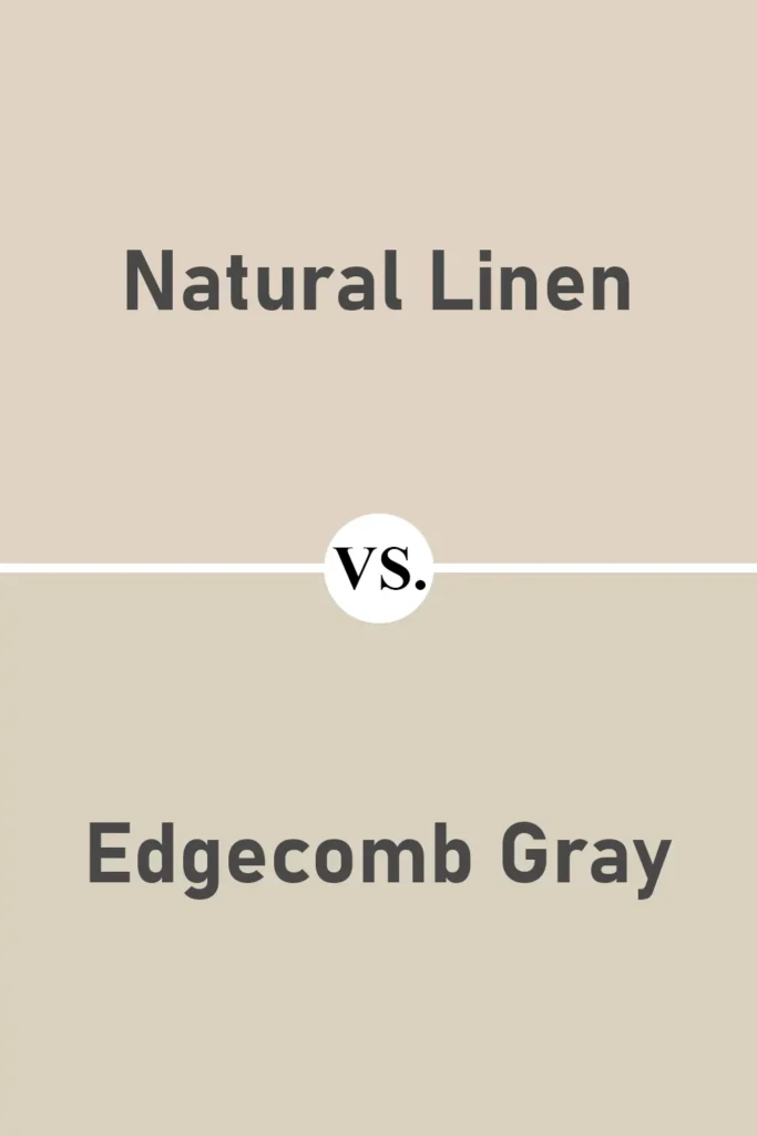
Sherwin Williams Natural Linen vs Benjamin Moore Edgecomb Gray HC-173
💥🎁 Christmas & Year-End Deals On Amazon !
Don't miss out on the best discounts and top-rated products available right now!
*As an Amazon Associate, I earn from qualifying purchases.
Edgecomb Gray is one of Benjamin Moore’s most popular greiges, and it’s easy to see why. It’s slightly cooler than Natural Linen and has more of a gray base.
If you’re looking for something that reads neutral in both cool and warm lighting, Edgecomb Gray might be the one.
But if your space needs just a bit more warmth and softness, especially in the morning light, Natural Linen creates that inviting atmosphere that Edgecomb sometimes lacks. I see Natural Linen as a more approachable, creamier alternative.
Sherwin Williams Natural Linen vs Wool Skein SW 6148
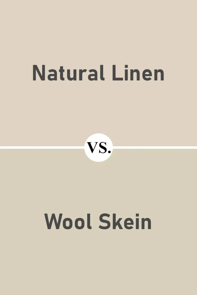
Wool Skein and Natural Linen are pretty close in vibe, but Wool Skein leans a bit more traditional. It has more visible yellow-beige undertones, especially in brighter lighting.
Natural Linen is a bit softer and more muted, and to me, it feels a little more refined.
Wool Skein is great if you’re going for that classic beige feel, but if you want something a little more modern and neutral-leaning, Natural Linen is a safer bet.
Sherwin Williams Natural Linen vs Maison Blanche SW 7526
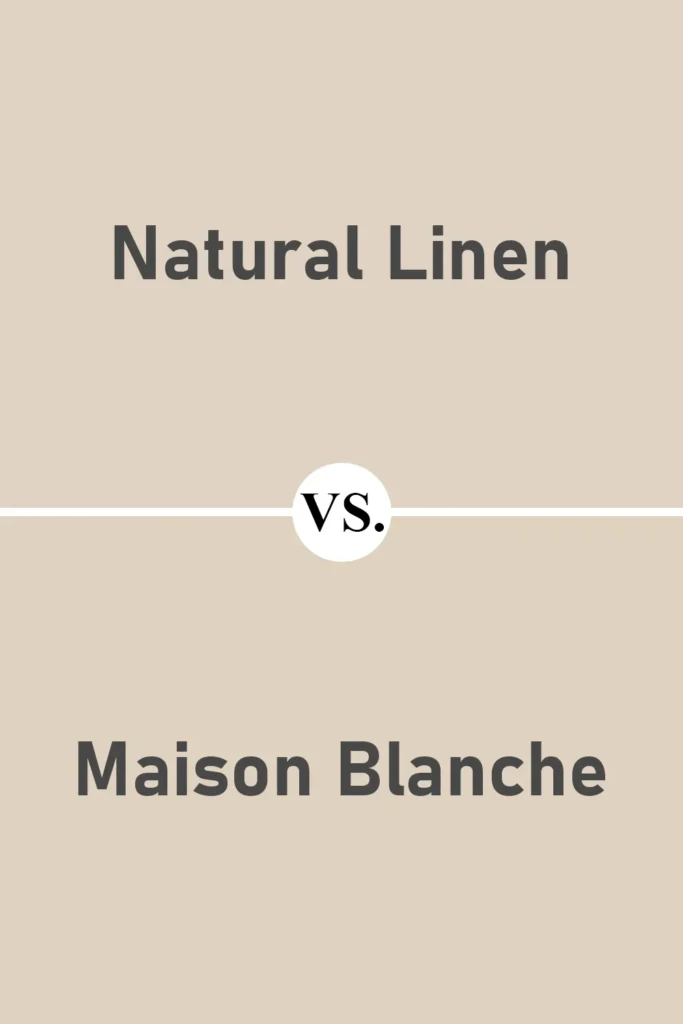
Maison Blanche is another warm neutral that shares some DNA with Natural Linen, but it’s slightly darker and richer.
I find that Maison Blanche has a bit more depth and can almost feel like a tan in some lights. Natural Linen is lighter, softer, and more versatile.
If you’re painting a smaller space or a room with limited light, Natural Linen will open it up more. Maison Blanche might be better for larger rooms where you want to anchor the space with more warmth.
Where to Use Sherwin Williams Natural Linen?
One of the things I appreciate most about Sherwin Williams Natural Linen is just how flexible it is. This isn’t one of those colors that only works in one kind of space.
It’s the type of neutral that can stretch across your entire home and feel different, but always good, in every room.
Whether you want to create a serene bedroom, a welcoming kitchen, or even give your exterior a soft, sun-washed look, Natural Linen just has that adaptable quality.
Over time, I’ve used it in different areas of the house, and each time, it has surprised me in the best way. Let me walk you through how it works in each space:
Sherwin Williams Natural Linen in the Bedroom
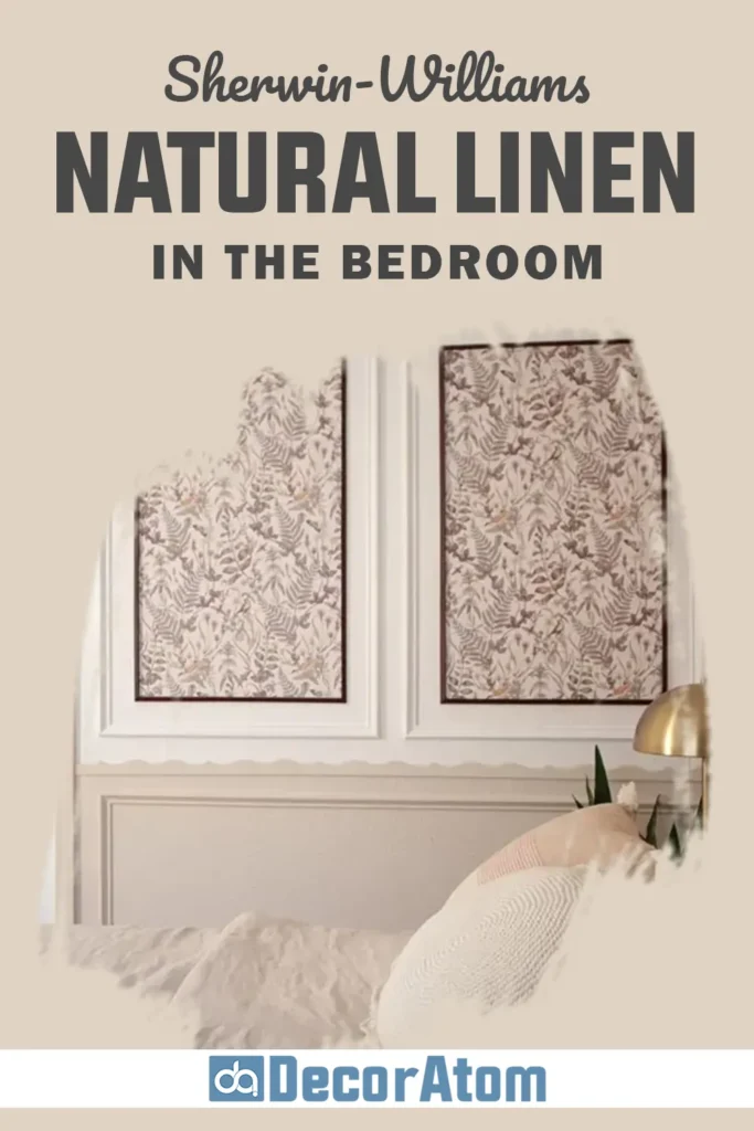
If there’s one room where Natural Linen really shines for me, it’s the bedroom. I’ve used it on both full walls and as a backdrop behind the bed, and every time it creates such a peaceful, grounded feeling.
The greige undertones give it a softness that feels comforting, not bland. It’s not too dark or heavy, so the room still feels light, but there’s enough warmth that you don’t feel like you’re sleeping in a sterile white box.
I especially love how it pairs with creamy bedding, textured throws, or even wood accents like a cane headboard or walnut nightstands. It creates the kind of cozy environment where you actually want to unwind at the end of the day.
And if your bedroom gets morning sunlight, the way Natural Linen picks up that warm light is just beautiful—it’s like the room slowly wakes up with you.
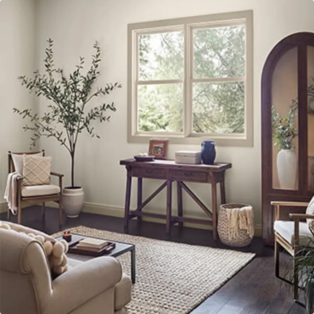
Sherwin Williams Natural Linen in the Living Room
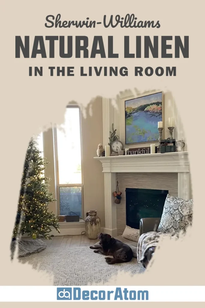
In the living room, Natural Linen acts like the perfect neutral backdrop, it allows your furniture, artwork, and textiles to really stand out.
I used it in a living room with a dark brown leather sofa, a vintage rug, and a lot of layered textures, and it grounded the whole space without overpowering anything. That’s what I like about it: it knows how to stay in the background without fading away.
It’s warm enough to make the room feel inviting, especially when paired with wood tones or brass finishes. At the same time, it has a clean, tailored quality that works in modern and traditional styles alike.
And if you love switching up your decor seasonally, Natural Linen is a safe choice, you can go cozy and earthy in the fall or breezy and light in summer, and the walls still make sense.
Sherwin Williams Natural Linen in the Kitchen
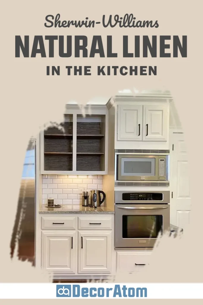
Now, kitchens can be tricky with paint colors. You’ve got cabinets, backsplashes, lighting, and so many surfaces competing for attention. But Natural Linen handles all of that gracefully.
If you’re using it on the walls with white or wood-tone cabinets, it gives the kitchen a subtle warmth that feels homey and welcoming.
I’ve also seen people use it as a cabinet color, and it works really well for that too, especially in a more relaxed, cottage-inspired kitchen. Pair it with brushed brass or matte black hardware, and the look feels thoughtful but not overdesigned.
Since Natural Linen doesn’t have strong yellow or pink undertones, it stays pretty neutral against countertops and backsplashes, which makes your life easier when you’re pulling all the materials together.
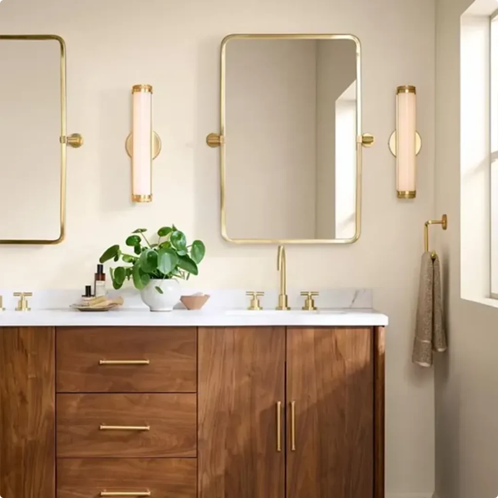
Sherwin Williams Natural Linen in the Bathroom
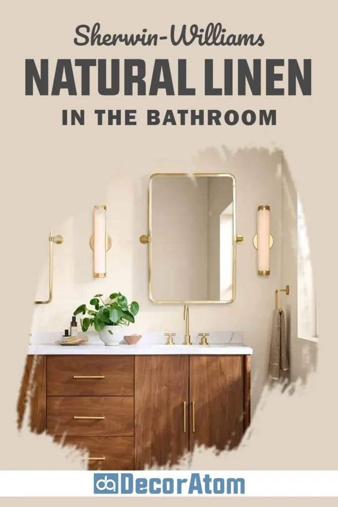
Bathrooms can sometimes feel cold, especially if they’re filled with white tile and chrome finishes. That’s where Natural Linen really helps. It warms things up just enough without clashing with the cooler materials typically used in bathrooms.
I used it once in a guest bathroom with white subway tile, brass sconces, and a warm wood vanity, and it created this really calming, spa-like vibe.
It’s also a great choice if you have a small bathroom with limited natural light. Because of its 66 LRV, Natural Linen keeps things feeling open and soft, even in tighter spaces.
It’s one of those shades that makes everything look pulled together, even if the bathroom layout isn’t ideal.
Sherwin Williams Natural Linen for the Exterior
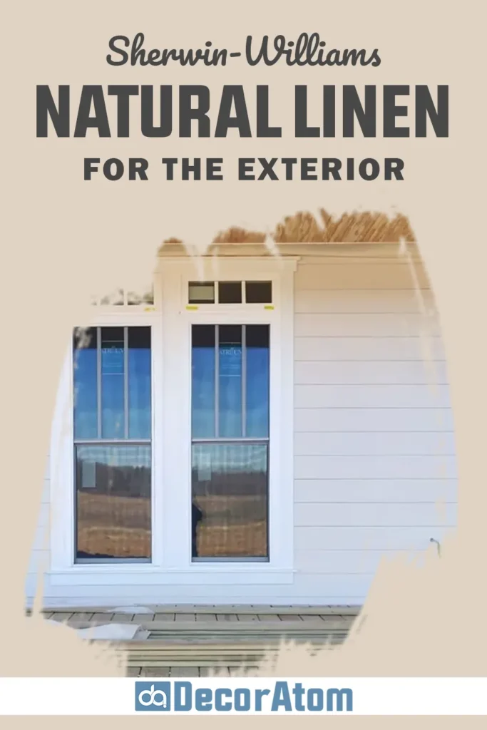
Using Natural Linen on the exterior might not be the most obvious choice, but hear me out, it’s stunning.
I’ve seen it used on traditional homes, ranch-style houses, and even modern farmhouses, and it brings a quiet elegance that doesn’t fade into the background.
If your home has brick, stone, or natural wood elements, this color creates a nice harmony. It doesn’t fight for attention but still holds its own.
What I love is how it changes throughout the day. In bright sunlight, it feels soft and creamy. In the evening, it takes on a slightly warmer, grounded tone.
If you’re looking for an exterior color that feels natural but still refined, Natural Linen is one of those understated neutrals that will stand the test of time.
Why I Love Sherwin Williams Natural Linen
Natural Linen isn’t a dramatic color. It doesn’t walk into a room and demand all eyes on it. And that’s exactly why I love it.
There’s a quiet confidence to it, like the friend who’s always steady, never trying too hard, but still makes you feel completely at ease when they’re around.
I’ve worked with a lot of paint colors over the years, but this one just feels different. It adapts to the space and the light, and somehow always manages to feel “just right.”
For me, it’s not just about how it looks (though yes, it looks beautiful), it’s about how it makes a space feel. Calm, warm, lived-in, and effortless.
I never feel tired of it, and I’ve never had regrets using it, which says a lot when you’re someone who’s constantly testing colors.
Final Thoughts
Sherwin Williams Natural Linen SW 9109 might not be flashy or trendsetting, but that’s what makes it special. It’s the kind of color that quietly transforms a space without overpowering it.
It plays well with other colors, works in almost any room, and shifts just enough with the light to keep things interesting. Whether you’re painting one room or an entire home, Natural Linen offers that soft, welcoming backdrop that makes everything else shine.
If you’re someone who leans toward warm, comfortable spaces, and you want a color that brings in that cozy feel without going too beige or too gray, give this one a serious look.
Sample it on your walls, watch how it shifts throughout the day, and see how it makes you feel. You might be surprised at how much character this soft neutral actually holds.
Also Read: 31 Most Popular Sherwin Williams Neutral Paint Colors