
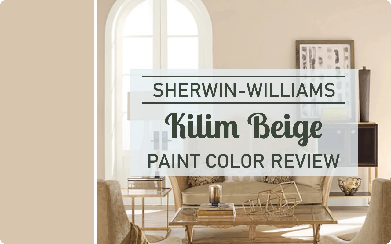
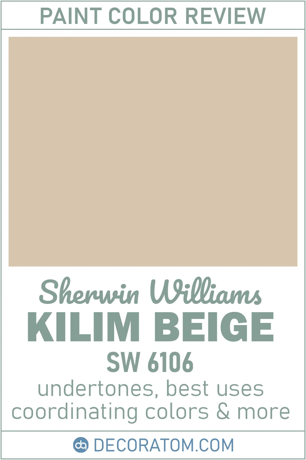
Let’s talk about a timeless and versatile color that has been a go-to neutral in homes for years—Kilim Beige SW 6106 by Sherwin-Williams.
If you’ve ever looked for a beige that doesn’t feel dull or too yellow, you’ve probably come across this one.
I’ve used Kilim Beige in a few different spaces, and each time it brings this cozy, grounded feeling that makes a room feel lived-in and calm without being boring.
This color sits in that sweet spot between not-too-dark and not-too-light, making it incredibly easy to work with.
Whether you’re repainting a bedroom, refreshing your living room, or just want a warm neutral for your walls that still has character—Kilim Beige is worth considering.
So, in this review, I’ll break it all down for you—from what the color really looks like, to how it behaves in different lighting, to what other colors it pairs well with. Let’s dive in.
What Color is Sherwin Williams Kilim Beige?
Kilim Beige is a warm, earthy beige with soft, creamy undertones. At first glance, it looks like a classic beige—but it’s more nuanced than that.
It’s not yellowy like some traditional beiges, and it doesn’t lean pink or gray either. Instead, it has this rich, almost sandy look that reminds me a little of a lightly toasted almond or a warm desert stone.
It has enough depth to show up nicely on the wall without making the space feel heavy or dark.
If you’re standing in a room painted with Kilim Beige, you’ll notice that it creates a soft backdrop—clean and subtle, but still warm and inviting.
It’s the kind of beige that feels like it wraps the room in a light hug.
Is Sherwin Williams Kilim Beige Too Brown?
I’ve heard this question a lot, and the short answer is: not really—but it depends on what you’re comparing it to.
Kilim Beige definitely has some brown in it, but it’s not the heavy, muddy kind of brown. It’s a lighter, softer brown that feels sun-warmed rather than dark or dingy.
If you’re used to cooler paint colors—like grays or greiges—Kilim Beige may feel a bit “browner” than what you’re used to. But in most spaces, especially those with warm wood tones or lots of natural light, it just reads as a cozy, balanced beige.
It’s not overpowering, and it won’t make your walls look like chocolate milk. Think of it as a sophisticated neutral with just a touch of earthiness.
Is It a Warm Or Cool Color?
Kilim Beige is definitely a warm color. There’s no mistaking that cozy, inviting undertone it brings into a space.
It doesn’t have any cool blue or gray undertones, so if you’re after that soft, toasty feel in a room, Kilim Beige delivers it in spades.
It pairs beautifully with other warm elements—like terracotta, muted golds, creamy whites, or warm wood finishes. If you put it next to cooler tones, you’ll notice the contrast right away.
This is a great color choice if you want to create a welcoming and homey atmosphere without going too dark or too bold.
LRV of Sherwin Williams Kilim Beige
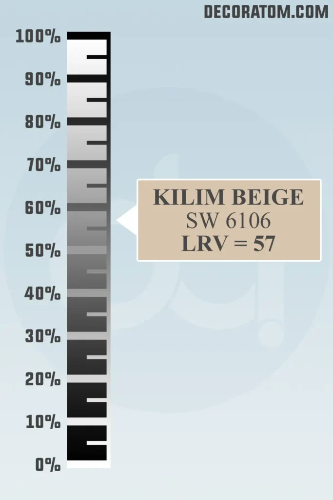
LRV stands for Light Reflectance Value, and it’s basically a number that tells you how much light a color reflects. The scale goes from 0 (pure black) to 100 (pure white).
The higher the number, the more light the color bounces back into the room.
Kilim Beige has an LRV of 57, which puts it right in the middle range. That means it reflects a decent amount of light—enough to keep a room from feeling dark—but it still has enough body to give your walls noticeable color.
It won’t wash out in a bright room, but it also won’t feel gloomy in a space with limited natural light. It’s a really comfortable, middle-of-the-road neutral.
Color Family
Sherwin-Williams Kilim Beige SW 6106 falls under the orange color family, which might surprise you at first.
I know what you’re thinking—”It doesn’t look orange!” But here’s the thing: beige tones like Kilim Beige often have warm, earthy bases, and in this case, the subtle warmth comes from a soft orange influence.
Now, this doesn’t mean it’s going to look like a pumpkin or a bright citrus shade on your walls. Far from it. Instead, that orange foundation is what gives Kilim Beige its cozy, sun-baked warmth.
It adds just enough richness to keep the color from feeling flat or too gray. That’s also why it works so well with other warm tones like creamy whites, terracotta, and golden browns. It’s part of what makes the color feel so inviting and homey.
RGB Colors
The RGB value of Sherwin-Williams Kilim Beige is 215 / 197 / 174, and this simply tells us how much red, green, and blue make up the color.
Let’s break that down:
- Red: 215 – This is the dominant value, and it explains a lot about the warmth you see in Kilim Beige.
- Green: 197 – The green is there to balance things out and soften the overall tone.
- Blue: 174 – This is the lowest, which keeps the color from drifting into cool or gray territory.
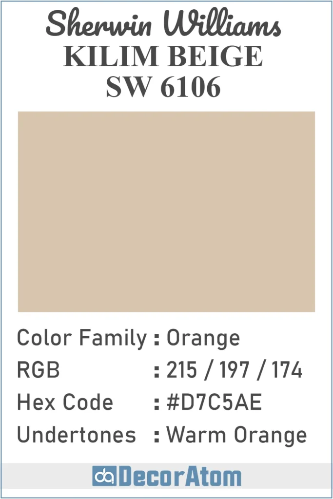
Hex Value
The hex value for Kilim Beige is #D7C5AE. This is just another way of representing the color digitally—what you’d use if you were picking this color for a graphic or web design project.
Undertones of Sherwin Williams Kilim Beige
Let’s talk undertones—because this is where Kilim Beige gets a little tricky. The undertones are subtle, which is part of what makes this color so versatile.
Kilim Beige has distinct warm orange undertones that give it its signature cozy and inviting appearance. These undertones are what make it feel richer and more golden than a traditional beige or tan.
You won’t see a bright or bold orange, but rather a soft, muted warmth that adds depth and character to the color.
In certain lighting—especially in rooms with a lot of natural sunlight or warm artificial lighting—these orange undertones become more noticeable, making the paint color appear warmer and even slightly peachy at times.
On the other hand, in cooler, low-light spaces, Kilim Beige can look a bit more subdued, but it never turns gray or cold like a greige might.
This warm orange base is also what makes Kilim Beige pair beautifully with other warm hues like creamy whites, earthy browns, and terracotta tones.
It’s a great option if you want a beige that leans traditional and welcoming rather than modern and muted.
How Does Lighting Affect Sherwin Williams Kilim Beige?
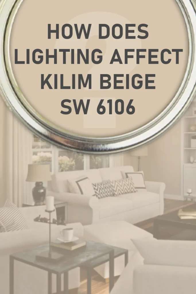
Lighting can really shift how Kilim Beige shows up in a space, so let’s walk through how it reacts in different situations.
In natural light (especially south-facing rooms): Kilim Beige tends to look its best. The warmth from the sun enhances the soft, creamy feel of the color, and it can look slightly lighter and more golden. It feels sunny and welcoming without being too bright or yellow.
In cool, north-facing light: This is where you’ll see more of the beige’s neutral side. The color can appear a little more muted, sometimes with a faint grayish tint. But even then, it still holds onto its warmth and doesn’t go cold or stark.
Under warm artificial light (like soft white bulbs): Kilim Beige really glows in this type of lighting. The warm undertones come forward, and the color feels cozy—perfect for evening settings or bedrooms where you want a relaxed vibe.
Under cool artificial lighting (like daylight LED bulbs): It can take on a slightly more neutral, even sandy appearance. Not as warm as in natural light, but still pleasant.
Trim Colors to Pair With Sherwin Williams Kilim Beige
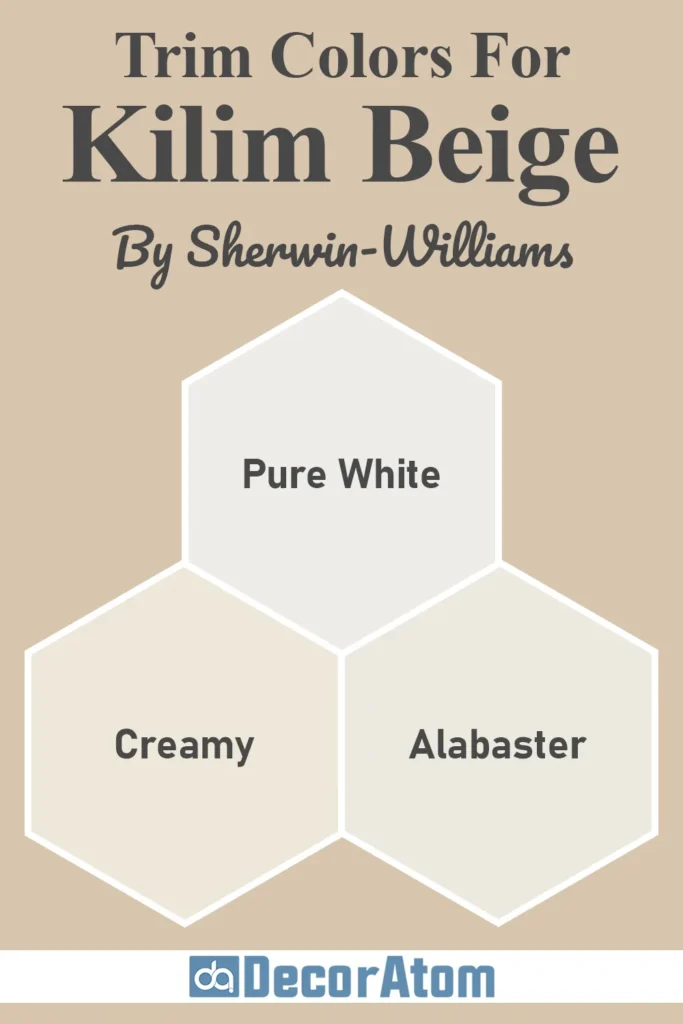
Choosing the right trim color can really make or break how Kilim Beige shows up in your space.
Since Kilim Beige has warm, earthy undertones, I personally lean toward soft whites or creamy off-whites that highlight its warmth without clashing.
Here are a few trim options that I’ve found work beautifully with Kilim Beige:
- Sherwin-Williams Alabaster (SW 7008)
This is one of my go-to whites for a reason. Alabaster is soft and creamy without feeling yellow, and it pairs so well with Kilim Beige. The two together give off a relaxed, classic vibe that feels cozy but still crisp. - Sherwin-Williams Pure White (SW 7005)
If you want a cleaner, brighter contrast, Pure White is a great choice. It has just enough warmth to blend with Kilim Beige, but it’s still a pretty true white. I love using this combo when I want something that feels fresh but not stark. - Sherwin-Williams Creamy (SW 7012)
As the name suggests, this one is all about warmth. Creamy has soft yellow undertones, so it gives a very traditional, welcoming look next to Kilim Beige. If your goal is to create a cozy, farmhouse-inspired space, this duo is hard to beat.
Stick with warm whites or creamy tones, and you really can’t go wrong. I’d avoid overly cool whites, though—they can clash and make Kilim Beige feel a bit muddy or dull.
Colors Similar to Sherwin Williams Kilim Beige
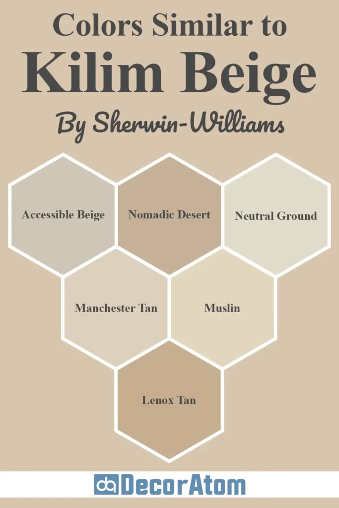
If you like the look of Kilim Beige but want to explore a few other options before committing, you’re not alone.
There are quite a few paint colors out there—both from Sherwin-Williams and Benjamin Moore—that sit in the same warm, neutral family.
These similar shades may differ slightly in undertones, depth, or warmth, but they all offer that soft, inviting feel we love in Kilim Beige.
1. Sherwin-Williams Accessible Beige (SW 7036)
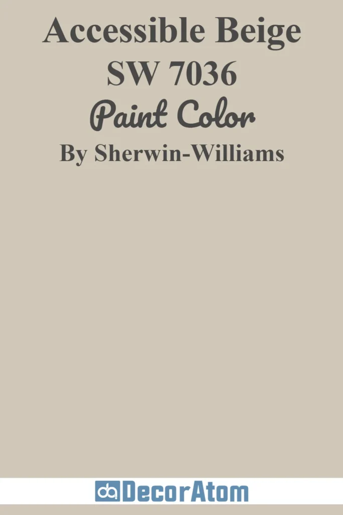
Accessible Beige is probably the first color that comes up in conversations about Kilim Beige alternatives. It’s a bit cooler than Kilim Beige with subtle gray undertones.
If you like the idea of beige but want something more neutral or greige, Accessible Beige might be a better fit. It’s more flexible with cooler trim colors, while Kilim Beige leans warmer.
2. Sherwin-Williams Nomadic Desert (SW 6107)
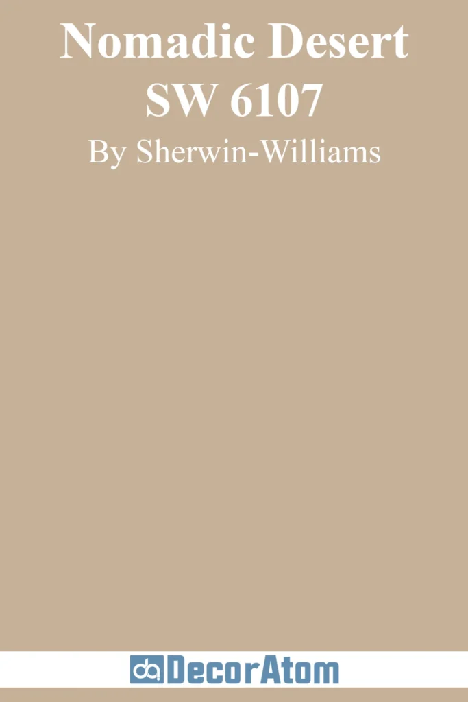
Nomadic Desert sits just a notch deeper than Kilim Beige and has stronger brown undertones. It still shares that warm, inviting look, but feels more grounded and earthy.
If you love Kilim Beige but want a little more depth on your walls—especially in large or well-lit rooms—Nomadic Desert is worth a sample.
3. Sherwin-Williams Neutral Ground (SW 7568)
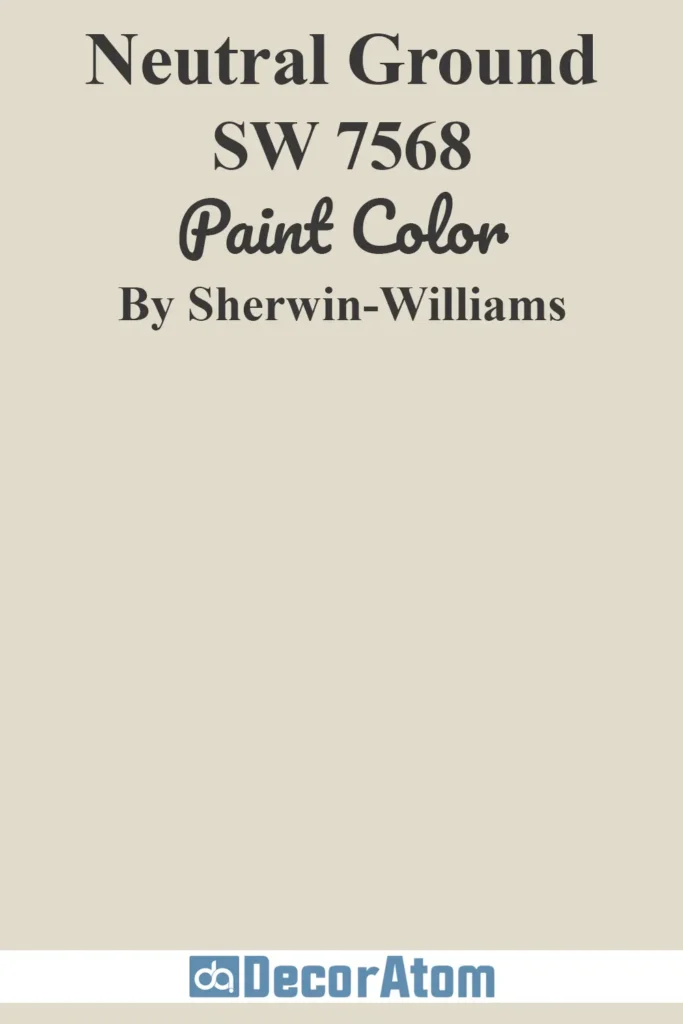
Neutral Ground is lighter and creamier than Kilim Beige, making it a great choice if you want to brighten up a space. It’s still warm and subtle but feels a little more airy.
Kilim Beige has more body and presence, while Neutral Ground is the kind of color that stays quietly in the background.
4. Benjamin Moore Manchester Tan (HC-81)

Manchester Tan is a classic warm neutral from Benjamin Moore. It’s similar in tone to Kilim Beige but slightly more muted and gray. I find it a bit more refined and traditional.
If Kilim Beige feels too warm or orange for your space, Manchester Tan could be a more subtle alternative.
5. Benjamin Moore Muslin (OC-12)

Muslin is soft, creamy, and a little lighter than Kilim Beige. It doesn’t have quite as much orange warmth, but it still reads as a warm neutral.
It works well in spaces where you want a quiet color that doesn’t pull too much attention—great for hallways or open floor plans.
6. Benjamin Moore Lenox Tan (HC-44)
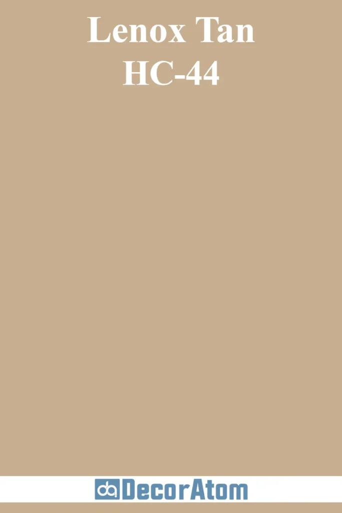
If you’re drawn to the richness of Kilim Beige but want more of a tan, Lenox Tan might be your match.
It’s deeper, more saturated, and has a stronger golden tone. This color reads more traditional and pairs beautifully with dark woods and classic finishes.
Colors that Go With Sherwin Williams Kilim Beige
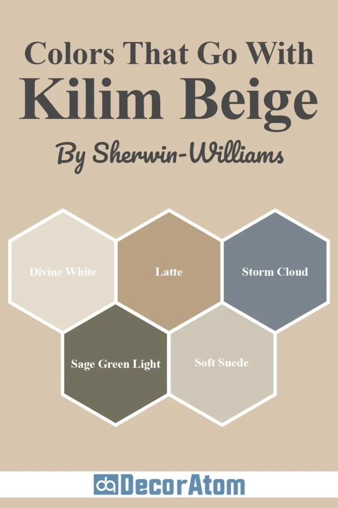
Kilim Beige is one of those colors that plays nicely with a wide range of palettes.
Whether you’re going for cozy, earthy tones or want to introduce contrast with deeper hues, this warm neutral has enough versatility to handle both.
I love pairing it with soft whites, warm browns, muted greens, and even moody blues for balance.
Here are five colors that coordinate beautifully with Kilim Beige:
1. Divine White (SW 6105)
Divine White is the color right above Kilim Beige on the same paint strip, so it makes perfect sense that they work seamlessly together.
It’s a soft, creamy off-white with just enough warmth to feel cozy, but still light enough to keep a space feeling open and bright.
I love using this for trim, ceilings, or even adjacent rooms to Kilim Beige for a smooth transition.
2. Latte (SW 6108)
If Kilim Beige is the perfect medium beige, then Latte is its deeper, richer cousin. It’s darker, warmer, and adds depth to a palette without veering into heavy brown territory.
I like using Latte as an accent wall or cabinetry color alongside Kilim Beige walls—it adds visual interest and a grounded feel while keeping everything cohesive.
3. Storm Cloud (SW 6249)
Now for something a little unexpected—Storm Cloud is a moody blue-gray that provides striking contrast to Kilim Beige’s warmth.
I love this pairing because it brings balance: Kilim Beige softens the boldness of Storm Cloud, while Storm Cloud makes Kilim Beige feel more dynamic and fresh.
This combo is fantastic in living rooms or even bedrooms where you want to create some drama.
4. Sage Green Light (SW 2851)
Sage Green Light is a muted, earthy green that brings a calm, organic feel next to Kilim Beige. It’s not too bold, but it adds a touch of color and natural energy.
If you’re after a nature-inspired palette, this pairing is perfect—it works beautifully in kitchens, bathrooms, or any space where you want a fresh yet grounded vibe.
5. Soft Suede (SW 9577)
Soft Suede is a darker, richer neutral that complements Kilim Beige without overpowering it. It’s deeper than Latte and has a slightly more modern edge.
This one is great for furniture, built-ins, or accent walls. It brings a refined warmth that makes Kilim Beige feel elevated and cozy at the same time.
Comparing Sherwin Williams Kilim Beige With Other Colors
Comparing paint colors side by side can be one of the most eye-opening parts of the selection process.
On its own, Kilim Beige may look like a classic warm neutral, but once you see it next to other popular shades, you’ll notice subtle (or not-so-subtle) differences in undertones, lightness, and temperature.
These comparisons can help you narrow in on the perfect tone for your space, especially if you’re debating between warm and cool neutrals or trying to avoid undertones that won’t work in your lighting.
Let’s dive into how Sherwin Williams Kilim Beige stacks up against six other well-loved paint colors:
Sherwin Williams Kilim Beige vs Accessible Beige (SW 7036)
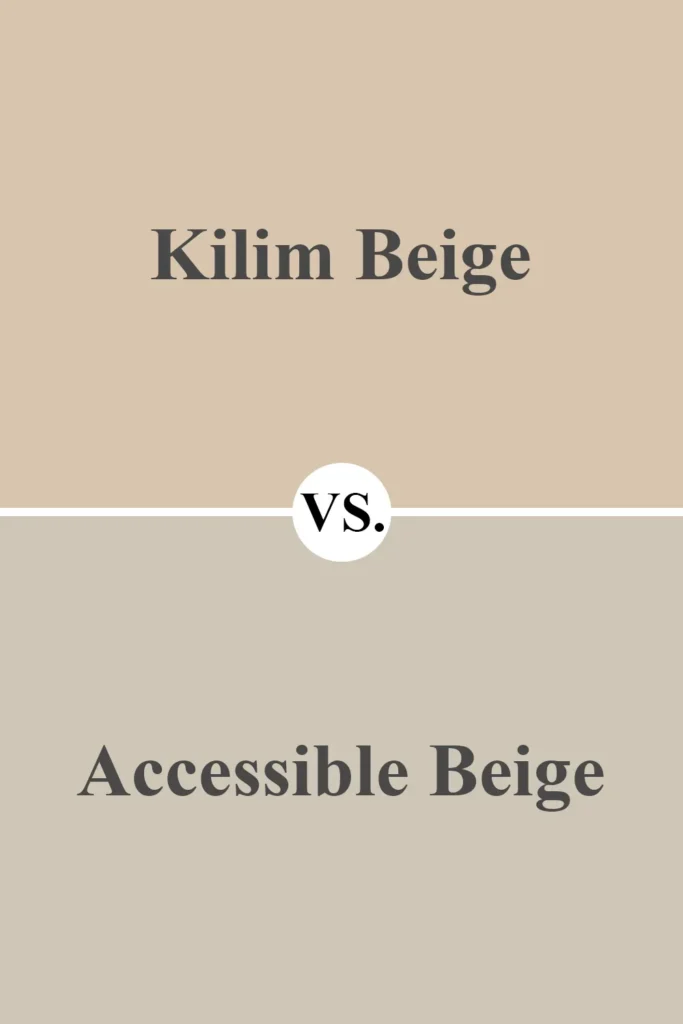
Accessible Beige is often mistaken for being close to Kilim Beige, but when you compare them side by side, the difference is pretty clear. Accessible Beige has more gray in it, which gives it a cooler, more muted tone.
It reads as a greige, while Kilim Beige is undeniably a warm, orangey-beige. Accessible Beige feels more modern and understated, while Kilim Beige is warmer, cozier, and a bit more traditional.
If your space gets a lot of warm light, Accessible Beige may help tone that down, while Kilim Beige will emphasize it.
Sherwin Williams Kilim Beige vs Nomadic Desert (SW 6107)
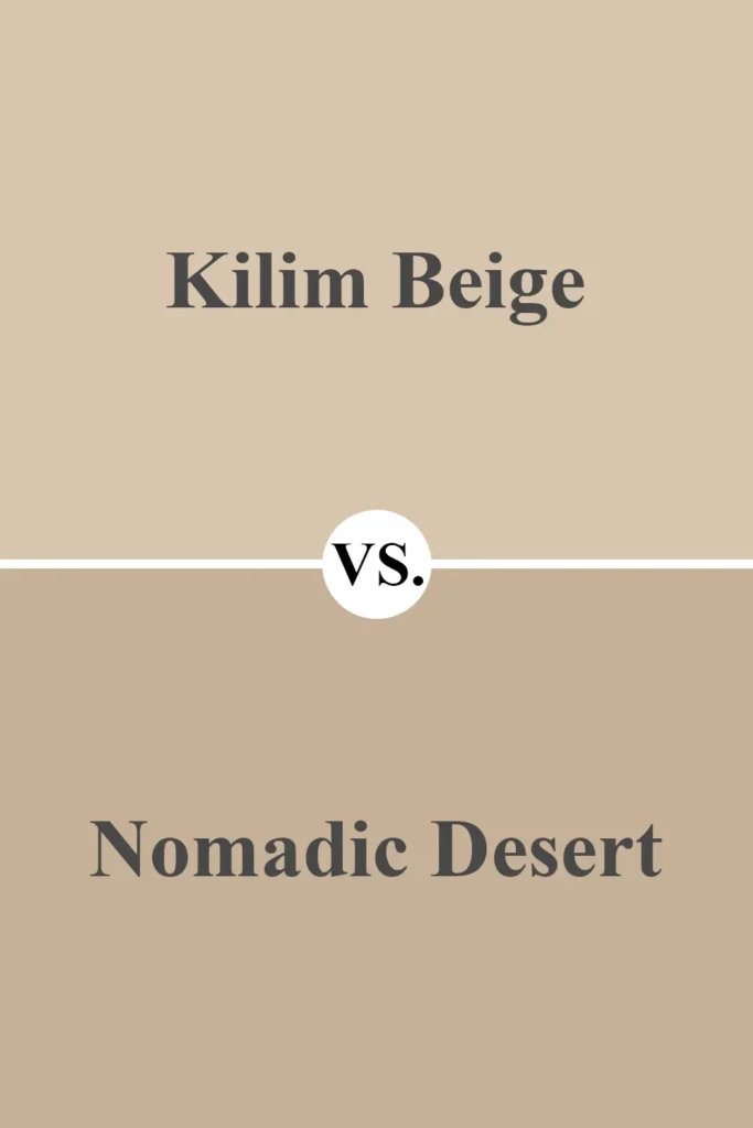
Nomadic Desert is the next step down on the same paint strip as Kilim Beige, and it’s noticeably deeper and more saturated. It carries the same warm undertones but leans more brown than beige.
If Kilim Beige feels too light or gets washed out in your room, Nomadic Desert could be a good alternative.
On the other hand, if you want a versatile backdrop that won’t dominate the space, Kilim Beige might be the better choice.
Sherwin Williams Kilim Beige vs Balanced Beige (SW 7037)
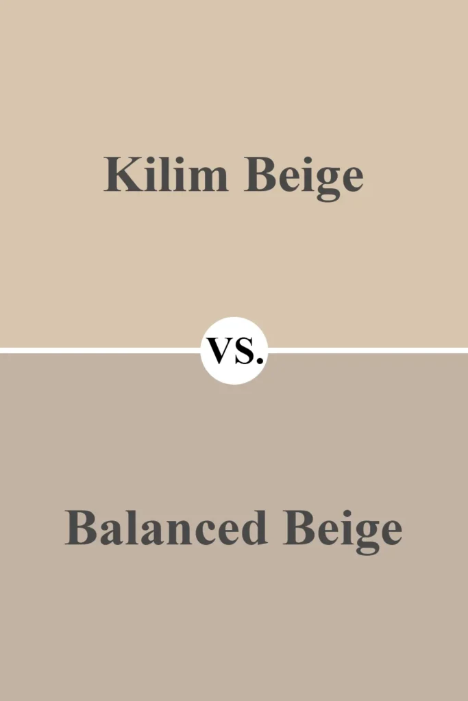
Balanced Beige has more gray in it, giving it a slightly cooler tone compared to Kilim Beige. While both are warm neutrals, Balanced Beige has a more refined, subdued look.
It’s perfect if you want something a little less “golden” than Kilim Beige but still welcoming.
I find Balanced Beige to be a bit more versatile in spaces with mixed lighting, whereas Kilim Beige tends to lean strongly warm, especially in rooms with a lot of natural sunlight.
Sherwin Williams Kilim Beige vs Canvas Tan (SW 7531)
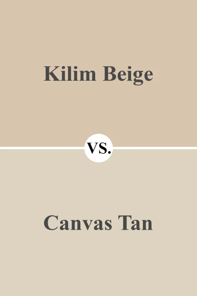
Canvas Tan is lighter and more subtle than Kilim Beige. It doesn’t have the same level of orange or warmth, and it reads more as a neutral tan or off-white in many spaces.
If Kilim Beige is too strong or warm for your tastes, Canvas Tan offers a quieter alternative.
It’s great for creating a breezy, open feeling in a room, especially if you want something that just gently whispers “color” without making a strong statement.
Sherwin Williams Kilim Beige vs Benjamin Moore Manchester Tan (HC-81)
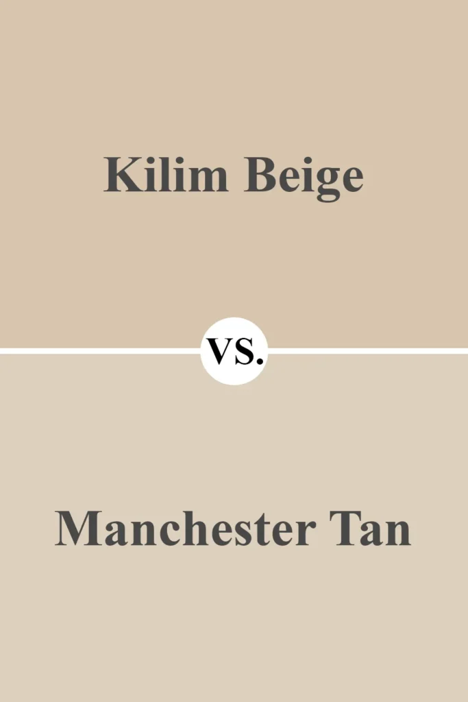
Manchester Tan is a great comparison color from Benjamin Moore. It’s less warm and doesn’t lean as orange or peach as Kilim Beige.
Manchester Tan has subtle green-gray undertones, which help tone down the warmth and give it a more grounded, calm appearance.
It’s an excellent choice if you want a more refined and balanced neutral, while Kilim Beige is better suited for spaces where you want warmth and richness.
Sherwin Williams Kilim Beige vs Benjamin Moore Shaker Beige (HC-45)
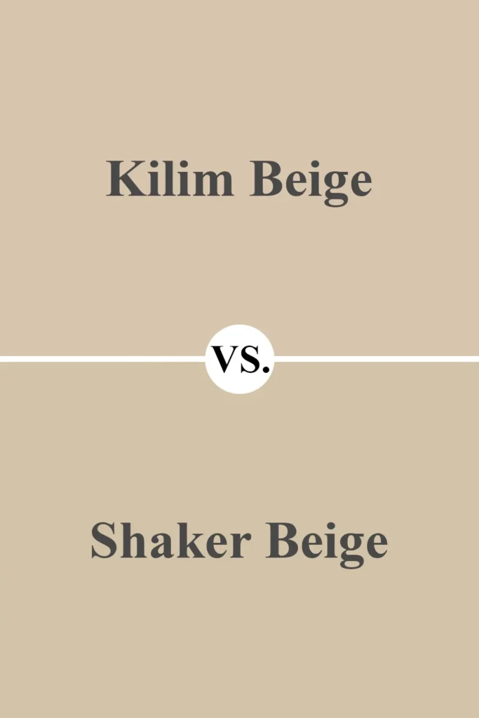
Shaker Beige is probably the most similar Benjamin Moore alternative to Kilim Beige. Both are warm, orangey-beige colors, and in many lighting conditions, they can look almost identical.
Shaker Beige may be just a hair more muted, but the overall feel is nearly the same.
If you’re deciding between the two, I’d recommend sampling both—Shaker Beige might work better in homes with cooler lighting, while Kilim Beige shines in warm or natural light.
Where to Use Sherwin Williams Kilim Beige?
One of the biggest reasons I keep coming back to Kilim Beige is how versatile it is.
It works in almost any room of the house and even outdoors. Its warmth adds instant comfort, and its mid-tone depth means it doesn’t overpower the space.
Whether you want something cozy, classic, or neutral, Kilim Beige has a way of adapting while still feeling rich and inviting.
Here’s how it performs in different areas:
Sherwin Williams Kilim Beige in the Bedroom
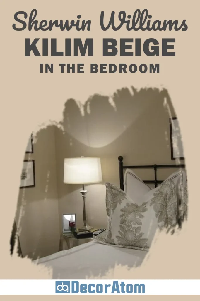
In bedrooms, Kilim Beige brings a soft, calming warmth that’s perfect for creating a restful environment. It pairs beautifully with warm whites, muted sage greens, or deeper browns for a grounded palette.
I like using it with warm wood furniture and creamy bedding to enhance its natural coziness. If your bedroom gets lots of natural light, Kilim Beige will glow softly throughout the day, creating a comforting, lived-in vibe.
Sherwin Williams Kilim Beige in the Living Room
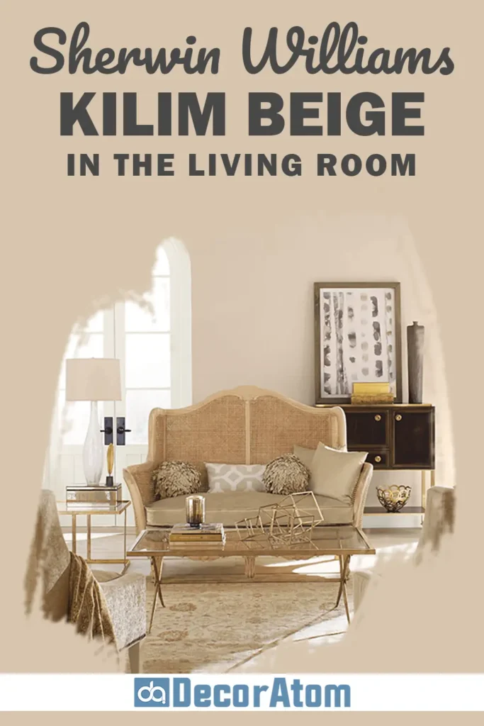
Living rooms are where Kilim Beige truly shines. It offers just enough color to add interest but is neutral enough to support almost any furniture or décor style.
Whether you lean traditional, transitional, or farmhouse, it works. I love using it with layers of texture—think soft throws, rattan accents, or dark leather—to bring out its warmth and make the space feel grounded yet relaxed.
Sherwin Williams Kilim Beige in the Kitchen
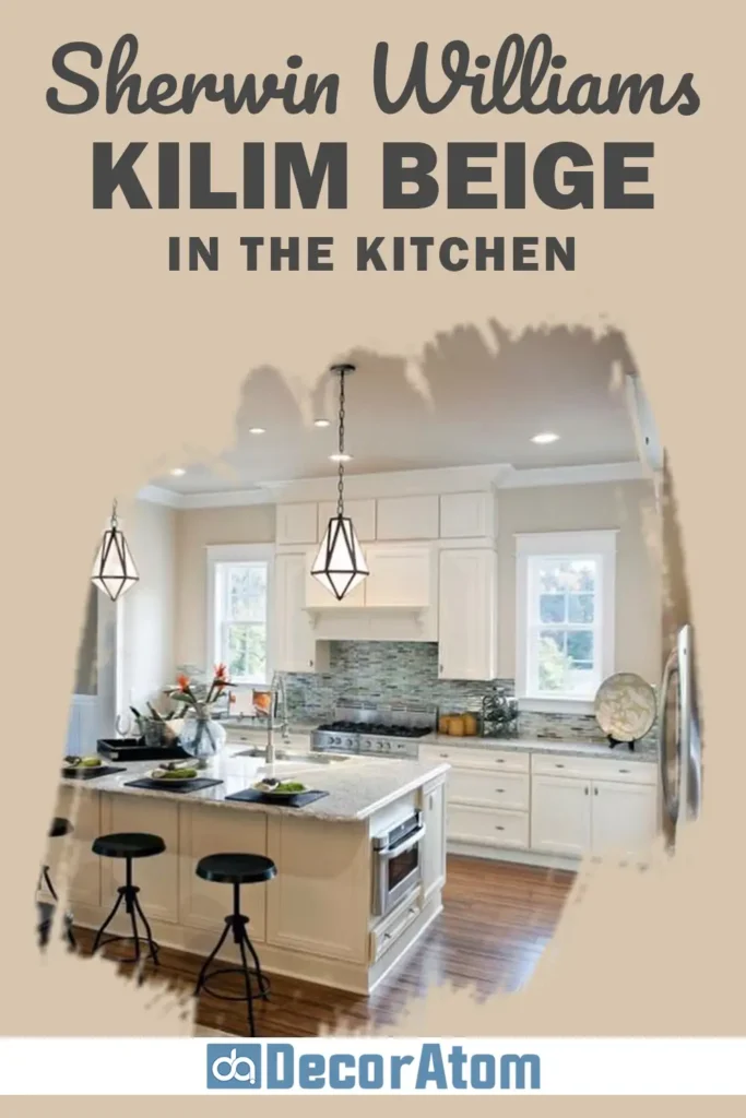
Kilim Beige is a great backdrop for kitchens, especially if you’re working with wooden cabinets or earthy countertops. It pairs nicely with warm white trim and soft, creamy backsplashes.
If you want a classic kitchen without going all-white, this color brings that subtle touch of warmth without looking yellow or dated.
It works particularly well in open-concept layouts where the kitchen blends into living or dining spaces.
Sherwin Williams Kilim Beige in the Bathroom
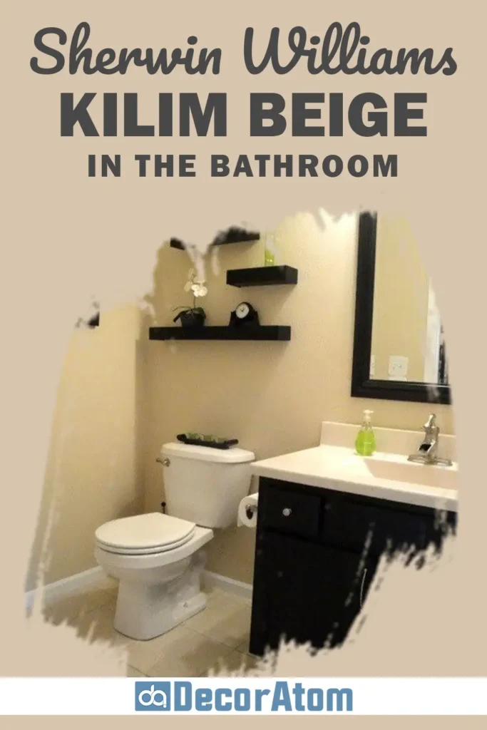
Bathrooms often benefit from soft, warm neutrals, and Kilim Beige delivers that spa-like feel without being boring.
Use it with creamy tile, brushed gold fixtures, and warm white trim to elevate a small bathroom into something soothing and sophisticated.
It also pairs nicely with darker accents—like oil-rubbed bronze mirrors or dark wood vanities—for a bit more drama.
Sherwin Williams Kilim Beige for the Exterior
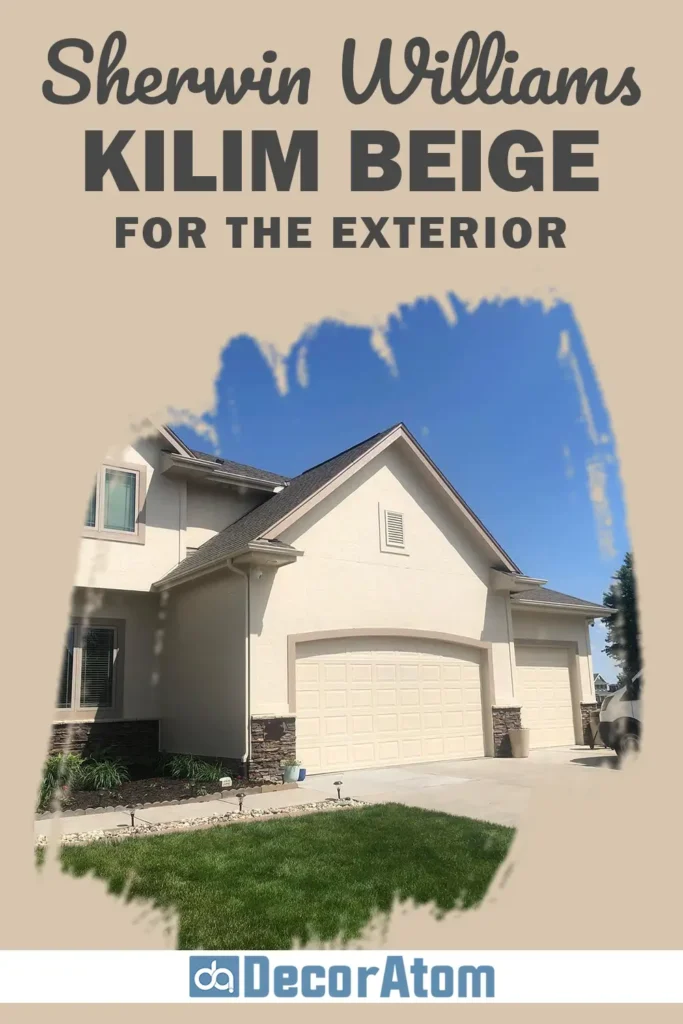
Kilim Beige isn’t just for interiors—it also works beautifully on the exterior of a home.
It reads as a soft, welcoming beige that complements stone, brick, and natural landscaping.
Pair it with white or cream trim for a traditional look, or go with darker browns and blacks for something more modern.
It’s a safe, timeless choice that feels both homey and elegant, especially on ranch, cottage, or farmhouse-style exteriors.
Why I Love Sherwin Williams Kilim Beige
There’s something undeniably comforting about Kilim Beige. I love how it feels both warm and grounded, yet it doesn’t overpower a room or steal attention from the rest of your décor.
It creates a sense of calm and familiarity—like your home is giving you a hug.
Another reason I keep recommending it is because it’s so dependable. Whether you’re working with warm wood tones, creamy whites, or even moody blues, it finds a way to fit in and enhance what’s already there.
It has just the right amount of color—not too dark, not too light—and that makes it easy to live with long-term.
It’s not trendy or flashy, but that’s exactly why it’s such a timeless pick.
Final Thoughts
Sherwin Williams Kilim Beige SW 6106 is one of those rare colors that just works.
Whether you’re refreshing a room or tackling a full home makeover, it offers the warmth, versatility, and timeless appeal that homeowners crave.
Its orange-beige base gives it a welcoming glow, while its mid-tone depth means it never feels flat or dull.
While it may not be the perfect fit for ultra-modern or ultra-cool spaces, it excels in traditional, farmhouse, and transitional homes.
If you’re drawn to warm, cozy neutrals that still feel fresh and classic, Kilim Beige is definitely worth a test swatch—or two.