
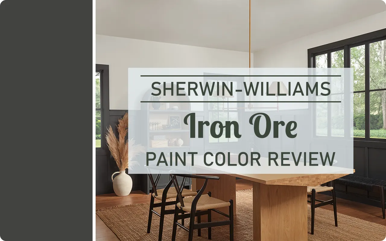
If you’ve been searching for a deep, dramatic paint color that makes a bold statement without being pure black, Sherwin-Williams Iron Ore SW 7069 might be exactly what you’re looking for.
I first discovered this color while browsing exterior paint inspiration, but the more I looked into it, the more I realized just how versatile it is — from cozy interiors to sleek kitchen islands to entire house exteriors.
It’s one of those shades that feels rich, modern, and timeless all at once.
In this review, I’ll walk you through everything I’ve learned about Iron Ore, including how it looks in different lighting, the undertones you might notice, and the best colors to pair it with.
*This post contains affiliate links. For more details see my full disclosure.
What Color is Sherwin Williams Iron Ore SW 7069?
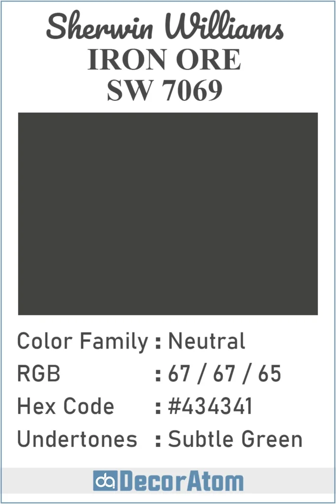
Let’s start with the basics. Iron Ore SW 7069 is a very dark charcoal gray — almost black, but not quite.
It’s rich and saturated, giving it a strong, moody presence without looking harsh.
Unlike true black, which can sometimes feel flat or too intense in a home setting, Iron Ore has softness and depth that makes it feel more approachable.
To the eye, it reads like a near-black with just enough gray to keep it grounded.
It has a refined feel to it — like a matte tuxedo or a deep slate stone. It’s bold, for sure, but there’s something very elegant about it.
How to Know if a Paint Color Is Right for You?
Would you like to sample Iron Ore SW 7069 paint color? I recommend using Samplize. They offer 12″x12″ peel-and-stick paint swatches that make testing colors super simple. Just stick it on your wall, move it around if needed, and when you’re done—peel it off and toss it. No mess, no cleanup. It’s quick, easy, and way more convenient!

Advantages of using peel and stick paint samples:
- EASY TO USE: Simply move your SAMPLIZE paint sample around the room to test under a variety of lighting conditions.
- AFFORDABLE: Budget-friendly solution and no more buying inaccurate swatches, rollers, wasted paint.
- SUPER FAST DELIVERY: Depending on your location, 1 day delivery is possible.
- ORDER FROM HOME: Save a trip to the store looking for samples.
- NO MESS: SAMPLIZE uses real paint samples with zero-mess
- NO WASTE: No leftover cans or wasted paint.
Is It a Warm or Cool Color?
Iron Ore might seem like a straightforward dark gray at first glance, but there’s a little more going on under the surface.
Technically, it leans slightly warm, though it’s very subtle. That slight warmth gives it a cozy feel and keeps it from feeling too cold or industrial.
It’s not icy or blue-toned like many cool grays. Instead, Iron Ore has a softness that makes it work beautifully with both warm and cool palettes.
You might even catch the faintest hint of an earthy undertone in certain lights, which gives it just enough depth to feel interesting.
So, to sum it up: Iron Ore is a dark neutral with slightly warm undertones — not warm enough to feel brown, but just enough to add richness and keep it from looking too stark.
LRV of Sherwin Williams Iron Ore SW 7069
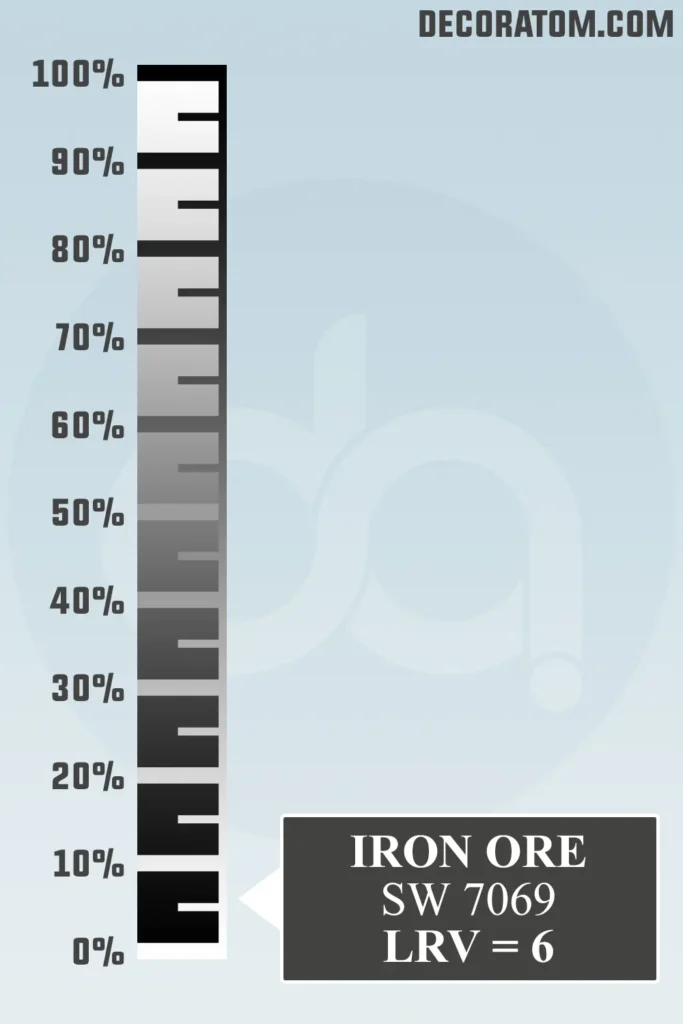
Let’s quickly talk about LRV, which stands for Light Reflectance Value. I promise it’s not as technical as it sounds.
LRV is a number from 0 to 100 that tells us how much light a color reflects. A color with a high LRV (like white) reflects a lot of light, while a color with a low LRV (like black) reflects very little.
It’s a helpful way to understand how light or dark a paint color will feel in your space.
Sherwin Williams Iron Ore has an LRV of 6 — which means it’s very dark and doesn’t reflect much light at all. This is what gives it that bold, dramatic vibe.
Color Family
Iron Ore SW 7069 belongs to the neutral color family, but it sits on the very dark end of the spectrum.
Neutral doesn’t always mean light or beige — it simply means that it can play nicely with a wide range of other colors, and that’s definitely the case here.
RGB Colors
If you’re curious about the technical makeup of Sherwin-Williams Iron Ore, the RGB values are a great place to look.
RGB stands for Red, Green, and Blue, and it’s how colors are created digitally. For Iron Ore, the RGB values are:
- Red: 67
- Green: 67
- Blue: 65
Hex Value
If you’re working on a digital design project or need to match this color for web use, the hex value for Sherwin-Williams Iron Ore is #434341.
Undertones of Sherwin Williams Iron Ore SW 7069
Now let’s talk about one of the most important things when choosing a paint color: undertones.
Iron Ore may look like a simple dark gray at first glance, but once you get it on the wall and the light hits it, you might start to notice something a little different.
This color has subtle green undertones. They’re not loud or obvious — you probably won’t look at a wall painted in Iron Ore and say, “Oh, that’s green.”
But in certain lighting, especially natural light, you may catch a faint earthy green or olive tone peeking through. That’s what gives this color its depth and complexity.
These green undertones are what separate Iron Ore from other dark grays or charcoals that might lean more blue, purple, or even brown. They’re part of what makes it feel grounded, organic, and incredibly modern.
How Does Lighting Affect Sherwin Williams Iron Ore SW 7069?
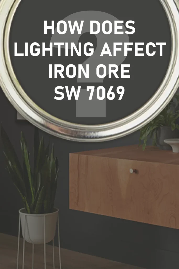
Lighting can completely change how Iron Ore looks, and it’s something I always recommend testing before you commit to painting an entire room.
In natural daylight, Iron Ore tends to show its true character. You’ll see the rich charcoal base, and if the light is bright enough, you might notice those subtle green undertones I mentioned earlier. It feels sophisticated and grounded.
In rooms with warm artificial lighting (like soft white or incandescent bulbs), Iron Ore will look warmer and cozier. The green undertones fade into the background, and it leans more into that moody, soft black territory.
In cool lighting or low light, it can look almost black. If your room doesn’t get much sunlight, Iron Ore will feel more intense and dramatic.
That’s not necessarily a bad thing — it just depends on the look you’re going for.
The takeaway here? Always sample it in your space and check it throughout the day. The lighting in your home will decide whether this color feels earthy, soft, or bold.
Trim Colors to Pair With Sherwin Williams Iron Ore SW 7069
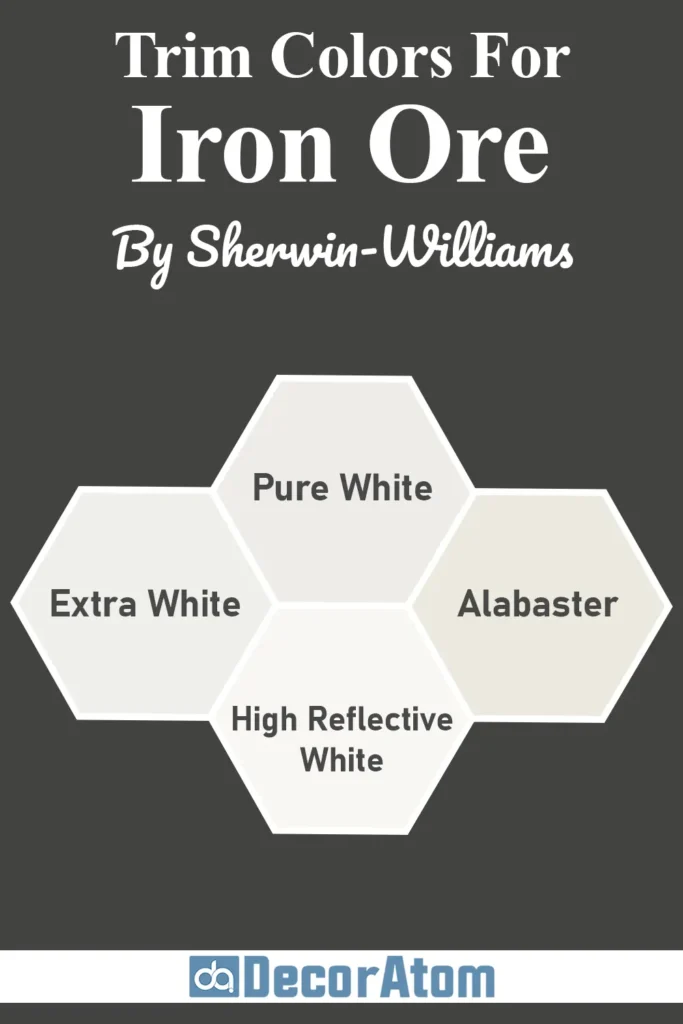
Pairing the right trim color with Iron Ore makes a huge difference in how polished the final look feels.
Because Iron Ore is so deep and dramatic, it looks best when it’s contrasted with something lighter or crisper. Here are some of my go-to trim color ideas:
1. Sherwin-Williams Extra White (SW 7006)
This is a bright, clean white with no strong undertones. It gives you a classic, high-contrast look when paired with Iron Ore. Think black window frames with white trim — very fresh, very modern.
2. Sherwin-Williams Pure White (SW 7005)
Pure White is a soft, warm white that still reads clean but has just a touch of warmth. It’s a little more forgiving than Extra White, and it pairs beautifully if you’re using Iron Ore in a room with warm accents or natural wood.
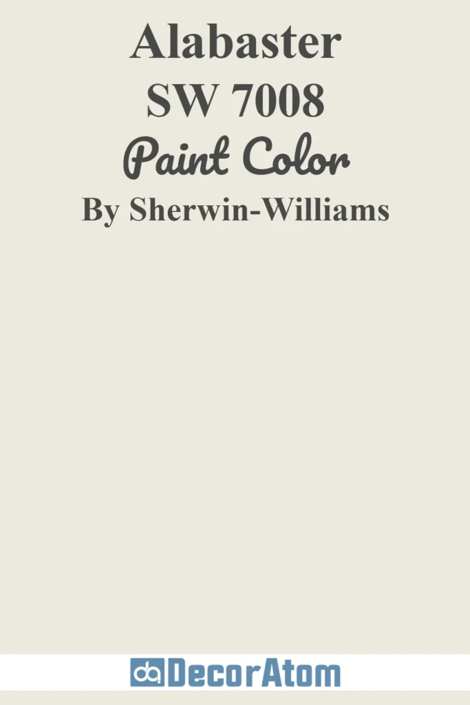
3. Sherwin-Williams Alabaster (SW 7008)
If you want a creamy white with a softer, more traditional feel, Alabaster is a great option.
It still gives you contrast against Iron Ore, but the effect is a little warmer and more inviting. This combo works especially well in farmhouse or transitional spaces.
Also Read: Alabaster SW 7008 Paint Color by Sherwin Williams
4. Sherwin-Williams High Reflective White (SW 7757)
This one is Sherwin-Williams’ brightest white. If you want maximum contrast and a clean, modern look, this is a strong choice. It makes Iron Ore feel even deeper and more defined.
Choosing the right white for trim really depends on the look you’re going for — crisp and bold, or soft and balanced. Iron Ore plays well with both ends of the white spectrum.
Colors Similar to Sherwin Williams Iron Ore
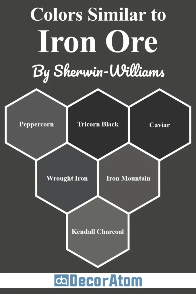
If you love the richness and depth of Sherwin-Williams Iron Ore but want to explore a few close alternatives, you’re in luck, there are several beautiful paint colors from both Sherwin-Williams and Benjamin Moore that deliver a similar look with subtle differences.
These “almost twins” can help you fine-tune the vibe in your space, whether you’re looking for a touch more warmth, coolness, or softness.
Here are six similar paint colors and how they compare to Iron Ore SW 7069:
1. Sherwin-Williams Peppercorn SW 7674

Peppercorn is a few steps lighter than Iron Ore and lives more solidly in the charcoal gray category. It still has richness, but it reflects more light and doesn’t feel quite as moody or bold.
If Iron Ore feels too intense for a full room, Peppercorn might be a great middle ground. It also carries slight blue undertones compared to Iron Ore’s subtle green base.
2. Sherwin-Williams Tricorn Black SW 6258

Tricorn Black is darker and more true-black than Iron Ore. It lacks the softness and green undertones, making it feel more stark and formal.
If you’re after a classic, deep black with minimal undertones, Tricorn Black is the one. But if you want a slightly more organic, nuanced shade, Iron Ore has more personality.
Also Read: Tricorn Black SW 6258 Paint Color Review
3. Sherwin-Williams Caviar SW 6990
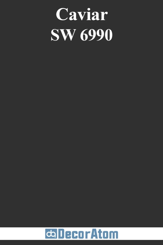
Caviar is another close alternative that’s more of a true black with just a touch of warmth. It’s not as soft as Iron Ore and doesn’t carry the same earthy undertones, but it’s elegant and refined.
Great for modern, high-contrast interiors where Iron Ore might feel just a little too soft.
4. Benjamin Moore Wrought Iron 2124-10
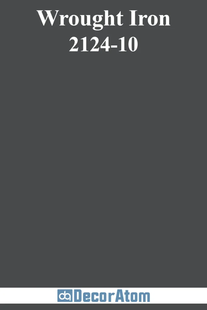
Wrought Iron is one of Benjamin Moore’s best near-black options. It’s very close in depth to Iron Ore but leans slightly cooler with subtle blue-gray undertones.
It has a similar versatility, though. If you prefer cooler tones in your space — think marble, chrome, or cool-toned wood — Wrought Iron could be a better fit than Iron Ore.
5. Benjamin Moore Iron Mountain 2134-30
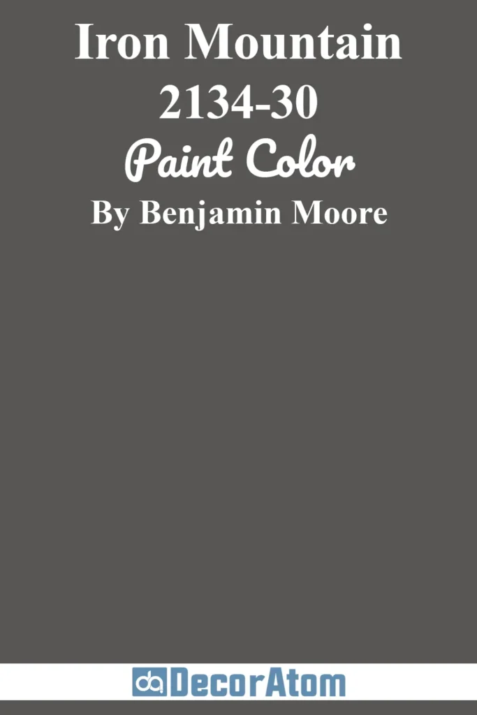
Despite the similar name, Iron Mountain is lighter and warmer than Iron Ore. It reads more like a deep brown-gray, with earthy undertones.
It works beautifully in traditional or rustic settings, where Iron Ore’s dramatic charcoal might feel too modern.
6. Benjamin Moore Kendall Charcoal HC-166
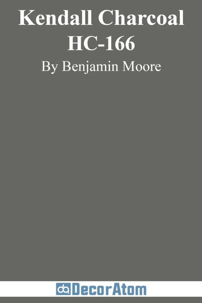
Kendall Charcoal is a very popular deep gray that’s a step lighter than Iron Ore. It has a more pronounced green undertone and reads more gray than black.
It’s excellent for cabinetry, accent walls, or exteriors when you want depth without going as dark as Iron Ore.
Colors that Go With Sherwin Williams Iron Ore
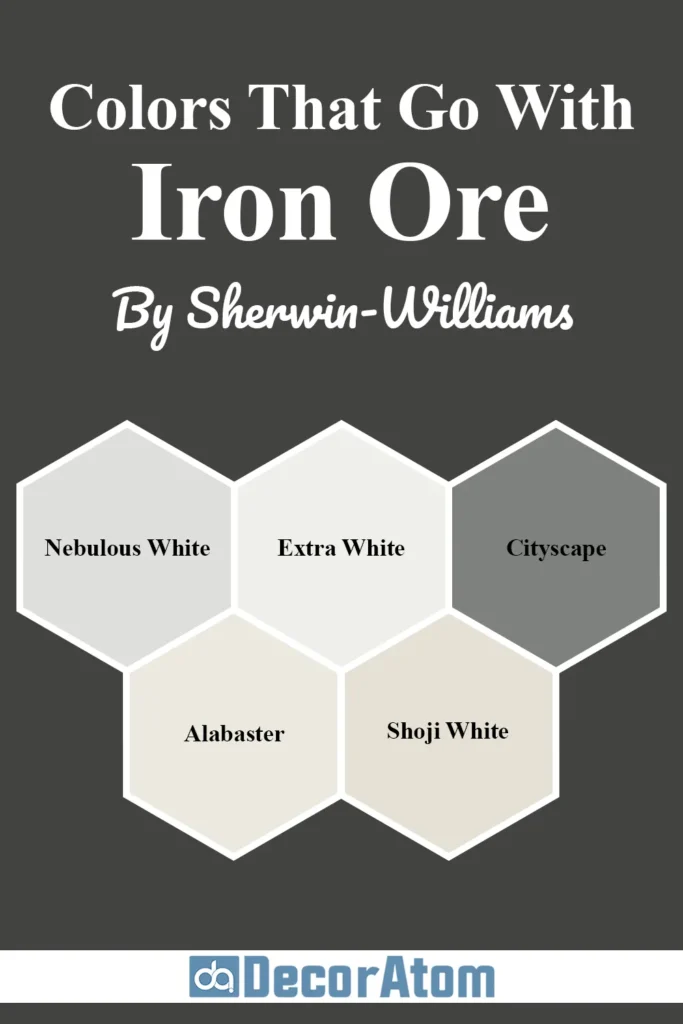
Iron Ore is bold, grounding, and surprisingly flexible. Because it lives in that dark neutral space, it can pair beautifully with a wide variety of colors — from soft whites to cool grays to even earthy hues.
Whether you’re working on a modern monochromatic palette or want something more transitional, the right coordinating colors will help balance Iron Ore’s depth and keep the space from feeling too heavy.
Here are five gorgeous coordinating colors that work beautifully with Iron Ore SW 7069:
1. Nebulous White SW 7063
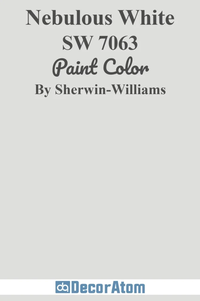
This is a very light gray with just a whisper of coolness. It’s subtle and airy, making it a perfect backdrop or trim color when you want contrast without stark white.
Against Iron Ore, it helps keep the overall look soft and modern — great for bedrooms, bathrooms, or even open living spaces.
2. Extra White SW 7006
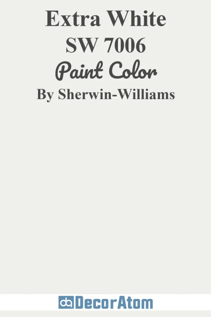
This is a clean, bright white with a cool undertone. It creates a sharp contrast with Iron Ore, really letting the dark tone pop.
This combo is ideal if you want that high-drama, black-and-white modern aesthetic. Think black windows with crisp white trim, or a dark kitchen island against bright white walls.
3. Cityscape SW 7067
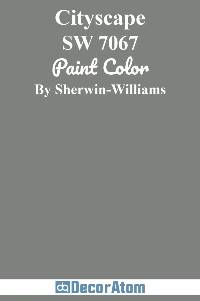
Cityscape is a medium-to-dark gray with a slightly cool undertone. It sits a few shades lighter than Iron Ore, which makes it a fantastic coordinating wall color if you’re using Iron Ore on cabinetry or trim.
This pairing feels sleek and architectural, and it’s especially beautiful in industrial or minimalist interiors.
4. Alabaster SW 7008
Alabaster is a warm, creamy white that contrasts softly with Iron Ore. It keeps things feeling cozy and grounded.
If your home leans more traditional or you have lots of natural wood, this pairing will feel balanced and inviting.
Also Read: Alabaster SW 7008 Paint Color Review
5. Shoji White SW 7042

Shoji White is a warm, beige-leaning off-white that brings softness into the mix. It works well if you want to warm up the drama of Iron Ore and avoid a stark black-and-white contrast.
Together, these two colors feel calm and earthy — a great option for transitional or rustic-modern spaces.
Also Read: 17 Best Creamy White Paint Colors for Living Room
Comparing Sherwin Williams Iron Ore With Other Colors
Sometimes, the best way to understand a color is to compare it side-by-side with similar options. Even small shifts in undertone or depth can completely change the mood of a room.
In this section, I’ll compare Sherwin-Williams Iron Ore SW 7069 with six other popular paint colors, so you can get a better sense of how it stacks up.
Also Read: Top 31 Most Popular Sherwin Williams Paint Colors
Sherwin Williams Iron Ore vs Tricorn Black SW 6258
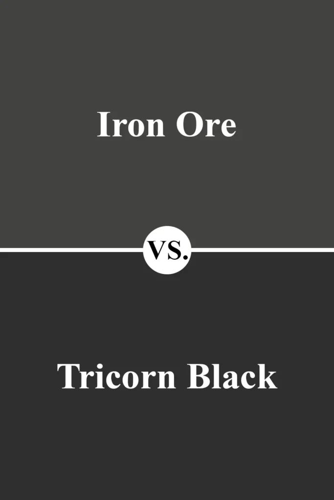
Tricorn Black is darker and more solidly black than Iron Ore. It has virtually no visible undertones, making it a go-to for trim, doors, or ultra-modern exteriors.
Compared to Iron Ore, it’s sharper and a bit colder. Iron Ore feels softer and more dimensional, thanks to its slight green undertones and lower contrast against white.
Sherwin Williams Iron Ore vs Peppercorn SW 7674
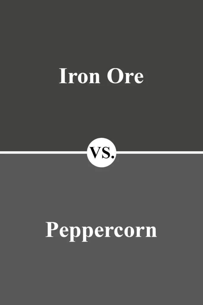
Peppercorn is noticeably lighter than Iron Ore and more distinctly gray. It has a cool, steely undertone that gives it a crisp, contemporary feel.
Iron Ore is deeper and moodier, with a hint more warmth. If you like the look of dark gray but want something a little less intense, Peppercorn is a great alternative.
Sherwin Williams Iron Ore vs Black Fox SW 7020
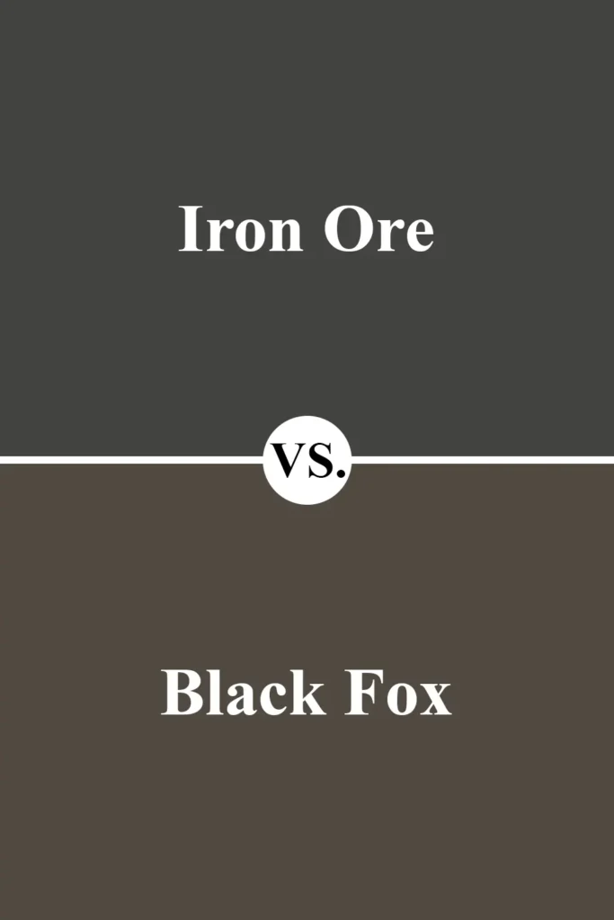
Black Fox is a deep brown-black with warm undertones. It’s noticeably more brown than Iron Ore, which makes it feel earthier and softer.
If you’re working with warm woods, leather, or taupe tones, Black Fox will blend more seamlessly. Iron Ore, on the other hand, leans darker and a bit more neutral in comparison.
Sherwin Williams Iron Ore vs Urbane Bronze SW 7048
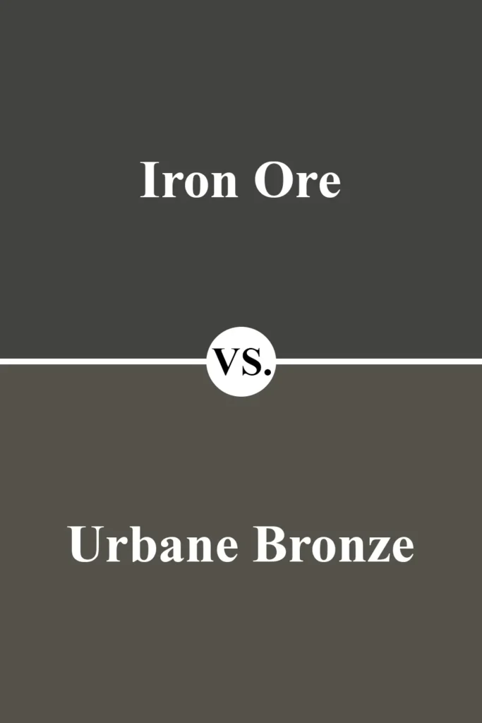
Urbane Bronze has a much stronger brown and greige undertone. It feels warm, earthy, and grounded — perfect for cozy, organic interiors.
Iron Ore is cooler, darker, and more charcoal-like. If you’re torn between a soft black and an earthy dark taupe, this comparison can help guide your decision.
Sherwin Williams Iron Ore vs Benjamin Moore Wrought Iron
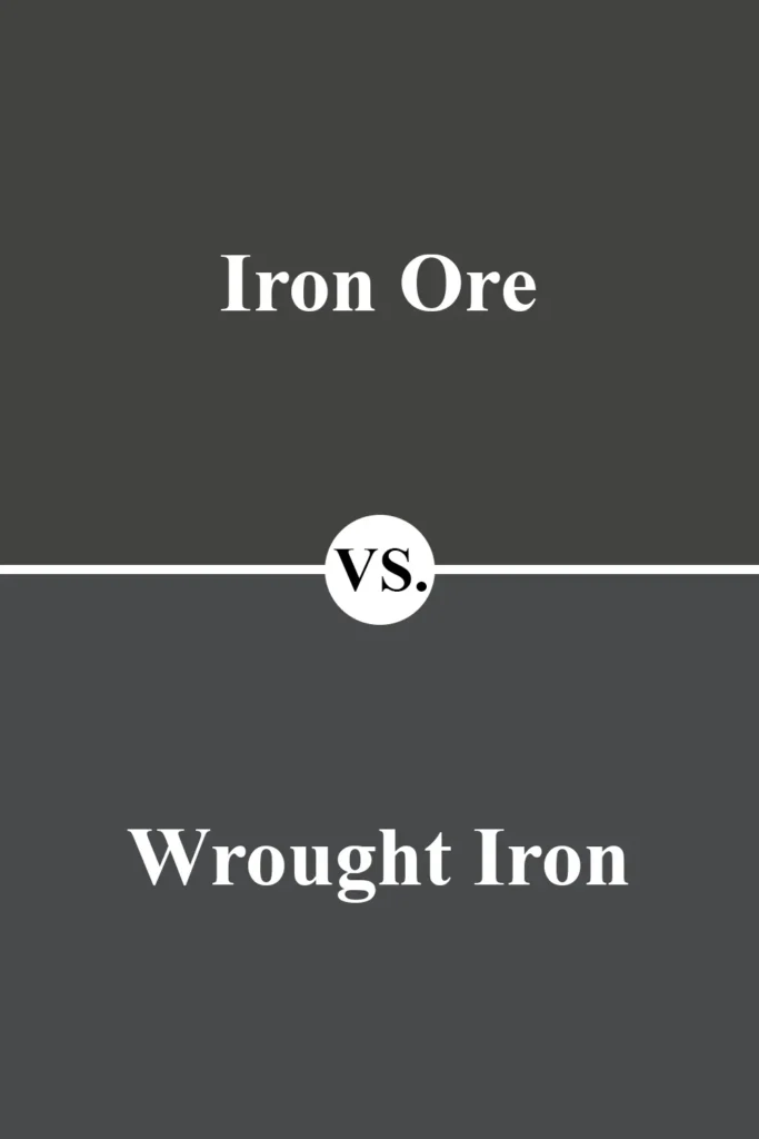
Wrought Iron and Iron Ore are often compared because they’re both popular near-black neutrals. Wrought Iron leans a little cooler, with more of a blue-gray undertone.
Iron Ore, by contrast, has subtle green warmth, making it feel more natural. Both are beautiful — it really comes down to your undertone preference and lighting conditions.
Sherwin Williams Iron Ore vs Benjamin Moore Kendall Charcoal
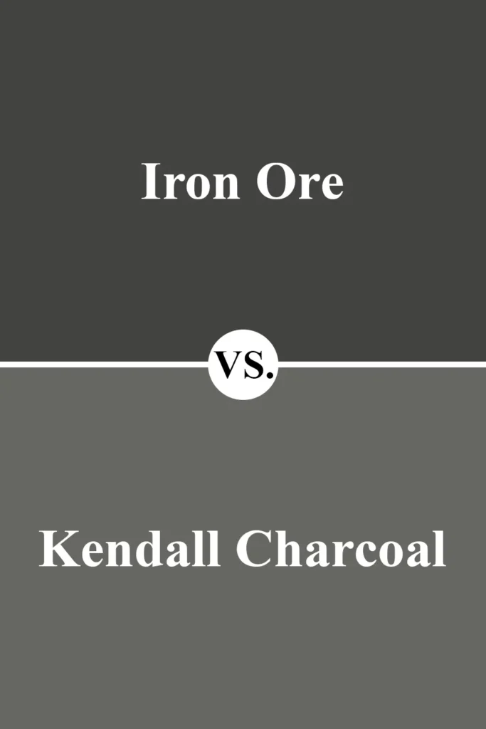
Kendall Charcoal is lighter and reads more like a deep gray than a soft black. It has more visible green undertones and is better suited for full-room use without overwhelming the space.
Iron Ore is significantly darker and better suited for accents, bold statements, or exteriors. If you’re hesitant about going super dark, Kendall Charcoal might feel like a safer step.
Where to Use Sherwin Williams Iron Ore?
One of the biggest reasons I keep coming back to Sherwin-Williams Iron Ore is how versatile it is. Yes, it’s bold. Yes, it’s dark.
But it’s also surprisingly flexible and looks incredible in so many different spaces — inside and out.
Whether you want a dramatic statement wall, a cozy cocoon-like bedroom, or a sophisticated exterior, Iron Ore brings depth and elegance wherever it’s used.
Here’s a breakdown of how you can use Iron Ore in different areas of your home:
Sherwin Williams Iron Ore In the Bedroom
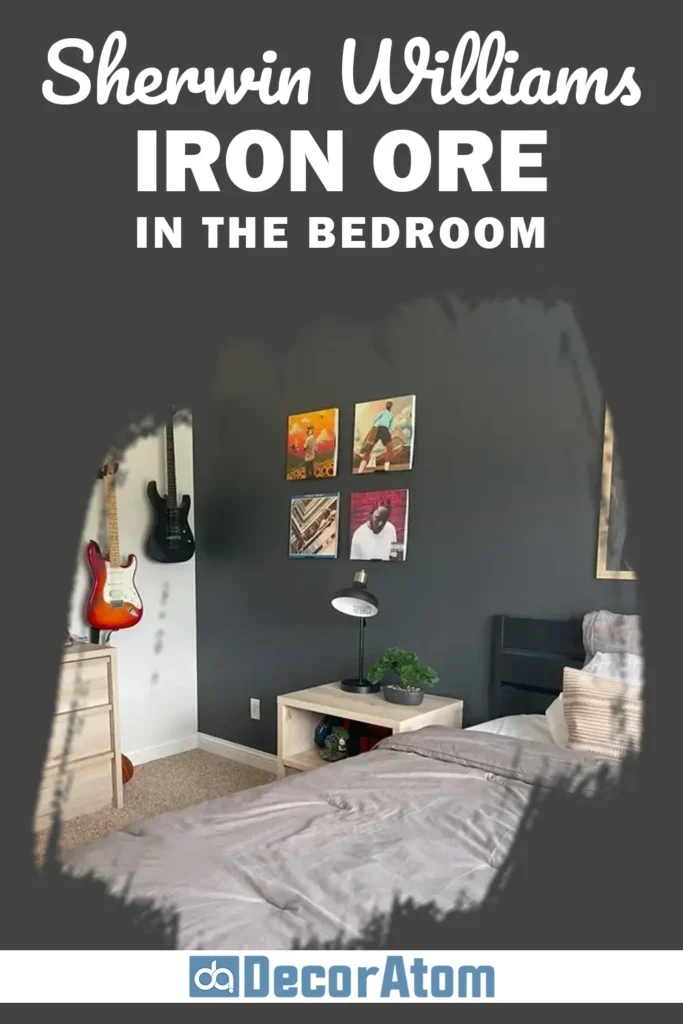
At first, you might hesitate to use such a dark color in the bedroom — I get it. But hear me out: Iron Ore can actually create one of the coziest, most calming bedroom atmospheres.
If your bedroom gets a decent amount of natural light, Iron Ore on the walls can feel like a warm, moody embrace. It’s perfect for those who want to create a sanctuary-style space that feels like a retreat from the world.
You don’t have to go all-in either. Even an Iron Ore accent wall behind the headboard can anchor the room beautifully.
Pair it with soft neutrals, natural textures (like rattan or linen), and layered lighting for a balanced, restful look. Add brass or gold accents for a little warmth and luxury — it’s a pairing I absolutely love in a bedroom.
Sherwin Williams Iron Ore In the Living Room
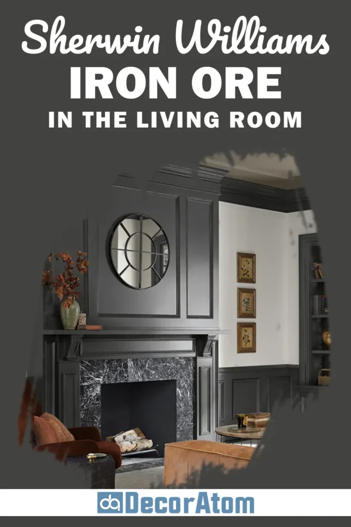
Iron Ore in the living room can be a game-changer — especially if you’re aiming for a modern, elevated look.
Whether you use it on all four walls or just a focal wall (like behind a fireplace or media unit), it instantly adds depth and sophistication.
If your living room has large windows or higher ceilings, Iron Ore can really shine without making the space feel closed in.
In smaller rooms, I like to keep the walls lighter and use Iron Ore for built-ins, a feature wall, or the trim around the fireplace.
Pair it with off-white walls, soft creams, or wood tones to soften the contrast. The overall effect? Polished, cozy, and just a little bit dramatic — in the best way.
Sherwin Williams Iron Ore in Kitchen
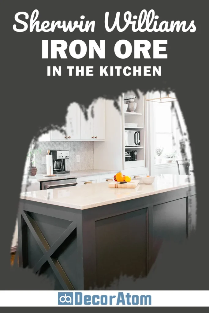
Using Iron Ore in a kitchen is one of my favorite bold design choices — especially for cabinetry, islands, or even vent hoods.
Iron Ore-painted cabinets are sleek, sophisticated, and work just as well in a farmhouse kitchen as they do in a modern one.
This color pairs beautifully with warm brass or matte black hardware, marble or butcher block countertops, and crisp white walls or subway tile.
I’ve also seen some gorgeous kitchens with Iron Ore lower cabinets and lighter uppers — it creates contrast without overwhelming the space. Even just painting the island in Iron Ore adds a focal point that instantly grounds the whole kitchen.
Sherwin Williams Iron Ore In the Bathroom
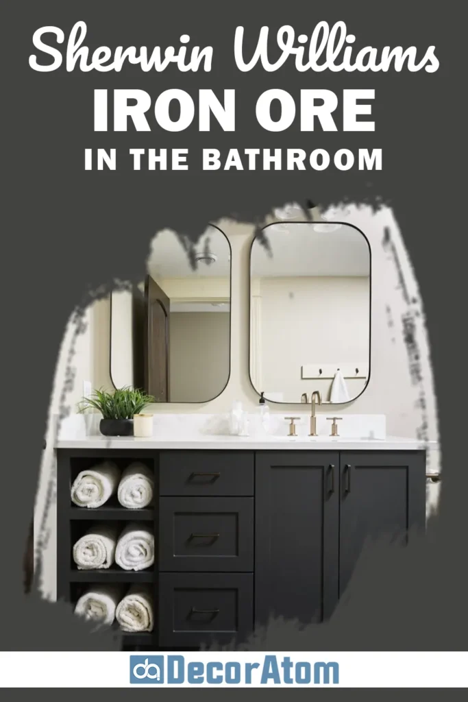
Bathrooms might seem like a risky place for such a dark color, but when done right, Iron Ore turns them into spa-like retreats.
I especially love using it for vanities, feature walls, or even shiplap behind a mirror.
In a powder room, you can go bold and do all the walls in Iron Ore, paired with light flooring and brass or chrome fixtures.
Because it’s a dark neutral, it gives a rich, clean look when paired with crisp whites, warm metallics, and stone or tile.
You’ll need good lighting to balance it out, but once that’s in place, Iron Ore can transform an ordinary bathroom into something unexpectedly luxe.
Sherwin Williams Iron Ore For the Exterior
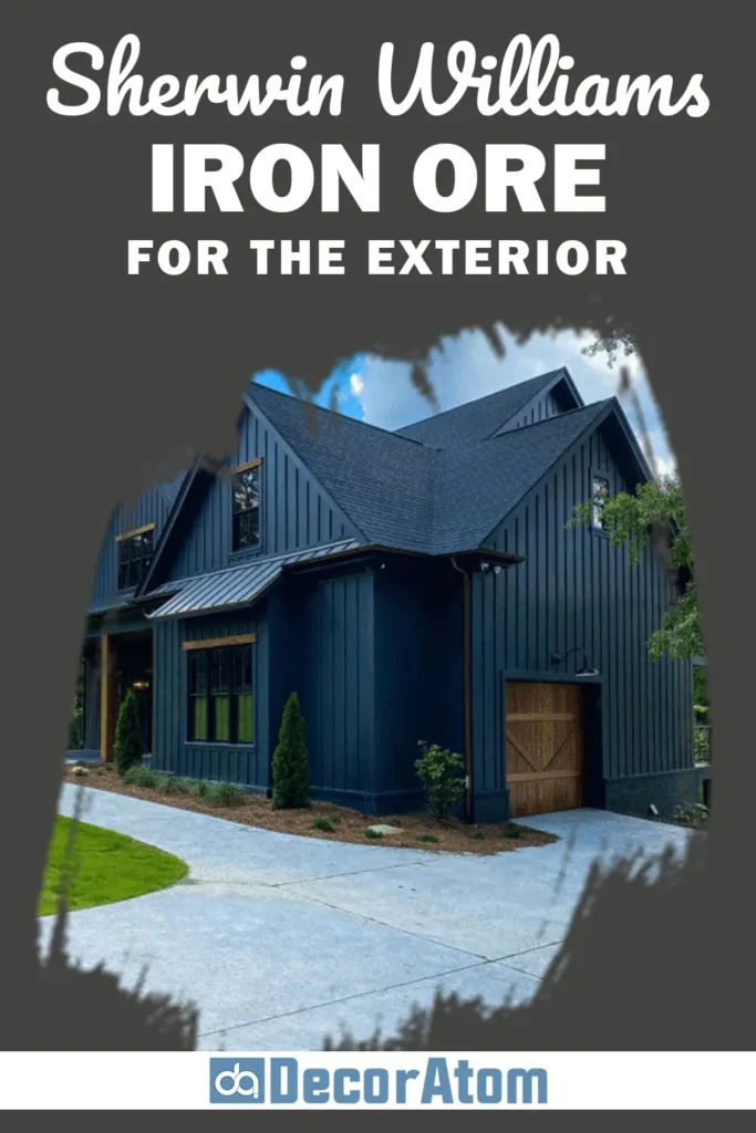
This is where Iron Ore absolutely shines — it’s one of Sherwin-Williams’ most popular exterior paint colors, and for good reason.
Whether you’re painting an entire house, an accent wall, or just the trim, Iron Ore gives your exterior a bold, modern edge while still feeling natural and timeless.
It pairs beautifully with stone, brick, and natural wood tones, making it ideal for both modern farmhouse and contemporary homes.
I’ve seen it used for front doors, garage doors, shutters, board-and-batten siding, and even fencing.
And the best part? It doesn’t read as jet black outdoors — it has that charcoal softness that feels inviting and grounded.
Also Read: 25 Most Popular Sherwin Williams Exterior Paint Colors
Why I Love Sherwin Williams Iron Ore
There’s just something about Sherwin-Williams Iron Ore that hits all the right notes for me.
It’s dramatic but not harsh. It’s neutral but not boring.
It feels bold and confident, but still blends beautifully with so many design styles — modern, farmhouse, industrial, traditional, you name it.
I love that it offers an alternative to true black — something that feels more nuanced and livable.
And I love how it interacts with other elements in a space, whether that’s warm wood tones, crisp white trim, brass accents, or natural light.
Every time I’ve seen it in a space, it’s added a kind of quiet sophistication that’s hard to replicate with lighter shades.
Iron Ore is one of those colors that sticks with you — once you try it, it’s hard to imagine going back to anything else.
Final Thoughts
If you’re looking for a rich, near-black paint color that feels timeless, versatile, and bold (without going full-on black), Sherwin-Williams Iron Ore SW 7069 is absolutely worth considering.
It brings character and contrast to any space, yet somehow manages to stay neutral enough to work in just about any style of home.
From cozy bedrooms and sleek kitchens to bold exteriors and everything in between, Iron Ore proves that dark paint doesn’t have to feel cold or overwhelming.
Instead, it can be elegant, grounding, and — dare I say — incredibly beautiful.
So whether you’re ready to go all-in or just test it out in small doses, Iron Ore might be the dark, dramatic shade your home has been waiting for.