

There’s something about a soft, creamy paint color that makes a home feel calm and inviting, and Sherwin-Williams Divine White is one of those understated gems.
If you’ve been hunting for a warm, neutral backdrop that doesn’t feel too stark or too yellow, this one might be worth a closer look.
I’ve worked with this color in a few spaces over the years, and it always brings this sense of quiet warmth that feels comforting without being overly beige.
It’s subtle, but in the best way.
In this post, I’m diving deep into everything you need to know about Divine White—from how it looks on the walls, to its undertones, lighting impact, and what makes it so versatile.
If you’re considering this shade for your home, I hope this helps you figure out if it’s the right fit.
What Color is Sherwin-Williams Divine White SW 6105?
Sherwin-Williams Divine White is best described as a soft off-white with a warm, creamy undertone. It sits somewhere between an ivory and a very light beige, which makes it feel cozy but not too yellow or golden.
It’s not a pure white—it has more depth to it—so it brings a gentle warmth to any room.
I like to think of it as a “barely-there beige” that still reads light and bright on the wall. It’s just enough color to give your walls a hint of warmth, without pulling attention away from everything else in the room.
If you’re someone who wants a clean but not cold white, Divine White is a nice middle ground. It works beautifully on walls, ceilings, and even cabinetry if you want a soft neutral palette.
Is It a Warm Or Cool Color?
Divine White is definitely a warm color. The creamy base and subtle beige undertones give it that soft, welcoming warmth.
It doesn’t have any cool or grayish feel to it—so if you’re looking for a crisp, icy white, this isn’t it.
But if you love that inviting, lived-in warmth that makes a space feel like home, you’ll probably appreciate what Divine White brings to the table.
This warmth makes it a great option in north-facing rooms that naturally feel cooler or dimmer. It helps balance out the light and keeps the room from feeling too sterile.
At the same time, it doesn’t lean too yellow or peachy, so it still feels sophisticated and neutral.
LRV of Sherwin-Williams Divine White SW 6105

💥🎁 Christmas & Year-End Deals On Amazon !
Don't miss out on the best discounts and top-rated products available right now!
*As an Amazon Associate, I earn from qualifying purchases.
Let’s talk about LRV, which stands for Light Reflectance Value. It’s just a fancy way of measuring how much light a paint color reflects.
The scale goes from 0 (which is pure black) to 100 (which is pure white). The higher the number, the more light it bounces around the room.
Sherwin-Williams Divine White has an LRV of 72, which puts it in the “light” category. That means it reflects a good amount of light, making a room feel airy and open—especially in spaces with natural sunlight.
It’s not the brightest off-white out there, but it’s still plenty light enough to brighten up a room, especially when paired with white trim or lighter furnishings.
Undertones of Sherwin Williams Divine White SW 6105
The undertones in Sherwin-Williams Divine White are what give it that signature soft warmth. It has a beige base with just a whisper of pink and maybe the slightest hint of peach in certain lighting.
Now, these aren’t strong or overpowering undertones—they’re subtle, but they’re there, and they can show up depending on the light in your room.
What I love about this paint is that the undertones make it feel cozy, but not muddy or dingy. That gentle beige warmth helps it play nicely with wood tones, creams, and even soft blush accents.
And while some off-whites can lean yellow or golden, Divine White holds back from that, keeping it from feeling too traditional or dated. It’s a more modern kind of warmth—gentle and elegant, but still fresh.
That said, if your room gets a lot of natural light, especially in the afternoon, you might notice a slight pinkish cast on the walls.
It’s not glaring, but it’s something to be aware of, especially if you’re pairing it with cooler colors like grays or blues.
How Does Lighting Affect Sherwin Williams Divine White SW 6105?
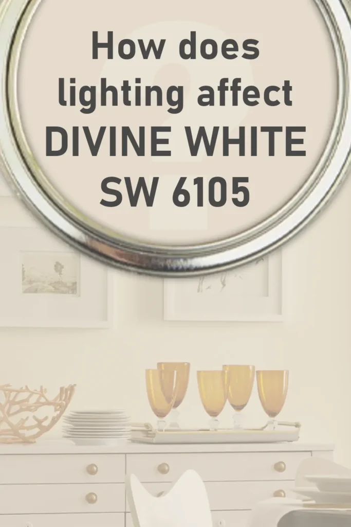
Lighting makes a big difference with Divine White—and honestly, this is where the color can surprise you a little.
In north-facing rooms, where the light is cooler and more diffused, Divine White tends to look a bit more muted. The beige undertones still come through, but the color might feel slightly grayer or more subdued. It still reads warm, but in a soft, subtle way—not overly creamy or yellow.
In south-facing rooms, you’ll really see that warmth come alive. The natural light tends to bring out the creamy and slightly peachy undertones, giving the room a very cozy, golden glow. It’s beautiful in living spaces or bedrooms where you want that extra bit of warmth and comfort.
In east-facing rooms (morning light), Divine White can look lighter and brighter early in the day, and then take on a bit more warmth as the sun moves.
In west-facing rooms, the afternoon sun can sometimes pull out those peachy-pink undertones more strongly, especially in the golden hour. If that’s a concern, you might want to sample it on the wall first to make sure it doesn’t read too warm for your space.
Overall, Divine White is a very adaptable color—but it’s one that really shifts with the light. So testing it out in different areas of the room is key before committing.
Trim Colors to Pair With Sherwin Williams Divine White SW 6105
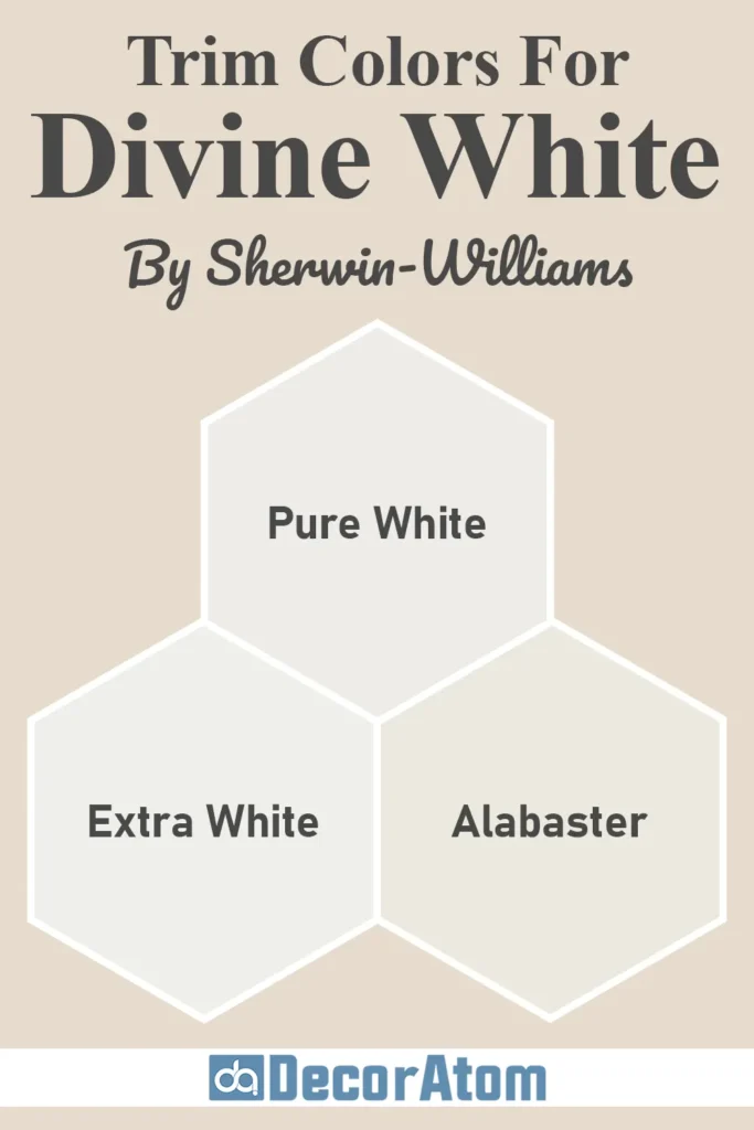
Divine White looks best when paired with a trim color that gives it just enough contrast to stand out without feeling too stark. Here are a few good trim options that work beautifully with it:
- Sherwin-Williams Extra White (SW 7006): This is a clean, crisp white that adds a touch of contrast without looking harsh. It helps Divine White pop a little, especially if you’re using it on walls and want your trim to feel more defined.
- Sherwin-Williams Alabaster (SW 7008): If you prefer a softer, more tonal look, Alabaster is a great pick. It’s a warm white with creamy undertones that blend seamlessly with Divine White. This combo feels elegant and cohesive, perfect for traditional or farmhouse-style interiors.
- Sherwin-Williams Pure White (SW 7005): Another excellent choice if you’re after something in-between. It’s not as stark as Extra White, but still lighter than Divine White, creating a gentle, balanced contrast that works well in both modern and classic spaces.
Avoid using trim colors that are too cool or icy white—they can make Divine White look dingy or even a little peachy by comparison. Warm whites with subtle depth are your best bet here.
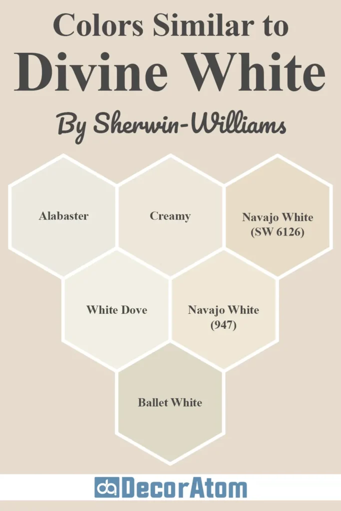
Colors Similar to Sherwin Williams Divine White SW 6105
💥🎁 Christmas & Year-End Deals On Amazon !
Don't miss out on the best discounts and top-rated products available right now!
*As an Amazon Associate, I earn from qualifying purchases.
Before I dive into specific alternatives, let’s talk about why someone might want to explore similar colors to Divine White.
Maybe you love the general look and feel of Divine White, but you’re not 100% sold on the undertones.
Or maybe you’ve sampled it in your space and found it leans just a little too warm or soft for your liking. That’s totally normal—undertones and lighting can shift things more than we expect.
The good news is, there are a handful of other colors from both Sherwin-Williams and Benjamin Moore that offer a similar warm, off-white vibe—some slightly creamier, some a little brighter, and others with a more neutral base.
Here are six great options to consider, with detailed comparisons:
1. Sherwin-Williams Alabaster (SW 7008)
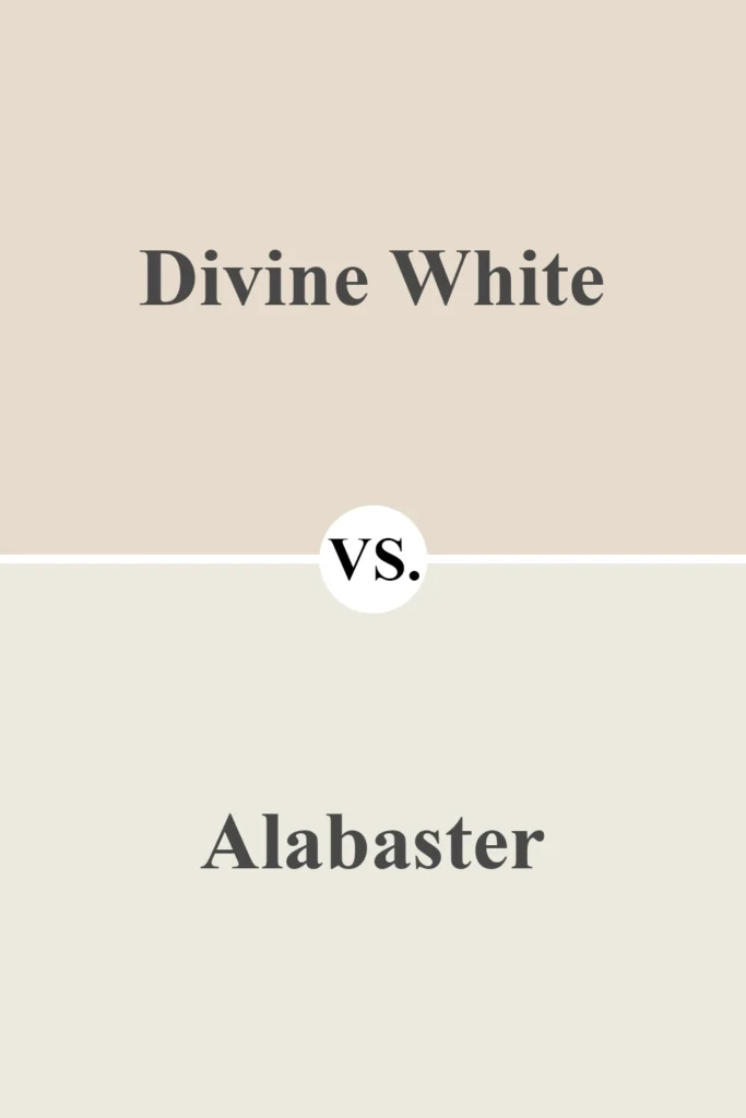
Alabaster is one of Sherwin-Williams’ most popular warm whites—and for good reason. It has a creamy softness that’s quite similar to Divine White, but it’s a bit lighter and brighter overall.
With an LRV of 82 (compared to Divine White’s 72), it reflects more light, which can help make a room feel airier.
Alabaster has very subtle yellow-beige undertones, but they’re less noticeable than the pink-peach hints in Divine White.
If you want something that still feels warm and cozy but with a bit more brightness and less color showing through, Alabaster might be a better fit.
2. Sherwin-Williams Creamy (SW 7012)
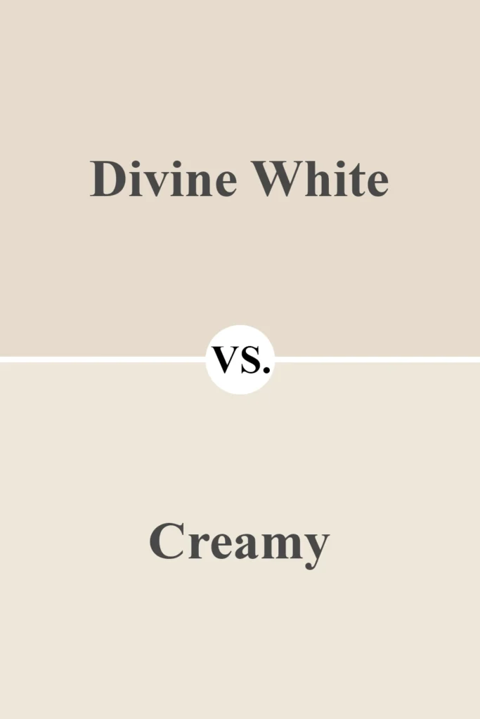
Creamy leans a bit more into that buttery warmth—it’s richer and has more of a yellow undertone compared to Divine White’s neutral-beige-pink mix.
It’s still soft and welcoming, but it’s more distinctly cream-colored.
If you’ve found Divine White just a touch too subtle or pink in your lighting, and you want something that reads a little sunnier, Creamy could be a great alternative.
It’s especially lovely in traditional or country-style interiors.
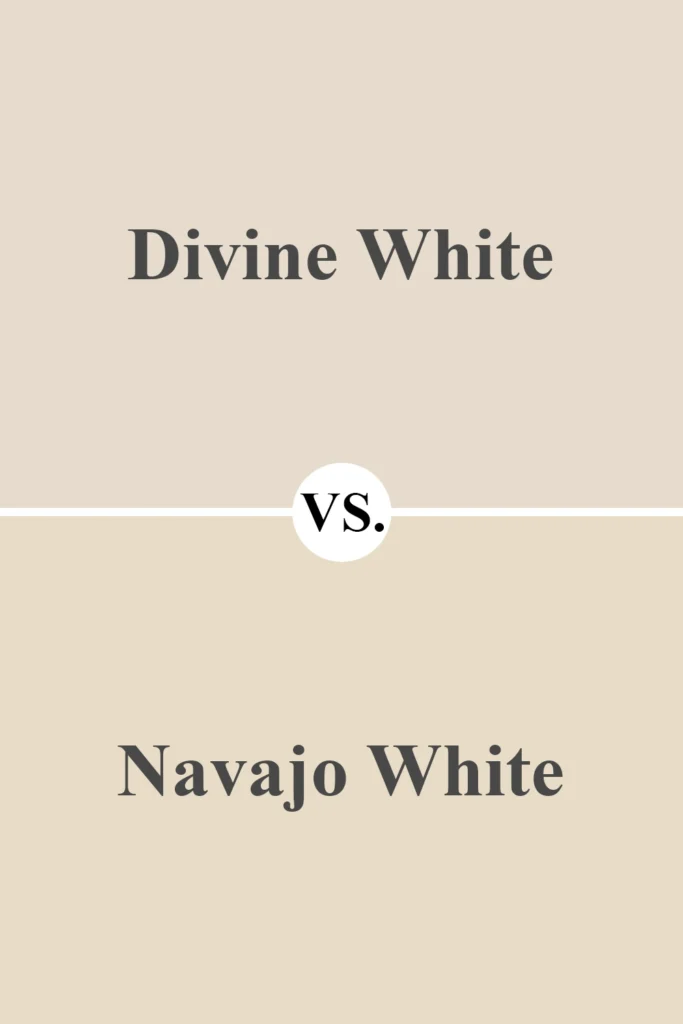
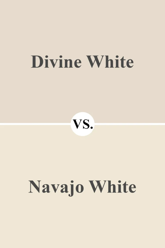
3. Sherwin-Williams Navajo White (SW 6126)
💥🎁 Christmas & Year-End Deals On Amazon !
Don't miss out on the best discounts and top-rated products available right now!
*As an Amazon Associate, I earn from qualifying purchases.
Navajo White is warmer and deeper than Divine White, with a stronger yellow-golden undertone.
It’s more assertive in terms of color, so it works best in rooms that get a lot of natural light—otherwise, it can feel a little too rich or golden.
Compared to Divine White, Navajo White feels more traditional and cozy, while Divine White is a little more subdued and neutral.
If you want a bolder warm backdrop, this is a good one to test.
4. Benjamin Moore White Dove (OC-17)
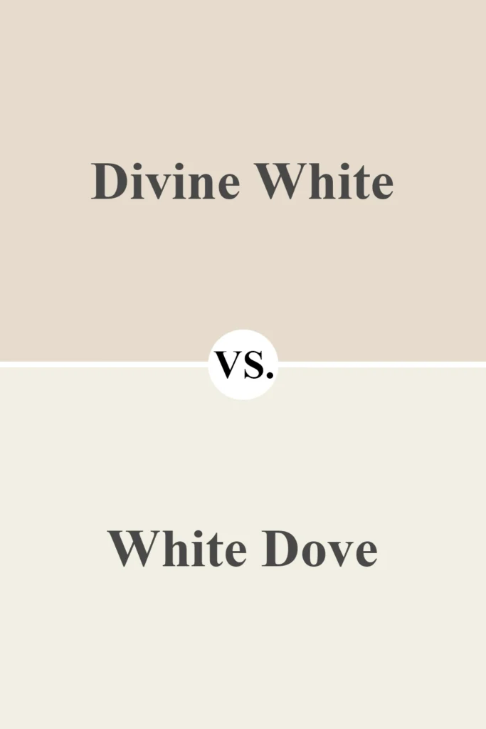
White Dove is another fan favorite, and it sits in a similar category as Divine White. It has soft, warm undertones—more cream than beige—but without going too yellow or peach.
It’s also slightly lighter, with an LRV of around 85, so it bounces more light in the room.
If you’re considering both brands, White Dove is a bit more neutral and versatile, and less likely to show those pinkish undertones that sometimes peek through with Divine White.
5. Benjamin Moore Navajo White (947)
Despite sharing a name with the Sherwin-Williams version, Benjamin Moore’s Navajo White is quite different.
It’s much lighter and softer, with creamy yellow undertones and a clean, classic feel.
It has an LRV of 78, making it a little brighter than Divine White but still in the same warm white family.
This one leans more creamy and sunny than Divine White’s subtle beige-pink tone. It works well if you want a bright but still warm backdrop, especially in traditional interiors.
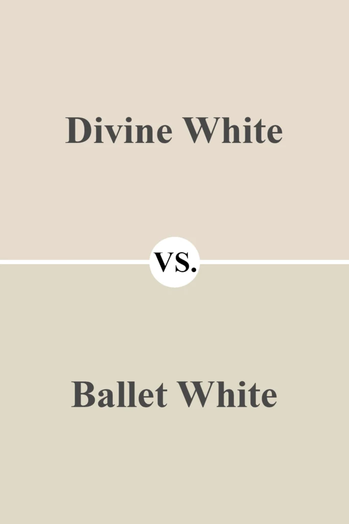
6. Benjamin Moore Ballet White (OC-9)
💥🎁 Christmas & Year-End Deals On Amazon !
Don't miss out on the best discounts and top-rated products available right now!
*As an Amazon Associate, I earn from qualifying purchases.
Ballet White is a beautiful soft greige (gray-beige) with just a hint of warmth. Compared to Divine White, it reads a little cooler and more balanced, especially in rooms with mixed lighting.
If you’ve found Divine White a bit too warm or pink in your space, Ballet White might be a better alternative.
It offers that soft, elegant feel without leaning as creamy, and it pairs nicely with both cool and warm accents.
Colors that Go With Sherwin Williams Divine White SW 6105

One of the things that makes Sherwin-Williams Divine White so lovable is its versatility—it pairs beautifully with so many other colors.
Since it sits in that warm, creamy off-white category, it creates a soft backdrop that allows both deeper shades and delicate tones to shine.
When you pair Divine White with the right coordinating colors, you can bring out different sides of it: go cozy and classic, fresh and modern, or even rich and dramatic depending on what you want the space to feel like.
Here are five colors that pair beautifully with Divine White, along with details on why they work so well:
1. Sherwin-Williams Homburg Gray (SW 7622)

Homburg Gray is a deep, moody green-gray with an earthy richness that adds drama and depth to any space.
Paired with Divine White, it creates a balanced, high-contrast palette that feels grounded and sophisticated.
Divine White’s warmth softens Homburg Gray’s cool edge, keeping the combination from feeling too stark or cold.
It’s a great duo for cabinetry and walls or accent walls and trim—especially in modern farmhouse or transitional interiors.
2. Sherwin-Williams Urbane Bronze (SW 7048)

💥🎁 Christmas & Year-End Deals On Amazon !
Don't miss out on the best discounts and top-rated products available right now!
*As an Amazon Associate, I earn from qualifying purchases.
If you want a more bold and grounding pairing, Urbane Bronze is a beautiful dark brown with subtle gray and green undertones.
It was actually Sherwin-Williams’ Color of the Year in 2021, and for good reason—it brings so much warmth and sophistication to a space.
Divine White and Urbane Bronze together create a classic, timeless palette.
Think Divine White walls with Urbane Bronze on interior doors, built-ins, or kitchen islands. It’s cozy, stylish, and never feels boring.
3. Sherwin-Williams Austere Gray (SW 6184)
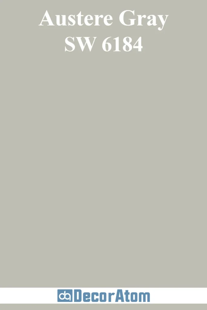
Austere Gray is a soft, muted green-gray that leans cool, which makes it a nice complement to the warmth of Divine White.
If you like a more airy, relaxed look—something spa-like or calming—this pairing works beautifully.
Austere Gray works especially well for bedrooms or bathrooms where you want a whisper of color without overwhelming the space.
With Divine White as your main neutral, Austere Gray adds just enough contrast to feel interesting.
4. Sherwin-Williams Threshold Taupe (SW 7501)

Threshold Taupe is a warm, medium-depth taupe that shares similar undertones with Divine White, which makes them feel related and harmonious when used together.
This combo is ideal for tone-on-tone spaces—maybe Divine White on the walls and Threshold Taupe on cabinetry, trim, or even accent furniture.
It feels cohesive, layered, and warm without being too beige-heavy or dated. If you’re drawn to earth tones or natural textures, these two colors complement each other so effortlessly.
5. Sherwin-Williams Sea Salt (SW 6204)

Sea Salt is a dreamy soft green-blue-gray that instantly adds a tranquil, coastal vibe to any room.
When paired with Divine White, the combination feels fresh, breezy, and light.
Sea Salt’s cool undertones help balance Divine White’s warmth, making this a fantastic palette for bathrooms, bedrooms, or even airy open-plan living spaces.
Together, these two colors create an easygoing, livable look that doesn’t feel too stark or too heavy.
Where to Use Sherwin Williams Divine White SW 6105?
Divine White is one of those colors that doesn’t just work in one kind of room—it adapts really well across your home.
Its warm, creamy base makes it soft enough to be comforting but neutral enough to feel polished.
Whether you’re creating a cozy retreat or looking for an elegant neutral for a more formal space, Divine White fits the bill. Here’s how it can shine in different areas of the home:
Sherwin Williams Divine White in the Bedroom

In the bedroom, Divine White creates a warm and restful atmosphere that feels inviting and serene.
Unlike stark whites that can feel cold or sterile, Divine White wraps the space in a soft, gentle glow.
If your room gets lots of morning sun, you’ll notice how beautifully it reflects the light without being too bright or washed out.
It pairs nicely with natural linens, soft grays, warm wood tones, or dusty blues and greens.
Divine White on the walls with crisp white bedding and a few cozy, layered textures can turn your bedroom into a peaceful sanctuary.
It also works well with antique brass or aged bronze lighting if you want to bring in a little vintage charm.
Sherwin Williams Divine White in the Living Room

This color is right at home in the living room, especially if you’re aiming for a cozy, lived-in feel that’s still polished and sophisticated.
Divine White’s warmth helps make large, open-concept spaces feel more grounded and intimate, and it gives off just enough color to feel more interesting than plain white.
If your living room has a mix of finishes—maybe dark wood floors, leather furniture, or even pops of color in the artwork—Divine White is a great neutral to tie it all together.
It’s also a lovely choice for homes with traditional trim or millwork, where you want to emphasize architectural details without overwhelming them.
Sherwin Williams Divine White in the Bathroom
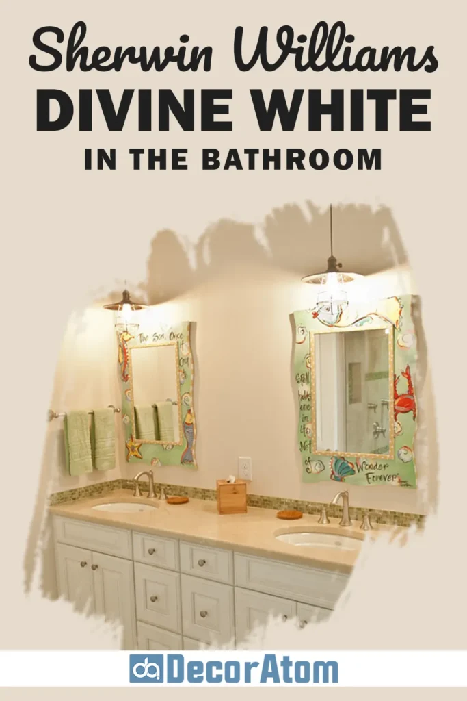
Bathrooms can often feel cold or clinical, but Divine White helps shift that mood completely. It brings warmth and comfort to a space that’s usually all tile and hard surfaces.
It works especially well in bathrooms with natural light—helping reflect it around the room while keeping everything soft and welcoming.
If you’re pairing it with marble or white subway tile, Divine White can soften the contrast and make everything feel more cohesive.
Add in some natural wood accents or soft brass fixtures, and you’ve got a bathroom that feels like a mini retreat.
Sherwin Williams Divine White in the Kitchen

In the kitchen, Divine White is a flexible player. You can use it on the walls to create a warm backdrop, or you can go all in and paint the cabinets with it for a soft, creamy look.
It’s especially lovely in kitchens that lean traditional, farmhouse, or French country—but it can work just as well in transitional spaces too.
It pairs nicely with quartz countertops, warm wood shelves, or even darker lower cabinets for a two-tone look.
Since it’s not too stark, Divine White also hides smudges and fingerprints better than a bright white—something worth noting if you’ve got little ones or a busy kitchen.
Sherwin Williams Divine White for the Exterior
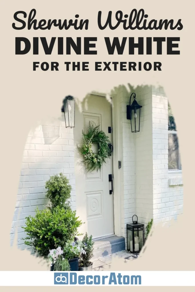
Don’t overlook Divine White for the outside of your home—it’s actually a stunning exterior color.
Its warm undertones keep it from looking too sterile in bright outdoor light, which is a common issue with cooler whites. It reads as a soft creamy white that feels timeless and welcoming.
Whether you’re going for a classic white farmhouse look or something more coastal and breezy, Divine White holds up beautifully against natural light, landscaping, and architectural features.
Pair it with a dark trim like Urbane Bronze or Iron Ore for dramatic contrast, or keep things soft with a taupe or greige trim. Either way, it creates serious curb appeal.
Final Thoughts
Sherwin-Williams Divine White SW 6105 is the kind of color that doesn’t shout for attention—but quietly works its magic in the background.
It’s warm, soft, and full of character, but still neutral enough to let your furniture, lighting, and personal style shine.
The subtle undertones make it interesting, and its adaptability means it can look just as good on a bathroom wall as it does on kitchen cabinets or a home’s exterior.
If you’re searching for a color that feels cozy without being heavy, polished without feeling too formal, and warm without veering into yellow territory—Divine White is a strong contender.
It’s timeless, livable, and works beautifully in so many different kinds of homes.