
There’s something truly calming about a color that sits right in the sweet spot between soft and sophisticated—and that’s exactly what Sherwin-Williams Comfort Gray SW 6205 brings to the table.
I’ve come across a lot of gray paint colors over the years, but Comfort Gray stands out for its subtle charm.
It’s one of those shades that instantly makes a space feel peaceful and pulled together, whether you use it on walls, cabinetry, or even exterior siding.
Despite having “gray” in its name, this color offers much more—it’s a beautiful blend of green, blue, and a touch of gray that gives it a fresh, breezy character.
If you’re looking for a color that feels clean but not cold, modern but not sterile, Comfort Gray is definitely worth considering.
Let’s take a closer look at what makes this shade so popular.
What Color is Sherwin Williams Comfort Gray SW 6205?
Sherwin-Williams Comfort Gray is one of those colors that doesn’t just sit in the background—it gently enhances the space it’s in.
At first glance, you might think it’s a soft gray. But once it’s on the wall, especially in natural light, you’ll quickly notice the green and blue undertones peeking through.
So, what kind of color is it really? It’s a muted greenish-gray with a cool blue tint.
Some even describe it as a sea-glass tone because of the way it shifts slightly depending on the lighting.
It’s not a stark or pure gray—it has enough color in it to feel interesting, but not so much that it becomes overpowering.
It’s versatile, calming, and has a soothing coastal vibe that works beautifully in both traditional and modern spaces.

Is It a Warm or Cool Color?
Comfort Gray SW 6205 is a cool color. You can tell that the moment you see it in a well-lit room.
It leans more toward green and blue, both of which are cool hues on the color wheel. These cool undertones give Comfort Gray its relaxed and refreshing feel.
If you’re trying to create a serene space—maybe something light, airy, and spa-like—cool colors like this one are a great choice.
Unlike warm colors (which have yellow, red, or orange undertones and tend to feel cozy and energetic), cool colors like Comfort Gray tend to recede, creating a more expansive and calming effect.
This makes it especially great for bedrooms, bathrooms, and other restful areas in the home.
LRV of Sherwin Williams Comfort Gray SW 6205
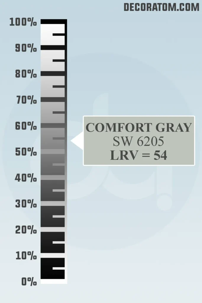
Let’s talk quickly about LRV, or Light Reflectance Value. I promise—it sounds more complicated than it is. LRV is just a number that tells us how light or dark a paint color is.
It’s on a scale from 0 to 100. Zero is pure black (no light reflected) and 100 is pure white (maximum light reflected).
Comfort Gray has an LRV of 54, which means it sits right in the middle. It’s not too light and not too dark—just that perfect midtone. This LRV makes Comfort Gray really versatile.
It has enough depth to stand out on the wall but still reflects a fair amount of light, helping your space feel open and airy. If you have a room with good natural light, it’ll look fresh and bright.
In dimmer rooms, it might read a bit moodier or more muted, but still soft and elegant.
Color Family
Comfort Gray belongs to the green color family. While it does have noticeable blue and gray undertones, the base of this color is very much green. That’s why you often hear it described as a soft green or even a seafoam tone.
RGB Colors
Let’s break this down simply: RGB stands for Red, Green, and Blue, and it’s a way to describe the mix of these three colors that create a paint shade. For Comfort Gray SW 6205, the RGB values are:
- Red: 190
- Green: 195
- Blue: 187
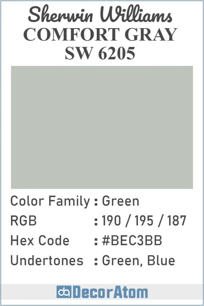
Hex Value
If you’ve ever picked a paint color for a digital mood board or website design, you’ve probably come across something called a hex value. This is the six-digit code that represents the color in digital design. For Sherwin-Williams Comfort Gray SW 6205, the hex code is:
- #BEC3BB
Undertones of Sherwin Williams Comfort Gray SW 6205
Now let’s talk undertones—this is where Comfort Gray gets really interesting.
Even though it’s technically in the green color family, Comfort Gray has noticeable blue undertones, too. So while the base leans green, the blue softens it and cools it down.
That’s what gives Comfort Gray its trademark calm, spa-like vibe. Depending on the lighting and the surrounding colors, sometimes the green shows up more clearly, and other times the blue takes the lead.
It’s a chameleon color, but not in a wild, unpredictable way. Instead, it gently shifts between soft green and muted blue, always grounded by that gray element.
This mix of undertones is what makes it feel breezy and fresh, without being too minty or too aqua. It walks that perfect middle line.
How Does Lighting Affect Sherwin Williams Comfort Gray SW 6205?
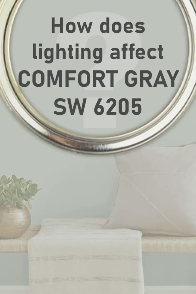
Lighting can change how any paint color looks—and Comfort Gray is no exception.
In natural light, especially in south-facing rooms, Comfort Gray usually looks lighter and slightly more green. The daylight brings out its fresh side, making it feel airy and uplifting. This is where that sea-glass tone really shines.
In north-facing rooms, where the light tends to be cooler and grayer, Comfort Gray may lean more toward blue. It still feels soft and elegant, but it might come across as a little more subdued or moody.
In rooms with artificial light, it all depends on the bulb. Warm yellow bulbs will push Comfort Gray slightly greener and softer. Cooler white bulbs can bring out more of the blue-gray tones.
And remember: lighting changes throughout the day, so the color can shift a little depending on the time. But that’s part of its charm—it always looks tasteful, just in different ways.
Trim Colors to Pair With Sherwin Williams Comfort Gray SW 6205?
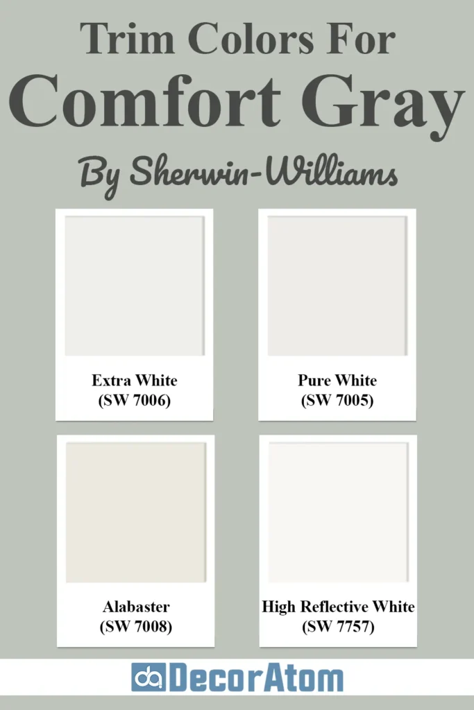
Pairing Comfort Gray with the right trim color can elevate the whole room. Because Comfort Gray is a cool-toned, mid-range shade, it looks best when contrasted with a crisp, clean trim color that lets it breathe.
Here are a few great options:
Sherwin-Williams Extra White (SW 7006) – This is one of the brightest whites in Sherwin-Williams’ lineup. It’s sharp, clean, and helps Comfort Gray feel even more refreshing. If you want a classic contrast that makes the walls pop, this is a solid pick.
Sherwin-Williams Pure White (SW 7005) – A softer, slightly warmer white, Pure White is a great option if you want a less stark trim. It’s clean but not cold, which works beautifully if you want to keep that cozy feel.
Sherwin-Williams High Reflective White (SW 7757) – The brightest white Sherwin-Williams offers. It’s bold and modern, which works great if you want a high-contrast, contemporary look.
Sherwin-Williams Alabaster (SW 7008) – If you’re after something a touch creamier, Alabaster is a warm white that still plays nicely with cool paint colors. It’s especially nice in spaces where you want a more traditional or farmhouse look.
Whichever trim color you choose, make sure it complements the lighting and the vibe of your space. Comfort Gray is flexible, so you have room to tailor the look to suit your style.
Colors Similar to Sherwin Williams Comfort Gray SW 6205
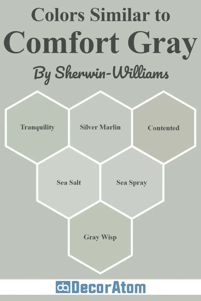
If you love the soft, soothing vibe of Comfort Gray SW 6205, you’ll be glad to know there are several other paint colors that carry a similar charm.
Let’s walk through each one and see how they stack up against Comfort Gray.
1. Benjamin Moore Tranquility AF-490

Tranquility is a very close cousin to Comfort Gray. It’s a soft blue-green with gray undertones, just like Comfort Gray, but it reads a touch bluer in most lighting.
While Comfort Gray has a balanced green-blue presence, Tranquility leans more heavily on its cool blue base, giving it a slightly airier and more aquatic vibe.
If you’re looking for something that still feels serene but with a little more crispness or coastal lightness, Tranquility might be the one to sample alongside Comfort Gray.
2. Benjamin Moore Silver Marlin 2139-50

Silver Marlin is another beautiful, muted green-blue-gray, but this one tends to appear a bit dustier and more gray-forward than Comfort Gray.
It has less visible green, so while Comfort Gray brings a sense of fresh greenery into the room, Silver Marlin feels a bit more restrained and cooler overall.
If you’re leaning toward a sophisticated gray with subtle hints of color, Silver Marlin is an excellent choice. It’s slightly more neutral, so it works well in spaces where you want less color saturation.
3. Sherwin Williams Contented SW 6191
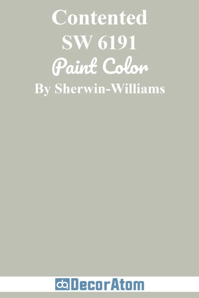
Contented is in the same color family as Comfort Gray, but it has less blue and more visible green.
If you like the overall tone of Comfort Gray but want a color that feels a bit more grounded in nature, Contented is a solid option.
It’s slightly deeper, and in low-light rooms it may look more olive or sage-toned compared to the lighter, breezier effect of Comfort Gray.
It’s a great alternative if you’re going for a softer earthy green without too much blue.
4. Sherwin Williams Sea Salt SW 6204
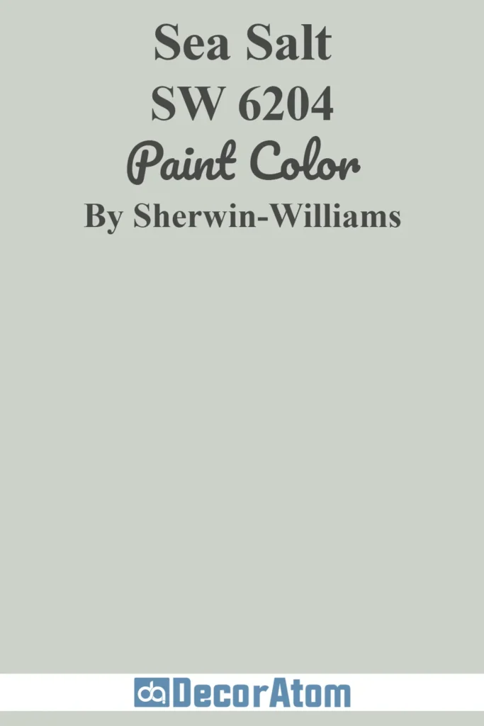
Sea Salt is probably the most famous “cousin” of Comfort Gray, and many people debate between the two.
While they’re close on the color strip, Sea Salt is noticeably lighter and a bit more pastel in appearance. It has a stronger blue undertone, making it feel even more coastal and bright.
In bright light, Sea Salt can almost read pale blue or even soft aqua, whereas Comfort Gray stays grounded with its gray-green base.
If you’re after a more subtle, airy vibe, Sea Salt might edge out Comfort Gray. But for a more balanced and richer hue, Comfort Gray remains the winner.
5. Sherwin Williams Sea Spray SW 9651

Sea Spray is part of the Emerald Designer Edition, and it’s very close in tone to Comfort Gray but a bit more refined and soft.
It maintains that same balance of blue-green-gray, but with a smoother, more modern feel.
If you want something just a touch more muted and polished, Sea Spray is a wonderful alternative. It feels luxurious and quiet, without going too far into neutral territory.
6. Benjamin Moore Gray Wisp 1570
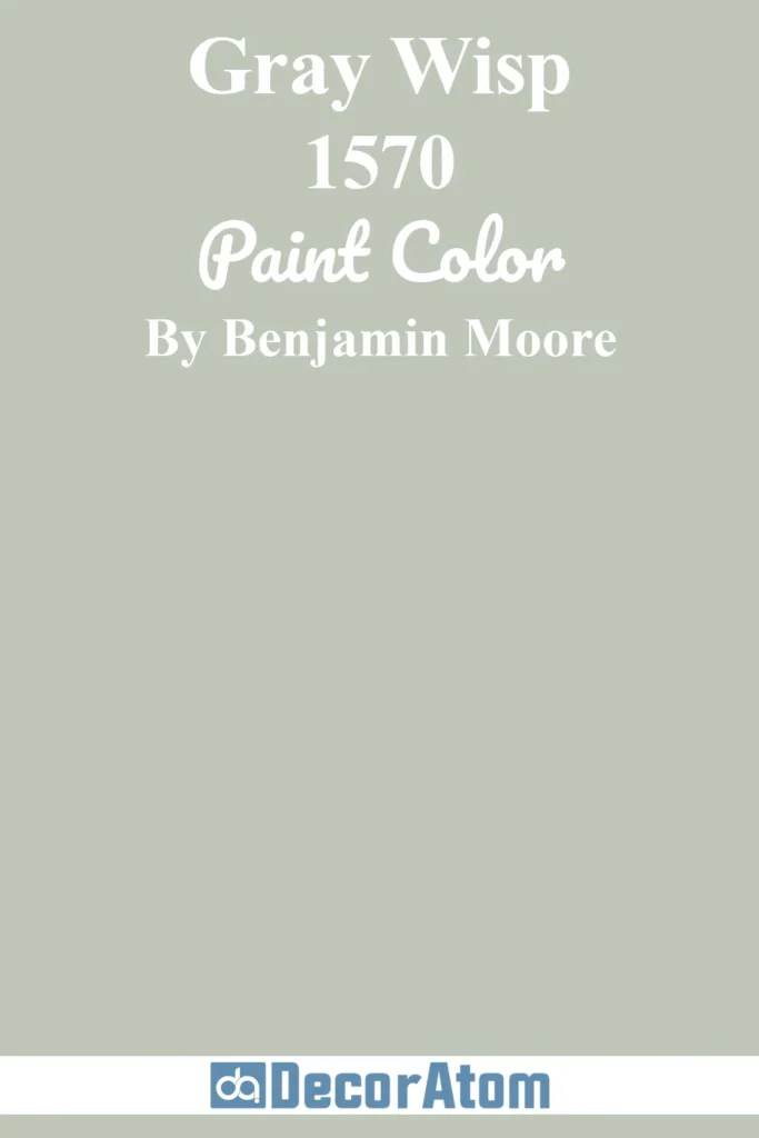
Gray Wisp is a beautiful match for Comfort Gray in terms of softness and versatility. However, it leans a little greener and a touch deeper.
It feels a bit more traditional and sophisticated, whereas Comfort Gray gives off more of a relaxed, beachy vibe.
That said, Gray Wisp is fantastic for creating a subtle statement and might suit spaces like formal dining rooms or transitional living rooms where you want more color depth.
Colors that Go With Sherwin Williams Comfort Gray SW 6205
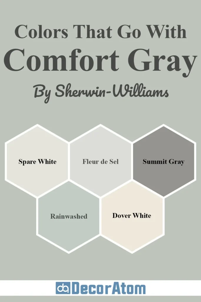
Now, let’s talk about colors that pair beautifully with Comfort Gray.
Because of its cool, calming base, you’ll want to choose colors that either complement its undertones or help create contrast without clashing. This makes Comfort Gray incredibly flexible.
Here are five coordinating colors that go wonderfully with Comfort Gray:
1. Spare White SW 6203
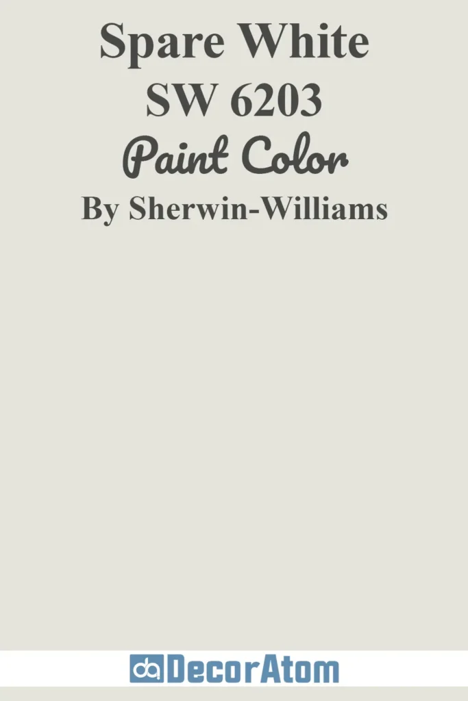
Spare White is a light, cool white with a hint of gray and a soft undertone that pairs seamlessly with Comfort Gray. It keeps the space feeling airy and minimal without being cold or stark.
Using Spare White for trim, ceilings, or even cabinetry can help Comfort Gray stand out just enough, while still maintaining a cohesive, peaceful palette.
2. Fleur de Sel SW 7666
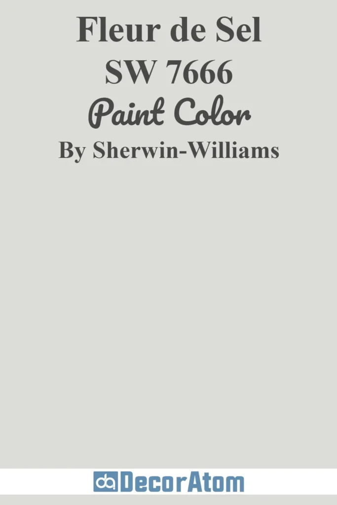
Fleur de Sel is a pale, silvery gray that has a hint of cool green—just enough to complement Comfort Gray’s undertones.
It doesn’t try to compete for attention but instead blends smoothly, creating a refined, layered effect.
If you’re after a tone-on-tone, modern look with depth and movement, Comfort Gray and Fleur de Sel are a winning combination.
3. Summit Gray SW 7669

Summit Gray is a deeper, stronger gray with a slightly bluish cast. When paired with Comfort Gray, it adds contrast and sophistication, perfect for accent walls or cabinetry.
This pairing is ideal when you want a subtle coastal palette that’s still rich and dimensional. Summit Gray grounds the softness of Comfort Gray, giving it more architectural impact.
4. Rainwashed SW 6211

Rainwashed is another cool blue-green paint that works harmoniously with Comfort Gray.
It’s a bit lighter and more saturated with blue, but when paired together, they create a breezy, spa-like aesthetic—think beach house or tranquil retreat.
You can use Rainwashed in nearby rooms or in the same space as an accent color to create visual interest without disrupting the flow.
5. Dover White SW 6385
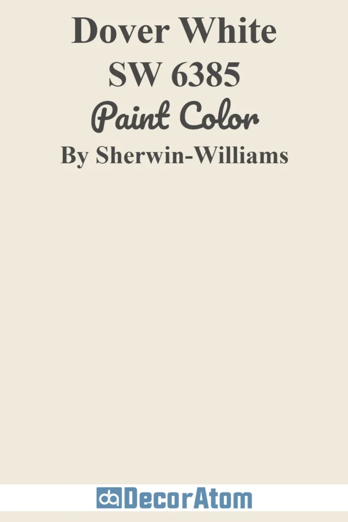
If you want to warm things up a little, Dover White is a creamy, soft white that adds contrast and coziness without clashing with Comfort Gray’s cool tones.
It works particularly well on trim, doors, or even shiplap walls to give the space more dimension and warmth.
Comparing Sherwin Williams Comfort Gray SW 6205 With Other Colors
Paint colors are never just “pick and go.” Often, it comes down to comparing several options side-by-side to see which one really speaks to you.
Comfort Gray is a color that sits between green, blue, and gray, so it’s natural to want to compare it to others that may fall in a similar space.
Sherwin Williams Comfort Gray vs Sea Salt

Comfort Gray and Sea Salt are often compared because they’re on the same color strip, and they both have that soft, coastal vibe. But once you see them side by side, the differences become pretty clear.
Sea Salt is noticeably lighter and has more of a blue undertone. It often looks like a pale aqua in well-lit rooms, almost drifting into a watery, beachy hue.
Comfort Gray, on the other hand, has more green and gray in the mix, which gives it a bit more depth and richness. If you want something that feels breezy and barely there, Sea Salt might work better.
But if you’re going for a calm, muted green-gray that feels a little more grounded, Comfort Gray is the stronger pick.
Sherwin Williams Comfort Gray vs Silver Strand
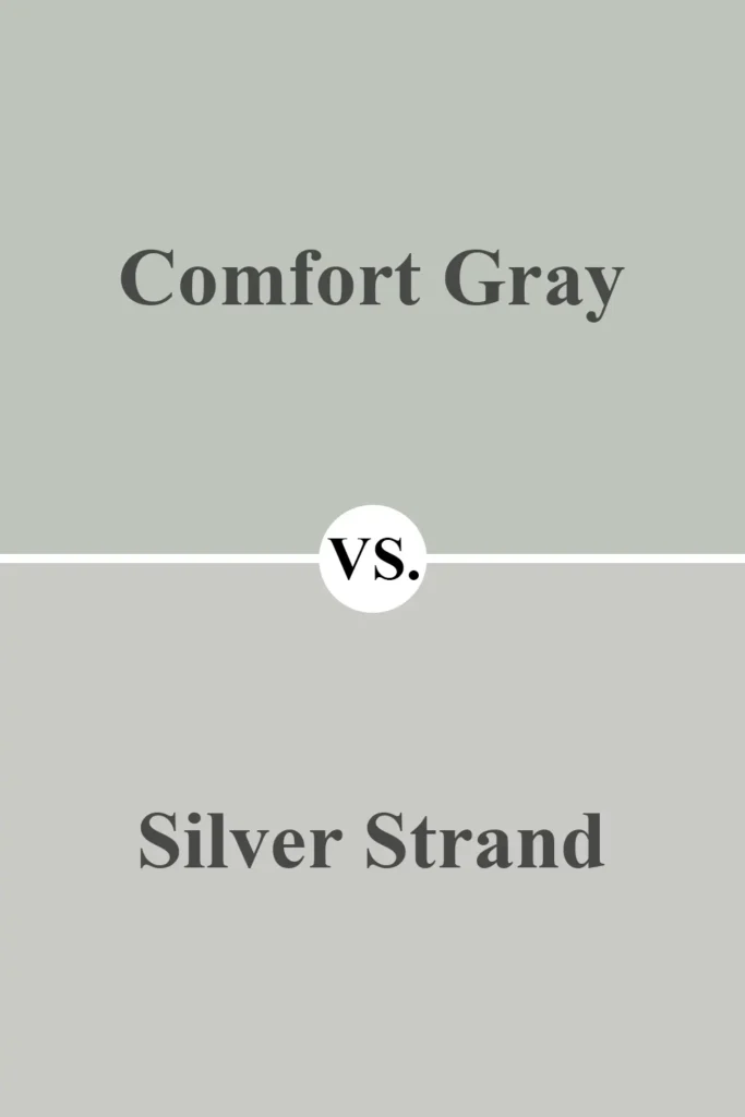
Silver Strand is another go-to for soft, subtle wall color, and it shares that gray-green family with Comfort Gray. However, Silver Strand is a touch cooler and a bit more silvery in tone.
It leans heavier on the gray, which can make it feel slightly more formal or modern.
Comfort Gray, while still soft, carries more visible green and a tiny bit of warmth compared to Silver Strand’s cooler finish.
If you’re after something that reads more like a misty, pale gray, Silver Strand is a great choice. But if you want a color that still feels cool but with a bit of natural, earthy green showing through, Comfort Gray delivers that perfectly.
Sherwin Williams Comfort Gray vs Oyster Bay
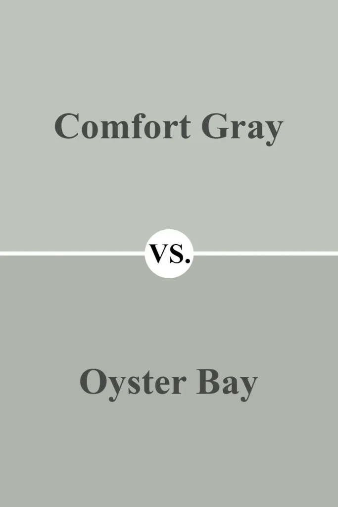
Oyster Bay is a deeper, moodier color compared to Comfort Gray. While they belong to the same general family of blue-green-grays, Oyster Bay has more saturation and looks more dramatic on the wall.
It leans slightly more into the green spectrum too, making it a great pick if you’re after a bolder, richer shade. Comfort Gray, by contrast, is much softer and lighter.
It’s easier to live with on large walls and doesn’t feel as heavy in dim lighting. Oyster Bay makes a statement, while Comfort Gray creates a peaceful backdrop.
Sherwin Williams Comfort Gray vs Repose Gray
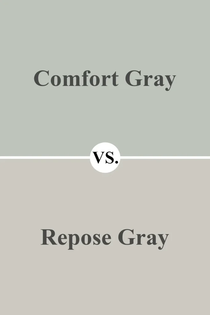
This comparison is interesting because Repose Gray is far more neutral. Repose Gray doesn’t really fall into the blue-green family—it’s more of a pure greige with the faintest hint of warmth.
If you’re choosing between these two, it really comes down to whether you want color or not. Comfort Gray brings soft personality with its gentle green and blue undertones.
Repose Gray is more subtle, timeless, and works almost anywhere. So if you want a touch of color, Comfort Gray gives you that. If you’re going for a more muted, classic neutral, Repose Gray is your friend.
Sherwin Williams Comfort Gray vs Rainwashed
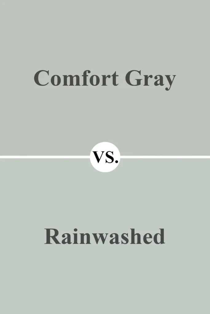
Rainwashed is another soft blue-green color that’s very close in vibe to Comfort Gray. The biggest difference is that Rainwashed leans more heavily into its blue side, especially in cooler lighting.
It often feels a bit more refreshing and airy, like a spa color. Comfort Gray, by comparison, has a more even balance of green, blue, and gray, which gives it a slightly dustier, more muted appearance.
If you’re looking for something a little more colorful and breezy, Rainwashed might edge out Comfort Gray. But if you want a calm, grounding color that still feels cool and coastal, Comfort Gray is the safer bet.
Sherwin Williams Comfort Gray vs Contented
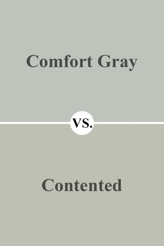
Contented and Comfort Gray both sit in the green-gray family, but Contented has a much more pronounced green tone.
It lacks the bluish cast that Comfort Gray has, and it also feels warmer and a little more earthy. In some lighting, Contented can almost lean sage-like, especially compared to Comfort Gray’s cooler, more balanced tone.
If your room needs a fresh, subtle green that isn’t too icy or too warm, Comfort Gray walks that line beautifully. Contented is a great option if you’re leaning more into green and want to avoid too much blue altogether.
Where to Use Sherwin Williams Comfort Gray SW 6205?
Comfort Gray SW 6205 is one of those rare paint colors that manages to feel soft, fresh, and timeless all at once.
It’s subtle enough to work as a neutral backdrop, but also brings a gentle pop of color with its muted blue-green undertones. Because of this versatility, Comfort Gray can work beautifully in almost any room—or even outside your home.
Whether you’re trying to create a calming retreat or a polished, welcoming space, this color adapts well depending on lighting and the decor around it.
Here’s how I think Comfort Gray can shine in different areas of the home:
Sherwin Williams Comfort Gray in the Bedroom

If you’re looking to create a bedroom that feels calm, restorative, and spa-like, Comfort Gray is a perfect fit.
It has that gentle blue-green hue that automatically makes the space feel cooler and more peaceful—ideal for winding down after a long day.
What I love most is how the color shifts throughout the day: in morning light, it looks fresh and airy, while in the evening, it takes on a cozy, muted tone.
Pair it with soft whites, light wood furniture, and natural textures like linen or cotton to make your bedroom feel like a serene retreat.
It’s not too dark to overwhelm small rooms, but it still offers a bit more personality than basic beige or gray.
Sherwin Williams Comfort Gray in the Living Room

Comfort Gray can be an amazing choice for living rooms, especially if you’re going for a transitional or coastal look.
It brings just enough color to make the walls interesting without overpowering your space or clashing with your furniture.
I’ve seen it look gorgeous with cream sofas, light oak coffee tables, woven baskets, and brushed gold or matte black fixtures.
If you get a lot of natural light, the blue tones might peek through more clearly, giving the room a fresh and crisp feel. In dimmer rooms, it reads more as a soft sage-gray.
Either way, it makes for a very cozy yet polished living space that feels pulled together without trying too hard.
Sherwin Williams Comfort Gray in the Kitchen
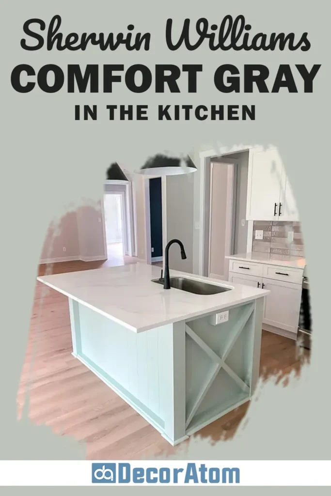
I think Comfort Gray works beautifully in kitchens—especially if you’re tired of seeing plain white everywhere but still want a clean and airy vibe.
This color pairs wonderfully with white upper cabinets and light wood or gray-toned lower cabinets for a layered, interesting look.
If you have marble or white quartz countertops, Comfort Gray can enhance the subtle veining in the stone and make the whole space feel cohesive.
It also looks great with brushed nickel hardware and black accents like pendant lighting or stools.
Whether on the walls, the cabinets, or even the backsplash area, Comfort Gray brings a soft sophistication to the kitchen without feeling cold or sterile.
Sherwin Williams Comfort Gray in the Bathroom
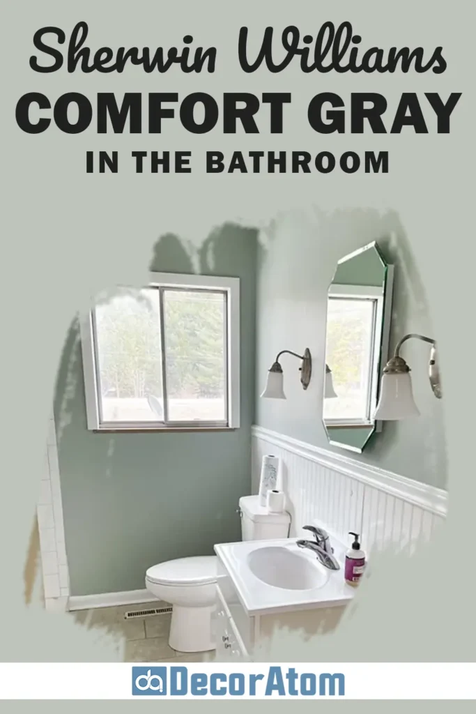
Bathrooms are another great place to use Comfort Gray. It feels naturally calming, which is exactly what you want in a space that’s meant for self-care.
The green-blue undertones can give a subtle spa-like atmosphere, especially when paired with white subway tile, soft gray grout, and warm wood vanities.
It also works great with polished nickel or chrome fixtures. I find that it looks especially beautiful in bathrooms that get natural light—it takes on a beautiful soft coastal tone that’s incredibly relaxing.
But even in bathrooms without windows, Comfort Gray doesn’t feel too dark or moody—it maintains its soothing personality.
Sherwin Williams Comfort Gray for the Exterior

Using Comfort Gray on your home’s exterior can create a soft, coastal-inspired look that still feels modern.
It’s especially beautiful on beach houses, cottages, or homes in warmer climates where a cooler exterior color helps reflect heat.
When paired with crisp white trim and maybe even a navy or black front door, the result is effortlessly elegant.
Keep in mind that exterior lighting will make the color appear a bit lighter and more blue-gray than it might inside your home.
That said, it still offers more visual interest than traditional gray or beige, without being bold or trendy. It’s timeless and stylish—great for long-term curb appeal.
Why I Love Sherwin Williams Comfort Gray SW 6205
Honestly, Comfort Gray is one of those colors that I keep coming back to because it’s just so dependable and beautiful.
It gives you the feeling of having color on your walls, but without overwhelming the space.
There’s something about that soft green-gray with just a hint of blue that feels peaceful, clean, and intentional.
It’s also flexible—you can use it in any room, at any time of year, and it still feels right.
Whether you’re working with a modern farmhouse style, a coastal cottage look, or even something more traditional, Comfort Gray adapts to its surroundings effortlessly.
That balance of subtlety and personality is what makes it such a winning paint color in my book.
Final Thoughts
If you’re on the hunt for a paint color that brings calm, comfort, and just the right amount of color, Sherwin Williams Comfort Gray SW 6205 is one you absolutely shouldn’t overlook.
It’s versatile, beautiful in every kind of light, and pairs well with so many styles and colors.
Whether you’re painting a whole house, freshening up a single room, or even taking it outdoors, Comfort Gray proves time and again that it’s a crowd-pleaser.
It’s not just a safe choice—it’s a smart one that you’ll likely still love years from now.