

If you’ve been searching for a light neutral that feels soft, subtle, and incredibly versatile, Sherwin-Williams City Loft SW 7631 might just be your new favorite.
I’ve personally found it to be one of those quiet colors that doesn’t demand attention but still manages to elevate any space.
It’s gentle, refined, and easy to work with—whether you’re refreshing a cozy bedroom, brightening a hallway, or looking for a whole-house neutral.
In this post, I’ll walk you through everything you need to know about City Loft—how it looks, how it behaves in different lighting, and how it compares to other similar shades.
So if you’re on the fence about choosing this color, I’m here to help you decide if it’s the right fit for your home.
*This post contains affiliate links. For more details see my full disclosure.
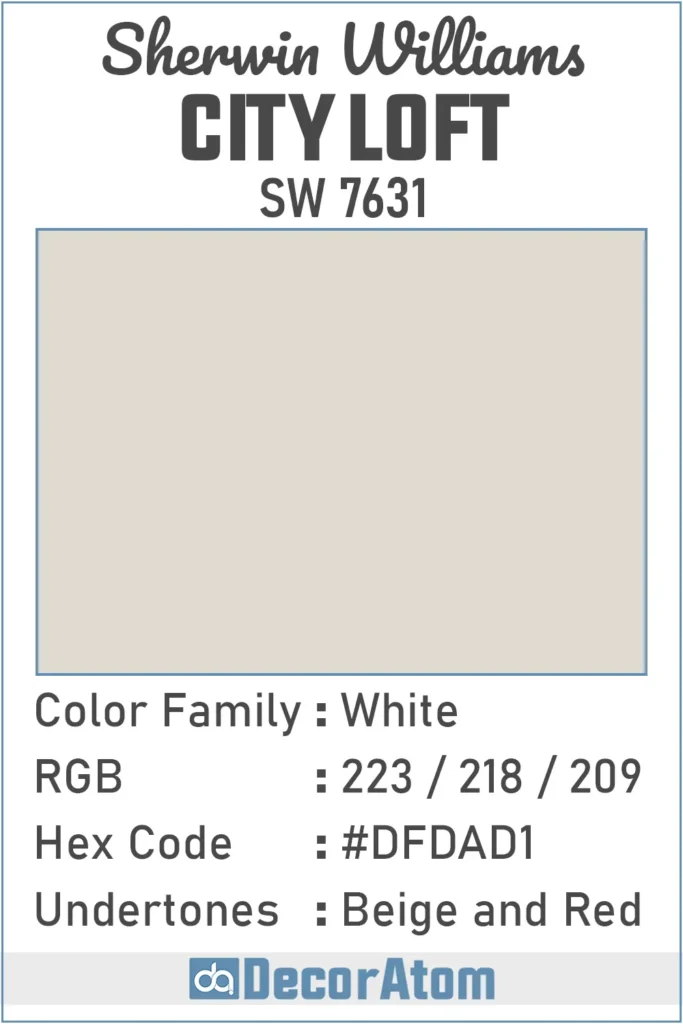
What Color is Sherwin Williams City Loft SW 7631?
Sherwin-Williams City Loft SW 7631 is a soft and airy neutral that sits somewhere between an off-white and a very light greige (a mix of gray and beige).
When you look at it on the wall, you’ll notice that it doesn’t come off as stark or cold like a true white, but it also doesn’t feel heavy or overly warm like some beiges.
It has a quiet elegance to it—subtle enough to work as a backdrop, yet just enough personality to keep a room from feeling flat.
What I really love about this color is how flexible it is. It doesn’t overpower a room, and it blends seamlessly with a wide range of decor styles—modern, traditional, minimalist, or coastal.
If you’re aiming for a soft and light neutral without committing to bright white, City Loft might be the perfect compromise.
How to Know if a Paint Color Is Right for You?
Would you like to sample City Loft SW 7631 paint color? I recommend using Samplize. They offer 12″x12″ peel-and-stick paint swatches that make testing colors super simple. Just stick it on your wall, move it around if needed, and when you’re done—peel it off and toss it. No mess, no cleanup. It’s quick, easy, and way more convenient!

💥🎁 Christmas & Year-End Deals On Amazon !
Don't miss out on the best discounts and top-rated products available right now!
*As an Amazon Associate, I earn from qualifying purchases.
Advantages of using peel and stick paint samples:
- EASY TO USE: Simply move your SAMPLIZE paint sample around the room to test under a variety of lighting conditions.
- AFFORDABLE: Budget-friendly solution and no more buying inaccurate swatches, rollers, wasted paint.
- SUPER FAST DELIVERY: Depending on your location, 1 day delivery is possible.
- ORDER FROM HOME: Save a trip to the store looking for samples.
- NO MESS: SAMPLIZE uses real paint samples with zero-mess
- NO WASTE: No leftover cans or wasted paint.
Is It a Warm or Cool Color?
City Loft is definitely a warm color, but it leans toward the softer end of the warm spectrum. That means it won’t come across as yellow, peachy, or overly cozy.
Instead, it has a gentle beige warmth with subtle red undertones hiding underneath, which help keep it from feeling too stark or gray.
In some lighting, especially during the day, it might even look like a very pale greige. But once the sun goes down or in north-facing rooms, that warm softness becomes a bit more noticeable.
Overall, it brings a calm and inviting vibe to any room. If you’re after a color that feels light and comforting without veering into the cooler gray territory, City Loft has that perfect warm balance.
LRV of Sherwin Williams City Loft SW 7631
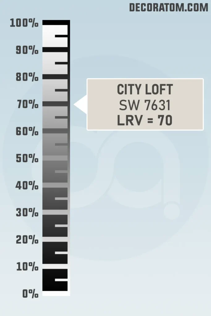
Let’s talk LRV, or Light Reflectance Value. In simple terms, LRV is a number that tells us how much light a paint color reflects. The scale goes from 0 to 100, with 0 being pure black (no light reflected) and 100 being pure white (all light reflected).
City Loft has an LRV of 70, which means it reflects a fair amount of light. It’s not super bright like a true white, but it’s definitely light enough to make a room feel airy and open.
With an LRV of 70, it works beautifully in spaces where you want a light color without the starkness of pure white. It also plays nicely with both natural and artificial light, which makes it a great choice for just about any room in your home.
Color Family
Sherwin-Williams City Loft SW 7631 falls into the white color family, even though it’s not what you’d traditionally call a bright white. Instead, it’s considered an off-white or soft white—which means it still belongs to the white family, but with added warmth and depth that give it more character.
RGB Colors
The RGB value of a paint color tells us how much red, green, and blue is mixed to create that particular shade. It’s a simple way to understand the “digital formula” of a color.
For Sherwin-Williams City Loft SW 7631, the RGB values are 223 / 218 / 209.
- Red: 223
- Green: 218
- Blue: 209
Hex Value
The Hex value is like the digital fingerprint of a color—used mostly in web design or anything on a screen. For Sherwin-Williams City Loft SW 7631, the hex code is #DFDAD1.
💥🎁 Christmas & Year-End Deals On Amazon !
Don't miss out on the best discounts and top-rated products available right now!
*As an Amazon Associate, I earn from qualifying purchases.
Undertones of Sherwin Williams City Loft SW 7631
Here’s where things get a little more interesting. City Loft might look like a soft neutral at first glance, but it has some subtle beige and red undertones hiding beneath the surface.
These undertones are what give the color its warmth and complexity. The beige base keeps the color feeling grounded and soft, while the red undertones can sometimes show up depending on the lighting—especially in warmer light or during certain times of day.
They won’t hit you over the head, but they’re definitely there, adding a hint of depth and warmth.
In rooms with a lot of natural light, these undertones might become a little more noticeable. You might catch a whisper of warmth that feels almost blush-like in the right conditions. But in low or cooler light, the color tends to lean more muted and neutral.
If you’re planning to use City Loft, I always recommend testing it out on different walls and watching how those undertones play out during the day. The subtle red warmth is what makes this color so cozy and inviting, but it’s also what makes it so nuanced.
How Different Types of Lighting Affect Sherwin Williams City Loft SW 7631?
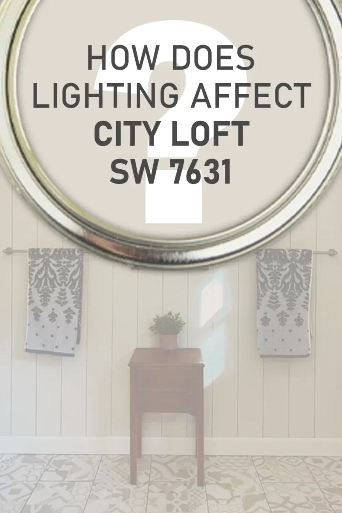
Lighting can totally change how a paint color looks, and City Loft is no exception. Since it’s a lighter color with warm undertones, it reacts quite noticeably depending on the direction and type of light it’s in.
Natural Light (South-facing rooms)
In bright, south-facing rooms, City Loft can appear almost like a soft, creamy off-white. The warmth really comes through, and the space feels light and cozy. You might catch those beige or red undertones more clearly here, especially in the afternoon.
Natural Light (North-facing rooms)
North-facing light is cooler and tends to bring out more muted, grayish tones. In these rooms, City Loft can look a little more subdued—more like a pale greige than a warm beige. It still feels soft, but with a slightly cooler edge.
Artificial Light (Warm bulbs)
With warm artificial lighting (think yellow-toned light bulbs), the warmth in City Loft becomes even more noticeable. It can bring out those red-beige undertones and make the room feel extra cozy—perfect for bedrooms or living rooms.
Artificial Light (Cool bulbs or LED)
Cooler lighting can wash out some of the warmth in City Loft and make it lean more neutral or even a bit gray. If you use daylight LEDs or bluish-toned lighting, it may feel more restrained and less warm.
Because City Loft sits in that delicate balance between beige and greige, it’s really sensitive to lighting. That’s why I always recommend testing swatches in a few spots before you commit.
Trim Colors to Pair With Sherwin Williams City Loft SW 7631?
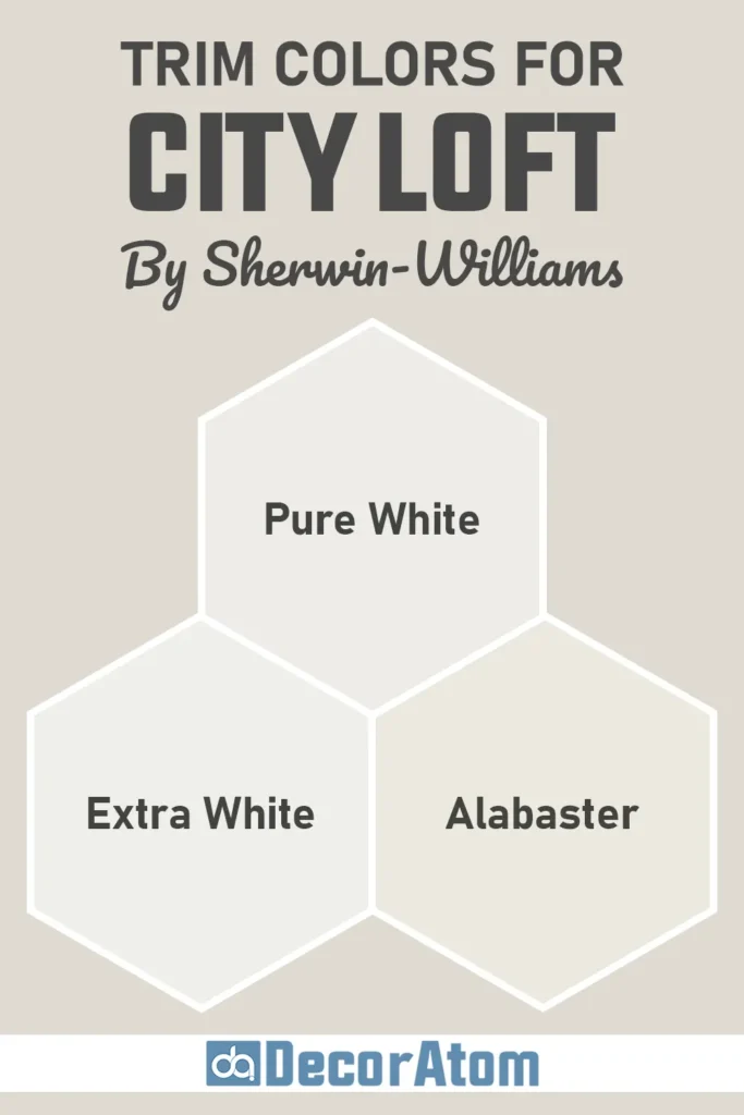
When it comes to trim colors, you want something that complements City Loft’s soft, warm vibe without clashing or overpowering it. The good news is, because City Loft is light and neutral, you’ve got several great options.
Here are a few trim color ideas that pair beautifully:
Sherwin-Williams Pure White (SW 7005)
This is one of the most popular trim colors out there, and for good reason. Pure White has a slight warmth to it, which makes it a perfect match for City Loft. It looks crisp without being too stark, and it keeps everything feeling cohesive.
Sherwin-Williams Extra White (SW 7006)
If you want more contrast and a brighter, cleaner look, Extra White could be a great option. It’s cooler than Pure White, so it’ll create more definition against the soft warmth of City Loft.
Sherwin-Williams Alabaster (SW 7008)
If you’re going for an ultra-soft, creamy look, Alabaster is a gorgeous choice. It’s a warm white with a cozy feel, and it blends beautifully with the beige and red undertones in City Loft. This combo feels especially nice in bedrooms and living rooms.
Whichever white you choose, just make sure the undertones align. Since City Loft has warm undertones, warmer whites usually create the most seamless and comfortable finish.
Colors Similar to Sherwin Williams City Loft SW 7631
If you love the soft, airy vibe of Sherwin-Williams City Loft but want to explore a few more options before making your final decision, you’re not alone.
I often recommend checking out similar colors side-by-side—because even small differences in undertones or depth can really influence how a paint color feels in your space.
City Loft SW 7631 sits in that sweet spot between off-white and greige. It’s light, warm, and has those subtle red and beige undertones that make it feel soft but not overly creamy.
Now, not all similar colors will have the exact same undertones—but there are definitely a few in both the Sherwin-Williams and Benjamin Moore collections that come very close in depth and vibe.
When comparing similar colors, pay close attention to Light Reflectance Value (LRV), undertones, and how cool or warm the color leans. Some of the colors that seem similar on a swatch might lean more yellow, pink, or gray once they’re up on the wall. That’s why testing samples is always a smart idea.
For instance, if you want something that feels just a touch cooler than City Loft, you might lean toward a soft greige with gray undertones. Or if you’re looking for something a bit warmer, you might prefer a warm off-white that leans more into beige.
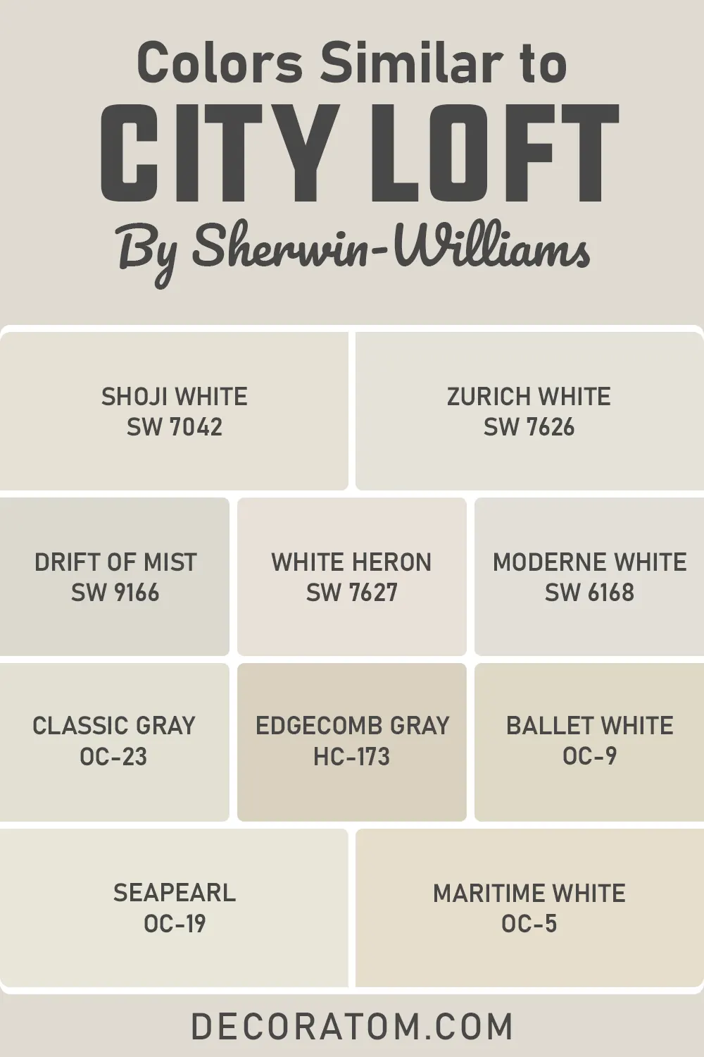
Here’s a quick list of 10 colors—five from Sherwin-Williams and five from Benjamin Moore—that are close cousins to City Loft in terms of tone, depth, and versatility. You can use this list as a starting point for comparisons.
💥🎁 Christmas & Year-End Deals On Amazon !
Don't miss out on the best discounts and top-rated products available right now!
*As an Amazon Associate, I earn from qualifying purchases.
10 Similar Colors to Sherwin Williams City Loft:
- Sherwin-Williams Shoji White SW 7042
- Sherwin-Williams Zurich White SW 7626
- Sherwin-Williams Drift of Mist SW 9166
- Sherwin-Williams White Heron SW 7627
- Sherwin-Williams Moderne White SW 6168
- Benjamin Moore Classic Gray OC-23
- Benjamin Moore Edgecomb Gray HC-173
- Benjamin Moore Ballet White OC-9
- Benjamin Moore Seapearl OC-19
- Benjamin Moore Maritime White OC-5
Colors that Go With Sherwin Williams City Loft SW 7631
One of my favorite things about City Loft SW 7631 is how incredibly flexible it is when it comes to pairing with other colors. Because it’s light and neutral—but not stark—it can work beautifully with a variety of coordinating colors depending on the mood you’re trying to create.
The key to choosing colors that go well with City Loft is to consider its undertones. City Loft has a soft beige base with subtle red undertones, which makes it warm without being overly yellow or peachy.
So, when you’re building a palette, it pairs best with other warm or muted shades—colors that either match its warmth or offer a grounded contrast.
If you’re aiming for a calming, monochromatic look, pairing City Loft with other warm whites or soft taupes can be incredibly soothing. Think colors like Snowbound SW 7004 or even something a bit deeper like Taupe Tone SW 7633.
These tones create a peaceful, layered neutral look that works great in bedrooms, living rooms, or any space where you want to relax.
On the other hand, if you’re feeling more adventurous and want to add depth or contrast, muted blues and soft greens can complement City Loft in a really beautiful way.
A color like Connor’s Lakefront SW 9060, for example, adds a refreshing yet subtle contrast that still feels harmonious. Earthy tones, muted olives, dusty mauves, and even some charcoal-based blacks can also add drama without overwhelming the softness of City Loft.
Whether you’re choosing accent walls, furniture upholstery, or cabinetry colors, this color is like a blank canvas that plays well with a wide range of companions. Here’s a curated list of colors that work well with City Loft if you want to build a thoughtful and cohesive palette:
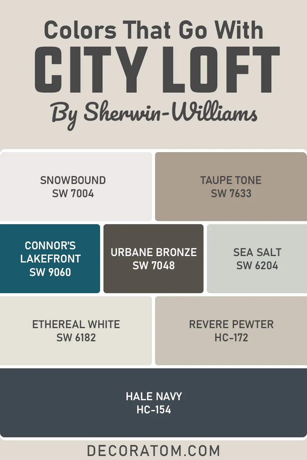
8 Colors That Go With Sherwin Williams City Loft:
- Sherwin-Williams Snowbound SW 7004
- Sherwin-Williams Taupe Tone SW 7633
- Sherwin-Williams Connor’s Lakefront SW 9060
- Sherwin-Williams Urbane Bronze SW 7048
- Sherwin-Williams Sea Salt SW 6204
- Sherwin-Williams Ethereal White SW 6182
- Benjamin Moore Revere Pewter HC-172
- Benjamin Moore Hale Navy HC-154
Comparing Sherwin Williams City Loft SW 7631 With Other Colors
Choosing the right paint color sometimes means doing a little head-to-head comparison.
It’s not just about finding a shade you like—it’s about figuring out how it performs in your space, under your lighting, and alongside your decor. That’s why I always suggest comparing a color like City Loft SW 7631 with other similar favorites to see what really fits.
City Loft is a warm, soft off-white with beige and red undertones. Its LRV of 70 places it firmly in the light category, but it still offers just enough pigment to be more interesting than a standard white. But how does it stack up against other popular neutrals?
Let’s walk through some detailed comparisons.
Sherwin Williams City Loft vs Shoji White SW 7042
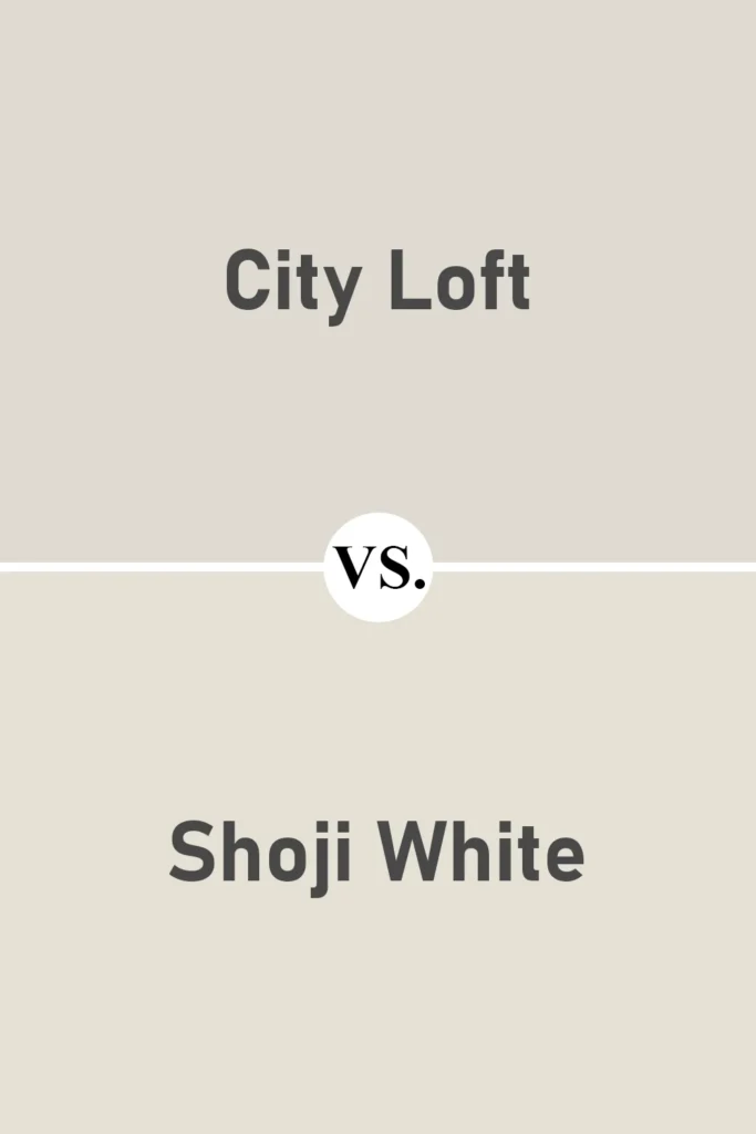
Both of these colors sit in the off-white family and are warm neutrals—but Shoji White has stronger beige undertones compared to City Loft. Where City Loft leans into a red-beige warmth, Shoji White tends to feel a bit creamier and slightly more traditional.
Shoji White might look more yellow in certain lights, while City Loft stays more balanced and muted. If you’re deciding between the two, go with Shoji White if you want a touch more warmth, and stick with City Loft if you prefer a quieter, cooler take on beige.
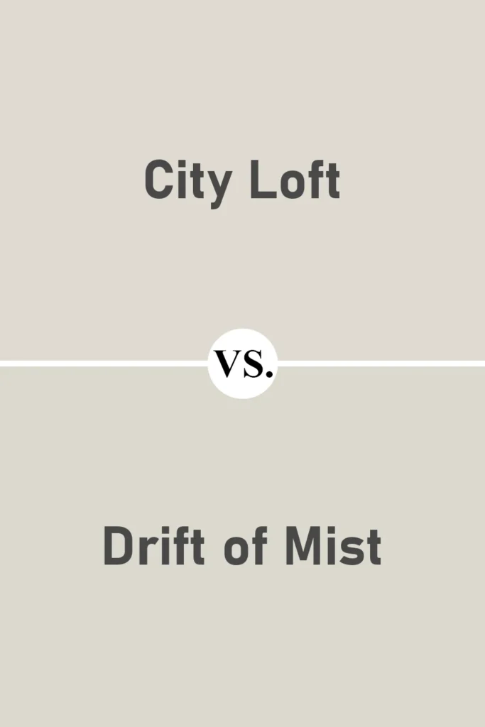
Sherwin Williams City Loft vs Drift of Mist SW 9166
💥🎁 Christmas & Year-End Deals On Amazon !
Don't miss out on the best discounts and top-rated products available right now!
*As an Amazon Associate, I earn from qualifying purchases.
Drift of Mist is noticeably cooler than City Loft. It has soft gray undertones, and in some lighting, it may even come off as a light silvery greige.
If your room has a lot of natural light or you want a more modern, cooler neutral, Drift of Mist could be the better choice. City Loft, on the other hand, feels warmer and cozier, especially in artificial or low light.
It’s great for spaces where you want a bit more softness and subtle warmth.
Sherwin Williams City Loft vs Alabaster SW 7008
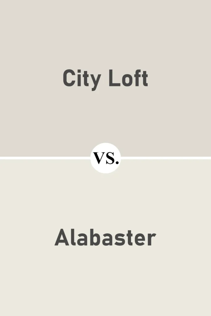
Alabaster is a creamy, warm white that’s a bit lighter and brighter than City Loft. It has a higher LRV (82) compared to City Loft’s 70, which means it reflects more light and will feel more like a white paint color on your walls.
City Loft has more noticeable undertones and more body—so if you want something more substantial and grounded, City Loft wins. But if you’re after an ethereal, barely-there white, Alabaster might be more your speed.
Sherwin Williams City Loft vs Agreeable Gray SW 7029
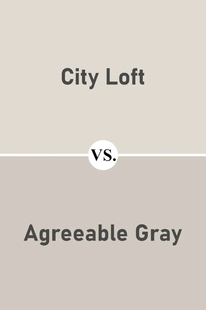
Agreeable Gray is a deeper greige that feels more grounded and distinctly gray-beige compared to City Loft. It’s richer and more pigmented, with a lower LRV (60), so it reads noticeably darker.
City Loft is lighter and more neutral, perfect for a whole-house color, while Agreeable Gray brings a bit more contrast and weight.
If you want a soft background color, City Loft might feel more open and airy. Agreeable Gray is better if you need something deeper and more defined.
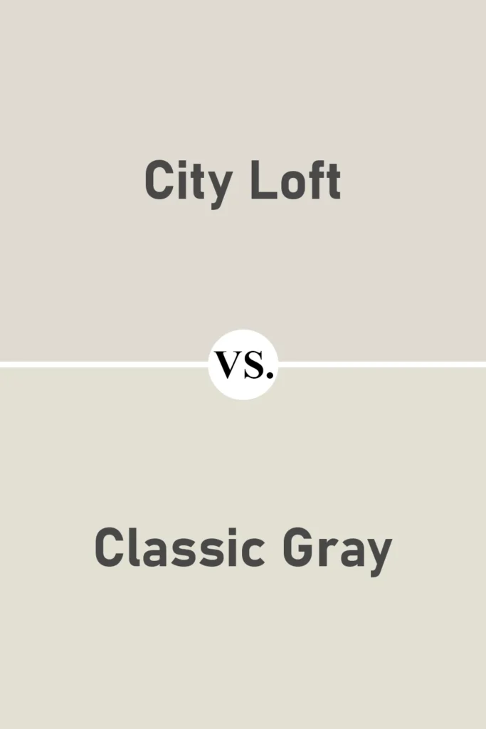
Sherwin Williams City Loft vs Benjamin Moore Classic Gray OC-23
💥🎁 Christmas & Year-End Deals On Amazon !
Don't miss out on the best discounts and top-rated products available right now!
*As an Amazon Associate, I earn from qualifying purchases.
Classic Gray and City Loft have a lot in common—they’re both light, soft, and versatile. However, Classic Gray leans a bit more into a taupe/gray territory, with slightly cooler undertones.
City Loft has that hint of red warmth that gives it a soft, comforting vibe. If you’re trying to decide between them, it really depends on whether you prefer something slightly cooler (Classic Gray) or slightly warmer (City Loft).
Sherwin Williams City Loft vs Benjamin Moore Edgecomb Gray HC-173
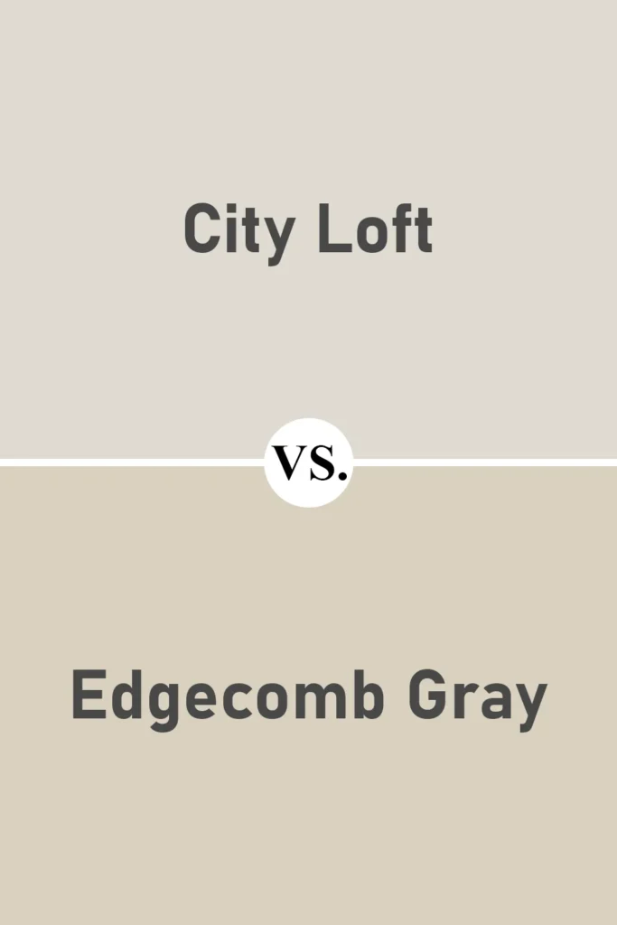
Edgecomb Gray is another popular greige, but it’s definitely darker and a bit more beige than City Loft. Its undertones are more pronounced, and it can read quite warm in a well-lit space.
Compared to City Loft, Edgecomb Gray feels more grounded and traditional, while City Loft feels light, fresh, and a bit more modern.
If you want more depth, Edgecomb Gray is a great pick. But if you prefer something soft and subtle, City Loft might be the better fit.
Where to Use Sherwin Williams City Loft SW 7631?
One of the reasons I’m such a fan of City Loft is its ability to work practically anywhere. It’s one of those “chameleon” colors that shifts ever so slightly based on the room and lighting, but never in a way that feels jarring or unpredictable.
Whether you’re painting a single room or considering it as a whole-house color, City Loft brings a sense of calm and sophistication that adapts beautifully to different spaces.
Because it sits in the off-white family with a soft warm base, it doesn’t overpower a space—but it also doesn’t fade into the background completely. It walks the line between being a supportive neutral and a color that can stand on its own.
Let’s take a look at how it performs in specific areas of the home.
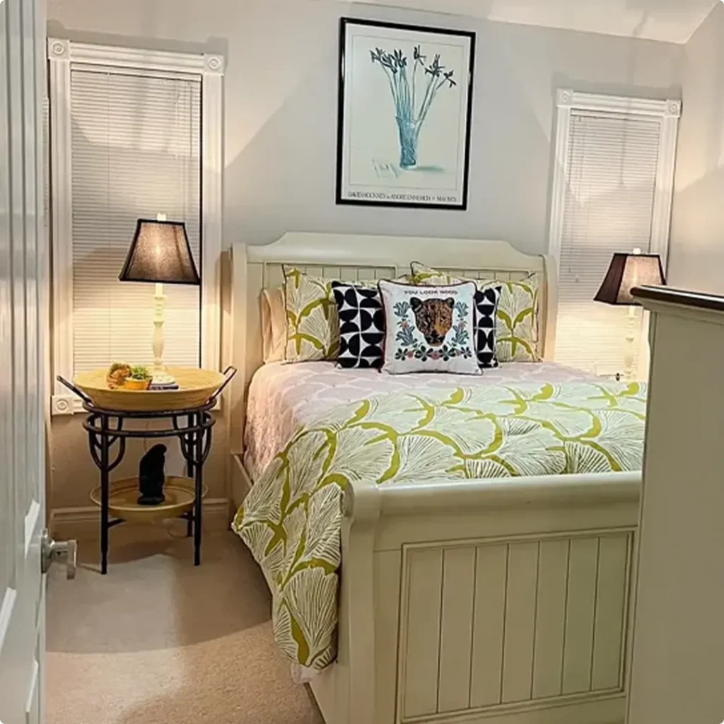
Sherwin Williams City Loft in the Bedroom

In the bedroom, City Loft feels like a breath of fresh air. It’s soft, warm, and incredibly soothing—exactly what I want when I walk into a room designed for rest and relaxation.
The beige and red undertones add just the right amount of coziness, which makes it a perfect backdrop for layered textiles, soft bedding, and ambient lighting.
If your bedroom gets a lot of natural light, City Loft will feel airy and tranquil. In low-light rooms, it still holds up beautifully without feeling too cold or washed out.
I especially love it paired with natural wood furniture, linen fabrics, and brass or matte black accents. It creates an understated elegance that works with everything from modern to farmhouse to transitional styles.
Sherwin Williams City Loft in the Living Room

City Loft is a dream for living rooms—especially if you’re trying to create a clean, cohesive look without the starkness of bright white walls.
It acts like a neutral foundation that allows your furniture, artwork, and decor to shine. But it also has just enough warmth to make the room feel welcoming.
Whether your space leans modern or traditional, City Loft adapts. I’ve seen it look stunning with both light-toned sofas and dark leather ones.
It pairs really well with wood floors, layered rugs, and everything from soft pastels to bold statement pieces. In open-concept living areas, City Loft helps tie different zones together without being too dominant.
Sherwin Williams City Loft in the Kitchen

In kitchens, City Loft brings a light, fresh look that doesn’t feel sterile. It’s an excellent wall color if you have white or off-white cabinets, or even soft greige or taupe cabinetry.
Because it’s warm and neutral, it works well with a range of countertops—quartz, butcher block, marble, or granite.
One of the things I appreciate most is that City Loft balances beautifully with stainless steel or matte black hardware. It also complements both cool and warm metals like brass or bronze.
If your kitchen opens into other rooms, City Loft is a great choice for creating visual continuity while still offering a gentle contrast to cabinets and trim.
Sherwin Williams City Loft in the Bathroom

Bathrooms benefit from light and airy colors, and City Loft is no exception. It brings a spa-like calmness to a space that often needs a little help feeling bright and welcoming—especially smaller bathrooms with limited natural light.
In a well-lit bathroom, the warmth of City Loft adds a cozy glow without making the room feel yellow. In a dimmer bathroom, it keeps the space from feeling too cool or gray.
Pair it with white or soft taupe tile, brushed gold or chrome fixtures, and plenty of plush towels, and you’ve got a clean, serene retreat that feels intentional and polished.
Sherwin Williams City Loft for the Exterior
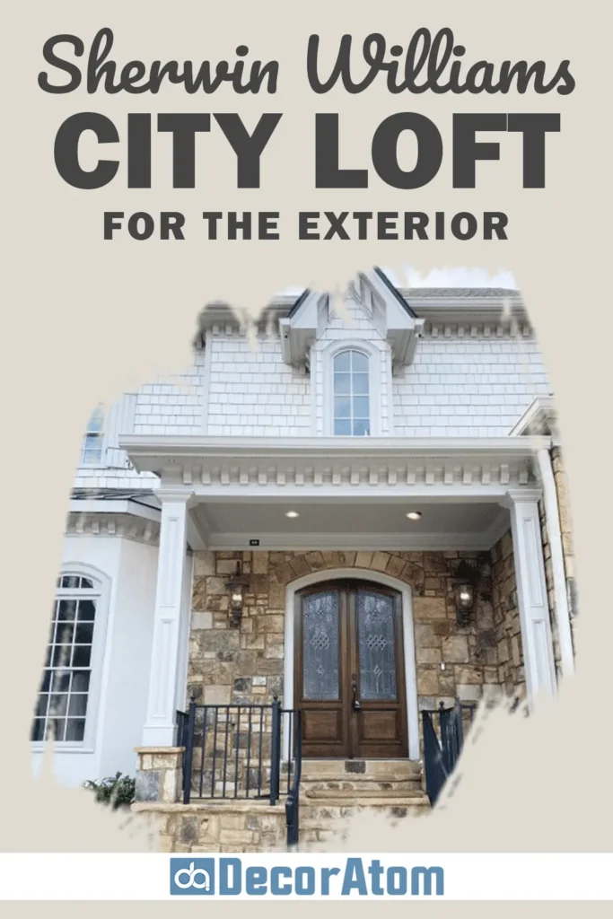
Now, using City Loft on an exterior may seem surprising at first—but trust me, it can look stunning. It’s a great off-white alternative for homeowners who want a softer look than a pure white or stark beige.
On exteriors, City Loft often reads brighter than it does indoors, especially in direct sunlight. It gives you that elegant, timeless appearance while still feeling warm and inviting.
It pairs well with darker trim colors—like charcoal, navy, or black—for contrast, or lighter beiges and warm whites for a more cohesive palette.
Whether you’re going for a coastal vibe, classic cottage look, or a modern farmhouse style, City Loft works beautifully as either the main exterior color or as an accent.
Why I Love Sherwin Williams City Loft
There’s just something about City Loft that feels right. It’s subtle, soft, and easy on the eyes—but not boring. I love that it’s warm without being too yellow, and neutral without slipping into cold gray territory.
It’s one of those rare colors that doesn’t fight with your furniture or decor. Instead, it supports whatever design direction you’re heading in.
City Loft is the kind of color that gives your home a quiet elegance. It doesn’t demand attention, but it still makes a strong impact through its versatility and comfort.
Whether I’m designing a calming bedroom, a bright and open kitchen, or even thinking about curb appeal, City Loft always comes to mind.
It’s also one of the few colors I feel confident recommending to just about anyone—because no matter your style or lighting situation, City Loft has a way of making a space feel thoughtful and pulled together.
Click here to get a Peel & Stick paint sample of City Loft
Final Thoughts
Sherwin-Williams City Loft SW 7631 is more than just a neutral—it’s a foundation for beautiful, livable spaces.
Its warm undertones, high versatility, and soft presence make it an ideal paint color for almost every room in the house. Whether you’re going for calm and cozy or fresh and modern, City Loft delivers.
If you’re unsure where to start with paint colors or feeling overwhelmed by endless swatches, I always recommend giving City Loft a try.
Grab a sample, paint a few test patches, and watch how it transforms throughout the day. It might just be the soft, sophisticated neutral you’ve been looking for.