

If you’re anything like me, you’ve probably stared at a hundred paint swatches trying to find that perfect not-too-white, not-too-dark color that just works.
That’s exactly how I stumbled upon Aesthetic White SW 7035 by Sherwin-Williams.
It’s one of those magical shades that doesn’t scream for attention, but quietly pulls a room together with its soft, welcoming vibe.
What I love most about this color is how versatile it is.
Whether you’re refreshing your living room, choosing a neutral for a new build, or just trying to find a subtle backdrop that works with almost anything—you might want to give this one a closer look.
Let’s break it all down, starting with what kind of color this actually is.
*This post contains affiliate links. For more details see my full disclosure.

What Color is Sherwin Williams Aesthetic White SW 7035?
Let me put it simply: Aesthetic White is a soft, muted off-white with a touch of warmth.
It’s not a bright, crisp white like you’d use for trim or ceilings. And it’s not a heavy beige or taupe either.
It lives in that beautiful middle ground—light and airy but not stark.
Think of it like a cozy blanket color—neutral enough to blend in but still rich enough to give your walls a hint of personality.
In most rooms, it reads as a warm, calming off-white that feels welcoming and comfortable.

Paint Color Samples
Would you like to sample Aesthetic White paint color? I recommend using Samplize. They offer 12″x12″ peel-and-stick paint swatches that make testing colors super simple. Just stick it on your wall, move it around if needed, and when you’re done—peel it off and toss it. No mess, no cleanup. It’s quick, easy, and way more convenient!

Advantages of using peel and stick paint samples:
- EASY TO USE: Simply move your SAMPLIZE paint sample around the room to test under a variety of lighting conditions.
- AFFORDABLE: Budget-friendly solution and no more buying inaccurate swatches, rollers, wasted paint.
- SUPER FAST DELIVERY: Depending on your location, 1 day delivery is possible.
- ORDER FROM HOME: Save a trip to the store looking for samples.
- NO MESS: SAMPLIZE uses real paint samples with zero-mess
- NO WASTE: No leftover cans or wasted paint.
Is It a Warm Or Cool Color?
Sherwin Williams Aesthetic White is definitely a warm color, but it’s very subtle about it.
This isn’t a yellowy warm white, and it’s not overly creamy either. It has just enough warmth to keep it from feeling cold or sterile, which makes it super livable.
It doesn’t lean into cool tones like blue or gray, so if you’re aiming for something that feels soft and inviting, this is a great option.
Warm whites like Aesthetic White tend to work really well in living spaces, bedrooms, and even kitchens where you want the space to feel comforting rather than clinical.
Also Read: 19 Best Warm White Paint Colors for Living Room
LRV of Sherwin Williams Aesthetic White SW 7035
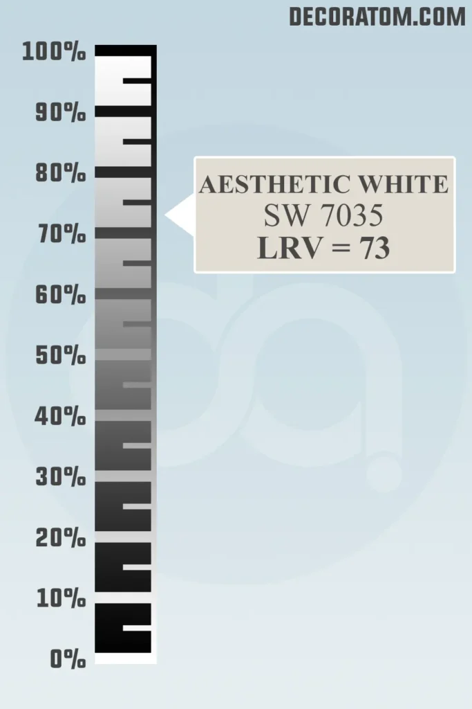
Let’s quickly talk about LRV, or Light Reflectance Value. I know it sounds a little technical, but it’s actually a helpful number to understand how light or dark a color will appear in your space.
The scale runs from 0 to 100—0 is pure black (no light reflected) and 100 is pure white (maximum light reflected).
Aesthetic White SW 7035 has an LRV of 73, which means it reflects a good amount of light and will help your room feel open and bright, especially if you have decent natural light.
That said, it’s not the brightest white on the spectrum, so if your room is very dark or has limited windows, it might appear more muted or beige-like. Still, its LRV makes it a solid choice for a neutral backdrop in most spaces.
Color Family
Aesthetic White falls into the white and off-white color family, but it’s far from the bright, paper-white tones you might be picturing.
It’s part of that subtle, soft white family with hints of warmth and depth.
I’d personally describe it as a modern classic, a color that sits comfortably in the white range but has just enough pigment to feel cozy rather than cold.
RGB Colors
If you’ve ever looked up a paint color online, you’ve probably come across three little numbers labeled RGB.
These stand for Red, Green, and Blue—the primary colors used to create all digital colors, and they give us a better sense of what tones are dominating in a particular shade.
For Sherwin Williams Aesthetic White SW 7035, the RGB values are 227 / 221 / 211.
Let’s break that down:
- Red: 227
- Green: 221
- Blue: 211
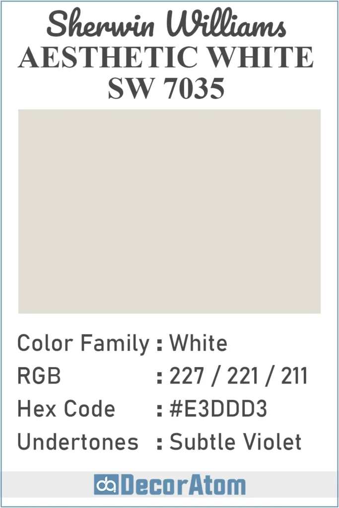
Hex Value
If you’re working on a digital project, or just want to see how a paint color might look online, the hex value is super helpful. It’s basically a six-digit code that represents the exact digital color.
The hex code for Aesthetic White SW 7035 is #E3DDD3.
Undertones of Sherwin Williams Aesthetic White SW 7035
Now, here’s where things get interesting. Aesthetic White has violet undertones, and yes, I know that might sound surprising at first.
But don’t worry—it’s not purple. In fact, in most lighting situations, you probably won’t see violet outright.
It’s more of a hidden undertone that affects how the color reads. These violet undertones help keep the color from leaning too yellow, beige, or muddy.
Instead, they add a subtle coolness and complexity that balance out the warmth from the dominant red and green tones in the RGB mix.
This is what makes Aesthetic White feel so refined and neutral. It has just enough coolness from that violet undertone to keep it from being overly warm, but not so much that it turns into a gray or blue shade.
That balance makes it extremely versatile—especially in spaces where you want a soft, slightly warm white that still feels modern and clean.
How Does Lighting Affect Sherwin Williams Aesthetic White SW 7035?
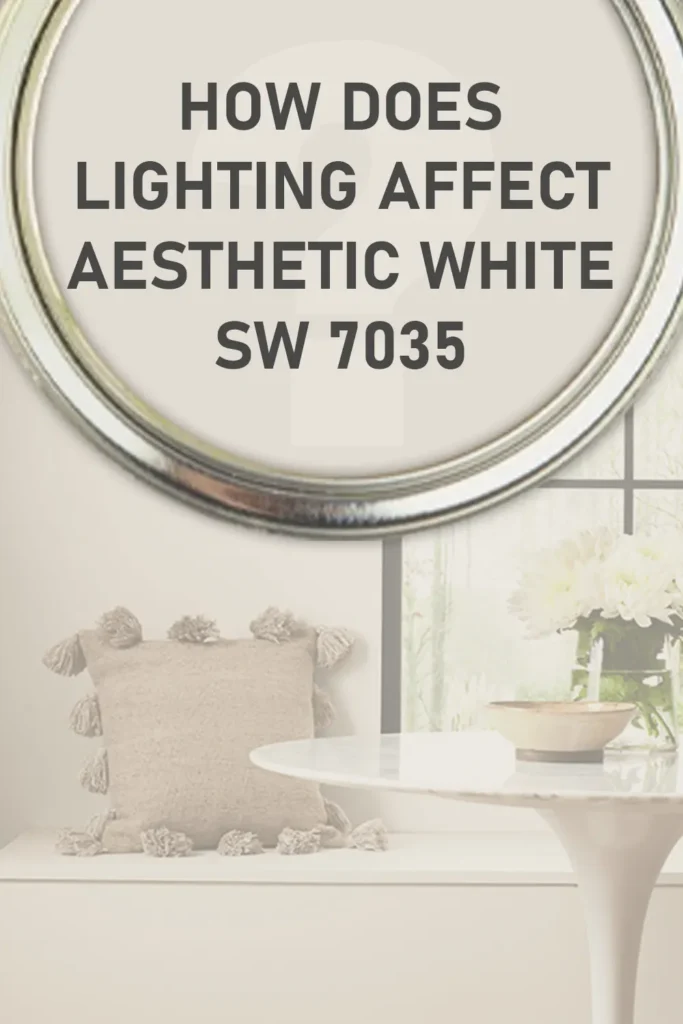
Lighting plays a huge role in how any paint color looks on your walls, and Aesthetic White is no exception.
Because it has a relatively high LRV of 73, it reflects a good amount of light, but the final look still depends on the light source in your space.
Here’s how it tends to behave:
In natural light (especially south-facing rooms): Aesthetic White appears soft and warm, but not overly yellow or creamy. It gives off a quiet elegance that looks clean without feeling stark.
In cool north-facing light: This is where the violet undertones might peek through a little more. The color can look slightly more muted, and the warmth takes a step back. It still looks beautiful, just a bit more subdued and soft grayish-beige.
In artificial light: Depending on your light bulbs, the color can shift slightly. Warm incandescent bulbs will bring out the warm taupe-beige feel, while cooler LEDs may emphasize the neutral or even faint violet tones.
Overall, this is a very stable paint color, but it’s always a smart idea to test a sample in different lighting throughout the day. It can look quite different from morning to night!
Trim Colors to Pair With Sherwin Williams Aesthetic White SW 7035?
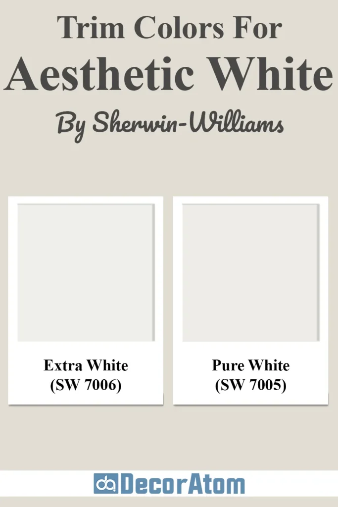
When choosing a trim color to pair with Aesthetic White, you want something that offers enough contrast to define the edges of your room, but not so much that it clashes with the softness of the walls.
Here are some of my go-to trim color options:
Pure White SW 7005 – This is hands-down one of the most popular trim colors to pair with Aesthetic White. It’s a clean white with a tiny bit of warmth, so it won’t look too stark next to your walls, but it still gives a nice crisp finish.
Extra White SW 7006 – If you want a brighter, more modern contrast, Extra White can work beautifully. It’s cooler and more vibrant, so it will really stand out against the soft backdrop of Aesthetic White. This is a great option if you’re aiming for a high-contrast, contemporary look.
Aesthetic White on Trim (Monochromatic look) – For a subtle, seamless look, you could even use Aesthetic White for both the walls and trim in a satin or semi-gloss finish. This works well in minimalist or cozy spaces where you want everything to flow together.
No matter which you choose, make sure to test them side-by-side on your wall. Lighting and sheen can impact how the colors play together, so don’t skip that final step.
Colors Similar to Sherwin Williams Aesthetic White SW 7035
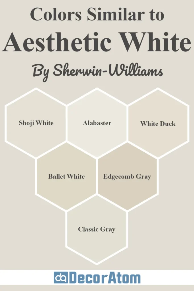
Sometimes, you might love the feel of a color but want something just a bit lighter, cooler, or warmer. That’s where finding similar shades comes in handy.
Maybe Aesthetic White is close, but not quite perfect for your lighting or furniture. Comparing it with look-alikes can help you land on the exact right fit for your space.
Below, I’ve gathered six similar colors—some from Sherwin-Williams and others from Benjamin Moore—that share a similar softness or undertone to Aesthetic White SW 7035. Let’s break down how they compare.
1. Sherwin Williams Shoji White

Shoji White is one of the closest matches to Aesthetic White. It’s another warm off-white, but slightly more beige in tone.
Where Aesthetic White has a subtle violet-gray undertone, Shoji White leans just a touch more yellow and creamy. If your space feels a little too cool or shadowy, Shoji White might add a touch of extra warmth.
2. Sherwin Williams Alabaster
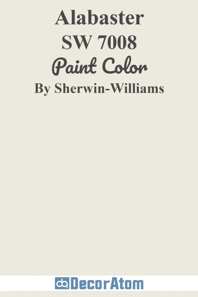
Alabaster is lighter and creamier than Aesthetic White. It has a warmer, slightly yellow undertone, so it will read much more like a soft white rather than a greige or taupe.
If Aesthetic White feels a bit too grounded or beige, Alabaster is a brighter, airier alternative—ideal for traditional spaces.
Also Read: Alabaster SW 7008 Paint Color Review
3. Sherwin Williams White Duck

White Duck is in the same family as Aesthetic White—it’s warm, muted, and earthy. However, it leans just a bit more tan or khaki in tone.
It has less violet influence and comes off as slightly more grounded and creamy. If you’re going for a cozy farmhouse or rustic modern vibe, White Duck is a lovely alternative.
4. Benjamin Moore Ballet White

This one’s a soft off-white with gray-beige (or greige) undertones, much like Aesthetic White. But Ballet White has a little more visible warmth and less of that subtle violet.
It’s creamy but not yellow, and feels a touch richer. I’d say Ballet White is a great pick if you like the idea of Aesthetic White but want just a smidge more depth.
5. Benjamin Moore Edgecomb Gray
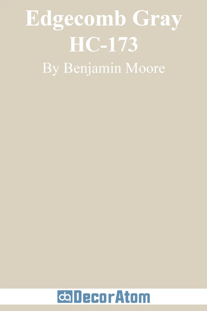
Edgecomb Gray is darker than Aesthetic White and more distinctly greige. It doesn’t sit in the white family, but it does share the same kind of softness and neutrality.
It’s warmer and cozier, and better suited if you want something a few shades deeper that still gives a quiet, balanced feel.
6. Benjamin Moore Classic Gray

Classic Gray is another elegant, light neutral that people often compare to Aesthetic White. It has a more noticeable gray base, and it leans a bit cooler than Aesthetic White in most spaces.
It’s great if you want that same refined, muted quality but with a cooler, more modern edge.
Colors that Go With Sherwin Williams Aesthetic White SW 7035
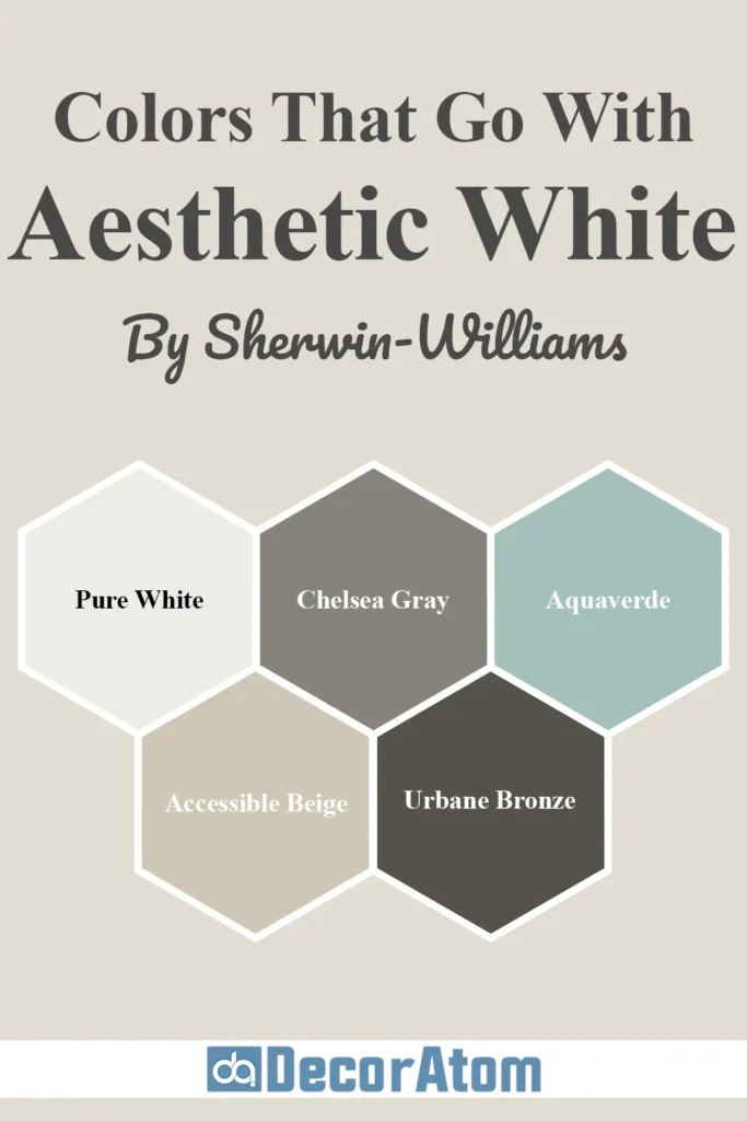
One of the reasons I keep coming back to Aesthetic White is because it plays so well with others.
It’s subtle and quiet, which means it won’t compete with bolder colors—but it also won’t disappear entirely. You can pair it with dark shades for contrast, soft hues for flow, or earthy colors for balance.
Here are five colors that coordinate beautifully with Aesthetic White SW 7035, including three that you mentioned:
1. Pure White

Pure White is a clean, soft white that makes an ideal trim color next to Aesthetic White. It has a hint of warmth, so the two colors blend well without clashing.
If you want crisp contrast that still feels cohesive, this combo is a go-to. It works especially well in modern farmhouses or updated traditional interiors.
Also Read: Pure White SW 7005 Paint Color Review
2. Chelsea Gray

Chelsea Gray brings boldness and drama to the softness of Aesthetic White.
It’s a rich, medium-to-dark gray with warm undertones, which makes it a beautiful pairing for cabinetry, accent walls, or even doors.
This combination gives you a sense of grounded sophistication without being harsh.
3. Aquaverde
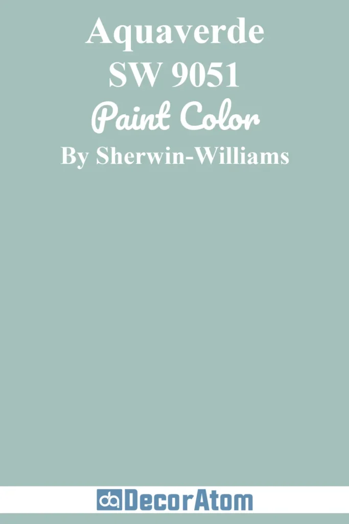
This is where things get a little more playful. Aquaverde is a gorgeous green-blue with a fresh, coastal feel. Pairing it with Aesthetic White creates a calming, nature-inspired palette.
Think spa bathrooms, beachy bedrooms, or boho-chic living rooms—it adds color without overwhelming the space.
4. Accessible Beige
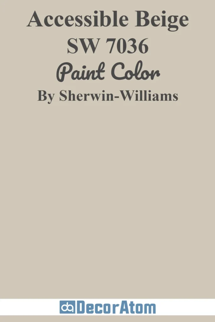
Since Accessible Beige sits right next to Aesthetic White on the color strip, they naturally complement each other.
It’s warmer and deeper, so it works well for accent walls or larger adjacent rooms like hallways. It keeps everything feeling neutral, layered, and soft.
Also Read: Accessible Beige SW 7036 Paint Color Review
5. Urbane Bronze

For a bold contrast that’s still in harmony, Urbane Bronze is a fantastic pick.
It’s a deep, earthy charcoal brown-gray that pops beautifully next to the softness of Aesthetic White. Use it on cabinets, window trim, or a front door for a moody, modern vibe.
Comparing Sherwin Williams Aesthetic White SW 7035 With Other Colors
Sometimes, the best way to decide if a color is right for you is to see it side by side with others.
Whether you’re stuck between a few options or just want to understand the differences, comparing colors directly can really help you feel confident in your choice.
Let’s take a closer look at how Sherwin Williams Aesthetic White SW 7035 stacks up against six other popular paint colors:
1. Aesthetic White vs Shoji White
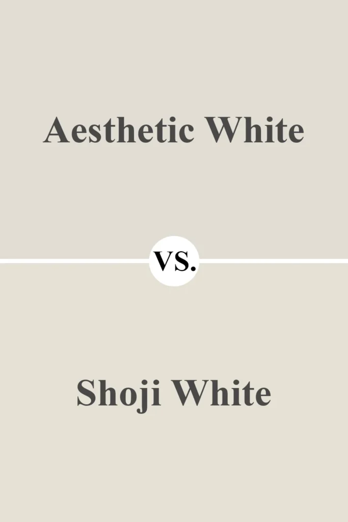
These two are close cousins. Shoji White leans just a touch more yellow and earthy. Aesthetic White, with its violet-gray undertone, feels a bit more refined and neutral.
Shoji is great for very warm, rustic spaces. Aesthetic White is better if you want a neutral that doesn’t lean too far into beige.
2. Aesthetic White vs Alabaster
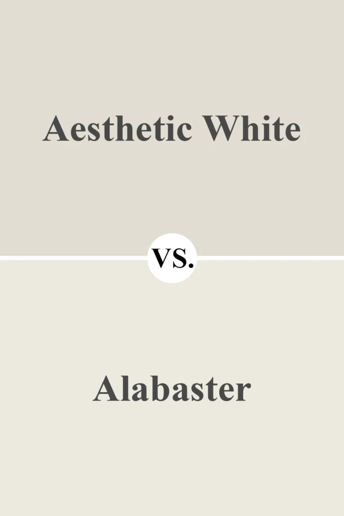
Alabaster is a much creamier white with warmer undertones. It reads more like an actual white in a space, while Aesthetic White comes off as a very light greige.
If you want a cozier, cottage-style white, go for Alabaster. If you’re looking for something more subdued and sophisticated, Aesthetic White might be your pick.
3. Aesthetic White vs White Duck
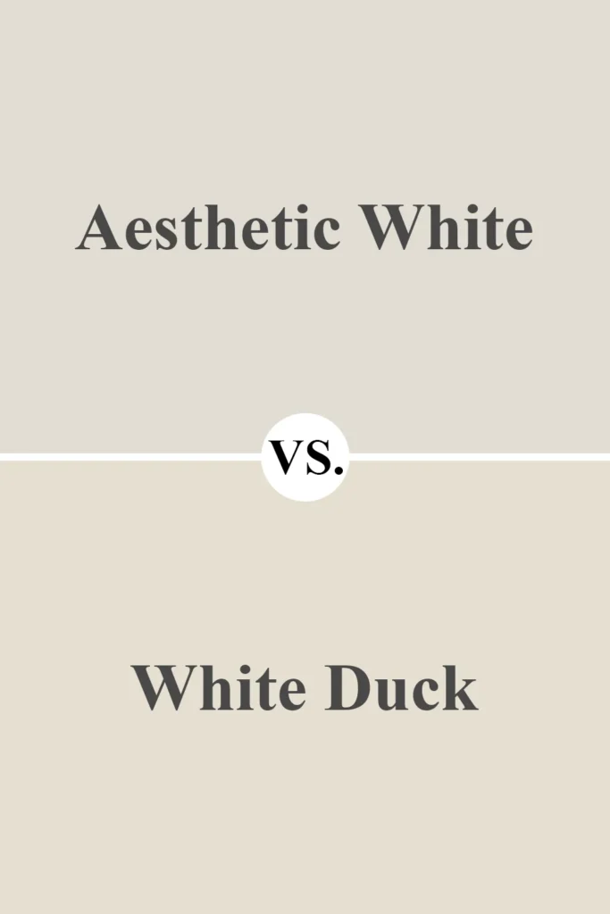
White Duck is deeper and more beige-tan than Aesthetic White. It feels a little heavier and has a more noticeable warmth.
Aesthetic White is slightly lighter and more balanced, making it more flexible in cooler or mixed lighting conditions.
4. Aesthetic White vs Agreeable Gray
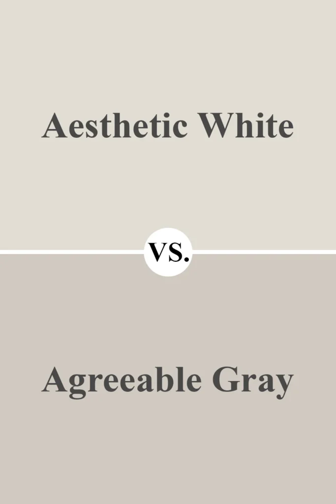
Agreeable Gray is a true greige—darker than Aesthetic White with more gray content.
It has stronger depth and presence, which is perfect if you want a cozy, grounded wall color.
Aesthetic White is the lighter, softer alternative, ideal for brighter spaces or those wanting a more subtle neutral.
Also Read: Agreeable Gray SW 7029 Paint Color Review
5. Aesthetic White vs Classic Gray (Benjamin Moore)
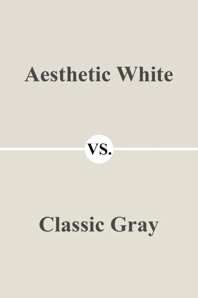
Classic Gray is cooler and a bit more modern in feel. It has stronger gray undertones compared to Aesthetic White’s soft taupe-violet vibe.
If you want a modern, minimal feel, Classic Gray might edge out. But for warmth and softness, Aesthetic White wins.
6. Aesthetic White vs Edgecomb Gray (Benjamin Moore)
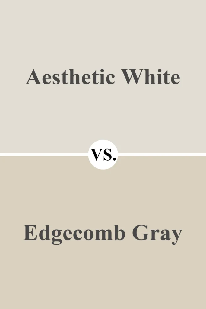
Edgecomb Gray is significantly darker and more greige-tan in tone. It doesn’t read like a white at all in most rooms.
It’s great for open floor plans and larger spaces, while Aesthetic White is a better choice if you want a light, breezy wall color that stays neutral without looking washed out.
Where to Use Sherwin Williams Aesthetic White SW 7035?
One of the best things about Aesthetic White SW 7035 is just how versatile it is. This isn’t one of those whites that only works in certain lighting or specific styles.
Whether you’re going for modern, traditional, transitional, farmhouse, or coastal—it fits right in without feeling out of place.
Because it’s soft, warm, and not too stark, Aesthetic White can be used in just about any room of the house.
But to really show you how flexible it is, let me walk you through how it performs in some key spaces—based on real experience and lots of observation.
Sherwin Williams Aesthetic White in the Bedroom
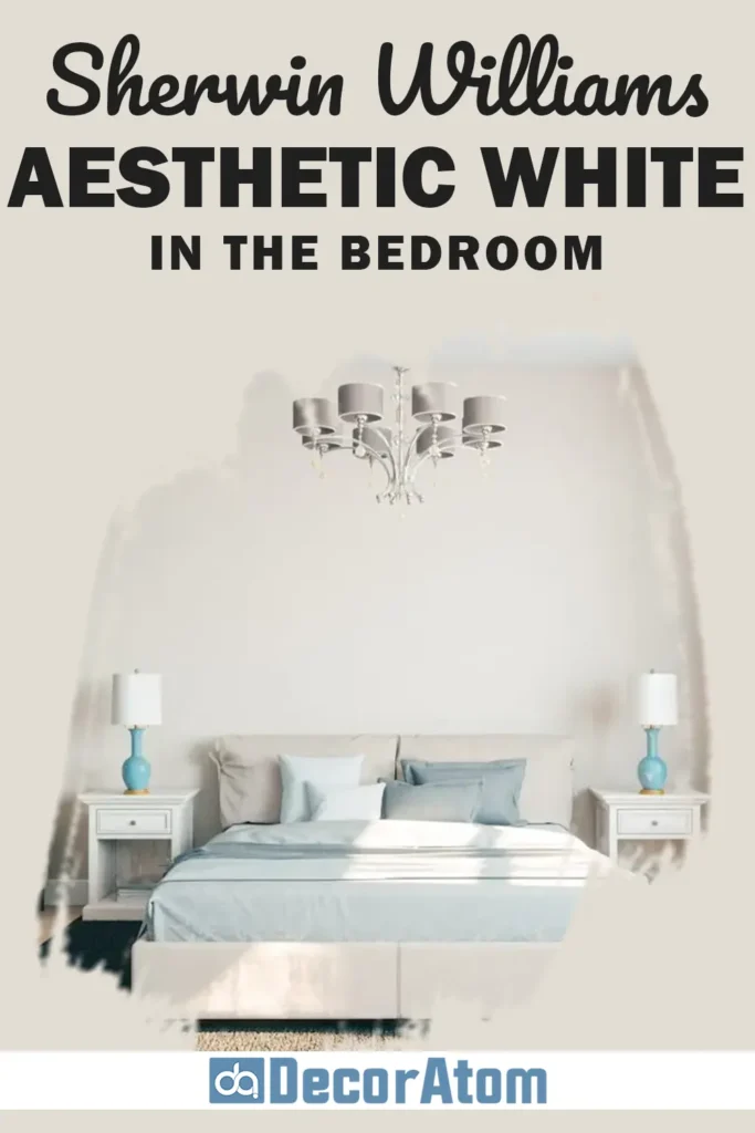
Bedrooms are where you want things to feel calm, cozy, and restful—and Aesthetic White nails that vibe.
It’s light enough to keep the space feeling airy and open, but it also brings just enough warmth to make it feel soft and grounded.
This isn’t a bright or clinical white—it’s a color that helps you unwind at the end of the day.
Pair it with natural textures like linen bedding, wood furniture, and soft rugs, and you’ve got yourself a neutral canvas that feels both serene and sophisticated.
It also works beautifully with deeper accent colors like navy, sage green, or charcoal if you want to bring in some contrast.
Sherwin Williams Aesthetic White in the Living Room

In the living room, Aesthetic White becomes the perfect backdrop for just about any design style.
Whether you’re going for cozy and traditional or minimal and modern, it quietly supports your decor without stealing the spotlight.
What I really love is how it works with both warm and cool color palettes.
You can use it with warm wood tones, earthy textiles, and gold or brass accents—or flip the vibe and go for cooler grays, blacks, and brushed nickel. It won’t fight with your furniture or art.
Instead, it lets your space breathe and feel polished without feeling sterile.
And if your living room gets a lot of natural light? Even better. Aesthetic White will glow beautifully during the day without ever looking too stark or washed out.
Sherwin Williams Aesthetic White in the Kitchen

Kitchens can be tricky when it comes to paint colors. You want something clean, timeless, and flexible enough to work with cabinetry, countertops, and backsplashes. Aesthetic White checks all those boxes.
If you have white or off-white cabinets, it pairs beautifully—especially if you’re using Pure White SW 7005 or something similar for trim or upper cabinetry.
If your cabinets are darker (like navy, charcoal, or wood tones), Aesthetic White keeps the room feeling bright without clashing.
Plus, it holds up well under various lighting conditions. Whether you’re working with cool LEDs or warm pendants, it won’t dramatically shift like some whites do.
Sherwin Williams Aesthetic White in the Bathroom

Bathrooms are another space where lighting can play a big role, and that’s why I love Aesthetic White here too.
It’s forgiving, neutral, and doesn’t show as much yellow or beige as some warmer whites might. It holds onto its softness but still feels clean and fresh.
If you’re designing a spa-like bathroom, this color works beautifully with soft greens, muted blues, and brushed nickel or matte black fixtures.
Add in some white towels and natural wood accessories, and you’ve got a space that feels relaxing but not boring.
It also works great if you want a monochromatic look—using Aesthetic White on the walls and Pure White on trim or vanities creates a crisp contrast that’s still soft on the eyes.
Sherwin Williams Aesthetic White for the Exterior

Using Aesthetic White on the exterior of your home might surprise you—but yes, it can absolutely work outdoors too.
Because it’s a soft white with warm undertones, it doesn’t look too stark or overly bright in direct sunlight like cooler whites often do.
It’s especially beautiful on traditional or farmhouse-style homes when paired with darker trim or shutters (think Urbane Bronze SW 7048 or even black). It has a clean, classic look that still feels inviting and lived-in.
That said, if you live in a very sunny climate, keep in mind that the color will look a little lighter and warmer outside.
Test a swatch in natural daylight to make sure you love how it looks on your siding or stucco.
Why I Love Sherwin Williams Aesthetic White SW 7035
I’ve worked with a lot of paint colors over the years, but Aesthetic White SW 7035 is one that keeps showing up on my shortlist—and for good reason.
First, it’s just so easy to live with. It doesn’t demand attention or overwhelm a space, but it always makes a room feel polished and pulled together.
It’s warm without being yellow, neutral without being cold, and light without being washed out.
I also love how flexible it is. I’ve seen it work in modern kitchens, cozy bedrooms, even exterior spaces—and it always feels right at home. It’s the kind of color that quietly adapts to whatever you pair it with.
But what really sold me? It’s the kind of white that makes a room feel calm. And honestly, who couldn’t use more of that?
Also Read: 31 Most Popular Sherwin Williams Paint Colors
Final Thoughts
If you’re hunting for that perfect off-white that feels neutral, warm, and elegant all at once, Sherwin Williams Aesthetic White SW 7035 is 100% worth considering.
It’s one of those rare shades that manages to be both subtle and sophisticated—never too cold, never too yellow, and always just right.
Whether you’re refreshing a single room or planning a whole-home palette, this is a color that will quietly support your design vision without ever stealing the show.
It’s timeless, versatile, and surprisingly easy to work with.
In short? Aesthetic White isn’t just a paint color—it’s a mood. And it’s one I’ve grown to love more and more with each project.