Picking the right paint color. Oh my gosh, it can feel like the hardest decision ever, can’t it? Seriously. You’re standing there looking at a tiny swatch. You try to imagine it on an entire wall. It’s a huge commitment.
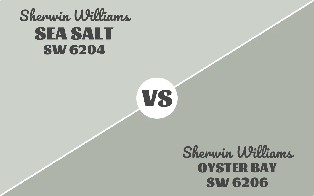
Right now, we’re diving into a very popular color comparison. It’s a battle between two coastal beauties from Sherwin Williams. They are Sea Salt SW 6204 and Oyster Bay SW 6206.
These two shades are right next door to each other on the paint chip fan deck. But they’re worlds apart in how they actually look on your walls. It’s a classic pairing of a light and airy shade versus its deeper, moodier cousin.
I’ve seen so many people wrestle with this choice. It’s all about finding that perfect balance. You want enough color to make a statement. But you also don’t want the room to feel small or dark.
Sea Salt is a superstar color, everyone knows it. Oyster Bay is a little more of an underdog. But it deserves all the love too. We’re going to break down everything. We will talk about their lightness. We will talk about their undertones. And we will figure out which one is the true winner for your home.
Key Differences Between Sea Salt And Oyster Bay
The biggest difference? Lightness.
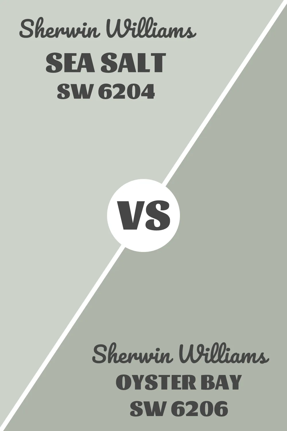
Sea Salt reflects 63% of light. Oyster Bay reflects 44%. That’s almost a 20-point gap. In a small room or a space with limited natural light, that difference will smack you in the face.
Sea Salt leans blue. Oyster Bay leans slate-blue, which means it’s got more gray mixed in. That makes Oyster Bay feel more neutral and less obviously “coastal.”
Sea Salt gives you that bright, open feeling. Oyster Bay gives you cozy and wrapped-up.
If you put them next to each other, Sea Salt looks almost white in comparison. Oyster Bay looks like Sea Salt’s moodier cousin who listens to jazz and drinks black coffee.
Also Read: Sherwin Williams Agreeable Gray VS Accessible Beige: What’s the Difference?
When to Use Sea Salt And Oyster Bay
Picking between these two really comes down to your space and what you’re trying to feel when you walk into the room.
They each have their moment to shine. Let me walk you through when to reach for which one.
Use Sea Salt if:
You have a small bathroom that needs to feel bigger. Sea Salt opens up tight spaces like magic.
Your room doesn’t get much natural light. That higher LRV keeps things from feeling like a cave.
You want a soft, calming backdrop that doesn’t demand attention. Sea Salt is the ultimate supporting actor in your design.
You’re going for that breezy, coastal cottage vibe. It’s basically made for shiplap and white linens.
You need something that plays well with white trim. Sea Salt and crisp white look gorgeous together without fighting for attention.
Your space already has darker furniture or bold accents. Sea Salt gives them room to breathe.
Use Oyster Bay if:
You have a big room with tons of natural light that needs grounding. Oyster Bay adds just enough weight without going dark.
You want something more sophisticated than the typical light coastal color. It’s got depth.
Your space has warm wood tones. Oyster Bay’s gray-blue undertones create beautiful contrast with oak or walnut.
You’re tired of rooms that feel too bright or sterile. Oyster Bay brings in softness without the harsh brightness.
You want a color that works in a modern farmhouse or transitional style. It’s less beach house, more refined retreat.
You’re painting a north-facing room. Oyster Bay handles cooler light better than super-light colors that can look washed out.
Emotional Effects: Sea Salt vs Oyster Bay
Colors do things to us. Whether we realize it or not.
Sea Salt walks into a room and immediately makes you breathe deeper. It’s got this peaceful, expansive quality that tricks your brain into relaxing. That blue undertone connects to water, sky, open horizons. Your shoulders drop a little when you’re surrounded by it.
People describe Sea Salt spaces as calming, spa-like, serene. It’s the paint color equivalent of a slow exhale. If anxiety had an opposite color, Sea Salt would be in the running.
It creates that barely-there backdrop that doesn’t demand anything from you. You can think clearly in a Sea Salt room. It gets out of your way.
But here’s something interesting. Because it’s so light and reflects so much brightness, it can actually energize a space too. Not in a jittery way. More like gentle morning energy that helps you start your day without overwhelming you.
Now Oyster Bay. Different story.
Oyster Bay wraps around you. It’s still calming, but in a quieter, more introspective way. That slate-blue undertone adds a touch of melancholy, but not in a sad way. More like thoughtful. Contemplative.
It makes spaces feel intimate. Like you could curl up with a book and lose three hours without noticing. Oyster Bay rooms feel like a hug.
The darker value creates boundaries in a good way. Your space feels defined. Contained. Safe. It’s especially nice in bedrooms where you actually want that cocooning effect at the end of a long day.
Some people find it sophisticated and grown-up. It doesn’t have that bright, breezy cheerfulness of Sea Salt. Instead, it’s got this understated elegance that whispers rather than speaks.
But be careful in small, dark spaces. Oyster Bay can tip from cozy into closed-in if you don’t have enough light to balance it out. In the wrong room, it might make you feel a bit confined rather than comforted.
Both colors reduce visual noise and create calm. Sea Salt does it with lightness and airiness. Oyster Bay does it with softness and depth. Pick based on whether you need to feel expansive or held.
Detailed Comparing Sea Salt And Oyster Bay
Let me walk you through everything you need to know about these two colors.
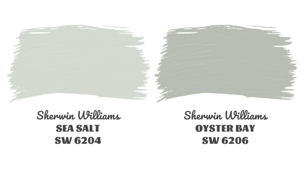
Sea Salt is that friend who shows up to brunch looking effortlessly put together. The hex value #CDD2CA tells you it’s sitting in that perfect sweet spot between gray and green with just enough blue to keep things interesting.
With an LRV of 63, it’s legitimately light. Not quite white, but close enough that it bounces light around your room like nobody’s business. You’ll notice this especially in smaller spaces or rooms with only one window.
Those blue undertones are what give Sea Salt its personality. They’re subtle. You won’t walk in and think “wow, blue walls.” But they’re there, creating that coastal, airy feeling that makes the color so popular.
Sea Salt works best in bathrooms, bedrooms, and any space where you want calm without commitment. It’s versatile enough for modern farmhouse, coastal, transitional, even Scandinavian styles.
Finishes matter with this one. Eggshell or satin work beautifully in living areas. Satin or semi-gloss handle bathrooms and kitchens where you need something wipeable.
Now Oyster Bay. This is Sea Salt’s sophisticated older sibling.
Hex value #AEB3A9 shows you immediately that it’s darker and grayer. Less bright, more depth.
That LRV of 44 means it’s absorbing more light than it’s reflecting. This creates a totally different mood. Cozier. More intimate. Less “look at me” and more “stay a while.”
The slate-blue undertones are where Oyster Bay gets interesting. It’s not just gray-blue. That slate element adds complexity and keeps it from reading as flat or boring.
Oyster Bay shines in larger rooms with good natural light. Master bedrooms, living rooms, home offices where you want to feel focused and calm. It works in modern farmhouse and transitional styles but leans more refined than beachy.
Same finish recommendations. Eggshell for walls, satin for higher-traffic areas, semi-gloss for trim if you’re doing a monochromatic look.
Here’s your comparison table:
| Features | Sea Salt | Oyster Bay |
|---|---|---|
| Hex Value | #CDD2CA | #AEB3A9 |
| LRV | 63 | 44 |
| Undertones | Blue | Slate-blue |
| Use | Bathrooms, bedrooms, small spaces, areas needing brightness | Living rooms, master bedrooms, large spaces with natural light |
| Finishes | Eggshell, satin, semi-gloss | Eggshell, satin, semi-gloss |
| Style Fit | Coastal, modern farmhouse, transitional, Scandinavian | Modern farmhouse, transitional, contemporary, refined spaces |
Real-Life Photos: Sea Salt vs Oyster Bay
Seeing these colors in actual homes changes everything.
Paint chips lie. Honestly, they do. The lighting in the store is completely different from your house. The tiny square doesn’t show you how a color behaves across an entire wall or how it shifts from morning to evening.
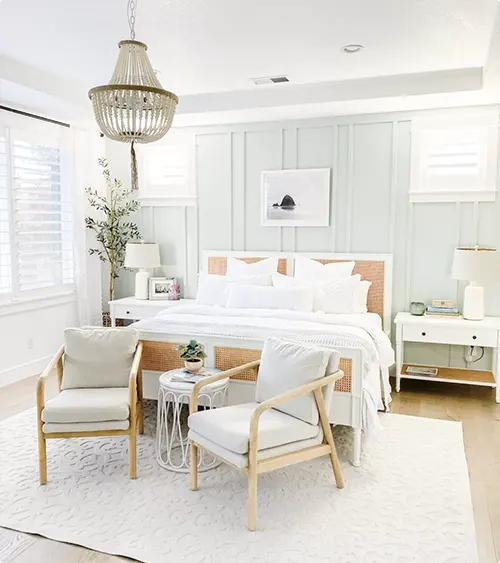
That’s why real-life photos matter so much. You get to see Sea Salt in someone’s actual bathroom with their actual lighting. You see Oyster Bay in a real bedroom with real furniture.
Pay attention to the time of day in these photos too. Notice how Sea Salt might look almost white in bright afternoon light but shows its blue-green personality in softer morning light. Watch how Oyster Bay can look almost gray in some shots and distinctly blue-green in others.
These photos also show you something important. How each color plays with different design styles, furniture colors, and flooring. That’s the stuff you can’t figure out from a paint chip.
Sea Salt SW 6204
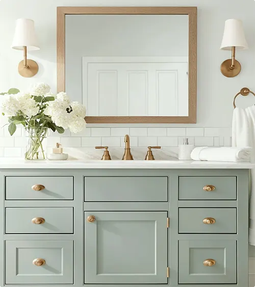

Oyster Bay


Sea Salt vs Oyster Bay: Are They Warm or Cool Paints?
Both of these lean cool. No question.
Sea Salt is a cool color. Those blue undertones push it firmly into cool territory. But here’s the thing. It’s not aggressively cool. It’s not icy or harsh. It’s more like cool with a soft edge.
You won’t get that stark, sterile feeling you might get with a true cool gray. Sea Salt has just enough warmth mixed in to keep it approachable. It’s cool, but friendly cool.
In north-facing rooms, Sea Salt will lean even cooler because of the natural light coming in. In south-facing rooms with warm sunlight, it might show a bit more of its green side and feel slightly warmer.
Oyster Bay is also cool, but it handles warmth differently.
That slate-blue undertone is decidedly cool. But the deeper value and the gray mixed in create this interesting effect. It doesn’t feel as obviously cool as lighter blue-grays do.
In rooms with warm wood tones or warm lighting, Oyster Bay plays nice. It creates contrast without clashing. The coolness actually highlights the warmth of the wood, which can be really beautiful.
If you have a lot of warm elements in your space already and you’re worried about things feeling too cold, Oyster Bay might actually be the safer choice. Its depth prevents it from reading as icy.
But if you have cool-toned everything already, be aware. Oyster Bay plus cool floors plus cool furniture can tip the whole room into feeling chilly. You might need to bring in some warm textiles or wood elements to balance it out.
Neither of these is what I’d call a warm paint. If you want warm, you’re looking at the wrong colors entirely. These are both firmly on the cool side of the spectrum.
Coordinating Colors
Getting the right colors to pair with Sea Salt or Oyster Bay can make or break your whole design.
You want colors that either complement the undertones or create intentional contrast. Colors that work with the mood you’re building, not against it.
The good news is both of these are pretty flexible. They’re not demanding divas that only work with one specific palette. But they definitely have their favorites.
Sea Salt

Sherwin Williams Pure White (SW 7005) is basically Sea Salt’s best friend. Pure White is clean and bright without being stark. It makes Sea Salt look more intentional and designed rather than just pale. Use it on trim, ceilings, or adjacent rooms.
Sherwin Williams Naval (SW 6244) creates gorgeous contrast if you want a darker accent wall or cabinetry. That deep navy plays off Sea Salt’s blue undertones beautifully. It’s coastal without being cliché.
Sherwin Williams Accessible Beige (SW 7036) brings in warmth if your Sea Salt space is feeling too cool. It’s a greige that has enough warmth to balance out the blue without clashing. Great for adjacent rooms or furniture.
Oyster Bay

Benjamin Moore Simply White (OC-117) is cleaner and brighter than most whites. It gives Oyster Bay room to be the star without competing. Perfect for trim and ceilings when you want crisp contrast.
Sherwin Williams Urbane Bronze (SW 7048) is bold but sophisticated. If you’re doing Oyster Bay walls, Urbane Bronze on an accent wall or built-ins adds depth and drama. They share that refined, modern vibe.
Benjamin Moore Revere Pewter (HC-172) is warmer and works when you need to transition from Oyster Bay into a warmer space. It’s got enough gray to coordinate but enough warmth to shift the mood. Good for hallways connecting different zones.
Trim Color with Sea Salt And Oyster Bay
Trim color matters more than people think.
The right trim makes your wall color sing. The wrong trim makes everything look muddy or confusing. And with colors like Sea Salt and Oyster Bay that have these soft, complex undertones, your trim choice really shows up.
Most people default to white trim. That’s fine. But which white matters a lot.
For Sea Salt:
Sherwin Williams Pure White (SW 7005) is my top pick. It’s bright and clean without being too stark or cool. The slight warmth in Pure White keeps Sea Salt from looking washed out. They balance each other perfectly.
Sherwin Williams Extra White (SW 7006) works if you want more contrast. It’s brighter and crisper than Pure White. This is the move if you want your trim to really pop against the walls.
Benjamin Moore Simply White (OC-117) is another great option. It’s got just a hint of warmth that plays nicely with Sea Salt’s undertones. Clean, classic, versatile.
For Oyster Bay:
Sherwin Williams Pure White (SW 7005) works here too. It creates nice contrast without being too harsh. The brightness lifts Oyster Bay without fighting it.
Benjamin Moore White Dove (OC-17) is softer and creamier. If you want less contrast and more of a monochromatic, sophisticated look, White Dove is your friend. It lets Oyster Bay be moody without the trim screaming for attention.
Sherwin Williams Alabaster (SW 7008) sits right between Pure White and White Dove. It’s got enough brightness to create definition but enough softness to feel cohesive. Really popular choice for a reason.
What’s the Verdict? Should I Choose Sea Salt or Oyster Bay
Here’s the honest truth. Both are great colors. Neither is going to ruin your house.
Choose Sea Salt if you need light. If your space is small, dark, or doesn’t get much natural light, Sea Salt opens everything up. It’s also the better choice if you want that classic coastal, airy vibe. If you’re someone who needs their space to feel bright and energizing, Sea Salt delivers.
Choose Oyster Bay if you have light to spare. Big rooms, lots of windows, south-facing spaces. Oyster Bay adds sophistication and coziness without going dark. It’s the move if you want something more refined and less obviously beachy. If you want to feel wrapped up and cozy in your space, Oyster Bay is your color.
Still not sure? Get samples. Seriously.
Paint swatches on your actual walls. Look at them in morning light, afternoon light, evening light. Live with them for a few days. The color that makes you smile when you walk past it is your answer.
Your lighting is different from mine. Your furniture is different. Your gut knows which one belongs in your space.
👉 Order Sea Salt peel-and-stick sample from Samplize
👉 Order Oyster Bay peel-and-stick sample from Samplize
FAQs
Is Oyster Bay darker than Sea Salt?
Yes. Oyster Bay has an LRV of 44 while Sea Salt sits at 63. That’s a pretty significant difference. Oyster Bay will look noticeably darker on your walls and create a cozier, more intimate feeling.
Can I use Sea Salt in a north-facing room?
You can, but be aware it’ll lean cooler and might show more of its blue undertones. North-facing rooms get cooler, indirect light. Sea Salt won’t look bad, but it might feel a bit more gray-blue than you expect. Sample it first.
What colors go well with Oyster Bay?
Crisp whites like Simply White or Pure White work great for trim. For coordinating colors, try Urbane Bronze for drama or Revere Pewter for warmth. Oyster Bay also plays nicely with natural wood tones and warm textiles.
Which is better for small bathrooms?
Sea Salt wins for small bathrooms. That higher LRV of 63 reflects more light and makes the space feel bigger and brighter. Oyster Bay could work but might make a small bathroom feel cramped.
Does Oyster Bay look good with wood floors?
Yes. Oyster Bay’s cool slate-blue tones create beautiful contrast with warm wood floors. The combination feels balanced and sophisticated. Oak, walnut, and pine all look great with Oyster Bay.
Can I use Sea Salt and Oyster Bay in the same house?
Absolutely. They’re from the same color family and coordinate well. You might use Sea Salt in smaller spaces like bathrooms and Oyster Bay in larger spaces like the master bedroom. Just make sure the transition feels intentional.
What’s the best finish for Sea Salt on walls?
Eggshell or satin work best for most walls. Eggshell gives you a soft, low-sheen look that’s easy to touch up. Satin has a bit more sheen and is easier to wipe clean, making it great for bathrooms or high-traffic areas.
Is Oyster Bay warm or cool?
Oyster Bay is a cool color. Those slate-blue undertones put it firmly on the cool side of the spectrum. However, its deeper value and gray component keep it from feeling harsh or icy like some cool colors can.

