
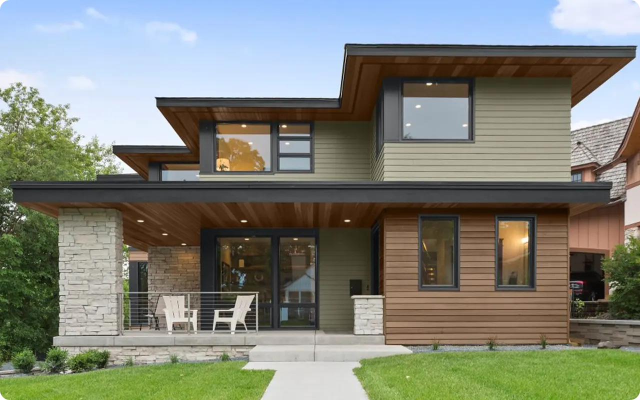
Picking the right paint color for your home’s exterior can honestly feel overwhelming.
I get it—there are so many shades to choose from, and the stakes feel high because it’s not something you want to change every year.
I’ve personally gone down this rabbit hole more times than I care to admit—and if there’s one brand that keeps popping up for its reliability and rich color options, it’s Behr.
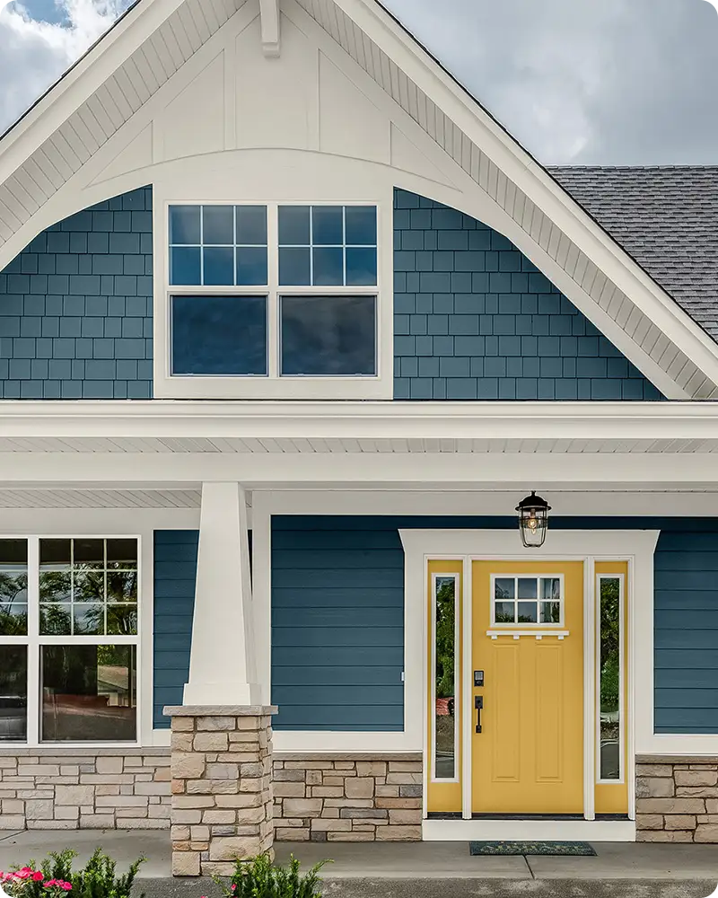
Behr offers an impressive range of exterior paint colors that work beautifully across all kinds of architectural styles, from cozy cottages to modern farmhouses.
In this post, I’m sharing 19 of the most popular Behr exterior colors that homeowners, designers, and builders keep coming back to.
These colors have a way of making homes look fresh, timeless, and just plain right. So, if you’re ready to get inspired and maybe even find the color for your house, let’s dive in.
What Is the Most Popular Behr Exterior Color?
While popularity can vary by region and home style, Behr Polar Bear (75) is easily one of the most loved exterior paint colors.
It’s a clean, soft white with just the slightest hint of warmth—making it feel inviting without ever looking yellow or sterile.
Homeowners love it because it’s incredibly versatile: it looks just as good on a modern farmhouse as it does on a traditional colonial.
Also, it reflects light beautifully, which makes it ideal for both sunny and shaded exteriors.
Other strong contenders include Behr Black Black for modern contrast and Behr Espresso Beans for a rich, earthy brown that feels grounded and elegant.
Are Behr Exterior Paints Durable and Weather-Resistant?
Yes—Behr’s exterior paints are designed to hold up incredibly well against the elements. If you’re using lines like Behr Marquee or Behr Premium Plus Ultra, you’re getting paint that’s engineered for durability.
These formulations resist moisture, UV damage, fading, peeling, and mildew—things every homeowner worries about when painting the outside of their house.
I’ve personally seen Behr paints perform beautifully through harsh winters and blazing-hot summers. They also offer fade-resistant technology, which means your color stays truer for longer.
That’s a big deal if you’re investing time and money into a new exterior look.
💥🎁 Christmas & Year-End Deals On Amazon !
Don't miss out on the best discounts and top-rated products available right now!
*As an Amazon Associate, I earn from qualifying purchases.
How Do I Know Which Behr Exterior Color Will Look Good on My Home?
The best place to start is by considering your home’s fixed elements—your roof color, stone or brickwork, and landscaping.
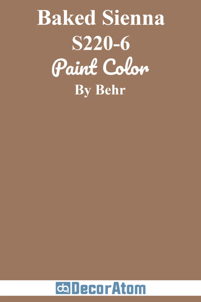
These features aren’t going anywhere, so your exterior color should complement them. If your home has a warm-toned roof, for example, you might want to lean toward beiges, warm whites, or earthy browns like Baked Sienna or Spanish Sand.
Also, test the color in different lighting. Paint a few large swatches on your home’s exterior walls and watch how the color shifts throughout the day. A shade that looks perfect at noon might read totally different at sunset.
Lastly, think about your home’s architectural style. A dark, dramatic color like Iron Gate might be stunning on a modern home but could feel overpowering on a quaint cottage. Context matters!
How Many Colors Should Be In an Exterior Color Palette?
Most well-balanced exterior color palettes include three main colors:
- Main Body Color – This is your dominant color and covers most of your siding or exterior walls.
- Trim Color – Used for window frames, eaves, fascia, and sometimes porches.
- Accent Color – This is usually your front door, shutters, or garage door.
For example, you could use Teton Blue for the body, Painter’s White for the trim, and a bold shade like Espresso Beans or Iron Gate for the front door. Keeping the palette to three coordinated shades helps your home feel cohesive and intentional—not overdesigned.
That said, if your home has very simple architecture, even two colors can be enough to make a strong statement.

How Do You Choose the Right Paint Colors for Your Exterior?
Start by asking yourself what feeling you want your home to evoke. Do you want it to feel warm and welcoming? Clean and modern? Cozy and classic? Once you’ve got a vision, here are a few practical steps:
- Look at the neighborhood. You want your home to stand out—but not clash—with nearby homes.
- Test real paint samples. Digital mockups help, but nothing replaces seeing the actual paint on your siding.
- Factor in lighting. Colors can look drastically different in morning sun vs. afternoon shade.
- Consider resale value. If you’re planning to sell in the next few years, neutral and timeless tones like Chic Gray or Khaki Shade are safe bets.
- Match undertones. If your roof has warm undertones, stick to warm exterior colors. Cool undertones pair best with grays, whites, or blues.
Ultimately, the best exterior paint color is the one that makes you feel happy every time you pull into the driveway. Trust your gut—but don’t forget to sample first.
Top 19 Popular Behr Exterior Colors
Here are the most popular exterior paint colors from BEHR.
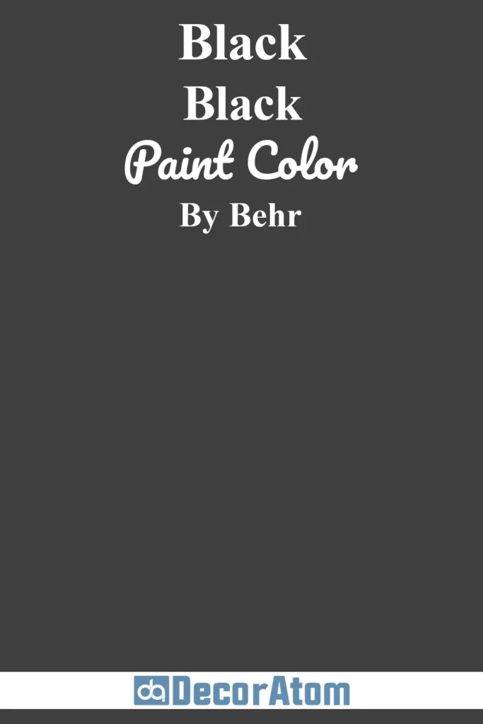
1. Behr Black
💥🎁 Christmas & Year-End Deals On Amazon !
Don't miss out on the best discounts and top-rated products available right now!
*As an Amazon Associate, I earn from qualifying purchases.
There’s something undeniably striking about a pure, true black exterior—and Behr Black delivers just that.
This color is deep, unapologetic, and dramatic, making it a favorite for modern farmhouse facades, minimalist cabins, and urban townhomes. It has no visible undertone, which gives it a bold clarity in all lighting conditions.
In bright sun, it stays true black without looking washed out. On cloudy days, it brings a moody, architectural edge.
It’s perfect if you’re after a statement exterior that pairs beautifully with natural wood, metal accents, or crisp white trim.
2. Behr Off White 73
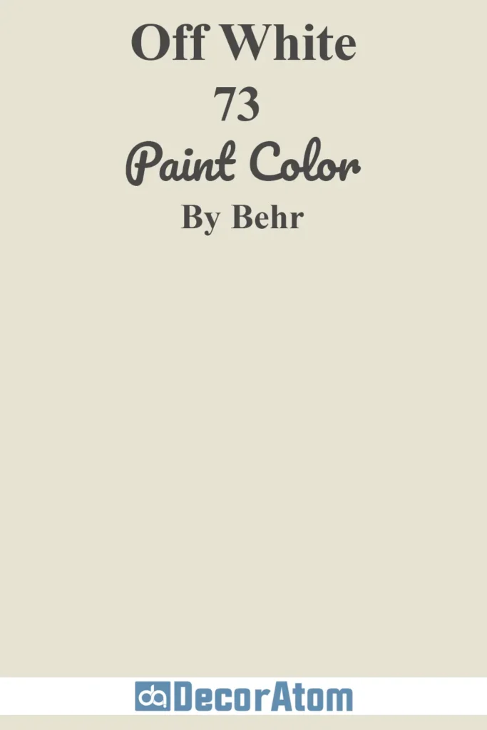
Off White might sound simple, but don’t underestimate its charm. This warm-toned white leans slightly creamy without tipping into yellow territory.
It’s a versatile shade that reflects just enough light to keep a home feeling fresh and inviting without looking stark. That makes it ideal for Colonial, Craftsman, or coastal-style homes where you want brightness without the harshness of pure white.
This color holds up beautifully in full sun, maintaining its warmth and avoiding glare. It’s also an excellent backdrop for contrasting shutters or a bold front door.
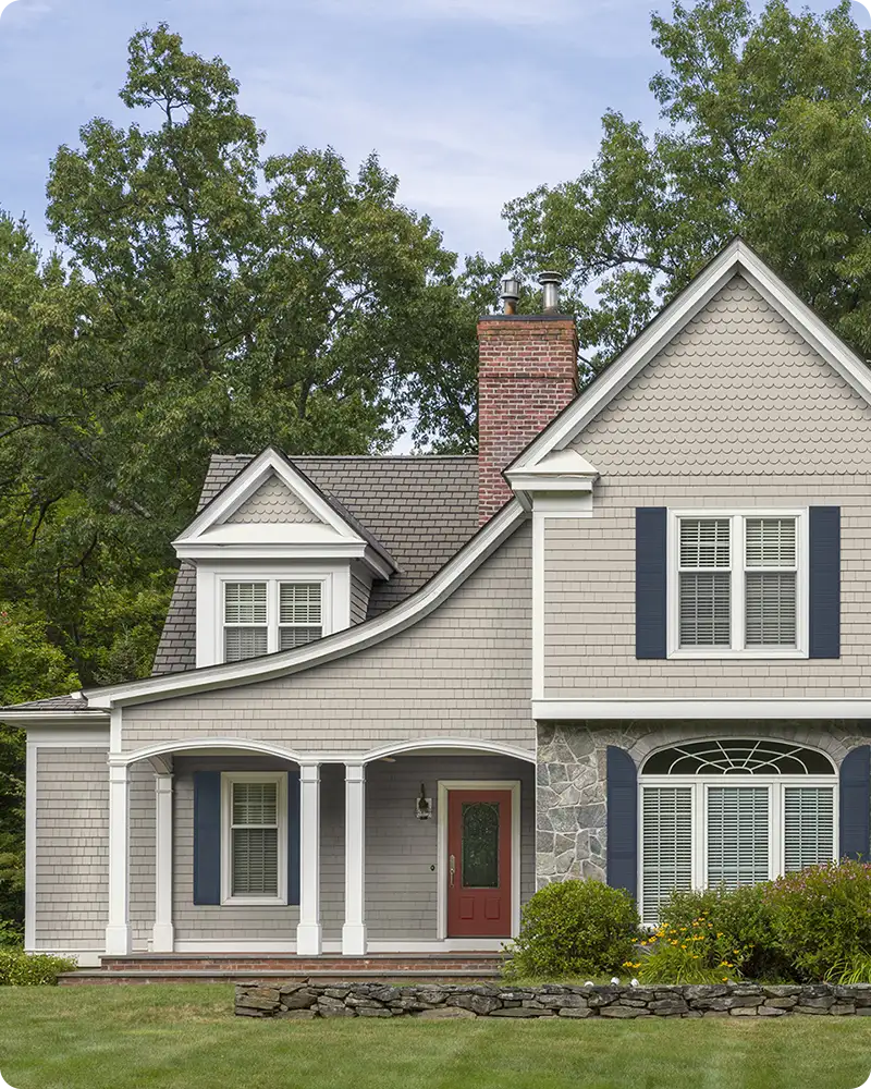
3. Behr Polar Bear 75
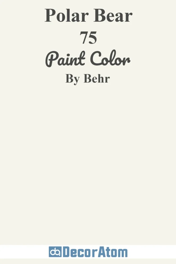
If you’re looking for a clean, bright white that still feels soft and livable, Behr Polar Bear hits the sweet spot.
It has subtle warm undertones—just enough to keep it from feeling cold—so it reads crisp without going sterile.
This is a crowd-pleaser on exteriors because it works across a wide range of architectural styles, from beach bungalows to traditional two-stories.
In natural daylight, it glows with brightness, making your home look fresh and timeless. It pairs especially well with black or navy accents for a classic high-contrast look.
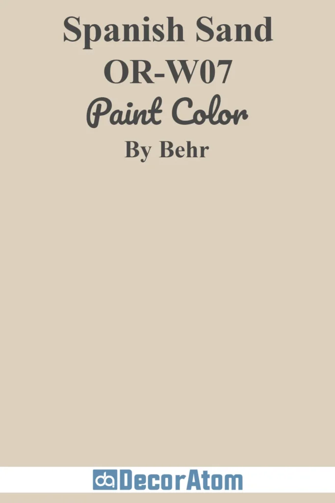
4. Behr Spanish Sand OR-W07
💥🎁 Christmas & Year-End Deals On Amazon !
Don't miss out on the best discounts and top-rated products available right now!
*As an Amazon Associate, I earn from qualifying purchases.
There’s a relaxed elegance to Spanish Sand that makes it an easy favorite for stucco homes, Mediterranean villas, and Southwestern-style properties.
It’s a soft beige with warm pinkish-tan undertones that glow beautifully in sunlight. This shade doesn’t just blend into the background—it adds warmth and character without being too bold.
Spanish Sand looks especially refined paired with terracotta roofs, bronze fixtures, or deep green trim. It’s also a great choice if you want an inviting, neutral exterior that feels cohesive with natural surroundings.
5. Behr Espresso Beans PPU5-01
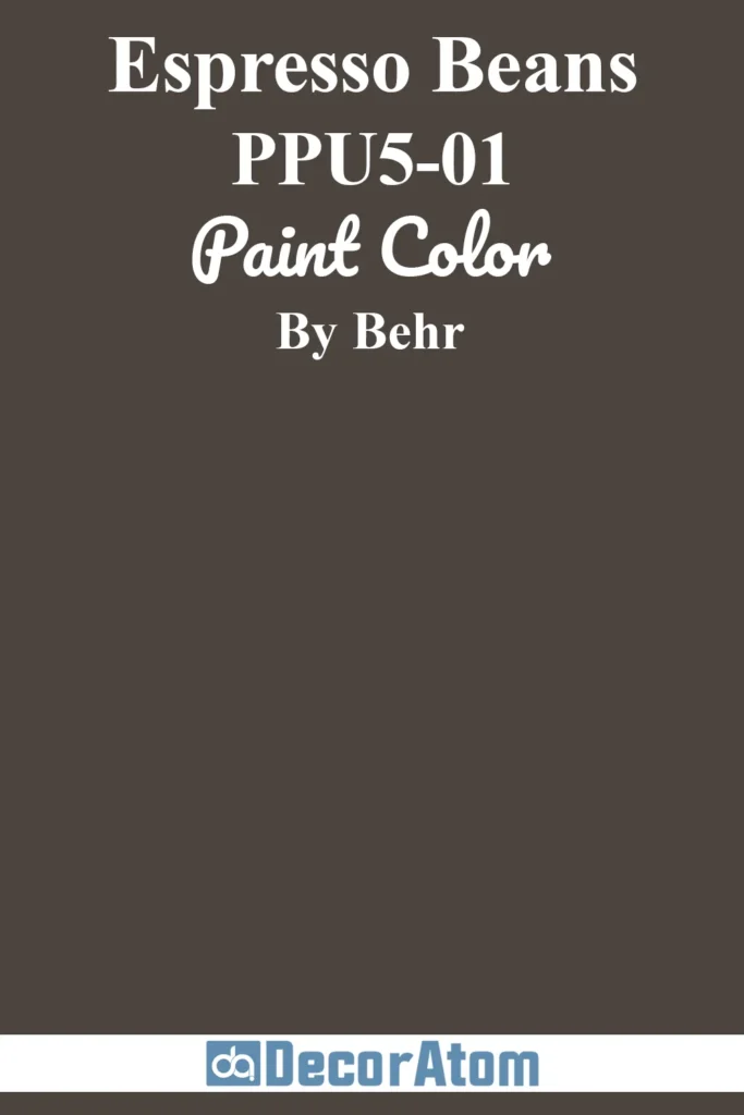
Espresso Beans is a deep, velvety brown with rich chocolate undertones that give it a luxurious feel.
It’s often chosen for rustic or lodge-style homes, where it blends seamlessly with stonework, wood siding, and forested backdrops.
What makes it stand out is how it reacts to light—on sunny days, the brown warms up and highlights the natural texture of your siding.
In shade or twilight, it deepens into an almost black-brown, adding sophistication and depth. If you want something darker than taupe but softer than black, Espresso Beans is the perfect in-between.
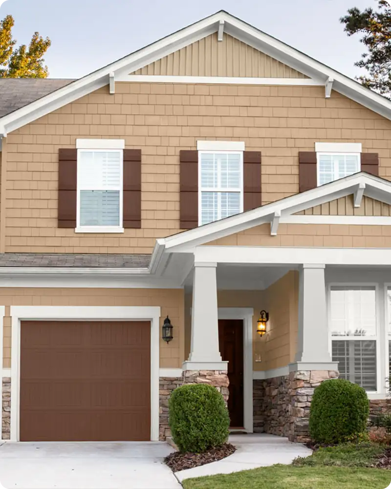
6. Behr Harvest Brown 710D-4
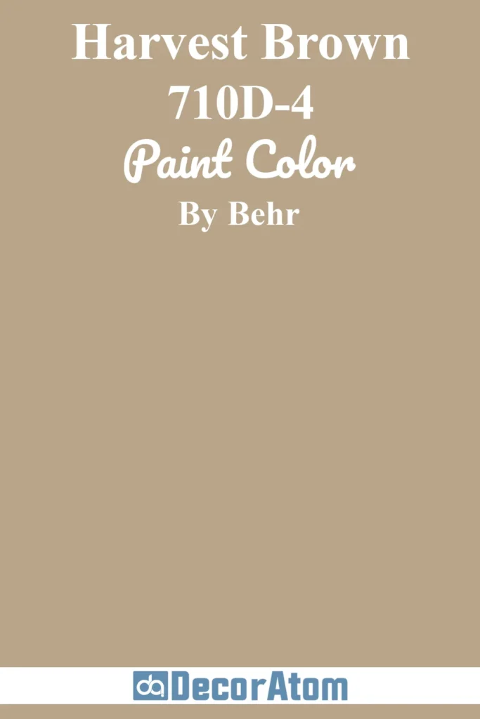
Harvest Brown brings cozy, grounded vibes to any exterior. It’s a medium brown with warm, earthy undertones—imagine the color of late-autumn leaves or sunbaked soil.
Unlike some browns that feel dated, this one has a timeless richness that complements both wood and brick exteriors. It pairs especially well with muted greens, beiges, or creamy trim.
Homes with traditional, Craftsman, or cabin-inspired architecture benefit the most from its natural tone. It reads warmly in sunlight and doesn’t lose its depth in shade, making it dependable year-round.
7. Behr Baked Sienna S220-6
💥🎁 Christmas & Year-End Deals On Amazon !
Don't miss out on the best discounts and top-rated products available right now!
*As an Amazon Associate, I earn from qualifying purchases.
If you want a splash of desert-inspired warmth, Baked Sienna is a gorgeous choice. It’s a bold, burnt orange-brown with strong terracotta undertones.
This color brings instant personality to a home and is especially popular in the Southwest, where it echoes the colors of canyon rock and clay tile roofs.
It holds up impressively in bright sunlight, where the orange tones really come alive. For balance, pair it with soft taupes, creamy whites, or even sage green.
It’s best for adobe-style homes or anyone leaning into a warm, earthy color story.
8. Behr Teton Blue N490-4

Teton Blue is the kind of blue that feels calm, cool, and grounded. It sits somewhere between denim and slate, with a slightly gray undertone that keeps it from feeling too nautical.
This versatility makes it a favorite for cottage-style homes, lake houses, or even suburban two-stories that want a modern update.
In full sun, it looks bright and airy; in shade, it deepens into a more muted, sophisticated blue-gray.
White trim makes it pop, while dark accents can add drama. It’s a color that works year-round and never feels trendy.
9. Behr Stone Brown 250F-4
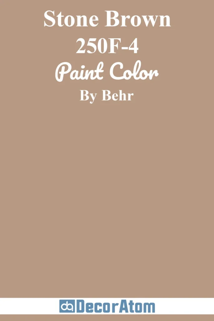
Think of Stone Brown as the refined middle ground between gray and brown. It has taupe undertones with a touch of greige, making it an excellent neutral for those who don’t want a color that’s too warm or too cool.
It’s particularly suited for homes with stonework or mixed materials on the exterior because it bridges the gap between earthy and modern.
It looks grounded in any light, with subtle shifts throughout the day—from a cooler greige in the morning to a warmer brown in the afternoon sun. It’s an ideal base if you’re into modern rustic vibes.
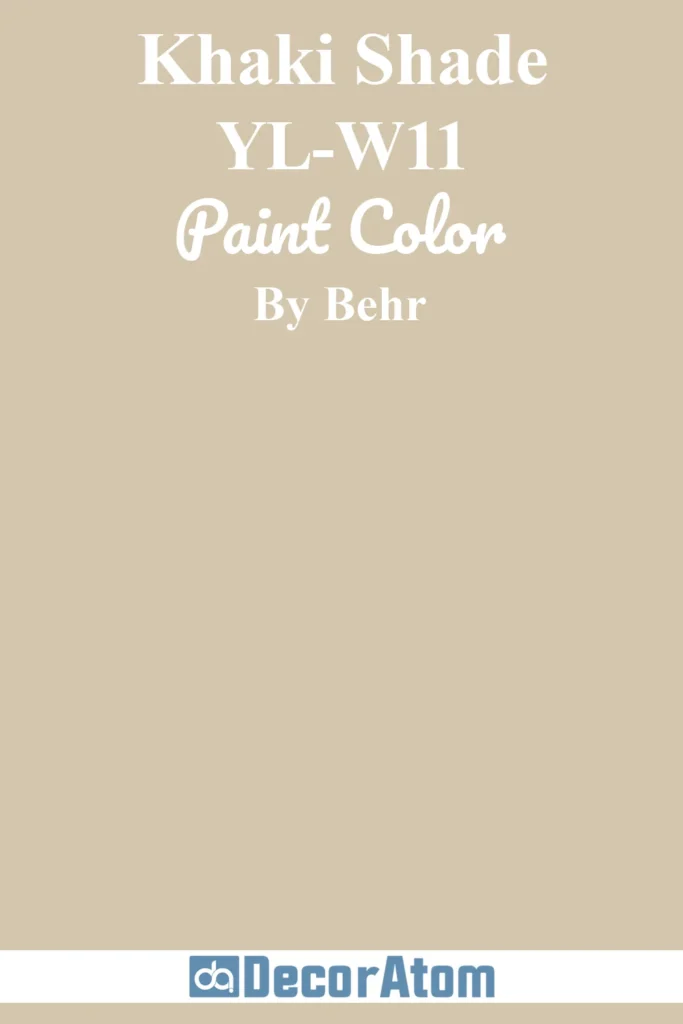
10. Behr Khaki Shade YL-W11
💥🎁 Christmas & Year-End Deals On Amazon !
Don't miss out on the best discounts and top-rated products available right now!
*As an Amazon Associate, I earn from qualifying purchases.
Soft, subtle, and effortlessly classic—Khaki Shade is one of those colors that feels understated in the best way.
It’s a pale tan with a creamy beige undertone, great for homeowners who want something light but not white. This color reflects light beautifully, keeping your exterior bright and airy without glaring in the midday sun.
It suits ranch-style homes, colonials, or even transitional new builds that want a timeless neutral look. Pair it with deep greens, dark browns, or navy trim for a finished, pulled-together palette.
11. Behr Jungle Camouflage N350-4
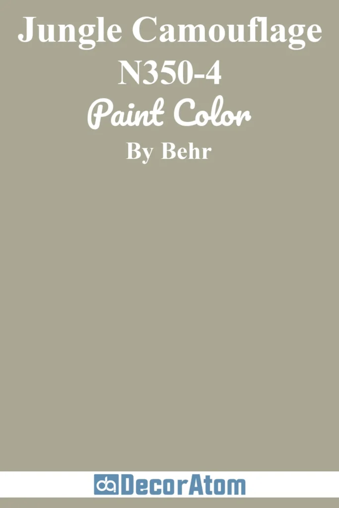
Jungle Camouflage is a rugged, muted olive green that brings a grounded, natural feel to a home’s exterior. It’s the kind of shade that makes a house blend beautifully into wooded or rural settings.
The undertones are earthy and slightly gray, so it doesn’t come off too bright or military green—it feels sophisticated, not loud. In the sun, it reveals a soft warmth; in shade, it leans more neutral and serene.
It’s a great pick for cabin-style homes, rustic retreats, or even urban homes looking to connect with the outdoors. Paired with black or wood-tone accents, it looks effortlessly stylish.
12. Behr In the Moment T18-15
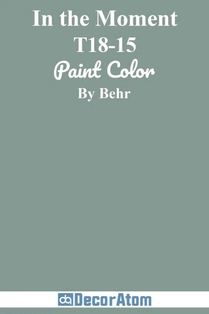
Originally named Behr’s 2018 Color of the Year, In the Moment is a beautifully balanced blue-green with subtle gray undertones.
It’s reminiscent of sea glass or sage but with more depth, making it a calming yet impactful choice for exteriors. This color truly shines in natural light, where its tranquil, misty vibe becomes more apparent.
It’s ideal for coastal homes, Craftsman cottages, or mid-century bungalows. Its modern, nature-inspired tone pairs wonderfully with warm wood, cream trim, or soft charcoal accents.
13. Behr Back to Nature S340-4
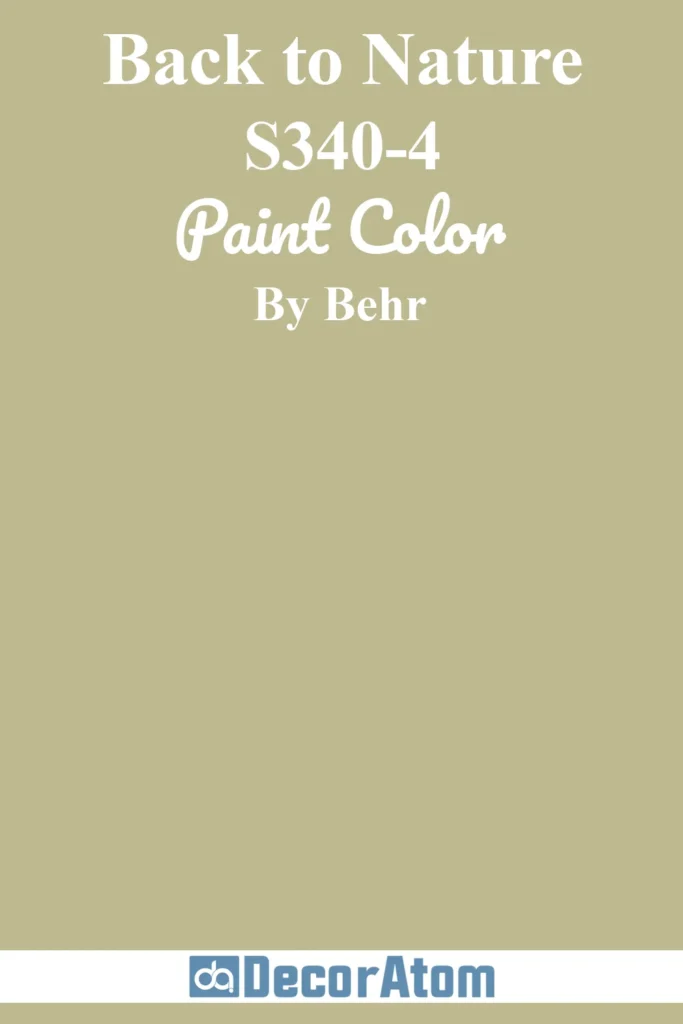
There’s a fresh, organic softness to Back to Nature that makes it feel instantly soothing. It’s a light, warm green with a hint of yellow that reflects the hues of spring foliage and sunlit fields.
On a home exterior, this color reads as cheerful and optimistic without being overly saturated. It looks best in morning and afternoon light, where the warmth in the undertone glows gently.
It’s especially appealing for cottages, farmhouse-style homes, or nature-forward designs. For a harmonious palette, pair it with soft white trim or earthy taupes.
14. Behr Adirondack Blue N480-5
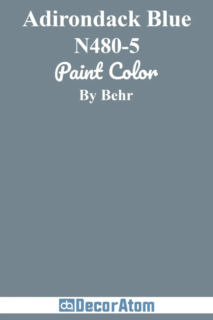
Adirondack Blue is rich, moody, and utterly timeless. It’s a deep blue with strong gray undertones—imagine the color of a mountain lake just before dusk.
It’s ideal for homeowners looking to add drama and depth without going as dark as black. In bright light, it maintains its blue character with a touch of slate.
In shade or cloudy conditions, it leans cooler and slightly more muted, which adds sophistication. It’s a top pick for cabins, lakefront properties, and contemporary homes alike.
Crisp white trim gives it a nautical touch, while wood accents make it feel more rustic and grounded.
15. Behr Chic Gray PPU26-10
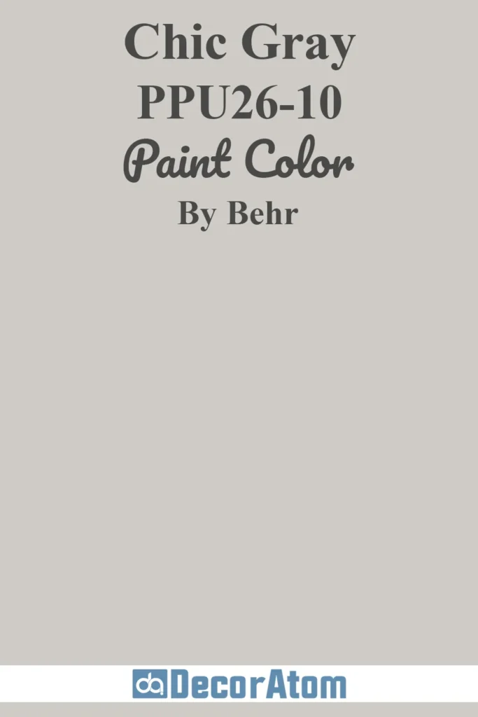
True to its name, Chic Gray is modern, clean, and highly versatile. It’s a light-to-medium gray with soft undertones—neither too warm nor too cool—which makes it a safe and stylish bet for almost any exterior.
In bright daylight, it reflects just enough light to keep a home feeling airy, while in shade, it settles into a calming, soft gray.
This neutrality makes it a great backdrop for both bold and subtle accent colors. It works especially well on modern farmhouse exteriors, traditional homes, and anything in between.
16. Behr Creamy Mushroom PPU5-13

Creamy Mushroom is a cozy neutral that sits somewhere between beige and greige.
It has warm taupe undertones, giving it a soft, grounded look that’s perfect for homeowners who want a color that feels natural but still polished.
In sunlight, it brings out a warm, welcoming vibe. In the shade, it remains smooth and consistent—never too gray or too brown.
It’s particularly attractive on ranch-style homes, suburban cottages, and properties surrounded by trees or stonework. Pair it with darker trim or natural stone for a layered, earthy look.
17. Behr Platinum PPU26-11
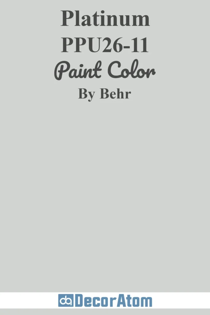
Platinum is a sleek, cool-toned gray that feels clean, crisp, and just a little modern. It leans slightly toward blue in certain lighting, which gives it a refined, upscale vibe without feeling too stark.
This color shines on contemporary homes, minimalist designs, and anything with clean architectural lines.
It performs beautifully in all types of light—bright sun keeps it sharp and clear, while cloudy or shaded areas bring out its steely undertones.
It’s also a fantastic base for darker shutters, slate accents, or a bold front door.
18. Behr Painter’s White PPU18-08

Painter’s White is a soft white with creamy undertones, making it a go-to for those who want a white exterior without the harshness of a true bright white.
It’s timeless, relaxed, and easy to style. In natural light, it reflects just enough warmth to feel inviting rather than sterile.
In lower light or on overcast days, it maintains its softness without turning dull. It’s well-suited for traditional homes, Craftsman bungalows, or transitional styles that blend old and new.
This white pairs beautifully with both warm and cool tones, giving you lots of flexibility with accents.
19. Behr Iron Gate MQ2-60
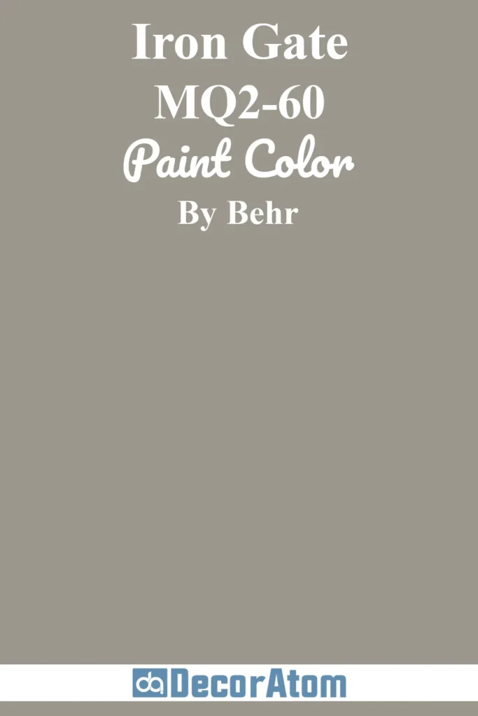
Last but not least, Iron Gate is a deep, rich charcoal with hints of brown and espresso. It’s a sophisticated choice for exteriors that want depth without going fully black.
This color brings a sense of strength and elegance, making it ideal for historic homes, modern exteriors, or even updated Victorians.
In sunlight, the brown undertones add a touch of warmth, while in the shade, it leans more toward a deep iron gray.
It’s especially beautiful with white or cream trim, as well as natural wood accents that soften its intensity.