
Picking the right paint color for a low-light room can be surprisingly tricky.
I’ve learned the hard way that what looks bright and airy on a paint chip can turn murky and dull in a space with minimal sunlight.
That’s where neutrals come in—but not just any neutral. Some colors fall flat without natural light, while others somehow manage to reflect and enhance what little light you do have.
In this post, I’m sharing 15 of my favorite neutral paint colors that actually work in low-light rooms.
These are the tried-and-true neutrals that can turn even the darkest corners of your home into light, welcoming spaces.
Tips for Choosing the Best Neutral Paint Colors for Low Light Rooms
When it comes to choosing a neutral for a darker room, it’s all about balance. Here are a few tips I’ve picked up over time:
1. Lean Warm Over Cool
Warm neutrals (like creamy whites, soft beiges, or warm grays) can add the illusion of warmth in a cold or shadowy room. Cool colors often feel flat in low light.
2. Watch the Undertones
Undertones matter more than you think. A gray with a purple undertone may look elegant in sunlight but turn drab in a darker space. Always test a sample first.
3. Test in Natural Conditions
Swatch your paint samples and observe them throughout the day. Lighting changes everything, especially in rooms that depend on artificial light.
4. Avoid Colors That Are Too Dark or Too Light
Dark colors can feel heavy in dim spaces, but ultra-light ones may look washed out. Go for something in the middle—a balanced neutral with a touch of color or depth.
5. Use Matte or Eggshell Finishes Carefully
Shiny finishes can bounce light, but they also highlight flaws. Eggshell is a good in-between option for walls in low-light areas.
The right neutral will feel calming and cohesive, not lifeless—and once you find it, it really transforms a space.
15 Best Neutral Paint Colors for Low Light Rooms
Here are the best neutral paint colors for low light rooms.
1. Sherwin-Williams Drift of Mist SW 9166

If you’re looking for a color that walks the line between cool and warm, Drift of Mist is one of those rare neutrals that just gets it right.
It’s a soft, airy gray with the faintest hint of warmth, which helps it come alive in dimmer spaces.
In low light, it doesn’t fall flat or feel dull—it actually holds on to its brightness surprisingly well.
It works beautifully on walls where you want that clean, minimal feel without it reading too stark.
2. Benjamin Moore Chantilly Lace OC-65

Chantilly Lace is a favorite for a reason. It’s one of Benjamin Moore’s brightest whites, but it’s not harsh.
In rooms with minimal natural light, it bounces back what little light there is and gives the space a crisp, uplifting feel.
It’s perfect if you’re going for that gallery-white wall look, or if you just want a neutral that feels clean without leaning cold. This one pairs well with just about anything.
3. Behr Eiffel For You MQ2-37
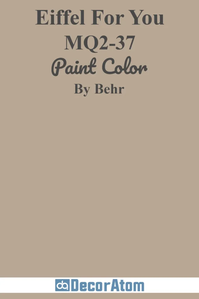
Eiffel For You is such a graceful shade. It’s a gray with a mauve undertone that subtly warms it up, which makes it especially flattering in shadowy or north-facing rooms.
It doesn’t get lost in low light the way cooler grays sometimes can.
Instead, it brings a hint of softness and sophistication that feels cozy but still modern. I find it looks great with taupes, mauves, or even black accents.
4. Sherwin-Williams Accessible Beige SW 7036
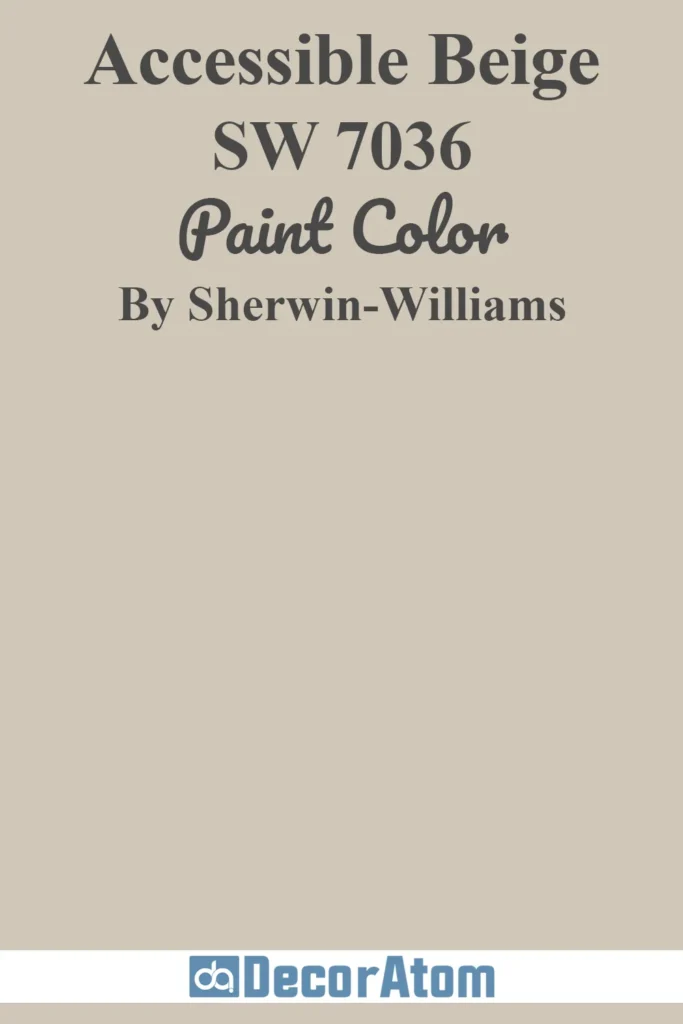
This color has been around for a while, and it still earns its keep—especially in rooms that don’t get much sun. Accessible Beige has a gentle greige quality to it.
It’s not your typical builder beige; it has enough gray in it to keep things balanced.
In lower light, the warmth comes forward a bit more, which can help a dim room feel inviting rather than dreary. It plays well with wood tones and natural textures too.
5. Behr Spun Wool N220-1

Spun Wool is like that perfect knit throw—soft, subtle, and comforting.
It’s a pale greige with a touch of warmth, and in rooms without a lot of natural light, it brings just enough color to feel intentional without overwhelming the space.
I love it for bedrooms or small living areas where you want a gentle, calming backdrop. It pairs beautifully with creamy whites and soft browns.
6. Benjamin Moore Annapolis Gray HC-176

This is one of those elegant grays that never feels too cold or too blue.
Annapolis Gray has a refined presence and leans slightly warm, which makes it a solid choice for low-light spaces. It’s deeper than a lot of light neutrals, but it doesn’t feel heavy—just grounded and classy.
I see this working well in dining rooms or studies where you want a little more depth but still want to keep things neutral.
7. Sherwin-Williams Passive SW 7064

Passive is a cool-toned gray that manages to stay soft without drifting into icy territory.
It’s a reliable pick if you want a true gray that won’t turn purple or green in weird lighting. In low-light rooms, it stays consistent, and while it leans cool, it’s not harsh or sterile.
I like using it with navy or crisp whites for a fresh, modern look—even in windowless bathrooms or hallways.
8. Benjamin Moore Lilac Hush CSP-490
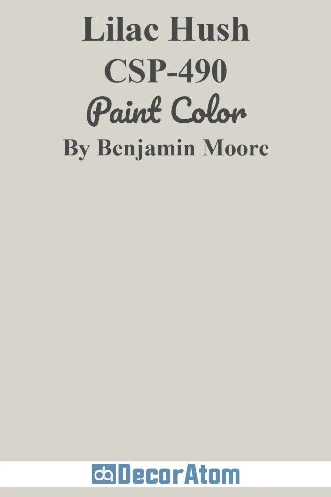
Now here’s a shade that adds a whisper of color while still staying neutral. Lilac Hush is a pale gray with just the faintest tint of lavender.
In brighter spaces it leans cool, but in low-light areas, that subtle purple undertone helps it feel unexpectedly warm and soft.
It’s perfect for a bedroom or reading nook—anywhere you want a little serenity with a hint of charm.
9. Behr Burnished Clay PPU18-09

Burnished Clay is a warm, earthy neutral with a bit more personality. It’s deeper than some of the others on this list, but in low light, it gives off this comforting, grounded vibe.
It’s not flashy, but it’s got soul—think warm clay with a modern edge. I’d use it in a cozy living room or an entryway where you want to make a subtle statement.
10. Sherwin-Williams Silverpointe SW 7653

Silverpointe is one of those grays that manages to feel both cool and luminous.
It’s a light silvery hue with a touch of green-blue undertone, which helps it stay bright even when there’s not much daylight.
In shadowy rooms, it can give off a refreshing, clean feel that’s perfect for small kitchens or bathrooms.
It’s crisp, but not cold—and looks gorgeous next to brushed nickel or matte black finishes.
11. Behr Castle Beige N230-1
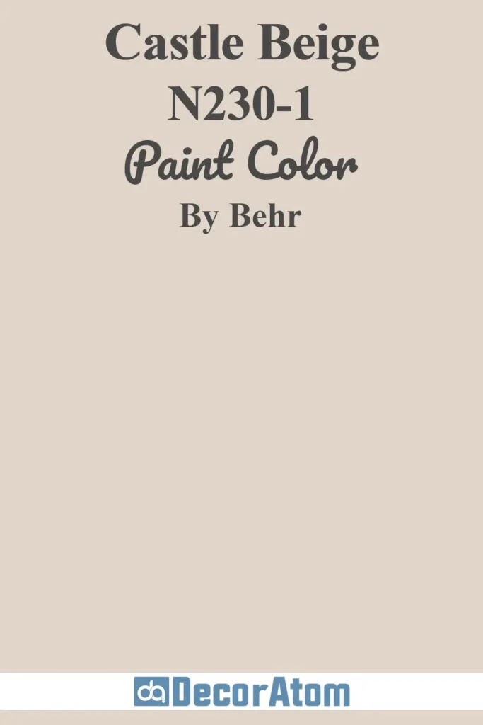
Castle Beige is a soft, creamy neutral that brings a sense of calm to any space.
What I like about it in low-light rooms is that it doesn’t go muddy or dull—it stays warm and grounded without being too yellow.
There’s a slight sandy undertone that makes it feel like a gentle backdrop for everything else in the room.
It’s a great option if you want your space to feel cozy but still light.
12. Benjamin Moore French Macaroon CSP-335
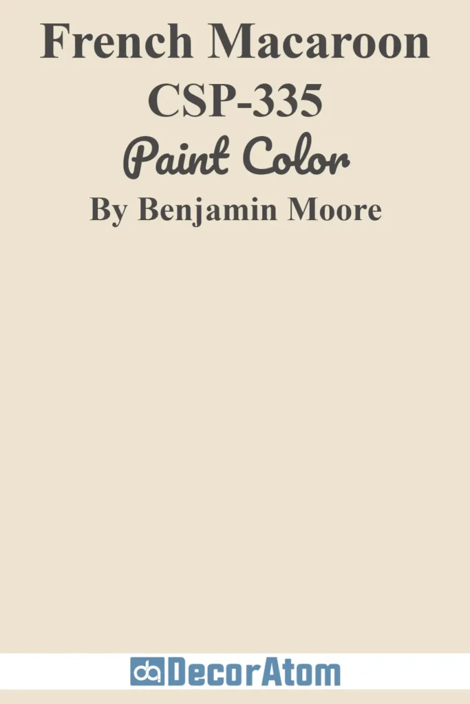
French Macaroon feels playful without being overpowering. It’s a pale beige with the tiniest whisper of blush, which gives it a delicate glow in low light.
It’s one of those colors that makes a room feel a little more cheerful without adding obvious color.
I see this working beautifully in a nursery, guest bedroom, or even a bathroom where you want something soft but a little different from the usual grays and taupes.
13. Sherwin-Williams Rivers Edge SW 7517

Rivers Edge is a unique neutral that leans into warmth, with brown and gray undertones that shift subtly depending on the light.
In rooms that lack natural light, it settles into a cozy, mocha-gray shade that feels elegant without being too dark.
It has a sophisticated depth to it, which makes it a good choice for spaces where you want a touch of richness without going full dark mode.
14. Benjamin Moore Sea Froth 2107-60

Sea Froth is such a peaceful color. It’s a very light gray with a creamy undertone, and in low-light rooms, it doesn’t fall flat or feel washed out—it actually glows a little.
There’s a subtle taupe warmth hiding in it that makes it feel more inviting than a cooler gray.
It’s one of those shades you can paint throughout a home if you want everything to feel calm and consistent.
15. Behr Harmonious White DC-013
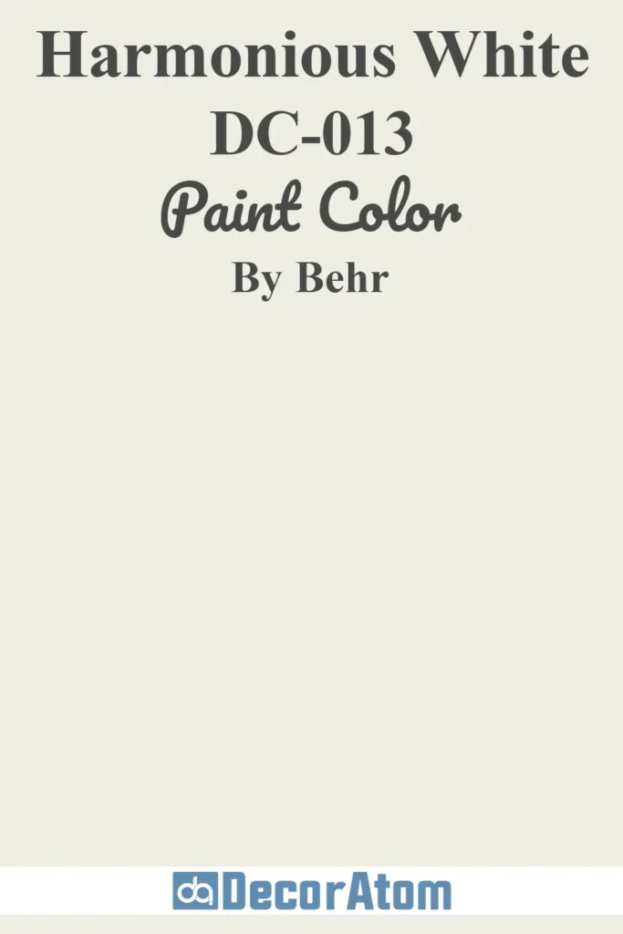
Despite the name, Harmonious White isn’t a pure white—it’s more of a creamy off-white with soft beige undertones.
That warmth is what makes it so effective in darker rooms.
It helps reflect whatever light is available, while still feeling grounded and approachable.
I’d use this anywhere you want a fresh, clean look without the starkness of bright white—think kitchens, hallways, or open-plan spaces.