When it comes to creating a timeless, sophisticated living room that stands the test of time, neutral paint colors reign supreme.
These versatile hues—ranging from crisp whites and soft beiges to modern grays and complex greiges—provide the perfect backdrop for your ever-evolving design preferences and lifestyle needs.
Unlike bold color choices that may quickly feel dated or overwhelming, neutrals create an adaptable foundation that allows your furniture, artwork, and accessories to take center stage.
But choosing the right neutral is far from simple—each shade carries unique undertones that dramatically affect how the color appears in different lighting conditions and alongside other design elements.
Whether you’re planning a complete living room renovation or simply refreshing your walls, understanding the nuances of neutral paint colors is essential for creating a space that feels both cohesive and personally expressive.
This comprehensive guide will walk you through everything you need to know about neutral paint colors—from understanding what makes a color “neutral” to selecting the perfect shade for your specific living room and complementing it with the right accent colors.

What are Neutral Paint Colors?
Neutral paint colors are shades that lack strong chromatic content and serve as versatile backdrops in interior design. These include whites, beiges, grays, greiges (gray-beige hybrids), taupes, and soft earth tones. True neutrals like white, black, and gray have no undertones, while most neutral paints contain subtle undertones that influence how they appear in different lighting and alongside other colors.
Neutrals are popular for living rooms because they:
- Create a timeless foundation that accommodates changing design trends
- Make spaces feel larger and more open
- Provide a versatile backdrop for furniture and decor
- Promote a sense of calm and relaxation
Tips for Choosing Best Neutral Paint Colors for Living Room
Consider the Natural Light
The amount and direction of natural light significantly impacts how neutral colors appear. North-facing rooms tend to emphasize cool undertones, making warm neutrals like beige or greige better choices. South-facing rooms enhance warm undertones, allowing cooler neutrals like soft grays to shine.
Identify Your Undertone Preferences
Neutral paints typically have warm (yellow, red, brown), cool (blue, green, purple), or true neutral undertones. To determine undertones:
- Compare paint samples against pure white paper
- View samples at different times of day
- Place samples near existing furniture to ensure compatibility
Consider Your Existing Elements
Choose neutrals that complement permanent fixtures like flooring, cabinetry, and architectural features. If you have warm wood tones, consider neutrals with compatible warm undertones.
Test Before Committing
Always test paint samples on multiple walls in your living room. Paint large swatches (at least 2×2 feet) and observe them throughout the day as lighting changes.
Popular Neutral Living Room Colors
- Soft whites (Benjamin Moore’s White Dove, Sherwin-Williams’ Alabaster)
- Versatile greiges (Benjamin Moore’s Revere Pewter, Sherwin-Williams’ Agreeable Gray)
- Modern grays (Benjamin Moore’s Gray Owl, Sherwin-Williams’ Repose Gray)
- Warm beiges (Benjamin Moore’s Manchester Tan, Sherwin-Williams’ Accessible Beige)

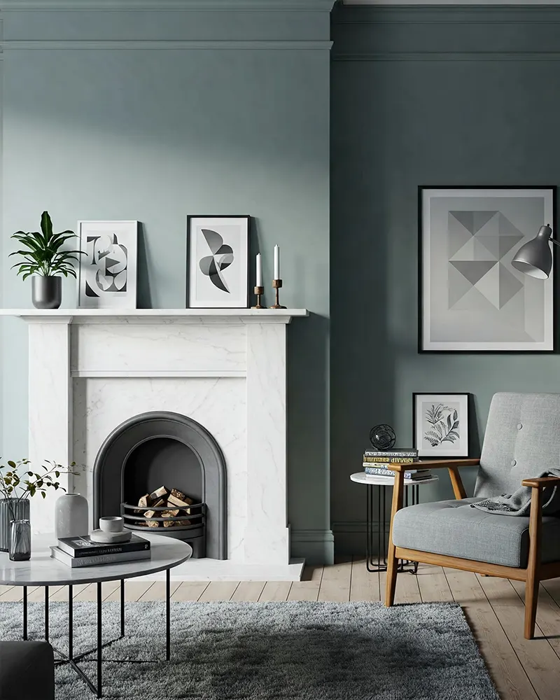
What Colors Complement Neutral Paint Colors?
Neutral walls provide an excellent canvas for both subtle and bold accent colors:
For White Walls
- Navy blue and charcoal gray create sophisticated contrast
- Jewel tones like emerald green or sapphire blue add richness
- Black accents provide crisp definition and drama
- Natural wood tones add warmth and organic texture
For Beige and Taupe Walls
- Terracotta, rust, and burnt orange enhance the warmth
- Sage green and olive create a serene, nature-inspired palette
- Navy blue offers elegant contrast
- Burgundy and wine tones create richness and depth
For Gray Walls
- Blush pink and lavender add soft, contemporary appeal
- Yellow provides energetic contrast
- Teal and turquoise create vibrant, refreshing combinations
- Mustard adds warmth while maintaining sophistication
For Greige Walls
- Deep blues and greens provide beautiful contrast
- Warm metallics like brass and gold enhance the warmth
- Dusty rose and mauve create subtle sophistication
- Caramel and cognac leather tones create cohesive warmth
The key to successfully pairing colors with neutrals is to maintain balance. For a calming space, use complementary colors sparingly. For more energy, incorporate bolder color statements through furniture and larger decorative elements.
Top 17 Neutral Paint Colors for Living Room
These versatile shades will transform your living space into a sophisticated, timeless retreat that can easily adapt to changing design trends and personal preferences.
1. Benjamin Moore Balboa Mist
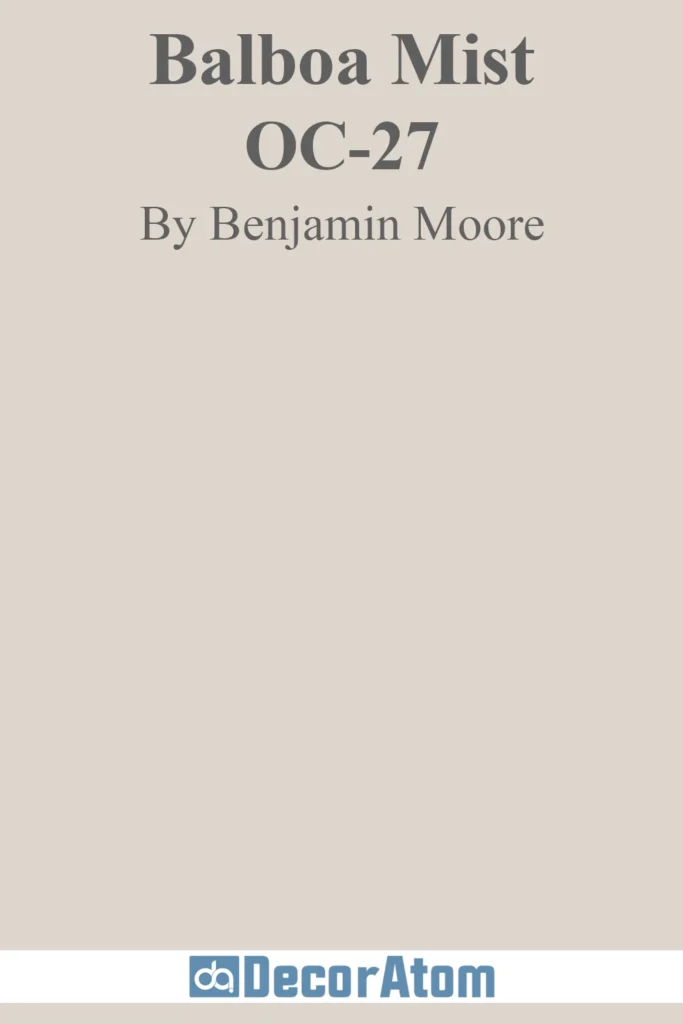
This ethereal light greige perfectly balances warm and cool undertones, making it exceptionally versatile for living rooms with any exposure. Balboa Mist creates a soft, diffused atmosphere that seems to change subtly throughout the day, reflecting light beautifully without feeling stark.
Smaller living spaces benefit tremendously from this shade, as it creates an airy feel without sacrificing warmth or character.
2. Sherwin-Williams Agreeable Gray
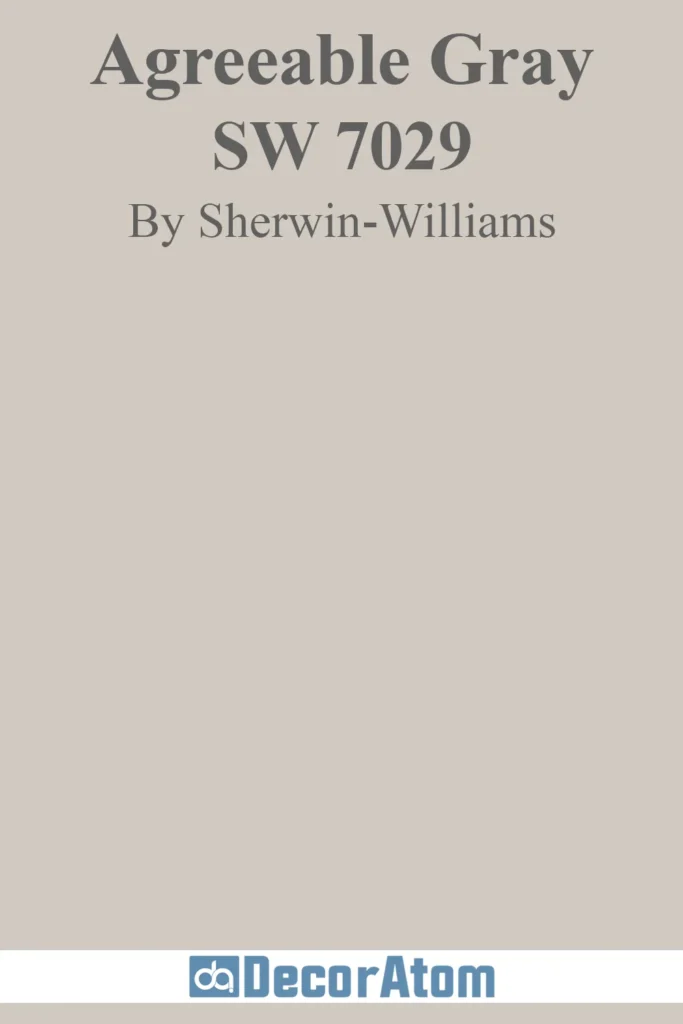
True to its name, this warm-leaning greige is universally flattering in living rooms of all sizes and lighting conditions. With its perfect balance of gray and beige, Agreeable Gray creates a sophisticated backdrop that works harmoniously with both cool and warm accent colors.
Rooms with mixed wood tones or transitional design elements that bridge traditional and contemporary styles showcase this color’s remarkable adaptability.
3. Benjamin Moore Classic Gray

This whisper-soft neutral is technically a pale gray with the slightest warm undertone, making it appear almost like a warm off-white in most lighting conditions.
Classic Gray creates an exceptionally refined atmosphere in living rooms, highlighting architectural details with subtle definition. The color has just enough depth to define trim and moldings while maintaining an open, airy quality.
4. Farrow & Ball Elephant’s Breath

This sophisticated mid-tone neutral defies simple categorization with its complex gray-beige character that shifts dramatically with lighting. North-facing rooms reveal more of Elephant’s Breath’s cool gray side, while warm light transforms it into a sophisticated taupe with lilac undertones.
The complexity of this shade creates living rooms with visual interest that changes throughout the day, never appearing flat or one-dimensional.
5. Sherwin-Williams Repose Gray

A true chameleon, Repose Gray bridges the gap between cool and warm with its slight blue-green undertones balanced by warm notes. The serene, calming atmosphere this mid-tone creates feels both current and timeless.
Open-concept living areas showcase the adaptive quality of this versatile neutral as it harmonizes varied lighting conditions throughout connected spaces.
6. Benjamin Moore Edgecomb Gray
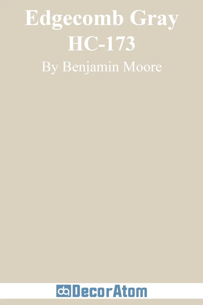
This soft, muted greige leans just slightly warm without ever feeling beige or yellow. Edgecomb Gray infuses living rooms with an inviting atmosphere while maintaining a sophisticated, modern edge.
Spaces with abundant natural light reveal this color’s subtle depth and complexity, as sunlight brings out nuances that create visual interest throughout the day.
7. Sherwin-Williams Accessible Beige

Despite its name, this complex neutral is actually a sophisticated greige with warm undertones that create an exceptionally welcoming living room atmosphere. Accessible Beige provides enough depth to define architectural features while remaining light enough to make spaces feel open and airy.
Rooms with limited natural light showcase the warming effect of this shade, where it brings coziness without feeling heavy or dark.
8. Benjamin Moore Pale Oak

This delicate, nuanced neutral features the perfect balance of soft gray and warm beige undertones, creating living spaces that feel both fresh and comforting.
With just enough color to provide definition and interest, Pale Oak maintains a refined, understated quality. The versatility of this shade makes it ideal for evolving design preferences, as it pairs beautifully with both cool and warm accent colors.
9. Farrow & Ball Purbeck Stone
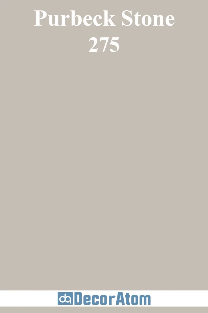
This mid-tone neutral gray has the slightest green undertone balanced by warm notes, creating a natural, organic feeling in living rooms. The depth of Purbeck Stone provides a cozy atmosphere while maintaining a contemporary, sophisticated edge.
Spaces featuring natural stone or concrete architectural elements showcase this color’s ability to enhance and complement organic materials.
10. Sherwin-Williams Colonnade Gray

This medium-toned greige combines the coolness of gray with the warmth of beige in perfect harmony. Colonnade Gray forms a sophisticated backdrop equally compatible with cool blues and greens or warm terracottas and rusts.
Living rooms with mixed design elements or transitional style benefit from this color’s unifying quality, bridging diverse elements into a cohesive whole.
11. Benjamin Moore Wickham Gray

This subtle, complex neutral appears as a soft gray with the slightest blue-green undertone balanced by warm notes. Wickham Gray infuses living spaces with serene, refined elegance without overwhelming other design elements.
Rooms flooded with natural light showcase the gentle depth and interest of this shade as sunlight reveals its subtle undertones throughout the day.
12. Sherwin-Williams Mindful Gray
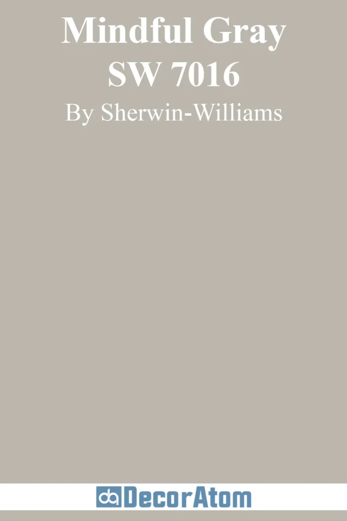
A true medium-toned greige with perfect balance between warm and cool undertones, Mindful Gray brings substance and sophistication to living rooms without feeling heavy.
The color provides enough depth to define architectural features while maintaining an airy quality. Larger living spaces benefit from this shade’s presence, where lighter neutrals might feel too washed out or insubstantial.
13. Benjamin Moore Revere Pewter

This classic greige has achieved cult status for good reason. With its perfect balance of warm beige and cool gray undertones, Revere Pewter creates living rooms that feel simultaneously cozy and fresh.
Northern exposure rooms showcase this color’s warming ability without allowing it to appear yellow or muddy, making it an ideal choice for spaces that need balance.
14. Farrow & Ball Skimming Stone

This delicate warm neutral has subtle gray undertones that keep it from appearing too yellow or beige. Skimming Stone brings sophisticated refinement to living spaces with a soft, diffused quality.
Traditional spaces with elaborate moldings or architectural details benefit from this shade’s subtle definition, highlighting craftsmanship without competing for attention.
15. Sherwin-Williams Drift of Mist

This ethereal light neutral walks the line between warm and cool with remarkable balance. Appearing almost like a soft white with the slightest greige undertone, Drift of Mist creates airy, serene living spaces with subtle dimension.
Smaller rooms showcase this shade’s light-enhancing properties without the stark or clinical feeling that pure whites can sometimes create.
16. Benjamin Moore Gray Owl

This versatile light-to-medium gray has subtle warm undertones that balance its naturally cool character. Gray Owl brings sophisticated, contemporary freshness to living spaces without coldness or severity.
Rooms with warm wood tones showcase this color’s complementary nature, as it highlights natural beauty while maintaining a modern edge.
17. Sherwin-Williams Alpaca
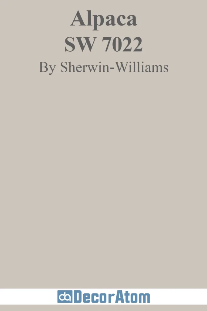
This sophisticated warm greige has subtle violet undertones that create remarkable depth and complexity. Alpaca infuses living rooms with unique, refined character that feels both contemporary and timeless.
Spaces with varied lighting conditions showcase this color’s complexity, as its undertones shift subtly throughout the day, creating visual interest that never feels static.
Final Thoughts
Selecting the perfect neutral paint color for your living room may seem daunting at first, but armed with knowledge about undertones, lighting considerations, and complementary color schemes, you can confidently create a space that feels both timeless and uniquely yours.
Remember that neutrals are far from boring—they’re sophisticated canvases that allow your personal style to shine while providing flexibility as your design preferences evolve.
Before making your final decision, always test your favorite neutrals in your actual space, observing how they transform throughout the day as lighting changes.
Paint large swatches on multiple walls and live with them for at least a few days before committing.
Whether you choose a warm, enveloping greige, a crisp, modern gray, or a soft, ethereal off-white, the right neutral paint color will create a living room that feels welcoming, balanced, and endlessly adaptable.