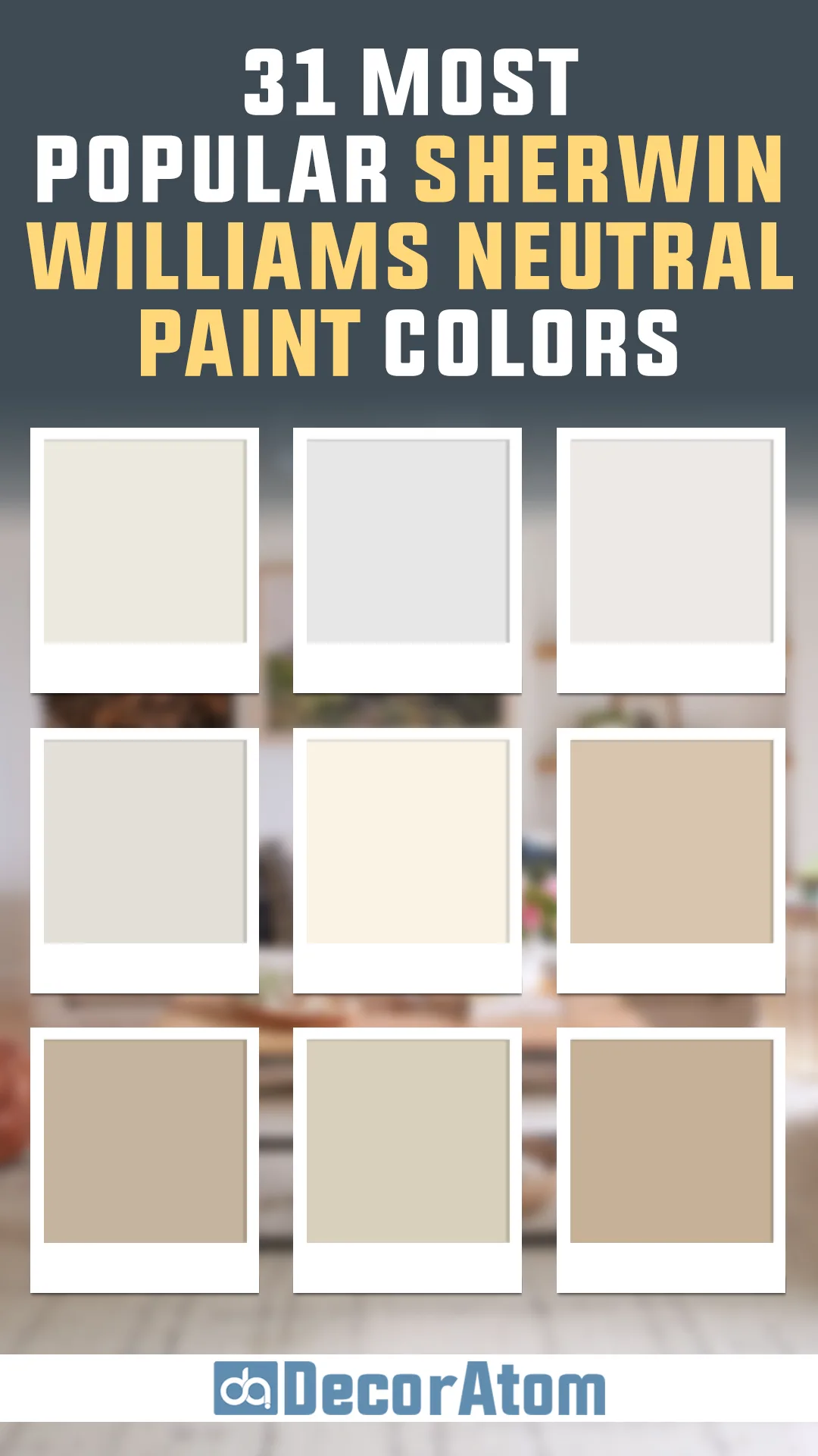
Finding the perfect neutral paint color can feel like searching for a needle in a haystack. With so many options—warm, cool, greige, taupe, off-white—it’s easy to get overwhelmed. But here’s the good news: I’ve done the hard work for you!
I’ve rounded up 31 of the most popular Sherwin Williams neutral paint colors that homeowners, designers, and paint experts can’t stop talking about. Whether you want a soft, airy white, a cozy beige, or a modern greige, this list has a shade for every style.
Neutrals are the backbone of a beautifully designed space. They set the tone, create balance, and allow other elements—like furniture, lighting, and decor—to shine. And the best part? A great neutral never goes out of style.
So, if you’re looking for that just right neutral for your home, let’s dive in!
Here are The 31 Most Popular Sherwin Williams Neutral Paint Colors
Accessible Beige (SW 7036)

Accessible Beige is a warm, welcoming neutral that has redefined the way we see beige. Unlike traditional beiges that can feel overly yellow or outdated, this shade incorporates subtle gray undertones, making it more modern and adaptable.
This balance between beige and gray gives it a soft, grounded quality that works beautifully in a variety of home styles, from contemporary to farmhouse. It’s a fantastic choice for those who want warmth without the heaviness of deeper tans or browns.
In rooms with ample natural light, Accessible Beige maintains its soft warmth without turning too golden, while in dimmer spaces, its gray tones emerge slightly, preventing it from feeling too heavy.
Balanced Beige (SW 7037)

For those who find Accessible Beige a little too light but still love its modern feel, Balanced Beige offers a richer alternative. It carries more depth, making it a fantastic choice for creating a cozy, enveloping atmosphere.
While still a beige at its core, it has that perfect hint of gray to keep it grounded and prevent it from feeling too yellow or traditional. It pairs exceptionally well with crisp whites and dark wood tones, making it a great backdrop for transitional and modern interiors.
When paired with soft lighting, it exudes a comforting warmth, making any space feel more inviting.
Kilim Beige (SW 6106)

💥🎁 Christmas & Year-End Deals On Amazon !
Don't miss out on the best discounts and top-rated products available right now!
*As an Amazon Associate, I earn from qualifying purchases.
Kilim Beige is a classic, warm beige with just the right amount of softness to feel timeless. Its earthy undertones make it an excellent choice for those who want a neutral with a hint of warmth that doesn’t lean too far into yellow or orange.
It complements natural wood tones, making it a favorite for homes with traditional elements or Mediterranean-inspired decor. The color’s warmth is especially noticeable in spaces with abundant natural light, where it feels rich and cozy without being overwhelming.
In north-facing rooms, it holds onto its warmth but can take on a more muted, sandy appearance.
Barcelona Beige (SW 7530)

Barcelona Beige is a light, airy beige that offers a neutral foundation for nearly any space. It has a subtle warmth that keeps it from feeling too stark or washed out but doesn’t lean so warm that it reads as yellow or golden.
It’s a great choice for open-concept homes, as it flows beautifully between different rooms without competing with other elements. This shade pairs well with crisp white trim for a fresh, clean look or with warm wood accents for a more natural, inviting atmosphere.
Its ability to shift with lighting conditions makes it a versatile, go-to neutral for those looking for a balanced beige.
Wool Skein (SW 6148)

Wool Skein is a soft, warm neutral that feels earthy yet refined. Unlike beiges that lean too golden or gray, Wool Skein has a unique mix of warmth with the slightest green undertone, giving it an organic, natural quality.
This makes it an excellent choice for those who love neutrals that blend seamlessly with nature-inspired palettes. It’s particularly effective in spaces with lots of natural materials, such as stone fireplaces, wooden beams, and linen textiles.
Under different lighting conditions, Wool Skein can read as a warm greige or a soft tan, making it an adaptable choice for various design styles.
Nomadic Desert (SW 6107)

💥🎁 Christmas & Year-End Deals On Amazon !
Don't miss out on the best discounts and top-rated products available right now!
*As an Amazon Associate, I earn from qualifying purchases.
For those who want a neutral with more depth and presence, Nomadic Desert is a fantastic choice. It’s a rich, warm beige that feels luxurious without being too dark or overpowering.
This color works well in larger spaces where you want to create a cozy, inviting atmosphere, and it pairs beautifully with warm whites and darker wood tones. In bright natural light, it appears as a sophisticated beige, while in dim lighting, it takes on a deeper, more moody warmth.
Nomadic Desert is perfect for accent walls, larger living rooms, and even exteriors where a warm neutral is needed.
Agreeable Gray (SW 7029)
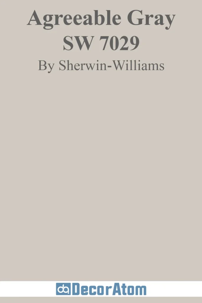
Agreeable Gray is one of Sherwin Williams’ most popular greige colors, offering the perfect balance between warm and cool tones. Its ability to shift between a soft warm gray and a light beige depending on lighting makes it an incredibly versatile neutral.
It pairs well with both warm and cool color schemes, making it a go-to choice for homeowners looking for a fail-proof neutral. In bright rooms, it leans more gray, while in lower-light spaces, its warm undertones emerge, giving it a cozy feel.
This adaptability makes Agreeable Gray a staple for open floor plans and modern interiors.
Repose Gray (SW 7015)
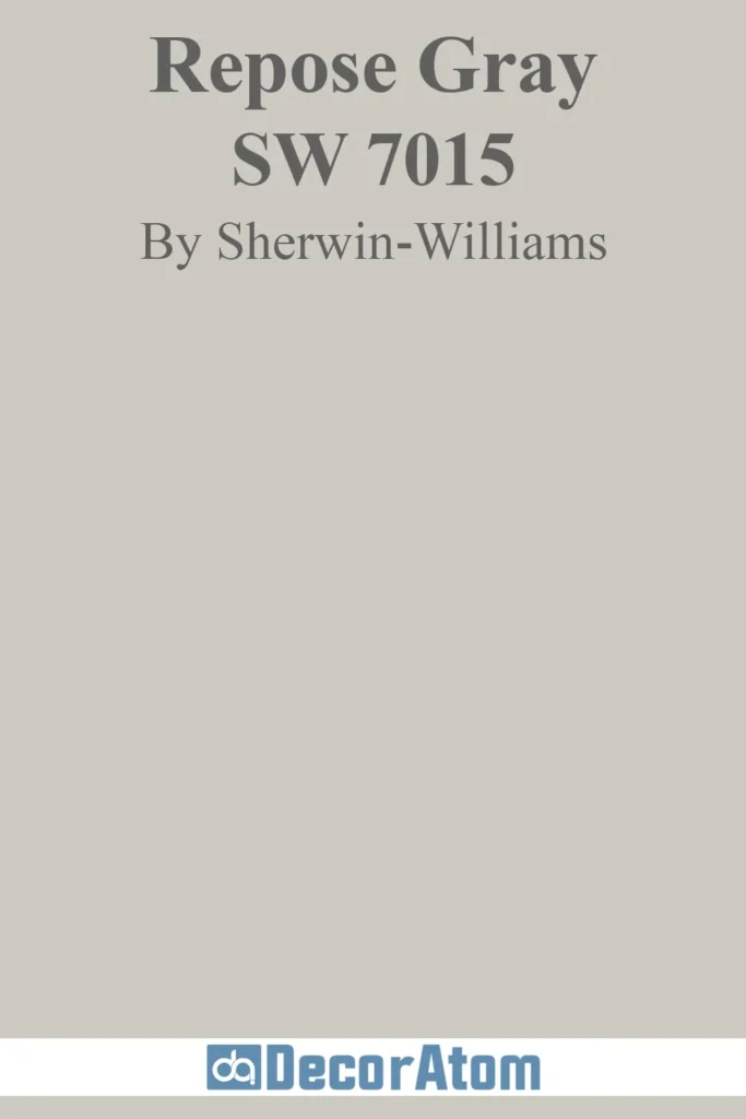
Repose Gray is a sophisticated, soft gray with a hint of warmth that keeps it from feeling too cold. This makes it an ideal neutral for those who want a gray that won’t feel stark or sterile.
Its slight beige undertone ensures that it pairs beautifully with both cool and warm colors, making it an excellent backdrop for a variety of styles. In natural light, Repose Gray reads as a true soft gray, while in artificial lighting, its warm undertones become more apparent.
This flexibility makes it a favorite for walls, cabinetry, and even exteriors.
Silver Strand (SW 7057)

💥🎁 Christmas & Year-End Deals On Amazon !
Don't miss out on the best discounts and top-rated products available right now!
*As an Amazon Associate, I earn from qualifying purchases.
Silver Strand is a light, cool gray with subtle green undertones, giving it a fresh and airy quality. It works well in coastal and modern spaces where a slightly cool neutral is desired.
Because of its green undertones, Silver Strand pairs well with natural elements such as wood and stone. In bright natural light, it appears as a soft silvery gray, while in artificial lighting, its cool undertones can become more prominent.
This makes it a great choice for bathrooms, bedrooms, and open spaces that need a fresh, serene vibe.
On the Rocks (SW 7671)
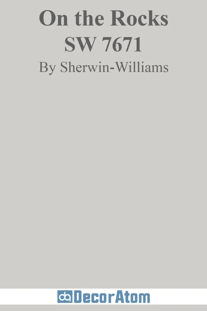
On the Rocks is a true neutral gray with no strong undertones, making it one of the most versatile grays in the Sherwin Williams lineup. Its clean, balanced nature allows it to complement both warm and cool colors, making it an excellent choice for modern and minimalist interiors.
Unlike other grays that can lean too blue or too beige, On the Rocks maintains a perfect balance, ensuring it always feels fresh and contemporary.
In spaces with ample natural light, it reads as a soft, airy gray, while in dim lighting, it takes on a slightly deeper, more sophisticated tone.
Big Chill (SW 7648)

Big Chill is a light, crisp gray that leans cool, making it an excellent choice for those who want a modern, refreshing neutral. Its subtle blue undertones give it a crispness that works well in contemporary and coastal designs.
In bright natural light, it maintains its light and airy feel, while in lower light, it can take on a slightly steely appearance. This makes it perfect for open-concept spaces, kitchens, and bedrooms where a fresh, cool gray is desired.
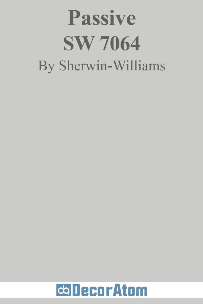
Passive (SW 7064)
💥🎁 Christmas & Year-End Deals On Amazon !
Don't miss out on the best discounts and top-rated products available right now!
*As an Amazon Associate, I earn from qualifying purchases.
Passive is a soft, cool gray with a subtle blue undertone, making it ideal for spaces that need a calming and serene atmosphere.
Unlike some cool grays that can feel stark, Passive has just enough softness to keep it from feeling too cold. It pairs beautifully with white trim and darker grays, making it an excellent choice for modern and contemporary interiors.
In natural light, Passive appears as a light, airy gray, while in artificial lighting, its cool undertones become more pronounced, giving it a crisp, refreshing feel.
Worldly Gray (SW 7043)

Worldly Gray combines gray and beige in a soft, harmonious blend. The warmth in Worldly Gray makes it a perfect match for spaces that include wood accents or earthy tones.
It brings a sense of grounded sophistication to your space without feeling heavy, making it ideal for open-concept areas.
This color is often chosen for its ability to complement both warm and cool color palettes, making it incredibly versatile in design.
Perfect Greige (SW 6073)
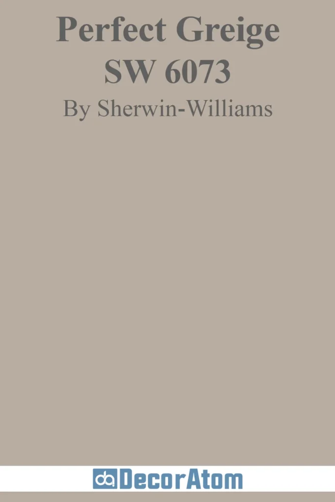
As the name suggests, Perfect Greige is a balanced mix of gray and beige. This color is beloved for its ability to offer both warmth and neutrality, allowing it to adapt to different lighting conditions and room styles.
Perfect Greige is particularly appealing in spaces where you want a sophisticated, neutral backdrop but still need a bit of warmth to create an inviting atmosphere.
It’s perfect for modern homes, where a subtle, timeless shade is desired.
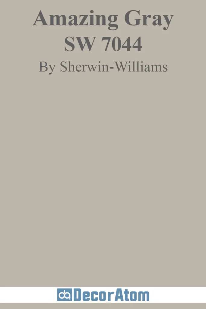
Amazing Gray (SW 7044)
💥🎁 Christmas & Year-End Deals On Amazon !
Don't miss out on the best discounts and top-rated products available right now!
*As an Amazon Associate, I earn from qualifying purchases.
Amazing Gray is a medium-toned greige that blends gray with rich beige undertones. It has a grounded and warm feel, making it a popular choice for living rooms and dining rooms.
Its balance between cool and warm tones allows it to work well with a variety of accent colors, including both bold and subtle hues.
Amazing Gray’s versatility is why it ranks among the top neutrals—it brings depth to a room without feeling overwhelming.
Anew Gray (SW 7030)
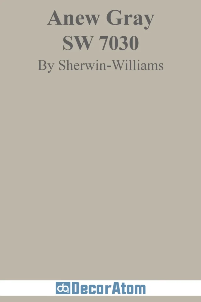
Anew Gray is a deeper greige that adds richness and depth to any space. This color works well in transitional spaces like hallways or foyers, as its warm undertones create a welcoming, elegant atmosphere.
Anew Gray’s versatility makes it a great choice for those who want to create a sophisticated space without using dark, overpowering tones. It complements both natural wood tones and metallic accents, giving it a truly timeless appeal.
Colonnade Gray (SW 7641)
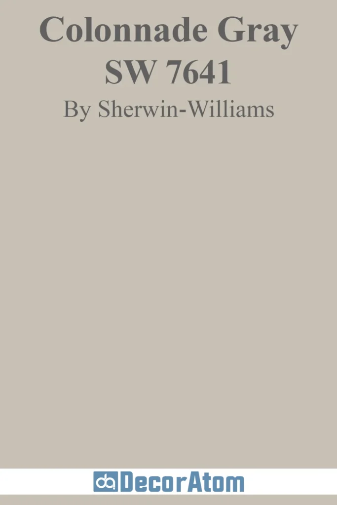
Colonnade Gray is a timeless greige that offers subtle depth with its mixture of gray and beige tones. It’s a versatile and dependable color, perfect for homeowners who want a neutral that can pair well with almost any color scheme.
Colonnade Gray’s ability to bring warmth and sophistication to a space, while remaining neutral enough to allow other elements to shine, makes it a go-to for any room.
Alabaster (SW 7008)

Alabaster is a warm, creamy white that gives off an inviting, timeless feel. This soft white works beautifully in both contemporary and traditional homes, thanks to its ability to evoke warmth without leaning too yellow or too stark.
Alabaster’s creamy undertones make it a popular choice for living rooms, kitchens, and bathrooms. It’s a highly adaptable color that feels cozy and elegant at the same time.
Snowbound (SW 7004)

Snowbound is a clean, soft white that brings a touch of warmth without feeling too heavy. It’s ideal for spaces where you want a fresh, bright backdrop with a gentle softness.
Snowbound pairs beautifully with both light and dark colors, making it an easy choice for creating contrast in your home décor. This white offers just the right amount of warmth to make it feel welcoming and sophisticated.
Eider White (SW 7014)
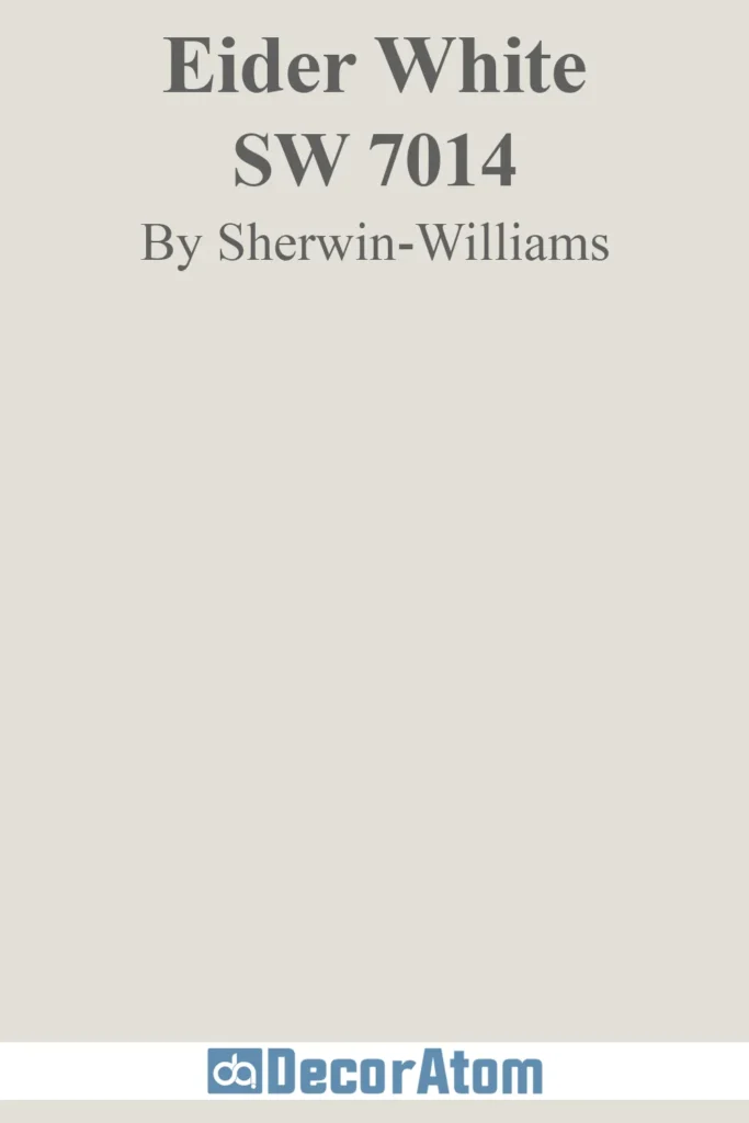
Eider White is a light, grayish-white that leans cool with subtle blue undertones. This color is a perfect choice for spaces that require a calming, peaceful atmosphere, such as bedrooms or bathrooms.
Its soft, cool feel makes it ideal for creating a serene environment, while its neutrality allows it to blend easily with other shades in your décor.
Creamy (SW 7012)

Creamy is a warm off-white with a subtle yellow undertone, giving it a soft, inviting appearance. It’s a great option for creating cozy spaces, especially in kitchens, dining areas, or living rooms.
Creamy’s warmth makes it ideal for pairing with rich wood tones, soft pastels, or golden metallic accents, enhancing its inviting and soothing atmosphere.
Extra White (SW 7006)
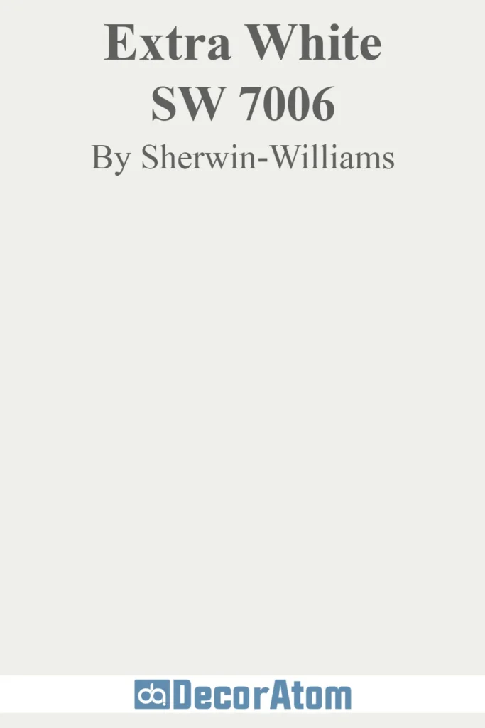
Extra White is a bright, clean white with a modern, crisp edge. Its freshness and clarity make it perfect for contemporary spaces where you want a bold, fresh feel.
This white works wonderfully with minimalistic or industrial décor, offering a sleek, polished appearance.
It pairs beautifully with darker colors and vibrant accent pieces, creating a fresh canvas for any design style.
Greek Villa (SW 7551)

Greek Villa is a warm white that feels both cozy and elegant. Its soft, creamy base evokes a sense of serenity and luxury, making it perfect for both traditional and contemporary interiors.
Whether you’re designing a classic living room or a modern bathroom, Greek Villa offers the warmth and brightness you need without being too stark.
Shoji White (SW 7042)

Shoji White is a soft, neutral white with a slight beige undertone, making it ideal for creating serene, calm environments.
Its understated warmth brings a natural, organic feel to any room, while its neutral tone allows it to blend beautifully with other colors and textures.
Shoji White works particularly well in spaces that need a natural, relaxed vibe, such as bedrooms, entryways, and living rooms.
Canvas Tan (SW 7531)

Canvas Tan is a muted tan that brings an earthy, grounded quality to any room. It has a natural, organic feel that makes it an excellent choice for creating rustic or nature-inspired spaces.
Its versatility allows it to complement a wide variety of décor styles, from farmhouse to bohemian, making it a reliable choice for anyone looking to add warmth and character to their home.
Ceiling Bright White (SW 7007)
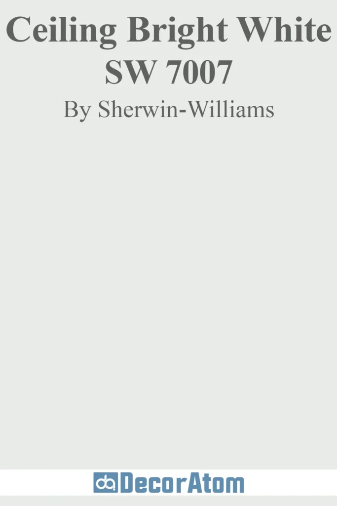
A great neutral isn’t just for walls—Ceiling Bright White (SW 7007) proves that the right ceiling color can completely transform a space. This crisp, cool-toned white is designed to brighten ceilings while enhancing natural and artificial light. With an LRV of 83, it reflects light beautifully, making rooms feel taller and more open.
Unlike warmer whites, Ceiling Bright White leans slightly cool, keeping ceilings looking fresh without yellow undertones. It pairs effortlessly with both warm and cool wall colors, making it a versatile choice for any space. Whether you’re using it on ceilings, trim, or even minimalist walls, this color adds the perfect finishing touch to a well-balanced neutral palette.
Dorian Gray (SW 7017)
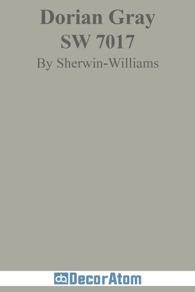
Dorian Gray is a medium gray with a touch of warmth, making it ideal for spaces where you want a neutral backdrop with a bit of depth.
It’s perfect for creating a sophisticated, modern atmosphere in living rooms or bedrooms. The warmth in Dorian Gray makes it more inviting than cooler grays, and it pairs beautifully with both warm and cool accent colors.
Mindful Gray (SW 7016)

Mindful Gray is a true gray with subtle greige undertones, giving it a grounded, neutral feel. It’s a versatile color that works well in almost any space, from bedrooms to living rooms.
Mindful Gray is loved for its balanced tone, which offers a sense of sophistication and tranquility. It’s perfect for those who want a true gray that isn’t too cool or too warm.
Dovetail (SW 7018)

Dovetail is a deep, warm gray that’s perfect for accents or cabinetry. It adds depth and sophistication to spaces, making it ideal for creating focal points or contrasts.
Whether you use it for a statement wall or cabinetry, Dovetail brings a sense of richness and elegance without feeling overpowering.
Gauntlet Gray (SW 7019)
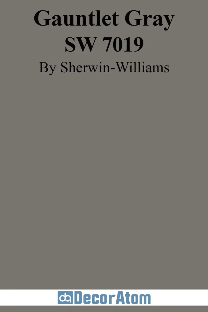
Gauntlet Gray is a rich, dark gray with a hint of warmth, offering a sophisticated and bold statement. It’s a popular choice for creating dramatic, moody spaces, such as accent walls or feature rooms.
Its depth makes it ideal for pairing with lighter tones to create contrast and highlight architectural features.
Urbane Bronze (SW 7048)

Urbane Bronze is a dark, earthy bronze-gray that brings drama and depth to any space. It’s a highly versatile color that works beautifully as an accent or a main color.
Its richness and warmth make it perfect for creating luxurious, intimate spaces, while its earthy tones ground the room and create a stunning visual impact.
Urbane Bronze’s unique blend of bronze and gray makes it one of the most compelling dark neutrals on the market today.
How to Choose the Right Neutral for Your Space?
Choosing the right neutral for your space is all about balancing the mood, lighting, and layout of the room. Here are some key factors to help you select the perfect neutral:
- Room Size: In smaller rooms, lighter neutrals like Alabaster or Snowbound help reflect light, creating the illusion of space and making the room feel more open. Conversely, larger spaces can handle darker neutrals such as Gauntlet Gray or Urbane Bronze, which add warmth and intimacy, making a large space feel more inviting and grounded.
- Natural Light: The amount of natural light a room receives can greatly impact how a neutral color looks. Rooms with plenty of natural light can benefit from cool-toned neutrals like Agreeable Gray or Passive, as these shades won’t feel too cold and will keep the room feeling balanced. In spaces with less natural light, warmer neutrals like Accessible Beige or Kilim Beige can add a cozy and welcoming feel by reflecting artificial light.
- Existing Décor: When choosing a neutral, consider how it will work with your furniture, flooring, and other elements in the room. If your room features darker wood furniture or floors, you may want to choose a light neutral, like Snowbound, to create contrast. If you have light-colored furniture or flooring, a deeper neutral like Dovetail or Barcelona Beige will provide balance and harmony.
- Mood and Ambiance: Different neutrals can set different tones in your space. For a peaceful, calming vibe, soft neutrals like Eider White or Creamy work wonderfully in bedrooms or retreats. If you’re aiming for a more sophisticated or dramatic feel, deeper tones like Urbane Bronze or Dorian Gray can bring a bold and luxurious vibe to your space.
Trending Neutral Color Combinations
Pairing neutrals with other colors can help elevate your space and add dimension to your design. Here are some trending combinations:
- Warm Neutrals + Rich Dark Colors: Warm neutrals like Accessible Beige pair beautifully with deep, rich shades like navy, emerald, or burnt orange. This combination creates a cozy and sophisticated atmosphere, ideal for living rooms or dining areas where you want both elegance and warmth.
- Cool Neutrals + Pastels or Metallic Accents: Neutrals like Agreeable Gray and Repose Gray provide a perfect backdrop for soft pastels such as blush pink, sage green, or light blue. Adding metallic accents, like gold or silver, brings a modern, chic look that works well in contemporary or minimalist spaces.
- Greige Layering: For a monochromatic, harmonious feel, layer various shades of greige, such as Worldly Gray and Perfect Greige. The subtle variations in hue will create depth and visual interest without overwhelming the space. This look is perfect for creating balance and serenity in bedrooms or living rooms.
How Lighting Affects Neutral Colors
Lighting plays a huge role in how neutral colors appear throughout the day. Here’s how lighting can change the look of a color:
- Natural Light: During the day, a room with ample natural light will showcase cooler neutrals like Passive and Silver Strand in their truest form, with soft, subtle tones. However, as the light fades, these colors may lean slightly warmer. On the other hand, rooms with minimal natural light will benefit from warmer neutrals like Nomadic Desert or Wool Skein, which won’t feel too harsh or cold.
- Artificial Lighting: The type of artificial lighting in a room can also affect how a neutral color looks. Incandescent bulbs tend to bring out warmer undertones, making colors like Kilim Beige or Dovetail appear cozier. Meanwhile, cool LED lights can enhance the cool undertones in colors like Repose Gray or Big Chill, giving them a fresh, modern feel.
- Testing Paint Samples: Before committing to a color, test large paint samples in the space and observe how they look at different times of the day. This will help you see how the color changes under both natural and artificial light, ensuring you’re happy with your choice.
Best Uses for Neutrals in Different Rooms
Each room in your home can benefit from a different neutral based on its purpose and the atmosphere you want to create. Here’s how certain neutrals work best in specific areas:
Living Rooms & Family Spaces: Neutrals like Repose Gray, Kilim Beige, and Colonnade Gray create inviting atmospheres that are perfect for relaxing and socializing. These colors provide a calming background that complements various furniture styles, from traditional to contemporary.
Bedrooms & Retreats: Soft, tranquil neutrals such as Alabaster, Eider White, and Mindful Gray help promote relaxation and restful sleep. These colors are ideal for creating a peaceful sanctuary, free from distractions, where you can unwind after a busy day.
Kitchens & Dining Rooms: Neutrals like Snowbound, Greek Villa, and Extra White work beautifully in kitchens and dining rooms, where a bright and fresh atmosphere is key. These shades create a clean, airy look that pairs well with stainless steel appliances, wooden cabinetry, and modern fixtures.
Bathrooms: For smaller spaces like bathrooms, soft neutrals such as Shoji White and Silver Strand can make the room feel more spacious and serene. These colors work well with both modern and traditional fixtures and will help create a calm, spa-like environment.
How to Add Depth and Contrast with Neutrals
Using neutrals to add depth and contrast can enhance the overall aesthetic of your space. Here are some ways to do this:
- Accent Walls: Create a striking focal point by painting one wall in a darker neutral like Urbane Bronze or Dovetail. This adds drama and sophistication, especially when paired with lighter neutrals on the remaining walls.
- Darker Neutrals with Lighter Furniture: If you opt for a light neutral on the walls, consider adding darker furniture or trim in shades like Gauntlet Gray or Dorian Gray. This contrast will help define different areas of the room and give it a more polished, layered look.
- Lighter Neutrals with Darker Accents: Conversely, if your walls are darker, lighter neutrals like Snowbound or Creamy on trim, doors, or furniture will create a balanced, harmonious space that feels spacious and well-organized.
Popular Color Pairings
Neutrals are versatile and can be paired with a variety of colors to create different vibes. Some popular pairings include:
- Warm Neutrals + Rich Blues or Greens: For a classic, elegant feel, pair warm neutrals like Accessible Beige with deep navy, emerald, or forest green. This combination works well in both traditional and modern settings, providing balance and sophistication.
- Cool Neutrals + Soft Metallics: Cool neutrals like Agreeable Gray or Silver Strand pair beautifully with soft metallics such as gold, bronze, or silver. This combination is ideal for contemporary spaces that need a touch of glamour and refinement.
- Earthy Neutrals + Natural Textures: Earthy tones like Shoji White and Canvas Tan look great with natural textures like wood, stone, or terracotta. This pairing creates a warm, organic vibe that’s perfect for rustic or bohemian-inspired spaces.