

I don’t know about you, but picking the right paint color always feels like a big decision.
You want something that looks beautiful, works with your furniture, and doesn’t go out of style in six months.
That’s why I love turning to Sherwin-Williams—they consistently offer colors that are not only timeless but also incredibly versatile.
In this post, I’m sharing 27 of the most popular Sherwin-Williams interior paint colors. These are the shades that homeowners, designers, and builders reach for over and over again—and for good reason.
Whether you’re planning a full home makeover or just want to refresh a single room, this list will give you a solid starting point with tried-and-true favorites.
Let’s take a look at what makes each of these colors special and why they continue to be top choices for interiors.

How Long Should Sherwin Williams Interior Paint Last?
Sherwin-Williams interior paint is known for its longevity. On average, their premium interior paints like Emerald or Duration can last 8 to 10 years or more when properly applied on a well-prepped surface. Several factors affect longevity, including:
- Surface preparation (clean, primed, and patched)
- Number of coats (two coats typically provide better durability)
- Room traffic (kitchens and hallways may need repainting sooner)
- Cleaning and maintenance habits
While the paint itself may remain in good condition for years, color fading or style changes often lead homeowners to repaint more frequently—about every 5–7 years on average.

What Is the Most Popular Sherwin Williams Interior Paint Color?
Hands down, Agreeable Gray SW 7029 is Sherwin-Williams’ most popular interior paint color.
It’s a soft, warm greige—a perfect balance of gray and beige—that works in nearly every space. Its neutral undertones make it incredibly versatile.
Whether you’re working with warm wood tones, white trim, or even modern finishes, Agreeable Gray creates a fresh, timeless backdrop that never feels too cold or too dark.
Other top contenders include Alabaster SW 7008, Repose Gray SW 7015, and Pure White SW 7005.

Which Paint Finish Is Best for Interior Walls?
The best paint finish depends on the room and how much wear and tear it experiences:
- Matte/Flat: Great for ceilings and low-traffic areas like formal dining rooms or adult bedrooms. It hides imperfections but is harder to clean.
- Eggshell: Ideal for most interior walls. It has a soft, velvety finish that’s slightly more durable than flat paint and easier to clean. A top pick for living rooms, hallways, and bedrooms.
- Satin: A step up in sheen and durability, perfect for kitchens, bathrooms, and high-traffic areas. It resists moisture and is easy to wipe down.
- Semi-gloss or Gloss: Typically used for trim, doors, and cabinetry. It’s very durable and reflective, which highlights architectural details.
For most homeowners, eggshell or satin are the go-to finishes for walls because they strike a nice balance between aesthetics and function.

How Do You Choose the Right Paint Colors for Your Interior?
Choosing the right paint color can feel overwhelming, but a few simple tips can help narrow things down:
- Consider the lighting in your space. Natural light tends to bring out cooler tones, while artificial light can warm up the color.
- Think about your existing furniture and finishes. Use paint to complement or contrast with wood tones, flooring, or cabinetry.
- Start with neutrals if you’re unsure. Colors like greige, soft whites, and pale grays work well almost anywhere.
- Test swatches on your walls and observe them throughout the day. Colors can look dramatically different in morning light vs. evening.
- Use sample boards if you’re painting a large area. Don’t rely solely on paint chips—they’re often misleading due to their small size.
- Consider flow between rooms. Pick a palette that creates a cohesive feeling as you move from space to space.
Above all, pick a color that feels good to you. It’s your home—make it reflect your style and mood.

Top 27 Interior Colors From Sherwin-Williams
Here are Sherwin-Williams 27 most popular interior paint colors that are sure to stand the test of time in any home no matter your style.
1. Pure White SW 7005
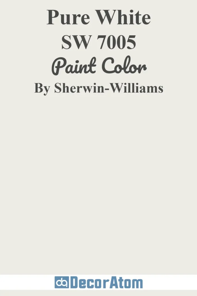
Pure White is a crisp, clean white with just a touch of warmth, which prevents it from feeling stark or sterile. It has minimal undertones, making it incredibly versatile for trim, ceilings, or walls.
Homeowners love it because it pairs beautifully with both warm and cool palettes, offering a bright yet soft backdrop that enhances natural light in any room.
2. Agreeable Gray SW 7029
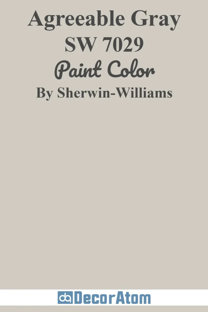
Agreeable Gray is a warm greige (gray + beige) with subtle brown undertones, making it one of Sherwin-Williams’ best-selling colors.
It adapts to many lighting conditions and looks great in both traditional and modern interiors. This paint color brings a soft, welcoming vibe to living rooms, bedrooms, and open-concept spaces.
3. Snowbound SW 7004

Snowbound is a soft white with cool gray undertones. It’s a favorite for modern farmhouse styles and clean, contemporary spaces.
It offers a fresh, airy look without being too cold, which makes it ideal for walls, trim, and cabinetry. It pairs especially well with gray, black, and natural wood tones.
4. Alabaster SW 7008
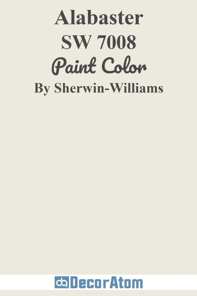
Alabaster is a warm, creamy white with a calming softness. It’s a timeless choice that feels cozy yet bright.
This color won Color of the Year in 2016 and continues to be popular for interiors because it adds warmth without overpowering the space. It works beautifully in bedrooms, kitchens, and even bathrooms.
5. Repose Gray SW 7015
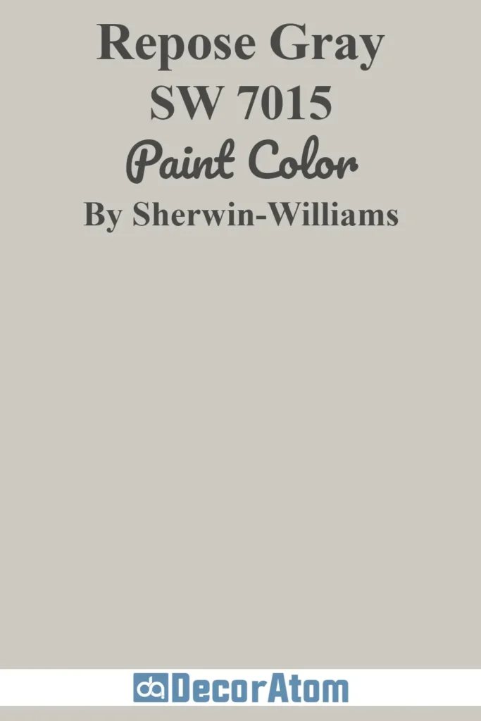
Repose Gray is a light-to-medium gray with warm undertones and just a hint of taupe. It’s a balanced neutral that doesn’t feel too cold or too warm, which makes it a favorite for entire-home color schemes.
It’s elegant, calming, and versatile enough for any room—from living spaces to hallways and home offices.
6. Dover White SW 6385
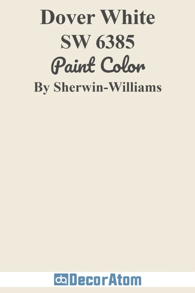
Dover White is a creamy off-white with strong yellow-beige undertones, giving it a soft, classic look.
It’s best used in traditional or cottage-style interiors where a warm, cozy atmosphere is desired. This shade is popular for trim, cabinets, and walls where a true white might feel too stark.
7. Accessible Beige SW 7036
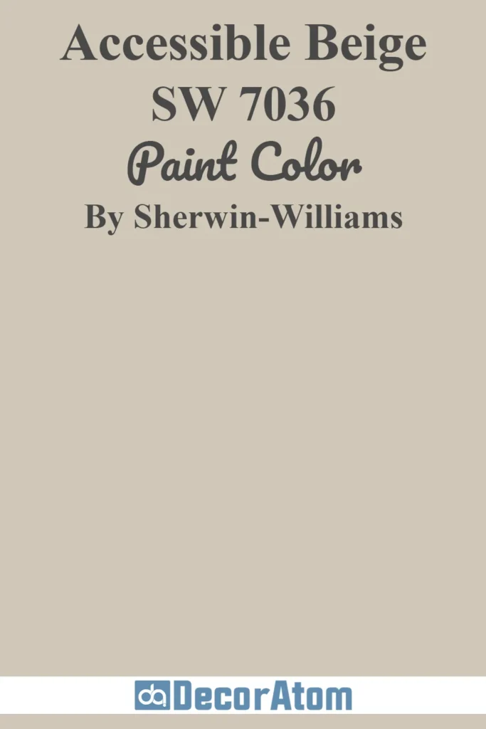
Accessible Beige is a warm neutral with subtle gray undertones, making it more modern than traditional beige. It works well in open-concept homes and pairs nicely with both wood tones and cool grays.
This color feels grounded and inviting, making it a go-to choice for living rooms and entryways.
8. Greek Villa SW 7551

Greek Villa is a soft, creamy white with a hint of warmth, offering a clean and refined look without the harshness of pure white.
It’s a favorite for brightening up spaces while still feeling cozy. This shade works beautifully for whole-house color schemes or as a backdrop for bolder accent pieces.
9. Drift of Mist SW 9166

Drift of Mist is a light, airy greige with soft green undertones. It brings a tranquil feel to any room and is often chosen for its subtle elegance.
This color works particularly well in bedrooms, bathrooms, or living areas where you want a soft, neutral palette with a hint of freshness.
10. Ceiling Bright White SW 7007
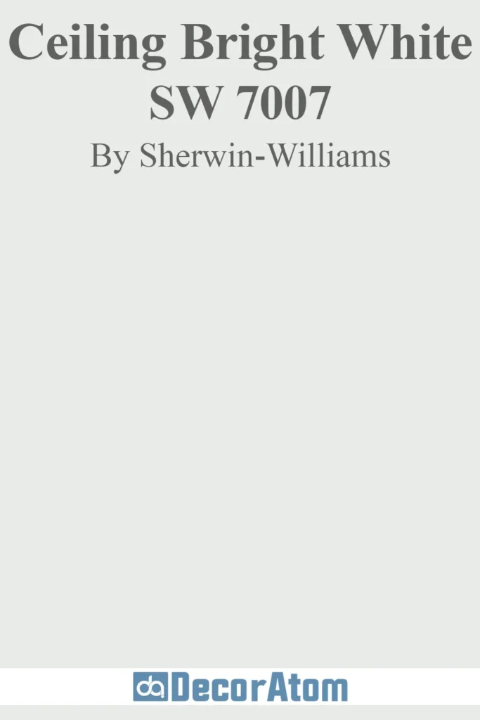
Ceiling Bright White is designed specifically for ceilings, offering a clean, cool-toned white that helps rooms feel taller and more open.
It reflects light well and blends effortlessly with most wall colors, making it an ideal choice for a polished, professional finish overhead.
11. Creamy SW 7012

Creamy is a warm, soft off-white that lives up to its name. It has subtle yellow undertones that give it a cozy, inviting feel without looking too yellow.
It’s a popular choice for traditional interiors and works beautifully in kitchens, bedrooms, or any space where you want a gentle, warm glow on the walls.
12. Kilim Beige SW 6106

Kilim Beige is a medium-toned beige with warm red undertones, giving it a rich and earthy appearance. It’s a timeless color that works well in classic and transitional interiors.
This shade pairs well with dark wood furniture and brings a grounded, comfortable feel to living rooms and dining spaces.
13. Passive SW 7064

Passive is a cool, light gray with subtle blue undertones. It’s a great option for modern and minimalist homes, offering a sleek and calming backdrop.
Passive works especially well in rooms with lots of natural light, and it complements stainless steel, marble, and other cool-toned finishes.
14. Tricorn Black SW 6258

Tricorn Black is a deep, true black with a rich, velvety finish. It has no strong undertones, which makes it one of the most versatile blacks in Sherwin-Williams’ lineup.
This bold color is often used for accent walls, doors, cabinets, and even exteriors to create contrast and sophistication.
15. Whitetail SW 7103

Whitetail is a bright, clean white with warm undertones, giving it a cheerful, welcoming feel. It reflects a lot of light, making rooms feel open and fresh.
It’s especially popular for interiors with warm flooring or gold-toned accents, and it brings a crisp finish to trim and ceilings too.
16. Olympus White SW 6253

Olympus White is a very light gray with subtle blue undertones that lean cool.
It creates a soft and soothing atmosphere, making it ideal for bedrooms, bathrooms, and home offices. It works well with white trim and gives off a quiet elegance without feeling stark or flat.
17. Sea Salt SW 6204
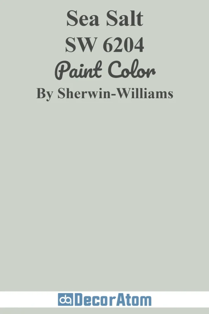
Sea Salt is a soft green-gray with just the right hint of blue. It’s a favorite for creating spa-like, calming spaces and works well in bathrooms, laundry rooms, and bedrooms.
This color shifts beautifully in different lighting, adding depth and personality without being overpowering.
18. Extra White SW 7006
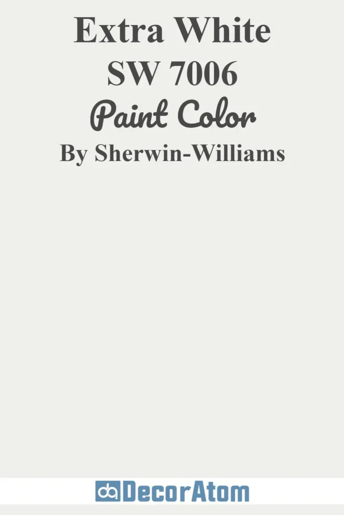
Extra White is one of the brightest whites in the Sherwin-Williams catalog. With barely-there undertones, it’s a favorite for trim, ceilings, and modern interiors where a sharp, clean look is desired.
It also pairs well with cool and bold accent colors, giving spaces a crisp contrast.
19. Westhighland White SW 7566

Westhighland White is a warm white that leans creamy but still reads clean and classic. It’s ideal for spaces where you want a soft but not yellow appearance.
This color flatters both traditional and transitional interiors and works especially well for full-room applications or cabinetry.
20. White Flour SW 7102

White Flour is a warm, slightly creamy white that offers more softness than a bright white.
It’s an excellent choice for walls in farmhouse, coastal, or cottage-style homes. This color creates a sense of comfort and blends seamlessly with warm wood tones and soft color palettes.
21. Reflection SW 7661

Reflection is a pale, cool gray with noticeable blue undertones. It brings a light and airy feel to interiors, perfect for open spaces, bathrooms, and bedrooms.
It’s a great option if you’re looking for a cool-toned neutral that won’t feel heavy or dark.
22. Iron Ore SW 7069

Iron Ore is a deep, rich charcoal that flirts with black but feels slightly softer.
It’s bold and dramatic, making it perfect for accent walls, cabinetry, or even entire rooms if you’re going for a moody, sophisticated vibe.
This color works especially well with brass, white, and natural wood accents.
23. Ice Cube SW 6252

Ice Cube is a fresh, icy white with subtle blue-gray undertones. It’s perfect for cool, contemporary spaces and helps enhance the sense of brightness and cleanliness in a room.
Ideal for bathrooms, kitchens, or any area where a clean, light look is desired.
24. Eider White SW 7014
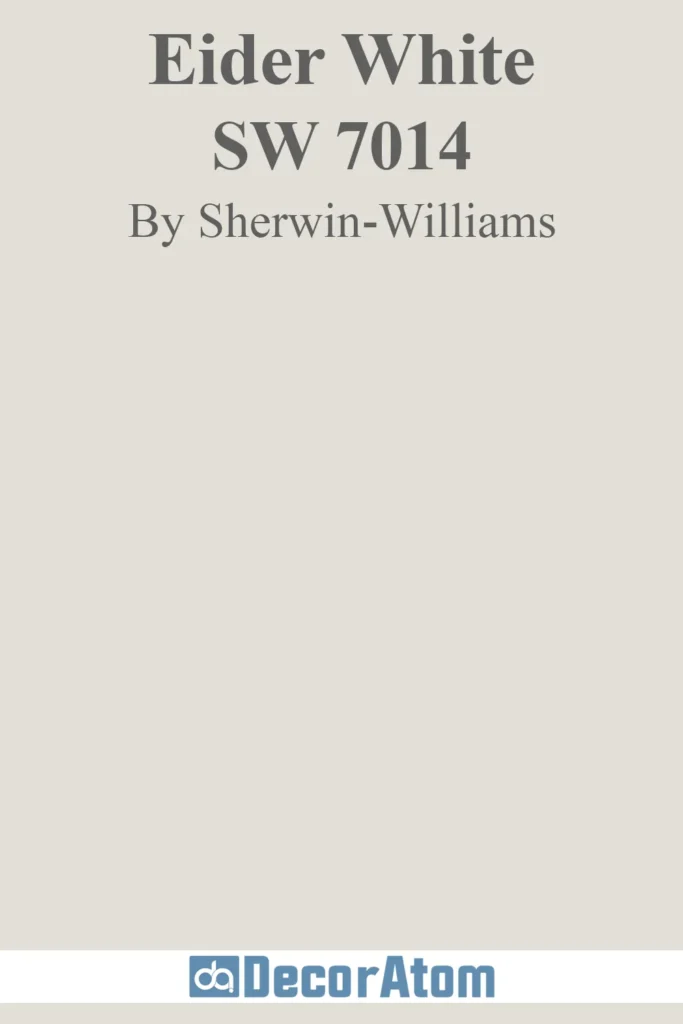
Eider White is a soft, light gray with faint purple undertones, which gives it a unique, almost ethereal quality.
It’s a sophisticated choice for modern interiors and works especially well in rooms with indirect light, adding subtle character without overwhelming the space.
25. On the Rocks SW 7671
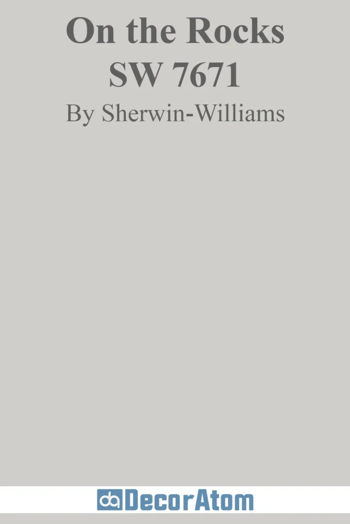
On the Rocks is a medium-light gray with balanced undertones that keep it feeling neutral and adaptable.
It’s a great whole-house color, offering enough contrast for trim while still being light enough to keep rooms feeling open. This shade pairs well with both warm and cool color schemes.
26. Naval SW 6244

Naval SW 6244 is a rich, deep navy blue that brings sophistication and drama to any space. It’s a bold yet timeless color that works beautifully in bedrooms, dining rooms, offices, and even kitchen cabinetry.
While it’s undoubtedly dark, Naval has enough warmth to feel cozy rather than cold. It pairs well with brass or gold hardware, white trim, natural wood tones, and crisp whites like Pure White or Extra White.
This shade is also versatile enough to lean nautical, classic, or modern depending on how you style the room. It was even Sherwin-Williams’ 2020 Color of the Year—proof that it’s more than just a trend.
27. Charcoal Blue SW 2739

Charcoal Blue SW 2739 is the perfect blend of navy and charcoal gray. It’s moody, stylish, and incredibly grounding—ideal for accent walls, built-ins, or anywhere you want to add depth and character.
Unlike pure gray or standard navy, Charcoal Blue has a slightly muted, dusky undertone that makes it feel both bold and refined. It looks stunning paired with warm woods, soft neutrals, or creamy whites like Alabaster or Greek Villa.
If you’re looking for a color that adds richness without feeling too overpowering, Charcoal Blue is a smart, flexible choice.