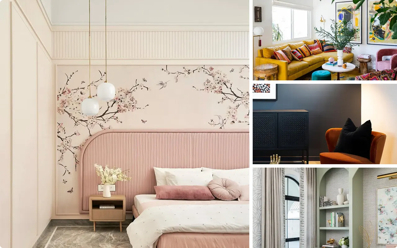
Selecting the right interior paint color is one of the most effective ways to influence the overall tone, style, and atmosphere of a home.
While color trends come and go, there are certain shades that consistently prove their versatility and impact across a variety of interiors.
From soft, calming hues to bold statement tones, modern paint colors are now less about following trends and more about expressing personal style in a way that feels cohesive and intentional.
In this curated collection of 19 modern interior paint colors, I’ve highlighted a range of shades that designers and homeowners alike continue to turn to for their timeless appeal and ability to elevate a space.
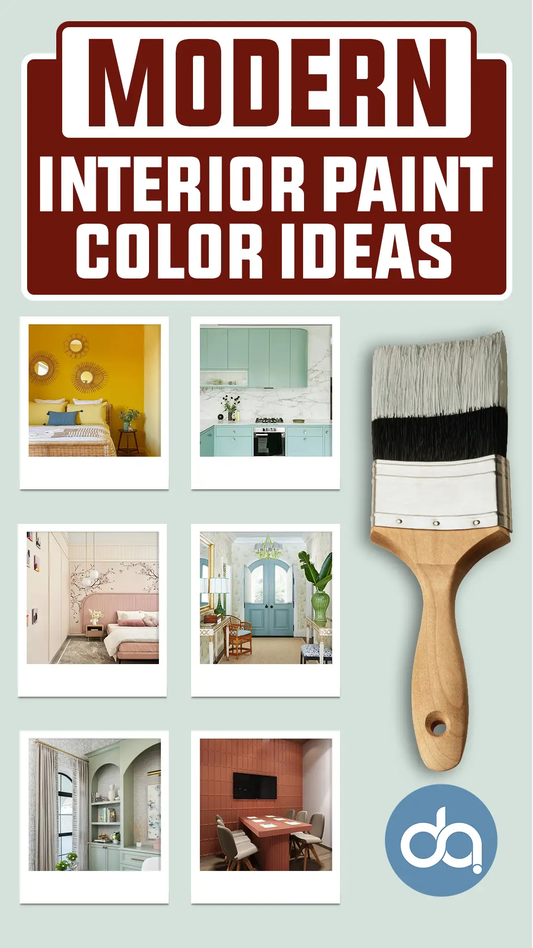
These shades are timeless, versatile, and work well with many different styles. Some are calm and neutral, others are bold and full of personality. Each one can help you create a space that feels just right for you.
Also Read: 27 Most Popular Sherwin-Williams Interior Paint Colors
1. Warm Greige
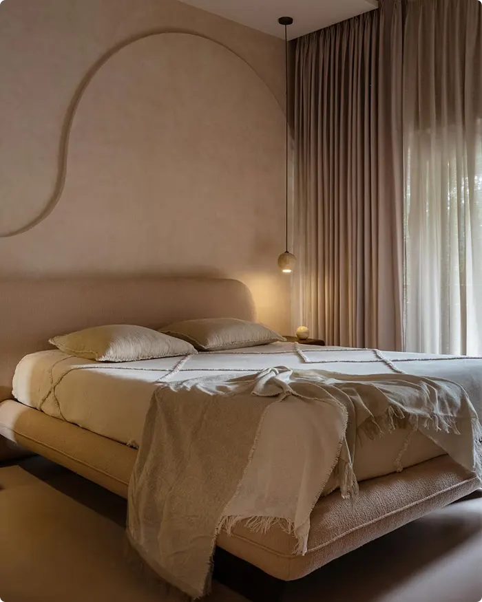
Warm greige is one of those magic neutrals that somehow fits into nearly every space. It’s what I reach for when I want a room to feel grounded but not cold, sophisticated without being sterile.
Think of it as the perfect middle ground between gray and beige—it pulls a little warmth from brown tones while staying modern and fresh with a cool undertone.
I’ve used warm greige in both my living room and hallway because it’s subtle enough to let furniture and art stand out, but it still adds just enough color to avoid a flat, washed-out look.
It also plays well with just about any accent—wood, brass, black, you name it.
2. Soft Sage Green
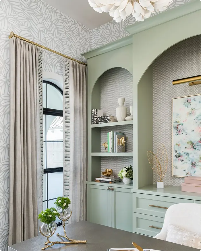
There’s a calmness to soft sage green that instantly makes a space feel peaceful. It’s got this soft, muted tone that echoes nature without screaming “green.”
I’ve found it especially soothing in bathrooms and kitchens, where it complements white tiles or wood cabinetry beautifully. What I love most about it is how it catches different moods throughout the day—bright and airy in morning light, mellow and earthy by evening.
Pair it with natural textures like linen or rattan, and you’ll end up with a space that feels quietly sophisticated, not overly styled.
Also Read: 21 Best Sage Green Paint Colors for Living Room
3. Deep Navy Blue
💥🎁 Christmas & Year-End Deals On Amazon !
Don't miss out on the best discounts and top-rated products available right now!
*As an Amazon Associate, I earn from qualifying purchases.
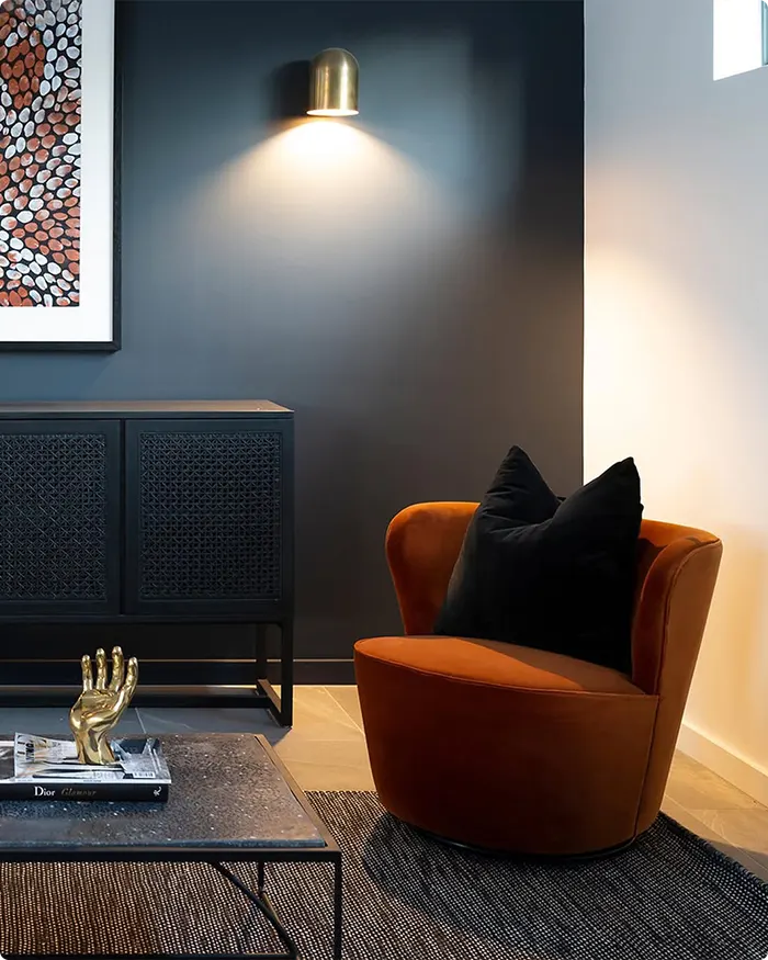
If you’re looking to add depth and drama, deep navy blue delivers every time. This isn’t just any blue—it’s rich, moody, and surprisingly versatile.
I once painted a bedroom wall in deep navy and paired it with crisp white trim and brass accents; the result was classic but bold. What I find interesting is how well navy works in both large and small spaces.
In a big room, it feels stately. In a smaller space, it cocoons the room in a cozy, elegant way. It’s also a fantastic color to use when you want metallics or wood tones to pop.
4. Crisp White
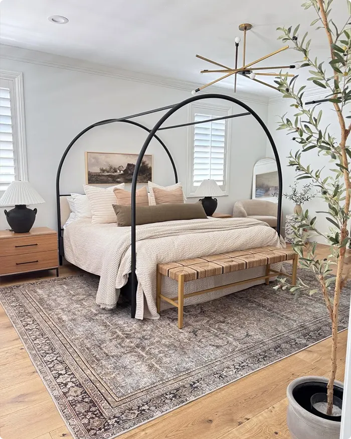
There’s something so timeless about crisp white walls. It’s clean, fresh, and creates a perfect blank canvas.
I’ve always used this shade in spaces where I want light to bounce around—small rooms, windowless hallways, or open-concept living areas. But crisp white isn’t boring.
When paired with bold artwork or colorful furniture, it acts as a subtle background that lets other elements shine. I also love using it in contrast with darker trims or beams—it creates a beautiful balance that feels modern but not cold.
5. Bright Sunshine Yellow
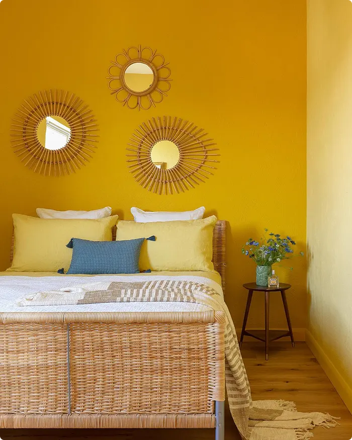
Bright sunshine yellow is pure happiness on a wall. I mean, how can you not feel cheerful walking into a room bathed in warm yellow light?
I’ve used this shade in kitchens and creative spaces where I want to encourage energy and positivity. It’s bold, yes—but when used as an accent wall or paired with white cabinetry and light wood, it becomes the uplifting focal point of the room.
It’s also a color that kids naturally gravitate toward, so it works beautifully in playrooms or nurseries. Just a little bit goes a long way in transforming a dull space into something joyful.
6. Dusty Rose
💥🎁 Christmas & Year-End Deals On Amazon !
Don't miss out on the best discounts and top-rated products available right now!
*As an Amazon Associate, I earn from qualifying purchases.
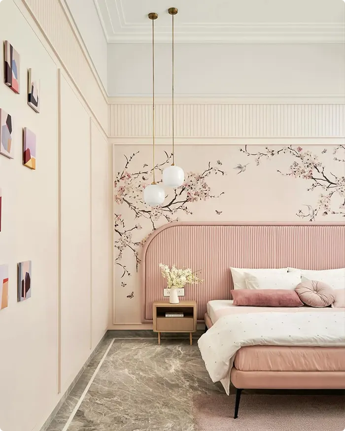
Dusty rose has that nostalgic, romantic vibe, but don’t underestimate how modern it can feel with the right styling. It’s a muted, dusky pink that leans toward a soft mauve, giving it a more grown-up, sophisticated edge.
I love using dusty rose in bedrooms or reading nooks—it adds warmth and personality without going full-on pink.
One of my favorite combinations is dusty rose with charcoal gray or antique brass—it’s unexpected and stylish. It’s also a cozy shade that flatters soft lighting, making it perfect for spaces where you want to slow down and unwind.
7. Earthy Terracotta
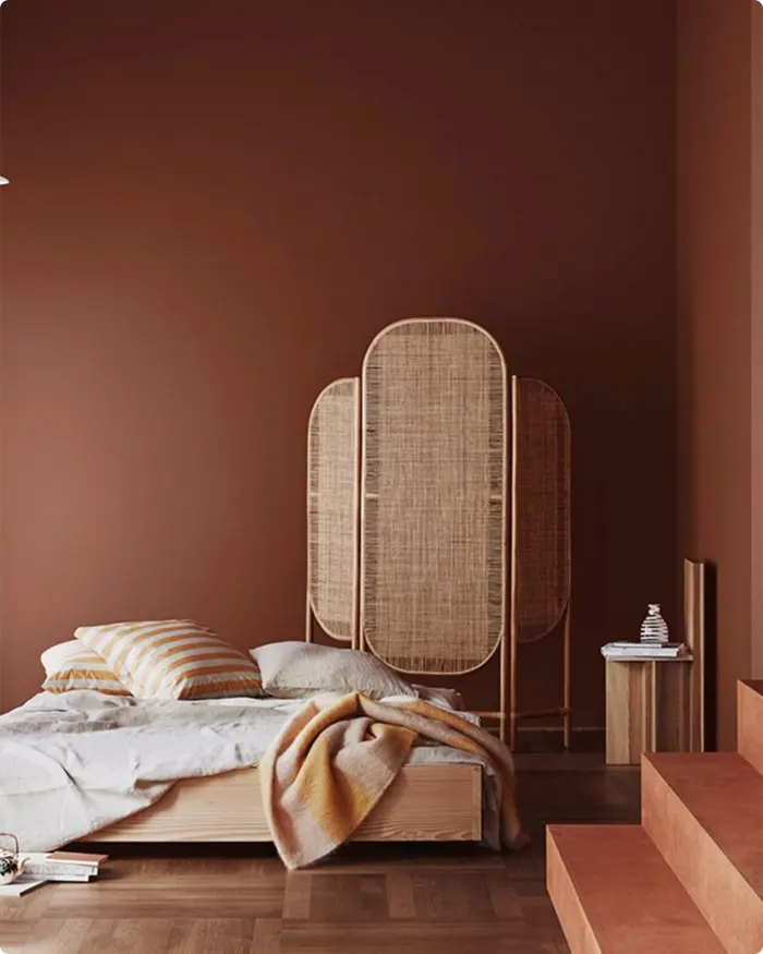
Terracotta is having a moment, and I am all for it. This color brings such a grounded, earthy warmth to any space—it instantly makes a room feel more intimate.
I’ve used it in my studio paired with natural wood, woven textures, and lots of greenery, and it always feels like a warm hug. It’s bolder than beige but more approachable than bright red or orange.
Earthy terracotta is especially beautiful in spaces with southwest, boho, or rustic influence, but honestly, it can be surprisingly versatile in a modern home if balanced with light neutrals.
8. Soft Blush Pink
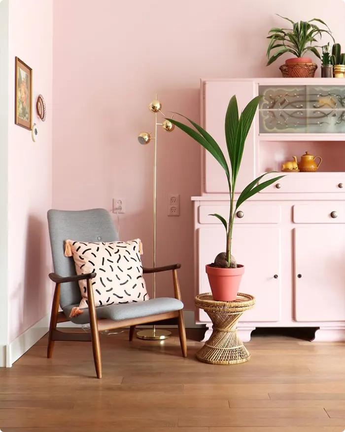
Soft blush pink walks the line between subtle and sweet. It’s one of those shades that doesn’t scream for attention, but once it’s on the wall, you can’t imagine the room without it.
I like to think of it as a whisper of color—it gently warms up a space without overwhelming it. In bedrooms, it creates a soft, calming environment.
In living rooms, especially when paired with gray or cream, it feels modern and stylish. It also pairs beautifully with gold or rose gold accents for a more refined look. A little blush can go a long way in elevating a space.
9. Classic Taupe
💥🎁 Christmas & Year-End Deals On Amazon !
Don't miss out on the best discounts and top-rated products available right now!
*As an Amazon Associate, I earn from qualifying purchases.
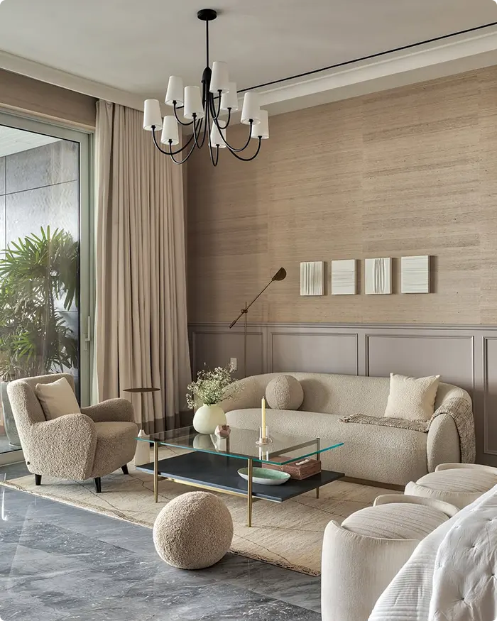
Classic taupe might not be the first color that catches your eye, but it’s one of the most reliable and timeless shades you can choose.
It’s that sweet spot between gray and brown—understated, elegant, and always in style. I’ve used taupe as a wall color in my entryway and paired it with black frames and natural wood, and it gave the space a refined yet welcoming feel.
What I love most is how easily it adapts to both traditional and modern decor. It’s one of those colors you don’t have to overthink—just layer in textures and accents, and you’re good to go.
10. Vibrant Coral
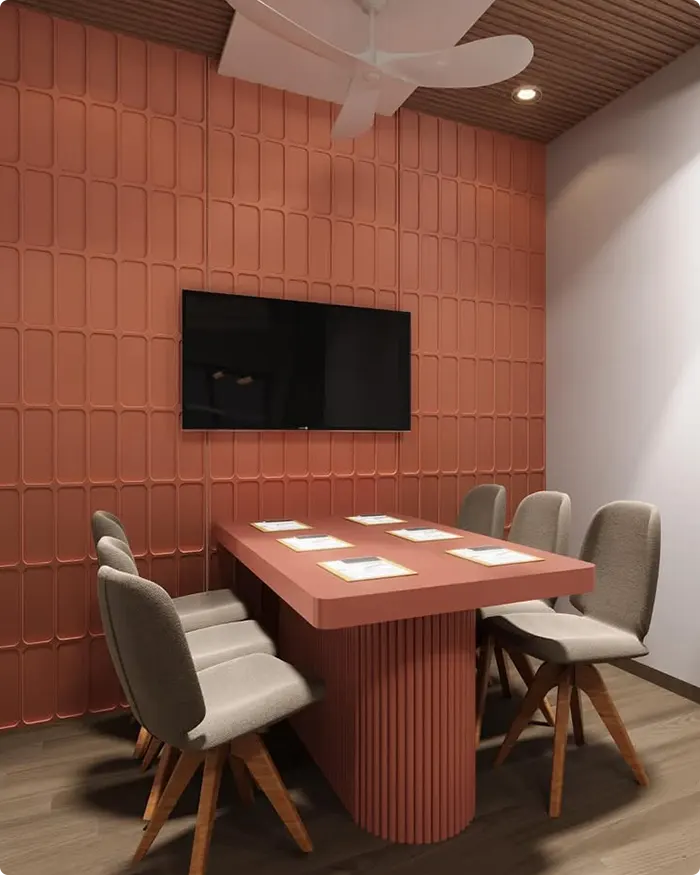
Vibrant coral is where bold meets cheerful. It brings energy and warmth into a room like no other.
I used it in an entryway once, and it made the space feel instantly welcoming—like the room was smiling. Coral works beautifully as an accent wall or even on furniture pieces if you’re not ready to commit to a full room.
It pairs surprisingly well with soft neutrals, navy, or even sage green. The key with coral is balance—keep the rest of the palette simple, and let the color do the talking.
11. Cool Mint Green
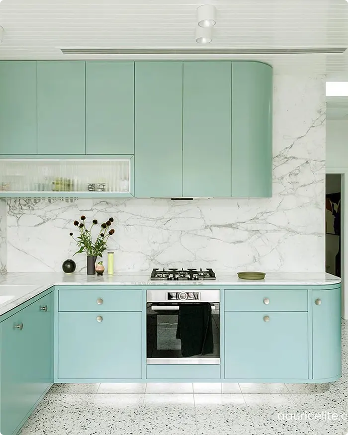
Cool mint green is like a breath of fresh air for your walls. It’s crisp, refreshing, and gives off a clean, almost spa-like vibe—especially in bathrooms and kitchens.
I’ve found it especially lovely in spaces that get a lot of morning light; it really makes the room feel awake without being too bold.
When I used it in a guest bathroom, I paired it with white trim and chrome fixtures, and the result was fresh, modern, and unexpectedly calming.
It’s a great choice if you want something a bit more playful than white but still subtle and relaxing.
Also Read: 13 Best Mint Green Paint Colors
12. Bold Black
💥🎁 Christmas & Year-End Deals On Amazon !
Don't miss out on the best discounts and top-rated products available right now!
*As an Amazon Associate, I earn from qualifying purchases.
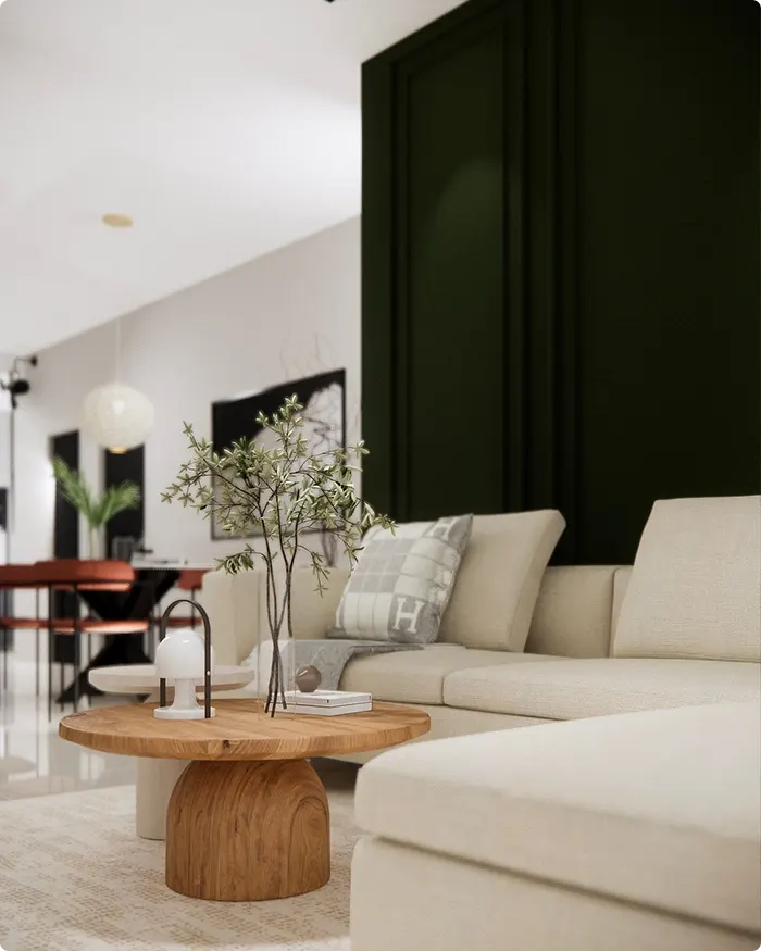
Bold black might seem intimidating at first, but once you try it, it’s hard to go back. There’s something undeniably modern and powerful about using black in interiors.
I’ve used it on accent walls, window frames, and even entire powder rooms. The key is contrast—it looks incredible paired with crisp whites, warm wood tones, or metallic accents like brass and gold.
Black brings out texture in a way lighter colors don’t; whether it’s matte or satin, the depth is always stunning. And surprisingly, in smaller spaces, it can feel dramatic rather than dark—like a cozy, intentional design choice.
13. Sunny Mustard Yellow
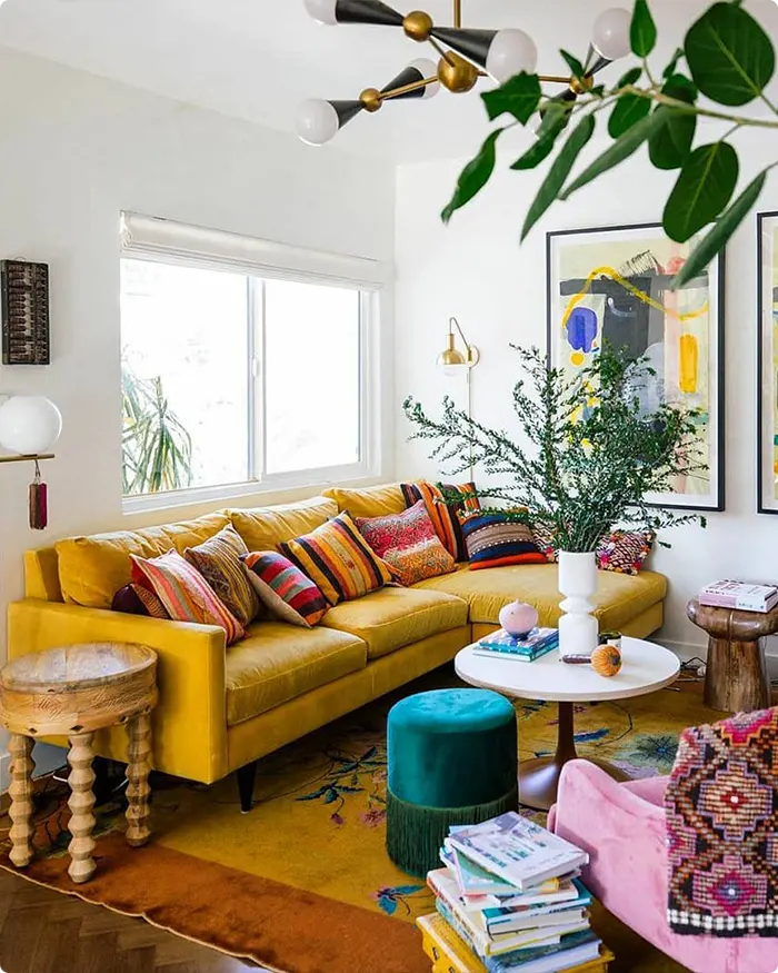
Sunny mustard yellow adds a vintage warmth that always feels like a throwback in the best way. It’s richer and deeper than your typical bright yellow, with just enough golden tone to make it feel cozy instead of loud.
I’ve used mustard yellow in dining areas and accent walls, and it instantly makes the space feel welcoming. It also pairs well with deeper hues like navy, charcoal, and walnut-stained wood.
There’s a retro charm to mustard, but when styled with modern lines and clean textures, it becomes timeless rather than trendy.
14. Elegant Pearl Gray
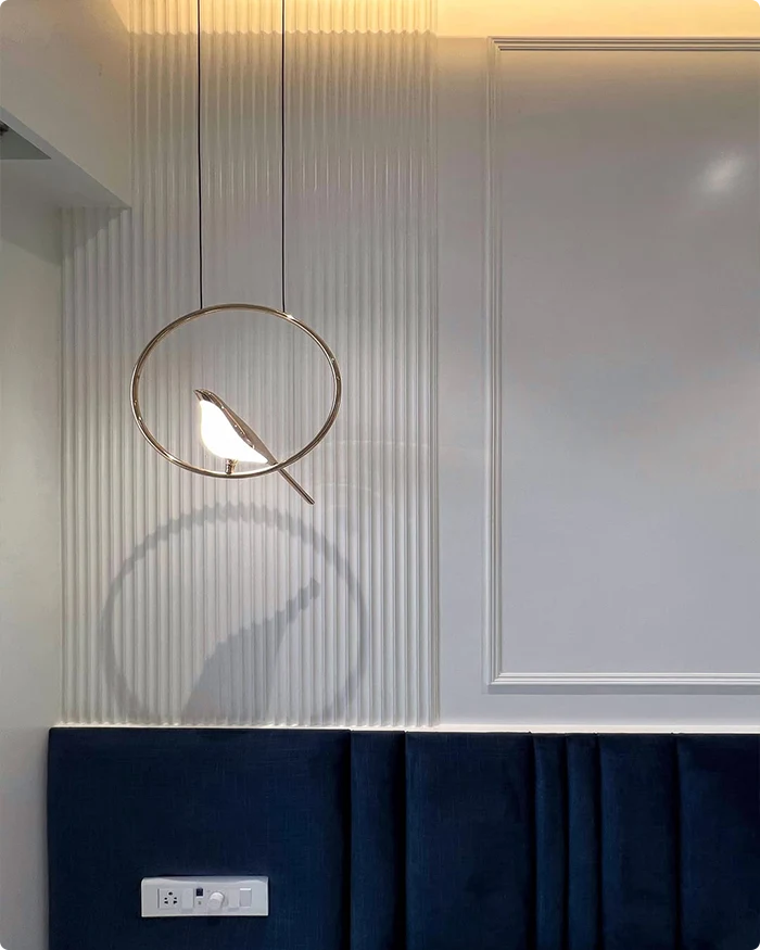
Pearl gray is what I turn to when I want a space to feel sophisticated, polished, and light without being stark.
It has a subtle sheen—like a whisper of shimmer—that catches light beautifully throughout the day. I used pearl gray in my bedroom once, and it made the space feel airy but grounded.
It’s softer than traditional cool grays, with just a hint of warmth that keeps it from feeling too sterile. This shade works with so many palettes—soft blush, navy blue, natural wood—and is ideal for both modern and transitional interiors.
15. Serene Ocean Blue
💥🎁 Christmas & Year-End Deals On Amazon !
Don't miss out on the best discounts and top-rated products available right now!
*As an Amazon Associate, I earn from qualifying purchases.
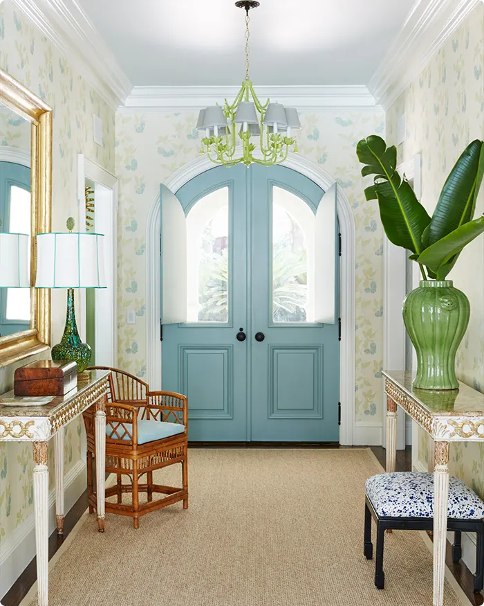
Serene ocean blue has a calm, coastal feel that instantly transports you somewhere relaxing. Whether it’s a breezy beach house or just your upstairs guest room, this shade brings a sense of escape.
I used it once in a bedroom with white linens and seagrass accents, and it felt like waking up by the sea—even in the middle of the city.
It’s got enough color to stand on its own but still feels soft and soothing. It pairs beautifully with sandy neutrals, woven textures, and even crisp white trim for a classic, clean contrast.
16. Rustic Olive Green
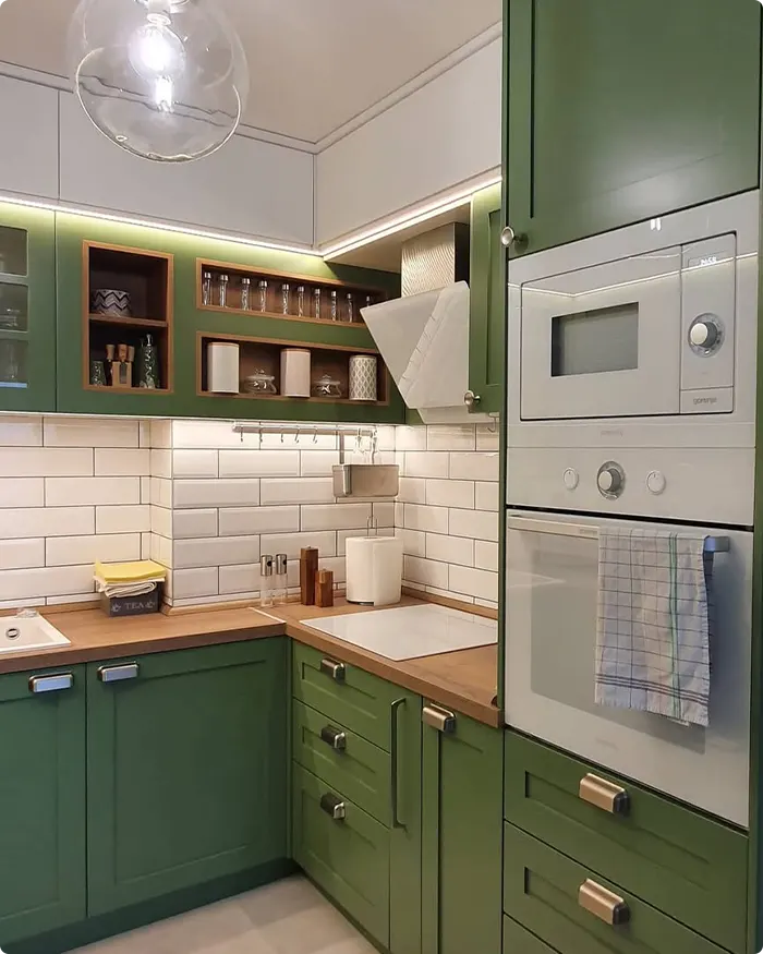
Rustic olive green is earthy, timeless, and incredibly grounding. It’s that rich, muted green you’d find in nature—somewhere between a leafy forest and an aged wine bottle.
I’ve used it in living rooms and home offices where I want a color that feels thoughtful and rooted. It plays so well with warm neutrals, leather furniture, and natural wood.
It also has this quiet confidence—darker than sage but not as heavy as forest green. Olive green makes any space feel curated, almost heritage-inspired, without trying too hard.
17. Moody Charcoal
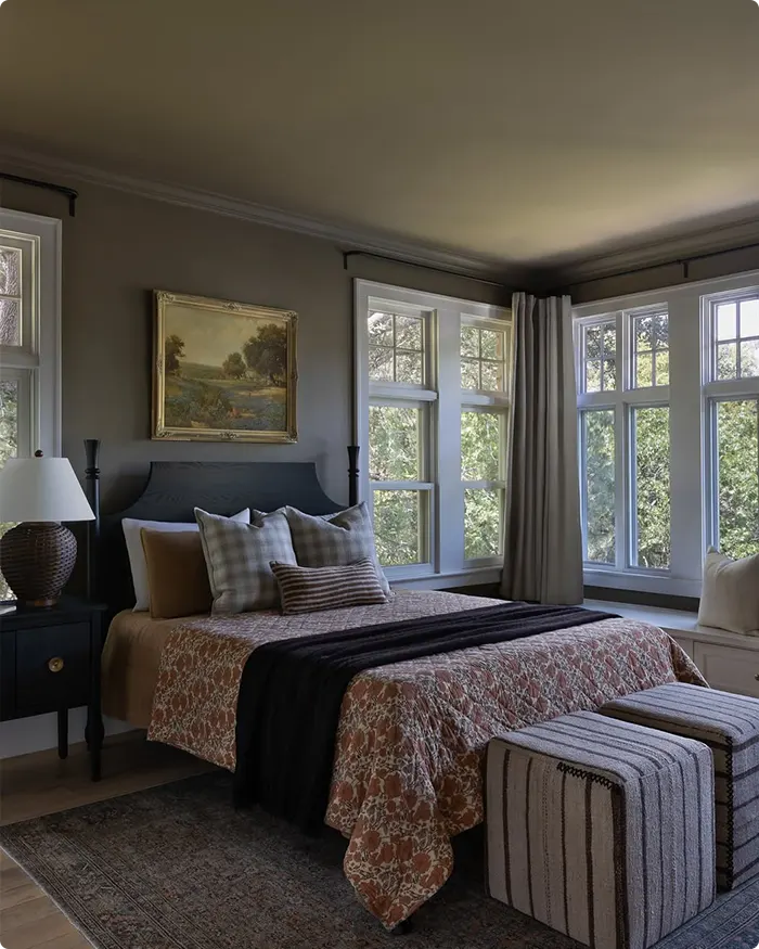
Moody charcoal is a deep, dramatic shade that adds instant sophistication. It’s not quite black, not quite gray—somewhere right in between with a rich, smoky undertone.
I once used it to define a library wall and was surprised at how cozy the space became. It absorbs light in a way that makes everything else in the room stand out—books, wood trim, even metallic details.
If you want a moody, intimate atmosphere, charcoal is your best friend. It’s a color that turns a room into a statement, without needing bold accessories or loud décor.
18. Muted Lavender
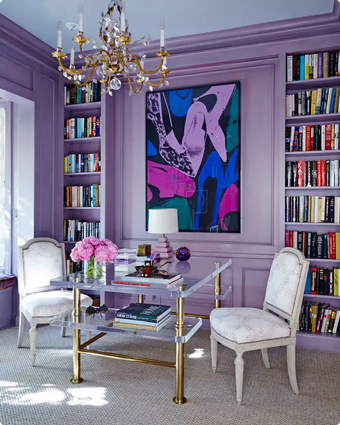
Muted lavender is delicate without being overly sweet. It has that soft, grayed-out tone that makes it feel modern and grown-up, rather than sugary or floral.
I love using it in bedrooms or bathrooms where I want just a hint of color. It’s especially beautiful paired with whites, warm woods, or even silver tones.
There’s a serenity to muted lavender—it’s the kind of shade that makes you want to curl up with a good book. It brings a bit of personality without being in your face, and that subtlety makes it incredibly versatile.
19. Rich Burgundy
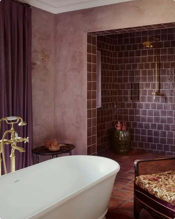
Rich burgundy is pure luxury. Deep, dramatic, and full of personality, this shade instantly makes a space feel more intimate and refined.
I used it once in a dining room with dark wood furniture and brass sconces, and it completely transformed the space. It’s warm without being too red, and bold without being overwhelming.
What I appreciate about burgundy is how well it layers—it looks amazing with velvets, leathers, antique mirrors, and even more modern elements like black accents.
It’s the kind of color that feels like a velvet blazer—classic, confident, and never boring.
Final Thoughts
If one of these colors sparked an idea or helped you imagine a new look for your space, I’d love to hear which one stood out.
And if you’re still deciding, don’t stress—sometimes it takes seeing a color in action (and maybe a test patch or two!) to really know.
Either way, I hope this guide helped narrow things down and made the process a little more enjoyable.

