
French blue has always been a color that stops me in my tracks. There’s something so effortlessly elegant about it—a shade that feels both timeless and fresh. It’s the kind of color that can transport you to a countryside villa in Provence or evoke the peaceful stillness of a misty morning sky.
Whether you’re looking to add a hint of softness to your space or make a bold statement, French blue has this magical versatility that works almost anywhere.
In this post, I’m sharing my picks for the 13 Best French Blue Paint Colors from Benjamin Moore and Sherwin Williams. I’ve worked with each of these shades in different settings, and I can’t wait to show you why they stand out. From soft and dreamy hues like Santorini Blue to richer, moodier tones like Distance, these colors have a charm all their own.
I’ll also share tips on how to choose the perfect French blue for your space, ideas for where to use it, and the best pairings to make your design shine.
If you’ve been dreaming of adding a touch of French-inspired elegance to your home, these paint colors might be just what you need to bring your vision to life.
What Is French Blue?
To me, French blue is more than just a shade of paint; it’s a feeling. It reminds me of the charm of Parisian apartments, with their airy, light-filled spaces, or the calming hues of the French countryside.
French blue typically falls between soft powdery blues and rich, muted tones, often with subtle gray or green undertones.
It’s versatile and timeless, making it perfect for almost any room in the house. I’d describe it as a color that whispers sophistication without trying too hard.
Why Choose French Blue?
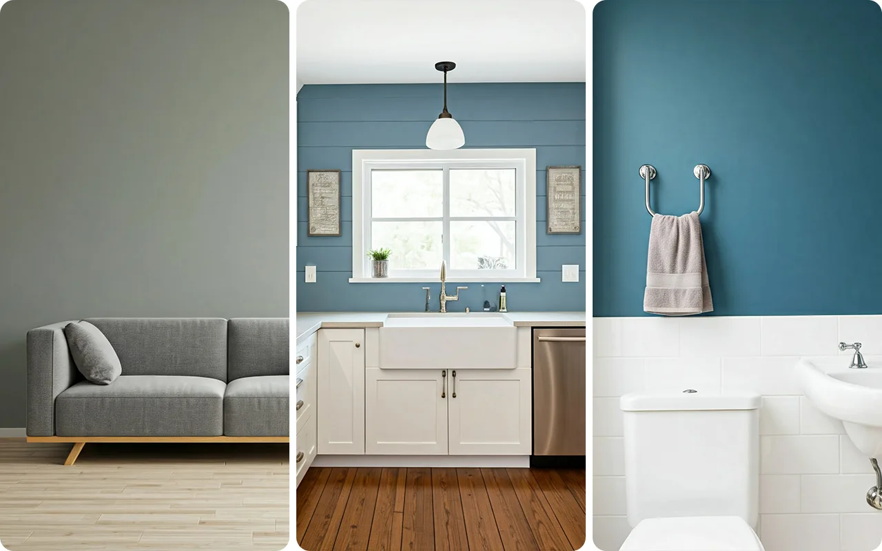
French blue is one of those colors that instantly creates a sense of calm, which is why I love using it in bedrooms and living spaces. It’s subtle enough to act as a neutral while still bringing personality to a room.
What makes French blue so special is how adaptable it is—whether you’re going for a coastal vibe, a modern look, or even something more traditional, it fits right in. Personally, I think it’s the perfect balance between warmth and coolness, making it a no-brainer for homes with mixed design styles.
Tips for Selecting the Right French Blue Shade
I’ve learned that lighting plays a huge role in how a shade of blue looks in your space. For instance, if your room faces north and gets less natural light, a French blue with warmer undertones like Santorini Blue or Wythe Blue can make the space feel cozier. On the flip side, brighter, sunlit rooms pair beautifully with cooler options like Blue Danube or Distance.
Another tip: always sample the color on your walls. Trust me, a tiny paint chip can’t tell you the full story. Paint a swatch and look at it in different lights throughout the day before committing.
*This post contains affiliate links. For more details see my full disclosure.
How to Know if a Paint Color Is Right for You?
The best way to see if a paint color works for your home is to test it on your wall. Look at it over a few days in different lighting—morning, afternoon, and evening—to see how it really feels.
You can do this by getting a sample from the paint store and using a brush put it up on the walls, but then you are left with a can that you can’t do anything with. Those samples are used with poor-quality paint and aren’t meant for use on your walls permanently.

Instead, I recommend going with Samplize. They are a company that will send you a 12X12 peel and stick swatch of a paint color that you can stick to the wall. When you are done just peel it off and throw it away.
It’s easy and much less messy!
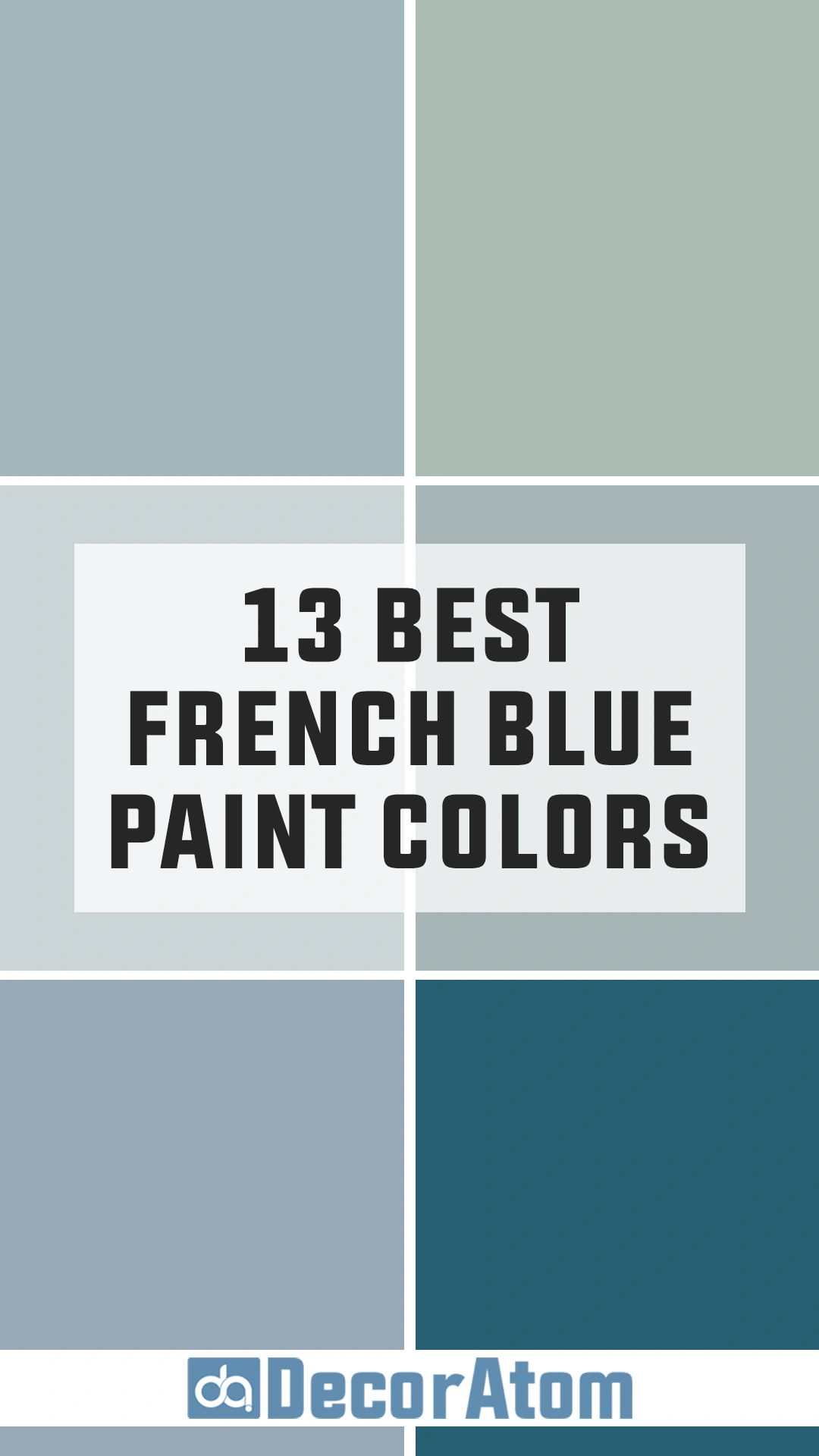
Top French Blue Paint Color Choices
This section is where we dive into the fun part—my favorite shades of French blue. I’ll break these into two categories: Benjamin Moore and Sherwin Williams, giving you a variety of options to choose from depending on your brand preference.
Top Benjamin Moore’s French Blue Paint Colors
Benjamin Moore is one of my favorite paint brands for its wide variety of colors, and their collection of French blue shades doesn’t disappoint. Each of these hues has its own unique character, and I’ve used many of them to create timeless, elegant spaces.
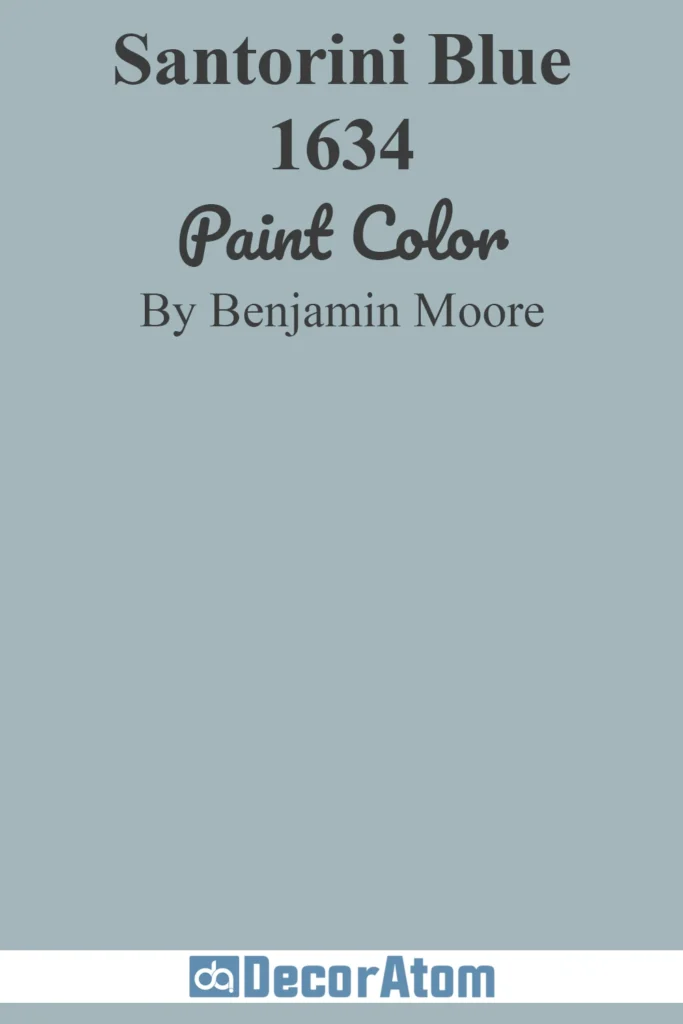
1. Santorini Blue (1634)
💥🎁 Christmas & Year-End Deals On Amazon !
Don't miss out on the best discounts and top-rated products available right now!
*As an Amazon Associate, I earn from qualifying purchases.
If I had to describe Santorini Blue in one word, it would be “tranquil.” This soft blue immediately reminds me of the Greek islands, with their iconic whitewashed architecture set against the Aegean Sea.
It’s a light, airy color with just the right amount of gray undertone to keep it feeling sophisticated.
I’ve found this shade works beautifully in bedrooms, especially when paired with crisp white bedding and subtle gold accents. It’s also an excellent choice for bathrooms, creating a spa-like atmosphere.
Get a Peel & Stick paint sample of Santorini Blue
2. Blue Danube (2062-30)
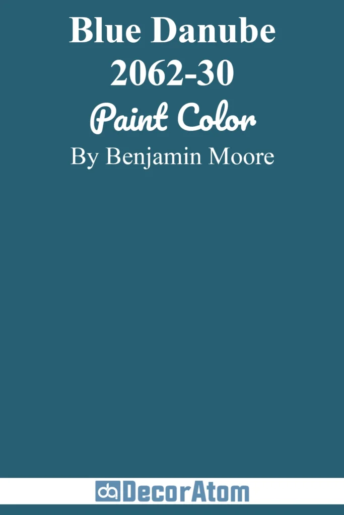
Blue Danube is for those who love a bit of drama. This is a deeper, more saturated French blue that commands attention without being overpowering.
I’ve seen it used on accent walls in living rooms, where it pairs stunningly with warm wooden furniture and neutral textiles.
It’s also a fantastic choice for front doors, offering a bold yet timeless look that adds instant curb appeal. If you’re looking for a shade with a bit more personality, Blue Danube is a must-try.
Get a Peel & Stick paint sample of Blue Danube
3. Solitude (AF-545)
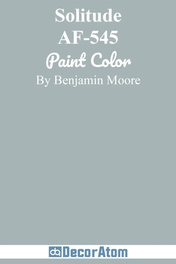
Solitude is one of those colors that feels like a breath of fresh air. It’s a soft blue with gray undertones that make it incredibly versatile.
I often recommend this shade for people who want a calming backdrop in their living spaces.
It works well in open-concept homes because it pairs seamlessly with other neutrals like beige, gray, or even pale greens. Solitude has a quiet elegance that makes it perfect for modern, minimalist interiors.
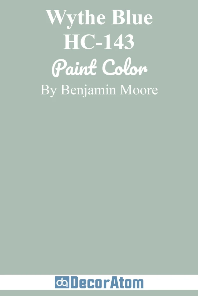
4. Wythe Blue (HC-143)
💥🎁 Christmas & Year-End Deals On Amazon !
Don't miss out on the best discounts and top-rated products available right now!
*As an Amazon Associate, I earn from qualifying purchases.
Wythe Blue is one of Benjamin Moore’s most popular shades, and for good reason. It leans slightly toward green, giving it a unique depth that sets it apart from other French blues.
I love using this color in kitchens—imagine it on cabinetry paired with white marble countertops and brass hardware.
It’s also stunning in entryways, where it creates a welcoming first impression. This shade feels warm and inviting, making it ideal for spaces where people gather.
Get a Peel & Stick paint sample of Wythe Blue
5. Van Courtland Blue (HC-145)

Van Courtland Blue is a medium-tone French blue that strikes a perfect balance between light and dark.
It’s a shade that feels traditional yet fresh, which is why I often recommend it for dining rooms or home offices.
It pairs beautifully with white wainscoting or trim for a classic look. I’ve also seen this shade used on built-in bookshelves, where it adds a sophisticated pop of color without overwhelming the space.
Get a Peel & Stick paint sample of Van Courtland Blue
6. Wedgewood Gray (HC-146)
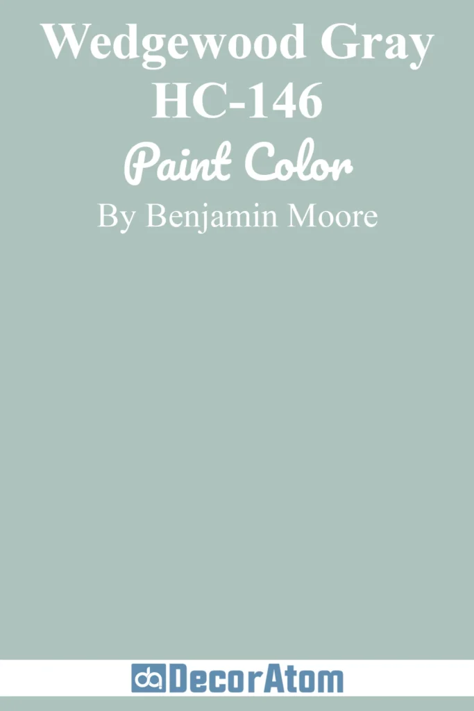
Despite its name, Wedgewood Gray leans more toward blue than gray, and it has a timeless quality that works in almost any setting.
This color is soft and understated, making it a great choice for bedrooms or bathrooms. I’ve also used it on ceilings in living rooms to create a subtle yet dramatic effect.
It pairs especially well with warm neutrals like beige or taupe, adding a sense of balance and harmony to any room.
Get a Peel & Stick paint sample of Wedgewood Gray
Sherwin Williams’ Best French Blue Paint Colors
Sherwin Williams offers some of the most elegant French blue shades, each with its own distinct charm. These colors range from soft and soothing to bold and dynamic, giving you plenty of options for your home.
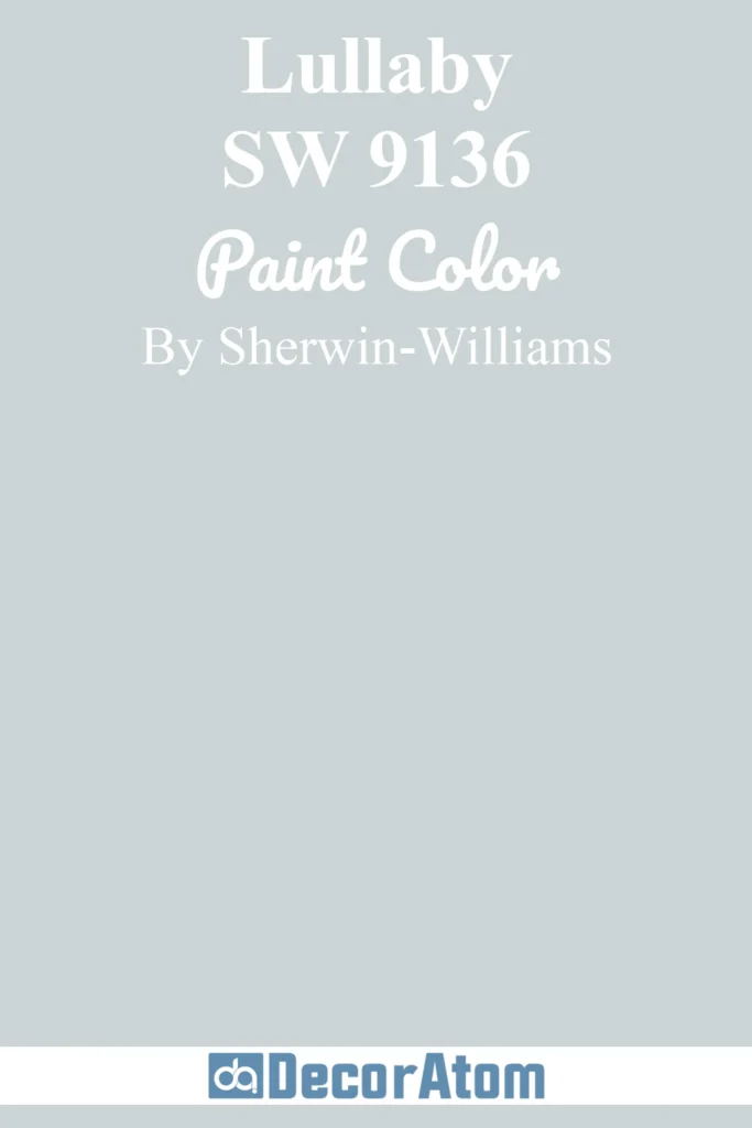
7. Lullaby (SW 9136)
💥🎁 Christmas & Year-End Deals On Amazon !
Don't miss out on the best discounts and top-rated products available right now!
*As an Amazon Associate, I earn from qualifying purchases.
Lullaby is one of the softest, most delicate shades of French blue I’ve come across. It’s light and airy, with just a hint of warmth that keeps it from feeling too cold.
I love recommending this shade for nurseries or children’s bedrooms because of its calming effect. It pairs wonderfully with pastel accents, creating a sweet and serene environment.
Get a Peel & Stick paint sample of Lullaby
8. Distance (SW 6243)
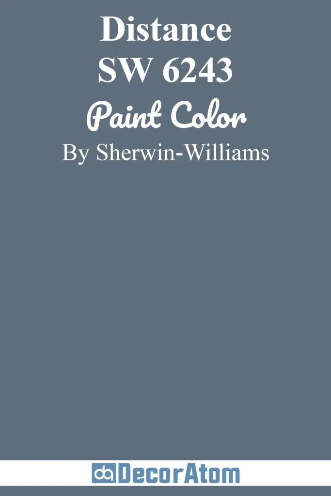
Distance is a darker, moodier take on French blue, and I absolutely love its richness. This color is ideal for accent walls or statement furniture pieces, like a painted console table or bookshelf.
It has a touch of gray that keeps it grounded, making it a fantastic choice for modern or industrial-style spaces. Pair it with white or light wood tones for a balanced look.
Get a Peel & Stick paint sample of Distance
9. Aleutian (SW 6241)
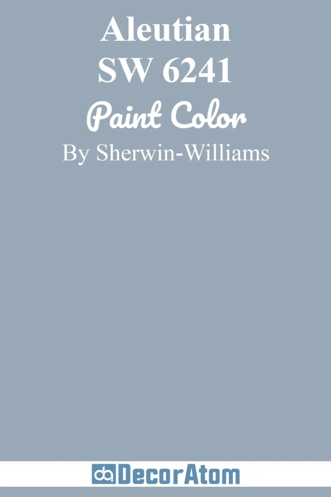
Aleutian is one of the most versatile blues from Sherwin Williams. It’s a muted, grayish-blue that feels understated yet sophisticated.
I’ve used it in living rooms to create a serene, cohesive look, especially when paired with soft cream or beige furnishings.
It’s also a popular choice for bedrooms, as its subtle undertones make it easy to relax and unwind.
Get a Peel & Stick paint sample of Aleutian
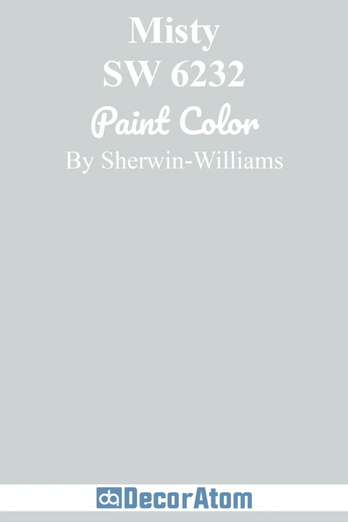
10. Misty (SW 6232)
💥🎁 Christmas & Year-End Deals On Amazon !
Don't miss out on the best discounts and top-rated products available right now!
*As an Amazon Associate, I earn from qualifying purchases.
Misty is exactly what its name suggests—a light, misty blue with soft gray undertones. It’s an excellent option for bathrooms, especially when paired with white tiles and chrome or brushed nickel fixtures.
This shade has a fresh, clean feel that’s perfect for creating a spa-like retreat. It’s also a good choice for ceilings if you want to add a hint of color without overwhelming the space.
Get a Peel & Stick paint sample of Misty
11. Rainwashed (SW 6211)

Rainwashed is a gorgeous blue-green that leans slightly more toward green, giving it a fresh, coastal vibe. I’ve seen this shade used in kitchens, where it pairs beautifully with white cabinets and natural wood accents.
It’s also a great choice for laundry rooms or small bathrooms, as it brightens up the space while still feeling soft and subtle.
Get a Peel & Stick paint sample of Rainwashed
12. Blustery Sky (SW 9140)
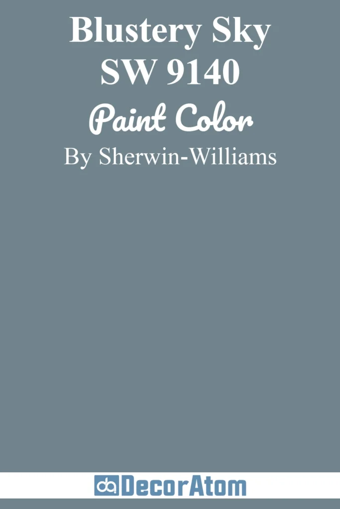
Blustery Sky is a mid-tone French blue with a richness that makes it stand out. I love using this shade for front doors or shutters, as it adds a bold, timeless charm to a home’s exterior.
Inside, it works well for accent walls or even cabinetry, especially when paired with warm metallics like brass or gold.
Get a Peel & Stick paint sample of Blustery Sky
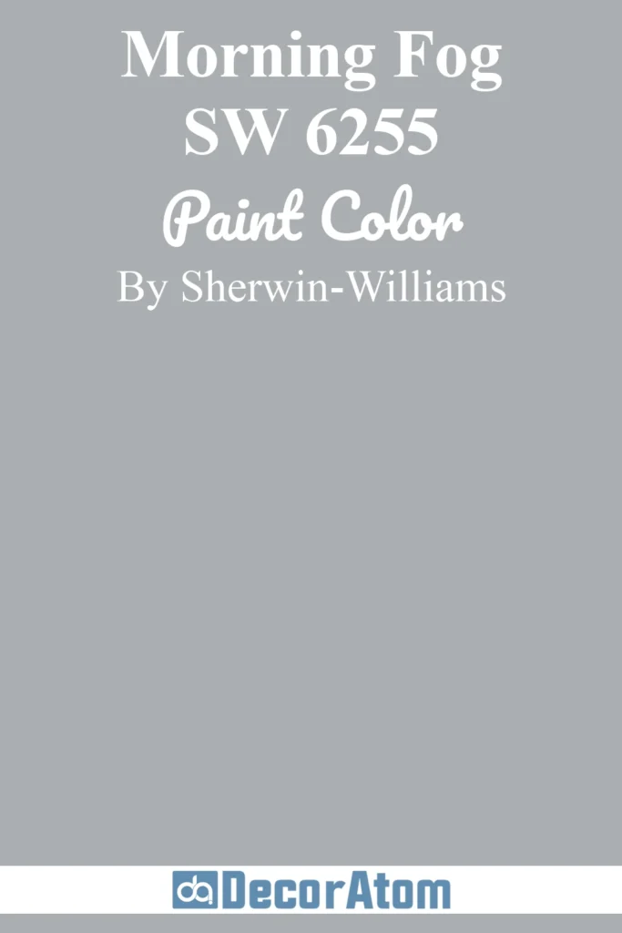
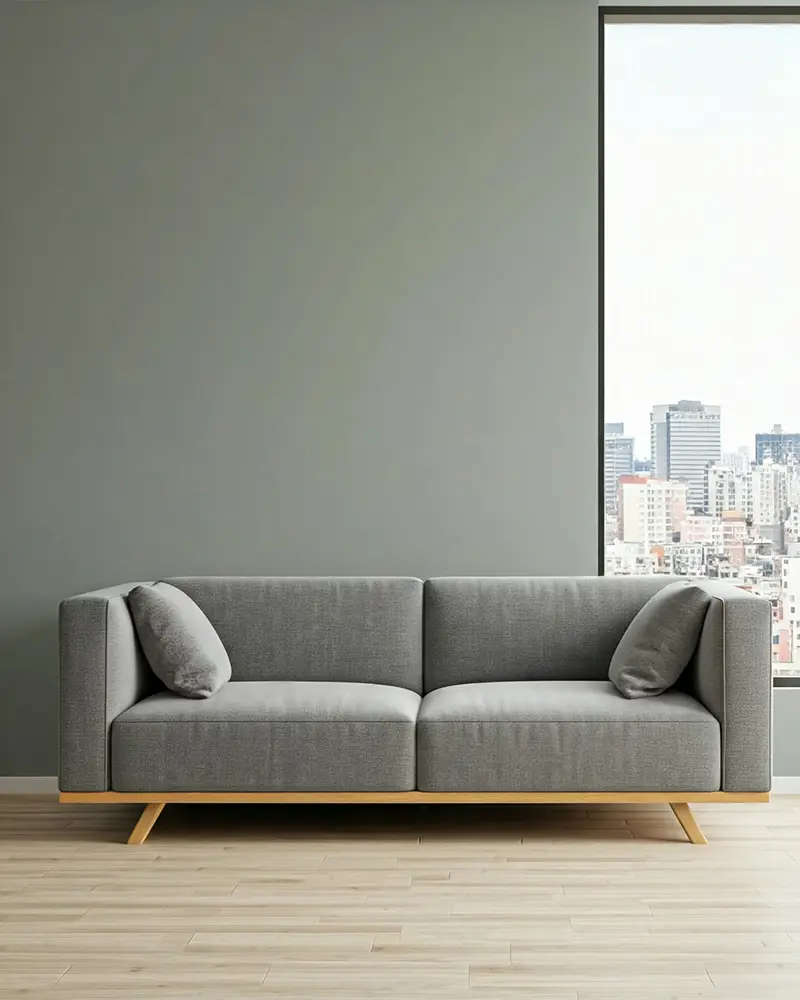
13. Morning Fog (SW 6255)
💥🎁 Christmas & Year-End Deals On Amazon !
Don't miss out on the best discounts and top-rated products available right now!
*As an Amazon Associate, I earn from qualifying purchases.
Morning Fog is one of the most elegant blue-gray shades I’ve worked with. It’s subtle and sophisticated, making it a perfect choice for open-concept living spaces or large bedrooms.
This color pairs beautifully with warm neutrals and wood tones, creating a cozy yet refined atmosphere. I’ve also seen it used in dining rooms, where it adds a touch of understated drama.
Get a Peel & Stick paint sample of Morning Fog
Examples of Where to Use French Blue in Your Home
Living Rooms
I love using French blue on the walls in living rooms because it creates a soothing backdrop for both neutral and bold furniture. Pair it with a light beige couch for a clean, classic look or with mustard accents for a pop of warmth.
Bedrooms
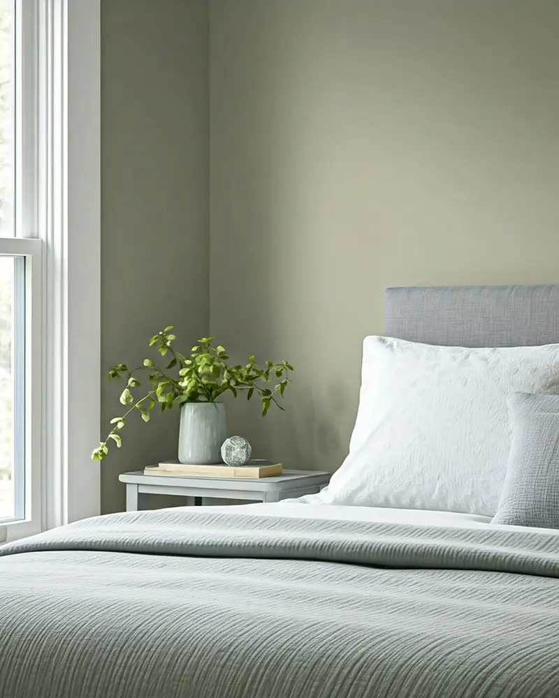
French blue in a bedroom feels like wrapping yourself in a soft, cozy blanket. I’ve used it on both walls and bedding to create an inviting retreat.
Kitchens

Imagine French blue cabinets paired with brass hardware—it’s pure elegance. If you’re not ready to commit to blue cabinets, consider using it for a kitchen island or backsplash.
Bathrooms
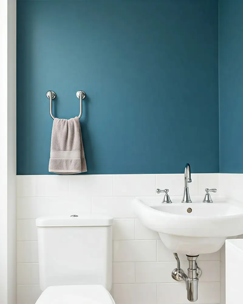
A lighter shade like Misty or Rainwashed works beautifully in bathrooms, especially when paired with white subway tile and natural wood accents.
Front Doors
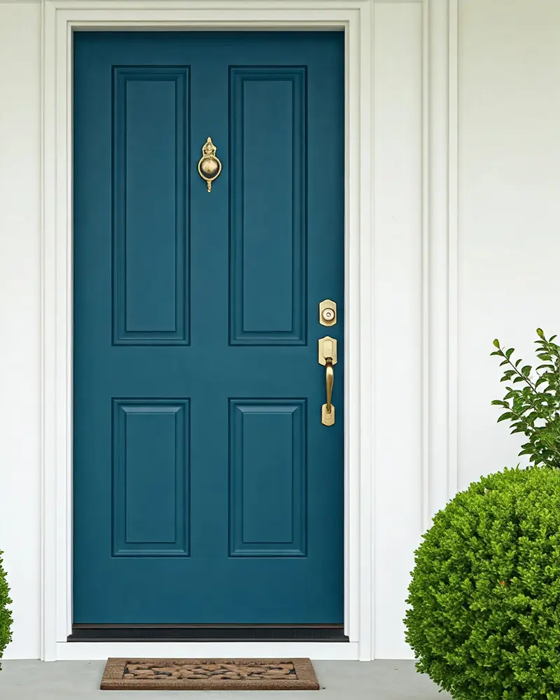
French blue front doors make a charming statement. I’ve seen both bold and muted shades used, and they always exude a welcoming vibe.
Popular Color Pairings with French Blue
French blue is incredibly versatile, and I’ve paired it with so many colors over the years. Here are a few combinations I swear by:
- White: This is a no-brainer. White trim or cabinetry makes French blue pop without overwhelming the space.
- Beige or Taupe: These colors bring warmth to the coolness of French blue, creating a balanced, inviting look.
- Mustard Yellow: I love this unexpected pairing for a modern twist. It’s bold, yet it works.
- Blush Pink: For a more feminine vibe, French blue with soft pink accents feels delicate and sophisticated.
- Gray: Pairing French blue with a medium gray creates a sleek and modern aesthetic.